
Modern front doors often fall into two uncomfortable extremes. One is a blank slab that feels clean but forgettable.
The other tries to look special with busy patterns, heavy ornament, or loud color, and the entry starts to feel noisy before you even step inside.

Textured doors solve that problem in a quieter way. They give you depth without relying on paint tricks.
They give you privacy without turning the entry into a bunker. They also give daylight a job: instead of light blasting straight through a clear pane, texture breaks it, softens it, and spreads it into the foyer as a gentle glow.

The privacy gradient, not a single privacy decision
A lot of people think of privacy as a yes-or-no choice: clear glass or frosted glass. The better modern entries can use privacy like a gradient that changes depending on where your eyes land.

The center is the privacy zone
The most private surface usually sits in the door itself, especially in the middle-to-upper area where faces and bodies align when someone knocks. That’s why reeded inserts, frosted fields, rain glass, hammered textures, and fabric-effect panels keep returning in the central leaf.
The benefit is not only privacy. A textured center panel lets the door act as a daylight source for the interior hall, even when the door is closed.
It brightens the space without turning the entry into a display window.

The edges can be clearer without feeling exposed
A narrow sidelight (or two) changes the whole experience of an entry. It gives peripheral visibility and daylight, but it does it off to the side, so you’re not staring into someone’s eyes through the door.
The sidelights can be clearer than the door insert, which creates a very usable combination:.
- The center stays blurred, so you can open the door without feeling watched.
- The edges stay more transparent, so the entry still feels connected to the exterior.
- Reflections of planting and sky appear in those side panes, so the entry gains life even with minimal décor.
The top glass does a different job than the side glass
Transoms are a quiet power move. They put brightness above sightline level.
They also make the opening feel taller, which matters for a modern door that’s trying to feel architectural rather than like a standard door in a standard wall.

If the house is near a street or a close neighbor, a transom can do the light work that you might otherwise try to force into a big clear sidelight. That’s part of why entries can combine three zones:.
- textured center panel for privacy,
- clearer sidelights for edge depth and outdoor cues,
- transom glazing for overhead brightness.
Once you understand that gradient, the texture choices become much easier. You’re not asking one surface to do everything.

Texture replaces color as the main statement
If the plants, mats, and lighting are striped away, the drama can come from how surfaces catch light, not from paint contrast. That’s useful because front doors deal with harsh conditions: direct sun, deep shade under a porch, reflective paving, nighttime spotlighting.
Bold color can look different every hour. Texture stays consistent because it’s built into the material.
Let’s break down the main texture families and how they work.

Reeded and fluted glass: the modern favorite for a reason
Reeded (fluted/ribbed) glass solves multiple problems in one move:.
- It blurs faces and details without blocking daylight.
- It adds vertical rhythm, which makes an opening feel taller.
- It looks good in both bright sun and shade because it creates thin highlight lines and soft shadow lines.
- It pairs well with slim frames, which keeps the entry looking current.
Where reeded glass works
- Full-height inserts feel like a luminous panel. They’re ideal when the entry hall is narrow or when the foyer needs daylight. From the inside, that door becomes a gentle light wall.
- Tall, narrow inserts feel more guarded and structured. They keep the door reading as mostly solid, which some homeowners prefer for security and presence, but you still get a daylight stripe.
- Reeded inserts plus clear sidelights are a strong combination because the difference in clarity creates depth. Your eye gets a sharper read at the edges while the center stays soft.
Frame color changes the mood more than people expect
There are two modern design directions:.
- Black or deep bronze frames give a crisp outline. They make the geometry feel sharper, and they emphasize the vertical bays and mullions. This is why reeded glass in a black grid can feel high-end even with simple stucco walls.
- Light champagne / pale greige frames soften the look. They still keep the entry modern if the profiles stay slim, but the mood shifts closer to coastal or Mediterranean. The privacy remains, the glow remains, but the contrast is gentler.
If the exterior is already high-contrast (white walls, dark windows, dark roof details), a black frame will feel integrated. If the exterior is tonal (stone, sand, warm whites), a pale frame can feel more natural.

Reeded glass needs a glare plan
One reason reeded-glass entries also include porch depth or a canopy is simple: shade makes texture legible. Direct sun can turn glass into a mirror.
A deeper overhang reduces reflection and lets you see the reeding as texture instead of glare. Recessed downlights also help at night because they skim light across the grooves and make the pattern visible.

Hardware should follow the same vertical logic
Reeded glass is already a field of vertical lines. Hardware looks right when it supports that direction:.
- long vertical pulls instead of knobs or curved levers
- rectangular profiles instead of decorative shapes
- placement near the edge so the glass field stays clean
In your examples, the pulls often act like a second thick stripe. That’s why the door face looks composed rather than cluttered.

Frosted fields with horizontal bands
If reeded glass is about vertical rhythm, frosted doors with horizontal lites are about width, pacing, and human scale. The design idea is that horizontal breaks can make a tall door feel less like a blank wall.
They divide the surface into sections, so the eye doesn’t scan one uninterrupted plane. This can be especially useful on doors that are mostly frosted, because one big frosted sheet can feel flat.

Why horizontal bands work in real life
- Privacy aligns with typical eye levels. Frosting can be heavier where faces align, while thinner bands can sit higher or lower to let in brighter light without revealing much.
- The door can feel wider. Horizontal rhythm pulls your attention side-to-side, which can make a single door feel more substantial.
- It pairs well with horizontal siding and wood soffits. You get a quiet push-pull: vertical sidelights and door height versus horizontal cladding lines and banding.
How to keep banding modern, not busy
Two or three breaks often feel enough. Once banding becomes frequent, it can start to look like an old-fashioned grid.
The doors in your set keep the divisions broad and calm, not thin and repetitive. Hardware matters here too.
A slim vertical pull beside the banded field keeps the door from turning into an all-horizontal composition. That mix of directions gives balance: horizontal rhythm in the glass, vertical anchor in the handle.

Base styling helps frosted doors feel grounded
Frosted doors can feel visually light as bright panels. That’s why the decoration often gets concentrated at ground level:.
- symmetrical planters with dark pots
- a mat placed tight to the threshold
- low shrubs or grasses that add weight at the base
That bottom weight keeps the light door panel from feeling like it’s floating.

Fabric-effect panels and micro-grid textures
A door surface can look like woven textile, micro-grid, or a fine mesh panel. It’s a different kind of texture than glass.
Instead of highlights in grooves, it’s a dense surface that changes subtly as the sun moves. This design works with tall portals, pivot-style proportions, deep recesses, and heavy stone surrounds.
That makes sense because a large slab needs a surface that can hold attention at a bigger scale.

Why fabric-effect panels feel modern
- The pattern is fine, so it reads like material depth rather than decoration.
- It avoids the common issue of a big slab looking dead-flat.
- It stays private by nature, often more private than frosted glass, yet it can still allow light if the panel is a translucent laminate or a screened insert.
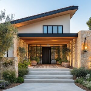
The portal matters as much as the door
Sometime doors look good because they’re framed by a larger composition: stone piers, deep recesses, and slim side glazing that keeps the opening from becoming too heavy. That slim side glass is important.
A tall stone surround can feel monolithic. Narrow sidelights and a transom band cut light into the entry volume and bring reflections from palms and sky, so the portal gains depth.

Handle scale has to match the slab scale
A common failure with oversized doors is using normal hardware. A tall slab needs a pull that can visually stand up to the height and weight of the leaf.
The pulls can be oversized but simple: rectangular, long, placed a bit off the edge so the hand has leverage. If the door feels like a pivot-door proportion, the pull should feel like it belongs to that proportion.
Small hardware can make a large door feel oddly unfinished.

Pair fabric-effect panels with a clean surrounding palette
These textures work when the rest of the entry stays quiet: pale stone paving, minimal planting near the threshold, and very few small decorative items. The surface becomes the feature.
If it has too many competing textures right next to it (busy tile, patterned rugs, multiple small planters), the door loses its controlled presence.

Related textures to know
Rain glass and hammered glass: privacy with a watery softness
These textures diffuse outdoor colors into soft blocks. They can feel especially good with double doors and tall sidelights because they keep the entry bright but reduce sharp visibility.
They also pair well with warm vertical sconces inside or near the entry because warm light plays beautifully in uneven textures, giving the glazing a layered look at night.

Horizontal striated glass inserts inside vertical mullion grids
One interesting design move is when a door insert uses horizontal striations while the surround uses vertical mullions. That cross-direction detail gives subtle energy.
It’s also a smart way to make a door feel designed when the rest of the entry is a big glazing wall. If there is a full-height mullion grid, adding a different texture direction inside the door prevents the center from disappearing into the frame.

Warm artisan glazing (amber or resin-like texture)
These are textured glass that reads like an art panel. The key to making that work is restraint around it:.
- keep paving calm
- keep planting minimal
- use metal pulls that bridge the warm glass and the cooler stone or stucco around it
This is the modern version of a statement door: not painted red, not carved, but luminous through material depth.

Proportion tricks that make entries feel taller and more expensive
Texture helps, but proportion is the foundation.
1) Slim sidelights that act like light slits
Narrow sidelights do two things at once:.
- visually widen the opening without making it feel like a glass wall
- add a tall vertical edge that stretches the whole composition
They’re especially effective when the door itself is mostly solid or has a textured insert. The door stays private; the sides bring brightness and depth.
2) Transoms that feel like a real design element, not an add-on
A thin transom can look like an afterthought. A deeper transom band, especially one with a grid, makes the entry look proportioned to the facade.
It also makes the interior feel brighter because light comes from above, which is where you want it if privacy is a priority.

3) Consistent frame thickness
This is the quiet detail that makes openings feel expensive. When the frame lines, mullions, and door borders keep the same thickness logic, the whole entry looks designed as one unit.
When frame thickness changes randomly, the opening starts to feel assembled from parts. Texture can’t save that.
4) Large-format paving that keeps the base plane clean
Large-format stone or tile at the threshold is an interesting design idea. A busy ground plane competes with a textured door.
Large pavers keep joints minimal, so the vertical door texture stays the main event.

Frame discipline: the geometry carries the composition
Strict geometry lets texture be expressive without looking chaotic. Here’s what that looks like:.
- mullions line up cleanly, often evenly spaced
- the door leaf sits centered within the glazing system
- transom grids relate to the door proportions
- pulls align with verticals, not fighting them
This doesn’t mean everything has to be symmetrical. It means the logic is readable.

Directional tension: mix vertical and horizontal on purpose
One sophisticated idea is the cross-direction pairing:.
- vertical reeded glass against horizontal siding
- vertical pulls against horizontal door lites
- vertical mullion grids against a horizontal striated insert
- vertical glass inserts under a horizontal transom band
This adds energy without adding objects. It also keeps the door from feeling like a single-note composition.
, and stone plus stucco walls.")
The entry architecture
The door face stays clean. The warmth stays low and to the sides.
The base styling formula that keeps repeating
- A mat placed close to the threshold, usually woven natural fiber or a quiet neutral.
- One tall plant or two planters, often symmetrical, with simple pot shapes.
- Landscaping that frames rather than blocks, often used like soft vertical columns.
That formula works because it supports the door rather than competing with it.
Mat sizing that looks intentional
For a single door: a rectangular mat that relates to the door width, placed tight to the swing line.
For double doors: a mat that sits centered and wide enough to acknowledge the full opening, but not so wide that it feels like a rug trying to become decor.
The mat’s role is not decoration first. It’s the threshold marker.
It also adds a soft material right where the feet land, which makes a modern entry feel welcoming without adding clutter.

Planters as visual weight
When the door surface is bright (frosted glass) or the frame is light (white-on-white entries), darker planters add weight at ground level. That’s why charcoal pots, black planters, or darker baskets are popular decorations.
When the entry already has strong dark framing, lighter natural baskets can soften the contrast and keep the scene from feeling too strict.
Plant shape should echo door proportion
This is a trick:.
- Cactus, yucca, and upright grasses echo vertical glazing.
- Palms and arching fronds soften strict rectangles.
- Low clipped shrubs keep the threshold clear while still adding texture.
It does not need many plants, only the right silhouettes.

Night identity: plan it with the same care as daytime
Textured entries can look flat at night if lighting is random. The strongest examples in your set rely on two lighting moves that work together.
1) Warm recessed downlights under the porch
Recessed ceiling lights create a pool of light over the threshold. Warm color temperature makes greige and taupe door tones feel richer, and it makes textured glass look deeper because the grooves create highlight and shadow bands.
A porch overhang also reduces harsh reflections, so the glass texture stays visible after dark.
2) Slim vertical sconces that support the door’s verticality
Vertical wall lights often show up flanking the opening, echoing sidelights and door proportions. They give the entry a readable shape in low light.
They also add side glow, which keeps a deep recess from turning into a dark cavity. If the only light is a bright fixture aimed directly at glass, the glass can flare and the texture disappears.
Textured glass looks better with controlled, warm light and a bit of shade structure.

Bringing it all together
- Privacy is layered: textured center, clearer edges, bright transom.
- Texture is the feature: color stays in neutrals; surfaces do the work.
- Frames stay disciplined: consistent thickness, aligned mullions.
- Proportions stretch upward: sidelights and transoms add height and presence.
- Direction is intentional: vertical vs horizontal is chosen, not accidental.
- Styling stays low: mat + planters + one tall plant beats clutter.
- Night lighting is planned: warm downlights + slim vertical sconces.
Textured modern front doors work so well because they solve several entry problems at once: they bring light, protect privacy, and add character without needing decorative overload. Once you start thinking in gradients (privacy, clarity, brightness) and in disciplined geometry, you can mix textures confidently—reeded glass, frosted banding, fabric-effect panels—while keeping the entry clean, current, and welcoming.
Disclaimer: This article is for design inspiration only. Always confirm product specs and local building requirements with a qualified professional before installation.
Related Posts
Harmony Home Design brings 10+ years of residential interior design experience to the ideas shared here. We publish design concepts, layout thinking, and practical styling notes.