
Choosing calming paint colors for a bedroom might seem straightforward, but getting the right balance between relaxation and visual interest takes a bit more thought. A soothing palette can easily turn dull if the textures, contrasts, and natural light are overlooked.
This article breaks down not-so-obvious strategies to create a bedroom that feels both restful and engaging—without falling into a predictable look.

From the impact of subtle undertones to layering different finishes, these insights go beyond simple color selection. Whether it’s incorporating architectural details, using textiles in unexpected ways, or playing with light and shadow, the right approach ensures a bedroom remains inviting rather than flat.
Inspired by various styles found in different regions, the ideas shared here blend classic design knowledge with creative twists that keep a space feeling fresh.

The Subconscious Power of Subtle Undertones
Color does more than fill a wall—it subtly influences how a bedroom feels, even if we don’t always notice it. The difference between a warm or cool shade can change the entire atmosphere of a space, affecting how cozy or open it appears.
Understanding these small shifts in tone is key to making calming bedroom colors work without turning the space into something lifeless or predictable.
Warm vs Cool Undertones
Two shades of beige might look almost identical at first glance, but their undertones determine how they interact with the room’s lighting and furnishings.
How Mood is Affected
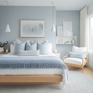
A beige or taupe with a peachy or golden undertone tends to create a comforting feel, making the space feel inviting. This works especially well in bedrooms that rely on warm artificial lighting or get soft afternoon sunlight.
On the other hand, a version of beige with a cooler gray base leans toward a cleaner, more restful look, ideal for a space designed to feel airy and minimal.
How Light Changes the Effect
The way a color reflects natural and artificial light plays a big role in how a room feels throughout the day. Warm neutrals tend to reflect daylight in a way that creates a cozy glow, especially in rooms with soft textiles and wooden furniture.
Cooler shades, like a soft gray-beige or muted sage, work well with crisp white trims, mirrors, and glass lamps, allowing light to bounce more efficiently and making the room feel open and calm.

Maintaining Visual Depth
A bedroom built around a single tone can quickly feel one-dimensional, even if the color itself is beautiful. Creating subtle contrast ensures the space remains interesting without disrupting its relaxed feel.
Adding a Second Tone for Balance
Keeping everything in the same temperature range—either all warm or all cool—can sometimes feel flat. A simple way to introduce depth is by adding a contrasting but complementary element.
If the walls are a soft taupe, darker wooden furniture or a few terracotta accessories can break up the monotony while keeping the warmth intact. For a cooler color palette, adding a deeper charcoal accent or even a muted dusty blue in small touches keeps the space from looking too uniform.
Layering Similar Shades
Instead of using just one version of a color, mixing different shades of the same family adds richness without overwhelming the space. Walls in a soft warm taupe, bedding in a slightly cooler beige, and a throw blanket in a deeper sandy tone create a layered effect.
This variation tricks the eye into seeing depth and dimension, making the room feel thoughtfully put together rather than flat. By paying attention to the subtle shifts in warmth and coolness, as well as layering complementary tones, a bedroom can feel calm without losing its sense of character.
These small details are what keep a space visually engaging while maintaining a soothing atmosphere.

Textural Variation: Going Beyond Just Color
Color may set the mood, but texture is what gives a bedroom real character. Even the most calming palette can feel uninspired if everything is too smooth or uniform.
The key to keeping a space interesting without disrupting its relaxing feel lies in mixing different materials—some soft, some structured, some that catch the light and others that absorb it. This careful layering ensures a bedroom stays visually engaging while maintaining a comfortable atmosphere.
Contrasts in Texture
Texture adds depth in a way that color alone cannot. Even in a room with soft neutral walls, the right materials can create shadows, highlights, and subtle changes in tone throughout the day.
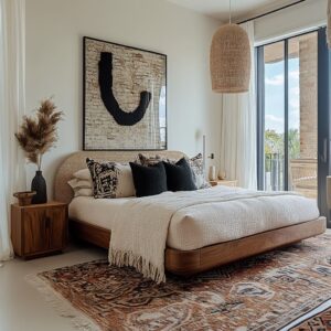
Woven Details That Add Dimension
Incorporating natural textures like cane, rattan, or jute brings warmth and variation. A cane headboard against a smooth painted wall introduces a light and shadow effect, preventing the space from feeling overly flat.
A chunky knit ottoman or a woven bench at the foot of the bed provides a break from the uniformity of sleek furniture, giving the room a lived-in and layered look.
The Role of Fabric Sheen
The way fabric interacts with light can make a significant difference. A tufted velvet or linen headboard, even in a neutral shade, can catch sunlight differently than a matte-painted wall, introducing subtle contrast without adding extra colors.
For those who prefer a subdued palette like beige, taupe, or sage green, incorporating a few elements with a slight sheen—such as a silk pillow, a metallic-threaded throw, or a subtly reflective lamp base—creates quiet movement in the space without overpowering the calming effect.

Layered Textiles
Soft furnishings play a crucial role in creating a space that feels complete. Instead of focusing on just one texture, combining different materials and weights helps the room feel more inviting and visually rich.
Mixing Quilts and Throws for Balance
A fine-textured quilt may look polished, but pairing it with a loosely woven blanket or a plush throw adds contrast. This balance keeps the bed from looking too stiff or overly casual.
A combination of linen bedding with a heavier knitted blanket introduces dimension without disrupting the restful feel.
Textured Upholstery for Extra Interest
A window seat or bench upholstered in a woven fabric—especially one that subtly ties into the wall color—can introduce another layer of depth. Opting for a material with small flecks of a complementary shade, such as a beige bench with subtle orange or green threading, creates a quiet link between the walls and decor.
This kind of subtle pattern keeps the room visually engaging while maintaining its soft, calming aesthetic. By combining different textures and materials, a bedroom can stay true to a soft, relaxing color scheme without becoming plain.
The right balance between smooth and textured surfaces, matte and reflective fabrics, and structured and relaxed materials ensures that the space remains inviting, layered, and full of quiet character.

Light Interplay and Color Shifts Through the Day
Light plays a huge role in how a bedroom feels, transforming even the softest color palettes depending on the time of day. A shade that appears muted and cozy in the morning might take on a crisp, airy quality by afternoon.
By considering both natural and artificial lighting, a space can maintain its sense of calm while adjusting to different moods throughout the day.
Natural Light
Sunlight changes how colors behave, making it essential to consider window placement and the way light moves through a room.
How Window Orientation Affects Color
A bedroom with large windows facing a garden or tree-lined street naturally benefits from neutrals that connect with the view. Soft sage, warm white, or muted taupe create a seamless transition between indoors and out, enhancing the restful effect of the space.
These shades work especially well because they subtly reflect the greenery outside, making the room feel more connected to nature.
The Influence of Architectural Shapes
Arched windows have an unmistakable presence in bedroom design, and their shape can be echoed throughout the space for a more cohesive feel. If a bedroom features these curved elements, introducing round mirrors, softly contoured headboards, or even artwork with fluid shapes creates a rhythm that makes the design feel intentional.
The repetition of curves softens the overall look, reinforcing the idea of a calm retreat.

Artificial Lighting
As the sun sets, artificial lighting takes over, shaping the way colors appear and influencing how the bedroom feels in the evening.
The Role of Layered Lighting
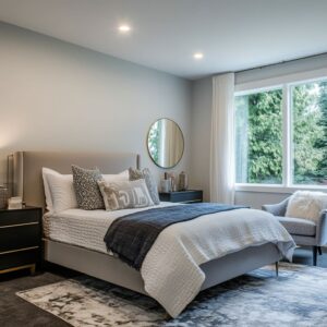
A balanced mix of lighting sources helps prevent a bedroom from feeling flat once natural light fades. Matching bedside lamps create a structured look, while a single sconce or pendant light on one side introduces subtle asymmetry.
The contrast between these elements keeps the space from looking too uniform while maintaining a relaxed ambiance.
Choosing the Right Metal Finishes
The tone of light fixtures can influence how wall colors feel. Brass or gold-finished lamps add a soft glow, making cooler shades like misty blue or sage green feel warmer and more inviting.
On the other hand, black or bronze fixtures create contrast, grounding the space when working with a predominantly neutral or pale color scheme. The key is to choose finishes that enhance the chosen palette without overpowering the softness of the space.
By paying attention to how natural and artificial lighting interact with relaxing bedroom colors, a bedroom can remain visually interesting without losing its calming effect. Whether it’s adjusting textures to catch the light or selecting the right finishes for fixtures, the right balance of light ensures that the space feels inviting at any hour.

Preventing Monotony Through Small Surprises
A bedroom designed around soft neutrals or soothing bedroom colors can easily feel refined and relaxing—but without the right details, it risks looking flat. The key to keeping a space visually interesting without overwhelming its calming effect lies in subtle contrasts, thoughtful accent choices, and layered patterns.
Even the smallest shifts in color or texture can make a quiet design feel more intentional and dynamic.
Subtle Contrast and Accent Colors
Adding contrast doesn’t mean disrupting the room’s restful feel. Even a space built around taupe, cream, or soft gray can gain depth with small, well-placed accents.
Introducing a Hint of Warmth
A single terracotta pillow or a ceramic vase in rust or deep plum can breathe life into an otherwise neutral setting. These warm, earthy touches prevent a muted color scheme from feeling too predictable.
A soft beige room, for example, instantly feels richer with one or two well-placed accents in deeper tones.
Reworking Trim and Doors for Unexpected Depth
While most people focus on wall color, painting doors or trim in a slightly deeper shade adds an extra layer of depth. A sandy beige room with a soft brown door or trim in a muted olive shade makes the entire space feel more considered.
This works especially well in bedrooms with high ceilings, as a darker trim can help ground the space without taking away from the overall softness.

Incorporating Patterns
Patterns are another way to introduce variety without overwhelming the room. The trick is to keep them subtle and layered, allowing texture to create interest rather than relying on bold colors.
Low-Contrast Prints for a Gentle Lift
A tone-on-tone rug with a soft geometric weave or pillows featuring a subtle stripe or organic pattern can create depth without overpowering the room. This approach ensures that patterns don’t compete with the overall color scheme but instead enhance the space with quiet detail.
Textured Artwork for Added Dimension
Instead of going for high-contrast art, consider monochromatic pieces with raised brushstrokes, sculptural surfaces, or layered materials. A simple plaster-like canvas in soft gray, beige, or muted blue can add more intrigue than a bright painting, as it plays with light and shadow throughout the day.
By weaving in small surprises through texture, understated contrast, and pattern, a bedroom designed around soothing tones stays visually engaging. The right details allow the space to feel balanced, refined, and quietly captivating, without straying from its calming foundation.

Repetition of Elements: Quiet Themes
A well-designed bedroom doesn’t need loud statements to feel interesting. Sometimes, the most cohesive spaces come from repeating subtle details—textures, shapes, or materials—that create a natural rhythm.
This sense of repetition allows calming wall colors to take center stage while everything else feels effortlessly connected.
Linked Textures and Hues
Using similar materials in different areas of the room keeps the design from feeling disjointed. A bedroom built around soft, natural tones benefits from repeating key elements in multiple places.
Wood and Rattan for a Layered Effect
If a space features a cane or rattan headboard, weaving that same texture into a pendant light, a bench at the foot of the bed, or even a decorative tray ties everything together. This quiet repetition makes the design feel intentional without overwhelming the softness of the color scheme.
The key is to spread these materials across different heights in the room, ensuring they don’t cluster in one spot.
Reinforcing Shapes for a Unified Look
If an arched window is part of the bedroom’s architecture, echoing that curve in other elements strengthens the overall aesthetic. A round mirror, a curved headboard, or even softly contoured decorative objects create subtle connections throughout the space.
These repeating forms guide the eye naturally, making the room feel harmonious without the need for bold contrast.

Restraint in Decor Counts
When working with a calming palette, too many small accessories can dilute the effect. Instead of filling the room with multiple decorative elements, focusing on a few impactful pieces keeps the space feeling uncluttered and intentional.
Prioritizing Fewer, More Meaningful Items
A soft-toned bedroom benefits from carefully chosen decor rather than excessive styling. A simple ceramic vase, a textured linen throw, or a few well-placed plants can enhance the space without disrupting its peaceful feel.
Keeping surfaces relatively open prevents visual clutter, allowing the textures and shapes to stand out more.
Letting One Standout Piece Do the Work
Instead of layering multiple focal points, choosing one defining element can give the room character without overwhelming it. A sculptural pendant light, a vintage wooden bench, or an oversized framed print in a monochrome palette can be enough to create interest while maintaining the space’s softness.
The goal is to create a sense of depth without pulling attention in too many directions. By repeating textures, colors, and forms in subtle ways, a bedroom can feel layered and thoughtfully put together without becoming cluttered.
This quiet consistency allows calming wall colors to shine, creating a space that feels both intentional and effortlessly soothing.

Maximizing the Sense of Calm with Natural References
A bedroom designed to feel restful often draws inspiration from nature. Whether through colors, materials, or small decorative choices, the connection to organic elements helps create a relaxing atmosphere.
By incorporating natural references—both subtle and direct—a space can feel more grounded and harmonious, reinforcing the effect of peaceful calm bedroom paint colors.
Biophilic Considerations
Bringing nature indoors doesn’t have to mean filling the space with plants. Sometimes, it’s about allowing the surrounding environment to influence the colors and textures within the room.
Blending with Outdoor Views
A bedroom with windows facing a garden, tree-lined street, or open landscape benefits from wall colors that complement the scenery. If lush greenery is visible, soft sage walls or warm whites with a green undertone create a seamless connection between inside and out.
This subtle reflection of nature enhances the sense of calm while preventing the color palette from feeling disconnected from its surroundings.
Botanical Prints That Reinforce the Atmosphere
Art choices can also play a role in maintaining a nature-inspired theme. Instead of bold, high-contrast artwork, opting for abstract or minimal botanical prints keeps the space visually balanced.
Soft watercolors of leaves, pressed plant illustrations, or monochrome sketches of organic shapes add a quiet reference to nature without overpowering the restful mood of the bedroom.

Earthy Materials
Beyond color, the materials used in a bedroom can influence how connected it feels to the natural world. Incorporating raw, organic textures brings warmth and character while reinforcing the idea of a soothing retreat.
The Subtle Impact of Stone and Clay
Small details like terracotta vases, stone bowls, or unglazed ceramic planters introduce an earthy quality that complements soft neutral walls. Even if the space follows a minimal aesthetic, these touches add an organic depth that feels inviting.
The presence of raw, tactile materials subtly balances the softness of painted walls and fabric-heavy furnishings.

Woven Fabrics and Handcrafted Details
Natural fiber baskets, rattan seating, or handwoven throws offer texture without overwhelming the space. A simple basket placed next to a wooden bench, a jute rug layered under the bed, or linen curtains that filter sunlight all contribute to a design that feels thoughtfully connected to nature.
These pieces enhance the overall look while remaining functional, adding to the sense of ease within the bedroom. By taking cues from nature—whether through soft, earthy materials, subtle artwork, or colors that mirror the outdoors—a bedroom can feel effortlessly relaxing.
These details work together to ensure that the space remains visually interesting while staying true to its calming foundation.

Creative Furniture Layout to Avoid Predictability
Even with carefully chosen peaceful bedroom colors, a predictable layout can make the space feel static. The traditional approach—centering the bed against the main wall with matching nightstands—works, but breaking away from this setup can make the room feel more personal and dynamic.
By shifting the arrangement slightly or defining different zones, a bedroom gains more depth and purpose without sacrificing its restful atmosphere.
Non-Centered Arrangements
A small change in placement can completely shift the way a bedroom feels. Moving away from the standard symmetrical layout creates a sense of flow and introduces an element of surprise.
Placing the Bed Slightly Off-Center
When the room’s shape allows for flexibility, positioning the bed slightly to one side instead of directly in the middle makes the space feel more organic. To maintain balance, a pendant lamp above one nightstand and a table lamp on the other can keep the lighting cohesive without making the asymmetry feel unintentional.
Built-In Features That Free Up Space
Custom shelving around the headboard or a window bench beneath a large window can eliminate the need for excess furniture. By reducing clutter, this opens up room for a lounge chair in one corner or an asymmetrical arrangement of decorative elements.
This approach works particularly well in bedrooms with limited square footage, where maximizing functionality is key.

Defining Zones
Dividing a bedroom into sections prevents it from feeling like just a place to sleep. Thoughtful zoning can give the space more depth while keeping it visually interesting.
Mini Sitting or Reading Areas
If the bedroom has enough space, creating a small reading nook instantly makes the layout feel more intentional. A low bookshelf or a small rug can subtly define this space without disrupting the overall softness of the design.
Choosing furniture in similar hues to the walls keeps the look seamless, while a slightly darker or textured fabric adds quiet contrast.
Benches and Ottomans as Functional Accents
A bench or ottoman at the foot of the bed not only adds seating but also provides an opportunity to introduce a complementary texture. A woven fabric bench in a slightly deeper tone than the bedding or a velvet ottoman in a neutral shade can expand the room’s color story without overwhelming the calming palette.
By shifting the expected layout and layering functional zones, a bedroom remains visually engaging while maintaining a restful energy. These small adjustments ensure that the space feels personal, layered, and thoughtfully arranged.

Refined Use of Metallic and Reflective Surfaces
While tranquil bedroom colors set the foundation for a peaceful space, metallic and reflective elements add subtle contrast without disrupting the softness. When used thoughtfully, these materials introduce quiet sophistication and prevent the color palette from feeling too one-dimensional.
Whether through mirrors, metallic-framed furniture, or polished lighting accents, these details help balance warmth, light, and texture.
Mirrors with a Purpose
Mirrors do more than reflect light—they can be positioned strategically to enhance depth, highlight textures, and reinforce the overall design.
Amplifying Art and Architectural Features
Instead of using a mirror purely for function, placing it where it captures an interesting feature—such as a panel wall, an abstract painting, or soft drapery—adds to the room’s overall atmosphere. This approach multiplies the visual impact of well-chosen details without adding extra decor.
The Effect of Soft Metallic Frames
A mirror framed in brass, bronze, or antique gold introduces quiet luxury to a bedroom dominated by neutral tones. These warm finishes keep the space from looking too plain while blending seamlessly into soft palettes like beige, sage, or misty blue.
A metallic-framed mirror also works well above a dresser, where it subtly reflects surrounding textures, enhancing the layered feel of the space.

Polished Accents on Furnishings
While wood and fabric set the primary tone in a bedroom, small polished elements elevate the overall look without overpowering the calming effect.
Metal Hardware That Feels Like Jewelry
If most of the furniture is wood-based, introducing metal accents through nightstands or dressers can add variety without disrupting the flow. Pieces with antique brass or brushed nickel handles, or furniture with slim metal legs, feel refined and add just enough contrast.
These understated details work similarly to jewelry—enhancing the space without overwhelming it.

Lamps That Add Subtle Shine
A glass or metallic lamp base adds dimension to a room while keeping the focus on soft lighting. If the bedroom’s color scheme leans toward cooler tones, silver or brushed nickel finishes work well, while brass or warm gold complements earthy neutrals.
Even a simple ceramic lamp with a slight sheen can reflect light in a way that makes the space feel richer without introducing unnecessary contrast. By incorporating mirrors and polished details in a deliberate way, a bedroom can maintain its soothing atmosphere while avoiding a flat or overly muted look.
These small refinements ensure that reflective surfaces work in harmony with tranquil colors, creating a space that feels balanced and inviting.

Heightened Awareness of Seasonal Transitions
A bedroom’s atmosphere shifts naturally with the seasons, even when the color palette remains the same. Textiles, lighting, and small decorative elements can be adjusted throughout the year to keep the space feeling comfortable and inviting.
Without making major design changes, these subtle transitions help maintain a fresh and adaptable look while ensuring tranquil bedroom colors remain soothing in every season.
Shifting Textiles Through the Year
The way fabrics interact with light and temperature can influence how a bedroom feels from season to season. Making small changes to bedding, rugs, and accessories keeps the space in tune with the time of year.
Light vs. Cozy Layers
In the warmer months, breathable fabrics such as linen and lightweight cotton help maintain an airy, relaxed feel. A thin woven throw draped over the bed complements the softness of pale neutrals or muted pastels.
When colder weather arrives, swapping these for heavier materials like wool, velvet, or a thick quilted duvet enhances the warmth of the space. Textures such as faux fur or knit wool throws also deepen the visual softness of a room, reinforcing the comfort factor.

Seasonal Color Adjustments Without Repainting
Wall colors take on different tones depending on the time of year, but instead of making drastic changes, small color accents can adapt with the seasons. Richer tones—like deep olive, rust, or chocolate—introduced through throw pillows, a bed runner, or even a textured lampshade can add warmth in fall and winter.
When spring and summer arrive, lighter shades such as off-white, soft sage, or powder blue keep the room feeling fresh. These small updates allow a bedroom to evolve while keeping the core palette intact.

Evolution of Nature’s Light
Natural light isn’t static—it shifts in intensity and tone as the seasons change, subtly altering how bedroom colors appear throughout the year.
How Shadows and Undertones Change
A sage or taupe wall might appear brighter and more vibrant in spring, when natural light has a slightly cooler quality. In contrast, the same color can feel richer and more subdued in winter when light tends to be warmer and softer.
Choosing a color with well-balanced undertones ensures it remains pleasant in all lighting conditions. Soft greige, warm off-white, or muted pastels adapt particularly well, preventing drastic shifts in appearance between seasons.

Using Reflective Elements to Adapt to Changing Light
Small adjustments in decor can help balance seasonal lighting changes. A mirror positioned to capture more daylight during darker months can brighten a room without the need for additional lighting.
In summer, sheer curtains allow soft light to filter through, preventing harsh glare while maintaining an airy feel. A thoughtfully placed metallic lamp base or a ceramic vase with a slight sheen can subtly catch and diffuse light, enhancing the natural glow of the room.
By responding to seasonal shifts with layered fabrics, small color accents, and an awareness of changing light, a bedroom remains comfortable and visually engaging year-round. These adaptable elements ensure that tranquil colors never feel stagnant, allowing the space to evolve with ease while maintaining its restful character.

Additional Deep-Cut Observations
Beyond color selection and furniture placement, certain overlooked details can subtly shift how a bedroom feels. These refinements work on a subconscious level, influencing mood, depth, and balance without drawing too much attention.
From ceiling treatments to the way furniture interacts, these small yet powerful techniques help create a more refined and engaging space.
The Uplift Technique with Ceiling Colors
The ceiling plays a crucial role in defining a bedroom’s atmosphere. While often left as an afterthought, the way it’s treated can either reinforce a sense of openness or introduce a more grounded feel.
A Shift in Tone Without Breaking Cohesion
Many bedrooms use a ceiling color that closely matches the walls to maintain a seamless look. However, adjusting it slightly—such as using a quarter tint of the wall color—creates depth while keeping everything connected.
This approach encourages the eye to move upward naturally, making the space feel more expansive without introducing stark contrast.
Working with Beams and Structural Details
Exposed beams can either act as architectural highlights or blend quietly into the background. Dark-stained wood or black-painted beams create a striking contrast, drawing attention to their presence.
On the other hand, keeping them in the same color as the ceiling allows the focus to shift elsewhere—perhaps toward a standout headboard, layered textiles, or a large window view.

Subconscious Use of Patterns
Pattern doesn’t have to be bold to make an impact. Subtle designs, especially when integrated into textiles or small details, create quiet visual interest without overwhelming a neutral bedroom.
Micro-Patterns That Reveal Themselves Over Time
Low-contrast patterns—such as finely woven bedding, subtly printed curtains, or a textured area rug—often appear solid at first glance but reveal their detail upon closer inspection. This effect adds richness without disrupting the calming nature of the room.
Borrowing from Cultural and Historical Influences
A restrained use of pattern inspired by global aesthetics can introduce depth without overpowering the design. A soft Moroccan lattice woven into a rug, a faint Japanese wave pattern on linen curtains, or even a traditional European-inspired stitched bedspread can add personality in a quiet, sophisticated way.
These influences work best when kept within the bedroom’s existing palette, ensuring they integrate seamlessly rather than dominate the space.

Complementary Furniture Silhouettes
The way furniture pieces relate to one another shapes how the room feels overall. Balancing curved and linear forms, as well as varying heights, introduces movement and structure without the need for bold color.
Soft vs Structured Shapes
A bedroom with a curved headboard can feel even more dynamic when paired with angular side tables. The contrast between rounded and straight lines keeps the space visually engaging while maintaining a balanced, cohesive look.
This technique prevents a room from feeling overly soft or too rigid by introducing a natural push-and-pull between elements.

Varying Heights to Avoid Flatness
Height variation keeps a space from feeling static. A taller statement headboard alongside lower-profile nightstands ensures the eye moves naturally through the room, rather than resting on a single horizontal plane.
Similarly, a floor-length mirror leaning against the wall or a taller shelving unit paired with a lower bench creates contrast without the need for additional decoration.

By refining these details—whether through ceiling color, subtle pattern integration, or furniture relationships—a bedroom gains a quiet sense of depth and complexity. These elements don’t announce themselves immediately, but their presence is felt, making the space more layered and thoughtfully composed.
Concluding Thoughts
A bedroom designed with cozy, calm bedroom paint colors doesn’t have to feel predictable or plain. The key lies in the balance between softness and structure, where subtle variations in undertones, textures, and silhouettes keep the space visually engaging without disrupting its relaxing feel.
A well-thought-out combination of color, furniture placement, and natural elements ensures that the room remains inviting while avoiding monotony. Small but deliberate details—such as woven baskets, textured throws, or metallic-framed mirrors—can shift the atmosphere, adding depth without overpowering the palette.
Lighting choices also play a role, with warm-toned fixtures softening cooler hues and reflective surfaces subtly enhancing the movement of natural light. These quiet adjustments help the room evolve throughout the day, ensuring a dynamic yet soothing environment.
Seasonal considerations further enhance a bedroom’s adaptability. Layering textiles, swapping accent colors, and adjusting how light interacts with different finishes allow the space to stay fresh without requiring major changes.
This approach ensures that the room feels cohesive year-round while still reflecting shifts in mood and temperature. By thinking beyond the obvious—such as how micro-patterns affect perception, how curved and angular furniture create contrast, or how shadows interact with painted walls—a bedroom becomes more than just a place for rest.
It turns into a carefully crafted retreat that maintains its calming essence while offering quiet intrigue.
Related Posts
Harmony Home Design brings 10+ years of residential interior design experience to the ideas shared here. We publish design concepts, layout thinking, and practical styling notes.