How Far Can One Room Go?
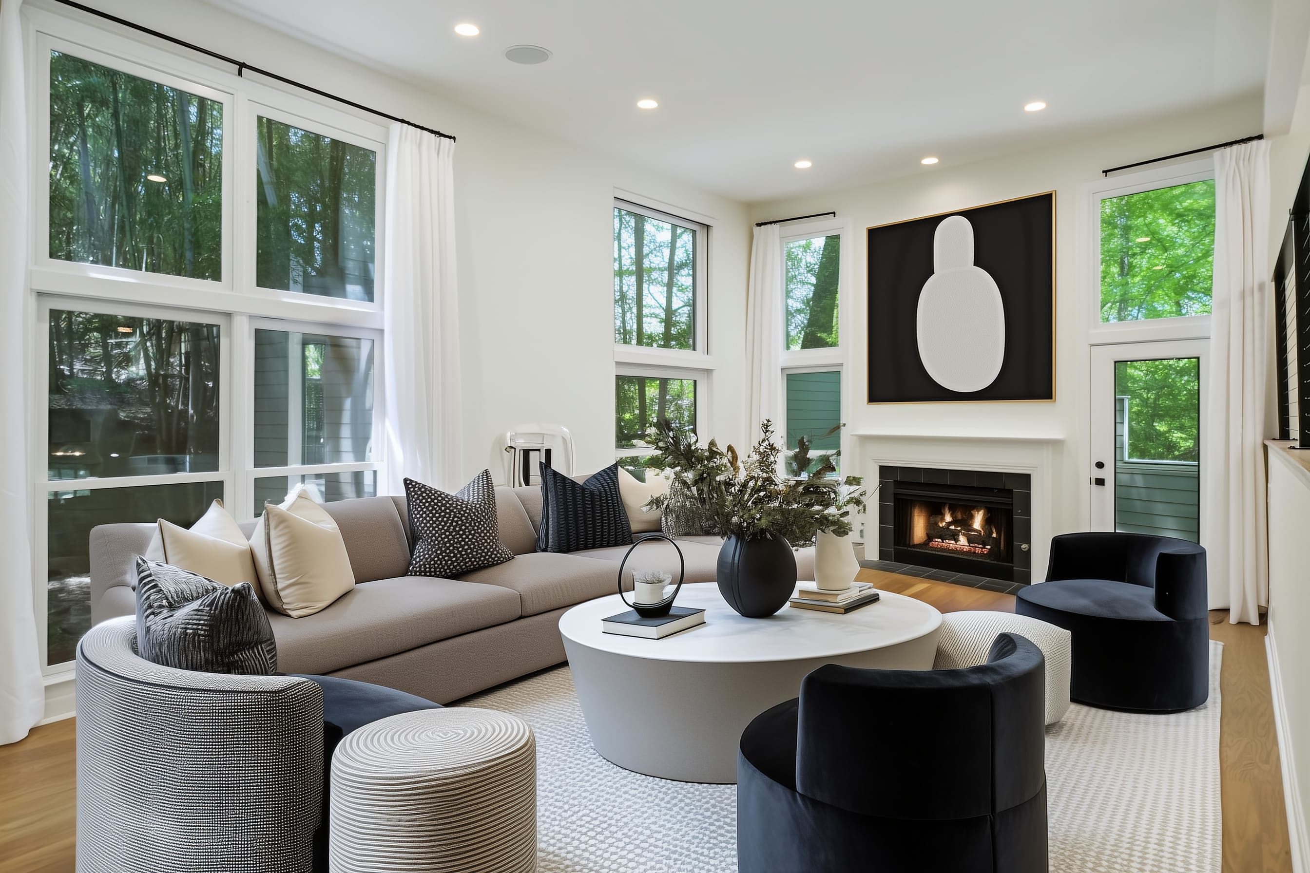
Some rooms have the basics—good light, the right amount of space, solid flooring—but still feel like they’re missing something. This living room had just that: tall windows that bring in forest-filtered daylight, a working fireplace, high ceilings, and warm hardwood floors.
Yet despite all that potential, it stood completely empty. No sofa, no rug, not even a hint of personality.
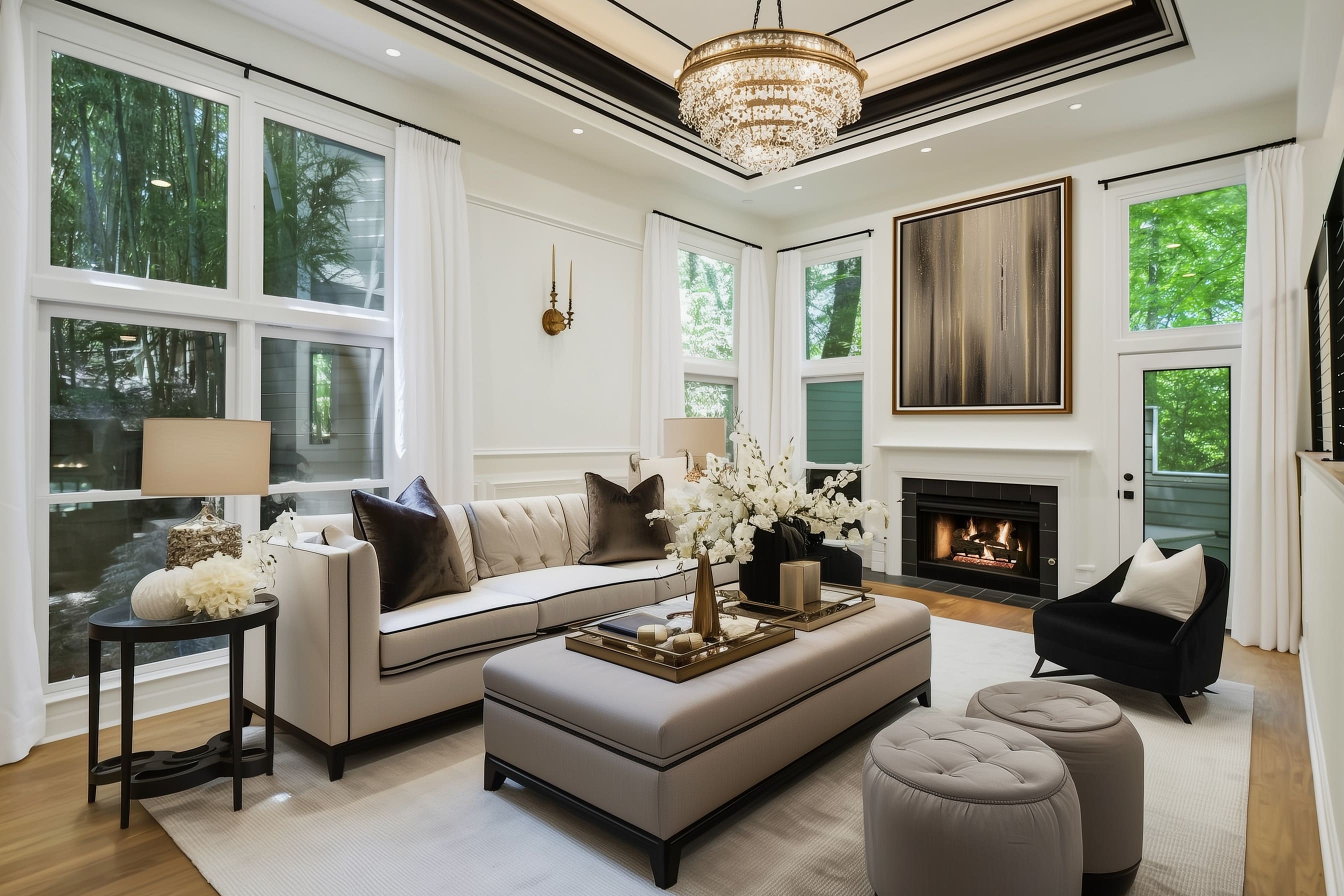
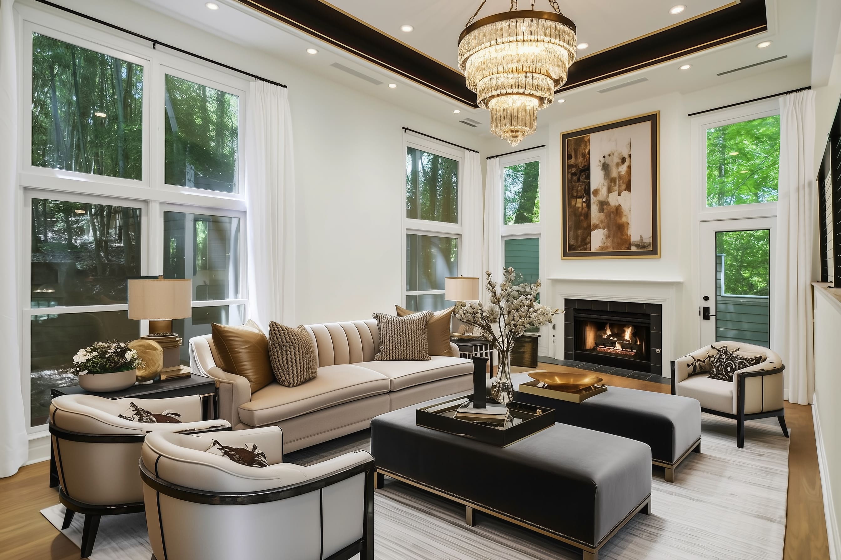
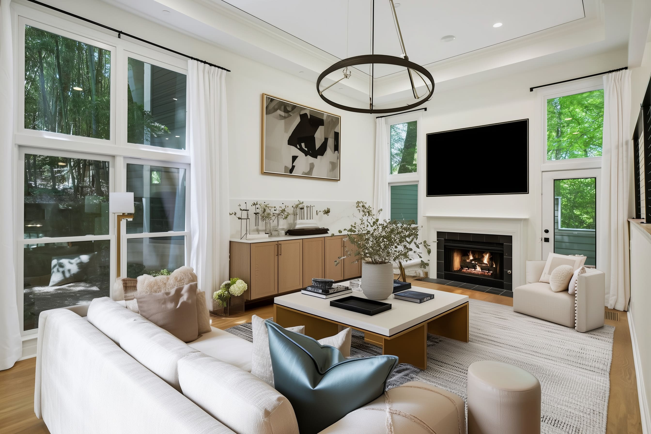
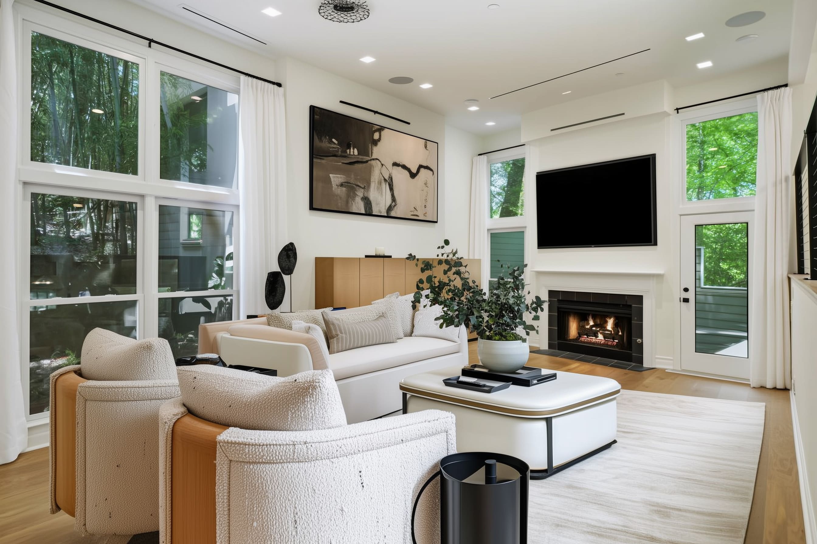
But here’s where the story gets interesting. Using that same exact room, nine very different interior design ideas came to life.
Each one used furniture, lighting, color, and layout to show how much atmosphere can be added just through design choices. From soft neutrals to dramatic contrasts, from sculptural minimalism to layered coziness—this article explores how different creative directions brought that blank room to life in their own way.
In the Before photo, what stands out is what’s not there. The space is wide open.
The walls are clean white. The fireplace has a simple black tile surround.
There’s no visual clutter, but also no focal point. That made it a perfect starting point for trying different design ideas.
Think of it as the empty sketch before the color goes in. So, what happens when the right mix of shapes, fabrics, lighting, and thoughtful details are introduced?
The answer is in the nine versions that follow—each one showing what’s possible when you begin with solid bones and let the design do the talking.
What a Living Room Like This Really Needed
The room had volume and light, but that alone doesn’t make it feel complete. Without furniture and thoughtful placement, even the most spacious layout can feel like a hallway.
Scale is key here. Tall ceilings ask for visual balance—through artwork, window treatments that go high, and furniture that fits the vertical height without being swallowed by it.
In every concept, the room finds that balance in a different way: some lean into symmetry, others play with contrast, curved lines, or bold materials. Furniture placement changed everything.
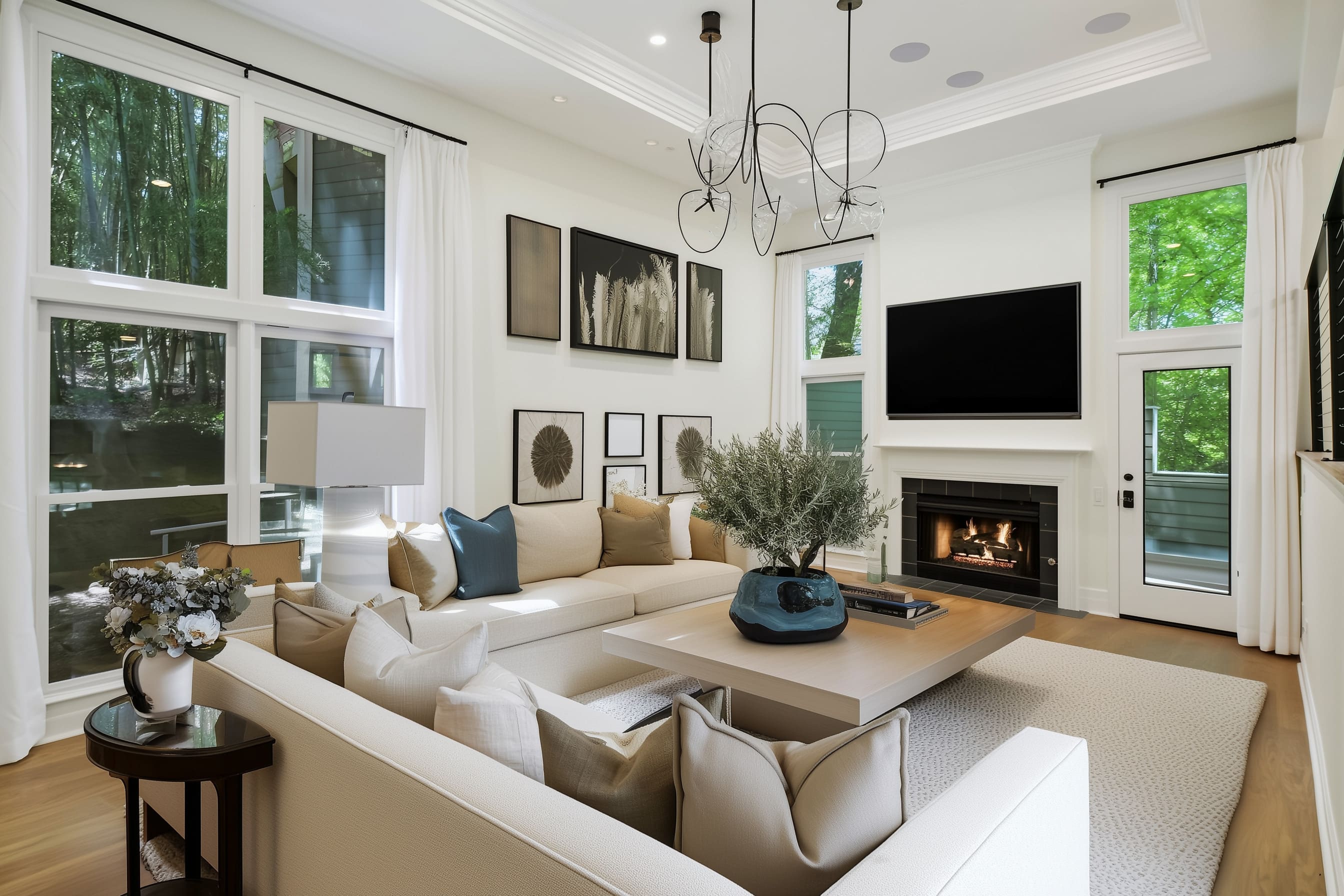
Once a central table was added—be it a tufted ottoman, a round sculptural table, or a wide wooden piece—the space finally felt grounded. Sofas anchored the layout, some using clean boxy lines, others showing softer curves or tailored tufting.
Accent chairs and low stools brought in comfort and flexibility, while each piece was chosen to suit the style of the overall concept rather than repeat a formula.
Lighting also played a big role. Some versions used bold chandeliers with layers of crystal or bronze.
Others took a quieter route with recessed lights and artistic pendants. The ceiling treatments—coffers, trims, and soft recessing—helped frame the space and added another layer of detail without taking away from the furniture arrangement.
And then there’s the color palette. Some stayed close to neutrals, others brought in navy, black, gold, or abstract art.
But each of these nine looks shared one goal: giving the room character. Whether by introducing sculptural shapes, mixing textures, or framing the fireplace with statement art or a mounted screen, the design ideas gave the space rhythm, warmth, and meaning—exactly what the blank room needed.
From Empty to Elevated: Design Strategies
Taking an empty space and turning it into something inviting isn’t about filling it up—it’s about making each element count. This same living room, styled nine different ways, proves how certain design choices make a bigger impact than others.
Here’s a breakdown of the strategies that shaped these transformations, each one showing how materials, placement, and contrast can shift the look and feel without touching the architecture.
The Power of a Statement Sofa
The sofa is more than a seat—it controls the room’s mood. Some layouts leaned into clean lines and neutral colors with low-track arm sofas that feel structured and crisp.
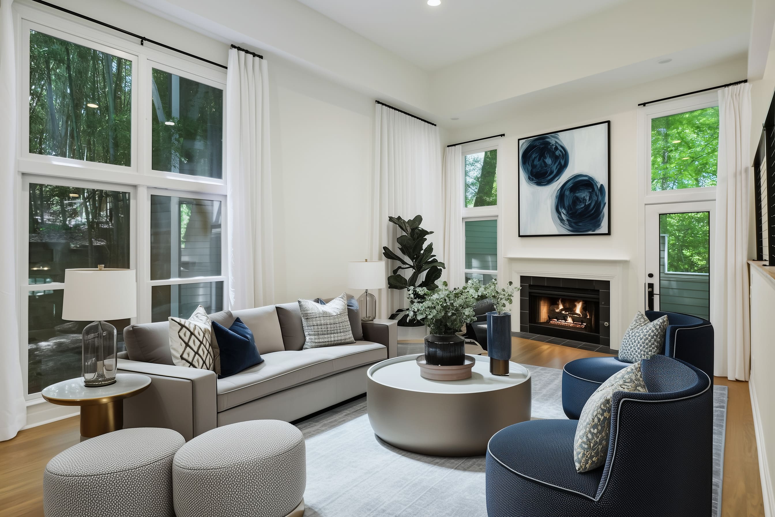
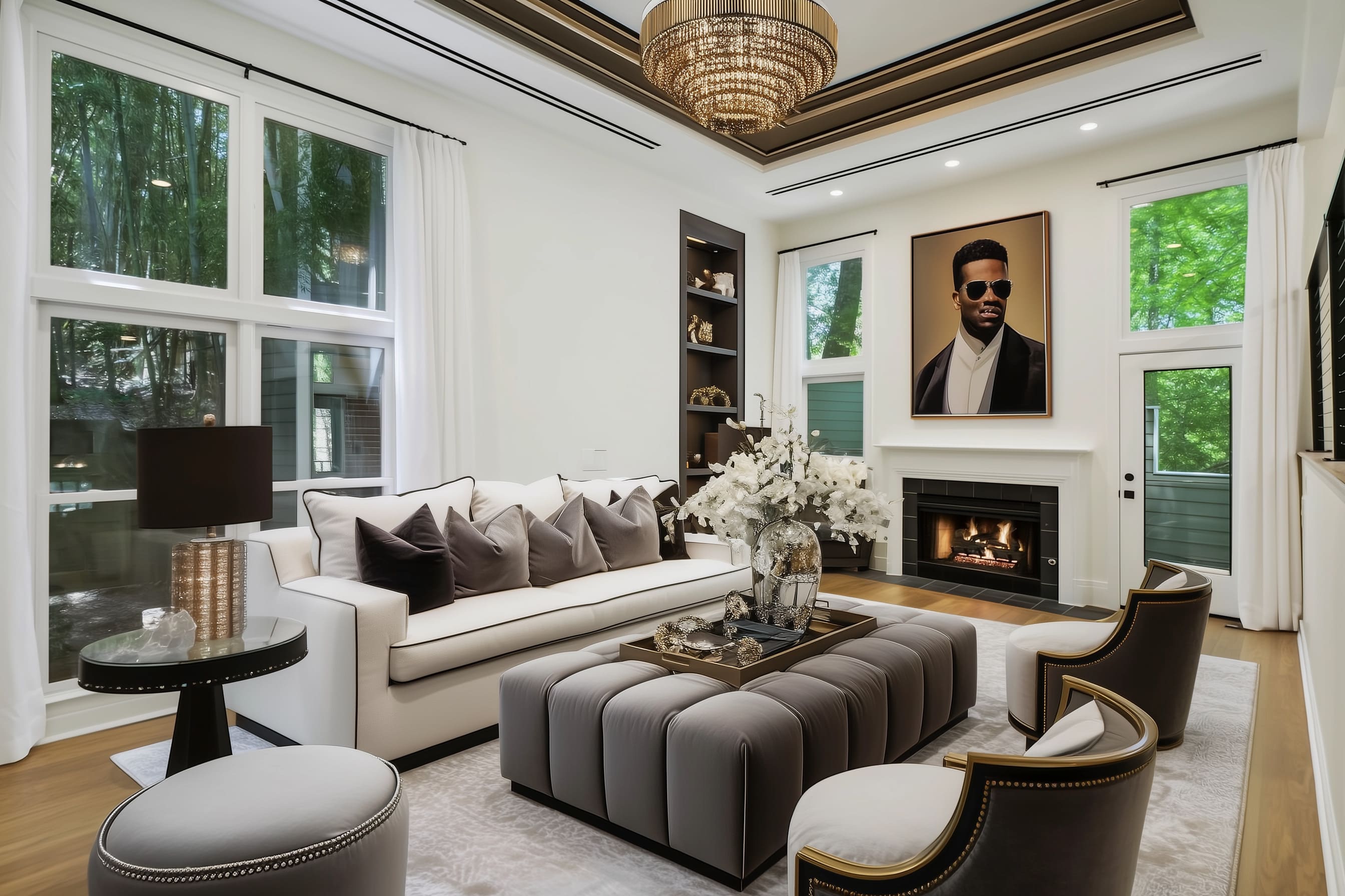
Others brought in softness with curved sectionals that wrapped the room in comfort. A few went bolder, using channel-tufted backs or warm caramel and ivory mixes to break from the all-white shell of the original space.
Sofas in light tones helped keep things open and airy, while deeper hues like charcoal or navy added contrast and depth. Across the concepts, the sofa was the first thing to define the design’s direction—whether sleek and minimal or plush and detailed.
Reimagining the Coffee Table
The center table isn’t only for mugs and magazines—it’s what pulls the whole seating arrangement together. Some designs placed wide, tufted ottomans front and center, often in suede or velvet finishes, topped with trays holding polished vases or stacked books.
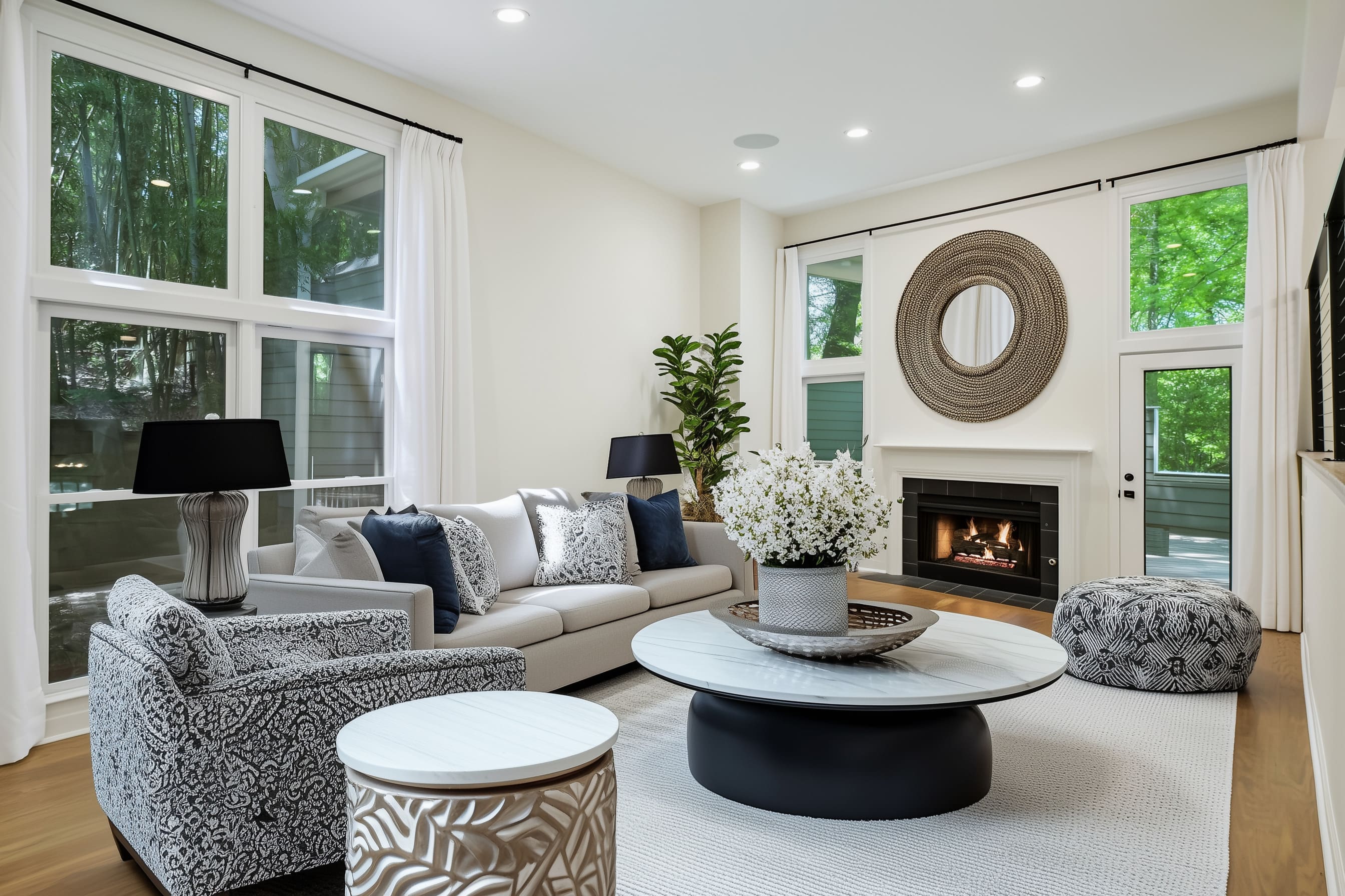
Others went for sculptural tables—circular bases, matte finishes, or soft corners—that stood out without shouting. Even the most minimalist tables were never left empty.
Every surface was styled with intention: a mix of ceramics, metal bowls, candles, or wild branches to break up the symmetry. These tables grounded the space while giving the eye a place to rest.
Layering for Warmth: Rugs, Drapes, and Pillows
No matter how beautiful the floors, a room needs layers to feel finished. Every concept brought in a large area rug—either subtly patterned or in soft solid tones—to define the furniture zone.
Some rugs had slight linear textures, others went for thick, cozy weaves, but all gave the room a sense of comfort underfoot. Long white curtains framed the windows in every version, keeping the height and flow intact while softening the sharp angles of the glass.
Throw pillows changed everything. Whether they introduced bold patterns or simply shifted from matte to velvet, they made each sofa feel styled rather than staged.
The Artwork Shift
In the Before photo, the wall above the fireplace sat empty. That changed in every makeover.
Some looks featured bold abstract prints, either in high-contrast black and white or moody watercolor tones. Others leaned into portraiture or mirrored textures.
There were versions that chose large-scale art to set the palette, while others used that space for a wall-mounted screen. The art didn’t just decorate—it helped shape the room’s focus.
Depending on what filled that spot, the fireplace either stood as a quiet anchor or turned into a dramatic vertical centerpiece.
Accent Chairs and Flexible Seating
Sofas alone couldn’t carry these layouts. Accent chairs brought movement, function, and visual variety.
Barrel chairs in deep navy or charcoal added curves where the main furniture was boxy. Some rooms introduced low sculptural loungers with subtle detailing, while others leaned into tailored forms with decorative pillows and polished trim.
Ottomans, poufs, and side stools made appearances too—not just as extras, but as part of the overall rhythm of the room. This mix gave each design balance, especially when paired thoughtfully with lighting or side tables.
Modern Light Fixtures that Do More Than Light
The lighting told its own story. In some rooms, a chandelier became the crown of the design—a bold tiered piece in bronze and crystal that added glamour.
Others chose abstract pendant fixtures or open black metal forms that echoed the shapes below. Recessed ceiling lights remained throughout, but they were paired with strong visual contrasts: coffered ceilings in black, brushed trim, or stepped detailing that broke the white ceiling into something more dimensional.
Fixtures weren’t there to blend in—they shaped how the whole room felt after sunset. Each of these strategies pulled the same room in a different direction.
Whether the goal was to add drama, soften the space, or bring in color, these elements worked together—not in isolation—to give the room new character each time. The key wasn’t complexity—it was knowing which details to lean on.
Consistency vs. Contrast: Design Decisions that Define a Room
Each version of this living room took the same foundation and pushed it in a unique direction, yet every one still followed a clear visual story. Some leaned hard into contrast—playing up black and white for graphic strength.
You’d see bold abstract art over the fireplace, sharp black-framed furniture, or navy accents paired with clean ivory. These spaces had a clear sense of edge, pulling attention with every line.
On the other hand, other designs kept things more tonal, using soft beige, layered neutrals, and warm wood finishes that felt natural and relaxed. Metallic touches like brushed brass or bronze were used sparingly, more like punctuation than decoration.
While a few concepts looked straight out of a modern loft with clean silhouettes and minimal forms, others leaned transitional. That mix of classic shapes—like a channeled sofa or arched chairs—paired with updated finishes gave the room depth without going full traditional.
What stood out across all of them was a sense of control. Nothing was overdone.
No one corner fought for attention. Every piece felt placed with intention—whether it was symmetrical or playfully off-center.
Even within those contrasts, certain choices brought consistency. Repeating shapes—like circular coffee tables or rounded chairs—kept visual flow, even when color palettes shifted.
Neutral bases let statement pieces stand out. And across the board, there was a clear rhythm of highs and lows: tall lamps, low tables, wide art, slender floor accessories.
That kind of pacing makes a space feel full, not crowded. It’s those little style choices—how much contrast to use, when to go soft, where to create tension—that ultimately define the feel of a space.
And seeing nine approaches to the same room makes it easy to notice how small differences can shape the whole mood.
What All These Concepts Have in Common
Despite their differences in style, all nine versions shared a handful of strong design habits that gave the room structure, comfort, and presence. First, they all respected scale.
No furniture felt too large or too small for the space. Chairs had breathing room.
Tables didn’t overwhelm. Sofas fit the footprint without swallowing the layout.
That sense of proportion kept the room usable and easy to move through. Next, there was always a visual anchor.
Most concepts used the fireplace wall as a central focus, but how they framed it varied. Some placed large art above it.
Others used a mounted screen. Either way, that wall carried weight in the layout.
Anchoring the eye is what made the room feel grounded, even with lots of variation in furniture or color. Soft materials always played against harder edges.
That meant rugs, drapes, and cushions helped counter balance sharp lines from tables, consoles, and lighting. The softness wasn’t just visual—it made the room feel like somewhere to relax.
Designs also played with symmetry in smart ways. Some went for balance: twin chairs, centered tables.
Others broke it up a bit, letting asymmetry add flow or interest. Put together, it’s this attention to balance, proportion, and focal points that gave each version a strong foundation—no matter what style direction it followed.
Final Thoughts: What This Teaches Us About Redecorating
Even in a room with great basics—light, ceiling height, good bones—there’s no clear personality until the right pieces show up. That’s what all these nine versions highlight.
The architecture gave us a clean slate, but the choices in shape, color, and placement made each version feel complete. A few new lines and layers completely shifted the tone without touching the structure.
If you’re staring at your own living room and it feels unfinished, it might not need a renovation. Maybe it just needs rearranged seating, better lighting, or a stronger anchor over the fireplace.
Sometimes the fix is in the details: the right rug to ground the space, or a chair that brings movement without breaking the flow.
Take a look back through the concepts. Which one lines up with your taste?
Would you borrow one chair from one look and a table from another? Mixing elements from different styles is where personal style really comes through.
And as these designs show, one room can take many directions—you just need the right pieces to point it there.

