
Designing a living room that feels complete within a small footprint takes more than shrinking down furniture. It requires a clear visual plan, smart use of materials, and careful attention to how the eye moves across the space.
In homes shaped by the mid-century modern influence, those ideas come with a built-in advantage: clean lines, low profiles, and a natural connection to light and texture. This article takes a close look at layout, storage, materials, and lighting to bring out the best in small-scale living rooms—without making them feel crowded or temporary.

You’ll find ideas of how subtle shifts in proportion, contrast, and built-in features help small living areas carry more weight with less. From painted brick walls and floating cabinets to globe pendants and window benches, the moves are practical—but carefully placed.
Whether you’re starting from scratch or refining an existing layout, these small mid-century modern living room ideas show ways to build a room that works quietly and looks considered.

Floor‑plan tactics that enlarge a small footprint
Designing a mid-century modern small living room comes with very specific constraints, but the most effective designers don’t try to fight the space—they shape it by directing how your eye reads the room. One of the smartest ways to do that is through datum thinking: drawing a clear horizontal line, often about 24 inches off the ground, that runs through the hearth, open shelving, benches, or even the bottom edge of a TV.
This visual line anchors the room, letting everything else fall into place above and below it. Once established, it makes walls feel taller and layouts feel longer—without changing a single square foot.

Furniture legs make another critical difference. Sofas and chairs that are raised about 5 to 7 inches off the ground leave that crucial bit of floor visible underneath.
This small gap adds breathing room for your carpet or wood flooring, which then appears to extend beyond the footprint of the furniture. It’s not a gimmick—it’s spatial strategy.

In tighter layouts, a built-in bench beats a loveseat almost every time. At only 18 inches deep, a bench offers the same seating length as a sofa, but with a slimmer profile and usually with bonus storage underneath.
This keeps wall space open and adds another plane for integrated finishes like wood slats or cushion texture.

Offset seating zones are another move that shows real design thinking. Instead of centering everything on the fireplace, seating is often nudged toward large windows, TV corners, or even structural elements like exposed columns.
Then, another piece—like a chair or bench—is placed perpendicularly to balance it. This sidesteps the narrow-lane effect many ranch-style homes can fall into and frees up walkways without sacrificing flow.

In homes with split levels or sunken dens, designers often use material continuity to make the transition feel smooth. When the same wood is used for stair treads and ceiling boards, for example, the space feels unified—turning what could feel like an interruption into a deliberate architectural feature.
In the best examples, this trick turns a mid-century quirk into a centerpiece.

Surfaces & materials: quiet layers, low sheen
The foundation of many mid-century modern living room ideas lies in the handling of materials. In smaller homes, surfaces need to do more than just look good—they have to support light flow, visual calm, and balance.
That’s why walnut and white oak are so widely used. Their mid-tone grain avoids the extremes of too-dark wenge or too-bright maple.
They absorb just enough light to add depth, but they won’t deaden a room. And they pair effortlessly with muted wall colors, textured fabrics, and stone accents.

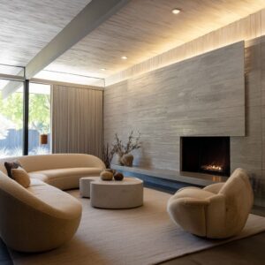
Brick plays a unique role in many of these homes. But instead of applying a flat coat of plaster or completely replacing it, designers often paint brick without hiding its texture.
The original mortar joints stay visible, and when you hit them with evening light—especially from a side sconce or a fireplace glow—you get quiet shadows that give the wall depth and movement.

Stone or concrete hearths are often built to appear heavier than they really are, but the key move is letting them float 2 inches off the wall. That gap, small as it is, casts a shadow line that tricks the eye into seeing the hearth as lighter, more sculptural.
It also emphasizes craftsmanship without adding clutter.

Bouclé fabric keeps showing up because of its ability to handle both texture and light in one surface. The looped weave scatters directional lighting so that no glare forms, and it brings a soft presence without needing a loud pattern.
It’s especially useful in homes that get strong natural light, where smoother fabrics might glare or reflect too sharply.

Finally, there’s brass, used not as a centerpiece but as a detail. You’ll see it in small hardware, pendant light caps, or trim on furniture.
The trick is keeping the finish soft—aged, brushed, or matte—so it adds warmth without catching too much light. A half-inch sconce backplate in brass might do more to balance a composition than a full cabinet face in bright chrome.
In a room this size, those tiny notes of metal don’t shout—they hum.

In the best mid-century modern small living room setups, these material choices do quiet work in the background, letting shape, light, and layout stay in control. The result isn’t just about style—it’s about how well each element stays in conversation with the next.

Shape grammar: updated Mid‑Century silhouettes
| Classic reference | Modern tweak found in texts | Why it suits small rooms |
|---|---|---|
| Low, boxy sofa | Channel‑tufted seat or subtle slope to the backrest | Keeps sightlines below window sills while still giving ergonomic support |
| Surfboard coffee table | Hexagon, live‑edge slab, or stacked biomorphic layers | Odd shapes create flow in tight walk‑paths without acute corners |
| Lounge chair with wood frame | Camel leather or tweed instead of bright primary fabric | Adds texture contrast while staying within low‑chroma palette |
| Globe pendant | Brass‑capped or ribbed glass variant | Softens LED point source; brass cap hides socket and cable exit |

Lighting: architecture before decoration
In small mid-century living room ideas that truly succeed, lighting isn’t treated as an afterthought—it’s structured into the bones of the room itself. The goal isn’t to decorate with fixtures but to build with light.
This is why recessed can lights are often tucked precisely into ceiling board seams. Instead of sitting proud and drawing attention, they vanish into the architecture.
The result is clean: the light arrives without the equipment showing, letting the glow carry the room rather than the hardware.

In places where height is limited, a globe pendant centered above the coffee table solves multiple issues at once. It provides focused downward light, fills the vertical void, and softens the room’s right-angled layout.
Its shape—a perfect circle—quietly contrasts the grid of shelves, furniture edges, and fireplace lines. And since its scale is smaller than a traditional chandelier, it works even in rooms with 8-foot ceilings.

Wall lighting adds more than ambiance—it balances function. Sconces flanking the TV are often placed at a ratio of about 1.
2 to 1 above the centerline of the screen. That means they sit slightly higher than the midpoint and throw a gentle wash outward.
This placement stops the black rectangle of the TV from dominating the wall when off and also reduces eye strain during nighttime viewing.

In the tightest floorplans, overhead fixtures are skipped entirely. Instead, designers use layered vertical lighting—like wall sconces, floor lamps, or even small table lights.
These build an indirect light rhythm across the space without creating hot spots on the ceiling. It also means ceilings stay visually clean, which is a quiet but effective way to make a room feel more open.
Lighting in these rooms never calls attention to itself. It’s the kind of design move that rewards time spent in the room—subtle at first, but the longer you sit with it, the more it feels right.

Storage & technology: hiding in plain sight
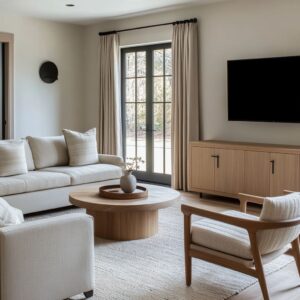
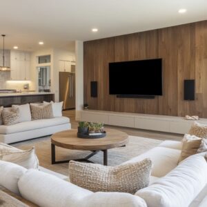
For a small room to feel finished, tech and storage have to be part of the visual order—not separate elements added later. One of the most consistently smart moves is the flush TV niche.
Rather than letting a flat-screen protrude off the wall, the entire wall is furred out by about 3 to 4 inches. This lets the TV recess flush with the drywall, making it feel integrated rather than stuck on.
That same cavity quietly handles cords and cables, so there’s no visual noise—even behind the scenes.

Long media cabinets that stretch wall-to-wall do more than hold your devices. They act like low architectural elements, almost like interior baseboards on a grander scale.
Even when half the compartments are just dummies for symmetry, the full-length look makes the room feel broader. Many of these are floated a few inches above the floor to reveal the ground beneath, adding to the sense of lightness and depth.

In the smartest setups, benches pull double duty. A walnut banquette, for example, might look like a clean slab at first glance.
But along the edge where cushion meets wood, there’s often a ½-inch reveal—just enough to get fingers in and open a hidden drawer. It disappears in shadow, which means no hardware and no clutter.
From a distance, the entire bench reads as a solid form.

These kinds of storage decisions aren’t about showing off—they’re about staying out of the way. In spaces this compact, every extra wire, hinge, or gap has weight.
The rooms that feel most resolved are the ones where even the storage has been smoothed into the architecture. That’s where mid-century clarity finds its place in modern homes.

Ideas for living rooms at <200 ft²
Designing a compact living space under 200 square feet is never about fitting less—it’s about deciding what needs to take the lead. One of the most effective starting points is setting a horizontal anchor, usually at sofa-seat height.
This might be the height of a bench, the base of a TV, or the opening of a firebox. When multiple key features line up along this band—say, a long floating cabinet, a flush-mounted screen, and a row of open shelving—the space feels calm and intentional.
It brings rhythm to the room without relying on bold moves.

- Instead of scattering side tables or stand-alone pieces, committing to one built-in across the length of a wall pays off. Whether it’s a bench under a window or a low cabinet running across a TV wall, the visual effect is uninterrupted. Legs disappear, gaps between pieces vanish, and the wall starts to feel longer than it really is. This one change removes clutter while adding presence.
- Choosing a single tactile focus material helps shape the tone. Bouclé, velvet, or even a ribbed wall tile can take that role. Repeating it—say on a sofa and a cushion, or a wall panel and the bench seat—ties the room together without leaning on color to do the work.
- To keep depth in play, it helps to let one surface carry the darkest tone. This could be a matte black firebox, a charcoal-toned sofa, or a walnut TV wall. All the other finishes should stay lighter, which keeps the space from closing in. If everything carries equal weight, the walls tend to feel closer.
- A mix of legged and grounded furniture makes the room easier to read. Movable pieces like chairs and side tables should float on legs, letting more of the floor show through. Fixed elements like benches or wall cabinets can have closed platforms—they act like part of the architecture.
- Lighting plays a role in shaping the room’s limits. Globe pendants or sconces that aim toward walls rather than straight down stretch the width at night. This sideways wash builds a sense of expansion, especially when paired with lighter-colored surfaces that reflect it softly.
- In small spaces, tech should vanish. That doesn’t mean no screen—it means the screen gets framed into the wall, the cords disappear into a cavity, and the console is floated a few inches off the floor. It stops reading as a tech object and becomes part of the built environment.
- To pull in natural depth, leave window frames bare wherever possible and keep seat height at around 15 to 16 inches. That way, when seated, your eye hits the outdoors right at ground level, which visually extends the space beyond its walls.
- As for layering, stop early. A good rule: three textures per surface level, three object colors total, and no more than three lighting types. Past that, visual friction begins. Staying restrained makes every object feel more intentional.
Finally, every grouping—be it a sofa setup, reading nook, or dining corner—should be grounded by one organic form. Whether that’s a live-edge slab table, a curved armchair, or a rounded rug, the shape eases the edges of the room’s boxy footprint.
That bit of softness works quietly in the background, keeping the layout from feeling too square or too rigid. These are the kinds of decisions that bring clarity to mid-century small living room ideas without asking for more space.
Closing thought
Looking across every example, it’s clear that standout small living rooms rarely rely on flashy statements. They succeed through alignment, restraint, and thoughtful use of texture.
A cabinet that floats, a TV wall that hides its depth, a rug that echoes the grain of the floorboards—these are moves that don’t shout, but they hold a room together. In mid-century thinking, efficiency wasn’t a constraint—it was the whole idea.
And in these updated spaces, those ideas still work. Material quality, spatial rhythm, and good proportions matter more than any one object.
That’s what makes a small room feel like it’s doing everything it needs to—with nothing extra.
Related Posts
Harmony Home Design brings 10+ years of residential interior design experience to the ideas shared here. We publish design concepts, layout thinking, and practical styling notes.