
Color in the bathroom has moved far beyond the accent wall or tile border. Today, it plays a deeper role—defining proportions, controlling how light behaves, and connecting surfaces with intent.
It’s less about picking a paint swatch and more about building a visual rhythm that holds together through contrast, texture, and material flow.

One of the clearest shifts in recent style trends is the rise of single-hue palettes that wrap entire spaces. These aren’t flat or repetitive—when paired with the right materials, a single color can show different sides across plaster, tile, wood, and metal.
Soft finishes, textured layering, and repeated tones now carry more impact than high-contrast schemes.

There’s also more attention to how tones respond to light. Subtle changes between morning and evening light can shift the feel of a space, especially in muted or mid-range hues.
The right placement of matte, glazed, or brushed surfaces can make the same color appear fresh throughout the day.

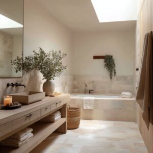
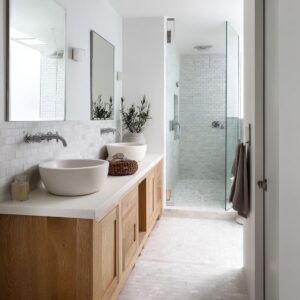
Material plays a major role too. Neutral woods, brushed metals, limewashed walls, and stone elements aren’t just chosen for texture—they act as color tools.
These materials echo or soften surrounding shades, bringing quiet structure without breaking the palette. In this approach, modern bathroom colors are no longer isolated decisions.
Each tone connects with the room’s layout, the grain direction, the metal finish, and the light source. Together, they create bathrooms that feel cohesive, layered, and intentional—without relying on loud contrasts or overused accents.

Single-Hue “Envelopes” That Rely on Texture, Not Contrast
One color can do all the work by letting surface changes carry the nuance.
| Sub-approach | How It Works (Visual) |
|---|---|
| All-over microcement or plaster | When a warm cement gray or ivory microcement goes floor-to-ceiling, joints vanish and light skims gently| The eye feels the room as a continuous volume rather than a tiled box |
| Same hue, mixed finishes | Powder-blue paint in matte meets powder-blue tile in satin| Light breaks differently on each plane, so the color never feels flat even though nothing else changes |
| Color-wrapped millwork | Eucalyptus green coats shiplap, trim, vanity, and shower framing| The wrap shrinks visual clutter; hardware appears to “float” on color rather than cut across it |
Why it feels special: Some bathrooms split materials every few feet.
These rooms show that sticking to a single hue can expand the space when slight shifts in sheen or texture give the eye micro-moments of interest.

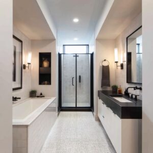
Quiet Neutrals Pressed Against High-Character Metals
Subdued backdrops can make uncommon metal tones read as color accents.
| Metal Hue | Partner Hue | Visual Payoff |
|---|---|---|
| Champagne bronze | Blush beige walls | A muted gold that doesn’t glare; it warms pastel walls without tipping them into “sweet. |
”Aged copperCool cement grayRusty fascia turns copper itself into the color statement. Patina adds red-orange notes without paintPewterBlush stone floorSoft gray metal meets pink tile so neither feels too polished or too preciousHidden move: Using a brushed or patinated finish tones the shine down, which lets the hardware read as color rather than sparkle.

Dark Saturates Balanced by “Air-Gap” Neutrals
Deep, moody tones carry weight, but when paired with a warm neutral at the right height, they stop short of closing in. This is where contrast becomes atmosphere rather than drama.
Ink green walls finished in glossy ribbed tile flicker with subtle reflections—those vertical lines don’t only stretch the wall but catch the light just enough to animate the surface. Set beneath them, ecru-toned cabinetry softens the shadow, grounding the palette with a tone that feels sunlit even without bright lighting.

Then there’s the play between smoky navy and terracotta—two tones that push and pull each other. The richness of the blue brings calm, while the earthy tile cuts through it with warm texture, allowing light to bounce unevenly across a surface that’s tactile, not shiny.
It’s a smart push-pull: the clay doesn’t shout, but it keeps the navy from sinking into itself. Steel blue and driftwood oak tell another story.
The paint leans cool and refined, yet once paired with oak’s soft grain and pale tone, the scheme lightens. The space holds onto its color depth, but the wood reads like air in the room.

There’s also a detail worth noting: the pale element is often placed directly where the eye meets the wall—vanity fronts, tub apron, and shelving—so reflections in mirrors aren’t muddied by dark tones. Instead, they look clear, soft, and flattering.
This type of contrast makes bathroom paint colors feel lived-in and thoughtful, with palettes that look confident without being hard-edged.

Pastel Tones, Grown Up Through Material Choice
Muted pinks, lilacs, and greens avoid sweetness by pairing with raw or matte partners:
| Pastel | Tempering Partner | Visual Result |
|---|---|---|
| Blush beige | Champagne bronze + pale oak | Pastel gains maturity; metal stays gentle |
| Misty lilac | Ash wood beams + gray-blue tile | Lavender skews architectural, not babyish |
| Rose dust | Deep taupe cabinetry | Pink reads sophisticated once anchored by a taupe “shadow” |
Design takeaway: Soft colors turn sophisticated when the surrounding materials hold visible grain, patina, or chalky pigment—anything that signals tactility over gloss.

Earth and Landscape Tones Echoing Site Context
Some bathrooms seem to pull their palette directly from the land they stand on. Whether it’s a dry hillside, lakeside sky, or forest slope, the idea is the same—let color feel rooted, not superimposed.
- Desert reds and browns—especially tones like burnt sienna and dusty mushroom—call back to soil and sediment. A shower wrapped in a soft clay tile or a floor glazed in muted ochre doesn’t only bring warmth; it brings a memory of earth. These colors don’t flash—they settle in.
- Mountain tones often lean cooler, but with depth. Weathered sage plaster, for example, looks like the kind of green you’d see on pine bark, not a plant pot. It casts soft shadows and behaves differently as natural light moves across the day. That’s the point: it belongs without needing to explain itself.
- Lake and glacier blues stretch rooms outward. When used across tile or painted wall planes, they reflect natural light in a way that mimics the shimmer of water. These shades often appear in bathrooms designed to embrace openness, where cool color brings calm without frost.
A quiet but powerful design move shows up in several layouts—repeating the regional tone outside of the wet zone. That might mean wrapping a window frame in the same shade as the shower tile, or pulling the ceiling coffer color from the same palette as the floor.
This method anchors the tone as part of the architecture, not a surface layer. In these examples, bathroom color design ideas go beyond swatches—they become structural.

Directional Color Placement That Shapes Space
Color can shift perception quietly—not by changing shade, but by directing how it’s laid out. Vertical ribbed tile gives a visual pull upward.
It doesn’t require a dramatic feature wall or complex construction—just the right texture running floor to ceiling. That movement lifts the ceiling line, even in a compact layout.
Across the room, horizontal stone grain spreads the view sideways. It stretches the space, pulling the eye across the sink wall or the back of the tub, making a narrow bathroom feel broader without widening anything physically.

Then there’s the underfoot story: chevron flooring introduces flow. The directional V-pattern naturally leads toward something—a freestanding tub, a shower enclosure, or even a window.
It’s a directional cue without being literal. Even if the floor, wall, and ceiling stay in the same color family, these layout choices bring subtle shifts that animate the space.
This is one of those bathroom colour design ideas that often hides in plain sight. It doesn’t rely on mixing lots of tones.
Instead, it lets the grain, groove, or tile layout act like stage direction—quiet, effective, and embedded in the material.

Color-Led Zoning Without Partitions
Rooms use hue changes at key surfaces to carve mini-zones:
| Technique | Example | Visual Effect |
|---|---|---|
| Floor swap | Terrazzo by vanity, wood planks beyond | Wash area feels like a rug; rest reads as dry zone |
| Hue shift inside shower | Mushroom zellige within arch | Shower glows as a lantern inside a calmer room |
| Accent wall behind vanity only | Oxidized copper fascia | Vanity becomes art piece without extra objects |
The eye respects the boundary even without a physical divider, keeping layouts open but psychologically ordered.

Mirrors and Metal as “Color Tighteners”
Well-placed mirrors and repeated metals can link an entire palette without anyone noticing why it feels so cohesive. It’s in the alignment—a black-framed mirror set perfectly above a black wall-mounted faucet creates a single strong line.
That’s not just about matching finishes, it’s about anchoring the eye. The mirror becomes more than reflective; it becomes part of the palette.

Copper tells a different story. A mirror framed in the same copper tone as the faucet, placed so their lines align, makes the metal feel like it belongs to the architecture, not as an accessory.
Bronze repeats this logic in a softer key. When a mirror’s arched top echoes the curve of a tub or niche, it gives the whole room structure—without needing extra decoration.

These tiny repetitions are a kind of punctuation. They quietly close the loop on a color story.
That’s the difference between good contrast and refined cohesion in bathroom ideas with color—it’s not just about matching tones, it’s about reinforcing shape, material, and placement so nothing feels random.

Light as the Hidden Pigment Shifter
Color doesn’t always stay still. In many bathrooms, the look changes depending on the time of day—and that’s no accident.
Some of the most expressive spaces are built to shift. A wall painted in chalked indigo, for instance, can read slate-blue in morning light, then turn richer and warmer once the sconces flick on.
It never feels too flat or staged—it stays in motion.

Then there’s shadow purple, which drifts across the spectrum as the day moves. Around midday it lifts toward soft lilac, while by dusk it cools toward taupe.
This quiet shape-shifting keeps the eye engaged and avoids visual fatigue—especially in rooms that don’t change much otherwise. Glacier blue stone tells a different story.
With the right window placement, these walls can reflect surrounding water, trees, or sky. A bathroom near a pool or lake might carry a bit of that scene inside, with the blue taking on more depth or transparency depending on the angle of the light.

These effects sharpen when materials are chosen to respond, not dominate. Placing matte or lightly reflective surfaces opposite natural light extends these pigment shifts even further—mirrors, plaster, stone, or pale tile all act like filters.
What seems like a stable backdrop turns out to be interactive. These layered changes open up a fresh take on bathroom paint ideas, where the goal isn’t perfect color match—it’s movement, tone, and mood.

Color + Form Pairings That Feel Fresh
Some combinations just click—color and shape working side by side in a way that makes the room feel grounded. Start with blush beige.
On its own, it’s a quiet pastel, but when paired with curved details—arched mirrors, round vessel sinks, soft-edge tubs—it softens even further. The color becomes almost fluid when surrounded by curves that echo its tone.

On the other end of the spectrum, mineral grays thrive in clean, angular formats. Concrete trough sinks, straight-edge mirrors, squared brass handles—all of them match the no-nonsense character of a desaturated gray palette.
The look isn’t cold—it’s deliberate. Every sharp line carries the tone forward.
Cool greens, like eucalyptus, tend to play well with slender verticals. Boards or slats running from floor to ceiling stretch the eye upward, giving a small or low-ceilinged room the feeling of space.
The coolness of the green keeps things light, while the verticality introduces a calm sense of structure.

Each of these pairings shows how shape can reinforce tone. Rounded forms absorb and soften warm shades; hard angles emphasize cooler ones.
This balance between line and hue appears again and again across popular bathroom colors, quietly proving that mood isn’t just about shade—it’s about how that shade is shaped.

Final Thoughts
In today’s interiors, color carries more weight than just visual appeal—it’s shaping how rooms feel, how they function, and even how they move. The strongest schemes aren’t the loudest.
They’re the ones that shape space quietly through consistency, texture, and alignment. Designs built around single-color wraps show how one hue—applied across walls, trim, ceiling, and cabinetry—can create unity without sameness.
The effect isn’t plain; it’s deliberate. Subtle shifts in material, grain, and sheen give one color many roles.

Muted metals now act like secondary pigments. Champagne bronze, brushed nickel, or oxidized copper show up in faucets, sconces, and mirror frames—not just for function, but to extend the color story in a restrained way.
Contrast isn’t about bold jumps anymore, either. Today’s contrast means combining depth with softness: saturated tile with pale oak, moody paint with light plaster.
The mix builds balance, not tension. There’s also a noticeable shift toward regional inspiration—pulling the colors of the land into the room.
Whether it’s soft sage in a mountain home or clay-red tile in a dry climate, these tones help the bathroom feel connected to its surroundings.
And then there’s layout as a visual guide. Vertical grains, horizontal stone lines, and directional flooring give structure without breaking the flow—letting the eye glide rather than stop.
What defines modern bathroom color schemes now is clarity. One tone can handle multiple tasks across surfaces, if given variation in finish and placement.
The result is a space that feels composed, layered, and visually quiet—even with color present in every corner.
Related Posts
Harmony Home Design brings 10+ years of residential interior design experience to the ideas shared here. We publish design concepts, layout thinking, and practical styling notes.