
A strong corner fire feature works best when it stops behaving like a leftover triangle of wall and starts behaving like room-making architecture. Many corner fireplace ideas treat the corner as a composed system: a tall vertical mass for orientation, a long low plane that claims floor space, and a dark opening that concentrates attention so the rest can stay calm.

In a corner fireplace living room, the most high-end results typically come from restraint and hierarchy, not from quantity of decor. The corner reads intentional when the eye is given a few clear “anchors” (line, field, void) and enough breathing room for those anchors to feel premium.

The shift that changes everything: from corner “problem” to corner “platform”
The most consistent decorating logic behind successful fireplace corner ideas is a platform mindset:
- Vertical landmark: a chimney mass that reads as a stable, simple shape first.
- Horizontal claim: a bench/hearth line that turns the corner into usable real estate.
- Controlled void: a firebox that behaves like a concentrated dark pocket, letting the surround stay quiet.

This is why many fireplace in corner ideas feel expensive when the base extends beyond the opening: the corner becomes a low architectural “shelf” that connects two walls, instead of a tight endpoint.

A taxonomy of corner looks and the effects they create
The Quiet Monument
This look is built on a clean silhouette that holds from a distance, with surface character kept inside that outline. The result is calm authority: the corner reads like a room landmark without forcing the room into a formal “face-the-fire” stance.
A key strategy is allowing texture to act as interest while the overall shape stays simple and legible, so the eye reads “architecture” before it reads “pattern. ”.

The Horizon-Line System
Here, the corner is organized by long bands: mantel height, bench height, or both. Continuity is the luxury cue.
The room reads as one composed gesture when the fireplace zone visually “reaches” toward daylight or seating through a single steady line. Balance often comes from light fields (windows, curtains, blank wall planes) rather than from mirrored decor.

The Jewelry Line
A thin warm accent—metallic edge, fine banding, or a narrow highlight—can replace heavy statement materials while still giving the corner a crisp edit point. This approach keeps the mass minimal yet refined, because warmth is introduced through reflectivity or brightness behavior rather than through additional objects.

Classic Shell, Edited Insert
Traditional envelopes (trim, brick, familiar proportions) can read current when the corner insert is treated as a simplified block with a clear hierarchy: one dominant horizontal, one dominant void, and a small number of large shapes. Casual cues like slightly relaxed placement (rather than perfectly centered, perfectly formal staging) help the corner feel lived-in without becoming busy.

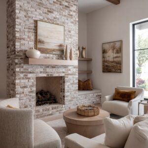
The Interior Cliff
Rugged stone can read gallery-clean when it is “edited” by one strong horizon line and by furniture that matches the fireplace’s scale logic. The composition stays composed when irregularity lives in the surface, while the mantel/bench lines keep the reading stable.

The core grammar behind effective corner fireplace design
A coherent corner fireplace design tends to repeat the same visual rules, even when styles differ:

The void leads, the rest supports
The opening is treated like a deep, matte pocket. Its darkness does the focusing work, which reduces the need for mantel display.
When the void is strong, the wall can stay quiet and pale without feeling empty.

A strict “texture budget”
One surface is allowed to speak (stone rhythm, brick relief, rough shelf face), and at least one major surface is kept visually resting (smooth mass, blank wall plane, low-pattern textiles). This prevents multi-material corners from reading cluttered.

Three height bands that shape the mood
- Ground band: the bench/hearth line that makes the corner social and usable.
- Eye band: the mantel line that edits proportion and calms the wall.
- Crown band: ceiling plane, beams, or soft light gradients that make tall masses feel lighter.

This is also where corner fireplace mantel ideas become less about styling and more about proportion: the mantel behaves like an architectural underline that organizes the wall.

Styling micro-strategies that read intentional
Punctuation groups, not collections
A small number of objects behaves best when it reads like punctuation: one dominant form and one supporting form, with generous spacing so the architectural lines remain the main event.

Scale-revealing placement
Tall, slender pieces placed near an edge quietly reveal depth and projection, helping long hearths and benches read as deliberate planes rather than bulky platforms.

Zoning rather than scattering
Objects feel calm when they are separated into zones with distinct roles—one area for height, one for softness/texture, one left nearly empty—so asymmetry still reads balanced.

Softening strict geometry
Slight angles, relaxed placement, and rounded volumes can counter the hard right angles that corners naturally produce, keeping the composition warm without adding noise.

Angle as a visual tool in angled corner layouts
In an angled fireplace living room design, angled elements often do more than add novelty: they act like directional cues that pull attention back into the seating area. The corner can feel less boxy when a bench front, hearth edge, or nearby line carries a subtle diagonal, because the eye is guided away from the sharp corner point and into the room’s social zone.
This is the quiet logic behind many angled fireplace wall ideas: geometry is used to aim the composition, not to decorate it.

Furniture choreography: making the fire feel atmospheric, not staged
The most modern layouts treat the fire as ambient gravity rather than a strict stage focal point. The room can face daylight and conversation while the corner remains present through massing and glow.
This is the deeper visual logic behind arranging furniture around a corner fireplace: the corner holds the room’s edge and mood, while seating lines keep the space relaxed and usable.

A concise map of repeatable visual effects
Related Posts
Harmony Home Design brings 10+ years of residential interior design experience to the ideas shared here. We publish design concepts, layout thinking, and practical styling notes.