
A strong white kitchen design rarely relies on decoration to feel finished. The calmer, more convincing examples treat white as a coordinated set of surface behaviors—reflection, softness, grain, shadow depth, and scale—so the space reads warm, composed, and livable even with very few objects.
Within that lens, many popular white kitchen ideas can be understood as different ways of controlling light, contrast, and “visual volume” while keeping the palette restrained.

White reads as surface performance
Successful white schemes separate white into multiple surface roles:
- Reflective whites (gloss or satin) broaden the room visually by returning light and soft reflections.
- Absorptive whites (matte paint, matte cabinetry) calm the scene by reducing hotspots and seam emphasis.
- Pale stones act as slow, quiet movement: a low-contrast layer that keeps large white planes from feeling blank.
- Micro-textures (fine mosaics, tiny tonal shifts) behave like atmosphere rather than pattern—more like a background grain than a graphic statement.

A key visual benefit comes from mixing these behaviors in a controlled way: white can stay dominant while still looking layered.

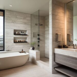
Shadow becomes ornament without turning decorative
Depth often appears through voids rather than color:
- Recessed niches and inset pockets create framed shadow that makes ordinary objects read curated because they sit inside a clear volume.
- Shelving that is intentionally sparse can make the emptiness itself feel designed, with negative space acting like a structural outline on the wall.
- A glossy wall broken by a recessed shelf zone introduces a pause in reflection, adding calm contrast without adding a new color family.

This is one of the quietest ways to add richness to a white palette: depth arrives as darkness inside the composition, not as contrast applied everywhere.

Scale control prevents visual stress
White kitchen designs often feel “nervous” when every layer competes at the same visual scale. The calmer approach separates scale roles:
- Micro-busy wall texture pairs best with macro-quiet counters, so the eye reads one detailed layer and one resting layer.
- Bold, dramatic stone reads most composed when it appears in large continuous zones, while cabinetry stays plain enough to behave like a gallery wall.
- Strong wood grain becomes easier to live with visually when surrounding stone and white planes stay low-contrast.

The deeper principle is information pacing: one high-information surface is balanced by several low-information surfaces.

Contrast looks expensive when it has a home
Rather than sprinkling dark accents everywhere, contrast becomes more deliberate when it is contained:
- A single material wall can “collect” black glass rectangles (ovens, integrated dark zones), so the strong shapes feel intentional instead of scattered.
- Black linework (pulls, faucet, trim) reads as graphic structure when repeated with discipline and kept slim, so it behaves like ink lines rather than decoration.
- One dominant metallic object can anchor a long white run, preventing a wall of white from feeling featureless.
Containment is the difference between contrast as composition and contrast as noise.

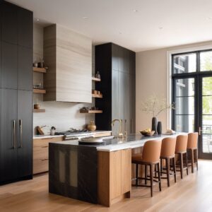
Warmth is choreography, not added color
Warmth appears through placement and height, not through obvious color accents:
- Warm materials placed at eye and hand height (open shelves, niches, wood planes) shift mood faster than warmth that exists only underfoot.
- Thin warm layers (a board, a bowl, a small wood object) soften the scene because they introduce rounded, tactile forms in a mostly rectilinear setting.
- Seating often acts as a bridge: light seats keep the lower half bright, while wood legs or frames quietly repeat the warm material language.
Warmth reads most convincing when it repeats in small doses and consistent positions, not as isolated accent moments.

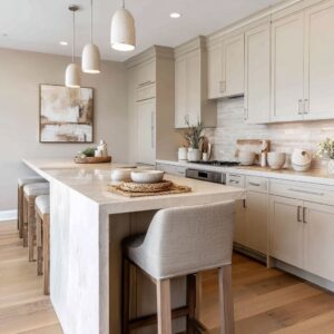
The silence plane is treated like a luxury surface
A defining move in refined white kitchens is protecting the counter horizon line:
- Objects stay low and close to the wall line, so the counter remains a readable, calm sheet.
- Everyday items gain visual order by clustering into compact groups rather than scattering, creating still-life logic instead of clutter.
- Islands often carry one soft organic element and one shallow vessel; the rest is left visually uninterrupted so the island reads as a composed stage.

The calm feeling comes from uninterrupted planes, not from emptiness. The plane itself becomes the designed element.

Corridor kitchens use runway mechanics
Galley layouts can look dramatic and calm at the same time when the corridor becomes a guided visual axis:
- A bright endpoint (window or glass door) pulls the eye forward so darker uppers or rich side walls behave like framing rather than weight.
- Repeated horizontals (long pulls, counter edges, hood lines) create rhythm that makes the length feel intentional instead of endless.
- Reflective flooring can act as a light river, carrying gradients toward the endpoint and increasing perceived depth.
- Evenly spaced downlights create a dotted visual guide that strengthens clarity without needing decorative fixtures.

The result is a controlled sense of depth where the design feels longer and cleaner because the eye reads consistent intervals.

Thickness reads as confidence when edges stay quiet
Thick counters and waterfall ends can signal a calm, sculptural look, but only when the detailing stays restrained:
- Thick edges work best when the tone remains within the white family, so mass looks present without feeling heavy.
- Waterfall ends create a framed, monolithic object effect—an island that reads like a single volume rather than a collection of parts.
- Texture sometimes moves to the vertical face (a thick, luminous edge), letting the top stay calmer so the island reads as one confident “ledge” rather than a busy surface.

Thickness becomes a compositional statement, and the surrounding surfaces remain disciplined enough to support it.

Pattern functions as motion, not decoration
Patterns in refined white kitchens often exist to animate a quiet composition:
- Chevron or directional textures can add soft movement behind calm cabinetry, especially when color contrast stays low.
- Micro mosaics often behave like a shimmer field that turns lighting into atmosphere rather than spotlight.
- Dramatic stone can act as the main artwork when contained to large, legible zones and balanced by minimal surrounding planes.
Motion feels intentional when it sits behind the quietest elements and remains consistent in scale.

Lifestyle cues add credibility without breaking the calm
White kitchen designs can feel staged if nothing suggests daily use. Subtle “life” signals can exist without visual clutter:
- Flat paper elements, books, or a low-profile work moment introduce human presence while staying compatible with clean lines and pale tones.
- Seating corners within narrow kitchens change the emotional meaning of the corridor: the space reads as inhabited, not merely transitional.
- Objects chosen for matte finishes and simple silhouettes keep the scene calm while still feeling real.
These cues work best when they align with the room’s geometry and stay within the palette’s quiet tone.

A taxonomy of white-kitchen visual personalities
The strategies above generate distinct white-kitchen looks that feel different even with similar colors:
- Textile-backed white: micro texture on the wall warms the cabinetry through atmosphere.
- Vertical glow white: height, reflective uppers, and soft wall shimmer make whites feel warm.
- Gallery calm: big planes, disciplined linework, and minimal objects create a curated quiet.
- Soft industrial hush: cool overhead presence balanced by warm wood planes and bright work surfaces.
- Light-corridor: gloss and reflection become the styling, guided by long intervals and an endpoint.
- Monolithic corner: thick bright edges and handle-free planes create a compact sculptural effect.
- Stage-island: the island reads as a calm platform, while contrast is collected in controlled zones.
- Negative-space composition: shelves behave like architectural outlines because emptiness is dominant.
- Tunnel contrast: darker uppers or walls frame a corridor that stays open through daylight pull.
- Friendly galley: one warm strip plus a soft seating moment makes sleek white feel relaxed.
This taxonomy clarifies why two white kitchens can share materials yet read emotionally opposite.

The shared deep principle: plane, depth, life
Successful schemes often repeat the same underlying composition formula:
- One continuous calm plane (cabinet run, slab wall, clean island top)
- One deliberate depth layer (shadow pocket, collected dark rectangle zone, rich wood field, bold stone panel)
- One gentle life counterpoint (organic stems, fruit, matte vessels, paper or books)
That three-part structure is the common thread behind white kitchen cabinet design that feels serene instead of flat, and behind the most coherent design ideas for white kitchen that stay minimal while still feeling complete.
Related Posts
Harmony Home Design brings 10+ years of residential interior design experience to the ideas shared here. We publish design concepts, layout thinking, and practical styling notes.