
A modern powder room design can look complete with very little on display when the visual structure is doing the heavy lifting. The most convincing modern powder room design language often comes from light behavior, line direction, proportion hierarchy, and a few repeated shape cues—so the room reads composed even before any styling appears.

Texture replaces color by creating light variety, not hue variety
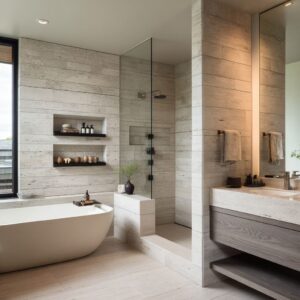
Many of the strongest modern powder room ideas stay inside a narrow neutral range and still feel rich because surfaces react differently to light. Ribbed fields break highlights into many fine bands, slab-like planes hold calm silence, and mineral-grain objects add micro-detail that reads tactile up close but quiet from a distance.
The visual effect is depth without relying on contrast palettes; the wall itself behaves like the decoration.

Line direction acts like spatial psychology
Linework changes how a room is perceived without changing its footprint. Horizontal ridges stretch the view and slow down perspective, while vertical stripes, mosaics, or slats pull the eye upward and sharpen the room’s posture.
A single vertical element placed against a mostly horizontal composition often works like a stabilizing post, giving the design height emphasis and making the scene feel architectural rather than purely functional.

Speed of texture: pairing fast micro-pattern with slow macro-shapes
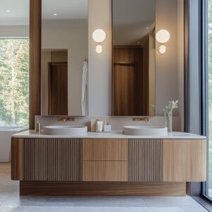
A modern powder room design often reads most refined when tiny, detailed backgrounds sit behind large, calm shapes. Fine mosaics or thin-lined wallpaper behave like fabric-like texture fields, while thick counters, broad mirrors, and long wood drawer bands read as slow, steady geometry.
This contrast of speeds keeps the space visually alive but controlled: the background carries energy, and the foreground carries clarity.

The counter as a horizon line that organizes everything
A long counter frequently becomes the room’s main organizing band. Whether it reads as a thin beam or a thick stone bar, the key strategy is hierarchy: the top plane becomes the primary line, while the base is visually softened through shadow gaps, recesses, or set-back volumes.
When the support story is subdued, thickness can feel intentional and calm rather than heavy, and the whole view becomes more legible.

Basins behave like placed objects, not fixtures
In many contemporary compositions, the sink reads as a sculptural object positioned on a platform rather than a built-in component. Thick-walled trough forms create gravity and craft; slim vessels keep attention on the wall field; bridge-tone basins sit between warm woods and cooler surfaces to prevent the palette from splitting into separate moods.
Slight offsets and generous empty zones strengthen this objecthood, making the counter feel curated even with minimal styling.

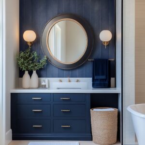
Mirrors function as mood instruments: target, softener, counterweight
Mirror shapes quietly steer the emotional temperature. Circles on calm walls read steady and centered—like a measured focal point.
Arches and organic ovals add softness that relaxes strict grids. Controlled asymmetry through mirror sizing creates rhythm (dominant + supporting) without introducing new materials.
In some schemes, perimeter glow turns the mirror zone into a light-shaped niche, allowing plain surfaces to feel intentional because illumination becomes the ornament.

Lighting behaves like a surface finish
Lighting often operates less like a utility layer and more like a material treatment. Cove washes turn patterned walls into atmosphere.
Grazing light makes ribbing and micro-lines appear refined rather than busy. Backlit edges create gentle gradients that visually lift height and soften contrast.
Even a tall luminous plane can function as an invented window effect, producing flattering, even brightness that reads calm and controlled.

Metal is used as punctuation, not as “accent color”
Hardware frequently works like graphic marks that clarify the composition. Dark metals can read as small dots and short strokes—spouts, controls, plates—especially when repeated so they feel like a consistent ink line.
Warm metals often act as bridging tones between cool greens/teals and warm woods, producing a quieter shine that feels integrated rather than flashy. Scale control matters here: in heavier rooms, smaller hardware keeps the view from looking crowded; in lighter rooms, longer spouts can become elegant line gestures.

Framing and recess strategies create intentional depth
A compact room can feel deliberate when the vanity zone is treated like a framed scene. Recessed color planes push the back wall away visually; side panels and tall cabinetry read like a portal that holds the composition together; continuous background surfaces running below a floating counter prevent the scene from feeling chopped into bands.
This is one reason many modern half bath ideas feel boutique: the room reads like a set piece with a clear focal stage.

Pattern pairing without noise: sketch logic instead of bold contrast
The most convincing pattern-mixing often depends on shared delicacy rather than strong color separation. Fine linework wallpaper and thin striped tile can sit together when both behave like drawing—low-contrast, restrained, and airy.
A calm, matte counter then acts as the visual reset plane that keeps the wall from dominating. Pattern becomes texture, and texture becomes structure.

Corridor compositions: axis, horizon, and end-wall character
Many powder room designs adopt a corridor-like clarity: a strong end-wall field anchors the view, a long side vanity becomes the horizon stabilizer, and a tall window or frosted door adds a bright vertical counterbalance. This trio—axis, horizon, and vertical light—creates a sense of order that makes a small space feel more architectural and composed.

Personality through silhouette, not color
Some of the calmest schemes still carry character by using tall, simple shapes and natural textures. Woven forms, dry branches, and restrained textiles bring movement thrugh outline and material feel while staying within a narrow tonal family.
This creates a styled” impression without turning the counter into a display surface.
Deep warm modern mood: drama without harshness
A darker palette can stay inviting when contrast is atmospheric rather than stark. Warm light at the mirror zone can read welcoming and flattering, while darker stone-like planes elsewhere create grounded weight.
Vertical posts—glowing panels, ribbed spines, door frames—organize the scene so the mood feels structured, not heavy.
Objecthood + emptiness as a quiet luxury signal
A consistent thread in luxury powder room ideas is the deliberate use of negative space. Broad counters left mostly empty allow thickness and material grain to read as intentional.
Styling tends to cluster into one controlled zone rather than scatter. Floating elements keep floor continuity so the room feels clean and gallery-like.
This approach supports a luxury modern powder room design effect because the remaining items look chosen, proportional, and visually calm.
Related Posts
Harmony Home Design brings 10+ years of residential interior design experience to the ideas shared here. We publish design concepts, layout thinking, and practical styling notes.