
Dining corners can feel instantly calm and current, even when the furniture count is low and the palette stays neutral. The effect usually comes from a clear hierarchy: one surface carries the visual identity, one element carries the weight, one light source carries the highlight, and everything else behaves like support.
This structure creates a “quietly intentional” mood where the space reads designed, not decorated.

The wall behaves like atmosphere, not décor
A common strategy behind polished breakfast nook ideas is treating the main wall as a background field that sets the room’s mood rather than a loud feature. Line-based murals (bamboo stems, winter-branch sketches, soft botanical drawings) work especially well because they add identity without turning the corner into a theme.

The strongest versions tend to stay low-contrast: tonal ink on warm beige, misty grey-on-grey, or softened blue-grey on off-white. The visual result is a wall that feels present from afar, then reveals detail up close.
This keeps everyday objects—mugs, bowls, a small plant—looking natural in the scene, because they are not competing with high-contrast graphics.

A second, quieter trick is density control. When the motif is heavier near edges and calmer near the center, the eye keeps moving and the corner feels wider.
The wall becomes a scale tool: it can visually stretch height through slim vertical stems and add calm through open breathing zones.

Temperature mixing to keep neutrals from feeling flat
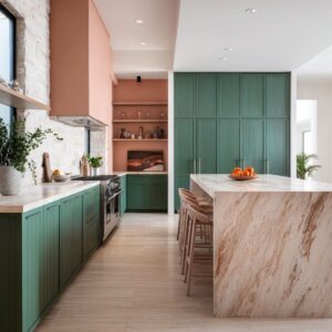
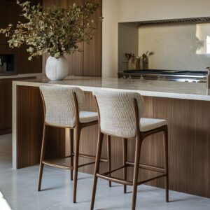
Many simple nooks look modern because they rely on a controlled warm/cool pairing instead of many colors. Mineral tones (concrete grey, charcoal, ink-like blacks, pale stone) set a clean, quiet foundation.
Warm notes (oak, woven fiber, caramel leather, warm brass) bring the human feel back in. What makes this strategy look refined is placement: cool tones often sit in large background planes, while warm tones appear where the body interacts—seat, tabletop edge, or a single highlight fixture.
The space feels composed because warmth is concentrated rather than scattered.

Building the mood using shape language
A calm nook often reads as a tiny “room within a room” because the shapes repeat softly. Rs*.
- Curves reduce visual sharpness and slow the rhythm. Rounded banquettes, circular tables, and globe lights create a lounge-like feeling even in an open kitchen corner.
- Straight lines create discipline. Grids (like black-framed glass partitions), long cabinet runs, and thin shelf edges add structure and keep the room from feeling loose.
- Bold blocks add gravity. Thick tabletops, monolithic islands, floating storage volumes, and dark cabinet slabs create presence without adding clutter.

The most balanced compositions usually combine one soft curve, one line system, and one grounded mass. That trio creates clarity: the room feels modern because the geometry is controlled, and it feels comfortable because the softness is intentional.

One element is the anchor, not everything
A polished breakfast nook design tends to concentrate weight into a single main piece so the rest can stay quiet. Sometimes the anchor is a substantial table with a thick profile that holds the center visually.
Other times it is the banquette—especially when it reads as one continuous band instead of multiple separate cushions and legs. When the anchor is strong, the styling can remain minimal.
The room doesn’t need extra décor to feel finished because the main element already provides scale, presence, and rhythm.

Reducing “leg clutter” to make the corner look cleaner
A subtle reason many nooks look calm is that the lower half of the scene is simplified. Bench seating removes a row of chair backs and reduces visual interruption in front of the wall.
Slipcovered chairs and tailored upholstery also quiet the silhouette by hiding complex chair geometry.

This approach is closely tied to built-in breakfast nook ideas, where the seating reads as part of the room’s envelope rather than additional furniture. When the bench base matches nearby cabinetry or repeats a wall tone, the nook feels integrated and planned.

Light as a visual high point, not a busy statement
Modern nooks often rely on a single lighting gesture that acts like a focused highlight. A dome pendant reads as one clean volume that anchors the upper zone.
A cluster of clear globes adds airy volume without blocking sightlines. A woven shade adds warmth because texture is visible even when the color stays neutral.
A key styling pattern is restraint: one expressive fixture makes everything around it look calmer. The ceiling stays visually clean, and the corner feels organized.

Shelves and surfaces as calm horizontal lines
Open shelves can support the “edited” effect when they behave like composition lines rather than storage. Repeated stacks of similar-toned plates, a few low-profile ceramics, and one trailing plant placed to soften an edge create a still-life feeling without clutter.

This approach turns shelving into a horizontal stabilizer—especially useful when the wall behind has fine linework. The shelf becomes a resting band for the eye, which keeps patterned walls from feeling busy.

Minimal styling feels complete through silhouette and height control
In very pared-back nooks, objects tend to be chosen for outline clarity rather than decoration. A low bowl reads as a grounded shape.
An airy branch arrangement adds vertical softness that echoes mural linework in three dimensions. A small group of items works best when it follows a simple height hierarchy: tall, medium, low.
In darker, moodier corners, silhouettes become even more important because contrast is built from light and shadow rather than from multiple colors. The room reads intentional because each object shows up clearly against the background.

“Small space” openness by keeping the center visually light
Many breakfast nook ideas for small space rely on maintaining open floor view and clean circulation. Pedestal tables help because the base is one calm form and the floor remains visible around it.
Floating sideboards lift mass off the floor and keep the room feeling larger. Even when a nook is dense with seating, the center can still read open if the table base stays visually compact.
This strategy often defines a small breakfast nook corner design: the corner feels complete, but the middle remains airy enough for the room to breathe.

Using enclosure to make an open-plan nook feel like a destination
A nook in an open kitchen can feel special when it has a clear enclosure cue—often achieved with a curved banquette, a wall motif that wraps the corner, or a graphic frame like a black grid partition. These moves give the area boundaries without building new walls.

An u-shaped breakfast nook creates this destination effect through a soft perimeter that turns dining into a lounge moment. The enclosure makes the corner feel intentional, while the open side keeps it integrated with the rest of the home.

Keeping the palette tight and tiny repeats do the connecting
The “simple but stylish” look is often built from a few stable tones—one deep tone for depth (navy, charcoal, black), one soft tone for lightness (warm white, greige, cream), and one natural tone for comfort (wood, woven fiber, leather). Instead of adding more colors, the room becomes rich through repetition: a warm metal glint appears in two or three places, a thin black line repeats in chair legs and pendant cords, a soft ink line echoes between mural and furniture profiles.
This is the core of many kitchen breakfast nook ideas: the corner feels finished not because it contains more, but because the few elements present quietly agree on line weight, shape rhythm, and tone balance.
The corner read built-in even with simple pieces
A nook can feel architectural when furniture aligns tightly with the room’s edges and behaves like part of the layout. A bench that tucks cleanly into a corner, a table positioned to borrow daylight, a wall motif that wraps around the seating zone, and one centered lighting point can make the whole setup read as a designed moment, even if the elements are straightforward.
This “integrated corner” effect sits at the heart of kitchen breakfast nook ideas and is also why built-in breakfast nook ideas often feel visually calm: fewer gaps, fewer floating pieces, fewer competing outlines—so the space reads as one composed scene rather than separate objects placed together.
Related Posts
Harmony Home Design brings 10+ years of residential interior design experience to the ideas shared here. We publish design concepts, layout thinking, and practical styling notes.