
In contemporary kitchen designs, the backsplash often behaves like a visual control surface that sets hierarchy: what becomes the focal point, what stays quiet, how light is edited, and whether the design reads as calm architecture, textured atmosphere, or a composed vignette. Instead of treating the wall zone as decoration, the backsplash can be read as a system that regulates attention, scale, and surface noise in the whole composition.

The backsplash as negative space
A backsplash can operate as intentional visual silence: a continuous, low-contrast wall plane that reduces stops and edges, so shelves, objects, and lighting become the main content. When the wall reads as one uninterrupted field, the eye stops reacting to tile band logic and starts reading the shelving line as a horizon—steady, leveling, and calming.
A subtle but powerful strategy sits in the upper half of the room: when the backsplash tone sits close to the ceiling and adjacent soffit fields, the number of color events above eye level drops. Dark cabinetry, black-framed glazing, and stone counters then read sharper and more deliberate because they sit inside a controlled envelope rather than competing against multiple contrasting wall moments.
On smoother wall finishes, under-shelf light tends to create gentle tonal drift rather than crisp texture shadows, so illumination reads like atmosphere, not a spotlight effect. Styling naturally shifts toward silhouette punctuation—matte ceramics, earthy vessels, a few darker pieces—because the calm background turns objects into curated forms instead of items.
Micro-mosaic as a light filter
Micro-scale surfaces can function less like pattern and more like light technology. When the units are tiny and evenly distributed, the wall behaves like visual fabric: detail exists, but it resolves as grain from a distance.
This allows a refined type of richness—high surface information without graphic busyness.

One of the strongest compositional moves in this family is scale contrast: long, clean shelf lines or calm cabinet planes paired with micro-detail on the backsplash. Big quiet geometry provides stability; tiny texture supplies finish and depth.
When the mosaic stays monochrome and consistent, the eye treats it as a cohesive field, so variation shifts to silhouettes and materials on the shelves—stoneware, matte bowls, subtle shapes—rather than the wall competing for attention. Warm metal fixtures gain extra presence on pale textured fields because the surface is light but not flat; highlights sit on a softly active background and read more intentional.

Another quiet mechanism appears when lighting is tucked under shelves or cabinets: texture turns light into rhythm—bright band to softer band to bright band—so the wall starts behaving like a layered composition made from illumination rather than ornament.

Pattern made from shadow, not color
A modern backsplash can carry pattern without announcing it through color contrast. Relief, chevron, and faceted surfaces often read restrained when the palette stays tonal, because the pattern is revealed mainly by grazing light—highlight and lowlight—rather than by printed graphics.

Dark relief backsplashes can create depth while remaining sophisticated when the surface stays close in value to nearby dark elements (hoods, counters, window frames). In that case, the wall behaves as a grounded base line that stabilizes taller light cabinetry and prevents the upper volume from feeling overly blank.
The strongest versions of this idea extend the relief through adjacent returns so the darker horizon travels behind small objects; simple bowls and vessels then read as still-life moments because they sit against a continuous depth field.

Pale 3D geometry achieves a related effect in a different register: instead of reading as tile pattern, it reads like a shadow textile—animated by small gradients that change with viewpoint. The key balance often comes from separating line directions: wood grain already carries direction and rhythm, so a grainless sculpted backsplash can add depth without introducing another competing set of lines.
This keeps long runs visually clean while still avoiding flatness.

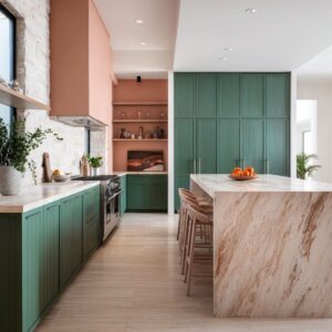
Slab as framed wall art
Full-height slab backsplashes often behave like a single composed panel rather than a background strip. Their natural variation—tonal drift, cloudy movement, mineral marks—can read like an image field, so surrounding elements function like framing devices: dark hood masses, tall cabinetry borders, or warm wood planes.
The slab becomes the emotional center because it carries movement while nearby forms stay disciplined.

A quieter slab strategy uses broad, blurry movement instead of sharp veining. When the image inside the stone is atmospheric rather than linear, the eye glides instead of catching on repeating lines.
A thin horizontal light seam can turn the wall into two calm bands, creating depth through separation rather than decoration. This kind of composed wall plane tends to push the design toward object restraint: low silhouettes and minimal vertical clutter allow the slab to keep its reading as a continuous field.
This is where kitchen backsplash design becomes a mood-setting device: the wall is treated like a primary visual plane with its own hierarchy rules, and everything nearby supports that hierarchy through scale and restraint.

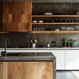
Backsplash + hood as one continuous mass
Another category treats the backsplash and hood as one material event, turning the cooking zone into a sculptural focal mass. When hood and wall share the same surface language, the cook area stops reading as equipment and starts reading as built form.

Stone slabs with strong directionality (especially vertical movement) can counterbalance the kitchen’s horizontal emphasis—long islands, drawer runs, floor planks—so the range wall gains authority without extra decoration. Warm stacked tile wrapped over the hood can create a clay-like block effect: subtle striations introduce rhythm, while continuity reads as architecture.
In the most composed versions, a thin shelf or niche cut becomes the depth break that prevents the mass from feeling flat; it introduces one controlled shadow line and a small pocket for quiet forms. Dramatic veined slabs often feel most current when paired with a very regular neighboring rhythm such as ribbed wood.
The tight repetition acts as a stabilizer next to expressive veining, so the slab reads curated rather than chaotic.

Glass block as soft-focus screen and light wall
Glass block backsplashes behave differently from tile because the wall’s main content becomes refracted light. A disciplined grid can still read calm, but each block introduces internal distortion and watery highlights, so the wall feels alive without needing a printed motif.
Instead of the eye reading grout rhythm first, it reads light events first.

Cool-toned glass blocks can be used as a concentrated temperature zone while the rest of the kitchen stays warm-neutral, creating controlled contrast: the design keeps warmth overall while the cooking wall provides a crisp, refreshing anchor. Clear globe pendants and polished metals often feel naturally integrated here because they share the same highlight language—transparency, sparkle points, and gentle distortion.
When paired with darker cabinetry or glossy counters, the wall can create layered depth: shimmer above echoed by reflective depth below.

The hidden choreography of objects and styling
A less obvious layer is how backsplash type quietly controls what kinds of objects look intentional in the design.
- Quiet planes tend to turn objects into silhouette punctuation: fewer pieces, clearer forms, calmer spacing.
- Micro-grain walls can handle more accessories, but the visual logic shifts toward grouping: clusters read curated; scattering reads noisy because the background already carries micro-activity.
- Dark depth walls convert simple items into still-life moments: contrast and continuity make even low objects feel staged.
Rounded silhouettes often act as the softening counterweight when the backsplash carries sharp geometry or heavy relief. Bowls, fruit, curved stools, and organic stems can keep the wall’s rhythm from feeling icy or overly crisp, maintaining calm while preserving depth.

A practical taxonomy of visual roles in modern backsplash designs
Grouped by what they do visually (not by what they are made from), backsplash strategies often fall into a small set of roles:
- Silence wall
- Diffuser wall
- Shadow-pattern wall
- Artwork panel wall
- Monolith wall
- Light-manipulating wall
- Gradient-bridge wall
Each role sets the rules for hierarchy, object behavior, and how light is experienced along the counter line.

The strongest shared principle: hierarchy
Across these approaches, the consistent strategy is a clear hierarchy: one leading visual system defines the room’s mood, and supporting elements stay disciplined so the lead system reads cleanly.
- In silence-wall kitchens, shelving, silhouettes, and lighting carry the content.
- In micro-grain kitchens, surface refinement and glow-band behavior carry the content.
- In shadow-pattern kitchens, depth and skimming light carry the content.
- In slab-panel kitchens, stone movement carries the content.
- In glass block kitchens, refracted highlights carry the content.
This is why ideas for a kitchen backsplash often feel most modern when they are treated as whole-room composition tools rather than as a decorative afterthought, and why the best modern backsplash ideas tend to be the ones that quietly decide what the eye is allowed to focus on, where it can rest, and how the room keeps its calm even with strong material moments.
Related Posts
Harmony Home Design brings 10+ years of residential interior design experience to the ideas shared here. We publish design concepts, layout thinking, and practical styling notes.