
Mid-century modern living room designs often feel instantly “right” because they rely on a small set of visual controls: long horizontal furniture lines, clear shape hierarchy, and a restrained mix of materials that look richer through light and shadow. The most convincing looks usually come from proportion logic and repeat rhythms rather than obvious vintage accessories.
This article breaks down the less-obvious decorating strategies that create those effects, using the same visual mechanics that keep a space calm, graphic, and livable.
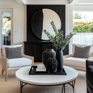
The core mid-century anchor is a low horizon line
A popular organizing device in mid-century modern living room decorating ideas is the long, low console or sideboard acting as a stable “horizon” near the floor. Once that line exists, the room tends to read composed even before accessories arrive.
- The eye registers a calm base band first, which makes the rest of the room feel settled.
- Wall height feels larger because the visual weight sits lower.
- The scene looks edited because one continuous line does the job that multiple smaller objects would otherwise try to do.
This is why a long low media console for a mid-century modern living room often becomes the true identity marker, even in rooms with very different color palettes.

The TV becomes acceptable when it is treated as pure geometry
A large black screen can dominate a living room, yet the most successful mid-century solutions frame it as a deliberate rectangle instead of an awkward object. The wall functions like a clean stage: empty space keeps the screen crisp, and the console underneath becomes a calm base layer that can “carry” that rectangle visually.

Key visual habits repeat in the strongest versions of mid-century modern living room decorating ideas with TV:
- generous blank wall around the screen so the rectangle reads intentional
- low styling that stays below the screen edge, keeping the top zone quiet
- a textured console front that can stand up to the screen’s weight without needing clutter
The room reads designed even when the TV is off, because the wall still works as a composition of two large forms.

Texture replaces ornament: detail arrives without adding objects
Many modern mid-century interior designs look rich while staying spare, largely because surface rhythm does the work. Fluting, ribbing, chevron faces, and fine wood grain behave like “shadow patterns,” producing depth without introducing more décor categories.

Examples of this “quiet richness” include:
- fluted or ribbed cabinet fronts that break a wide surface into many slim beats
- chevron or herringbone wood that adds motion while staying inside one material family
- matte and glossy pairings (matte console + glossy screen) that create subtle contrast
This is the visual engine behind mid-century modern fluted media console styling: the cabinet face provides complexity, so the top can remain calm.

A repeating shape conversation keeps rigid feeling
Mid-century modern living room decorating ideas often follow a steady “shape grammar,” usually built from three categories that balance each other:
- Rectangles: screens, cabinets, large frames
- Circles/ovals: coffee tables, mirrors, bowls
- Organic silhouettes: branches, plants, pampas, dried stems
The most confident designs commonly feature one decisive curve rather than many small curves. A single dominant circle can calm a wall of straight lines and keep a media wall from turning into a grid.
This is why a mid-century modern living room with a round mirror above a sideboard can feel so complete with very little extra decor.

Dark accents form a skeleton, warm metal works like small bright punctuation
In restrained palettes, repeated dark elements often act as the visual “skeleton” that holds everything together. Screens, lamp shades, table bases, slim frames, and dark cabinet tops appear as a limited set of repeating notes, keeping the composition coherent.

Warm metal (often brass) behaves differently: it shows up as tiny bright points rather than large shiny fields. Those small points:
- warm up cooler colors like sage or lavender
- break large painted surfaces into smaller visual units
- connect separated zones through repetition (hardware + lamp detail + thin rim)
The effect is especially strong in mid-century modern living room ideas with brass hardware and muted colors, where the palette stays soft but never drifts into blandness.

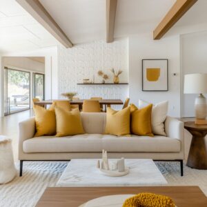
Accent color is handled as concentrated heat sources
Many contemporary interpretations avoid spreading color everywhere. Instead, the room concentrates color into a few dense moments, then repeats it in a second material so it feels layered rather than random.

Common patterns include:
- one anchor color (navy, emerald, charcoal, terracotta) as a major mass
- one warm accent (mustard, rust) repeated in at least two textures (velvet + dried stems, pillow + throw, rug stripe + vessel)
- a pale base (cream, beige, soft gray) that keeps contrast clean
This is the logic behind navy and mustard mid-century modern living room color palette ideas: bold contrast stays controlled because repetition is disciplined and the base remains quiet.
The center zone often uses “pause materials” to prevent visual fatigue
A frequent non-obvious move is giving the center of the room a material that acts like a visual rest. When sofa fabric and rug texture are both soft or dense, the eye benefits from a cleaner pause surface in the middle.

Common pause choices:
- glass tops that create a crisp break between plush and woven textures
- pale stone tops that brighten the center and keep dark palettes from feeling heavy
- round forms that soften the straight-line dominance of media walls
This is why a round marble coffee table in a mid-century modern living room can make even a moody palette feel lighter and more breathable.

Styling reads mid-century when it is built from silhouettes, spacing, and height discipline
Tabletop styling often looks mid-century when it is organized by clear silhouettes rather than many small “interesting” objects. The most consistent arrangement language tends to be:
- a low rectangular book stack (flat geometry)
- one rounded mass (bowl, vase, lamp base)
- one airy vertical element (stems, branches)

The decisive factor is height discipline: objects stay low so the wall composition remains clean, and spacing stays generous so each silhouette reads clearly. This silhouette-first approach is a defining trait in mid-century modern console decor styling ideas for living rooms.

Light and reflection behave like an extra decorating layer
Mid-century looks often gain depth from how light travels over surfaces rather than from additional décor. Grooved cabinet faces catch shadow lines.
Wood grain shows as warm movement under daylight. A glossy screen reflects faint room tones, making it feel less like a void and more like a deliberate panel.
In calm palettes, these light behaviors become the “animation” that keeps the room from feeling static:
- diagonal shadow bands add temporary graphic interest
- matte-versus-gloss pairings read richer even in neutral rooms
- pale stone or glass surfaces bounce light into the seating zone
This is a key reason neutral mid-century modern living room decorating ideas with texture can look finished without looking busy.

Controlled asymmetry creates realism without losing composition
Many successful mid-century arrangements avoid strict showroom symmetry, yet still feel balanced. Slight offsets do a lot of work:
- a lamp positioned off-center relative to the screen
- a tall vase balancing a smaller lamp mass on the opposite side
- art arranged as a pair that feels related, but not mirrored
This “controlled imbalance” keeps the room from feeling staged, while the big shapes remain clear enough to read as a designed system.

Pattern becomes bold only when everything else stays quiet
Graphic rugs and strong artwork often appear in mid-century interiors, but the most composed designs typically give one element the right to be loud while keeping the rest restrained. Common pattern logic:
- bold rug + calmer wall art and simpler pillows
- bold artwork + quieter rug and fewer competing prints
- texture-heavy neutrals supporting one clear graphic statement
This is the foundation for mid-century modern living room ideas with a bold geometric rug, where the pattern feels intentional because the room protects it with restraint elsewhere.

Two modern mood families show up again and again
Contemporary mid-century decorating often falls into two stable mood families that use the same core rules, just expressed differently:
Gallery-calm mid-century
- pale walls, restrained objects, texture doing the heavy work
- thin dark notes for structure
- stone/wood/linen surfaces keeping the scene quiet
A frequent long-tail expression of this is blush and cream mid-century modern living room decor with brass accents, where softness stays grounded by disciplined dark outlines and clear shapes.
Playful-graphic mid-century
- navy + mustard or terracotta + cream as strong blocks
- one bold rug or one bold artwork controlling the energy
- clean furniture silhouettes preventing visual noise
Both families still rely on long-low furniture, lifted legs, shape clarity, and controlled repetition.

A compact visual rule set that explains why the look holds together
Mid-century modern living room decorating ideas tend to feel coherent when these underlying strategies appear together:
- a low horizon line that anchors the room
- a screen treated as a deliberate rectangle with calm wall space
- texture rhythms (fluting, chevron, wood grain) replacing excess décor
- a shape trio: rectangles + circles/ovals + organic silhouettes
- repeated dark notes forming structure, warm metal appearing as small highlights
- accent color concentrated into a few heat points, repeated in different materials
- a center pause material (glass or pale stone) keeping the middle visually light
- styling organized by silhouettes, spacing, and low height discipline
That combination is what makes a space read unmistakably mid-century modern while still feeling current, clean, and emotionally steady.
Related Posts
Harmony Home Design brings 10+ years of residential interior design experience to the ideas shared here. We publish design concepts, layout thinking, and practical styling notes.