
A lot of urban living room design ideas start with the same point: the architecture is already loud. Big glazing, a long rectangular plan, a column that slices a corner, brick that refuses to be background, or a view that behaves like a giant moving poster.
The most convincing ideas don’t try to outshine those conditions. They build a visual system that absorbs them—so the interior reads steady, human, and settled even when the city outside is sharp, bright, and busy.
What follows is a deep read of the moves—why they work visually, what they quietly solve, and the less obvious details that keep the interior design from tipping into either sterility or clutter.

A runway room: turning a long rectangle into a calm sequence
Many city apartments behave like a corridor with furniture: entry, seating, balcony door in a straight pull. The strongest design ideas treat that corridor as a sequence rather than a single scene.

The hidden trick: the center stays visually low
Instead of filling the middle with multiple shapes, the interior design solution is to keep the center as a low band: a rug field + one anchoring table + contained styling. That low center creates a clean line of sight to the balcony sliders, so the room feels longer without feeling empty.

Why it feels designed, not merely furnished
A long plan looks intentional when it has stops—moments where the eye rests briefly before moving on. Such stops often come from:
- A large artwork on the counterwall (a single tall piece, not many small frames)
- A warm object cluster on the media console (one bouquet, one vessel group)
- A vertical accent near the curtain line (thin branches, a floor lamp, a plant)
Each stop is a gentle speed bump. It slows the interior design down visually, so the rectangle reads like a composed interior rather than a passage to the view.

The view as backdrop
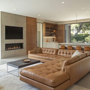
In high-rise and corner-glass layouts, the skyline can dominate so hard that the interior starts feeling like a staging area in front of a window. The most effective design concepts do something subtle: they make the interior feel like a foreground scene with its own gravity, so the city becomes atmosphere instead of competition.

Foreground gravity comes from weight placement
There are three main types of visual weight:
- One dense warm mass (caramel leather sofa, warm wood console, tan chair)
- One dark anchor (black oval or block coffee table, charcoal media cabinet)
- One soft field (oversized rug that reaches deep under seating)
That trio keeps the interior from dissolving into daylight. It’s not about adding more stuff; it’s about giving the eye a stable base so the bright exterior doesn’t erase the interior.

Interior art that echoes the horizon
Large abstract pieces with weathered, hazy surfaces do a quiet job: they mimic what the view does (gradients, atmosphere, distant contrast) without copying it literally. That makes the design feel in dialogue with the skyline rather than fighting it.

Contrast used as structure
Often urban interior designs are neutral-on-neutral, yet they don’t look flat. The reason is that contrast is used like an outline—thin, deliberate, repeated.

The outline effect
- A black coffee table or black table base
- Black window frames or black art frames
- A charcoal pillow or one deep accent note
That small dark repetition creates a crisp perimeter around softness. It’s the difference between soft and blurry and soft but intentional.
The dark elements behave like punctuation: a few marks that sharpen everything around them.

Why it matters in city living room designs
In bright condos, daylight can wash surfaces into one pale mass. A controlled dark note prevents that washout and keeps forms readable from a distance—especially important when the exterior view is visually intense.

Texture as emotional insulation in hard architecture
The design concepts with concrete ceilings, polished floors, tall glazing, or brick shells rely on texture to do the comfort work. Not extra color.
Not busy pattern. Texture.

The key idea: texture replaces ornament
When the architecture is severe, ornament can look messy fast. Instead, such designs stack tactile layers that read calm:
- Nubby rugs that look thick and slow
- Bouclé-like or looped upholstery that softens edges
- Knits and fringes that introduce human irregularity
- Leather with natural creasing that signals lived-in warmth
That last one is especially underrated: creased leather visually breaks perfection. In a glass-heavy room, that imperfection reads as comfort, not disorder.
This is where many urban living room ideas quietly succeed: they make the design feel warm through surface character rather than through louder color stories.

The media wall as a composition
The recurring problem is obvious: a black rectangle on a pale wall can look like a void. The stronger design ideas treat the TV zone as a still life with layers, rhythm, and breath.

Layering that integrates the screen
- A long low cabinet as the base line
- A second horizontal line above (floating shelf) or behind (slatted panel)
- Sparse objects placed with room around them
The TV stops reading as the only focal object because the wall has a frame language. Even simple shelves do this if spacing is generous and objects are chosen for silhouette, not variety.

Texture that turns the wall into architecture
Vertical slats or ribbed cabinet faces are doing more than adding detail. They create a steady rhythm that makes the TV look embedded within a larger surface pattern.
The eye reads the wall as a designed plane, and the screen becomes one component inside it.

Warmth without clutter
It can use one warm cue near the TV—candle glow, amber glass, warm wood tray, a small bouquet—to soften the screen edge. One cue is often enough because it changes the emotional temperature of that wall.

Containment: how lived-in stays visually calm
A striking pattern which can be used is to bring signs of life—books, fruit, candles—without letting them look scattered.
The containment principle
Instead of placing many items independently, the design idea is to group them so the eye reads one shape:
- A tray that collects daily objects
- A book stack that becomes a base platform
- A bowl that holds color in a single boundary
This makes the design feel active and real while still reading tidy. The visual signal is: life exists here, but it has edges.

Why it’s especially urban
City living room layouts often share space with dining, kitchen, or work zones. Containment prevents open-plan bleed, where every surface starts looking like a drop zone.
Grouping keeps the calm even when the room is multi-purpose.

Curves as a quiet antidote to city geometry
Rectangles dominate urban architecture: window grids, balcony sliders, corridor-like plans, wall-mounted screens. It can insert curves as relief—not as a style statement, but as a psychological softener.
Curves show up in strategic places
- Rounded chaise edges that pull the seating inward
- Oval or organic coffee tables that relax the center
- Round drum tables that make tight circulation feel easier
- Soft, rounded ceramics that repeat curve language in small scale
Curves do something important: they make the interior design feel less like a diagram. Even one curved element can change the mood because it interrupts the grid the building already supplies.

Balance: distributing visual weight in open plans
The layout can have potential imbalance built in: a structural column, a heavy TV wall, a dominant window corner. The designs feel stable because visual weight is distributed—rarely symmetrical, but always compensated.

Common counterweights
- If the media wall is dark, the coffee table often carries a dark note too.
- If one wall has a strong artwork, the opposite side gets a tall lamp or vase.
- If the sofa is very light, frames or a table base add thin dark structure nearby.
This is a compositional habit: the design doesn’t rely on matching sets; it relies on repeated weights at different points so nothing feels like it’s tipping.

Softening exposure: making glass feel residential
A glass wall can make a room feel bright but also exposed—especially at night when windows turn reflective. The strongest design concepts soften the glass without heavy drama.
The subtle tools that change the feeling
- Sheer curtains that turn the window into a softer plane
- Roller shades that look neat but still signal privacy control
- Plants placed where glass meets floor, creating a gentle boundary
- Window ledges used as casual seating, making the glass edge feel inhabited
What’s happening is psychological: when the window edge has softness and life nearby, the room stops feeling like a display box.

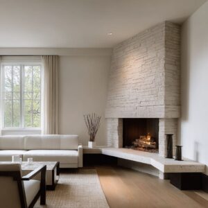
The loft shell: keeping industrial character calm instead of harsh
Loft style design concepts with brick and concrete succeed when they give the eye places to rest. A brick wall is full of micro-contrast; a concrete ceiling is visually heavy; polished floors reflect light sharply.
The calming response in these rooms is consistent:

Rest surfaces + punctuation notes
- A large pale rug to hush the floor’s sharpness
- One monolithic dark table to hold the center down
- One large artwork with restrained palette to reduce visual chatter
- A warm lamp glow to counter the coolness of hard surfaces
A non-obvious but powerful move appears in the brick loft: placing a smooth, clean wall plane adjacent to brick. That pairing makes the brick look curated because it now has a clear boundary, like a featured material rather than background noise.

Multi-use without looking like a mashup
If it includes desks, work chairs, or combined living/dining footprints, the rooms can avoid the office in the corner look by keeping the work zone inside the same visual language.
How it stays coherent
- Work surfaces align with the media wall or cabinetry line, so they read built-in by association
- Accent color (like a warm orange chair) appears as one controlled note, echoed by small warm elements elsewhere
- The lounge zone remains textile-heavy, while the work zone stays visually clean and linear
The result is a design that can support daily routines without turning into competing themes.

Evening mood: turning reflection risk into atmosphere
Evening mood matters because glass-heavy rooms can feel stark after sunset. The winning approach is layered glow—small warm sources placed at different depths so the room gains a protected feeling.
What creates the protected feeling
- A wall sconce or lamp that warms one side of the room
- A second warm source farther back, closer to the window line
- Small candle-like glow near the media wall or on the table
When warm light hits sheer fabric, the fabric becomes a luminous surface. That single effect can change the whole room’s mood: the window wall stops reading as a hard boundary and starts reading as soft atmosphere.

The deeper pattern tying all together
The visual calm systems for urban living room designs:
- A few large elements instead of many small ones
- Texture doing comfort work where architecture is hard
- Small, repeated dark notes that outline softness
- One or two warm nodes that prevent neutral palettes from feeling cold
- Curves inserted as relief inside a grid-dominated environment
- Grouped tabletop scenes that keep life visible but contained
- A media wall treated like composition, not a device mount
- The skyline treated as atmosphere, with the interior holding its own gravity
That’s why the designs read settled even when the building envelope is sharp and the city outside is loud. The design language doesn’t try to compete.
It quietly organizes what the eye is allowed to do: rest, move, pause, and feel held.
Related Posts
Harmony Home Design brings 10+ years of residential interior design experience to the ideas shared here. We publish design concepts, layout thinking, and practical styling notes.