
How a home office can look minimal without feeling empty, rich without feeling busy, and finished even when the desktop stays mostly clear. It covers different modern home office ideas and frames them as a unified approach.
What makes home office interior designs feel unusually convincing is not one signature item. It’s a set of quiet decisions that operate like a design grammar: containment, horizon lines, light behaving like a surface, and storage that has a social role (what it hides, what it reveals, and what it softens).
The goal is not more decor. The goal is visual control that still reads warm and human.

Containment: the built-in pocket that makes the desk feel intentional
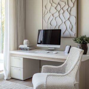
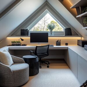
A design move is the pocket effect: the work zone is framed by side panels, upper cabinets, shelves, or an inset wall field. The desk stops reading like a table placed in a room and starts reading like a dedicated bay.

Why the pocket works even in open, bright interior designs:
- It gives the eye a boundary. When the work zone has a defined top edge (shelf line, upper storage, soffit glow), the mind reads it as complete even if the desktop has very little on it. The space looks done because the architecture-like frame provides closure.
- It produces quiet privacy without heaviness. A desk can feel exposed when it is only a surface against a flat wall. A pocket adds side edges and depth behind the desk, which reads like a sheltered place. That sheltered feeling is visual, not technical: the eye senses an alcove and relaxes.
- It supports the fast-reset look. When a pocket is present, the styling can stay sparse because the framing does the decorative work. The room keeps its composed mood even after real work happens.
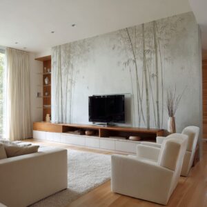
This is one reason many modern home office interior designs rely on a single strong wall treatment (plaster-like texture, stone slab field, or a warm backsplash panel) paired with a clean perimeter frame. The office reads as one designed object.

Horizon line discipline: the calm power of one repeating height
Interior design can look expensive partly because it respect a consistent horizon height—often the line of a countertop, a desk surface, a long credenza top, or the base of a lit backsplash field.

When the same height repeats, it creates a subtle visual rule:
- A long, dark or medium-toned horizontal band (desktop, counter, shelf shadow line) becomes the baseline that organizes everything else.
- Items placed on that line look curated even when they’re ordinary because the line behaves like a gallery plinth.
- The horizon line also prevents the eye from bouncing. The gaze can rest.
A particularly refined version of this appears when two horizons work together: a desk height horizon and a second horizon slightly above (a backsplash, a shelf line, or a light wash band). That pairing forms a quiet ladder of values and brightness: desk as grounded, wall as softly illuminated, upper storage as calm closure.
The outcome is an interior design that feels visually steady. It’s not minimal because it has few items; it’s minimal because it has few competing alignments.

Light behaving like a material, not a fixture
The strongest mood comes from light that behaves like a surface finish—soft, even, and embedded—rather than light that announces itself. Three recurring lighting roles appear:
A) The wall-wash that turns a plain wall into a feature
A broad, warm wash over plaster-like texture makes the wall read as dimensional and alive without needing art. The texture catches light in micro-variations, so the wall becomes quietly rich while staying neutral.

B) The shelf glow that turns storage into atmosphere
Under-shelf lighting does more than brighten a shelf. It creates a glow band that visually separates display from work, making the desk feel calmer.
The shelf becomes a soft ceiling for the desk zone, which is why the work area feels sheltered.
C) The layered glow that creates evening identity
Many office corners look fine in daylight but feel flat at night. It can be avoided by stacking light layers: ceiling glow (ambient), wall cones (structure), under-shelf (intimate).
The interior design keeps its calm character after sunset because brightness is distributed gently instead of concentrated harshly.

A deisgn insight: when the wall behind the desk glows softly, the brain reads the space as held and complete, even if the desk is almost empty.

Storage with social roles: hide, reveal, blur
Many office design inspirations consider storage as a quantity problem (add shelves) rather than a perception problem (what does the design reveal about your life? ).
Three storage personalities:
Closed storage as wall architecture
Tall doors in quiet tones behave like wall planes, not furniture. That makes storage visually silent.
The room stays calm because the largest surfaces do not show activity.

Open storage as a narrow personality lane
Instead of covering the whole wall in open shelving, such approaches often use one vertical column or one bay. That keeps the life of the room contained: books and objects appear in one controlled strip rather than everywhere.
Semi-visible storage as a blur filter
Ribbed or reeded glass fronts create a soft blur. This is a subtle luxury move: it acknowledges that storage is real, but it refuses to show the full outline of what’s inside.
The eye reads order even when the contents are mixed.

This hide–reveal–blur trio creates a design that looks tidy without looking sterile. It also supports the fast-reset aesthetic: visible zones stay small, hidden zones carry the mess, blurred zones keep convenience without visual exposure.

The active zone and the staging zone: keeping work mess from becoming decor
The most convincing desks often rely on a two-surface logic:
- One surface is the active zone where papers can live temporarily.
- Another surface nearby (a back counter, a return leg of an L-shaped desk, a side credenza) is the staging zone where the room’s character sits: vase, lamp, a low tray, a single book stack.
This separation is a visual strategy. It prevents the common failure mode where styling objects compete with working objects on the same plane.
When the design gives life objects their own strip, the main desktop can remain clear and calm, which keeps the entire space looking intentional.

The L-shaped desk appears often because it naturally produces this behavior: one leg can be work, the other can be presentation. The corner becomes a quiet anchor point for a single sculptural object, making the geometry feel deliberate rather than leftover.

Texture hierarchy: using one hero texture so the interior design stays quiet
Modern home offices rarely rely on color variety. They rely on texture variety with strict hierarchy.

A common hierarchy looks like this:
- Large quiet plane: smooth wall or soft plaster field (calm background).
- Hero texture: stone with subtle movement, fluted wood, or a textured niche wall (visual richness).
- Soft tactile counterweight: a rounded upholstered chair that adds warmth and comfort.
- Small matte accents: ceramics, branches, low trays (human detail without sparkle).
The reason it works is scale control. The hero texture is usually large but not loud in color.
The chair texture is soft and rounded, which prevents the design from feeling too rectilinear. The small accents stay matte so they don’t introduce glare points.
This creates an office design that feels layered and expensive while still staying neutral.

Symmetry that doesn’t feel stiff: centered architecture, human styling
Interior design can use strong symmetry (a centered desk, paired sconces, a framed wall field). Symmetry can easily feel cold, but these concepts keep it human by letting asymmetry enter in small ways:
- One branch arrangement placed slightly off center.
- One larger object balancing a corner.
- Books grouped in tight clusters with visible breathing gaps.
This produces an important emotional effect: the room feels stable, but not frozen. The architecture feels composed; the styling feels lived.

Window logic: daylight as a side companion, not the main event
A frequent problem in home offices is that the window either dominates (glare, distraction) or disappears (heavy treatments, lost brightness). Interior design can use a calmer relationship:
- The window often sits to the side of the work focus rather than directly behind it.
- Dark window frames are echoed by one or two dark horizontal planes (desktop, shelf shadow line, hearth ledge), so the window doesn’t feel like an unrelated graphic.
- A bench or side surface near the window turns daylight into a pause zone, not a distraction source.
The benefit is that the room gets a second posture: screen work at the desk, then a softer mode near the window. The office stops feeling like a single-purpose box.

Objects as anchors, not clutter: why the decor stays low and grounded
A styling pattern: objects are kept low, matte, and grounded. Even when shelves hold many books, the objects that define the mood are usually a few heavy forms:
- a large vessel,
- a shallow tray,
- a branch arrangement,
- one framed piece placed low rather than high.
This works because low objects protect the horizon lines. They don’t interrupt the room’s calm geometry.
A tray functions like a shadow base, visually binding small items into one intentional grouping. A matte vessel absorbs light, preventing sparkle that would add visual jitter.
This is why the rooms feel curated without looking decorated.

The comfort counterweight: soft shapes that make minimal rooms feel welcoming
Home offices would look strict if they only used straight lines and flat planes. The soft counterweight is the chair: rounded silhouette, tactile upholstery, and a slightly lounge-like presence even in a working setting.
That chair does more than add comfort. It adds visual softness, which makes the room feel hospitable.
The chair’s texture becomes the only obvious textile in the room, which keeps the palette minimal while still giving a sense of warmth. Even in interior designs that lean executive, the softness keeps the seriousness from becoming cold.

The restorative office: when a fireplace or bench changes the room’s identity
A standout idea is that the office can carry a non-work anchor: a fireplace wall, a window bench, or a lounge-like strip. This changes the psychological read:
- The room becomes a place for thinking, reading, and decompressing, not only output.
- The desk stops being the sole center of gravity, which reduces the always working vibe.
- The office feels like a real room in the home, not an inserted workstation.
The visual grammar stays modern—clean lines, tonal palette—but the emotional story becomes restorative.

A closing synthesis
A consistent definition of modern home office design that is easy to miss if the focus stays on furniture lists. The engine is visual control:
- containment that makes the work zone feel like a designed pocket,
- horizon line repetition that quiets the room,
- light that behaves like a surface finish,
- storage that manages what is revealed, what is hidden, and what is softened,
- texture hierarchy that keeps the palette neutral yet rich,
- small, grounded styling that reads curated rather than cluttered,
- a second posture (bench, fireplace, side counter) that prevents the room from feeling purely transactional.
Together, these moves create interior designs that look calm on purpose: minimal without emptiness, warm without visual noise, and finished even when the desk stays clean.
Related Posts
Harmony Home Design brings 10+ years of residential interior design experience to the ideas shared here. We publish design concepts, layout thinking, and practical styling notes.