Green has long been a favorite in home design, but its influence in the living room extends far beyond a simple choice of paint or upholstery. While many discussions focus on obvious contrasts—like choosing velvet over linen or deciding between deep emerald and soft sage—there’s a lot more happening beneath the surface.
This article takes a closer look at the hidden dynamics of using green color in living room décor, exploring the subtle ways it interacts with texture, lighting, and architectural elements. The goal is to go beyond surface-level trends and uncover the strategies that make green feel inviting, sophisticated, or even unexpectedly bold.
From the way reflective fabrics shift in different lighting to how built-in shelving painted in deep green can alter spatial perception, every choice influences the overall impact.
Whether drawn to classic interiors with rich, moody greens or contemporary spaces that use soft, muted shades for a relaxed atmosphere, understanding these details makes all the difference. This breakdown isn’t about repeating what’s already been said—it’s about looking at what most people overlook and offering a fresh take on how to work with green in ways that feel intentional, stylish, and seamlessly integrated into a space.
How Reflective Surfaces and Lighting Shape Green Interiors
The way green appears in a living room isn’t just about the shade you pick—it’s also about how light interacts with different materials. Fabrics with a sheen, glossy finishes, and even glass fixtures can change how green is perceived at different times of the day.
This is why some spaces seem to shift in mood from bright and fresh in daylight to deep and dramatic in the evening.
Shifting Tones Throughout the Day
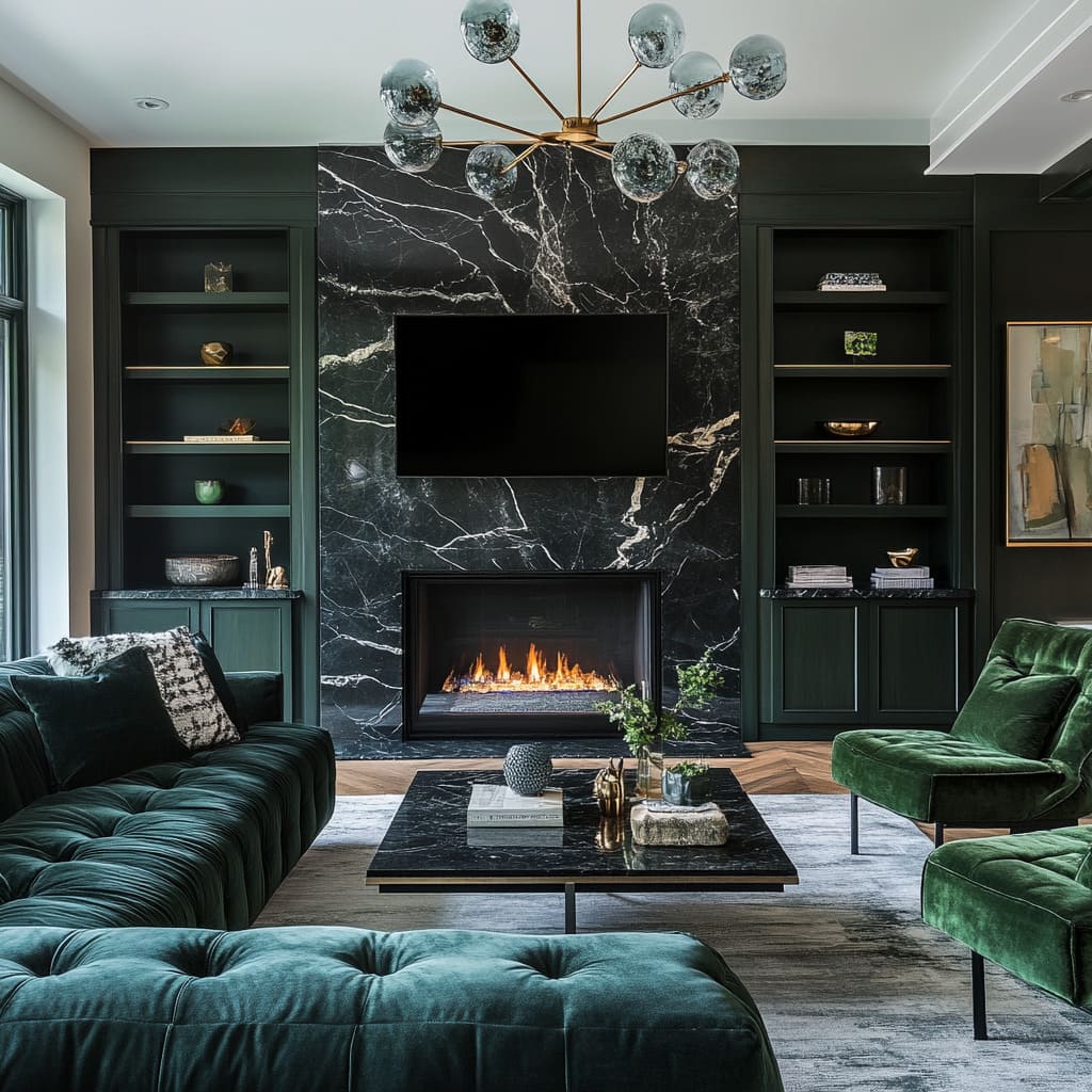
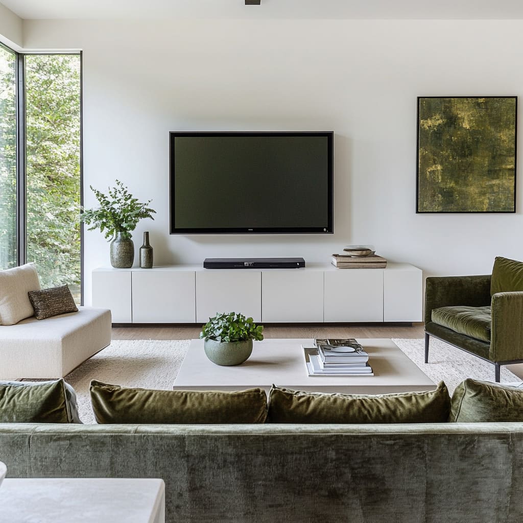
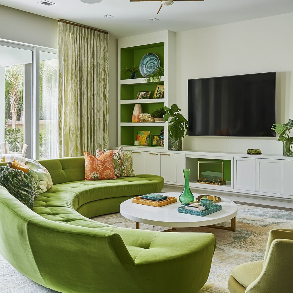
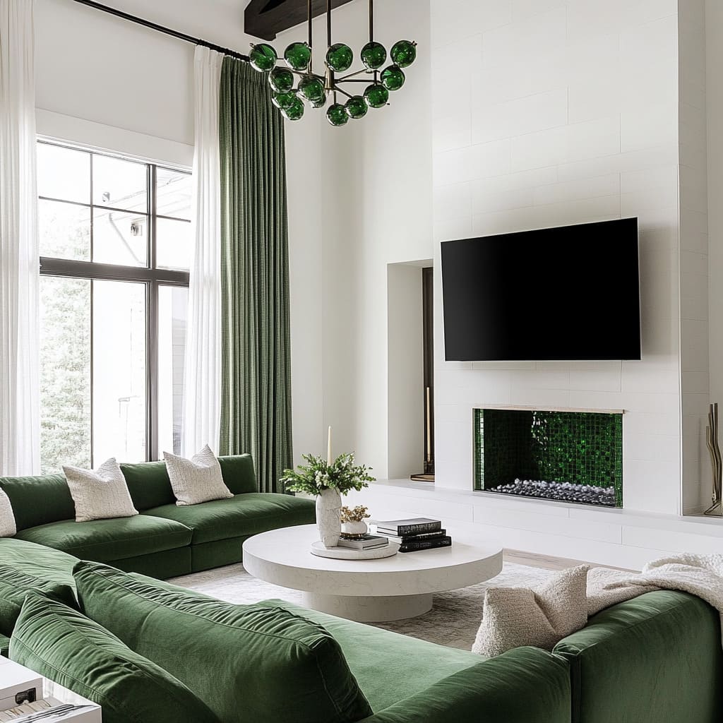
Velvet sofas, green glass chandeliers, and glossy ceramic tiles all have the ability to reflect and refract light, subtly changing their appearance depending on the angle and intensity of illumination. In the morning, natural light tends to highlight softer undertones, making sage or olive feel even lighter.
By contrast, in the evening or under warm artificial lighting, the depth of emerald and forest green becomes more pronounced.
Enhancing Natural Light with Strategic Placement
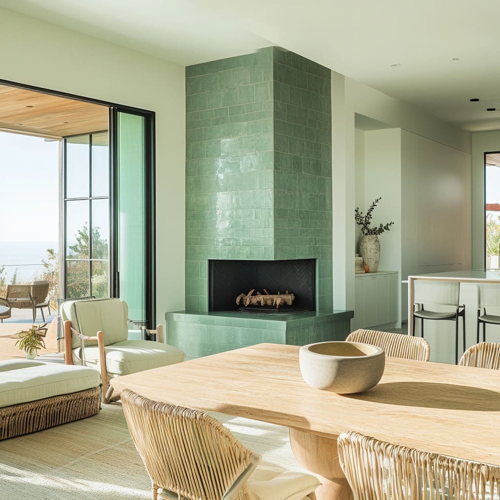
Positioning reflective green surfaces near large windows enhances their effect, almost like multiplying the color throughout the room. This approach is particularly useful for spaces with limited sunlight, where glossy green tiles or polished furniture can bounce light around and prevent the space from feeling too shadowed.
In many green living room ideas, designers use a combination of matte and reflective materials to create depth. A velvet sofa placed near a bright window can look entirely different from the same sofa positioned in a dim corner.
The key is understanding how light shifts throughout the day and using reflective elements to make green feel more dynamic rather than static. Whether the goal is a cozy, atmospheric space or a bright, airy feel, knowing how different textures interact with light ensures that green remains lively and full of character, rather than appearing flat or predictable.
Layering Textures in Green Interiors: More Than Just Fabric
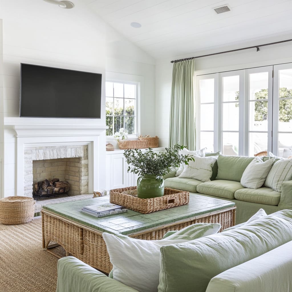
The way textures interact in a green design living room can completely shift its atmosphere. While many people focus on fabric choices like velvet or linen, the real depth comes from mixing different materials—wood, rattan, tile, and even painted millwork.
The contrast between smooth and rough surfaces makes each texture more noticeable, adding visual richness without overwhelming the space.
Balancing Rough and Sleek Surfaces
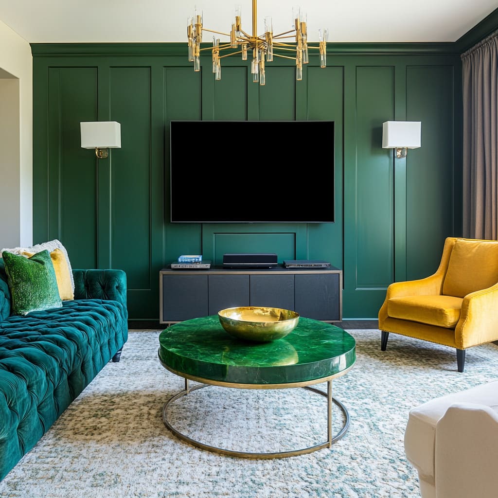
Pairing organic materials with glossy finishes creates an unexpected yet harmonious effect. A deep green marble coffee table set against a woven rattan chair, for example, highlights the contrast between refined and rustic.
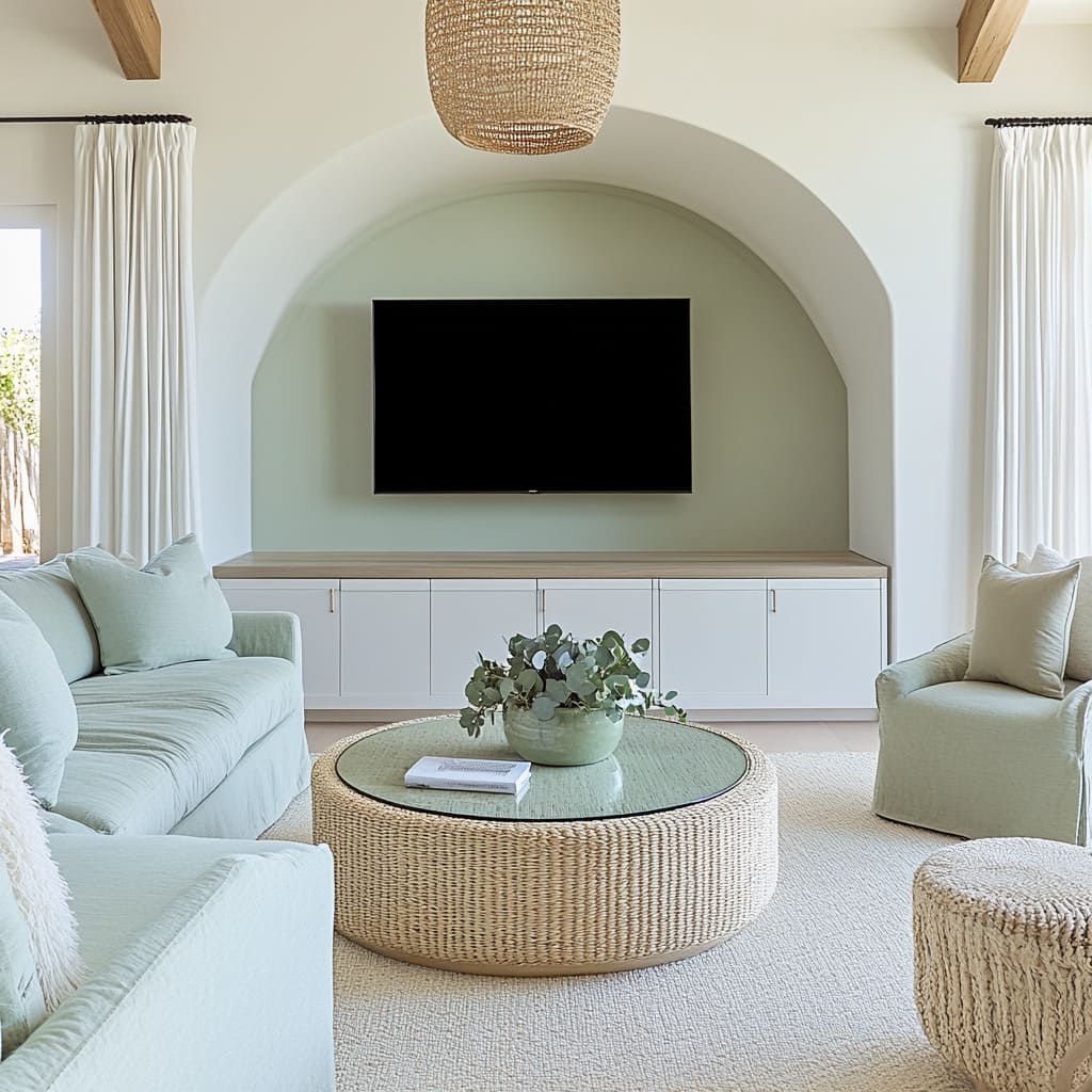
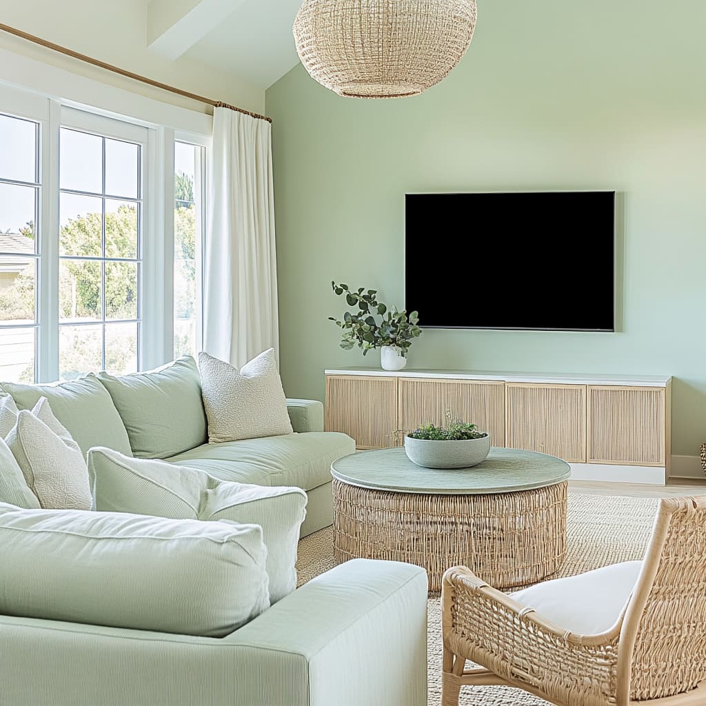
Similarly, polished cabinetry in a muted green shade gains character when combined with handwoven pendant lights, making sure the space doesn’t feel too uniform or overly polished. The push-and-pull between textures helps prevent green from looking too flat, giving it a layered, natural feel.
Subtle Reinforcement Through Smaller Details
A well-balanced interior doesn’t rely on a single bold statement—it’s about how colors and textures are repeated throughout the space. If a room features a forest-green velvet sofa, adding smaller touches like a ceramic vase in a similar shade, a patterned throw pillow, or even green-tinted glassware helps the eye move effortlessly across the design.
This repetition makes the color feel cohesive without looking forced. By combining soft, matte surfaces with glossy or structured ones, green interiors gain depth and complexity.
Whether through furniture, decorative elements, or architectural finishes, layering textures keeps the space visually engaging while allowing green to play a dynamic role in the overall design.
How Architectural Features Strengthen Green Interiors
Beyond paint and furniture, the structure of a room plays a key role in how green is perceived. Thoughtful architectural choices can either subtly frame the color or make it the defining element of a space.
Built-in features, alcoves, and extended cabinetry create a seamless green living room design that feels intentional rather than an afterthought.
Framing with Arches and Panels
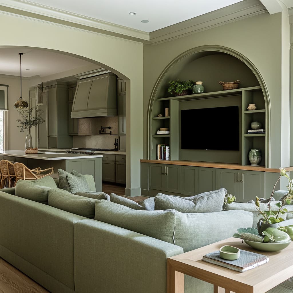
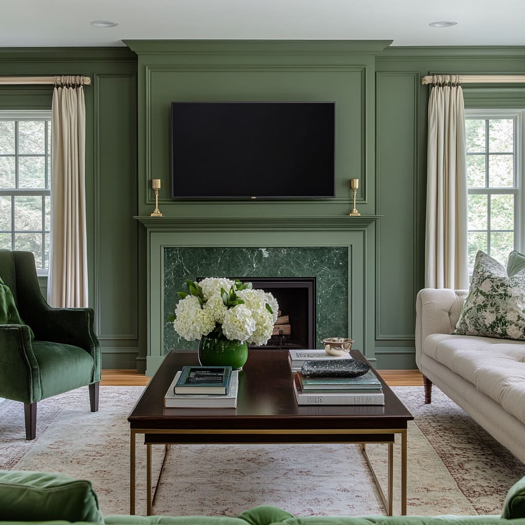
Arched alcoves and paneled walls do more than add character—they naturally direct attention to focal points like a fireplace, TV, or shelving. When painted green, these elements become even more pronounced, shaping the way the eye moves through the space.
Instead of green feeling like a separate decorative choice, it becomes part of the room’s structure, reinforcing its presence without overwhelming the overall design.
Green Millwork as a Visual Anchor
Extending green cabinetry from floor to ceiling or wrapping it around a fireplace creates a built-in effect that enhances continuity. This approach visually expands a space, making walls feel taller and transitions between furniture and architecture more fluid.
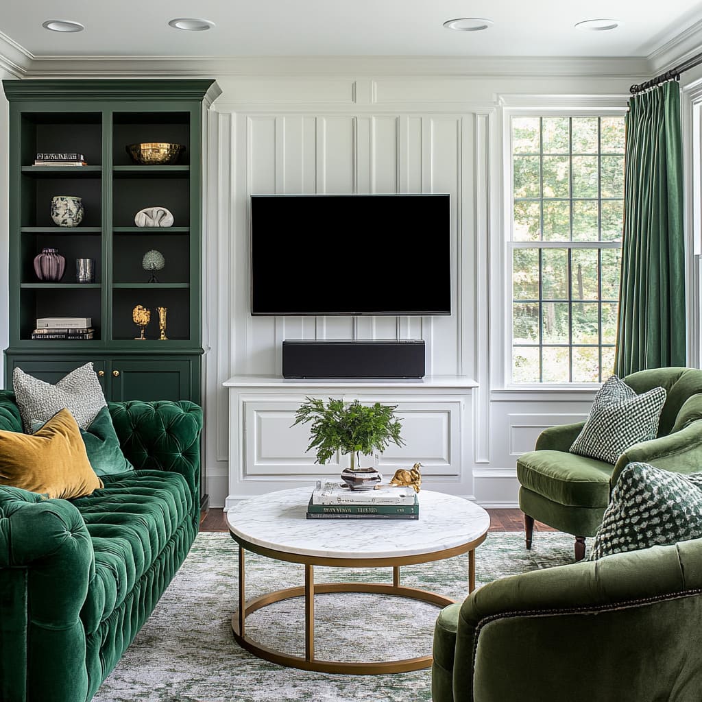
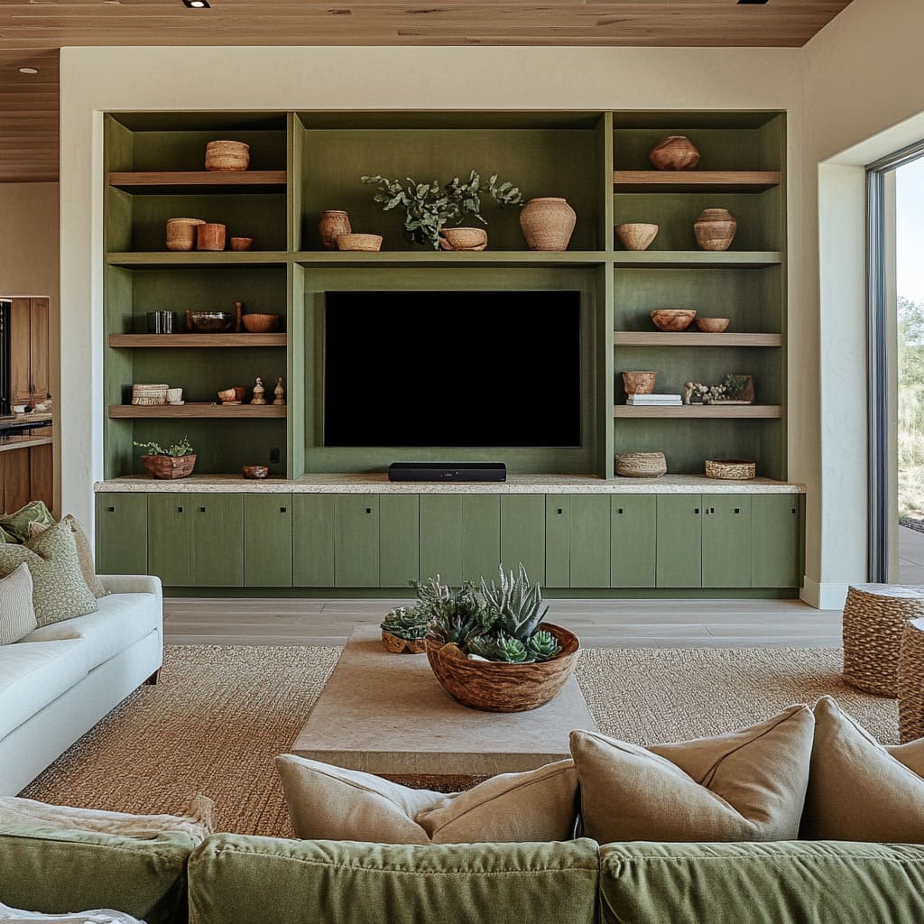
A deep green bookcase blending into the surrounding trim, for example, removes the harsh contrast of standalone furniture and turns storage into a seamless design feature. By incorporating green into the actual framework of the room, these techniques ensure that the color doesn’t just sit on the surface—it becomes part of the home’s architectural identity.
Whether through alcoves, paneling, or integrated millwork, structural elements shape the way green interacts with light, furniture, and spatial flow, making the color feel both grounded and dynamic at the same time.
How Green Defines Spaces in Open-Concept Living
In open-concept homes, where the living, dining, and kitchen areas flow into each other, color plays a crucial role in shaping each zone without the need for physical dividers. Green, when used strategically, can create subtle separations while keeping the overall look cohesive.
Whether applied to cabinetry, furniture, or accent walls, it acts as a unifying thread that ties different spaces together.
Creating Visual Flow with Repeated Green Tones
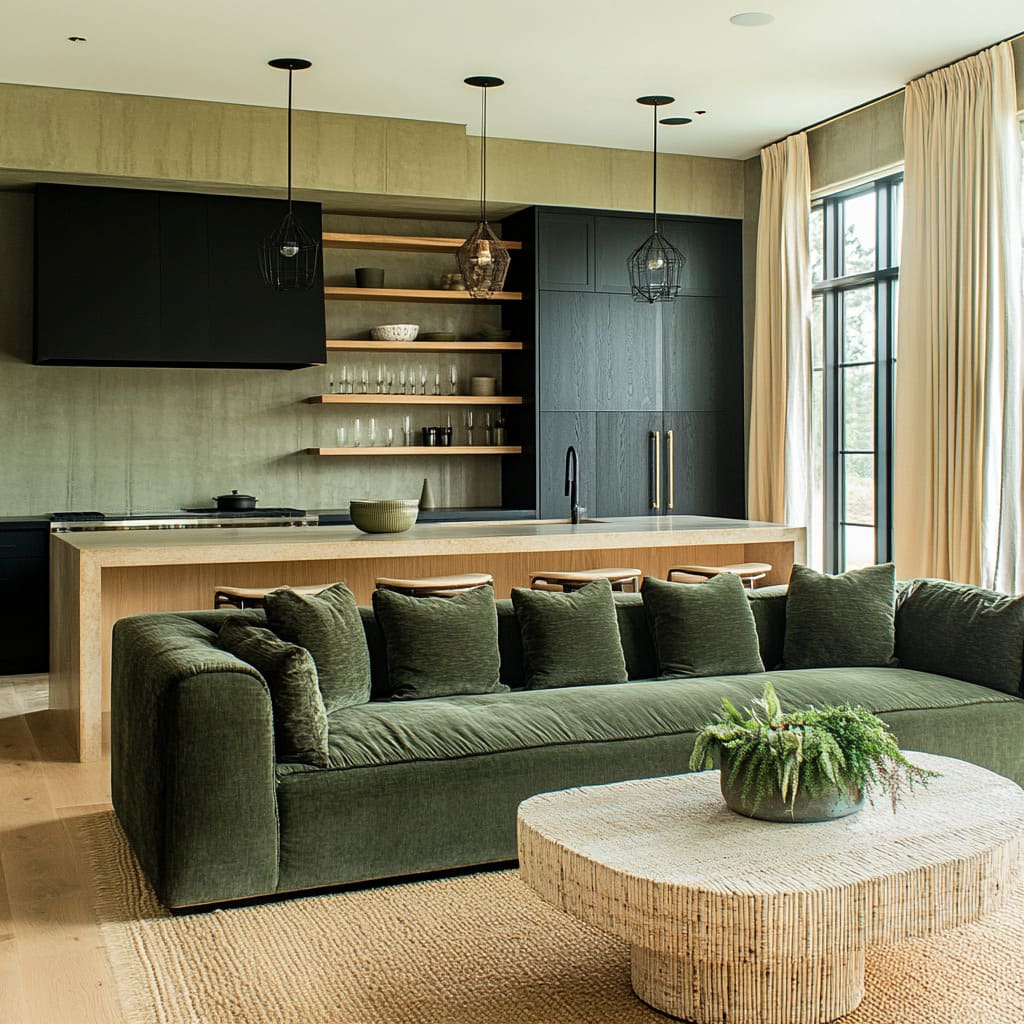
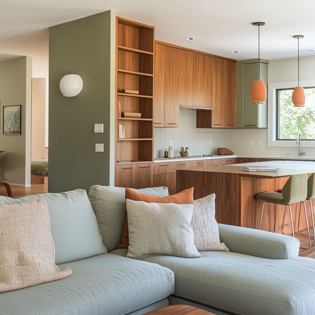
One of the simplest ways to maintain harmony in an open-plan space is to repeat the same shade of green across different elements. A kitchen island painted in deep olive, for example, can subtly connect to a matching green sofa in the adjacent living area.
This repetition prevents the space from feeling disjointed and allows the eye to transition smoothly between functions.
Cabinetry That Blends with Living Room Features
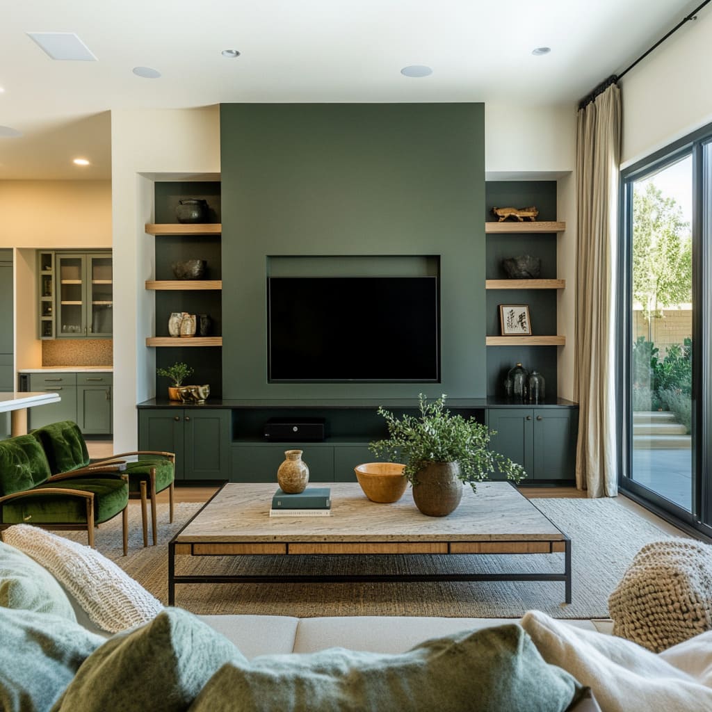
Another effective approach is extending green cabinetry beyond the kitchen, allowing it to flow into built-in storage or a media wall in the sitting area. Even in homes with predominantly neutral walls, using the same green for lower kitchen cabinets and living room shelving creates a sense of continuity.
The result is a well-balanced space where each zone remains distinct but feels like part of a carefully considered design. For those looking for green sitting room ideas, this technique ensures that the color isn’t confined to just one area.
Instead, it works as a flexible design tool that organizes open spaces while making the layout feel intentional. By thoughtfully repeating green in different ways, it’s possible to define separate areas without breaking the natural rhythm of the room.
How Color Temperature Shapes Green Interiors
Not all greens feel the same—some bring warmth and comfort, while others create a crisp, modern edge. The secret to making green work in a space isn’t just about picking a shade but understanding how its temperature interacts with other materials.
Whether it leans toward earthy and muted or deep and cool, pairing it with the right elements ensures balance and cohesion.
Warm Greens for a Cozy and Grounded Look
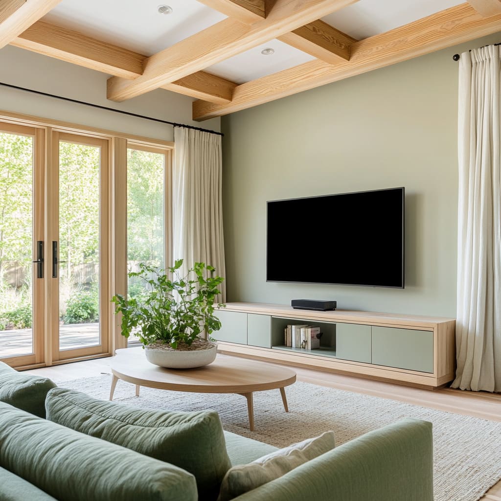
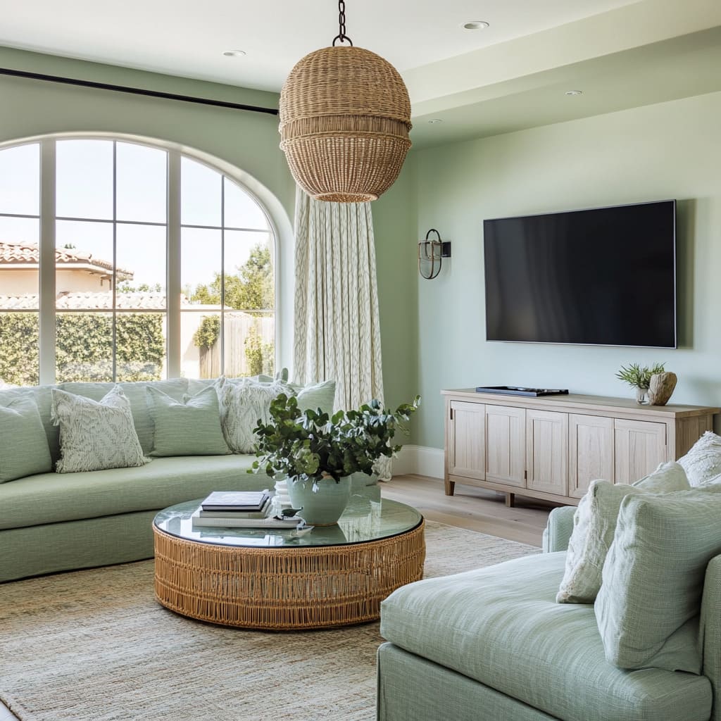
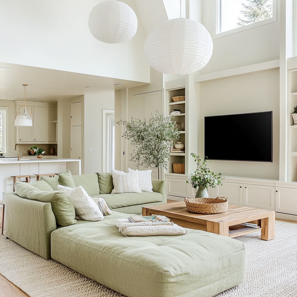
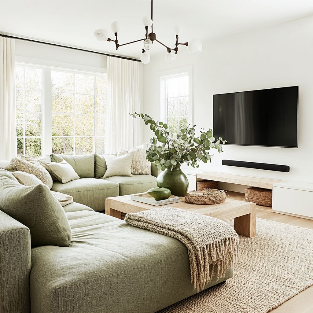
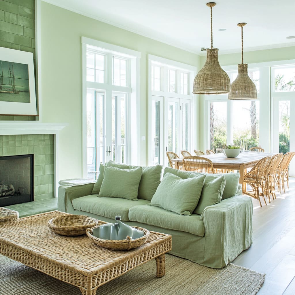
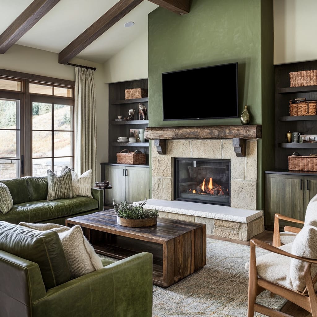
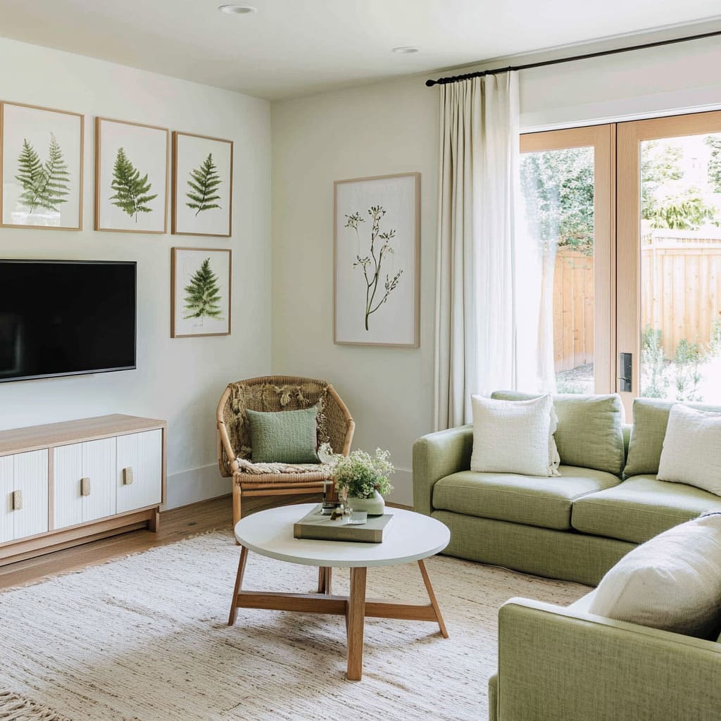
Olive, moss, and sage naturally have a soft, inviting feel, especially when mixed with warm finishes. These shades work beautifully with aged brass fixtures, terracotta decor, and natural wood beams, creating a welcoming atmosphere.
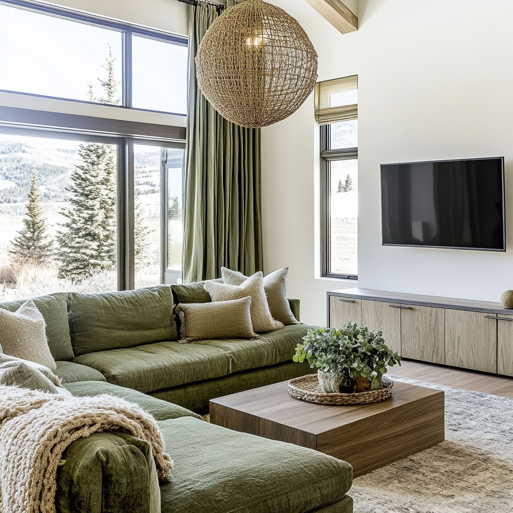
Layering woven textures like linen upholstery or rattan lighting enhances this effect, making the space feel relaxed but well put together. This approach is common in designs that embrace rustic, vintage, or Scandinavian influences, where the goal is to add warmth without overwhelming the room with dark tones.
Cooler Greens for a Sleek, Modern Touch
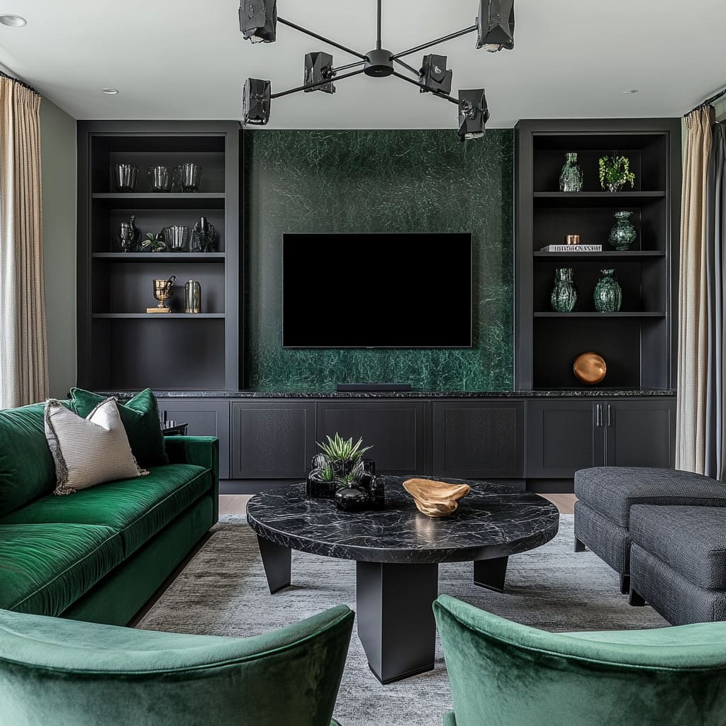
Emerald, deep forest, and seafoam introduce a refined, contemporary feel. These shades pair well with black metal details, smoked glass lighting, or polished stone finishes, giving a space a more structured and sophisticated look.
Unlike their warmer counterparts, these greens feel fresh and bold, often used in spaces that lean toward modern or industrial aesthetics. High-gloss surfaces, such as deep green cabinetry or lacquered paneling, further amplify this effect by reflecting light and enhancing the color’s depth.
The choice between warm or cool green depends on the overall feel of the space. A green color living room ideas approach often blends both—mixing a rich, cool green wall with softer, earth-toned textiles, or introducing warm sage in a room with sleek black accents.
Getting the balance right ensures that the space feels layered and intentional rather than one-dimensional.
How Green Works with Other Colors to Shape a Room
Green rarely exists in isolation—it thrives when paired with complementary or analogous hues that enhance its character. Whether it’s a deep emerald sofa accented with warm gold tones or a soft sage wall softened by neutrals, the right color combinations can define the entire mood of a space.
Choosing the right balance ensures that green feels intentional rather than overpowering.
Green & Gold: A Timeless Match
Adding gold accents—whether through lighting fixtures, hardware, or a bold mustard chair—instantly enhances the depth of green. This pairing is often seen in vintage, Art Deco, or mid-century designs, where rich tones and metallic finishes create an inviting yet dramatic effect.
A deep forest-green velvet couch with brass legs or an emerald-tiled fireplace framed by gold sconces adds warmth while keeping the space refined.
Green & Blue: A Seamless Blend
For a softer, more fluid aesthetic, layering blue with green creates a natural, calming feel. Teal cushions on a sage sofa, a soft aqua vase on an olive sideboard, or navy cabinetry alongside a green accent wall all work together effortlessly.
This combination is especially popular in coastal and Scandinavian interiors, where muted blues and greens reflect the outdoors and add a breezy, organic touch.
Green & Neutrals: Keeping the Look Balanced
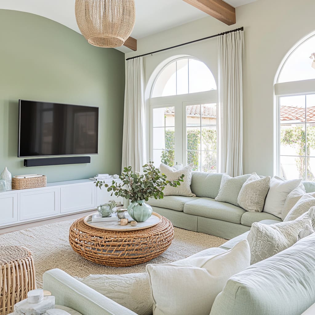
To prevent green from feeling too heavy, pairing it with whites, beiges, and soft grays ensures brightness and contrast. A sage-green kitchen with off-white countertops or an olive accent wall next to a taupe linen sofa creates a structured yet inviting feel.
Neutrals act as a backdrop, allowing green to shine while keeping the space from feeling too saturated. Each of these combinations brings out a different side of green, whether dramatic, calming, or grounded.
The key is finding the right balance, making sure each color plays a role in shaping the room without overwhelming it.
Balancing Scale and Placement of Green in a Room
How green is distributed throughout a space has just as much impact as the shade itself. Some interiors embrace large-scale green elements—like walls, cabinetry, or built-in shelving—while others use smaller but intentional placements to create balance.
The way green is incorporated can influence whether it dominates the room or simply enhances its overall feel.
Letting Architecture Carry the Color
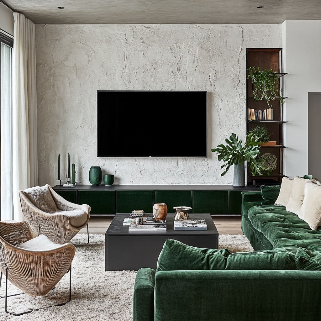
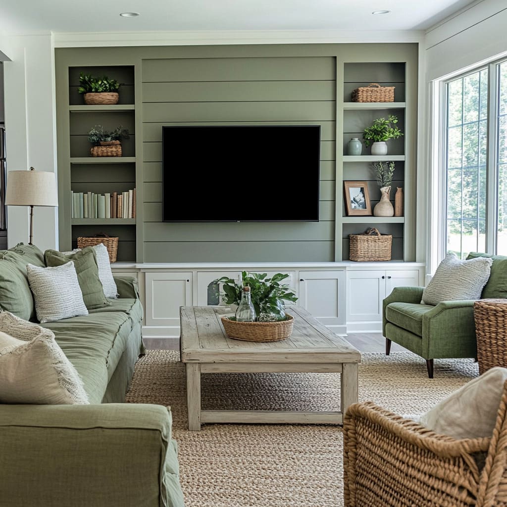
Instead of relying on furniture as the primary source of green, many spaces use walls, millwork, or built-ins to anchor the palette. Painting an entire media wall in a deep shade of green, for example, allows sofas, rugs, and decor to remain neutral while still maintaining a strong color presence.
This approach keeps the room feeling open, as the eye perceives the space as a whole rather than focusing on individual furniture pieces. It also allows for greater flexibility—neutral furnishings can be easily updated without altering the core aesthetic.
Strategic Use of Smaller Green Accents
For those who prefer a more restrained approach, concentrated green zones can be just as effective. Instead of an all-green feature wall, a space might use two matching velvet chairs and coordinating curtains to create a subtle focal point.
This method works well in rooms with a predominantly monochrome base, where selective pops of color guide attention without overwhelming the design.
The key to making green feel intentional is understanding how its scale and placement affect the overall balance of the space. Whether applied in broad strokes through architectural details or used in focused areas for contrast, the right distribution of green ensures that the color enhances the room rather than competes for attention.
Green’s New Pairings: Unexpected Combinations That Work
Green has long been a staple in interior design, but recent trends show a shift toward pairing it with bolder, less conventional elements. Instead of the usual neutral backdrops or predictable wood tones, designers are experimenting with high-contrast finishes and rich metallics to give green a fresh edge.
These unexpected combinations add personality, depth, and a sense of refinement that feels both modern and timeless.
Matte Black: A Bold Contrast
One of the most striking ways green is being used today is alongside matte black. Whether through lighting fixtures, hardware, or entire cabinetry sections, this pairing creates a dramatic contrast that sharpens both colors.
Deep forest-green kitchen cabinets with black handles and open shelving feel structured and sophisticated, while an emerald velvet sofa next to a black metal coffee table has a crisp, modern edge. The contrast keeps the space from feeling too traditional and gives green a more graphic, architectural presence.
Earthy Metallics: Warmth and Depth
Instead of polished chrome or bright gold, many designers are turning to copper, aged brass, and bronze to complement green tones. These metals bring out the warm undertones in shades like olive, moss, and muted sage, making them feel richer and more layered.
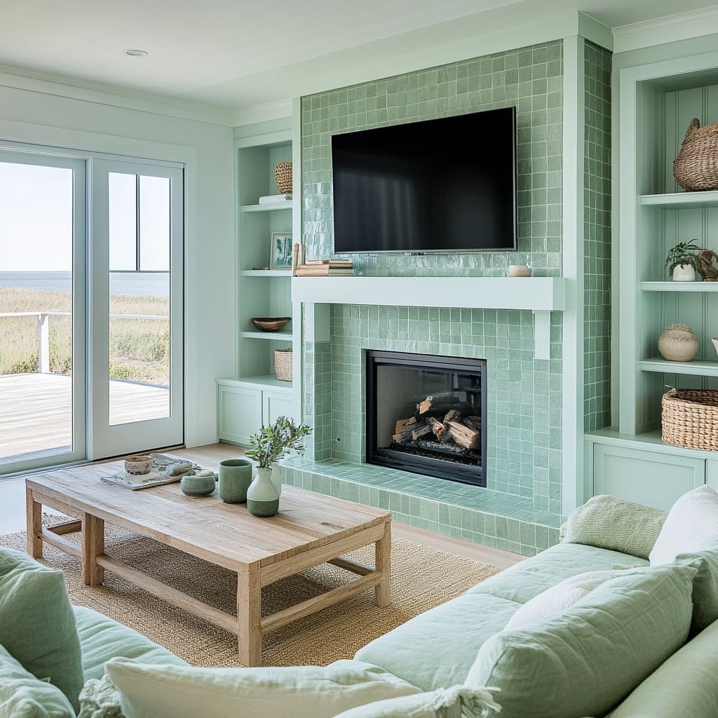
A green-tiled fireplace with a hammered brass mantel, for example, blends old-world charm with contemporary styling, while deep green cabinetry paired with antique bronze hardware creates a balanced mix of modern and vintage.
These unexpected pairings show that green is more versatile than ever. By choosing finishes that highlight its depth—whether through sharp contrast with black or the warmth of aged metals—green can take on a whole new character, making spaces feel intentional, curated, and distinctly modern.
Final Thoughts: The True Impact of Green in a Living Room
Green in interior design goes far beyond aesthetics—it influences the entire feel of a space, from the way light interacts with surfaces to how different textures and materials shape the atmosphere. The most thoughtfully designed green living rooms aren’t just about choosing a shade but about layering the right elements to bring depth, warmth, or drama.
Subtle details, like the way a velvet sofa catches natural light or how green millwork seamlessly integrates into an open floor plan, make all the difference. Built-in shelving painted in deep green can anchor a space, while soft sage textiles woven throughout a neutral palette keep the look cohesive without overpowering the room.
These aren’t just design choices—they’re ways to direct visual flow, balance contrast, and create a space that feels both inviting and intentional.
Green’s versatility is what makes it so compelling. It can be understated and calming, bold and striking, or seamlessly woven into a space through layers of color and texture.
Whether used in classic, modern, or eclectic settings, it adapts to its surroundings, reinforcing the mood and character of the home. The key is understanding how each shade interacts with light, structure, and the surrounding materials, ensuring that green doesn’t just exist in the room—it enhances it.
Related Posts
Harmony Home Design brings 10+ years of residential interior design experience to the ideas shared here. We publish design concepts, layout thinking, and practical styling notes.
