
A transitional living room is easiest to recognize by what it refuses to do. It doesn’t lean hard into one era, one mood, or one “statement.
” Instead, it builds a quiet agreement between opposites: crisp lines and soft edges, light-filled surfaces and a few dark anchors, modern restraint and traditional comfort. The best versions don’t look mixed.
They look resolved.

The fast test: 7 signs a room reads transitional
- One calm statement, not five competing ones
A single focal wall, one sculptural table, or one dominant artwork carries the identity. Everything else supports. - Contrast exists, but it’s placed like punctuationDark elements appear in a few deliberate spots (window frames, a credenza, a firebox opening), rather than scattered everywhere.
- A neutral base with “color in controlled doses”Color shows up in a few concentrated areas (pillows + one chair + a rug echo), not in random small items.
- Warmth and coolness are blended, not separatedA room doesn’t feel split into “warm zone” and “cool zone.” Something bridges the two—often art, metals, or a rug.
- Texture carries the richnessWhen color is restrained, the room still feels complete because fabrics, ceramics, stone-like surfaces, and subtle patterns do the work.
- Symmetry is present, but not always mirror-perfectThe balance is often “by weight,” not by identical objects.
- The center of the room is composedThe coffee table area acts like a small stage: edited, readable, and calm, even if the room is lived in.

The core idea: “Anchor + echoes” creates that settled look
Many transitional interior designs succeed because they follow a simple visual logic:
- Anchor: one heavy, calm object that stabilizes the seating group
- Echoes: smaller repeats that make the anchor feel intentional, not random
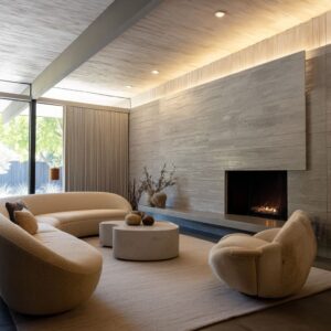
The anchor is often a wide, low, round table
A large drum or thick stone-topped round table does something powerful: it stops a seating arrangement from feeling like separate pieces placed near each other. Its width creates an implied center of gravity.
Even with multiple chairs and a sofa, the interior design reads as one conversation zone because the table holds it together.

Echoes make the anchor feel “meant to be there”
The anchor looks right when you repeat its language in lighter ways:
- a round tray on the table that repeats the circle (circle-on-circle unity)
- a ring-base console in the background that echoes the same curve
- rounded chair backs that soften the table’s mass
- a gold-toned frame or curtain hardware that “explains” a brass table base
This is one of the most overlooked transitional tricks: the interior design doesn’t rely on a loud statement. It relies on a shape family that repeats quietly.

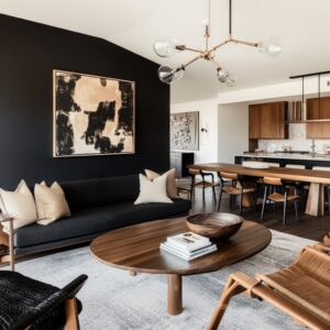
Color that looks expensive: use a “color path,” not scattered accents
For example, such a color can be dusty blue, but the effect is never theme-like because it’s handled with discipline. The strongest interior designs place color in a sequence your eye can follow:
- Primary hit: one deep or dusty blue pillow, or one plush blue chair
- Support: softer blue-gray in the rug pattern
- Bridge: a darker blue drapery panel or art tones
- Softening: pale neutrals and warm notes that keep blue from feeling cold
This turns color into a guided rhythm instead of decoration. It also prevents the common problem where a room feels “almost done” but slightly random because the accent color has no map.

The bridging role of art is bigger than most people think
In the strongest examples, the main artwork isn’t just pretty. It’s a translator.
For instance, a coastal-style abstract with a warm beige/gold band inside a blue-gray horizon can be quietly doing advanced work: it blends warm metals with cool textiles, so brass and blue feel like they belong in one story instead of living in separate camps.

Warm metal used correctly: it should behave like an outline, not a spotlight
Brass is a popular option, but the interior designs avoid looking flashy when the metal is treated as a thin, repeating highlight:
- curtain rods and rings (a warm line near the ceiling)
- table bases or trim lines (a warm line near the center)
- picture lights and lamp bases (warm vertical accents)
- frames (warm border that ties everything together)
The key is restraint and consistency. One warm metal repeated in small doses reads intentional.
Multiple metal finishes, each used once, reads accidental.

A useful rule: if the room has a large black rectangle (TV), a warm metal outline helps the room feel “finished,” because it brings back human warmth and prevents the palette from turning cold.

Symmetry that doesn’t feel stiff: balance “by visual weight”
Some transitional rooms are symmetrical, but the best ones avoid the obvious mirror trick. They balance the wall with different objects that carry equal presence:
- a large artwork on one side
- a tall lamp on the other side
- TV centered as the stable middle
This is “weight symmetry,” not identical symmetry. It feels calmer and more grown-up because it has order without looking staged.
The same applies to seating: two sofas facing each other can be formal, but the formality softens when the center is round and the table styling is low and edited. Round shapes reduce the feeling of strictness because they don’t have corners pointing at people.

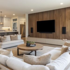
The focal wall problem: how to make fireplace + TV feel designed
A fireplace-and-TV wall is one of the hardest living-room compositions to make look intentional, mainly because the TV is visually blunt: a dark rectangle that wants to dominate. The strongest transitional solutions do three things:
1) Give the TV a “soft frame”
A TV looks less harsh when the wall creates a calm surrounding field: stepped surrounds, quiet panel grids, or vertical grooves that add shadow texture. The wall becomes a composed background rather than plain paint.
2) Add one controlled texture so the wall doesn’t look flat
Vertical groove panels (fluted texture) are powerful because they add rhythm without adding visual noise. They also make the wall feel “made,” which reduces the sense that furniture was placed in front of a blank surface.

3) Place contrast only where it helps
In light rooms, a dark firebox opening becomes a crucial anchor. It prevents the entire wall from floating.
The contrast feels deliberate because it’s concentrated in one place, not sprinkled everywhere. And then—this is the subtle part—the coffee-table decor stays quiet.
If the wall is already the statement, the center table shouldn’t compete. The room looks calmer when the table styling is lower and more restrained.

Open-plan calm: rugs are not decoration, they’re “zone boundaries”
In open living/dining layouts, the biggest risk is drift: furniture looks like it’s waiting to be arranged, even when it technically is. The interior designs that feel truly settled use rugs as clear boundaries:.
- one rug holds the living group
- another rug holds the dining group
- the eye reads two “assigned” footprints, so the open plan feels organized without walls
This is why a living room can look calm even with black-framed glass, a long dining table, and multiple zones: the rugs are doing the invisible organizing work.

Repeat one accent through the full length of the room
In the best open-plan examples, one accent runs from zone to zone:
- black outlines (window frames + a door frame + a dark tabletop)
- brass accents (table frames + curtain rods + lighting)
- dusty blue (dining chairs + one living pillow + rug tones)
This prevents the common open-plan issue where each zone looks styled separately, but the home doesn’t feel like one story.

Texture is the luxury in a quiet palette: build a “texture ladder”
When interior design is mostly cream, gray, and soft beige, richness has to come from texture. The most refined transitional interior designs stack texture in a deliberate ladder:
- Soft matte: upholstery and rugs (the calm base)
- Woven or patterned: pillows and chairs (fine detail without loud print)
- Handmade surfaces: ceramics, vases, bowls (irregularity that feels human)
- Reflective touches: a glassy lamp base, a metal rim, a picture light (small glints that keep the room alive)
The result is a room that feels complete without needing strong color or busy decor.

A small but important detail: “washed” rugs with clouded patterning do more than look nice—they blur boundaries between pieces, so chairs and sofas feel like one group rather than separate items sitting on a floor.

Coffee-table styling that looks transitional: a repeatable formula
A transitional coffee table usually looks best when it feels edited, layered, and calm—never crowded, never overly themed. Use this framework:
Step 1: Choose a base that organizes the scene
- One tray or one large book stack (not both as competing bases)
This creates a clear “home” for smaller objects.
Step 2: Build a height triangle
- one taller element (flowers, a vase, a sculptural branch)
- one medium element (a bowl, a candle-like form)
- one low element (a shallow dish, a compact object)
This gives the center visual structure without clutter.

Step 3: Add a texture trio
- one matte surface
- one slightly reflective surface
- one organic/natural surface (wood-like, coral-like, greenery)
This is how a neutral table looks rich instead of flat.
Step 4: Leave breathing room on purpose
A luxury table almost always has an “empty” zone. That negative space is what makes the styling look intentional rather than busy.
Step 5: Keep the palette inside the room’s main story
If the interior design concept uses dusty blue + warm metal + soft neutrals, the table styling should echo those tones (white flowers, muted ceramics, warm trays), not introduce new colors just because. A major transitional move: white flowers with greenery.
They brighten the center, relate to pale walls and ceilings, and add life without turning the table into a color statement.

Common mistakes that quietly ruin the transitional feel
1) Everything is mid-tone and smooth
If every surface is the same softness and the same value (all light gray-beige), the room can feel flat. Fix it by adding:
- one dark anchor (a credenza, a firebox opening, black-framed glass, a dark tabletop)
- one texture with shadow rhythm (vertical grooves, ribbed fronts, layered fabric)
2) Accent color appears in tiny random pieces
A few small blue objects scattered around often look like decor. A better approach is concentrated placement:
- one strong blue moment (chair or pillow cluster)
- one supporting echo (rug tones or art)
- one quiet bridge (drapery or an adjacent zone like dining chairs)
3) Too many metal finishes used once each
Mixed metals can work, but transitional interior designs look calmer when one warm metal repeats consistently. If a finish appears only once, it tends to look accidental.

4) The TV becomes the only focal point
A TV wall feels intentional when it has companions:
- a large artwork nearby
- a lamp as a vertical counterweight
- cabinetry or panel rhythm that frames the full composition
5) The room tries to be “special” in too many places
Transitional interior designs read refined when one area leads and the rest supports. If the focal wall, the rug, the coffee table, the chandelier, and the art all fight for attention, the room stops feeling calm.

Three strong transitional directions
A) Coastal-leaning transitional
Look: creamy neutrals, misty blues, soft washed rugs, warm metal outlines
What makes it work: blue is treated as a controlled accent; art often has horizon banding; tables are round and grounding; the mood is airy but structured.
B) Modern-classic transitional
Look: ordered wall grids, subtle panel rhythm, centered fireplace/TV composition, restrained decor
What makes it work: symmetry and texture do the heavy lifting; contrast is concentrated (often the firebox); the palette stays light but never blank.
C) Contrast-led open-plan transitional
Look: black-framed glass + warm metal + soft neutrals, with blue or rust used as depth
What makes it work: black outlines organize long sightlines; rugs define zones; brass repeats from living to dining to kitchen-facing views so the whole home reads as one system.

A final checklist
- Do you have one anchor that stabilizes the seating group?
- Can you point to three repeats that make the room feel intentional (shape, color, or finish)?
- Is your accent color placed as a path rather than scattered?
- Does your focal wall have one calm texture that adds depth without noise?
- Does the center table styling have a base, a height triangle, a texture trio, and breathing room?
- In open-plan spaces, do rugs clearly mark separate footprints for living and dining?
- Can you remove one decorative item and the room still feels complete? (If not, it may be relying on clutter for interest.)

Why interior designs feel “done” without feeling busy
The strongest transitional living interior designs don’t rely on trend pieces or loud gestures. They rely on a quiet system:
- a stable center (often round and weighty)
- controlled repetition with small variation (so unity doesn’t become boredom)
- contrast used sparingly (so it reads intentional)
- texture as the main luxury ingredient
- composition that balances “visual weight,” not just matching objects
That’s the heart of transitional design at its best: an interior design that feels calm the moment you enter, yet keeps rewarding the eye the longer you look.
Related Posts
Harmony Home Design brings 10+ years of residential interior design experience to the ideas shared here. We publish design concepts, layout thinking, and practical styling notes.