
A home can carry the same pull as a good coffee shop without turning into décor theater. The difference is structure.
In a café, nothing feels random because the room has a clear sequence: an entry that lets people arrive, a working surface where drinks get made, a few seat types that support different moods, and lighting that makes wood, hands, and faces look warm. When that operating system exists, the style follows naturally.

The café plan inside a home plan
The cafecore feeling starts with how the space behaves in the first minute. Most cafés give you a small buffer right after the door—a strip where your body slows down and your hands need a landing spot.
In a home, that same moment can appear as a narrow entry zone that quietly absorbs keys, bags, and the transition from outside to inside.

From there, cafés pull you toward a counter moment. It’s a surface that reads as active: cups land there, tools live there, and the lighting treats it like a little stage without making it flashy.
In many homes this role is already present in an island, a sideboard, or a compact bar ledge. Once that surface exists, the room gains a simple logic: a drink gets made, then carried a few steps, then the space offers a choice of where the drink gets enjoyed.

That choice matters. Cafés rarely rely on only one seating posture.
They mix perching seats at a counter, a small two-top table that supports conversation and laptop time, and a linger zone that makes staying feel normal. When a room holds at least two of those postures, the atmosphere shifts from a single-purpose living area into something that feels like a small venue.

Materials that make cafecore feel believable
Cafecore design works when the finishes behave like a tight vocabulary repeated with intention rather than a theme built from objects. Warmth usually comes from wood that shows grain and looks touch-friendly.
The surface might be a butcher-block top, a plank-clad island face, or a chunky coffee table with visible character. Wood works because it carries time and use in a way that still looks clean.

Most cafés also rely on a darker outline to keep the room from turning soft and blurry. Thin black lines—metal legs, shelf brackets, stool frames, window grids—act like the graphic structure that organizes all the warm tones.
It’s the same reason café interiors photograph well even with quiet palettes: the edges stay clear.

Then there’s the small metal note that reads like jewelry. Warm metal finishes—brass, aged bronze, copper—tend to appear in compact repeats: hardware, a faucet, a bracket, a light fixture.
The effect comes from the echo, not from quantity. Repetition gives a room that collected-but-coherent feeling cafés do so well.

Texture often arrives through brick or simple tile. Brick reads as instant patina and shadow, while subway tile adds rhythm through joint lines and the sense of a wipeable service wall.
Both materials communicate everyday use without feeling messy.

Textiles do another important job: they keep the room from looking matched. Cafés usually feel assembled over time, so rugs, pillows, and upholstery look collected rather than coordinated.
When large pieces and walls stay fairly quiet, the smaller fabric layers can carry personality without turning the room loud.

Lighting that creates café mood without theatrics
Cafés typically do not use one bright ceiling source. The atmosphere comes from stacked light—small warm pools that shape the room instead of flattening it.
That stacking typically includes a focused glow at the working surface, a low warm source near seating, and a softer ambient fill that keeps corners from going dead.

The fixture types associated with café spaces tend to be simple but expressive: clear glass globes that show a warm bulb, woven pendants that cast gentle shadow, multi-globe fixtures that feel like clustered points rather than one central sun, and wall sconces that create a booth-like intimacy. The reason these forms read as cafecore is practical: they create light close to where people sit, read, talk, and drink.

Display that stays functional, not cluttered
A coffee shop can keep mugs, jars, and tools visible because it uses a visual system. Repetition is the backbone of that system.
When containers match—similar jar shapes, similar lids, similar heights—the eye reads order even when there are many items.

Another café habit is leaving a working strip empty. Even a small coffee station needs a clear landing zone, and that empty space communicates readiness and use.
Without it, the surface turns into a museum shelf and stops feeling real.

Grouping also follows action rather than object type. Cafés place items according to the sequence of making: cups near spoons and sugar, beans near grinder, tea near kettle.
The arrangement feels tidy because it mirrors actual behavior.

Breathing room completes the look. Open shelves hold gaps on purpose, and those gaps keep the display from turning into storage.
A single soft element—something matte, something green, something that breaks the hard lines—prevents the shelf from reading like pantry overflow.

How cafecore plays out room by room
Entry hallway: the threshold as a small storefront moment
In many cafés, the first impression comes from a strong threshold: a recognizable color note, a hint of light, and a clear place to pause. In a home entry, that same effect can happen when the door area reads as intentional and slightly layered—light from glazing, a runner that guides movement, and a console that functions like a tiny counter rather than a decorative altar.

The console works when it behaves like a service surface. A warm top with slim dark legs, a small lamp that creates a pool of light, and one tray that catches daily items make the scene feel active.
Underneath, baskets give the entry that under-counter storage logic cafés use: real-life clutter disappears, while texture stays visible.

Hooks and a ledge complete the arrival sequence. When one tote or coat sits where it belongs, the entry looks lived-in in a good way, like a place that receives people.
A tall mirror helps tight hallways because it adds depth without adding more objects, and a plant near daylight makes the threshold feel fresh instead of staged.

Open-plan living and kitchen: café choreography in one view
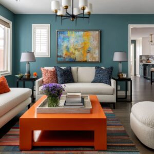
A strong cafecore open plan usually reads as three choices held in one sightline: a counter seat, a lounge seat, and a small table seat. That trio is what makes cafés feel natural for different moods, and the same logic translates well to combined living-kitchen layouts.

The island often becomes the bar. It reads that way when it looks capable of service—substantial top, stools aligned with consistent spacing, and a face that adds a little texture (wood boards, warm paneling, or a finish that doesn’t feel glossy and fragile).
Behind it, the back wall helps when it feels clean and wipeable—tile fields, slab-like surfaces, or a simple pattern that adds rhythm without becoming busy. A small warm metal note keeps the kitchen from turning clinical.

What sells the café effect here is the amount of daily life that’s allowed to show, but in a controlled way. A short rail with mugs, a couple of open shelves with aligned jars, or a niche that holds canisters communicates routine.
The order comes from repetition and alignment, not from hiding everything.

The lounge becomes the linger zone. Deeper seating works because it quietly suggests staying, the way banquettes do in cafés.
A coffee table with real wood character—plank tops, thick boards, organic edges, or a lower shelf—adds the sense of use and weight that café tables have. Styling also works best when it looks plausible: a shallow bowl with greenery, a small stack of books, a tray that could hold mugs.

A rug often acts as the room-inside-the-room that cafés naturally create with furniture clustering. Warm patterned rugs with a worn look tie wood, metal, and upholstery together while adding visual depth without needing bold wall color.
Textiles then finish the lived-in feeling: varied weaves and a mix of textures create that collected tone.

A small two-top changes the atmosphere even when a dining table exists elsewhere. It introduces the coffee-date posture—one mug, one seat, one conversation—and it pulls the room slightly toward hospitality rather than pure residential function.
When it sits near a window, the cue becomes even stronger because daylight at a small table is one of the most recognizable café signals.

The dedicated coffee corner: a micro-scene with real logic
When coffee has its own address, the space stops feeling like a kitchen accessory and starts reading like a station. The backdrop does a lot of the storytelling here because it frames the tools: brick texture, dark paint with texture, subway tile, or a wood niche with long shelves all create a service-wall association.

The station feels convincing when the layout follows use order. Grinder near beans, cups within reach, spoons and sugar grouped, and a clear landing spot for a mug.
Shelves above can read like a back bar when jars line up, cups stack in small clusters, and a few matte ceramics add softness. Greenery helps here not as decoration, but as atmosphere—something that breaks the hard edges and keeps the scene from feeling like equipment on display.

Identity elements work when they behave like real wall art. A large board with a clean graphic layout reads as a café reference because of scale and simplicity, while tiny novelty signs often read as props.

Seating near the coffee zone can quietly seal the vibe. Booth-like forms—tufted upholstery, a compact banquette, a pedestal table—carry the hospitality signal without needing theme décor.
Tufting works because it echoes classic café upholstery in a subtle way.

The living room coffee wall: beverage service meets the social wall
Coffee service can sit on a media wall and still feel cohesive when the console behaves like a service ledge. One side holds the machine, the nearby zone holds cups and tools, and a clear strip stays open for setting down a mug.
Open shelves above work best when spacing and gaps are intentional: cups, bowls, books, and one draping plant in a rhythm that doesn’t crowd the wall.

In cafés, a big rectangle often anchors the composition—a menu board, a feature artwork, a framed mirror. In a living room, the screen can play that role, as long as the surrounding shelves and objects balance it so it doesn’t overpower the wall.
Soft seating with mixed textures supports the social function: the room looks ready for a mug and conversation, not arranged only for photos.

Apartment-scale cafecore: one wall that carries the story
Small spaces can feel café-like quickly because everything sits closer and the lighting can shape zones without much distance. A single wall often does the heavy lifting: brick texture or dark metal shelving with wood planks, a long counter with visible gear, and jars aligned like ingredients.

The café effect strengthens when the seating postures vary even in a tight footprint: counter stools, a small round table, and one soft edge (sofa or banquette). That variety changes the room’s identity; it reads less like a standard living area and more like a place that supports different routines.

Warm pendant light helps here because it creates little islands of glow rather than one overhead wash. Typography-style graphic prints can add identity without requiring complex wall styling, since the graphic contrast already echoes café visuals.

Bedrooms: the bed zone as a private booth
A cafecore bedroom often feels like a reading corner that happens to include a bed. The backdrop carries a lot of that tone.
Wide plank wood, horizontal paneling, or a narrow wood strip paired with shelves gives the bed a booth-like frame and adds material warmth without relying on color.

Bedding often works in the café direction when the base stays bright and simple, and character sits on top through texture—chunky knits, woven band pillows, warm rust and cocoa notes, dusty tones that connect to wood and warm lighting.

Lighting also shifts the feel. Hanging pendants or wall-mounted lights near the bed resemble the intimate booth lighting found in cafés and keep surfaces from getting crowded.
A shallow display shelf can echo café shelf styling when it holds a few books, a leaning framed print, and a small planter with breathing room.

A reading corner version completes the mood: a wall of book spines as texture, warm metal sconces, and one audio object that signals routine and atmosphere. A vintage-pattern rug peeking around the bed ties the whole palette together through subtle warmth rather than wall paint.

Bathrooms: hospitality cues without coffee props
A café-like bath feels welcoming for the same reasons hotel bathrooms do: warm light, a bit of wood warmth, and storage that looks tidy even when items are visible. A vanity wall can carry the bar-wall logic—subway tile or a clean tile field behind a wood base, warm metal hardware, and black accents that outline the composition.

Lighting is the difference-maker. Globe sconces or pendants with warm bulbs create even, flattering mirror light, while harsh overhead-only light tends to flatten everything and make materials look colder.

Open shelves can work when they follow display rhythm: generous spacing, a few ceramics, plants at varied heights, and bottles arranged in neat rows. Amber bottles read like apothecary containers and echo the syrup-bottle look seen on café shelves, while still feeling functional and adult.
Black-framed glass can add that graphic partition cue many cafés use in windows and dividers, and baskets with rolled towels bring in the organized supply-zone feeling without looking like storage overflow.

What tends to break the illusion
Cafecore slips into set-like styling when the room becomes slogan-heavy, when every surface is filled, or when lighting turns cold. Open shelving loses its café order when packaging stays random instead of becoming a repeated container rhythm.
Too many metal finishes at once also blurs the visual system; cafés usually read clearly because the finish language stays consistent.
The layer logic that makes it feel natural
Cafecore builds as a sequence of layers. First comes behavior: a place to arrive, a place to make the drink, and more than one way to sit.
Lighting then shapes those behaviors into zones through warm pools rather than one flat wash. Surfaces and shelves add the service-wall feel through repetition and working clearances.
Textiles and green elements finish the lived-in tone by adding softness where hard lines dominate.
When those layers stack, the home starts supporting the same habits that make cafés feel comforting: arrival, routine, and a few easy ways to stay.
Related Posts
Harmony Home Design brings 10+ years of residential interior design experience to the ideas shared here. We publish design concepts, layout thinking, and practical styling notes.