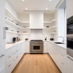
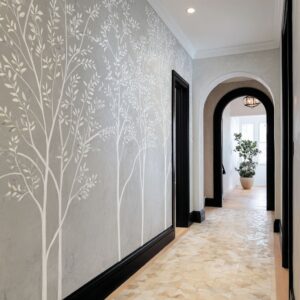
A luxury Scandinavian-inspired entry design does not try to impress with lots of decor. The impression comes from a calm sequence that feels planned: a durable landing surface, a clear place to sit, storage that disappears into flat planes, and light that lands exactly where hands and eyes need it.
The palette stays quiet—warm pale wood, soft off-whites, light greige cabinetry, pale stone—so the room can show its quality through texture shifts: woven fibers, brushed metal, veined marble, matte plaster, and greenery.
In such entryways, luxury isn’t created by adding more objects. It’s created by making the everyday routine look intentional: arrive, slow down, set down a bag, remove shoes, hang outerwear, move deeper into the home.
The best versions feel calm even when they’re actually used.
The entry as a small landing zone
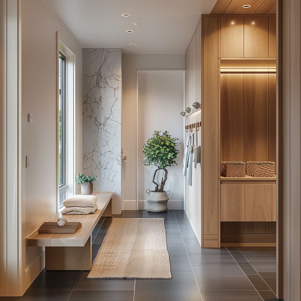
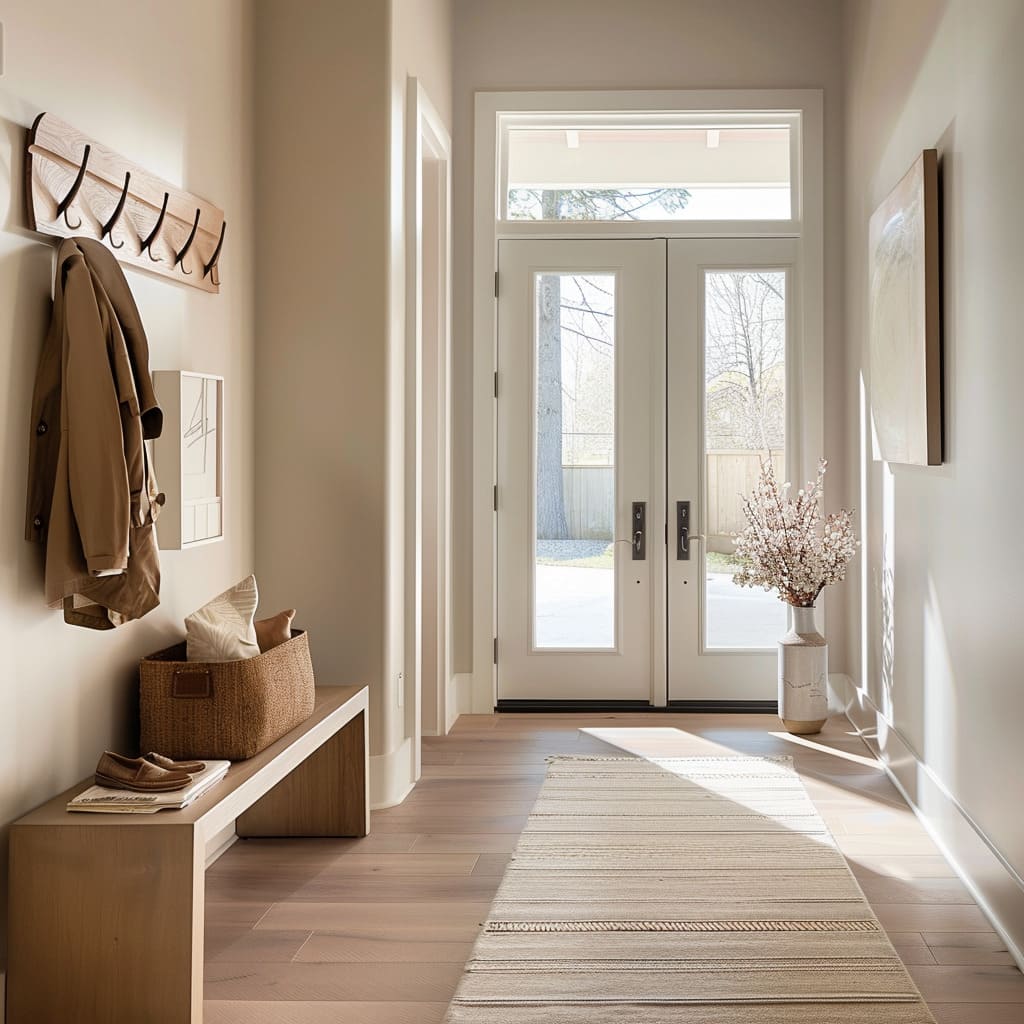
If a Scandinavian-inspired entry is shaped like a corridor, it doesn’t feel like a passage. It feels like a small room with a purpose because the circulation line is protected.
Built-ins stay tight to the wall line, benches don’t steal walking width, and storage fronts form clean vertical planes that keep the scene visually steady.
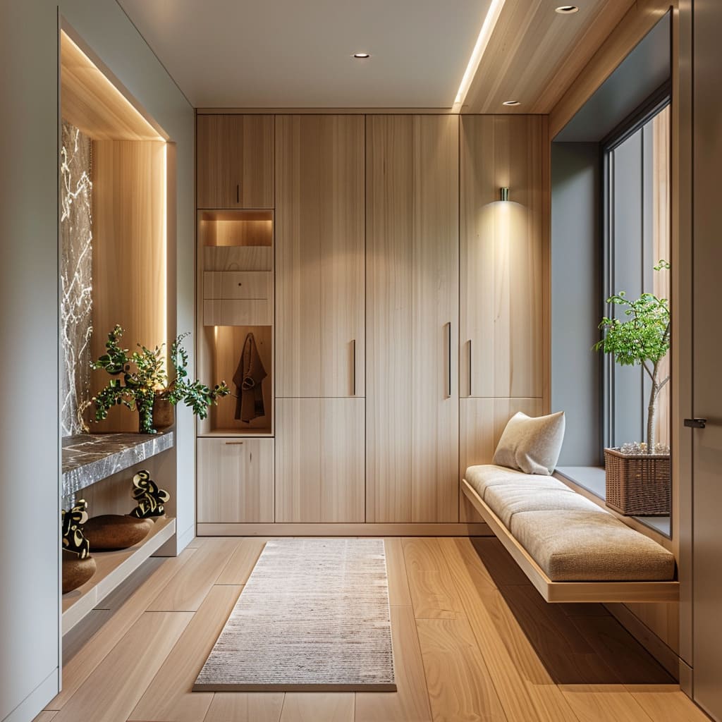
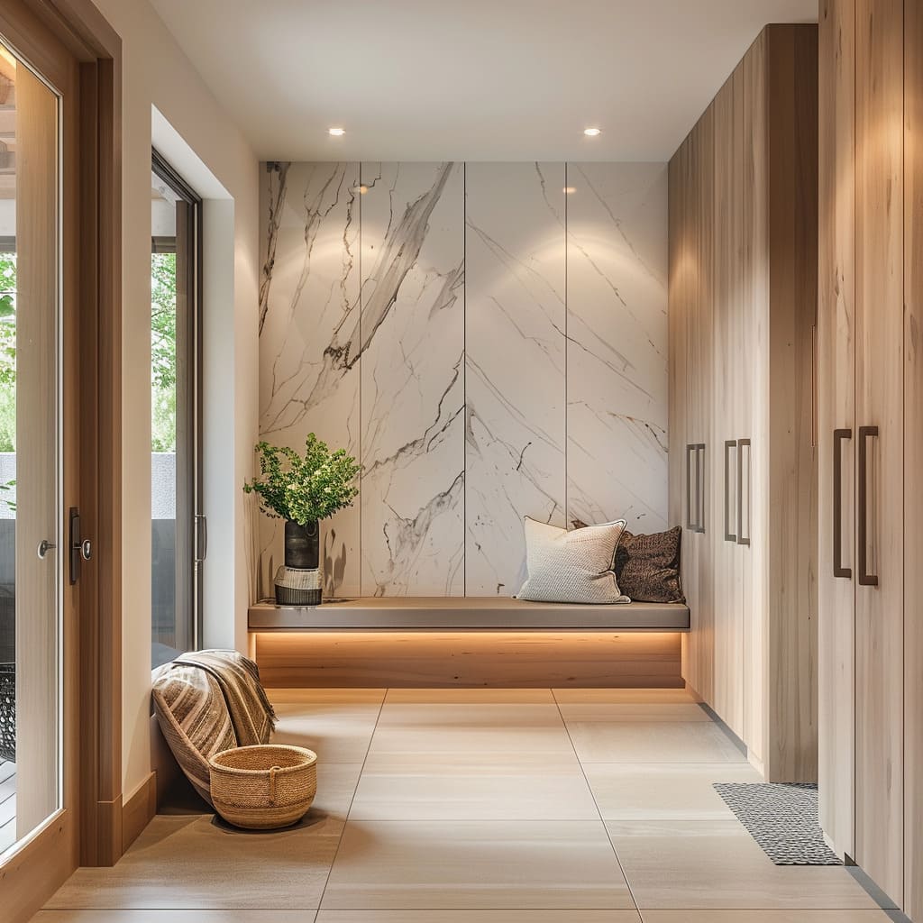
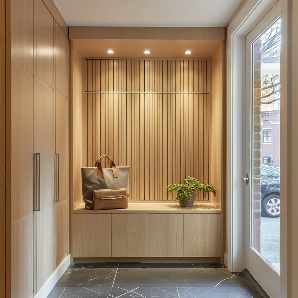
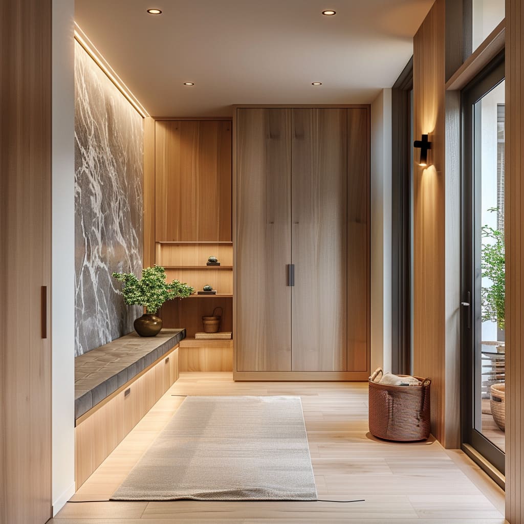
A common move is a storage wall on one side—full-height wardrobes with flat fronts, long linear pulls, and disciplined seam alignment. The doors are often split with a thin horizontal break line near the top, which reduces the feeling of one giant slab and makes the proportions feel calmer.
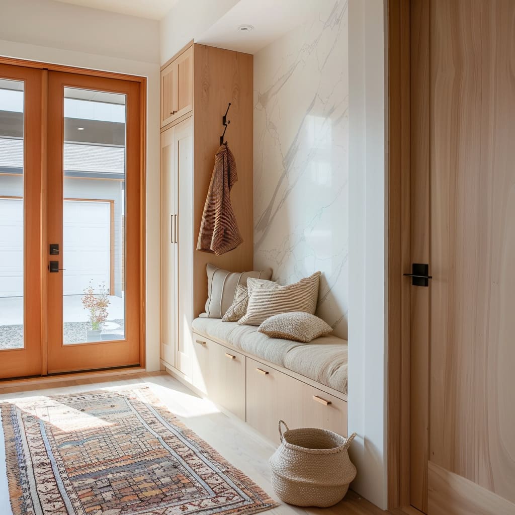
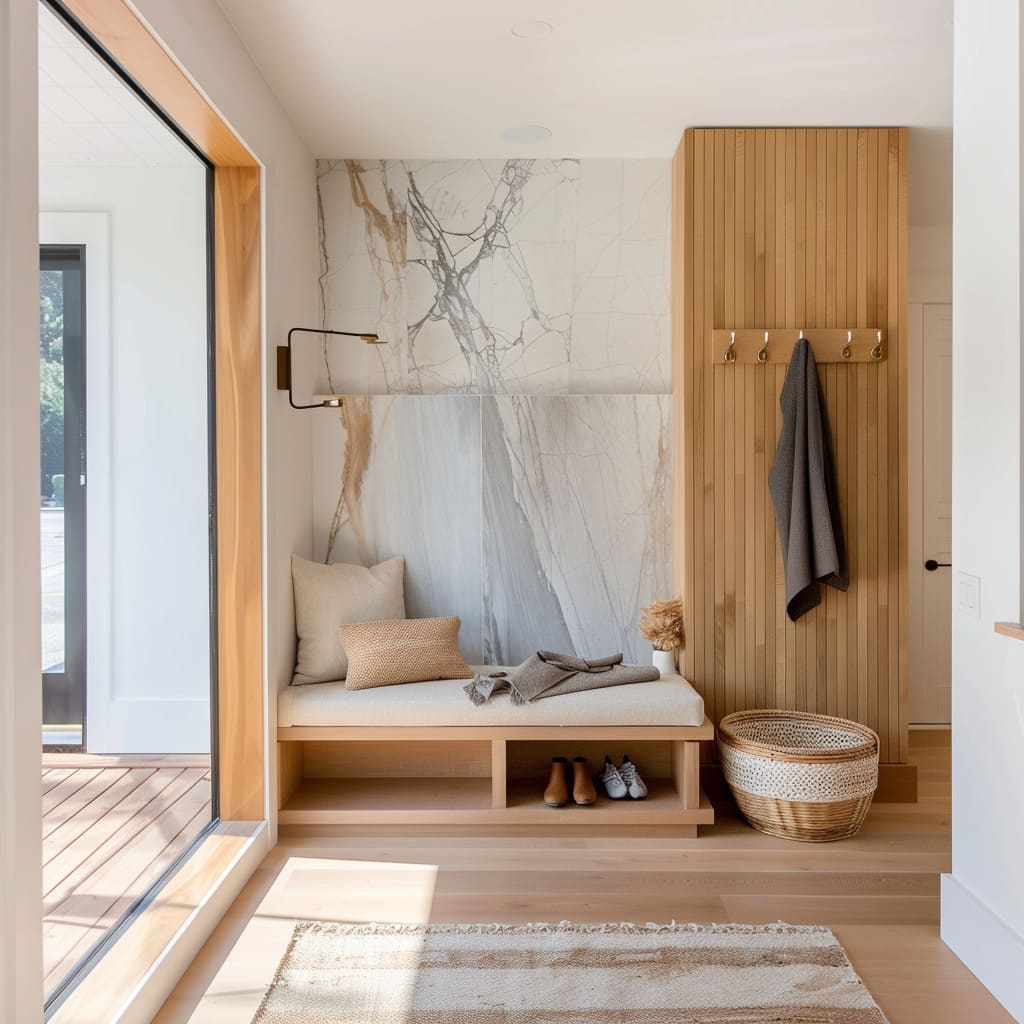
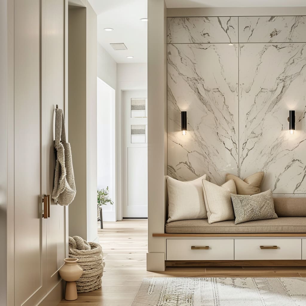
Opposite that, the seating wall takes over as the soft pause point: a bench, a cushion, a few textiles, and one strong backdrop material.
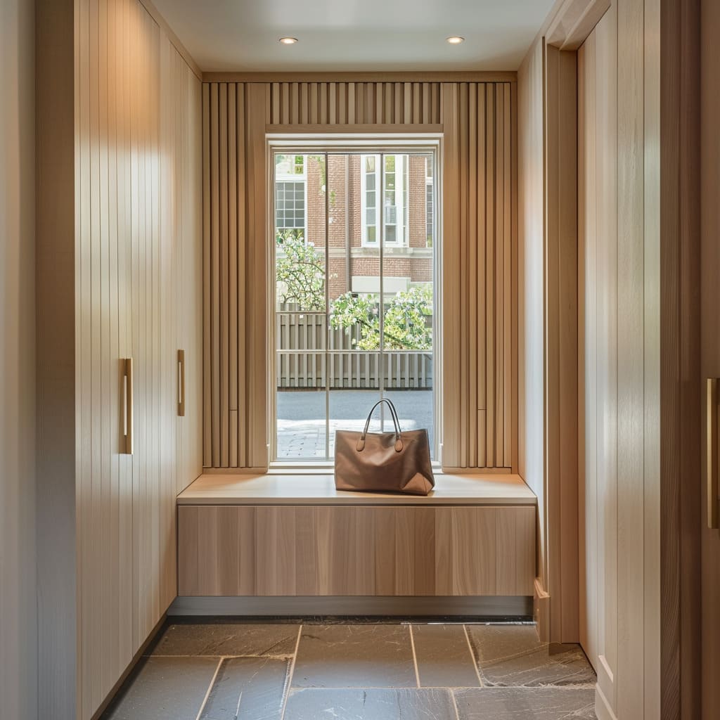
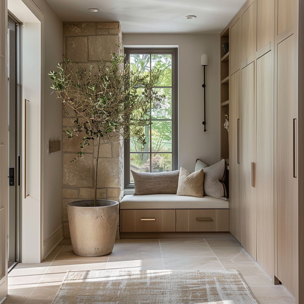
Even in compact layouts, the same logic works. Tall cabinets on both sides can form a narrow corridor that ends at a window, turning the end view into the emotional center.
The bench under that window becomes the daily workhorse, while cabinetry handles the clutter behind closed faces. The interior design feels tidy fast because symmetry is baked into the plan: cabinet-to-cabinet spacing, bench centered under glazing, handles placed at consistent heights.
Marble and stone as artwork
In luxury Nordic entry design, stone often replaces framed art. The effect depends on scale.
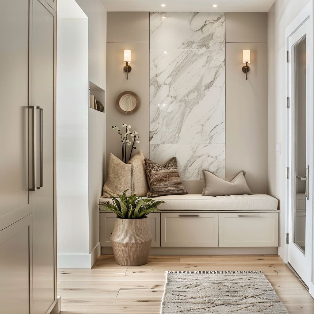
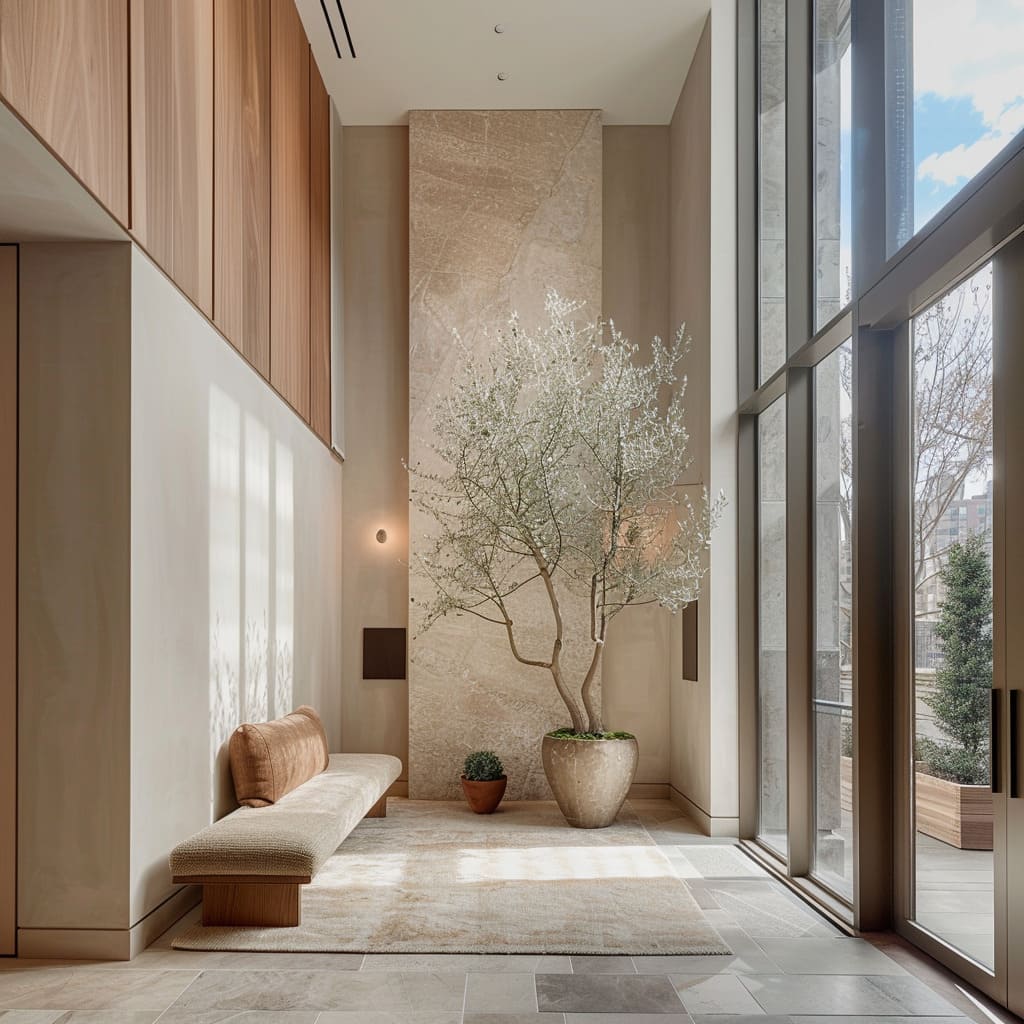
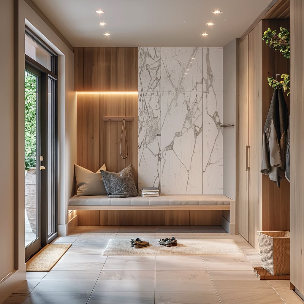
Large panels—marble broken into big rectangles or stone laid in oversized slabs—avoid the busy look that small tile grids can create. A single tall marble composition behind a bench can carry the entire wall because the veining provides movement, almost like a landscape drawing, while everything else stays restrained.
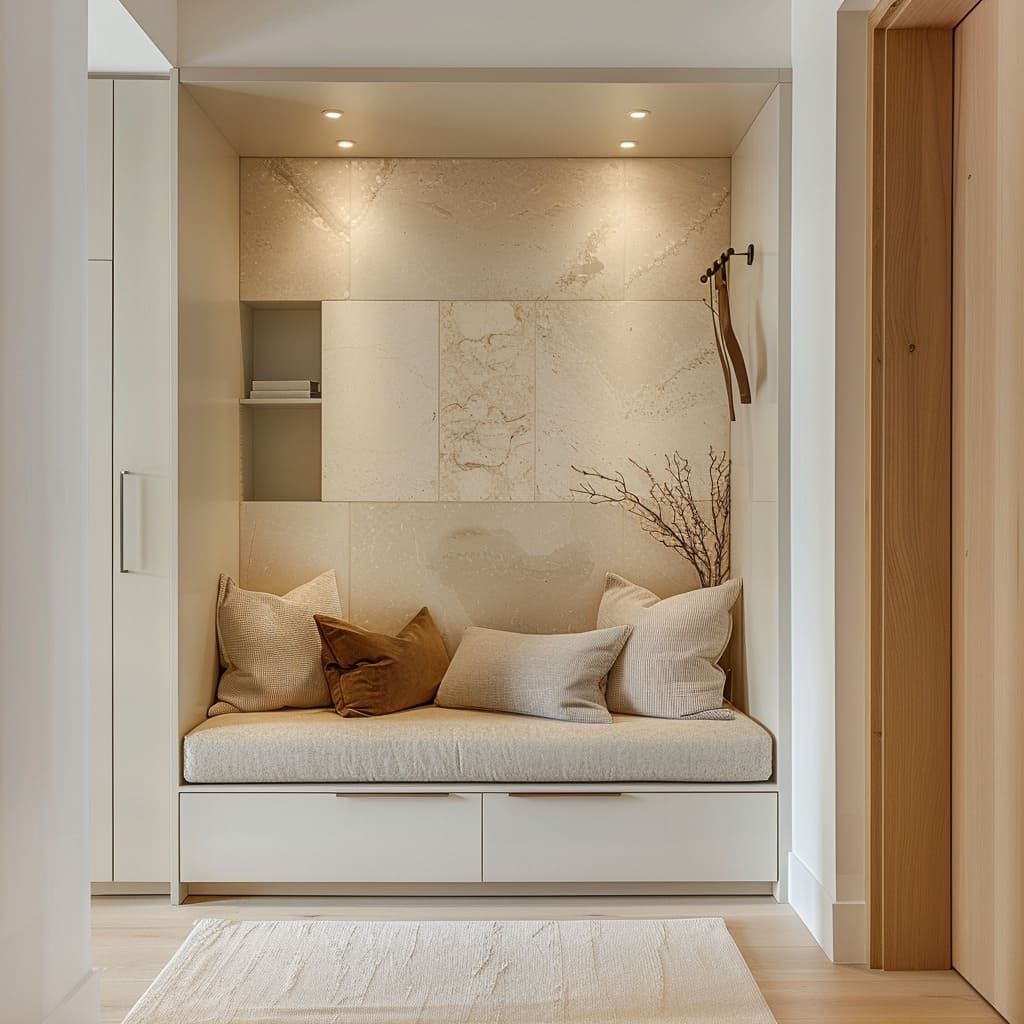
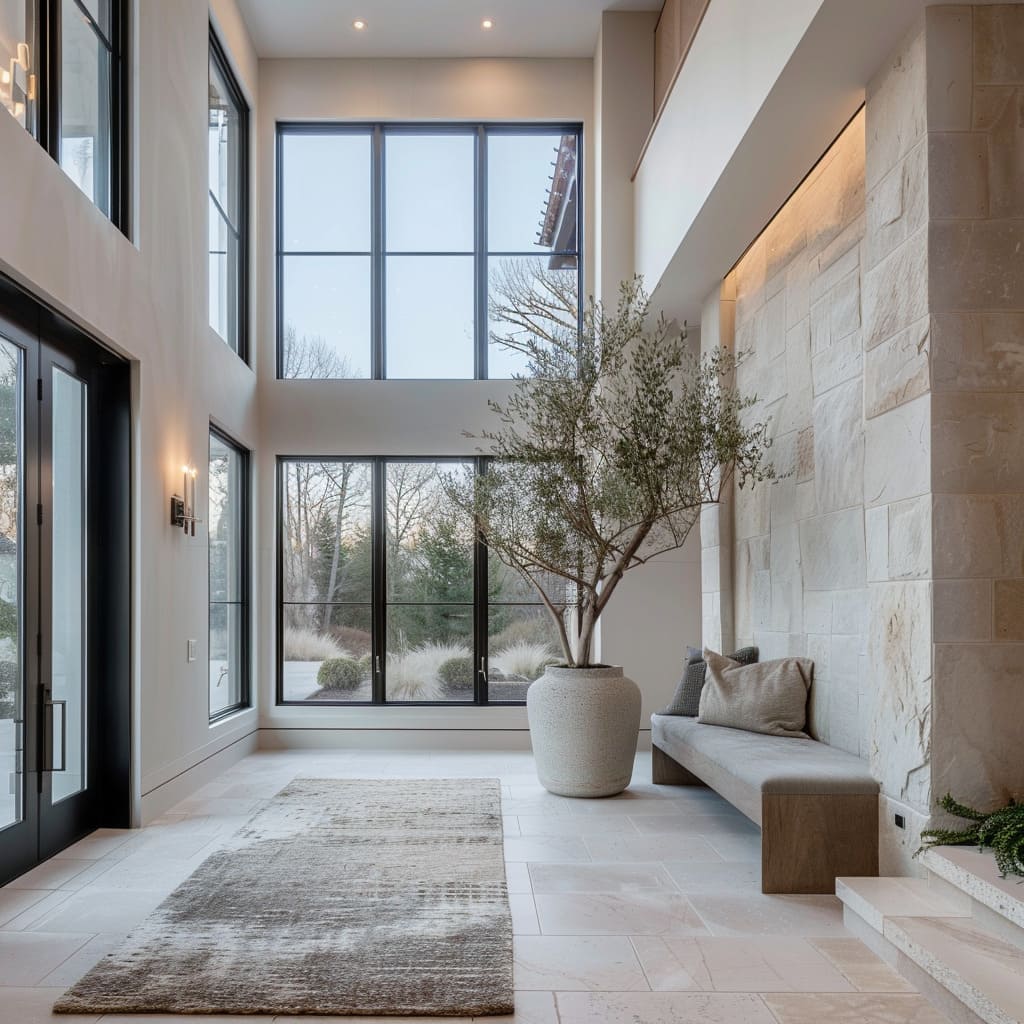
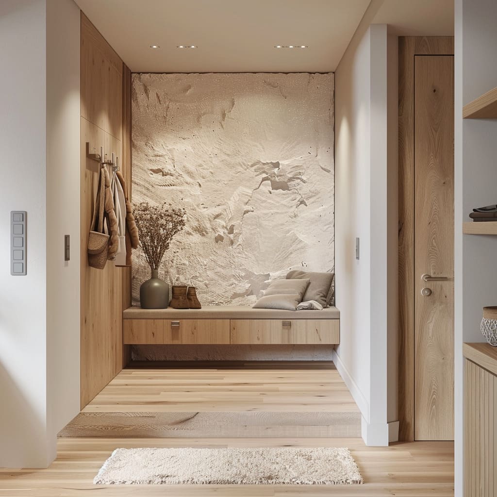
Some versions can lean into marble with diagonal or branching veining that becomes the only strong visual motion in the space. Others use limestone or warm-beige stone in large blocks, where the interest comes from faint mineral variation and the way light grazes tiny surface texture.
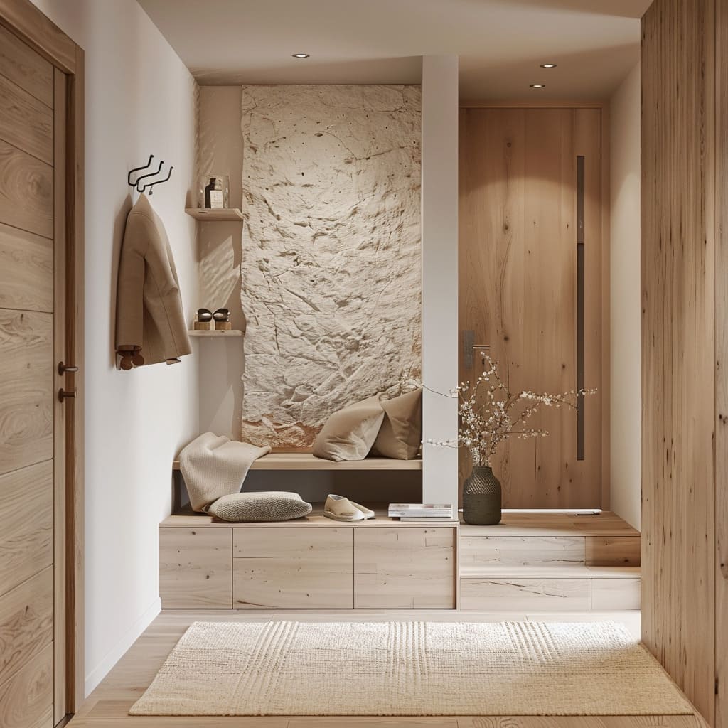
Even rougher stone can work, but the joints stay crisp and controlled so the wall feels intentional rather than rustic.
A very specific luxury move is using stone in a monolithic way: one tall slab at the far end of a long, glass-lined entry, framed by plain wall areas with minimal trim. That one panel becomes the anchor for the view line.
It holds the end of the corridor the way a painting might, except it feels architectural and permanent.
Backlit stone panels
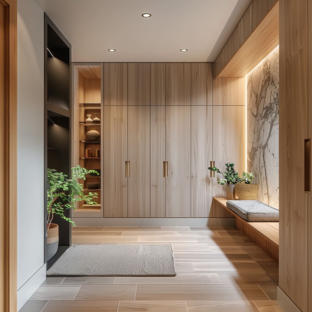
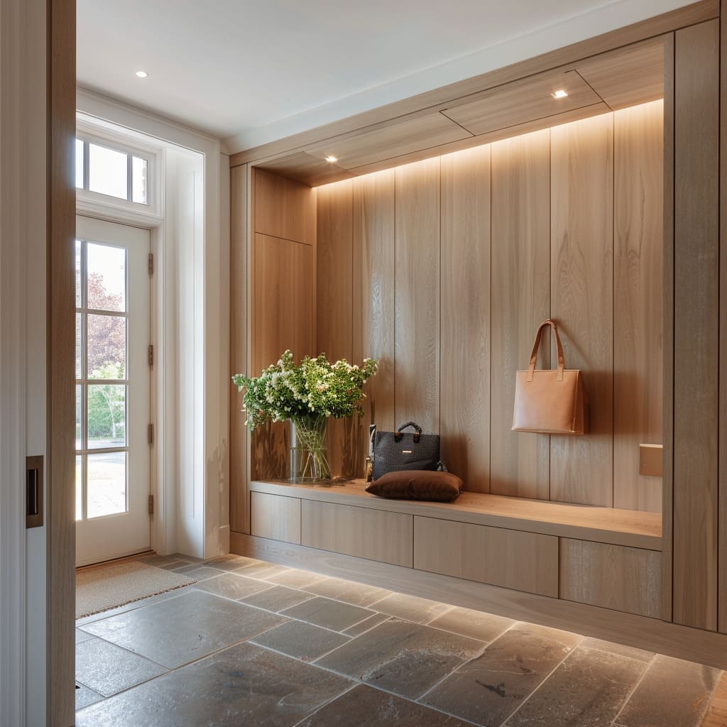
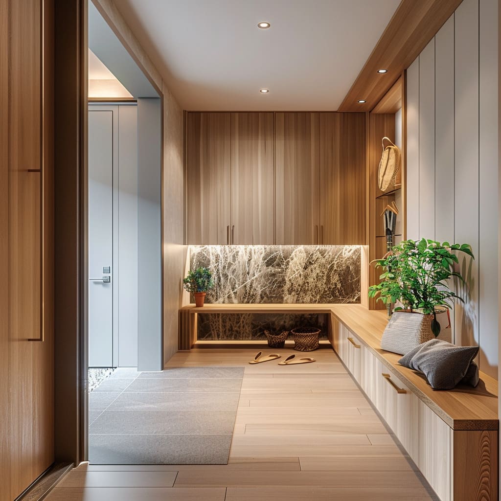
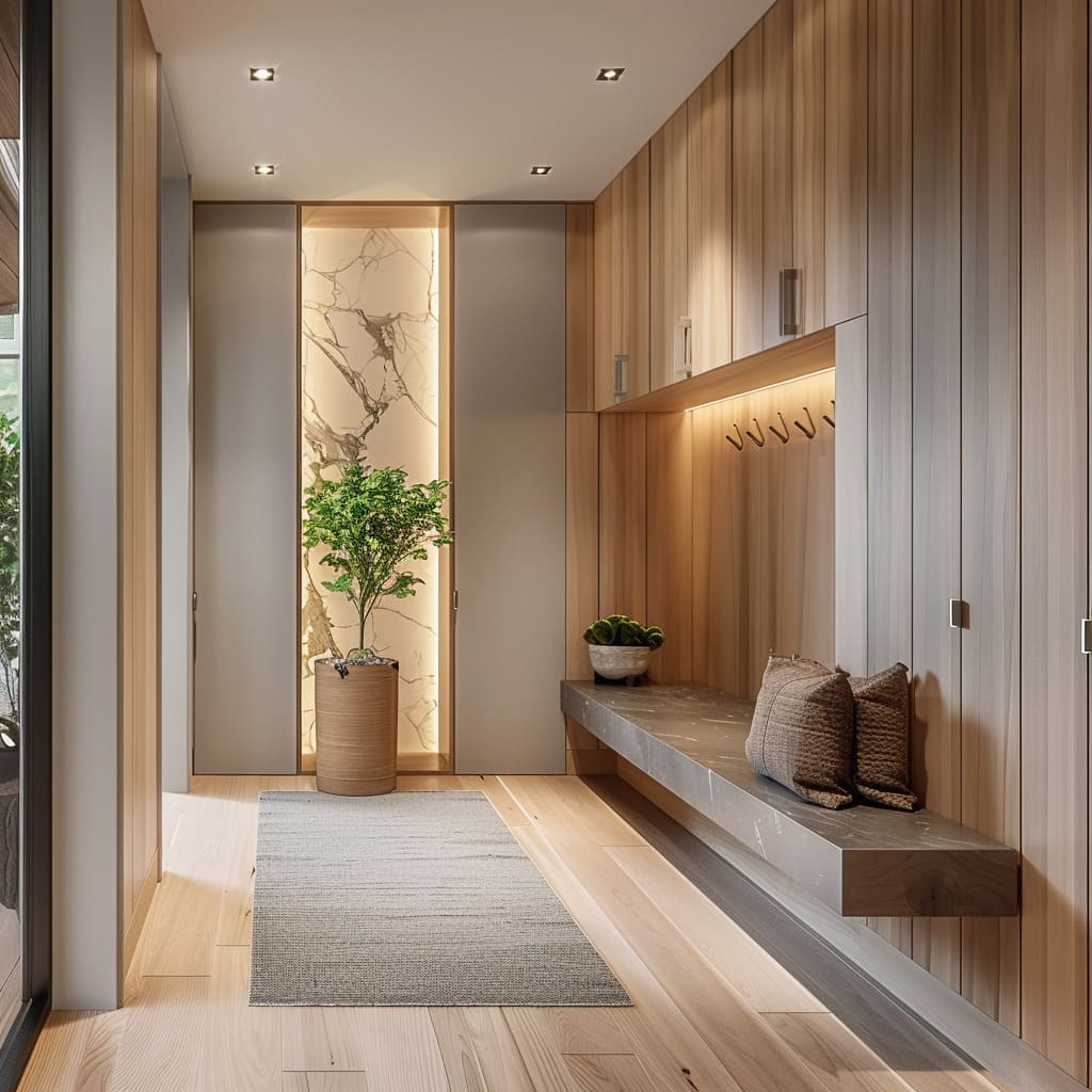
Backlighting is one of the clearest signals of modern Scandinavian luxury because it adds depth without adding clutter. A concealed strip outlining the edge of a stone panel creates a gentle halo that separates textures: wood in front, stone behind, light in between.
The glow does three things at once:
- It turns stone into a focal surface at night without needing more décor.
- It softens the room’s contrast so pale walls and wood don’t feel flat after sunset.
- It makes the panel feel placed, like it has its own boundary and importance.
The backlit element can be a stone feature behind a bench, pushed forward by a subtle perimeter glow. In others, the light is concentrated as a top wash—an LED line near the upper edge of a stone slab wall—so the surface gains a soft gradient rather than a sharp spotlight.
This is why those stone walls can feel gallery-like without being cold: the light is warm, indirect, and controlled.
Floating bench glow
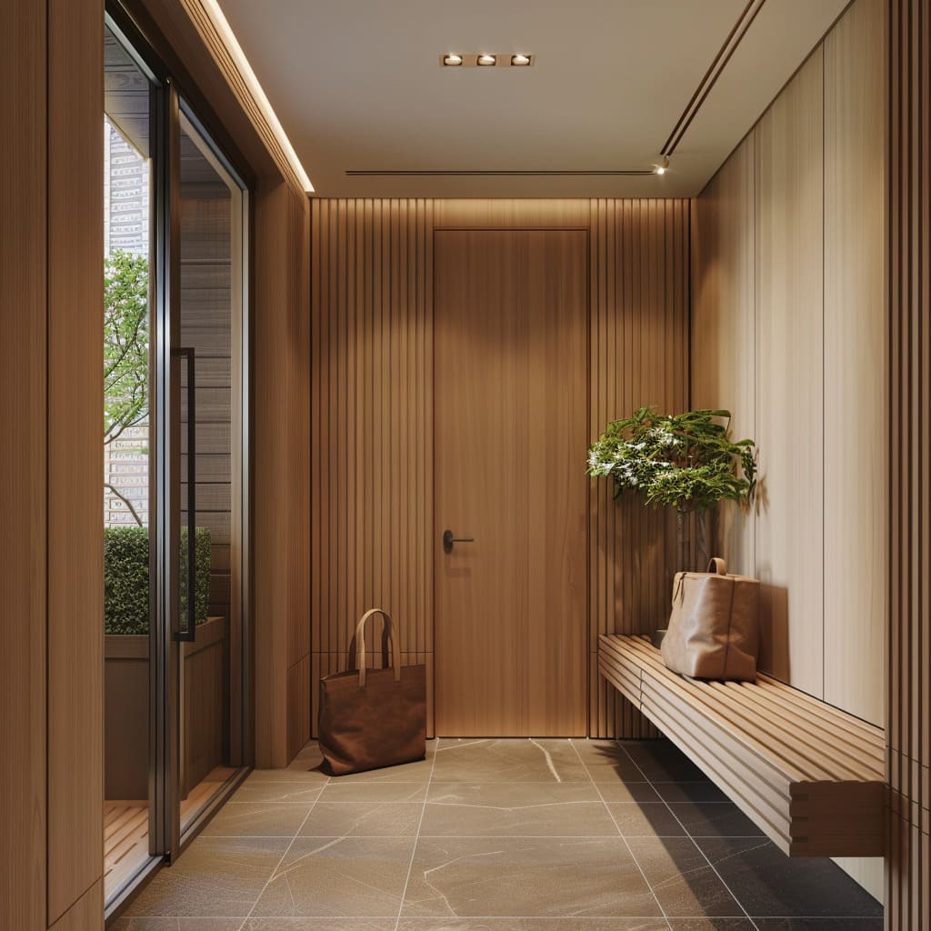
A bench that appears to float changes the atmosphere of an entry immediately. The shadow gap under the seat keeps the floor plane continuous, which makes narrow corridors feel wider and makes double-height spaces feel less heavy at the edges.
When under-bench lighting is added, the bench stops feeling like a block and starts feeling like a calm, hovering line.
That underglow also solves evening usability without turning on harsh ceiling light. In practice, it creates a low-level guide that helps with shoes and bags and reduces the bright box effect many entries suffer from.
The glow is most successful when it’s warm and hidden—light is felt more than seen—so the bench stays minimal even while the lighting feels rich.
Some designs combine under-bench glow with a marble feature wall behind, creating a layered stack: veined stone as the backdrop, upholstered cushion as the touch surface, light as the separator, and pale stone tile or wood planks as the base.
Built-in seating
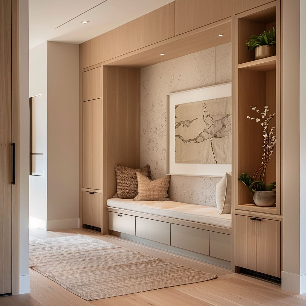
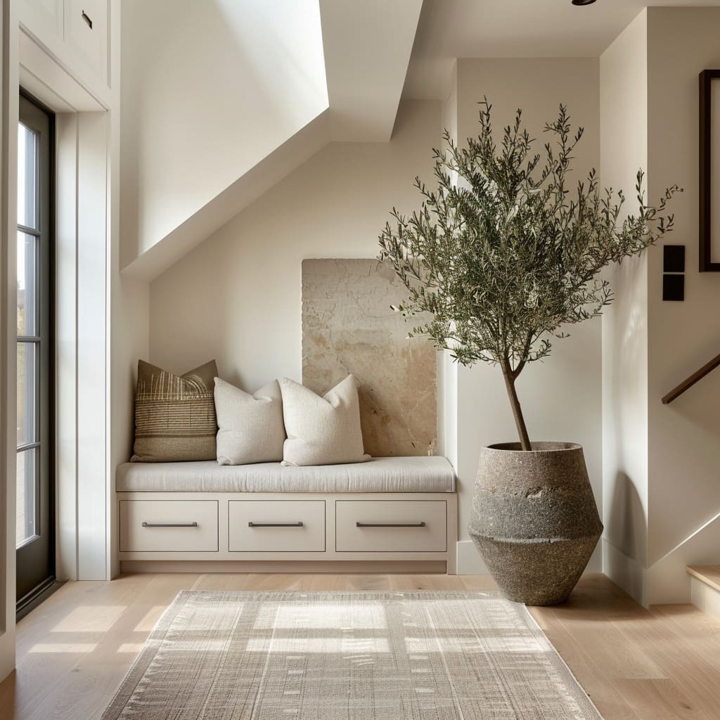
Seating in Scandinavian-inspired entries is not treated as decorative furniture only. It’s treated as architecture: a bench tucked into a niche, a long line along a wall, or a window bench that turns daylight into comfort.
The cushion choice matters because it sets the tone of use. Many luxury ideas avoid overstuffed seating and use firm, tailored cushions with crisp edges.
The result feels clean and easy to maintain, and it also makes standing up and tying shoes feel practical. Pillows provide the softness, but they stay within the same neutral family—cream, oatmeal, beige, warm camel—so the layering adds depth without turning into visual noise.
Texture differences do the work: a chunky woven pillow paired with a smoother linen-like one, a small patterned cushion that stays low-contrast, and sometimes one deeper tan or camel accent that anchors the seat visually. That single darker note can echo nearby wood or a leather bag and prevents the bench zone from feeling washed out.
Hidden storage that doesn’t look bulky
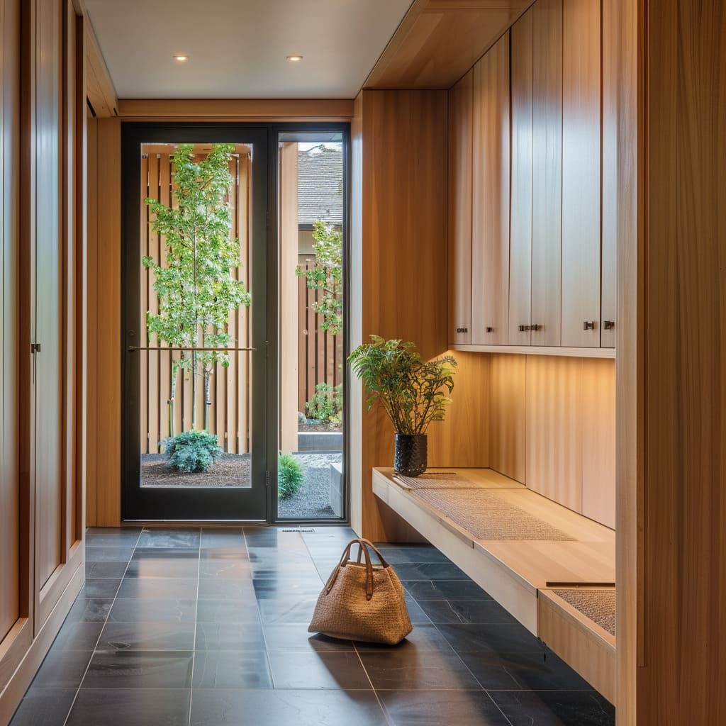
Luxury Scandinavian entry storage tends to disappear into flat fronts and consistent alignment. Tall wardrobes read like a calm wall, not a collection of doors, because the pulls are disciplined and repeated in a steady rhythm.
Under-bench drawers often repeat the same language—flat panels, thin shadow gaps, minimal hardware—so the bench base feels integrated rather than tacked on.
Even in entries with lots of storage, designers often break the mass once, on purpose. A narrow open niche with warm lighting, a few drawers, and a small hanging zone creates a micro-station for daily essentials: keys, a light jacket, a bag that gets used constantly.
The rest of the volume stays closed, which keeps the room visually calm even on busy days.
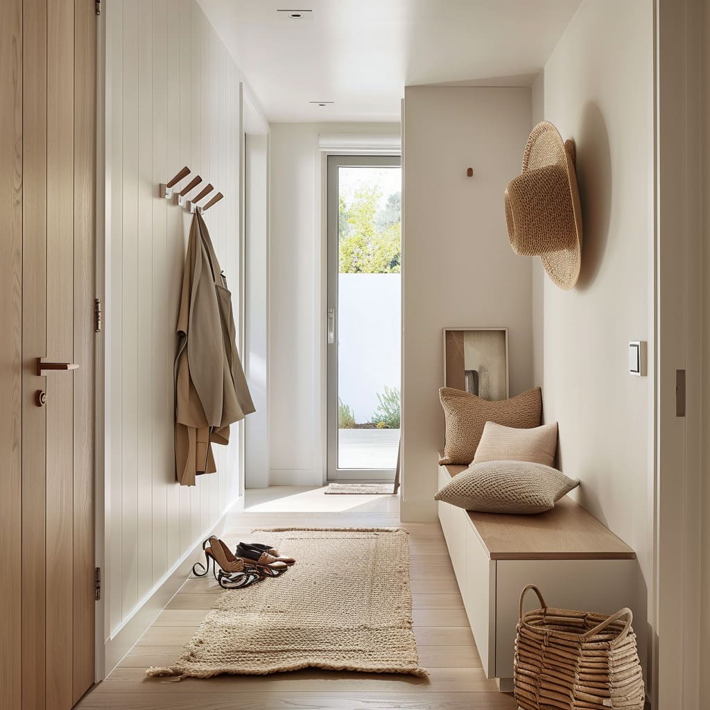
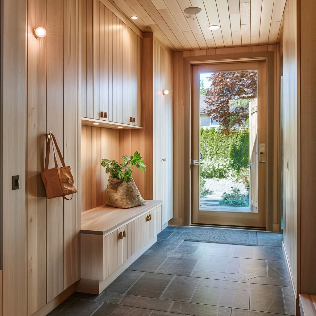
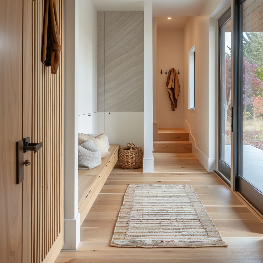
Natural-fiber baskets show up repeatedly because they solve messy categories without making the entry feel like a utility closet. Two baskets in an open cubby can hold gloves, dog leashes, mail, and scarves while still looking intentional.
A woven planter or basket near the bench links storage to décor in a believable way: it’s functional texture, not decoration for its own sake.
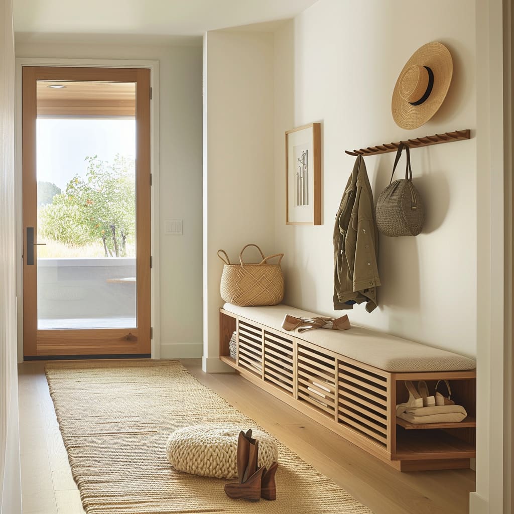
Ventilated shoe storage is another practical luxury detail. Slatted fronts or ribbed wood profiles let the storage feel lighter and hint at airflow, while the visual rhythm of slats adds shadow texture that still fits a minimalist palette.
Lighting hierarchy
The Scandinavian lighting pattern is a clear hierarchy:
- Recessed downlights provide functional brightness and stay visually small. The spacing is restrained, not a dense grid.
- Wall sconces or niche lighting create warmth at human height, so the entry feels welcoming rather than overlit.
- Concealed LED strips add depth: behind stone panels, under cabinets, along bench zones, or within ceiling recess lines.
Wall sconces often show up as a symmetry move: two matching sconces flanking a marble panel. Cylindrical shades or slim vertical fixtures give a hotel-like balance without looking ornate.
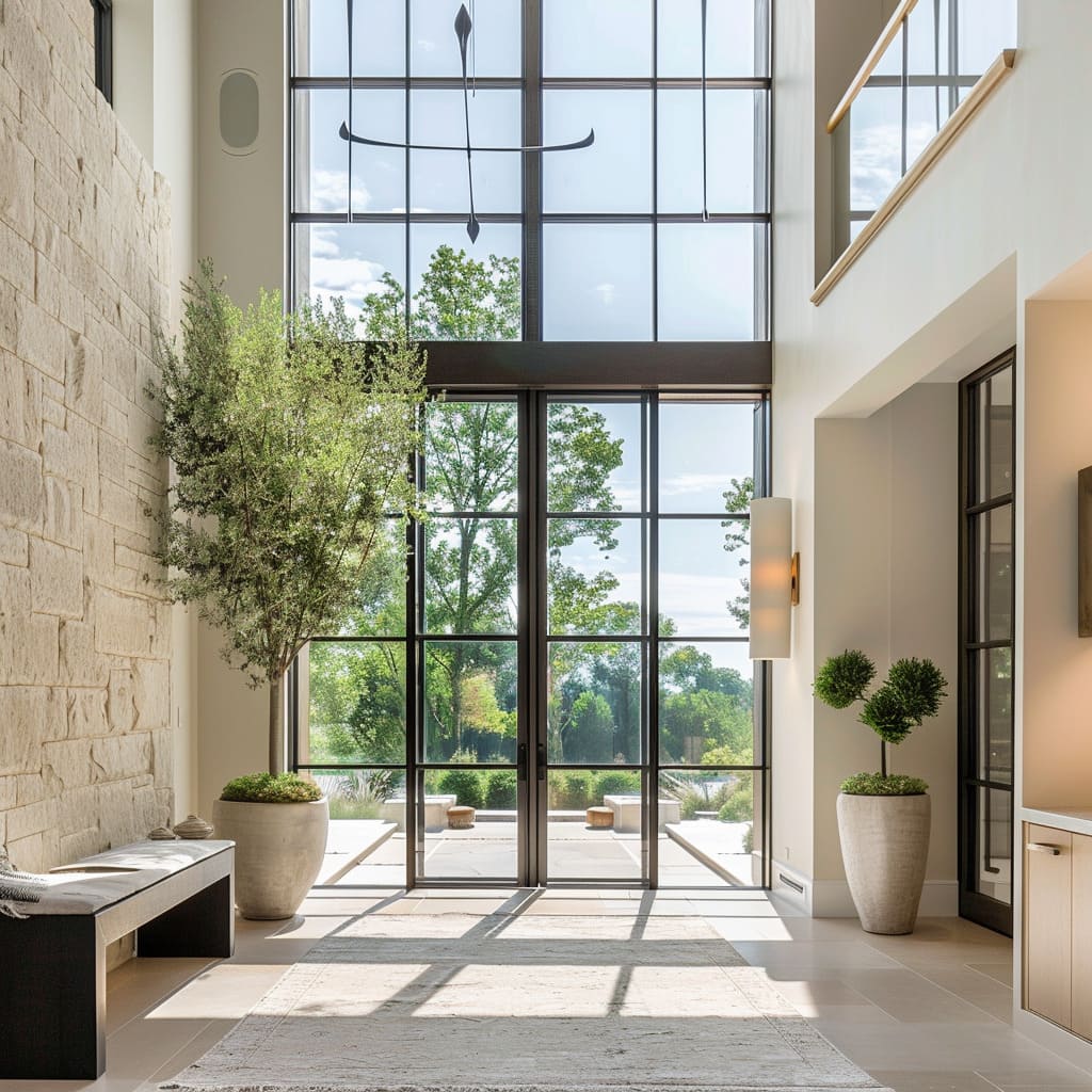
In larger foyers, sculptural pendants can appear, but the successful ones stay airy—thin arms, minimal mass—so they don’t block daylight or compete with black window grids.
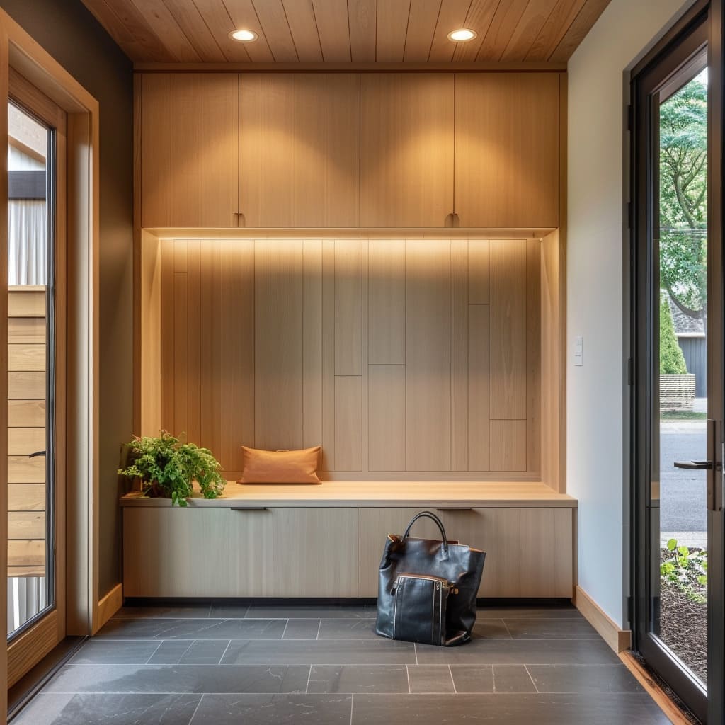
In compact niches, small downlights inside the recess do a lot of work. They wash textured plaster or stone, turning the back panel into the feature while keeping the rest of the room simple.
That same approach shows up in wood-lined bench bays where small spotlights in a soffit highlight the bench surface and the few objects placed there.
Daylight and black window grids
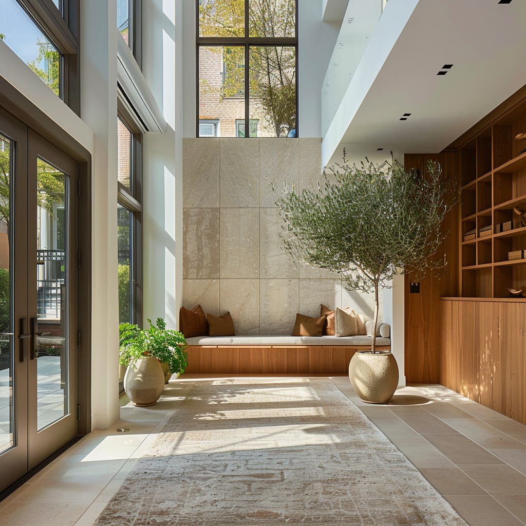
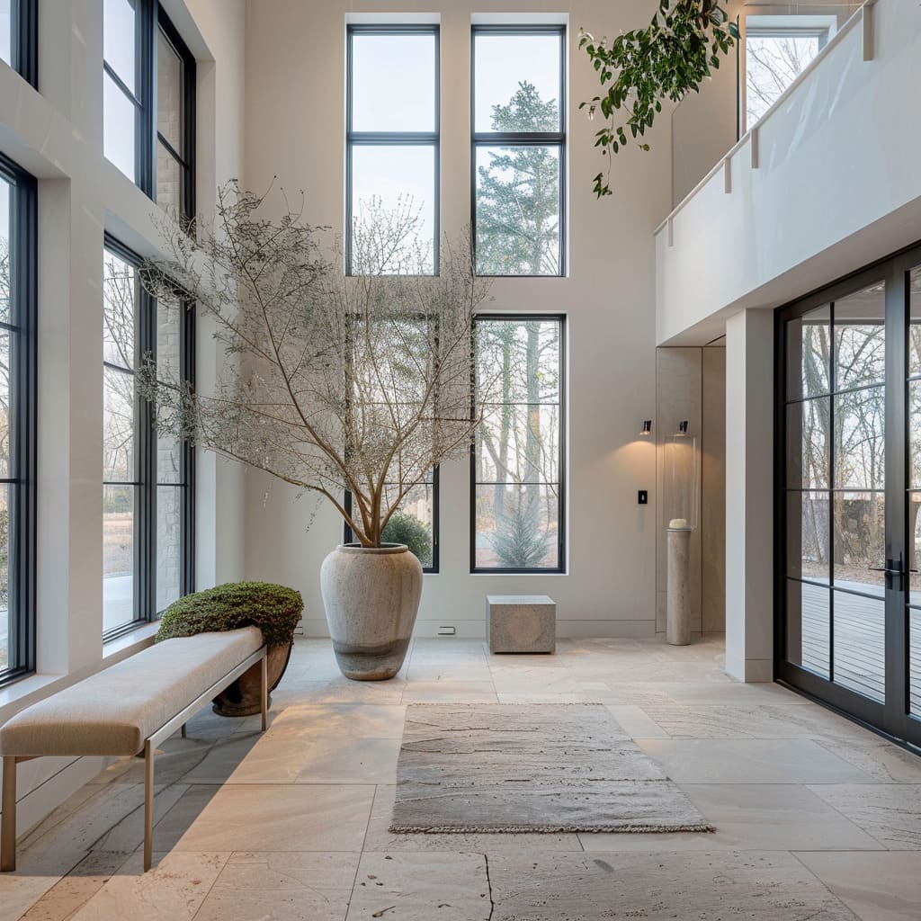
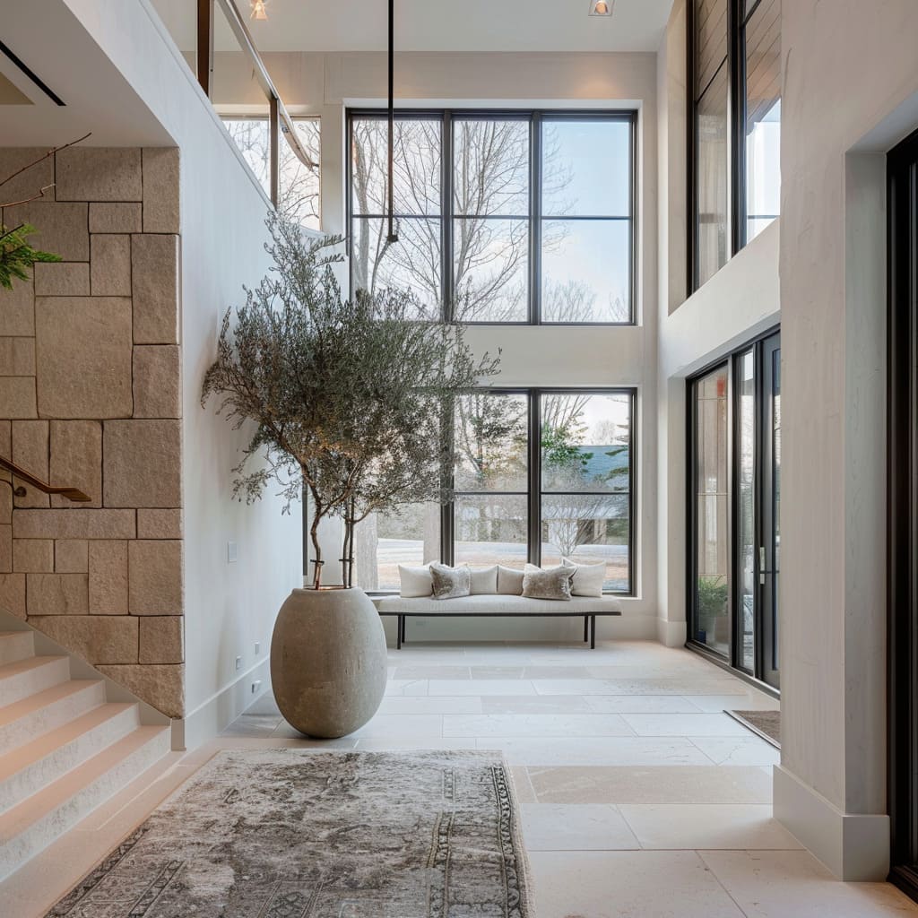
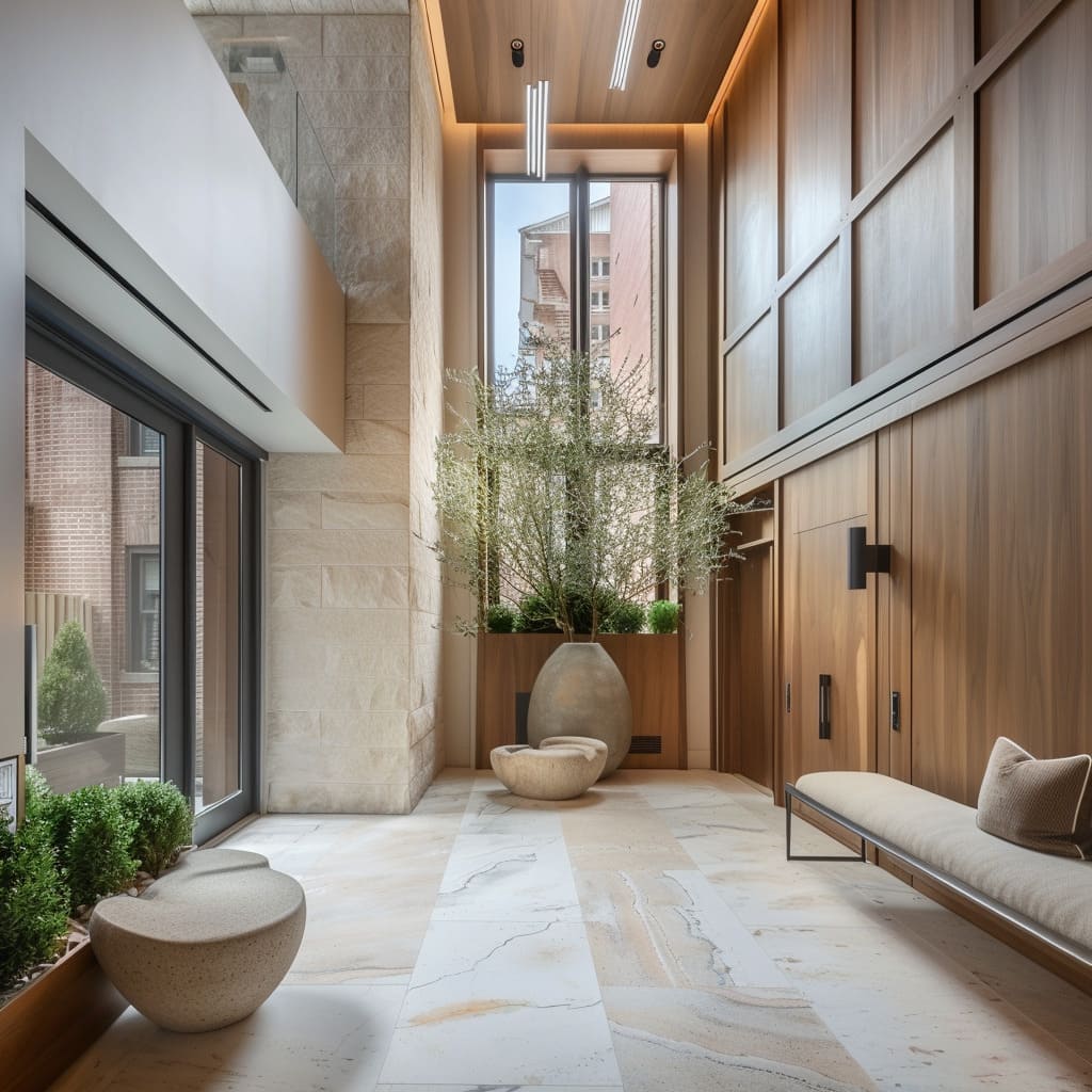
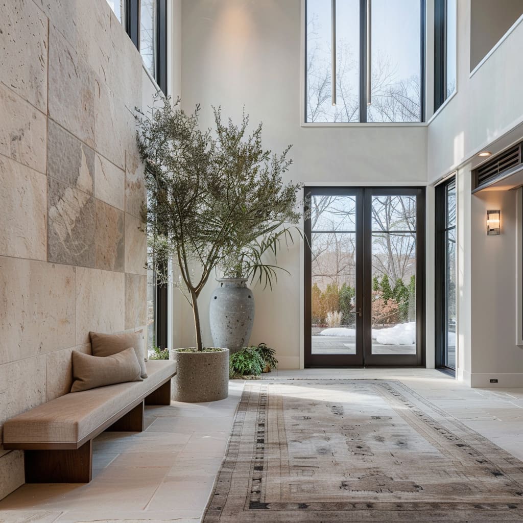
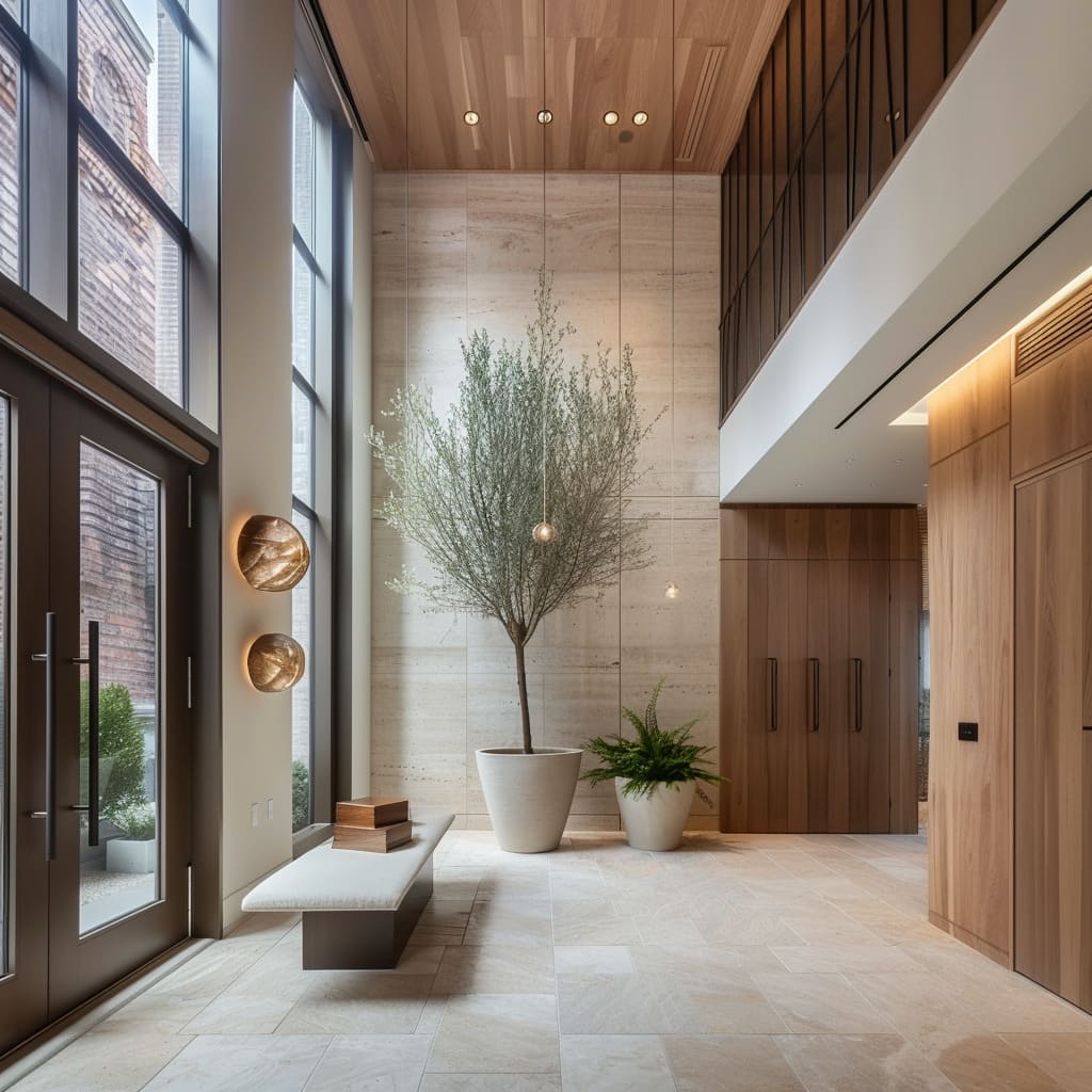
In luxury Scandinavian-inspired foyer ideas, the strongest design element is daylight itself. Double-height glazing with black mullions creates a graphic structure that organizes the volume.
The grid gives shape to all that light and makes pale walls feel crisp rather than empty. Outdoors—trees, winter branches, greenery—becomes the living backdrop, which is why interior palettes can remain restrained without feeling dull.
This is also where stone and plants earn their place. A pale stone floor catches the light softly when it’s matte, and shadows from window grids become a moving pattern through the day.
The room feels active without any added décor. In long, glass-sided corridors, the outdoor view becomes the endpoint, pulling the eye forward and preventing a tunnel feeling.
Indoor trees and large planters
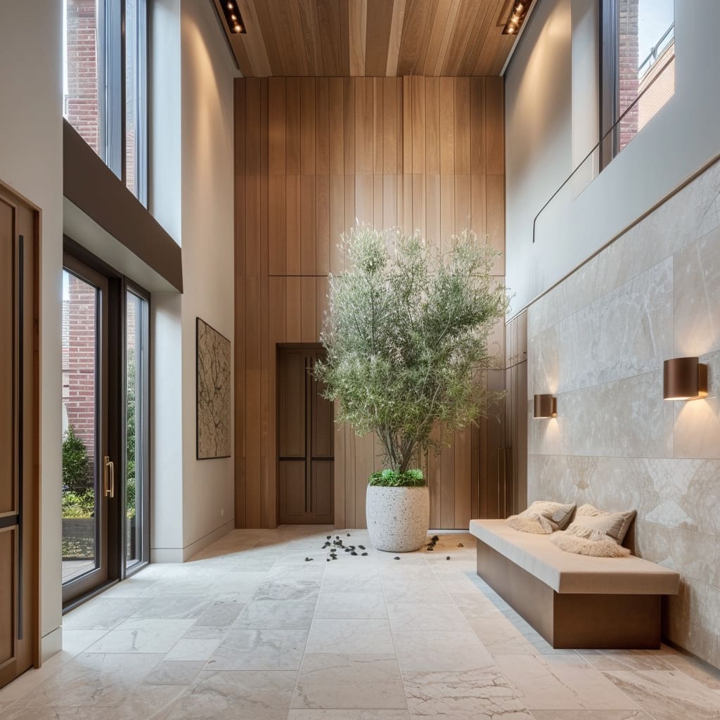
One mature indoor tree can do what a chandelier usually does in a large entry: it occupies the vertical space, softens hard geometry, and becomes the emotional center. The key is scale and silhouette.
A trunk that splits low and branches into fine, airy foliage fills height without blocking sightlines. The planter tends to be oversized, rounded, and matte—stone-like ceramic, concrete look, or textured clay—so it feels grounded against pale stone floors.
Smaller companion plants often appear as a second note: a lower planter near the door zone, or a smaller terracotta pot near the main tree. That pairing creates a height rhythm—low and tall—so the planting doesn’t feel isolated.
In entries where stone walls act as the anchor, the tree often sits near that wall so branches cast soft shadows on the surface, turning light behavior into part of the composition.
Flooring logic
Luxury Scandinavian entry floors tend to follow two main strategies:1) Pale stone tile in large slabs for a calm, upscale base that can still handle traffic. Minimal grout lines reduce visual noise, and a matte finish keeps the light gentle.
2) Dark stone or slate-like tile in mudroom-style entries where wet shoes are a daily reality. The dark base grounds the wood and hides dirt better, while straight grout joints keep the look disciplined.
Many designs add a runner to define the walking lane. The runner is usually low-contrast, with a subtle stripe or tone-on-tone pattern, so it supports the quiet palette.
In long corridors, the runner stretches the perspective and clarifies the path. In larger foyers, a bigger rug is sized like a real zone rather than a doormat, softening acoustics and giving the bench area a clear pause surface.
Some entry suites use a clear flooring transition to separate wet and clean areas: a soft mat or darker landing zone near the door, then light wood planks deeper inside. The boundary is felt underfoot and understood visually, without signage or extra decor.
Why Scandinavian-inspired entryways feel expensive
The common thread is discipline. Marble and stone appear in big, calm pieces instead of busy fragments.
Storage is generous but hidden behind consistent fronts. Benches look integrated, with shadow gaps and clean edges that keep the space light.
Lighting is layered so evening comfort comes from glow and wash rather than glare. Natural fibers and greenery supply softness, but the object count stays low, so each item looks chosen instead of stored.
In the end, the luxury Scandinavian-inspired entry is a quiet system. It turns daily routines into a composed scene: stone for weight, wood for warmth, textiles for touch, light for depth, and nature for life—held together by alignment, negative space, and a palette that lets material quality do the talking.
Related Posts
Harmony Home Design brings 10+ years of residential interior design experience to the ideas shared here. We publish design concepts, layout thinking, and practical styling notes.
