
Curved furniture changes a room in a way straight furniture almost can’t: it gives the eye one continuous outline to follow, and it gives your body a safer, smoother way to move. In many homes, that single outline ends up doing the planning work people usually try to solve with partitions, extra rugs, or too many small pieces.

Think of a curved sectional as a drawn line on the floor plan. Once that line is in place, the rest of the decisions become easier: where the walking lane belongs, where the coffee table should sit, which direction the seating faces, and how the kitchen and living zone can share one open space without feeling like a corridor.
Below is a practical way to use curved furniture with confidence, grounded in the same patterns that keep showing up in successful open plans, loft shells, and modern bedrooms.

One dominant curve can do most of the planning
In open plans, the curve replaces partitions without building a wall
In open living–kitchen layouts, straight sofas often create two common problems at once:
- They feel like a barrier when placed in front of the kitchen.
- They turn the room into a long rectangle that pushes your eye straight into cabinetry.
A curved sectional fixes both. Instead of making a hard back line, the sofa becomes a soft boundary.
You still get separation (lounge in front, kitchen behind), but you don’t get the stop-sign feeling of a straight edge.

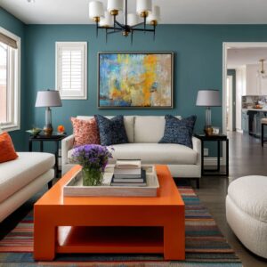
This idea is especially clear in the bright open-plan design concept where the sofa forms a wide crescent facing the kitchen. The rounded ends remove the classic sharp corner that catches circulation.
You can approach the seating from the window side, from the kitchen side, and from a side walkway, and it still feels natural. That matters in real homes where people don’t enter the living area from one perfect direction.

The curve quietly improves conversation
A straight sofa often seats people in a line that aims outward. A curved sectional shifts the seat angles slightly inward.
That small rotation changes the entire social behavior of the room:
- People naturally face the center instead of lining up parallel to a wall.
- The center becomes the shared focus even if there’s no TV wall in sight.
- The seating group feels like a gathered pocket rather than furniture floating in a large footprint.

Look at the long arc layouts: even when the background is minimal (one oversized artwork, one shelf zone), the room still feels planned because the seating is one continuous gesture. The arc creates enclosure without closing the space.

In loft shells, the curve calms harsh geometry
Lofts tend to have visual noise built into the shell: beams, ducts, brick surrounds, heavy window grids, and long sightlines that can make furniture feel small. In that setting, a curved sofa works differently than it does in a sleek open plan.
It becomes a smooth foreground outline that holds the eye steady while the architecture stays busy. A low, long curved sofa in a nubby cream fabric, for example, can sit in front of columns and beams and still feel like it belongs because it gives the room a single human-scale shape to anchor the living zone.
In industrial rooms with brick and steel grids, the same logic holds: one serpentine sofa becomes the main counter-shape against all the rectangles. The shell stays rugged, but the seating makes it feel intentional.

Curve + circle is the clearest confirmation that the layout was planned
A pairing: curved sofa + round/oval/organic coffee table
When a curved sofa sits with a round table, the room immediately feels purposeful. It’s a simple relationship: one large curve, one center shape that agrees with it.
This pairing also solves a very practical issue—circulation.

A round or oval table removes corner collisions in the zone where people constantly pass:
- between sofa and kitchen island
- between sofa and glazing
- between living and dining in one open footprint
The table keeps the center open, the base provides weight, and the circle confirms the sofa’s geometry. Organic glass tops do the same job with a slightly different mood.
A soft-edged pebble outline on a sculptural bronze base still avoids corners, still supports movement, and still echoes the curve of the seating—just with a more sculptural feel.

When a straight coffee table appears, it’s used as controlled tension
Sometimes a curved sofa paired with a straight, rectangular coffee table. When it works, it’s not an accident.
It’s used like one sharp line to keep the room from turning soft everywhere. This pairing shows up best in high-contrast kitchen-living spaces where the background is already very graphic: black cabinetry, bold marble slabs, crisp lighting.
The curved sofa prevents the room from becoming severe, while the straight table brings back one crisp edge so the space doesn’t drift into a fully rounded theme. The table has to stay visually light:
- low height
- thinner top
- minimal styling
- enough clearance around it so the rectangle doesn’t fight the sofa curve
Done well, the rectangle becomes a deliberate counterpoint, not a mistake.

Hard background, soft foreground
Rectilinear kitchens often need a soft lounge in front of them
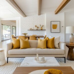
Many open plans stage the kitchen as a strong graphic wall: slab stone backsplash, cabinet grids, waterfall islands, long pull lines, and a centered hood volume that behaves like architecture. In such interior designs, the lounge needs to be the rest zone.
Curved seating is perfect here because it absorbs the strictness behind it. A pale greige curved sectional in a velvet-like fabric can sit in front of dramatic veined stone and keep the overall scene welcoming.

Industrial settings flip the logic: rough background, clean foreground
In brick lofts and warehouse shells, the background is rough by nature: worn plaster patches, brick joints, steel window grids, exposed piping, and tall openings. Here, the curved sofa becomes the clean foreground.
It doesn’t compete with the roughness; it frames it. A near-black curved sofa in velvet or leather with a subtle sheen can sit against brick and allow the texture to stay atmospheric instead of chaotic.
The interior design feels collected because it gets a strong smooth line at furniture level, then complexity behind it.

Reflective tops reduce visual weight when the room already has heavy surfaces
When a room has bold stone (especially a full backsplash slab or a waterfall island), the center can become visually heavy fast. Adding a solid coffee table on top of that can create a stack of blocks effect.
That’s why glass and dark reflective tops show up so often in successful curved seating rooms:
- A smoked glass top keeps the center open.
- It reflects ceiling lights and window brightness, which adds life without adding clutter.
- It lets the sofa remain the main volume, because the table doesn’t become a second bulky object.

The trick is what sits under the glass. The base carries the weight:
- brass or bronze drum bases
- ribbed cylinders that add vertical rhythm
- sculptural metal loops that add depth without adding color
This base strategy matters because curved sofas are long and low. The coffee table needs to feel grounded, but it can’t block sightlines or create another heavy rectangle.

Warm metal works best as connective tissue
Curved furniture often lives in neutral interior designs: greige, taupe, cream, soft gray, stone, wood. The risk in a neutral open plan is that the living room and kitchen feel like two separate worlds even when they share one floor and one ceiling.
Warm metal solves that, but only when it’s repeated in small, strategic places rather than spread everywhere.

Brass or bronze usually placed like this:
- coffee table base in the living room
- faucet or cabinet pulls in the kitchen
- light stems or pendant hardware overhead
- one or two small objects: a bowl, tray, or a vase
That small repetition stitches the zones together without introducing a new color. The living room feels related to the kitchen even if the cabinetry shifts from warm wood to glossy black, or the backsplash becomes the main visual feature.
A very useful pattern: warm metal often appears near the center (table base), at the work zone (faucet/pulls), and in the air (pendant hardware). Floor, counter, ceiling—three touchpoints—one metal tone.

Pillow placement
Curved seating creates one long silhouette. If the upholstery is light and the room is bright, that silhouette can start to look like one pale ribbon unless something breaks it up.
That’s where pillows become a structure tool.

Where darker pillows belong on a curved sofa
Darker pillows can be placed at specific points:
- at the ends (to anchor the curve)
- at the inner bend (to give the curve a visual weight where it turns)
- near any chaise-like bulge (to keep that area from feeling oversized)
This placement gives rhythm to the long sweep. It also helps your eye measure scale.
Without it, a large curved sectional can feel like a single unbroken band, and the room can lose visual clarity. The palette stays controlled: charcoal, deep taupe, camel, warm black, and a few creamy neutrals.
Sometimes one small pattern pillow appears, but it’s used sparingly—more like a texture accent than a print story.

This is especially effective when the sofa fabric has nap or sheen. Velvet and chenille show tonal shifts as daylight moves.
Pillows placed at curve turns amplify that shape, because it gets contrast exactly where the silhouette changes direction.

Art is either a scale anchor or a color translator
Curved furniture is often large, especially in open plans. If the wall behind it is pale and empty, the sofa can overpower the elevation even if the room is expensive.
Art solves that in two reliable ways.
1) Art as a scale anchor on large pale walls
Oversized art is common behind curved seating for a reason:
- It gives the wall a strong vertical presence.
- It balances the sofa’s long horizontal sweep.
- It keeps the sofa from feeling like the only major element in the room.
This works especially well in minimalist living rooms where the background is nearly blank. The curved sectional becomes the dominant foreground gesture, so the art must be large enough to hold its place in the composition.

2) Art as a color translator in mixed-material rooms
In open plans that mix:
- warm wood cabinetry
- greige upholstery
- brass details
- stone veining with gray/black movement
Art often becomes the bridge. A single large piece that includes warm browns, creams, and metallic notes can connect the whole palette in one panel.
It quietly links the kitchen finishes to the living room textiles without asking to add new colors through accessories. This is why geode-like compositions, layered neutral abstracts, and pieces with warm gold accents work so well.
They combine the room’s major materials into one visual statement.

Plants work like vertical counterweights
Curved seating is usually low and long. That creates a real compositional risk: the room becomes too horizontal, especially when the kitchen island is also long and low, and the rug is oversized and pale.
A tall plant fixes that.
Why tall greenery works beside curved seating
A tall indoor tree or bird-of-paradise near glazing solves multiple issues at once:
- It breaks the low-and-long profile of the sofa with height.
- It softens black window grids without changing the window system.
- It adds an organic silhouette that naturally pairs with curved furniture.
- It brings saturation (green) in a controlled way, which helps neutral rooms feel alive.
The plant can be placed near the window wall or close to the transition between living and kitchen. That placement makes it a bridge: it relates to outdoor greenery while also acting as a vertical marker inside.
In industrial interior designs, tall branches in a vessel do similar work. They add a fine, airy texture that contrasts with heavy brick and thick upholstery.
They also prevent corners from feeling empty and sharp.

The bedroom version of curved furniture: comfort with structure
Curves in bedrooms behave differently than in open plans. They’re less about circulation lanes around a kitchen island and more about body comfort, lighting softness, and safer movement in tighter footprints.
Rounded upholstered beds reduce harsh edges in real layouts
A rounded bed frame changes how the room feels the moment the person walks in. Corners soften near knees and shins, and the bed becomes a comfort object rather than a hard platform.

This works in modern bedrooms with:
- rounded headboards with channel detailing
- thick padded bases with softened corners
- calm gray panel walls or warm neutral walls behind
The contrast is important: the bed is rounded, but the wall system is often straight and panelized. That balance prevents the room from turning into an all-soft theme.
The bed becomes the main comfort sculpture inside a clean architectural frame.

Pendant globes and curved beds work as one lighting-shape system
Glass globes beside the bed repeat the bed’s rounded edges, and they do it without visual heaviness. Clear or smoky globes keep the bedside area light, especially when paired with warm metal elements inside the globe.
There’s also a practical benefit: hanging pendants free up nightstand surfaces. That allows the bed and bench to remain the dominant masses without extra table lamps cluttering the composition.

Rounded benches and ottomans prevent the foot of bed from becoming a hard stop
A tufted bench with rounded edges or two oversized rounded ottomans at the foot change the whole proportion of the room. Instead of a straight line wall at the foot of the bed, it gets a softer boundary that feels lounge-like.
This matters most in bedroom layouts that open toward a terrace or a bathing zone. The room feels like one continuous suite when the furniture edges don’t create abrupt stops.
Warm cove lighting around the ceiling perimeter also supports this. Curved upholstery looks richer when shadows are softened.
Warm perimeter glow reduces harsh contrast and gives rounded forms a smoother gradient.

How to style the center without clutter
Curved seating often makes the coffee table the main focal point because the seating wraps inward. The table becomes the shared center, so styling needs discipline.
A reliable formula from successful rooms:
- Keep objects low so sightlines stay open.
- Mix one reflective element with one tactile element.
- Add one organic note (moss, branches, a sculptural piece) to prevent the center from feeling sterile.
Examples that work well:
- a shallow bowl with green moss forms (low, natural, controlled)
- a coppery or brass tray/bowl (ties to warm metal elsewhere)
- stacked books (adds scale and keeps styling grounded)
- one translucent sculptural object (adds shine without adding color)
In industrial interior designs, the styling often stays even bolder and fewer: one matte black vase, a small bowl, a book stack. The architecture is already complex, so the table stays clean.

Mistakes that make curved furniture feel random
1) A curved sofa with a rectangular rug that’s too small
If the rug doesn’t extend far enough past the curve, the sofa looks like it’s floating. Use an oversized rug so the curve sits fully on the textile field.
Soft abstract rugs work well because they support curved silhouettes without fighting them.
2) Too many competing curves at the same height
If the sofa is curved, the coffee table is curvy, the shelves are full of round objects, and the lighting is also very sculptural, the room can lose clarity. Keep one family dominant and let other curves appear in smaller doses.
A clean way to balance:
- one major curved sofa
- one round or organic table
- straight supporting pieces (nightstands, cabinetry, console)
3) Pillows placed like a random pile
Curved seating needs pillow placement to reinforce the silhouette. Use pillows to mark:
- ends
- inner bend
- major turning points
That creates rhythm and keeps a long sofa from feeling like a single band.
4) Art that is too small behind a large curved piece
A large curved sectional needs art that can hold the wall. If you want a gallery wall instead, it has to be planned as a large composition rather than a few small frames scattered above the sofa.

Fast design recipes
Recipe A: Kitchen-first open plan with bold stone
- Curved sectional in a pale neutral with visible texture (chenille, velvet-like performance fabric)
- Round smoked-glass coffee table on a brass/bronze drum base
- Brass repeated in faucet/pulls and one small living-room object
- One oversized artwork that blends wood + metal + upholstery tones
- Tall plant near glazing to lift the composition
Recipe B: Industrial brick living room
- Low serpentine sofa in velvet/leather with subtle sheen (charcoal, deep warm tone, or cream boucle)
- Round or organic stone table with minimal styling
- Long dark console behind the sofa to create a clean base line under art
- Oversized art with one warm metallic note to connect to brass accents
- Tall branches or a tree near the window to soften steel grids
Recipe C: Modern bedroom with comfort focus
- Rounded upholstered bed with channel detailing
- Straight, simple nightstands to balance the bed’s softness
- Globe pendants with warm metal elements to echo the bed shape
- One oversized artwork scaled to the bed width
- Optional rounded bench/ottomans at the foot for a lounge-like finish

The takeaway: a curve is a planning line
Curved furniture works best when it is treated like the room’s main organizing move. One dominant curve can define the lounge, protect circulation, improve conversation angles, soften strict architecture, and give the eye a continuous outline to hold onto.
Then the supporting choices do specific jobs:
- circles confirm intention
- reflective tops keep the center light
- warm metal stitches zones together
- pillows give rhythm and weight
- art handles scale or blends materials
- plants lift the composition vertically
Related Posts
Harmony Home Design brings 10+ years of residential interior design experience to the ideas shared here. We publish design concepts, layout thinking, and practical styling notes.