
Grey has become one of the most versatile and enduring choices in kitchen design, striking the perfect balance between modern sophistication and timeless appeal. Unlike trend-driven colors that can feel outdated after a few years, grey adapts effortlessly to different styles, whether it’s a sleek contemporary space, a cozy farmhouse kitchen, or a refined transitional design.

One of the biggest advantages of working with grey is its flexibility. It pairs beautifully with a wide range of materials—warm wood tones, polished marble, matte black fixtures, and metallic accents all bring out different aspects of grey’s personality.
This adaptability makes it easy to craft a space that feels personal and distinctive rather than one-size-fits-all.

But not all greys are the same. Some lean cool, with subtle blue undertones that feel crisp and airy, while others have warm, earthy notes that blend seamlessly with rustic or classic interiors.
Choosing the right shade—and understanding how it interacts with lighting, textures, and surrounding finishes—is key to making gray kitchens ideas feel inviting and visually layered rather than flat or monotonous. This guide explores the deeper details that go into designing a grey kitchen that stands out.
From the impact of undertones and finishes to the way lighting and metal accents shift its perception, every decision plays a role in shaping a space that feels both stylish and functional. Whether you’re considering a full remodel or looking for small ways to refresh your kitchen, these insights will help create a space that feels anything but ordinary.

The Importance of Undertones in Grey
Grey may seem straightforward, but it’s a color full of subtle variations that can completely change the mood of a kitchen. The secret lies in undertones—those hints of blue, green, beige, or even purple that emerge depending on the surrounding elements.
Understanding these subtle shifts is key to making grey kitchen cabinets ideas feel intentional rather than flat or mismatched. A cooler grey with a blue undertone, like a soft mist grey, creates a crisp and airy atmosphere.
This works well in kitchens that lean towards a coastal or Scandinavian influence, where light, open spaces are a priority. However, pairing it with warm metallic finishes—such as brushed brass handles or gold pendant lights—adds a contrasting warmth, keeping the space from feeling too cold.
On the other hand, a warm grey with beige or taupe undertones, often referred to as greige, introduces an earthier feel. This shade works beautifully with natural textures, making it ideal for kitchens that incorporate rustic wood beams, stone countertops, or handmade tiles.
When combined with honey-toned wood flooring or walnut shelving, warm grey feels inviting and balanced, preventing the kitchen from looking too sleek or overly modern.

How Wood Choices Influence Undertones
The right wood finish can amplify or downplay a grey’s undertone, shaping how the entire kitchen feels. Light oak flooring or cabinets highlight the freshness of cooler greys, enhancing their bright and airy effect.
In contrast, rich walnut or deep-stained wood can bring out the warmth in a greige-toned kitchen, creating a cozy, layered feel. Even small details, like wooden cutting boards, floating shelves, or barstool frames, can subtly shift how the grey reads in different lighting conditions.
The best approach to selecting the perfect grey? Test samples under various lighting conditions, place them next to key materials like countertops and floors, and consider how the space changes throughout the day.
Grey isn’t just a single shade—it’s a versatile foundation that responds to its environment, making every kitchen unique.

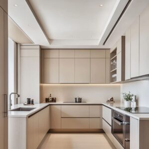
Surface Finishes and Reflections
A grey kitchen design isn’t just about choosing the right shade—how that color interacts with light depends heavily on the finish. The same grey can feel completely different on matte versus high-gloss surfaces, shaping the entire mood of the space.
Matte grey absorbs light, creating a more intimate and refined effect. This makes it a great choice for deeper shades like storm grey or charcoal, as it prevents the kitchen from feeling overwhelming.
The soft texture also minimizes glare, making it ideal for kitchens with large windows or skylights where natural light is abundant. Instead of bouncing light around, matte finishes diffuse it, helping the space feel balanced rather than overly bright.
In contrast, high-gloss grey reflects its surroundings, adding a sleek, polished look. This effect works especially well in modern or minimalist kitchens, where clean lines and reflective surfaces enhance the sense of openness.
The mirror-like quality of glossy cabinetry helps smaller kitchens feel larger by making the walls and surfaces appear to extend beyond their physical boundaries. This is particularly effective in spaces with limited natural light, as the gloss finish amplifies artificial lighting, reducing the need for extra fixtures.

How Light Changes Perception
Lighting plays a crucial role in how grey finishes are perceived throughout the day. A storm grey matte finish under strong daylight looks calming and understated, while the same color in a high-gloss version can appear more dynamic, reflecting shifting light patterns.
In kitchens with minimal windows, glossy cabinets can prevent the space from feeling dim by bouncing light off surfaces like countertops and backsplashes. Choosing between matte and high-gloss is not just about style—it’s about function.
For those who prefer a softer, grounded feel, a matte surface provides depth and warmth. If the goal is to make the kitchen feel bright and expansive, a high-gloss finish brings energy and movement.
Understanding these differences allows for a more intentional approach, ensuring the space works in harmony with its lighting conditions and overall design.

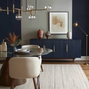
Blending Metals and Grey Tones
The right metal accents can completely shift how a grey kitchen feels. Whether the goal is to add contrast or create a seamless blend, selecting the right finish for hardware, lighting, and fixtures plays a big role in defining the space’s personality.
The decision comes down to whether you want a bold statement or a more understated transition between elements.

For those drawn to a cooler grey palette—such as storm, graphite, or smoke grey—warm metallics like brushed gold, brass, or copper introduce a striking contrast. These finishes add warmth, preventing the kitchen from feeling too stark or industrial.
Gold cabinet pulls, a brass pot filler, or a polished copper range hood bring out the richness in cooler greys, making them feel more dynamic.

On the other hand, if the kitchen leans toward taupe, pewter, or greige tones, black and gunmetal accents maintain a softer, low-key aesthetic. Black fixtures, such as a matte black faucet or cabinet handles, reinforce a contemporary feel without overpowering the space.
Gunmetal hardware, in particular, blends seamlessly with warmer greys, giving the kitchen a refined yet relaxed appearance.
Striking the Right Balance
Mixing metals is an option for those looking to add depth. A kitchen with gray kitchen ideas can feature a combination of finishes—such as black handles paired with brass light fixtures—creating a layered, curated look.
The key is to keep the distribution intentional; for example, using warm metals for lighting and cooler metals for hardware maintains balance without feeling disjointed. Beyond cabinet hardware, metallic accents can extend to furniture, range hoods, or even barstool bases, subtly reinforcing the chosen grey tone.
A well-thought-out combination of grey and metal finishes ensures the space feels cohesive, whether leaning toward dramatic contrast or a smooth, tonal flow.

Textural Layers and Material Contrasts
A grey kitchen is more than just its color—textures and material contrasts shape how the space feels. Even with the perfect shade, a flat, uniform look can make a kitchen feel lifeless.
The secret to making grey kitchen cabinets stand out is layering different materials, each contributing a unique depth that prevents the design from feeling overly cold or sterile.
Wood Beams & Floors
Natural wood elements work wonders in kitchens with cooler grey tones. Whether in the form of exposed ceiling beams, open shelving, or warm-toned flooring, wood introduces balance, keeping the space from feeling too crisp.
Lighter oak flooring highlights a grey kitchen’s airy quality, while deeper walnut tones ground the design, adding richness and contrast.
Woven Elements
Rattan barstools, cane cabinet panels, or pendant lights wrapped in natural fibers introduce organic warmth, breaking up the structured look of sleek grey cabinetry. This approach works especially well in transitional and coastal-inspired kitchens, where a mix of soft and structured elements creates a welcoming atmosphere.
Stone & Marble
A strong veining pattern in marble or quartz can turn a grey kitchen into something bold and expressive. The choice between bold or subtle veining makes a noticeable difference—heavily veined marble adds drama, while soft, barely-there patterns keep things understated and sophisticated.
Matte-finish stone surfaces absorb light, reinforcing an earthy look, while polished surfaces reflect their surroundings, making them feel more dynamic.

Tile Patterns That Shift Perception
The arrangement of tiles plays a bigger role than most people realize. A herringbone backsplash creates a sense of movement, energizing a kitchen with muted tones.
Stacked tiles introduce a structured, modern appeal, while classic subway tiles provide a timeless backdrop that pairs well with both contemporary and vintage-inspired designs. Even grout color makes an impact—contrasting grout highlights pattern, while a matching tone blends everything for a seamless effect.
The right mix of materials ensures that a grey kitchen never feels one-dimensional. Whether the goal is warmth, contrast, or subtle sophistication, layering different textures keeps the space visually interesting while reinforcing the character of the design.

Lighting Nuances
Lighting isn’t just about function—it has a major influence on how a gray kitchen design looks and feels throughout the day. The way light interacts with grey tones can shift their appearance, making them feel cooler, warmer, deeper, or even more reflective depending on the source.
Whether it’s natural light streaming through windows, strategically placed pendants, or subtle under-cabinet illumination, the right lighting choices can enhance the depth of grey tones in a kitchen.
Warm Interior Pendants
Choosing pendant lights with gold or brass interiors adds a soft glow, counteracting the potential coolness of deep grey cabinetry. Exposed filament bulbs or antique-finish lighting create pools of warmth, giving charcoal and graphite grey kitchens a more inviting atmosphere.
These types of fixtures work especially well in kitchens that feature matte finishes, preventing them from feeling too flat or heavy.
Translucent Pendants & Glass Globes
For kitchens with darker grey tones or limited natural light, translucent lighting helps maintain an open feel. Glass pendant lights and frosted globes allow light to spread more evenly, preventing shadows from making the space feel smaller.
This is particularly useful in compact kitchens where too many solid fixtures might visually weigh down the design.
How Reflection Changes Perception
Reflective surfaces like glossy tiles, polished countertops, or glass cabinetry can subtly alter the way grey tones appear. In kitchens with high-gloss finishes, grey cabinets may take on a slightly lighter appearance during the day as they bounce light around the space.
This creates a sense of movement, making the color feel more dynamic. In contrast, matte finishes absorb light, keeping the shade of grey more consistent regardless of lighting conditions.
For the best balance, a mix of lighting sources—pendants for ambiance, under-cabinet strips for task lighting, and natural light for depth—ensures that grey tones remain rich and multidimensional at all times of day. The right lighting not only enhances a kitchen’s color scheme but also helps define its overall atmosphere, making it feel warm, spacious, or sleek depending on the desired effect.

Hidden or Discreet Features
A well-designed kitchen is as much about what you don’t see as what you do. The beauty of gray kitchen cabinets often lies in their ability to create a clean, continuous visual flow, making hidden features a natural fit.
From concealed appliances to seamless storage solutions, these details help maintain a refined, uncluttered aesthetic without sacrificing practicality.
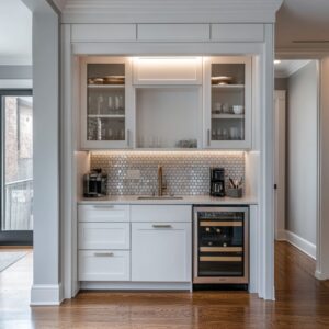
Handle-Free Cabinetry
One of the most effective ways to keep a grey kitchen looking polished is by eliminating visible hardware. Handle-free cabinets with push-to-open mechanisms or integrated grooves create an uninterrupted surface, allowing the focus to remain on the tone and texture of the cabinetry.
This technique works particularly well with mid-tone greys, as it enhances their ability to blend effortlessly into modern or minimalist interiors.
Integrated Storage for a Seamless Look
Hidden pantries and pull-out storage systems maximize functionality while preserving the kitchen’s sleek design. Instead of traditional pantry doors or bulky shelving, these concealed compartments keep essentials tucked away, ensuring that the kitchen retains its streamlined appearance.
In kitchens with matte grey cabinetry, this approach reinforces the smooth, unbroken surface, while in high-gloss designs, it prevents unnecessary reflections that could disrupt the color balance.
Why Small Details Matter in a Monochromatic Space
With a predominantly grey palette, even the subtlest elements stand out. A marble countertop with delicate veining, a black-trimmed oven, or a polished metal edge on a concealed appliance suddenly becomes a focal point because there are fewer competing colors.
This makes every material choice more significant, as small accents can completely shift the kitchen’s overall impression. By incorporating hidden elements into the design, a grey kitchen becomes more than just a stylish space—it transforms into a functional, high-performance environment where design and practicality work together seamlessly.

Layering Subtle Tones of Grey
A kitchen doesn’t have to stick to just one shade of grey—combining multiple tones can create depth, structure, and a well-balanced design. Light and dark greys work together to shape the space, giving cabinets, walls, and islands a sense of movement instead of a flat, one-dimensional look.
This approach is especially effective for kitchens that need a little extra visual interest without introducing bold colors.
Why Layering Different Greys Works
Pairing lighter upper cabinets with deeper-toned lower ones instantly makes a kitchen feel more open. The brighter tones at eye level prevent the space from feeling heavy, while darker lower cabinetry anchors the design.
A similar effect can be achieved by using a contrasting island—soft grey perimeter cabinets combined with a charcoal-toned island add a stylish contrast that keeps the space from looking too uniform. For smaller kitchens, using multiple shades of grey is a practical way to add depth.
A single dark tone can sometimes make a compact space feel enclosed, but breaking it up with varying shades allows the eye to move more freely, making the room appear larger. Even subtle shifts—like using cool grey cabinets with a slightly warmer grey backsplash—can create a soft contrast that makes the space feel layered rather than monotone.
How to Balance Layered Greys with Other Materials
Choosing different finishes can further enhance this effect. Matte and gloss variations of grey create an understated contrast, while pairing grey cabinetry with natural stone or warm wood accents brings dimension to the overall design.
The key is to maintain balance—if one element is dark and bold, the surrounding elements should be lighter to keep everything feeling proportional. For those exploring gray kitchen cabinets ideas, layering different tones offers flexibility in design.
Whether aiming for a soft, tonal blend or a more defined contrast, using multiple shades of grey ensures the kitchen feels intentional and dynamic without overwhelming the space.

Interesting Color Pairings
Grey is often paired with black or white for a classic, neutral look, but there are plenty of unexpected color combinations that can bring more personality to the space. The right accent colors can shift the mood of modern grey kitchen cabinets, making them feel cozier, more playful, or even more sophisticated depending on the chosen pairing.
Soft Blues and Pastels for a Vintage or Cottage Feel
Pairing grey with pastel tones—such as pale blue, muted blush, or soft sage—creates a charming, time-worn look reminiscent of classic European kitchens. A pastel backsplash against warm grey cabinets introduces a subtle contrast that feels light and fresh without overwhelming the space.
Soft blue in particular works beautifully with cool-toned greys, reinforcing an airy and relaxed atmosphere.
Greenery and Natural Elements for Freshness
Adding natural elements—like potted herbs, fresh fruit, or deep green accents—instantly enlivens a grey kitchen. The contrast of lush greenery against a muted grey backdrop draws attention to organic materials, helping to balance out the coolness of the cabinetry.
Whether it’s a vase of eucalyptus branches, a bowl of green apples, or even forest-green upholstered barstools, these small touches make a big difference in softening the overall aesthetic.
Unexpected Metallic Accents for Warmth
Not all greys have the same undertones, and selecting the right metallics can enhance their unique qualities. Greys with a slight lilac or pinkish base pair exceptionally well with copper and rose-gold accents.
A set of copper pendant lights or a brushed rose-gold faucet can add a warm, understated glow without feeling trendy or overdone. Grey might be neutral, but that doesn’t mean it has to be predictable.
Playing with these less conventional pairings allows for a more customized look, ensuring that a grey kitchen feels anything but ordinary.

Combining Rustic and Modern Themes
Balancing rustic and modern elements in a kitchen creates a space that feels both inviting and refined. Grey serves as the perfect neutral bridge between these two styles, softening the contrast between old and new while keeping the design cohesive.
Instead of letting one style dominate, a thoughtful mix of materials and finishes allows each element to shine in its own way.
How Rustic and Modern Elements Work Together
A farmhouse sink with sleek black fixtures, exposed wooden beams above high-gloss cabinetry, or a reclaimed wood island paired with minimalist pendant lights—these combinations create depth and character. The key is contrast.
A smooth, matte grey cabinet set against a rough-hewn wooden countertop enhances the beauty of both materials, preventing the kitchen from feeling too industrial or overly rustic. Using straight-edged hardware and streamlined appliances alongside vintage-inspired details—like beadboard paneling or open wooden shelving—keeps the space from leaning too far in one direction.
The result is a kitchen that feels timeless rather than locked into a single trend.

How Textures Make a Difference
When rustic wood sits next to matte grey cabinetry, the contrast enhances the natural grain of the wood while making the grey feel richer and more structured. The same applies to stone elements, such as a rough quartz backsplash placed alongside smooth concrete countertops.
These layers of texture add dimension without introducing unnecessary color, keeping the kitchen visually balanced. A rustic-meets-modern kitchen is all about subtle refinement.
By choosing the right mix of textures and finishes, the space feels both grounded and contemporary, proving that these styles aren’t opposites—they’re perfect complements.

Using Grey as a Background for Statements
Grey is one of the most adaptable colors in kitchen design, and its strength often lies in its ability to act as a neutral backdrop. Unlike bolder colors that demand attention, grey provides a subtle foundation that allows standout design elements to take center stage.
Whether it’s a dramatic range hood, a striking stone island, or an oversized chandelier, grey keeps the focus where it matters most.
How Grey Enhances Statement Pieces
Mid- to light-grey tones work particularly well in kitchens where a single feature is meant to be the star. A bold black range hood framed against soft grey cabinetry immediately draws the eye, making the hood feel more sculptural.
A marble island with deep veining—especially in gold or rich charcoal—stands out even more when surrounded by muted grey tones, creating an intentional contrast that adds sophistication. Similarly, metallic fixtures—such as gold pendant lights or polished chrome hardware—have more impact when set against grey walls or cabinets.
Instead of competing with other colors, grey allows these accents to shine, reinforcing a sense of balance in the design.

Why the Right Grey Matters
The key to making this approach work is choosing the right shade of grey for the surrounding space. A mid-tone grey offers enough depth to contrast with both dark and light statement pieces, while a soft dove grey provides a more delicate backdrop that enhances reflective materials like glass or polished stone.
By treating grey as a supporting element rather than the main attraction, a kitchen can feel bold and distinctive without being overwhelming. It’s this versatility that makes grey such a timeless choice, allowing statement features to stand out while keeping the space visually cohesive.

The Effect of Pattern and Shape
Grey may be a neutral color, but the way it interacts with patterns and shapes can completely change how it feels in a kitchen. The design of tiles, cabinetry, and even seating influences whether grey appears structured and crisp or soft and inviting.
The right balance of angular and curved elements ensures the space doesn’t lean too far in one direction, keeping it visually engaging and comfortable.
Patterns That Enhance Grey Tones
The layout of tile backsplashes can make a surprising difference. A herringbone or chevron pattern adds movement, giving even the most muted grey surfaces a dynamic feel.
On the other hand, stacked or grid-pattern tiles reinforce a clean, modern look, working well in kitchens where simplicity is key. Subway tiles in a staggered layout create a timeless appeal, allowing grey cabinetry or walls to act as a subtle, grounding element.
The design of cabinet doors also plays a role. Shaker-style grey cabinets bring a touch of classic structure, especially when paired with polished hardware.
Flat-panel cabinetry, with its smooth, uninterrupted surface, feels more contemporary and allows the texture of countertops or backsplashes to take center stage.

Softening a Linear Design with Curves
Too many sharp angles can make a kitchen feel rigid, which is where curved elements come in. Rounded barstools, pendant lights with soft contours, or even an arched faucet can break up the straight lines of cabinetry and countertops, introducing a subtle sense of balance.
Even slight variations in shape make a noticeable impact. A row of barstools with gently curved backs instantly softens the crisp geometry of a Shaker-style kitchen.
Similarly, a circular dining table can contrast beautifully against a structured, grey-toned island, making the space feel more inviting. Grey’s versatility means it can adapt to any style, but the right mix of pattern and shape determines whether it leans toward sleek and modern or warm and classic.
By layering different design elements thoughtfully, a grey kitchen remains anything but one-note.

Highlighting Micro-Details
One of the biggest advantages of a grey kitchen is how it allows small design details to stand out in ways that might go unnoticed in a more colorful space. Subtle textures, refined stitching, and even the finish of hardware can take center stage when placed against a neutral grey backdrop.
The simplicity of grey doesn’t mean the design is basic—it means every detail has the chance to be appreciated.
Stitching and Tufting on Barstools
The texture of seating makes a surprising impact. Barstools with visible stitching or tufted upholstery bring a layer of depth that contrasts beautifully against smooth grey cabinetry.
A simple leather or fabric seat with stitched edges instantly adds a touch of craftsmanship, making the space feel more considered.

Under-Cabinet Lighting to Enhance Texture
Strategic lighting can transform a grey kitchen by emphasizing different materials. Under-cabinet lighting casts soft shadows on textured cabinetry or backsplashes, making their patterns more pronounced.
Whether it’s highlighting the grain of a wood-toned accent shelf or drawing attention to a herringbone tile pattern, this small detail creates a striking effect without introducing additional color.
How Hardware Finish Changes the Look of Grey
Even the sheen of hardware affects how grey tones are perceived. Matte black handles absorb light, keeping the kitchen feeling understated and refined, while polished black or chrome reflects light, subtly brightening the surrounding grey.
Brass or nickel hardware can shift the warmth of grey cabinetry, either softening cool undertones or enhancing a greige palette. By focusing on these small but significant elements, a grey kitchen becomes far more than just a neutral space.
Each detail contributes to the overall atmosphere, proving that the beauty of a well-designed kitchen is often found in its most subtle touches.

Finding the Right Grey for Your Kitchen
Grey is far from a one-size-fits-all color. The right shade can completely change the feel of a kitchen, whether it’s meant to be bright and airy, bold and dramatic, or warm and inviting.
The key to getting it right is understanding how different tones interact with lighting, surrounding materials, and accent colors.
How to Choose the Best Grey for Your Space
- Cool, Airy Greys work well in sunlit kitchens, especially those with a coastal or modern feel. They reflect light beautifully, making a space feel open and refreshing.
- Deep, Moody Greys are perfect for urban or industrial-inspired kitchens, where metal, concrete, and stone elements create a refined contrast. These darker tones add a sense of depth and sophistication.
- Warm, Earthy Greys fit effortlessly into transitional or rustic kitchens, complementing wood details and natural textures for a cozy, grounded look.
- Greige Tones offer the best of both worlds, blending seamlessly with classic and contemporary accents. This flexible shade works well in spaces that mix traditional warmth with modern simplicity.

Why Testing Your Grey Before Committing is Essential
A grey that looks perfect in one home may appear completely different in another. Undertones can shift depending on lighting, flooring, and countertop materials.
A small paint swatch tested under daylight, evening lighting, and artificial light will reveal subtle shifts that might not be obvious at first glance.
Key Details That Shape a Grey Kitchen
- Undertones Define the Look – Whether cool, warm, or neutral, undertones influence how the kitchen pairs with hardware and accent colors.
- Matte vs. Gloss Makes a Big Difference – Matte greys absorb light for a soft, modern touch, while glossy finishes add a sleek, reflective quality.
- Texture Prevents a Flat Appearance – Combining wood, glass, woven materials, or stone ensures depth and contrast.
- Layered Grey Tones Add Structure – Using varying shades of grey for cabinets, islands, and backsplashes creates dimension.
- Unexpected Color Pops Keep It Interesting – Soft greens, warm pastels, or metallic accents break up the monotony and bring personality to the space.
- Small Details Stand Out More in a Neutral Palette – Thoughtful touches, like the texture of barstools, subtle tile patterns, or the sheen of hardware, become more noticeable.
A well-planned grey kitchen is never just neutral—it’s intentional, layered, and designed to work with the surrounding elements. Taking the time to explore different tones, textures, and finishes ensures a space that feels timeless, functional, and unique to your style.
Related Posts
Harmony Home Design brings 10+ years of residential interior design experience to the ideas shared here. We publish design concepts, layout thinking, and practical styling notes.