
A lot of high-end contemporary rooms look effortless, but the best ones are rarely “styled” into place. They’re planned.
Not in the sense of over-designing every corner—more in the sense that every major decision has a job. Color is assigned responsibilities.
Scale replaces extra ornament. Zoning is made legible without partitions.
Tables get treated like small buildings. TV walls stop acting like a tech problem and start acting like a surface problem.
Tall volumes stay livable because height is handled at the edges, not dumped into the middle.

A refined interior design is usually built from a few strong moves that repeat in different forms and at different heights. The room can change function—living space, kitchen, bedroom, open plan, double-height volume—and the logic still holds because the roles stay consistent.

Color has jobs
Luxury contemporary interiors that lean neutral don’t succeed because the palette is safe. They succeed because each color family carries a specific task, and the room repeats that task in a few reliable places.

White and ivory: the envelope and the comfort layer
In many upscale contemporary-transitional designs, white (or warm white) handles two big responsibilities at once:
- It becomes the architectural wrapper: walls, ceiling planes, trim, and sometimes large built-ins live in a close white family so the room feels continuous.
- It becomes the comfort mass: slipcovered seating, large upholstery fields, and oversized rugs sit in a similar value range so the room feels soft and easy to occupy.
This pairing matters. If the walls are bright and crisp but the seating is creamy and heavy, the room can feel split.
If the seating is bright and the walls are warmer, the upholstery can look dingy. In the strongest rooms, the whites are related but not identical: one might lean slightly creamy in fabric, another slightly cleaner in paint, another slightly chalky in plaster or stone.
That subtle variation adds depth without turning the palette into a patchwork. A practical rule here: let white take up the most square footage, but don’t let it be one single white.
You want a family of whites with small undertone shifts so light can move through the room and still show layers.

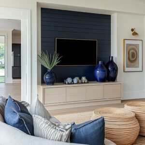
Blue: a signature mark that needs weight
Blue often functions as the one unmistakable accent, but the expensive version of blue is rarely sprinkled. It lands in fewer, heavier pieces so the color feels chosen, not added.
Think of blue working like an ink stamp:
- A large blue-and-white ceramic piece (or two) with real volume
- A rug border or a rug field with washed blue that can carry area
- A couple of substantial pillows that act as corner weights, not a scatter of small cushions
Blue does its best work when it shows up at more than one height—usually once low (rug edge, table object) and once mid-height (pillows, ceramics on a console). That creates a vertical thread without needing blue in artwork, cabinetry, and accessories all at once.
A useful discipline: if blue is your signature, give it mass. One large porcelain jar does more than eight small trinkets.
Two dense pillows placed where the eye naturally lands do more than a dozen tiny ones.

Green: structural, not decorative
Green can be treated like decoration—small plants on every surface—but in stronger luxury interiors it acts as structure. It becomes the living version of architecture: it sets verticals, defines edges, and adds middle-value contrast so pale rooms don’t float.
Three green roles:
- Living columns: tall trees or large planters near openings, corners, or glazing lines
- Low mass: moss bowls, compact topiary forms, low trays of greenery that sit inside the table-height band
- Soft canopy: airy branching arrangements that add height without forming a hard block
This is why olive-like trees work so well in neutral luxury rooms. Their foliage is gray-green and airy; it reads soft against white without turning tropical or loud.
They add height while staying visually porous. A rule worth stating clearly: green placement should solve a spatial problem.
Use tall greenery where a corner feels empty or where glazing feels too hard-edged. Use low greenery where the center needs weight without blocking sightlines.

Black: a thin outline that sharpens without darkening
Black in such interior designs is rarely a color. It’s an outlining tool.
A few strategic black lines can do the work that a darker palette normally would:
- Window grids and metal door frames
- Thin table bases, stool legs, hardware lines
- A narrow track, beam, or linear ceiling detail
- A fireplace opening or media rectangle that gives the room a dark anchor
When black is kept thin, it sharpens the pale scheme without pulling the interior into a dramatic, high-contrast look. It’s the difference between a room that feels airy-but-structured and one that feels washed out.
A guiding principle: use black where geometry needs definition. Frames, legs, thin rails, narrow outlines.
Avoid turning black into large painted fields unless the room is built to handle it.

Warm accents: the anti-cold insurance policy
Neutral + blue + black can drift cool fast, especially in kitchens and bright open plans. That’s where warm accents step in—not as “extra color,” but as temperature management.
Common warm stabilizers include:
- Brass (faucets, pendant stems, hardware)
- Terracotta (one large vessel, one clay tone note)
- Walnut or warm oak (tables, cabinetry, shelving)
- Warm bulbs and amber-tinted glass that keeps evenings from feeling icy
Warmth works best when it appears in a few confident notes rather than in a mix of unrelated warm colors. A single terracotta vessel can do the job if it’s large enough.
Brass can do it if it repeats in at least two places. Warm wood can do it if it shows up in both living and dining surfaces.
The point is consistency of role: warm accents keep the palette welcoming and prevent blue-and-white from turning clinical.

Scale replaces extra ornament
Many contemporary luxury interiors stay visually calm because scale does the decorating. Instead of layering pattern on pattern or filling shelves with accessories, the room uses oversized anchors that feel architectural.
Oversized seating acts like soft architecture
Large sectionals and deep sofas do something a smaller sofa cannot: they create a boundary and a center at the same time. In open plans, a big seating mass defines the lounge zone without needing partitions.
In bright rooms, it provides a large matte surface that makes sunlight feel intentional instead of harsh.

A smaller sofa in a large footprint can force the stylist to compensate with extra pieces: more side chairs, more tables, more décor, more pattern. The room gets busy.
When seating is scaled correctly, the room can breathe. A practical cue: if the room has big glazing or long open sightlines, the sofa must have enough physical presence to hold the space.
Not by being bulky, but by having footprint and depth.

Oversized coffee tables create a platform, not a perch
A large coffee table is often the visual center of a neutral room. When it’s too small, the center feels weak and the seating looks disconnected.
When it’s appropriately scaled, it becomes a platform that can carry styling without turning fussy. The best oversized tables do at least one of these things:
- Present as a thick slab or plank that feels grounded
- Use a recessed top or internal border so objects feel contained
- Combine a pale top with a darker base so the outline stays legible on a pale rug
A table with enough surface area lets you style in zones rather than in a single pile. That makes the room feel curated instead of decorated.

Large planters and urns frame edges and openings
If you want a room to feel finished without adding a lot of art or built-ins, scale greenery up. Large planters placed near doorways, near glazing, or near the transition between living and kitchen can do the job that columns, screens, or tall casework might normally do.
The expensive move is not “more plants. ” It’s fewer plants, larger containers, better placement.
A subtle benefit: large planters also balance visual weight. A wall of black-framed doors has strong geometry; a pair of substantial planters nearby softens the hard grid and adds mass at the perimeter so the room doesn’t feel center-heavy.

The calm side effect of big anchors
Once anchors are large, the room can stay restrained in pattern and color.
- Rugs can be quiet or softly aged
- Pillows can be mostly tonal, with only a few color weights
- Decorative objects can be fewer but larger
- Walls can stay light without feeling empty
Scale reduces the need for constant small “fixes. ” That’s why these rooms can look rich without looking busy.

Zoning is built with rectangles and underlines
Open layouts often fail for one reason: the space is physically open, but visually undefined. The fix is rarely furniture shopping.
It’s zoning clarity—making each area readable through simple geometry.

Two-rug logic: one zone, one rug, one boundary
A strong open plan often uses a rug for the lounge and a separate rug for dining. This is not decoration; it’s a spatial boundary.
The lounge rug acts like a floor room. It tells your eye: everything on this rug belongs to one conversation area.
The dining rug does the same, while also handling chair movement and giving the table its own visual perimeter. Hierarchy matters:
- The lounge rug can carry more pattern or a stronger border because it’s the “character zone.”
- The dining rug often stays quieter so chairs and table legs don’t fight with busy pattern.
A simple rule: if two zones share one big floor, they still need separate floor rectangles.

One long ceiling line as an underline between zones
Some open plans use a beam, track, or long ceiling detail as a visual divider. It functions like an underline: it tells your eye where one zone transitions into the next.
This works especially well when walls and floors stay pale, because it adds an architectural marker without adding color. A thin dark line on the ceiling can be enough to organize a large footprint.

The back of the sofa as a soft boundary
In open plans where the kitchen is behind the lounge, the sofa placement becomes critical. When the sectional is oriented so its back faces the kitchen, that back acts like a soft wall.
It creates a clear separation without cutting the home in half. A well-planned layout typically preserves at least one generous circulation lane:
- A lane along the glazing line
- A lane behind the sofa
- A cross-lane that links dining to doors without forcing people through the seating group
If you want the room to feel planned, not floating: keep walk paths obvious and wide, and treat the sofa back as a boundary line.

Rectangles do the planning, softness does the living
A useful way to think about this: rectangles handle clarity; textiles handle comfort.
- Rugs and tables sit square to the architecture
- Sofas align to rug edges
- Consoles run parallel to major walls
- Then pillows, throws, and greenery soften the strictness
This combination keeps the room legible while still welcoming.

Coffee tables as micro-architecture
In many luxury contemporary rooms, the coffee table is not treated like a casual surface. It’s treated like a small built environment with its own structure, boundaries, and height plan.
The raft method: a few stable zones, not scattered objects
A coffee table styling that looks expensive usually has clear zones. Not necessarily symmetrical, but easy to read.
A dependable structure is:
- One main anchor (a large vessel, a substantial bowl, or a big branch arrangement)
- One book stack zone (rectangular, crisp edges, acts like a plinth)
- One tray zone (contains smaller items so they don’t migrate)
The power of this approach is that it can handle abundance without mess. Even if there are many objects, they belong to groups with boundaries.

Height discipline: one tall gesture, everything else low
Tables get chaotic when multiple objects compete for height. The stronger rule is simpler: allow one tall move at most—orchids, branches, a single vertical ceramic.
Everything else stays in the table-height band. This does two things:
- Keeps sightlines open between seats
- Makes the table feel like a composed landscape rather than a forest of objects
If you want the room to feel serene, height control is one of the fastest wins.

Boundary tools keep richness from turning messy
Certain table choices naturally support organized styling:
- Recessed tops that create a contained center
- Trays and book plinths that define zones
- Tables with internal borders or framed edges that keep objects “inside” a visual boundary
These are small details, but they matter because they turn abundance into composition. The room can feel lived-in without looking scattered.

Material contrast: shine, matte, organic, paper
Neutral rooms need surface variation or they go flat. A coffee table can supply that variation without adding new colors.
A reliable mix includes:
- Glossy ceramic (blue-and-white porcelain works especially well here)
- Matte stoneware or textured neutral vessels
- Organic softness (moss, greenery, a woven element)
- Paper edges (books) for crisp linear detail
The room stays neutral, but the eye still has work to do because the surfaces keep changing.
A table that stays usable still looks designed
A common mistake is styling every inch. In strong interior design concepts, there is usually breathing space—visible wood grain, a clear area for a cup, an open corner that keeps the table functional.
A good table composition often feels “complete” even with empty areas, because the zones are strong enough that the mind fills in the rest.

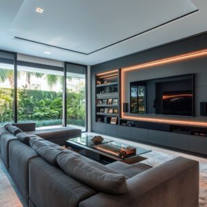
Media walls become calm through surface logic and pairing
A TV wall tends to inject what many people dislike: a black rectangle that reads like electronics. The best interiors neutralize that problem by turning the wall into a surface composition where the screen is only one rectangle among other intentional rectangles.

Make the wall a single field so the TV feels intentional
Instead of treating the TV as something to hide, the room treats the wall as a single, deliberate field:
- A stone slab surround
- A ribbed or fluted panel surface
- A smooth plaster-like plane
- A quiet, continuous wall treatment that has texture but not clutter
When the wall has its own presence, the TV stops looking like an afterthought. It becomes part of a designed grid: one dark rectangle placed within a broader surface decision.

Pairing flanks reduces electronics energy
Two oversized objects flanking a TV—large vases, tall planters, matching bays—do something subtle: they give the wall a balanced vertical structure. The screen becomes the center of a wider composition rather than the only focal item.
This works especially well when the objects are:
- Similar in scale
- Related in material family (ceramic with ceramic, planter with planter)
- Quiet in color, or tied to the room’s signature accent (blue porcelain used sparingly)
Even in modern interiors, this is one of the easiest ways to keep a media wall from feeling like a tech corner.

Long, low consoles give the wall a grounded base
A long, low cabinet under the TV functions like a horizon line. It grounds the wall, provides storage, and gives the TV a base so it doesn’t float.
The cabinet often succeeds when:
- It is wide enough to extend beyond the screen width
- Its finish sits between the upholstery and the accent color (warm gray, pale wood, soft taupe)
- Styling on top uses spacing rather than clutter
Porcelain as spaced markers, not a collection dump
Blue-and-white ceramics can calm a media wall when they’re placed like punctuation marks—spaced, substantial, and not overdone. A common strong pattern is:
- One piece toward the left
- One toward the right
- Possibly one smaller piece closer to the center line
- Then wide empty stretches of cabinet top between them
That spacing is crucial. It gives the ceramics authority.
It also keeps the top from turning into a shelf of unrelated items.

Texture replaces artwork in media zones
In many rooms, a media wall has limited appetite for art because the TV already claims the center. Texture becomes the decorative layer instead:
- Vertical ribbing that creates shadow rhythm
- Fluted wood side bays that add warmth without clutter
- Stone veining that adds movement while staying neutral
Texture provides depth and interest without competing with the screen.

Double-height rooms stay human when height is placed at the perimeter
Tall volumes can feel impressive and uncomfortable at the same time. The fix is rarely more furniture.
The fix is where you put height.
Keep furniture inside an oversized rug frame
In a tall room, the rug does more than soften sound. It defines the human-scale room inside the room.
When the rug is properly oversized, furniture can sit fully inside it, and the seating group feels anchored. A common failure is a too-small rug in a tall volume.
Furniture then looks like it’s drifting in a lobby. The expensive version is the opposite: a rug large enough to behave like architecture.

Put tall gestures at edges, not in the middle
Tall rooms don’t need tall centerpieces that block sightlines. They need perimeter height so the upper volume feels occupied without crowding the seating zone.
Strong perimeter height tools include:
- Tall trees near glazing lines
- Chandeliers with glass elements that fill airspace without heaviness
- Full-height curtains that frame doors and pull the eye upward
- Large vertical art placed where it can breathe, not stacked
This approach keeps the center livable and the volume complete.

Use a second horizon line to reduce emptiness
A long console, a bar cabinet edge, or a built-in band can act as a second horizontal line that visually lowers the room. It creates a “mid-level” so the eye doesn’t jump from low seating straight to high ceiling.
Large lamps on consoles help here too—not tiny lamps, but lamps with shades that can visually hold their own in a tall space.
Symmetry helps, then one small break makes it feel human
Tall rooms often benefit from symmetry—paired planters, matching curtains, balanced seating—because symmetry makes the volume feel designed. But a room can become too formal if everything is mirrored.
The most livable tall rooms usually include one small hinge of asymmetry:
- A single chair slightly off-axis
- A tree placed near one opening instead of centered
- A side vignette that adds personality without breaking the structure
That small irregularity keeps the room from feeling like a showroom display.

A compact check
Before calling the room finished, look for signs that the plan is working. The base palette should feel continuous, with one accent that has real weight, greenery placed to solve space, black used to sharpen edges, and warmth repeating in at least two spots.
The main pieces should carry the room on their own—seating and the primary table have enough footprint that you didn’t need to “patch” the space with lots of small add-ons. The layout should read in zones, with rugs and furniture blocks separating lounge and dining without walls.
The coffee table should feel organized, built around one anchor, one book stack, and one contained grouping, with only one taller gesture and the rest kept low. The media wall should look like one calm surface, grounded by a long base and balanced by flanking elements so the screen doesn’t dominate.
And if the room is double-height, it should still feel human: the rug defines the lived-in zone, while height and vertical moments stay near the perimeter instead of crowding the center.

Closing: why this works
The reason such design formulas translate so well between spaces is simple: they’re not built around a trend item. They’re built around repeatable roles.
- White carries enclosure and softness.
- Blue carries identity, but only where it has mass.
- Green carries height and life where the architecture needs relief.
- Black draws the edges so pale rooms stay crisp.
- Warm accents keep the scheme welcoming through daylight shifts and evening light.
Then scale and zoning do the heavy lifting. A big sofa and a real coffee table give the room a center.
Rugs and ceiling lines organize open plans. Coffee tables become composed landscapes rather than clutter plates.
Media walls become surfaces instead of tech problems. Double-height volumes feel livable because height is handled where it belongs—at the boundaries.
Related Posts
Harmony Home Design brings 10+ years of residential interior design experience to the ideas shared here. We publish design concepts, layout thinking, and practical styling notes.