
A TV and a fireplace both pull attention, because each one is a bold rectangle with a clear purpose. On a plain wall, they can feel like two separate add-ons.
On a well-composed feature wall, they feel like one built-in element that belongs to the room—so even with minimal decor, the space feels complete.

The designer-looking examples usually rely on a few main decisions. Instead of chasing a hundred different styles, focus on structure first.
Once the structure is right, finishes can change (travertine-look stone, veined marble, warm oak, walnut, plaster) and the wall still feels intentional.

A useful way to think about this wall is as a system of big shapes and small details working together. The big shapes do the heavy lifting: one main field behind the TV, one fireplace zone that feels anchored, and one long line near the floor that ties everything together.
The small details—reveals, shadow gaps, light placement, and a few repeated materials—make it feel custom instead of assembled.

The hidden structure behind TV and fireplace walls
TV + fireplace walls often feel finished when they follow a three-part hierarchy: a main surface for presence, a few places for shadow and layering, and one long line near the floor that connects left-to-right:
- Weight zone: the main surface that gives the wall presence (stone slab, plaster plane, ribbed panel field)
- Depth zone: places where recesses and shelves create shadow (lit niches, shelving towers, shadow-box bays)
- Ground line: one long base that connects left-to-right (base cabinet, hearth bench, long ledge)
That ground line is a big deal. It’s the reason why a TV wall can look done without lots of accessories—because the wall already has a clear base, like a built-in piece of furniture.
It also creates an obvious “start point” for the wall, which helps the TV and firebox feel placed on purpose rather than floating.

A detail that strengthens the hierarchy is alignment. When the edges of the TV field, the fireplace opening, and the base cabinet share a few clean vertical lines, the wall feels planned even before any styling is added.
Alignment can be subtle: the TV’s left edge lining up with the inner edge of a shelving tower, or the firebox centering on a stone field while the base runs beyond it to connect the whole elevation.

Weight zone
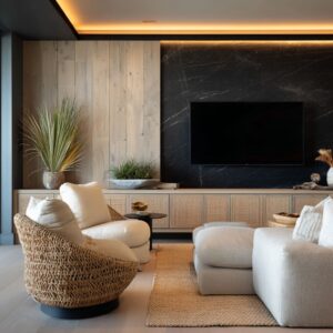
A TV is visually heavy because it’s a dark block. If the background is too plain, the TV becomes the only dominant shape, and the wall feels unfinished.
The weight zone fixes that by giving the TV a purposeful field behind it.

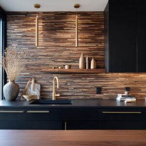
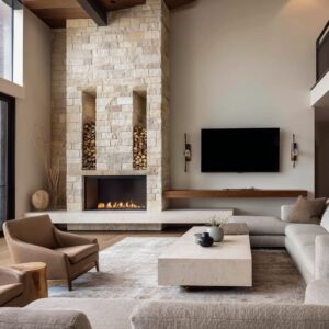
Stone is popular because it brings scale and pattern. A single large slab behind the TV can carry the composition, especially when the stone has broad veining or soft cloudy movement.
Another strong approach is bookmatched stone (two slabs mirrored), because it creates one larger gesture that competes successfully with the TV rectangle. Banded travertine-look stone is another option with a different character: its horizontal striping feels steady and architectural, especially when paired with a long linear fire line.

Plaster and smooth microcement-style surfaces can also work, but they often need a stronger depth zone—niches, shelves, or side towers—so the wall doesn’t feel flat. Plaster becomes more convincing when it has purposeful edges: a crisp framed panel, a recessed TV bay, or a slight step that creates a shadow line.
Even a small change in plane can give the wall a crafted feel.

A helpful logic: the more active the weight zone, the simpler the surrounding zones can be. If the stone has dramatic movement, the side niches usually work better with fewer objects and fewer competing finishes.
If the stone is calmer and uniform, richer side niches and stronger shelf lighting can carry more of the visual interest.

Another idea that often helps is managing sheen. Glossy stone can look sharp, but it also reflects light and can create glare near the TV.
Honed or leathered finishes often sit better next to a large black screen because reflections feel softer. The same idea applies to wood: a matte or lightly oiled wood finish tends to pair more smoothly with stone and the dark TV rectangle than a high-gloss lacquer.

Depth zone
Depth is the part that makes the wall feel custom. Recessed bays, shelf towers, and niche interiors create shadow lines that add dimension day and night.
This is also where minimal styling can look intentional, because light and shadow do some of the work.

One approach is symmetrical side niches around a stone center. Warm-lit shelves on both sides add warmth, soften the stone, and give controlled places for a few objects.
The symmetry can be strict (matching niches left and right), or it can be “soft symmetry” where the overall widths match but the inside styling differs slightly.

Another approach is a single shelving tower on one side, balanced by a full-height textured panel on the other. That split keeps the wall from feeling like a heavy center stack while still looking planned.
The textured panel can be micro-fluted MDF, ribbed plaster, or wood slats—something that adds shadow without needing strong color contrast.

Depth can also be created by stepping materials forward and back. For example:
- Stone sits slightly forward as the main field,
- the TV is set into a recess or framed by a margin,
- niche interiors sit back in shadow,
- and a base cabinet sits forward again as the grounding element.
That push-pull is what gives the wall dimension even with almost no decor.

A practical-looking detail that also improves the design is integrating the equipment in a disciplined way. A soundbar can become part of the composition when it sits in a planned slot, aligned with the fireplace opening or a cabinet band.
When it’s floating with visible cords, the wall loses the built-in effect. The same goes for outlet placement and device storage: when the base cabinet is treated as the “service zone,” the visible wall stays clean.

Ground line
A long base cabinet or a deep hearth bench often becomes the connector that makes the TV bay, the fireplace, and the shelves feel like one system. It also solves practical issues: storage, hidden equipment, cable management, and a surface for a small styling moment that doesn’t creep into clutter.

Base cabinets tend to look more refined when the fronts stay simple—flat panels, calm seams, and discreet hardware (or none). A recessed toe-kick or a shadow gap under the cabinet can make the wall feel lighter.
A thicker, deeper hearth bench gives a more architectural feel and makes the fireplace seem anchored. A bench can also function as a “landing ledge” visually: it provides a strong horizontal line that keeps the wall from feeling top-heavy.

The ground line also helps control proportion. A very tall stone panel can feel like a column if there is no long base to stretch the composition sideways.
Once a base runs long, the wall starts to feel like a full elevation rather than a single vertical feature.

A strong material trick here is repeating one finish from the weight zone down into the ground line. If the TV sits on stone, a stone bench or a stone cabinet top can link the whole wall.
If the TV sits on plaster, a plaster-return detail or a matching painted cabinet band can do the same job.

Texture direction pairing: vertical and horizontal
Directional texture can be used with intention. Vertical textures add height and fine shadow; horizontal lines add stability.
Pair them and the wall gains structure without needing strong paint contrast.
- Vertical texture ideas: micro-fluting, ribbed panels, slatted wood, fluted pilaster-like side fields
- Horizontal structure ideas: linear fireplace slot, long ledges, banded stone, extended base cabinet line
- A simple pairing: vertical ribbing behind the TV + a long horizontal fire line + a long base
- Another pairing: horizontal banded travertine-look stone + vertical slats in the side niches
There can be one main vertical texture and one main horizontal anchor. When every surface becomes a different pattern, the wall can feel restless.

Scale matters here. Very tight micro-fluting can look sophisticated in close-up, but on a very wide wall it can become visually busy.
Wider slats or larger rib spacing often look better in big living rooms because the rhythm stays legible from across the room. Wood grain direction matters too: vertical wood grain can support height, while horizontal grain can emphasize the wall’s width.
The choice can help correct a room that feels too low or too narrow.

The black-anchor trio that makes the TV feel built-in
The TV and the firebox are naturally dark. Repeat that dark note one more time so the TV doesn’t land as a random black patch on a light wall.
It’s a small discipline that changes the whole impression.
- Black anchor 1: the TV screen
- Black anchor 2: the firebox opening
- Black anchor 3: one extra black element (dark niche interiors, a slim cabinet band, black trim, or a compact sculptural grouping)
That third black repetition is often subtle. It can live inside the millwork (dark shelf back panels), show up as a thin metal trim around a stone field, or appear as a narrow band that also serves as a soundbar slot.
The key is placement that feels intentional, not scattered.

This is also why many successful walls avoid mixing too many metal finishes at once. When black is already doing the anchor work, brushed brass or warm bronze can be kept for small moments: a lighting trim, a minimal sconce, or a few decor accents.
Too many competing metals can fight with the black rectangles rather than supporting them.

Lighting as joinery
Lighting often separates a decent wall from a high-end one. In the strongest examples, light is treated like part of the build, not a last-minute add.
Warm light reveals stone movement at night, keeps niches dimensional, and makes the wall look good even with the TV off.
- Warm shelf LEDs: under shelves or within vertical niche sides
- Warm ceiling coves: to wash the wall and avoid harsh overhead glare
- Stone grazing light: aimed to bring out veining or texture relief
- Soft shadow gaps: under a floating base or behind a projecting hearth bench
Consistency matters here. When shelf lighting is warm but ceiling lighting is cooler, the wall can feel split.
Keeping one warm family of light makes materials feel cohesive.

Placement matters as much as color. Stone grazing works best when the light hits at a shallow angle so the veining or relief becomes visible.
Niche lighting works best when the light source is hidden, with a diffuser that avoids dot patterns. Another helpful idea is avoiding direct downlights aimed toward the TV, because glare can become the main thing seen at night.
Indirect light—coves, shelves, grazers—keeps the wall attractive without fighting the screen.

Margin rules: give the TV breathing room
A built-in TV often has a clear border of material around it. That border might be a stone margin, a panel margin, or a recess margin.
It replaces bulky frames and stops the wall from looking crowded.

The TV opening belongs to a larger field. The screen should not nearly touch the stone or trim edges.
A generous border helps the TV sit calmly inside the composition, especially when the stone has bold movement. Margins also help when the TV is off.
The screen becomes a dark mirror, and the border prevents it from visually “eating” the wall. A recess margin can be especially effective because it turns the screen into part of a shadowed bay rather than a floating rectangle.

Controlled asymmetry
Some interior designs can stack TV above fireplace and still feel good, but many walls look more custom when the roles are separated. Instead of one tall center column, the wall can split into roles: a fireplace tower, a TV bay, and a shelving zone—then connect everything with the ground line.
This approach helps with windows, doorways, or furniture layouts that don’t allow a perfect center stack. It also tends to feel steadier because the wall isn’t trying to make one vertical pile do everything.

A common version of controlled asymmetry is:
- fireplace sits in a taller stone or plaster tower,
- TV sits slightly offset in its own field,
- shelves occupy the remaining section,
- and one base cabinet runs underneath to stitch it together.
The wall becomes a composition of parts, but the ground line makes it act like one built-in element.

High-end-looking material combinations
A pale stone center with warm wood niches is popular because stone brings visual weight while wood adds warmth and comfort. Dark built-in volumes inside bright rooms work because daylight keeps the wall from feeling heavy, and the dark plane helps the TV disappear more easily.
Ribbed greige or off-white panel fields work because they create shadow detail without strong color contrast—especially when paired with a thin linear fire line and a simple base.

More combinations that often land well:
- Travertine-look stone + walnut slats: the stone gives horizontal structure, the walnut adds depth in niches and side towers.
- Veined marble + oak shelving: marble becomes the main gesture, oak keeps the wall approachable and prevents it from turning cold.
- Plaster field + dark niche interiors: the plaster stays soft and uniform, and the dark niche backs act as the third black anchor without adding clutter.
- Ribbed panel field + thin stone hearth: ribbing adds texture in shadow, stone adds a crisp base that looks intentional.
Transitions matter. When stone meets wood, a thin trim reveal or a clean shadow line often looks better than forcing the materials to butt tightly with no breathing room.
Small reveals make the wall feel crafted.

Proportion tips
TV height matters for comfort. The seated eye line lands near the lower third of the screen rather than forcing a steep upward view for long periods.
When the fireplace sits below, leaving enough space helps the two dark rectangles feel separated rather than compressed.

Fireplace length matters too. A wide TV often pairs better with a longer linear fire line, because both shapes then speak the same visual language.
The lengths don’t need to match exactly, but they should feel related in width so the wall doesn’t look like two unrelated inserts.
A few extra proportion ideas that help the whole wall:
- The base cabinet often looks better when it runs wider than the TV field, so the wall feels grounded.
- Side shelves look more intentional when their widths relate to the TV width (for example, two slim towers that together equal one large central zone).
- Deep niches are usually more convincing than shallow ones, because they create real shadow lines that show up even in daylight.
For styling, larger simple silhouettes usually beat many small items. Stone veining, ribbing, slats, and lighting already create visual activity.
A few matte ceramic pieces, one strong vase with branches, or a compact sculptural group often feels cleaner than lots of tiny decor. Repeating one material finish in the styling—black, warm wood, or a soft stone tone—keeps the shelves connected to the wall rather than looking like a separate display.
Conclusion
When a TV-and-fireplace wall is planned as one composition—one main surface for presence, a few shadowed zones for depth, and one long base line to connect everything—the room starts to feel finished before any extra décor is added. Clear texture direction, a controlled repeat of black, consistent warm lighting layers, and generous margins around the screen help the TV feel integrated and the fireplace feel anchored.
With that structure in place, stone types and wood tones can vary freely, and a small number of larger, low-sheen objects is usually enough to complete the look in both daylight and evening light.
Related Posts
Harmony Home Design brings 10+ years of residential interior design experience to the ideas shared here. We publish design concepts, layout thinking, and practical styling notes.