
Luxury interior design can fail in two opposite ways. Sometimes they turn flat, as if every surface landed in the same safe volume and nothing has a pulse.
Other times they turn random, because stone was chosen for impact, metal was chosen for shine, and fabrics were chosen for comfort—three separate decisions that never fully reconcile.

A reliable fix for high-end contemporary interiors: one large artwork becomes the room’s full-size material board. Not as a last-minute wall filler, but as the first decision that quietly governs everything else.
The painting carries a value range (pale haze through charcoal), a temperature mix (cool mineral notes alongside warm gold or rust), and a surface feel (matte fog, granular grit, sharp marks, reflective flecks). Once that exists on the wall, stone, metal, and textiles stop competing, because they’re all translating the same source.

The canvas is first, not the sofa
What to read inside the artwork before choosing finishes
Before a single swatch comes out, treat the artwork like a map. Not an abstract emotional prompt—a practical one.
1) A value map. Find the darkest note in the art. It might be charcoal marks, a blackened corner, a deep smoky band, or a thin dark frame that sharpens the edge. Then find the lightest field: a pale fog, mineral cream, chalky gray, or washed beige.
Those two endpoints matter more than the mid-tones, because the room will borrow definition from the dark and calm from the light.

2) The warm signal. Look for gold veining, bronze haze, champagne streaks, rust blooms, or warm staining that reads like oxidized metal.
This is the quiet permission slip for warm metals and warm light later. Without a warm signal in the art, brass can look like jewelry added after the fact. With it, brass reads like part of the palette.
3) The texture signal. Some artworks feel granular, like mineral dust or layered plaster. Others show banding, like stone strata.
Others shift in soft gradients, like smoke. And some bring sharper geometric patches that feel architectural. This texture cue helps you decide whether the room needs tufting and nubby weaves, or smoother textiles with crisp edges.

A neutral interior design that holds together usually has an artwork that already contains:
- pale field for the envelope
- dark note for definition
- warm trace for value and comfort
- surface complexity so the rest of the room can stay restrained
Single anchor vs paired panels vs mineral and agate patterns
Different art formats solve different wall problems.

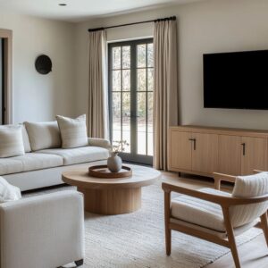
A single oversized anchor works best when the living room wall needs one clear hierarchy—especially above a long fireplace slot, behind a large sectional, or on a slab wall that could otherwise feel blank. One big canvas gives the wall a center of gravity and keeps small decor from having to do the heavy lifting.
Paired panels excel in bedrooms. Two pieces create a calmer band that supports symmetry over a headboard without making the wall feel top-heavy.
The gap between the panels becomes a controlled pause, and that pause often echoes the room’s own vertical channeling, drapery folds, or panel seams.
Mineral, topographic, and agate-style patterns do a specific job: they introduce an organic counter-shape in rooms dominated by straight lines—ribbed headboards, linear trim, tall curtains, and clean-edged nightstands.
Concentric rings and banding break the strictness without needing color.

Translating paint into stone
Picking the stone tone from the artwork’s light field
Stone decisions go wrong when they chase drama without a governor. The artwork can be that governor.
If the canvas’s light field is pale mineral cream or foggy beige, it points toward pale slabs and pale marble that still feel intentional. The room can stay bright because the art carries the mood.
Pale stone stops feeling generic when the artwork has enough atmosphere—staining, layered haze, or fine marks that give the wall a presence.

If the canvas’s light field leans warm taupe-gray, it often nudges the whole stone story warmer: slab walls read less icy, marble veining reads more sand-and-smoke than steel-and-white, and the room avoids that flat coldness that sometimes happens when every neutral is a cool gray. A practical way to use this: treat the artwork’s lightest area as your stone baseline, not your paint chip.
In many polished rooms, paint is almost irrelevant; the stone is the real background, and the canvas tells you whether that background should read creamy, sandy, mushroom, or cool mineral.

Veining as a rhythm
Veining can be expensive-looking or busy-looking, and the difference is rarely about the stone itself. It’s about rhythm.
When marble already has dramatic motion, the room needs a pause zone so the veining reads like a continuous natural field instead of a loud print. That pause is usually textile: a large matte rug under the seating group, or a calm upholstered expanse with minimal patterning.

Artwork helps in two ways:
- It licenses movement. If the canvas already has swirling haze, diagonal sweeps, or mineral banding, then stone movement feels related rather than attention-seeking.
- It softens the translation. Stone veining can be sharp and high-contrast. The artwork often repeats the idea in a gentler way—smoky gradients, granular clouds—so the eye accepts both as part of one material story.
Think of veining as tempo. The stone can move fast, but then the rug needs to slow it down.

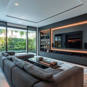
Shine control: where gloss is allowed to live
Many luxury neutral rooms rely on a reflective shell: polished stone floors, glass walls, mirror accents, and occasional high-gloss furniture. That shine can make neutrals look expensive—or make them look slippery and harsh.
A strategy:
- Reflective shell: glossy floor, glazing, sometimes a polished stone feature wall
- Matte textile island: a large rug that absorbs glare under the seating group
- Controlled sparkle above: chandelier crystals or glass elements that add light without turning every surface shiny
This is why rugs in these rooms are rarely small. They’re not decoration; they are glare management.
They turn off reflections exactly where faces, hands, and upholstery need to feel soft.

Translating paint into metal
Gold in the artwork is the permission slip for warm metals
Warm metal works best when it feels sourced, not sprinkled. If the artwork carries gold veining, champagne flecks, bronze staining, or rust-toned mineral zones, brass and warm metals stop reading like random accents.
They become a continuation of the art’s internal warmth.

Two main families of warm-metal translation:
1) Fine vein gold (thin, restrained): This points to slimmer metal moments—thin frames, sconce details, table bases with light profiles, small sculptural objects, subtle trims. The metal reads like a line, not a block.
2) Gold focal zone (stronger patch): This supports bolder moments—pendants with presence, a sculptural chandelier, a more substantial metal base under a table, a single emphatic gold object that holds attention. The key is consistency of intensity.
A canvas with faint gold hairlines rarely supports a huge brassy fixture. A canvas with a clear gold mass can.

Repeating metals at multiple heights so they look intentional
Warm metal tends to fail when it shows up once. One brass table base with nothing else to echo it can look like a purchase, not a plan.
A better approach is to repeat metal at multiple heights, so it reads like a system:
- Ceiling height: chandelier stem, pendant caps, canopy details
- Wall height: sconces, frame edges, picture lights
- Table height: table base, tray, a small sculpture with the same tone
- Furniture base: plinths, rings under ottomans, slim feet under a sofa

When warm metal appears in at least three of those layers, the room feels composed. The artwork usually provides the reason: the warm streaks in the canvas are already a repeated note inside one field, so repeating warm metal around the room feels natural.

Translating paint into textiles
Textiles can carry depth through shadow
Neutral textiles become interesting when they create depth through shadow structure. Tufting, channeling, and nubby weaves do something color cannot: they create a small-scale shadow grid that keeps pale upholstery from flattening against pale stone and pale walls.
In rooms that rely on hazy, granular artworks, shadow texture is especially effective because surface depth is echoed in more than one place: the canvas has layered texture, the sofa has dimensional upholstery, and the room feels rich without turning decorative. There’s also a shape benefit: soft upholstery with rounded edges balances hard architecture—straight glazing grids, slab walls, crisp fireplace cuts.
Many successful rooms pair a strict envelope with softer furniture profiles and shadow-driven textiles.

The rug as the quiet tool that makes stone and fabric coexist
A rug in these interiors is doing at least four jobs:
- Glare control over polished stone floors
- Zone definition in open plans
- A soft platform that makes seating look intentional
- Scale correction so furniture feels anchored, not scattered
Size discipline matters. The strongest rooms use rugs that are large enough to catch the main furniture feet and hold the whole seating group.
When a rug is too small, the room breaks into floating objects, and the stone floor becomes the dominant visual event.

A good rug in a neutral scheme often looks quiet from a distance—tonal, low-contrast, matte—then reveals structure up close: a woven grid, a subtle mottling, a gentle sketch-like motif. That keeps the room calm while still preventing blankness.
Pillow and bedding logic: micro-contrast in one family
In well-composed neutral interior designs, pillows introduce micro-contrast:
- weave shifts: linen-like matte next to a tighter tailored fabric
- sheen shifts: a faint shimmer next to a dry texture
- value shifts: one step darker, not five steps darker
In bedroom interior designs, this often includes one deeper counter-note pulled from the artwork—rust pillows, a smoky throw, or a charcoal accent—so the bed reads intentional against pale bedding. The art makes that darker note feel chosen rather than accidental.

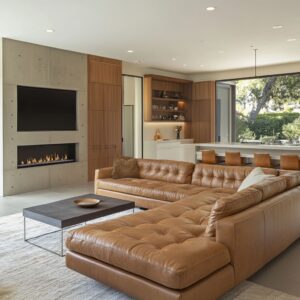
The fireplace wall stack: why art and flame work as a single composition
The flame line is an underline; the canvas is the main mass
A long, thin fireplace slot can look too small on a large wall. It’s a common proportion issue in contemporary homes with tall planes.
The fix is a repeated wall grammar: linear fireplace below, oversized canvas above. The flame becomes a thin underline—a moving warm band—while the artwork becomes the primary mass that gives the wall identity.
This pairing prevents two failures at once:
- the fireplace does not read like a lonely slit
- the wall does not read like a blank expanse

It also sets a strong axis for furniture orientation. The seating group looks purposeful because it faces a complete composition rather than a single thin feature.

Vertical correction in tall rooms
In double-height spaces, furniture often looks underscaled unless the wall elements are sized with confidence. Artwork is one of the cleanest ways to hold height without adding extra architectural clutter.
Two approaches show up repeatedly:
- One massive pale canvas that fills the wall with quiet authority. Pale can still be powerful if scale is right and surface texture is present.
- A taller, more dramatic wall composition paired with strong glazing lines and a clear fire underline, so the vertical volume feels inhabited from floor to ceiling.
The mistake is medium art in a tall room. It creates a dead zone above and makes the lounge feel temporary.

The dark note: where charcoal belongs in neutral rooms
Neutral interiors need definition, and definition usually starts in the artwork. The darkest value often arrives first as charcoal marks in the canvas.
Then it repeats in restrained architectural details:
- black-framed glazing
- a thin dark picture frame edge
- the fireplace opening
- slim table cores or a darker tabletop
- piping on chairs or a crisp seam line
This is why a pale room can still feel sharp: the dark note is not everywhere; it appears in specific edges and cuts. A thin dark frame around a pale painting can be enough to keep the artwork from dissolving into the wall.
Dark chair piping can link seating to window frames without requiring dark furniture. The rule is simple: dark belongs at edges, openings, and outlines.
The art usually teaches the room where that dark should live.

Artworks in Bedrooms
Two-panel sets as a calm band
Bedrooms often need symmetry, but heavy symmetry can feel stiff. Two-panel art solves that tension.
It keeps the bed wall centered, provides a controlled horizontal band above the headboard, and avoids the top-heavy look that a single large piece can create when the headboard is already tall. The gap between panels acts like breathing room.
It also echoes vertical channeling and drapery folds without turning into a literal pattern match.

The gold focal patch bedroom: warm metal that looks inevitable
A bedroom can stay luxury neutral when the artwork carries a clear warm zone—gold, bronze, or concentrated staining. That warm zone then reappears in:
- pendant details rather than big lamps
- one small sculpture or object on a nightstand
- subtle hardware tones
The warmth feels inevitable because it has a visible source: it already exists inside the canvas.

Mineral and agate art as the organic counter-shape
Bedrooms are often full of straight lines: channel headboards, panel seams, curtain pleats, and the crisp rectangles of nightstands. Mineral and agate patterns introduce rings, banding, and organic contours that relieve that linear intensity.
This is especially useful in rooms where textiles are already disciplined and tonal. The artwork becomes the one place where organic movement is allowed to be obvious.

Dark envelope bedrooms: art as the mediator between deep walls and pale bedding
Dark wall panels and pale bedding can look disconnected if nothing bridges them. Artwork often does that bridging by holding both deep and pale tones in one field—smoky charcoal, warm bronze, and a lighter haze.
In such rooms, reflection is used selectively: a chandelier sparkle or a mirror vertical can add lift, while textiles stay largely matte so the room feels calm rather than glossy.

Open-plan rooms: using art to give each zone a front face
Open plans often make dining zones feel temporary: a table placed in space, waiting for architecture to give it an address. Large wall art can give a zone that address.
A tall canvas above a slim fireplace line creates a vertical front face for the dining area, even when the room continues into a lounge behind it. It helps the eye understand where the dining zone belongs in the larger volume.

The same material logic can repeat:
- glass tabletops and sculptural bases echo the artwork’s mix of transparency and sheen
- warm metal appears in chair bases or chandelier details, backed by warm notes inside the canvas
- rugs sit under dining sets to control reflections on glossy floors
A repeated perspective trick strengthens the result: dining in the foreground, lounge behind, and an art-and-fireplace wall stabilizing the background. The room feels planned because the wall composition gives the entire view a destination.

Common failure modes (and how to avoid them)
Art too small for the wall height
Result: the wall feels empty, and a linear fireplace looks thin. Fix: scale the canvas so it holds the wall’s mass, or use a paired format where appropriate.
Random warm metal with no source
Result: brass reads like scattered accessories. Fix: let the artwork carry a warm signal first, then repeat metal at multiple heights.
Too many small decor items on reflective tables
Result: visual noise and messy reflections. Fix: fewer objects, heavier presence—one tray, one stack, one sculptural piece.
Gloss everywhere
Result: the room feels harsh—floor, table, metals all bouncing light. Fix: a large matte rug and mostly matte textile surfaces, with sparkle concentrated in one overhead zone.
Neutral palette with no dark note
Result: the room loses definition and edges blur. Fix: let the artwork introduce charcoal first, then echo it in frames, openings, piping, or a slim dark tabletop.
Related Posts
Harmony Home Design brings 10+ years of residential interior design experience to the ideas shared here. We publish design concepts, layout thinking, and practical styling notes.