
A modern open-plan kitchen can look finished the moment you walk-in, or it can feel slightly unsettled even with expensive finishes. The difference usually comes down to one quiet decision: does the room have a clear line that tells your eye where the space begins, how it moves, and where it ends?

A linear fireplace is a powerful tool for that, because flame naturally pulls attention. The layout can be arranged like a long gallery view: the island leads your eye forward, the dining table continues the line, and the fireplace becomes the visual stop that makes the whole plan feel complete.

Island-to-fireplace line as the plan’s organizer
If you only fix one thing in an open plan, fix the main axis first. Think of your island as a runway.
When the island points toward the fireplace wall, the room immediately feels planned. Even before you notice the stools, art, or rug, your eye understands the order.

What makes this work is circulation. A space feels comfortable because there’s usually one generous walking lane from the kitchen area toward the living zone.
It does not force people to squeeze behind stools or slide between chair backs.

Layouts feel easy when the main aisle between the island and the opposite side (a counter run, a sofa back, or the living edge) lands around 1100–1400 mm. Behind dining chairs, 900–1200 mm often keeps movement smooth without pushing the table too far from the windows.
It does not require chasing perfect numbers; what matters is consistency. A single lane that stays comfortably wide in the whole stretch is what makes the open plan feel calm.

Horizontal and vertical balance
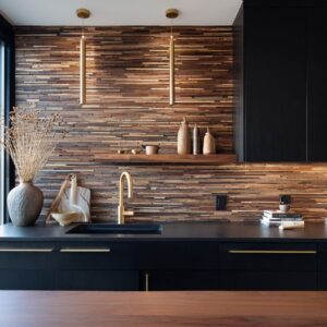
Open-plan kitchens with modern fireplaces can use this long horizontal element, and that’s a big part of why they look modern. There are a few long items: a long island, a long dining table, and a long flame slot.
Sometimes it is a good idea to have also a linear pendant that echoes those lengths. That repetition is not a coincidence.
It gives the whole space a shared proportion language.

But if the room only speaks in horizontals, it can start to feel flat. The design can have vertical counterpoints that keep the space from turning into one stretched band.
Tall glazing helps a lot, especially when the window mullions are dark and clean. Pendant drops also matter because they bring vertical strokes down into the room.
It can be full-height wood panels with quiet seams, tall cabinet towers framing the cooking wall, or a stone column that rises next to the dining zone. Those upright moves give the long layout a sense of structure.

So, if the space has three major long, low elements (island, table, fireplace line), the eye should be able to find two clear vertical elements without searching (glazing height, pendant drops, tall cabinetry, a stone tower, clean panel seams).

Material hierarchy: big calm planes first, then one texture move
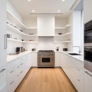
Open plans show everything at once, which is why the designs that feel cohesive usually follow a simple material order. First, they establish big, calm surfaces.
That often means slab backsplash instead of small tile grids, broad stone on the fireplace wall instead of busy trim, and full-height wood fields with minimal seams instead of lots of door-and-panel variety. Flooring tends to run continuously through kitchen, dining, and living so the plan feels unified, not chopped into zones.

Then the design adds one focused texture move that earns its spot. It might be a chevron stone wrap on a column, a herringbone surface on the fireplace wall, a diagonal wood veneer pattern on upper cabinets, or a ribbed island face.
The key is that it’s usually low-contrast. The interest comes from shadow lines and direction, not loud color.
One of the cleanest strategies is to let that texture show up once in the kitchen zone, then repeat it once near the fireplace. For example, a zigzag stone pattern might appear behind the range and then return on the fireplace wall.
That repeat does a lot of quiet work: it links cooking and lounging without adding more colors, more decor, or extra partitions.

Warmth feels intentional when it is consistent
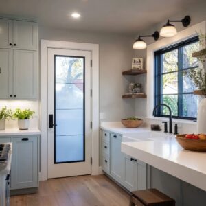
Fireplace glow already brings warmth, but the surrounding palette decides whether the room feels inviting or slightly cold. These can be: warm wood for comfort, cool stone to keep the space crisp, charcoal/black to frame the composition, and brass as a small highlight.

Warm wood often lands where people touch and gather: island base panels, tall cabinet bookends, and dining table surfaces. Cool stone shows up on the island top and backsplash, then repeats at the fireplace wall so kitchen and living feel related.
Charcoal or black appears as structure: a hood block, window frames, a sharp firebox outline, thin hardware, stool legs, pendant cords. Brass usually stays limited—often faucet plus pendant fittings, sometimes a footrail on stools—so it reads as a deliberate accent rather than a theme.

Choosing finishes, one helpful approach is to decide which stone surface will carry the boldest veining and keep the other stone calmer. A dramatic slab can look striking behind the range or at the fireplace wall, but when every stone surface is loud, the room can start to feel visually restless.

Zoning by giving each area an anchor
Open plans feel clear when each zone has one anchor element that signals what the area is for.
- In the kitchen, the island and the pendants usually do that job. Even with a large cabinet wall, the island becomes the social center, so it benefits from lighting that defines it without blocking views.
- In the dining area, a long table plus a strong light element tends to settle the space. A pendant cascade or repeated globes can fill tall ceiling height without a heavy chandelier shape, especially when the shades are clear or lightly smoky. A rug under the dining table can also help, not only visually but for sound control in rooms with lots of glass and stone.
- In the living area, the fireplace wall becomes the anchor, and a low bench or ledge at the base often makes it feel usable, not purely decorative. A sofa placed with its back toward the dining table can act as a soft divider, separating zones while keeping sightlines open. This is one of the simplest layout moves that makes an open plan feel organized without adding construction.

The island as a furniture object
A high-finished look can be achieved by using an island that looks like a sculpted object. Waterfall ends and monolithic stone wraps help because the material turns the corner and drops to the floor, so you don’t see a thin top sitting on a separate side panel.
This is especially effective when the island faces the living area; the end panel becomes a feature surface you see from the sofa and dining table.

A second idea is a dark base with a light top. A pale stone top can feel heavy in a large open plan, and a deeper base tone helps visually ground it.
It also hides daily wear better at stool level.

On very long islands, an end-cap panel in a darker stone or charcoal surface can make the island feel finished. It gives the long run a clear endpoint and often helps at the high-traffic corner where scuffs happen.

Comfort still matters as much as appearance. Many seating lines feel workable when stools land roughly 550–650 mm apart (center to center) and the overhang gives around 250–300 mm of knee space.
Slim stools with thin legs keep the lower half of the room visually open, which helps in open plans where the fireplace and glazing remain prominent.

Lighting in layers
Lighting can do the decorative work because surfaces stay simple. The mistake is relying on one layer.
The rooms that feel cohesive usually use three layers that each have a clear job. Recessed ceiling lights provide even baseline brightness so the room never has harsh pockets of shadow.
Under-cabinet strips make counters functional and prevent dark cabinetry from turning into a heavy block at night. Then pendants become the feature layer, defining the island and dining zone with warm glow.

Glass pendants often work well here because they give sparkle without blocking the view to the fireplace wall or the windows. Clear globes keep sightlines open.
Smoky glass can soften bulb glare. Slender rods and cords add a quiet vertical rhythm that balances the long horizontals of island, table, and flame slot.

If the space has a ceiling tray or cove light band, that can add another level of comfort, because it spreads warm light gently and reduces sharp contrast on cabinetry faces and stone surfaces. It also helps the room shift from daytime brightness to evening mood without feeling like you flipped a switch from one extreme to another.

Fireplace wall options
A linear fireplace tends to look cleanest when its framing is simple and graphic. A dark recess behind the flame line can make the fire read crisp, especially when the wall material around it is lighter stone or textured tile.
That contrast lets the fire feel designed without needing a mantel or a lot of objects nearby.

If it is a patterned fireplace surface (herringbone, chevron, zigzag), low-contrast color makes it easier to live with. The pattern becomes texture and direction, not a loud graphic.
It can also reduce the need for large artwork because the wall already has depth and shadow. A corner linear fireplace can be especially practical in open plans, because it can serve the dining zone and the living seating at the same time.
One fire feature can warm the whole space visually without asking for two focal points.

A few common issues that make open plans feel disconnected
Open plans often start to feel messy when there are too many patterns competing. If there is a herringbone floor, strong-vein stone in several places, a patterned fireplace wall, and a busy rug, the eye has nowhere to rest.
Bringing it back usually means choosing two calm surfaces and letting one surface carry the texture, then repeating that texture once elsewhere and stopping there.
Another common problem is heavy pendants in front of large windows. Opaque shades can interrupt the view and make the ceiling line feel crowded.
Clear or lightly tinted glass tends to keep the space airy, especially when the windows are a major part of the room’s character.
Finally, island styling can quietly ruin a clean open plan. Small objects spread out along the counter turn into clutter quickly because the kitchen is always on display.
A calmer approach is to keep styling in one or two compact groups—a bowl, a tray, a low green element—and leave open surface around them so the stone reads as one clean plane.
Related Posts
Harmony Home Design brings 10+ years of residential interior design experience to the ideas shared here. We publish design concepts, layout thinking, and practical styling notes.