A glass kitchen door often reads best when it’s treated as a visual instrument that regulates three simultaneous behaviors in the room: how light behaves (clear view, softened glow, shimmer, or matte diffusion), how attention behaves (whether the eye travels through the opening or rests on the door surface), and how order behaves (whether the kitchen feels edited and calm or visually busy). In well-composed designs, the door stops being a simple transition point and starts functioning like a designed panel with a clear role inside the overall composition.
That role can shift: sometimes it behaves like a framed artwork, sometimes like a screen, sometimes like a bright end-cap that completes a long sightline, and sometimes like a dark outline that quietly sets the room’s graphic rules. The overall effect tends to feel “finished” without extra objects because the door is performing the work that wall décor or feature lighting often does.
Transparency is a dial, not a yes/no
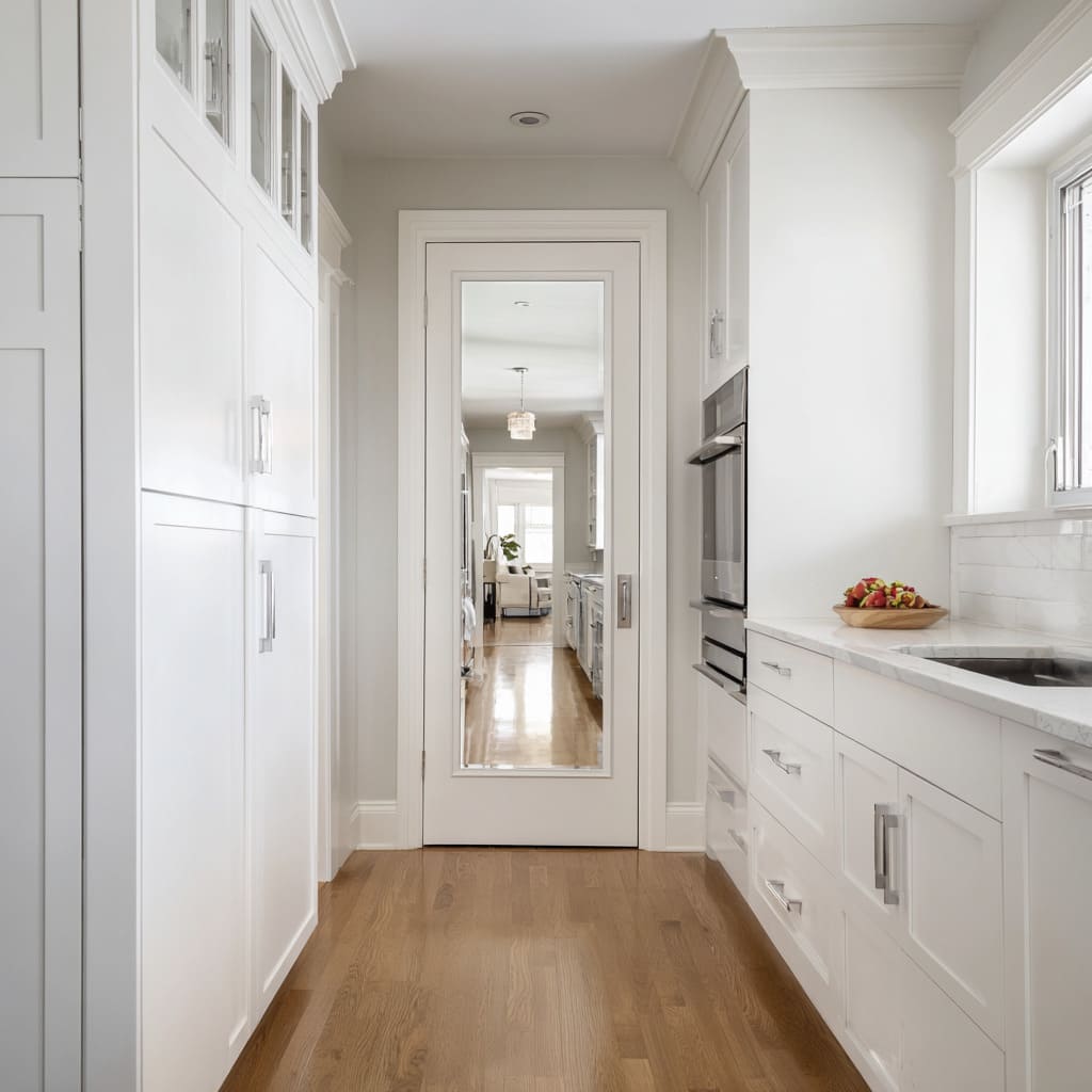
Glass reads in multiple visibility modes, and each mode changes the emotional temperature of the kitchen. Fully clear glazing creates a depth effect that rewards the viewer with a layered view; it makes the kitchen feel connected to other rooms because the eye is invited to keep going.
But clear glazing also increases the amount of information the brain has to process, which means clarity needs visual editing elsewhere—usually through structured linework on the door or calmer surrounding surfaces—so the view beyond reads intentional rather than accidental. Diffused glazing shifts the purpose: instead of offering information, it offers brightness.
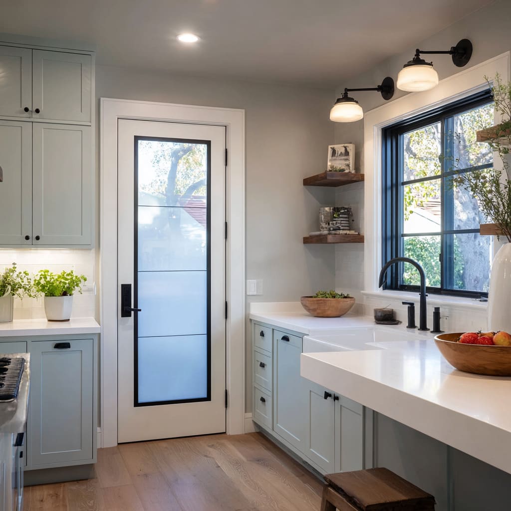
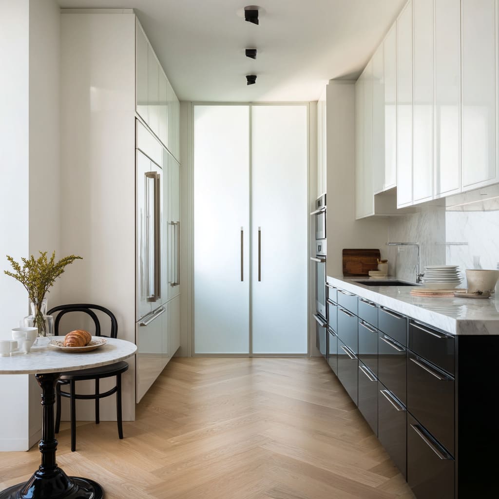
Frosted, opaque, or softly obscured glass tends to behave like a luminous surface rather than a window, and that changes the entire perception of the wall. The door becomes a stable, bright rectangle that can replace the role of framed art or shelving because it fills the wall with controlled light value.
Textured glass sits between those two extremes: it can hint at depth while removing detail, producing a gentle veil effect that keeps the room airy without allowing background clutter to become part of the visual story.
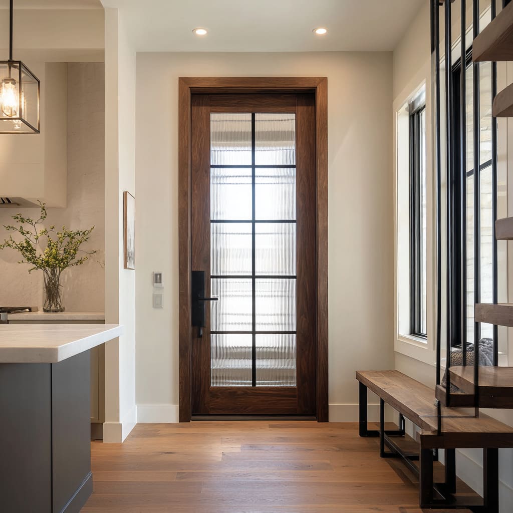
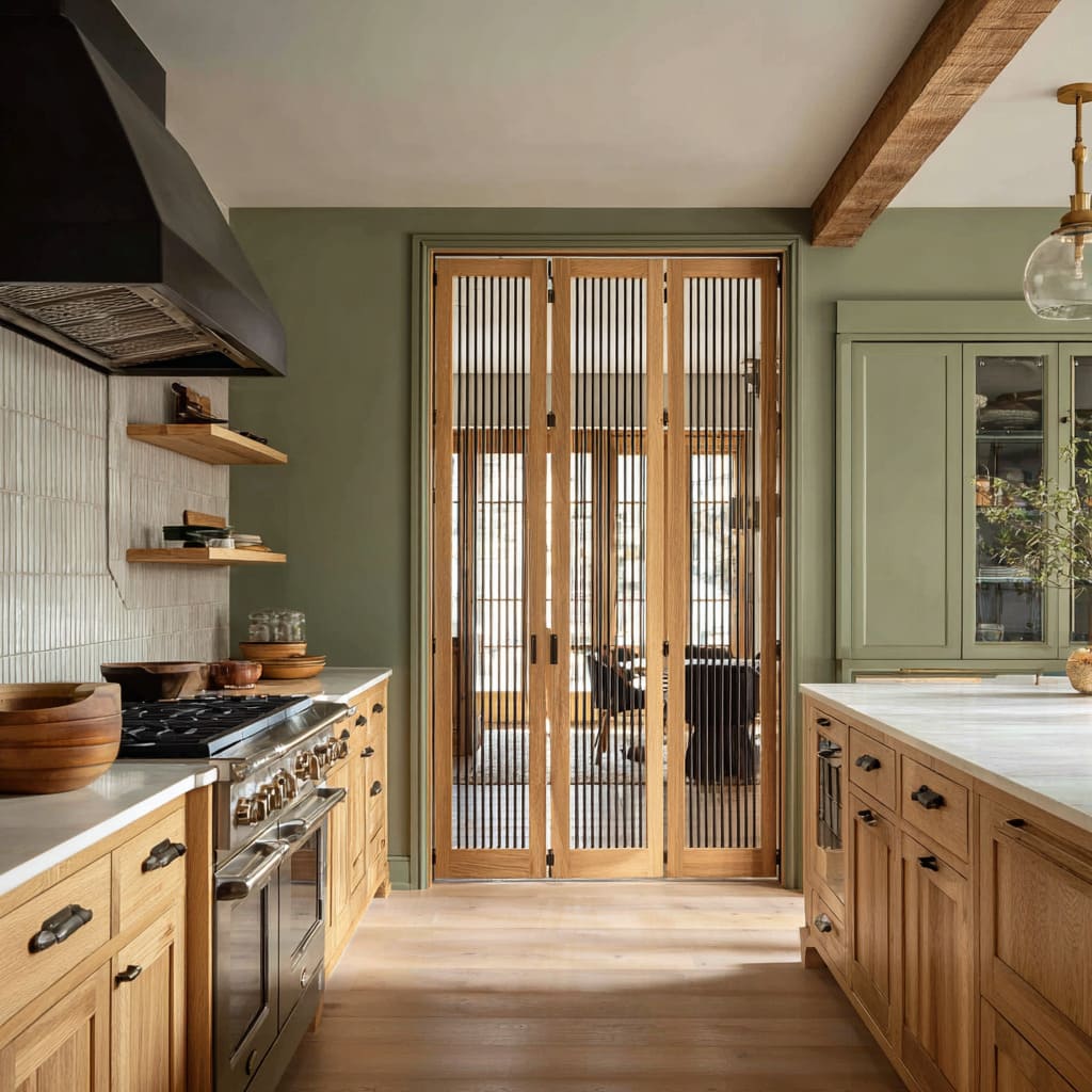
A subtle but powerful variation inside this “dial” is vertically textured or ribbed glass, where the surface introduces a fine shimmer that reads almost like a fabric-like glow. The eye experiences it as light plus texture, not light plus scenery.
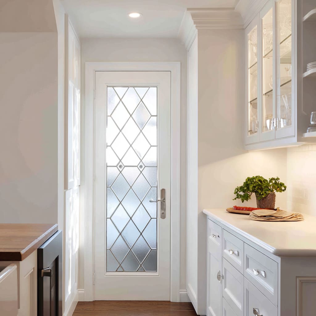
That texture often holds attention on the door plane, which means the door feels like part of the kitchen’s wall composition rather than a tunnel into the next space. Patterned glazing (such as diamond or leaded rhythms) adds a different kind of control: it introduces ornament without adding objects.
Because the pattern lives inside the glazing field, it can make a corridor-like kitchen feel complete at the end without relying on external decor, as long as the surrounding planes stay visually quiet so the pattern remains readable and clean.
Linework is the door’s typography
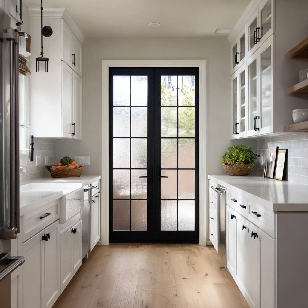
The internal divisions of a glass door function like typography: they control reading speed, hierarchy, and mood. A full grid tends to read as dependable structure.
It makes the door feel architectural, and it also edits whatever sits behind the glass by slicing the view into calm units. This is why a grid can make even ordinary background elements feel composed—because the view is reorganized into a set of rectangles with predictable rhythm.
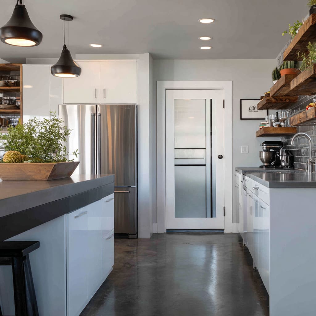
Minimal divisions create a different impact. When linework is reduced to a few bands or a simplified set of mullions, the remaining lines become more authoritative, reading as deliberate graphic strokes rather than window-like segmentation.
That shifts the aesthetic toward a contemporary, poster-like clarity where the door behaves as a designed sign inside the room.
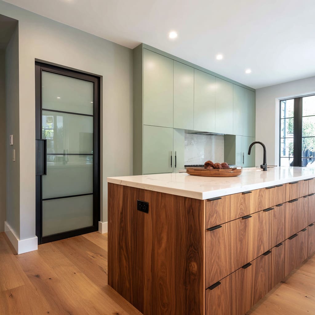
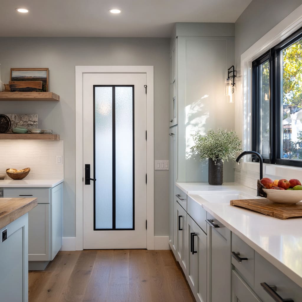
Another approach appears when mullions form a narrow, vertical signature rather than a full grid. Two tall diffused fields held by a bold spine can read almost typographic—like a strong central stroke holding light on either side—so the door feels intentional without becoming busy.
Patterned rhythms also behave like typography, but with a softer tone: diamonds, diagonal lattices, or tight stripe effects add decorative cadence. The important nuance is scale.
Large, legible rhythms read as graphic and calm; tiny, frequent rhythms read as fussy and visually loud. In well-balanced compositions, the door’s line language becomes the highest-frequency pattern in the scene, while other surfaces remain calmer so the door stays the primary “text” the eye reads at the endpoint.
Frame color and material set the volume of the door
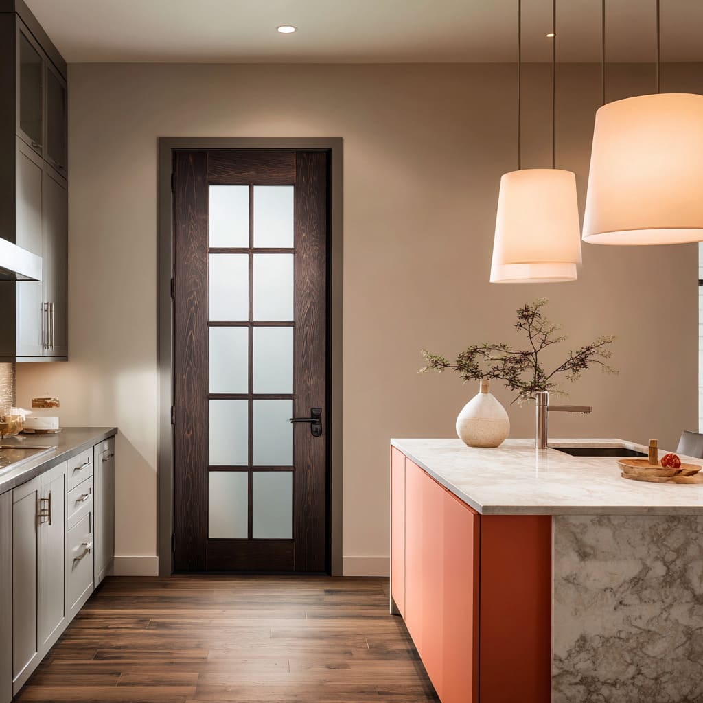
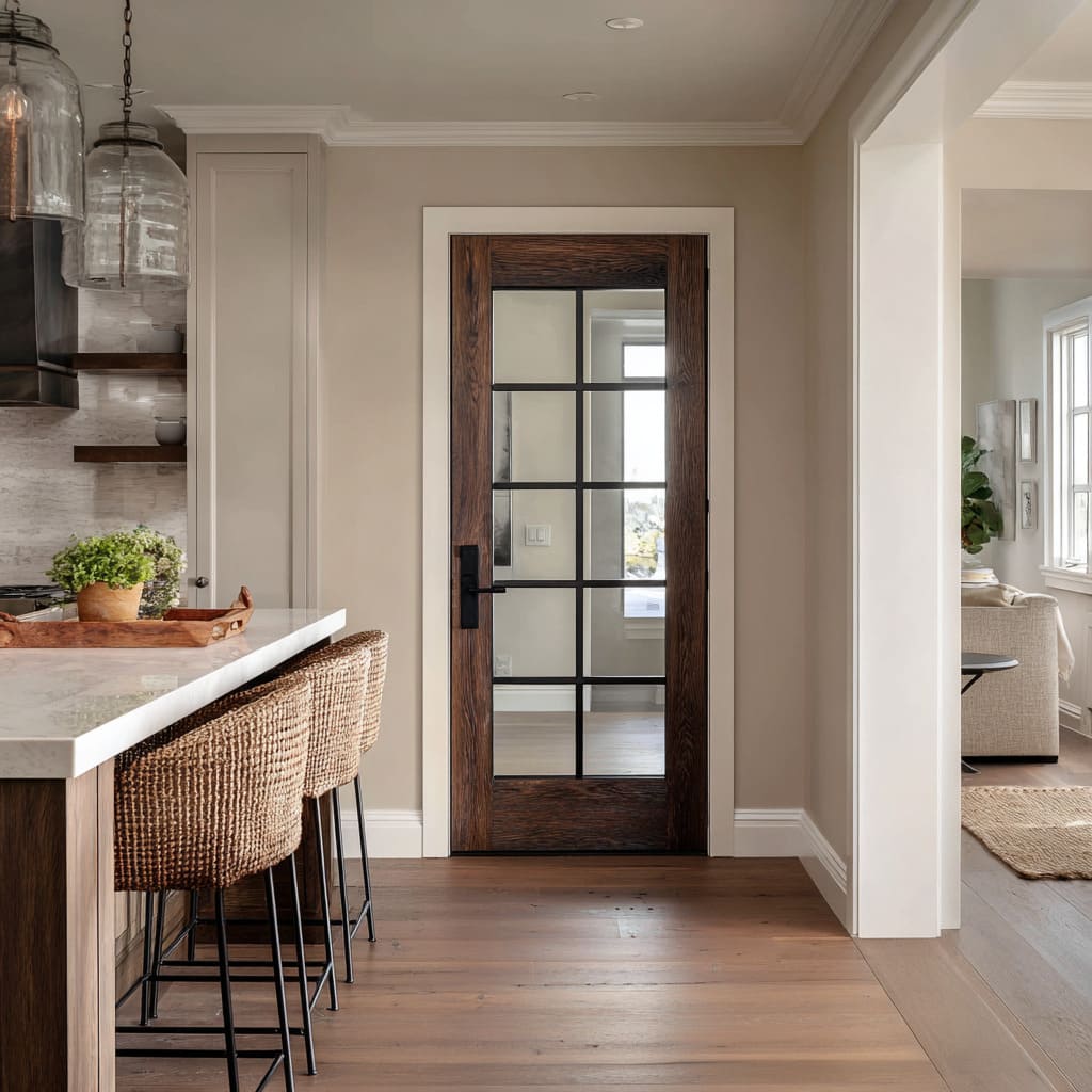
The perimeter material of the door works like a volume knob for contrast. A dark wood frame often reads as warm ink: the grain adds living irregularity that softens strict geometry and prevents the door from feeling clinical.
Wood allows strong structure—like a grid—to feel grounded and human because the material itself carries warmth and variation. A black steel frame behaves differently.
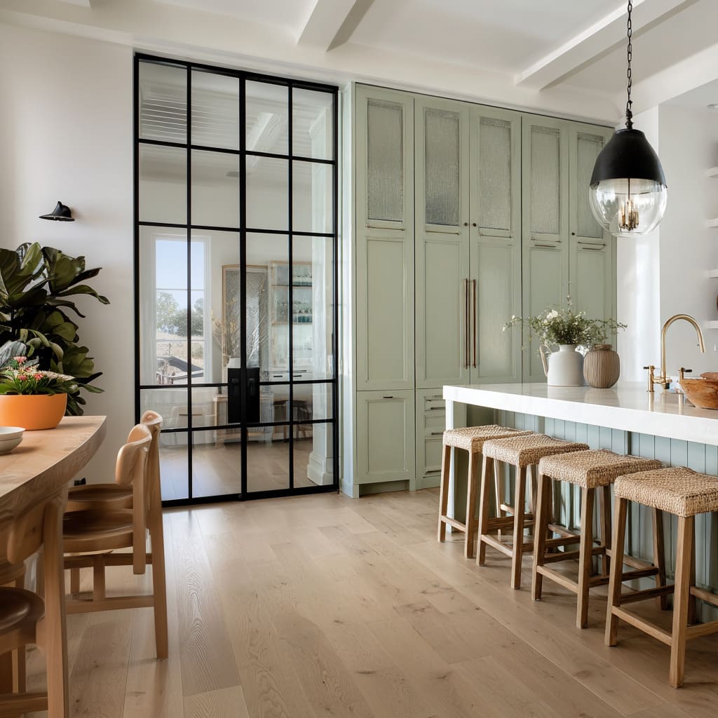
It reads as architectural outline and tends to impose an immediate graphic order on the wall. That order can feel crisp and clean, but it also demands a supporting language elsewhere in the room so the black doesn’t look like a one-off moment.
When black is treated as a repeated punctuation—appearing in small strokes such as faucet silhouettes, window trim, or hardware—the door reads integrated rather than dramatic. White painted frames operate as trim continuity.
A white door blends with casing and baseboards, which makes the perimeter intentionally quiet. In that scenario, the visual focus moves inward to the glass treatment: diffusion, texture, pattern, or bold mullions become the point of interest because the outline is designed to disappear into the room’s finish language.
This is why the same type of glass insert can feel more “featured” in a white door than in a black one: the room reads the interior panel as the designed event because the perimeter is deliberately neutral.
Placement changes the meaning of the door
Placement can transform glass into a wall-composition element rather than a functional transition. When a door is centered on a wide, calm wall plane, it can read like a framed panel or a piece of built-in artwork, especially when surrounding negative space is treated as intentional “framing.
” The wall feels complete not because it has décor, but because the door itself provides a controlled rectangle of contrast and light. In narrower compositions, placement at the end of a galley changes the door into a destination wall that resolves perspective.
A long run of cabinets naturally creates directional force; a well-chosen glazed endpoint gives that direction a satisfying finish, allowing the eye to land on a clear final shape rather than drifting in a corridor effect. A third placement strategy appears when glass acts as a divider between rooms.
In that role, the door behaves like a lens: it doesn’t merely open to another area, it imports atmosphere. The kitchen borrows the softness, daylight, and calm surfaces of the adjacent space and makes them part of its own palette.
The door becomes an architectural boundary that still feels shared, which can lower visual stress because the kitchen reads less like a sealed work zone and more like part of the home’s broader, quieter envelope.
Echo systems: how the door teaches the room to behave
Many polished interiors use the door as the origin of a design rule that appears elsewhere in varied forms. A black outline or mullion system often becomes the source of a repeating stroke language throughout the space: the door establishes the idea, and other elements quietly echo it at different scales and in different directions—thin legs, linear pulls, a faucet silhouette, or a framed light fixture.
This repetition works best when it is not identical, because exact matching can become literal and rigid. Instead, the room tends to feel more sophisticated when it repeats the principle (dark strokes, clean geometry, clear outlines) while shifting scale and shape so the repetition reads as rhythm rather than copy.
A second echo system shows up through glass family layering. When a room contains only one large glass element, it can look overly special.
But when glass appears in multiple personalities—diffused in the door, clear and rounded in pendants, reflective and contained in cabinet fronts—the material becomes a theme with variation. That variation keeps the composition from feeling themed or staged; it reads like a coherent material story where transparency and reflection are distributed in controlled doses, giving the kitchen depth and light-play without creating clutter.
Counterbalances that keep glass doors from feeling severe
Strong linework benefits from soft counterweights. Organic silhouettes—branches, airy greens, rounded bowls—act like a visual handwriting beside the door’s more printed, graphic geometry.
That contrast prevents grid logic from becoming rigid, and it also introduces a gentle softness that makes the design feel lived-in even when surfaces are clean and edited. Curves serve a similar role at the room scale.
A single curved element can interrupt the rectangle-dominant structure of cabinetry runs and long sightlines, shifting the feeling from corridor-like to social and relaxed. These curves can appear as lighting shapes, small furniture moments, or sculptural accessories, but the deeper strategy is consistent: a curved note slows the eye and softens the psychological “strictness” created by repeated right angles.
Another stabilizing counterbalance appears when fine patterns are present. Thin stripes, tight textures, and repetitive rhythms can create visual nervousness if everything in the room is similarly high-frequency.
A large calm mass—such as a simple hood form, a quiet cabinet band, or an uninterrupted color plane—acts as a visual brake. It slows reading speed and gives the eye a resting block so the finer glass texture can feel refined rather than busy.
In that sense, the door’s success is rarely about the door alone; it depends on whether the surrounding environment provides the right mix of quiet planes and soft interruptions.
Pattern budgeting: where visual complexity is spent
A kitchen tends to have an inherent level of visual information because functional life produces objects, tools, and small changes. Glass doors can either amplify that information (when they reveal extra views) or reduce it (when they diffuse and simplify).
The most composed spaces treat pattern like a budget. If the door is already carrying strong structure—grid, diamond rhythm, stripe texture—then other major surfaces typically stay calmer: cabinetry faces remain clean, tile reads as a quiet field rather than a bold motif, and countertop styling stays low and grounded so the door remains legible as the anchor rectangle.
When the door is minimal and graphic, the design often supports it through disciplined large planes so the few lines on the door remain powerful and readable instead of getting lost in competing textures. This is also where material choice becomes strategic.
Natural textures such as woven seats, warm wood bowls, and subtle textiles can soften a strict door without adding visual noise because they read as tactile warmth rather than pattern. In that way, the door’s linework becomes the main “graphic content” while other textures behave like atmospheric support—present enough to feel welcoming, restrained enough to keep the visual hierarchy stable.
Light choreography: why glass can replace wall decor
Diffused glass often behaves like a controlled light value, which makes the wall feel finished even when it remains mostly empty. Downlighting can create a gentle brightness field that treats the door as a quiet feature without using art.
Warm base glows from under-cabinet lighting can create a second, softer light layer that converses with the daylight held inside the glazing, preventing pale palettes from feeling cold or sterile. Opaque or frosted door glass often reads calmer than clear glass under multiple light sources because it avoids sharp reflections and busy mirror effects; it maintains a stable tone, which helps the entire composition feel settled.
This is one reason the glass kitchen door design concept frequently appears in edited interiors: it gives a kitchen a “designed wall” without adding objects that require maintenance, dusting, or constant rearranging. The door becomes a reliable visual element that supplies light, structure, and a finished endpoint, leaving the rest of the design free to stay functional and calm without feeling under-decorated.
Main concept families grouped by dominant visual effect
Group I: Doors that read as composed panels on a calm wall
These strategies rely on centered placement, negative space framing, and glazing that holds light in a controlled way. The wall feels complete because the door is treated as a designed rectangle rather than an incidental opening.
The visual hierarchy is simple: a calm field, a strong panel, and minimal competing elements, producing a quiet “built-in artwork” effect without literal artwork.
Group II: Doors that resolve long sightlines in galley layouts
Here, the door functions as an endpoint that provides closure to strong perspective lines created by cabinetry runs and flooring direction. When diffusion is used, the endpoint can feel like a bright wall that avoids a hard stop; when dark framing is used, the endpoint becomes a crisp target that organizes the corridor visually.
The feeling shifts from tunnel-like to intentionally composed because the eye has a clear destination.
Group III: Minimal, graphic doors that establish a modern outline language
These strategies use fewer lines with higher authority, often supported by repeated dark punctuation elsewhere—window trim, hardware strokes, faucet silhouettes, or lighting frames. The design reads clean and confident because the door’s linework becomes part of a broader outline system, forming a stable graphic triangle or network that organizes the space without heavy décor.
This is the logic behind a modern kitchen glass door design that feels architectural while still remaining warm when balanced with wood and soft textures.
Group IV: Screen-like doors that filter information while keeping rhythm
Textured, striped, ribbed, or slatted approaches turn the door into a privacy veil with strong vertical cadence. The design feels calmer because the door provides light without adding additional scenes to process.
Fine rhythm typically reads best when the environment supplies calmer planes and one or two stabilizing masses so the pattern feels refined rather than restless.
Group V: Large glass door systems that behave like an atmosphere divider
Here, the door is less an endpoint and more a lens that imports daylight and softness from an adjacent room. The kitchen benefits visually because it borrows the calmness of nearby spaces, and glass becomes a shared medium that keeps separation without isolation.
This is often the visual foundation of a modern kitchen with glass doors that feels open, bright, and composed even when daily life introduces functional items into the kitchen zone.
The principle underneath all versions
A glass kitchen door tends to read intentional when it is treated as one of three roles within the composition: a composed light panel that replaces the need for wall decor, a view editor that structures what would otherwise be visual clutter, or a graphic spine that sets line rules echoed elsewhere in the design. The strongest interiors treat the door as a stabilizing element that organizes attention, not as an isolated feature.
When the surrounding environment supports that role through calm planes, controlled repetition of outlines, and soft counterbalances like organic silhouettes and gentle curves, the result feels finished, calm, and visually intelligent without needing excessive decoration.
Related Posts
Harmony Home Design brings 10+ years of residential interior design experience to the ideas shared here. We publish design concepts, layout thinking, and practical styling notes.
