Botanical minimalism in circulation space designs tends to feel high-end when the wall behaves like atmosphere first and the plant marks behave like rhythm, spacing, and scale rather than “artwork. ” The strongest results come from a controlled hierarchy: soft surface fields, disciplined linework, a few anchoring edges, and one or two tactile notes that keep the space human.
In that sense, many entryway feature wall ideas succeed because the wall is treated as a pacing system—how the eye moves, where it rests, and how a corridor gains calm, height, or depth without visual noise.
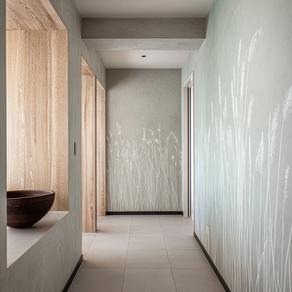
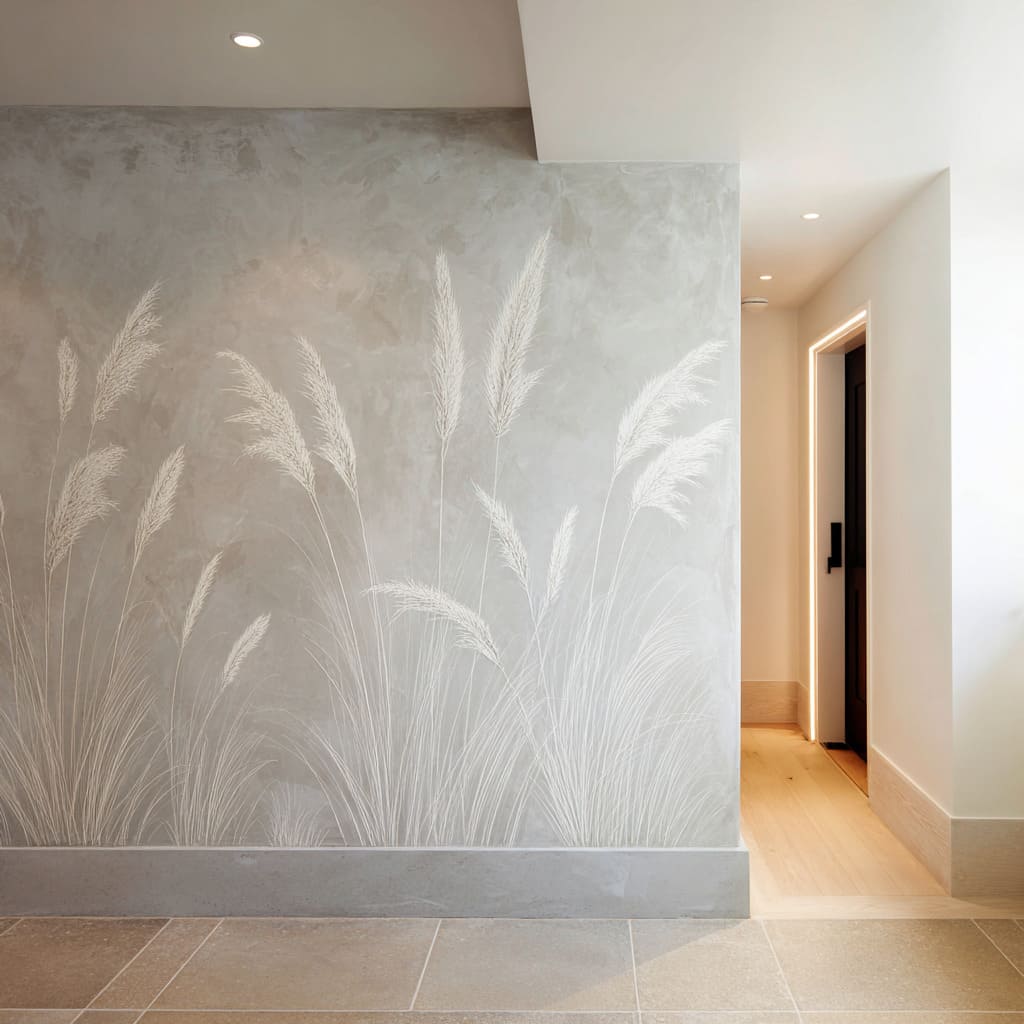
Low-field meadow walls that create “quiet height” and corridor stretch
A corridor reads taller and lighter when botanical activity is concentrated low on the wall while the upper field stays open and calm. The space also reads longer when repeated stems act like soft vertical markers that guide the gaze forward in a slow, steady tempo.
The design ideas behind it
- Density placed near the floor: Keeping the most active marks in the lower half gives the upper wall and ceiling plane “rest space,” which increases perceived height and removes the feeling of a decorated tube.
- Fade-out top edges: Botanical marks that dissolve upward turn into air and haze rather than illustration, so the wall reads as atmosphere instead of a statement graphic.
- Micro-variation instead of strong contrast: Uneven visibility—some stems crisp, some barely present—adds depth and a collected, hand-touched character without needing color shifts.
- Base datums that sharpen softness: A thin dark line, a plinth tone change, or a crisp base edge can act like an underline that makes pale stems read intentional, not faint.
Botanicals integrated into architecture: storage faces as functional art
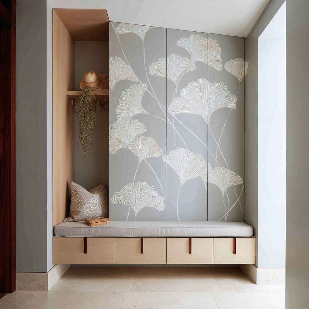
The wall feels cleaner and more “designed-in” when the botanical layer sits on panel doors, tall cabinetry faces, or built-in planes. The result reads as one composed object rather than an added mural moment.
The visual logic
- Surface authority: When the motif is on doors or panels, the botanical layer inherits the seriousness of architecture; it stops reading like decor and starts reading like a designed skin.
- Curving linework that softens box geometry: Diagonal sweeps and long arcs (especially fan-leaf forms) counterbalance right angles, making niches and bench zones feel lighter without changing mass.
- Adjacent blank planes as brightness tools: A nearby quiet wall often functions as a light-reflecting partner; it amplifies pale linework and expands the sense of volume without extra elements.
- Tiny warm accents that repeat quietly: Small pulls, subtle wood framing, and restrained textiles can add temperature in measured doses so the whole composition stays calm rather than clinical.
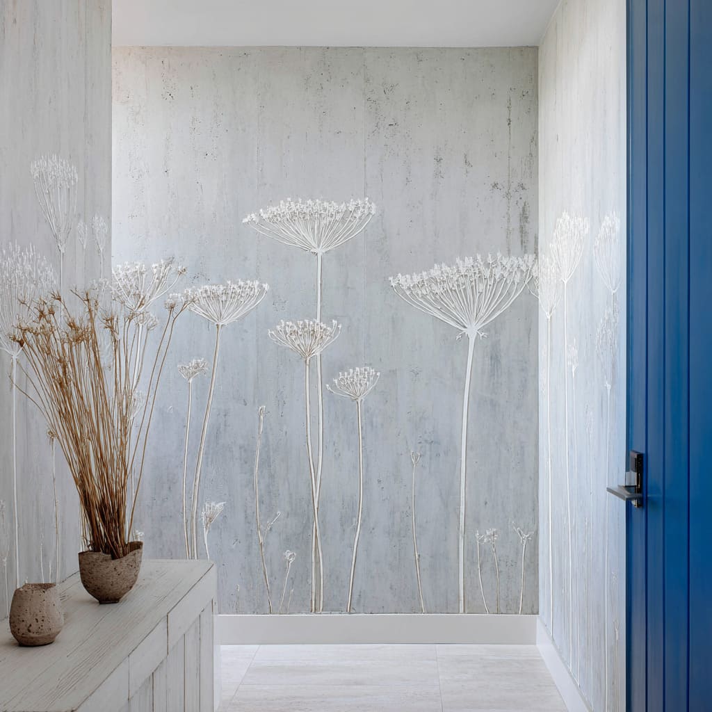
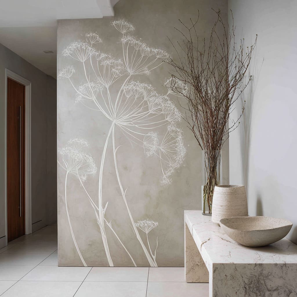
Concrete-wash botanical fields paired with a single strong punctuation element
A soft botanical veil can sit comfortably beside one decisive, saturated element (often a door or a single dark slab), because the botanical layer is deliberately low-contrast. The overall impression becomes modern and memorable while still quiet.
What shapes the effect
- Contrast hierarchy (not contrast competition): The wall field carries texture; the botanical drawing carries identity; the punctuation element carries the main contrast; hardware carries the sharp micro-accent.
- Veil-like botanicals: Lace heads and airy umbels read as “air” when rendered lightly, which keeps the wall from becoming a pattern and allows bold punctuation to stay clean.
- Warmth introduced through natural texture: Dried stems and earthy vessels give warmth through material feel, not extra paint colors, which keeps the palette disciplined.
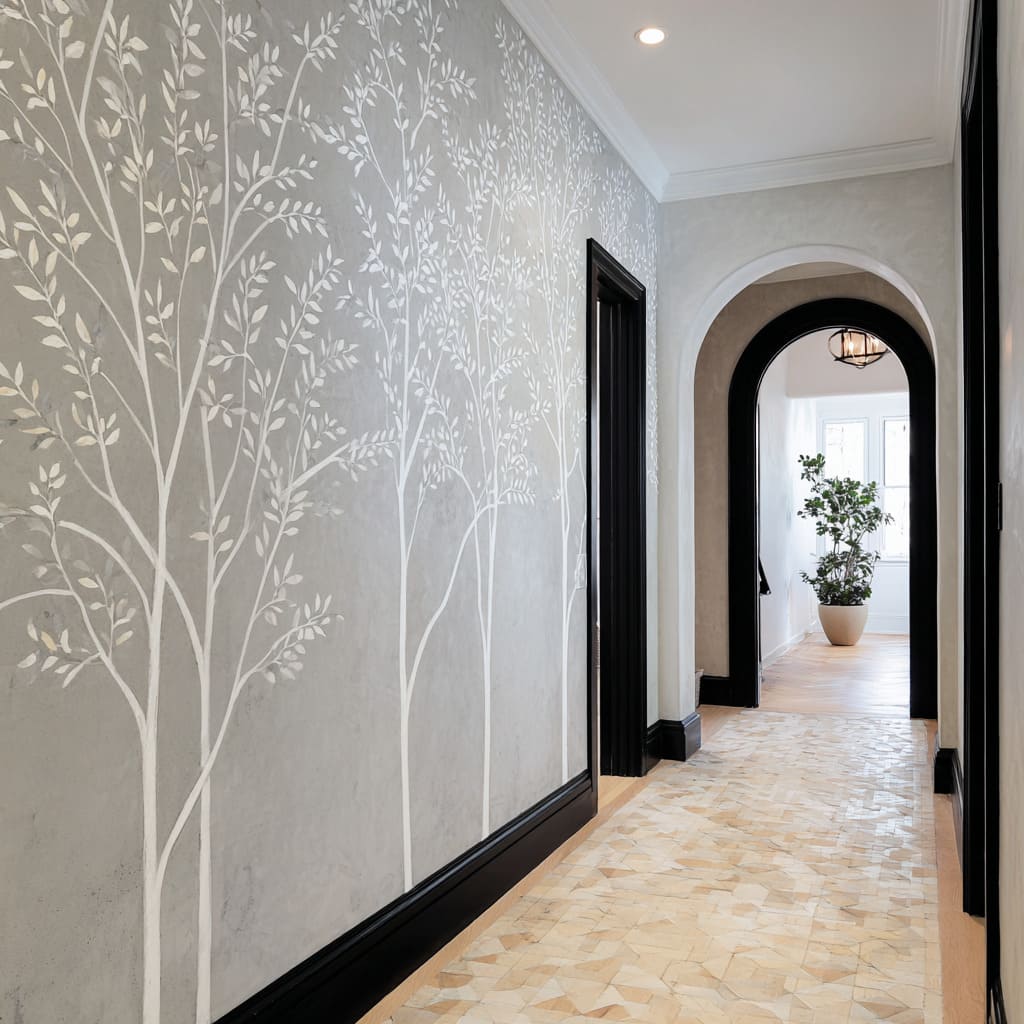
Graphic framing: dark trims and openings that make botanicals feel architectural
Botanical silhouettes become more refined when they are anchored by strong edges—base bands, door casings, deep openings, and crisp portals. The wall reads like a calm surface system, and the corridor gains depth without added decor.
The logic behind the look
- Dark base bands that “ground” airy drawings: Cropping trunks at a strong datum line makes a grove read architectural instead of story-like.
- Edges as the main styling language: Dark casings and shadowy openings behave like ink strokes that give the corridor definition, allowing botanical content to remain low-contrast and disciplined.
- Curves that echo organic forms indirectly: A softened opening shape can mirror branch softness without introducing more botanical motifs, keeping the wall’s narrative clear and minimal.
- Floor texture as the warmth counterweight: When walls are matte and quiet, subtly lively stone mixes or warm neutrals underfoot prevent flatness while staying within a restrained palette.
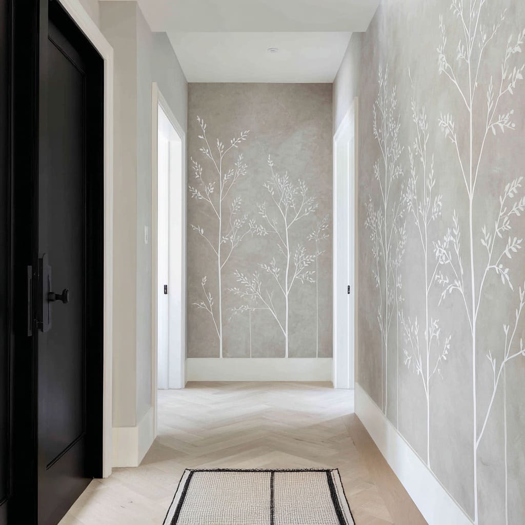
Panelized mural “screens” that feel ordered, not illustrative
When the botanical layer is divided into tall rectangles, it reads as architecture first and nature second. The corridor feels structured and airy, and the mural avoids the look of a single framed scene.
The compositional mechanics
- Grid discipline: The panel rhythm holds the wall together even from a distance, so the botanical motif never has to work hard to look intentional.
- Partial scenes and cropping: Trunks and canopies that continue beyond panel edges create modern continuity and reduce the “centered mural” feeling.
- One dark anchor to prevent washout: A single darker door plane or void nearby gives weight, which makes pale botanical lines read premium rather than faint.
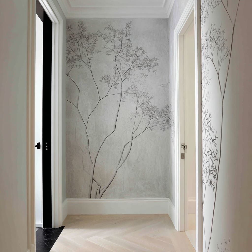
Whisper-level end walls: oversized form with ultra-light line weight
An end wall can feel deep rather than final when the botanical form is large in scale but drawn with extremely thin, near-graphite linework. From far away the wall reads calm; closer up it reveals delicate complexity.
The design principles
- Scale vs. line-weight contrast: A large branching structure with feather-thin lines creates presence without heaviness, so the corridor stays quiet yet interesting.
- Asymmetry as modern calm: Off-center origins and uneven branching leave deliberate empty zones that feel intentional rather than leftover.
- Negative space treated as a primary material: Blank wall areas become the “silence” that makes the delicate marks feel expensive.
- Shadow adjacency: A nearby darker opening can give the eye a reference weight so ultra-thin lines feel chosen, not timid.
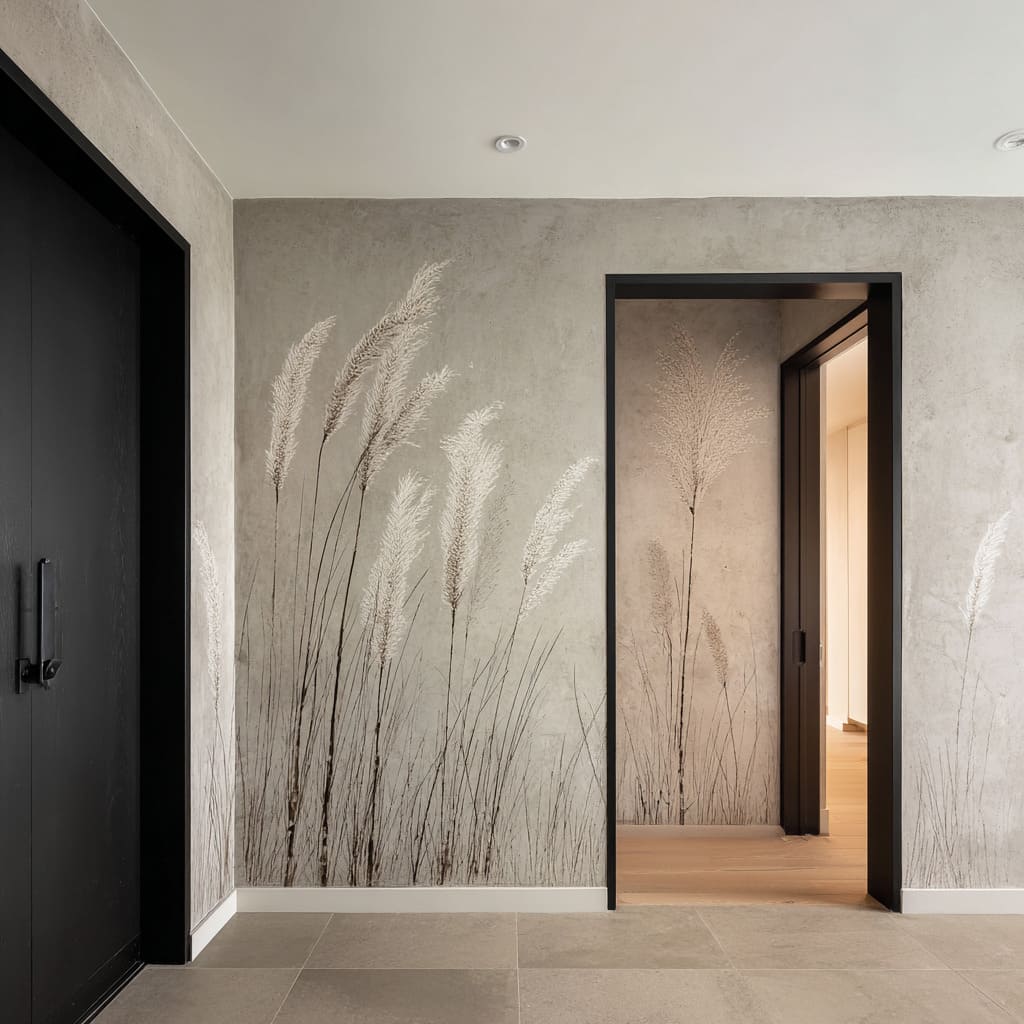
Botanical staging with a dark portal: softness framed by decisive architecture
A soft grass or plume motif can read quietly dramatic when framed by a crisp, dark doorway or casing. The wall begins to feel like a composed scene—foreground softness, mid-depth shadow, and a second plane beyond.
The compositional approach
- Two intensities to create depth: Darker stems and paler plumes build a foreground/background effect without changing the palette.
- Respecting the opening: Botanical density often thins near portals so the opening stays legible and the composition reads intentional.
- Repetition in depth: A single related mark within the portal can turn one mural into a sequence, adding layered calm rather than extra decoration.
- Black as editor: Dark planes sharpen the perceived smoothness of muted wall fields, giving a clean gallery feeling even with organic motifs.
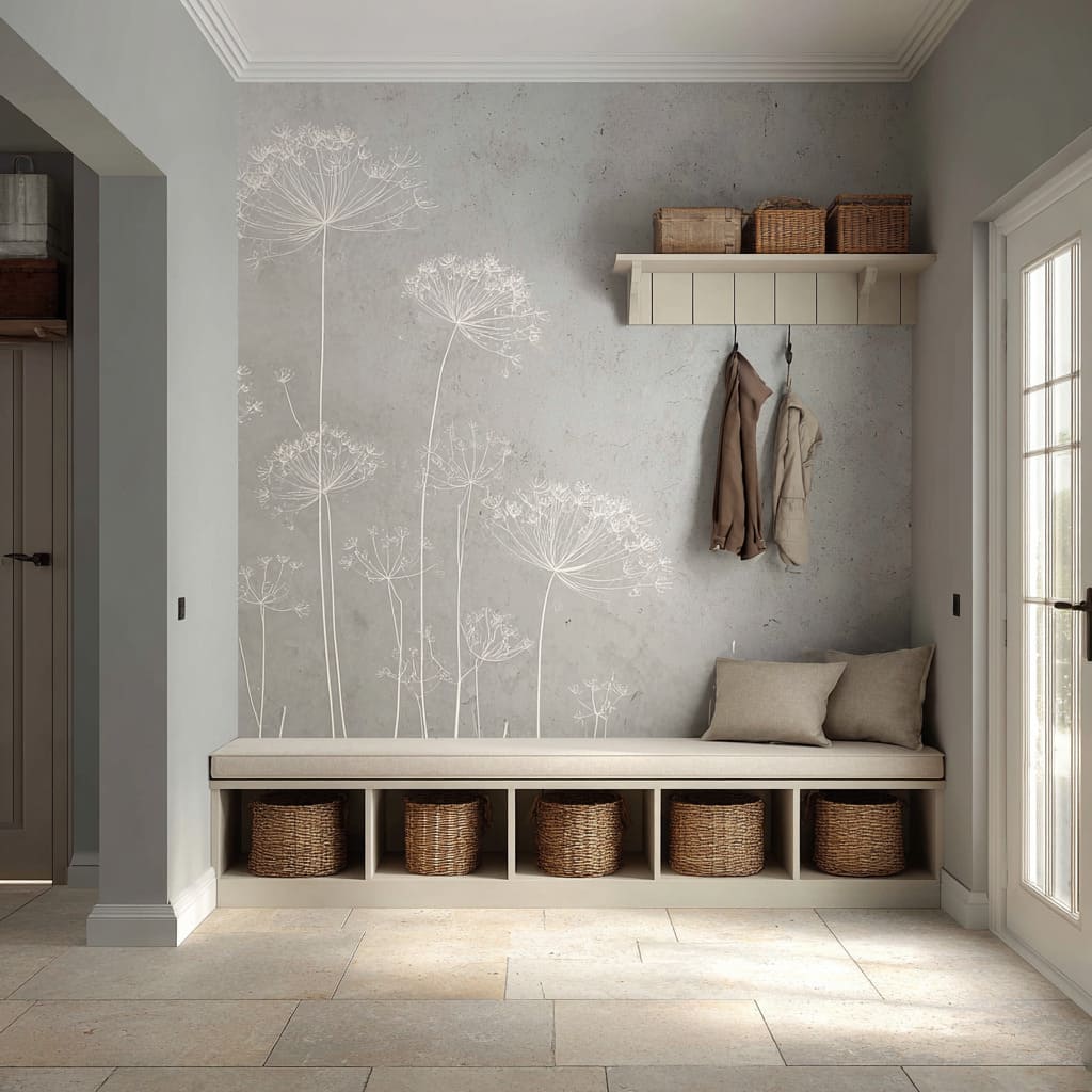
Practical botanical entry compositions: “art layer” separated from “lived-in layer”
A functional entry can remain refined when the botanical wall is treated as the airy visual layer, while baskets, hooks, and coats carry the tactile and practical layer. Calm is preserved because each layer has a clear job.
The elements that shape the mood
- Plain bench geometry under delicate linework: A rectilinear seat functions like a pedestal, keeping fine botanical lines readable.
- Woven storage as controlled warmth: Baskets bring warmth and texture where hands naturally reach, so the wall can stay cool and misty without becoming sterile.
- Muted textiles as soft blocks: Neutral outerwear and quiet cushions behave like gentle shapes that support, rather than hijack, the mural’s rhythm.
- Side light that activates linework: Grazing daylight tends to make thin botanical lines appear gently luminous and gives woven textures richer highlights.
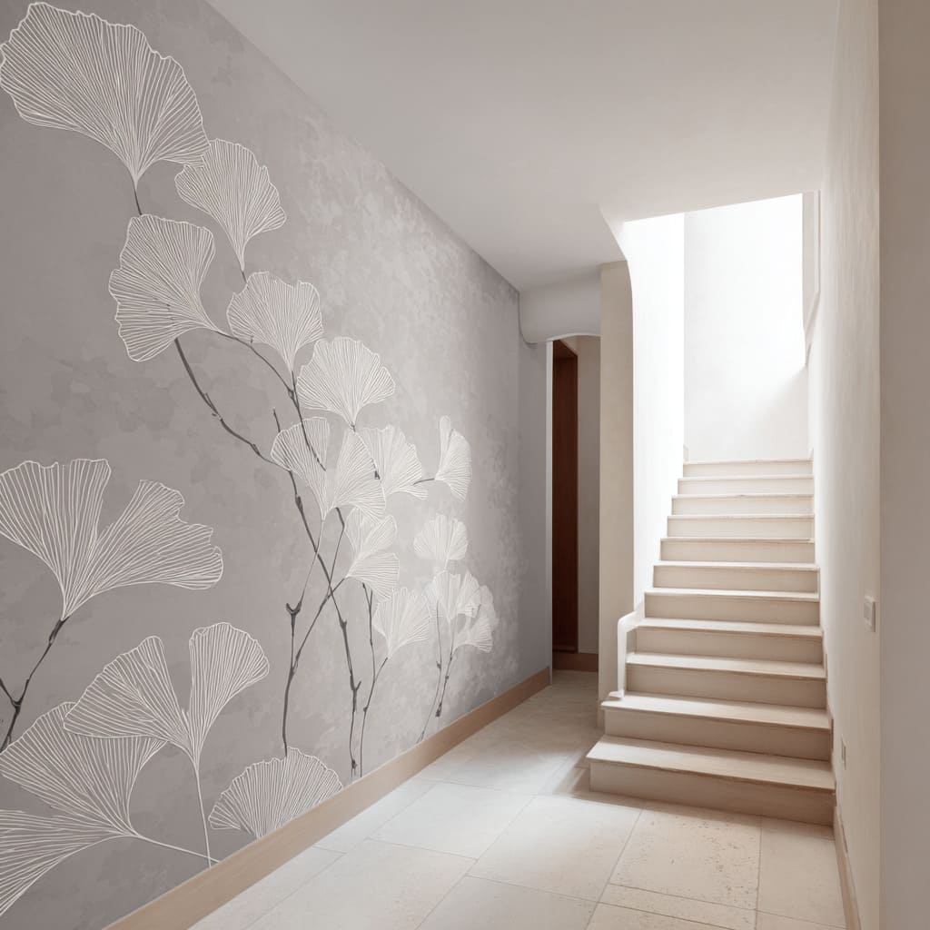
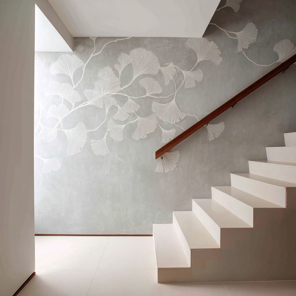
Ginkgo fields as slow movement: corridor walls that lead without shouting
Fan-leaf forms can create a drifting panorama along a corridor wall. The space feels guided and continuous, with richness coming from line texture rather than color.
The factors creating the effect
- Cropping for continuation: Oversized leaves that extend beyond edges imply a larger composition, avoiding pattern-unit repetition.
- Internal ribbing as quiet luxury: Fine rib lines make leaves read as texture at a distance and as detail up close, which suits spaces experienced in motion.
- Directional sweeps: Stems that rise and drift along the wall create calm momentum, turning the wall into a subtle spatial guide.
Single “icon plant” walls: one silhouette used like an emblem
A single oversized botanical silhouette on a large quiet plane can read ceremonial and highly edited. The wall becomes the anchor that organizes the surrounding openness.
Design logic
- Placement tied to negative space, not furniture: The silhouette gains power when it is scaled to the wall’s emptiness and positioned to lift the upper zone.
- Light gradients that make white feel luminous: Side wash and subtle wall shading can make a pale silhouette appear softly radiant without introducing new materials.
- Low, dark counterweight: A small dark object placed near the floor often stabilizes the composition so the large pale field feels intentional rather than washed out.
Stair botanicals that use the handrail as a compositional cut line
In stair zone designs, botanical drawings can feel integrated with movement when the handrail becomes a graphic bar that intersects the mural. Organic linework and strict geometry form a composed tension.
Compositional structure
- Diagonal overlay: The handrail slices through the botanical field, introducing direction that matches upward motion and keeps the wall from reading like a static picture-plane.
- Density tapering upward: Botanical clusters that thin out toward upper zones open the stairwell visually and reduce heaviness.
- Warmth placed at the touchpoint: A warm wood rail adds human temperature exactly where the body interacts, keeping the space emotionally warm while the palette stays restrained.
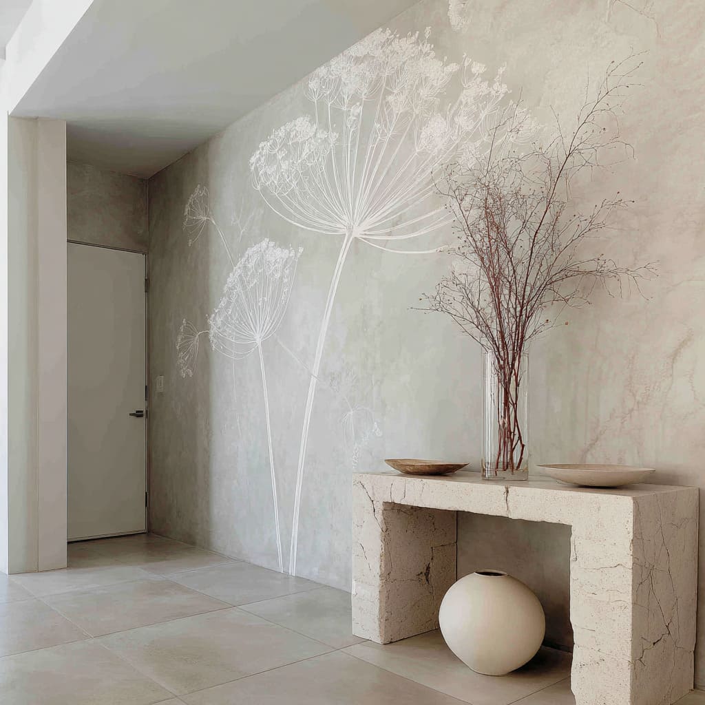
“Air drawing + earth block” compositions: atmosphere walls grounded by weight
A very light botanical drawing can feel especially luxurious when paired with a heavy, stone-like console or a dense, grounded object. The wall reads like air; the base reads like permanence.
Design logic
- Ghost layering for depth without color: Faint background botanicals behind a primary bloom create near/mid/far distance inside one palette.
- Vertical stacking of quiet forms: Tall, fine branches; low shallow bowls; and one large round form can create a full-height still-life that remains calm.
- Separation to avoid tangling: Real branches tend to work best as a side counterpoint rather than placed directly in front of drawn stems, keeping both legible.
The quiet rules that consistently produce refined results
Feature wall ideas for hallway succeed when the wall is treated as a system with clear roles, rather than a single decorative moment:
- Contrast ladder, not contrast chaos: Background field (soft) → botanical marks (disciplined) → edges/portals (crisp) → one anchor (weight).
- Cropping as the modern cue: Partial scenes and continuation reduce illustration vibes and increase architectural calm.
- Dark weight near the base: A datum line, a shadowy opening, or a single dark plane keeps pale botanicals from reading fragile.
- Warmth as a repeated micro-note: Small warm touches—wood, woven textures, dried stems—keep muted palettes human without becoming busy.
- Texture on the field; drawing on top: When mottling belongs to the wall field and the botanical stays clean, the composition avoids “texture fighting texture.”
In many feature hallway wall compositions, the most important decision is not the plant type—it’s the discipline of spacing, cropping, and contrast roles. That discipline is what separates soft botanical minimalism from a themed mural look and is the core engine behind feature wall hallway ideas that read calm, architectural, and quietly memorable.
Related Posts
Harmony Home Design brings 10+ years of residential interior design experience to the ideas shared here. We publish design concepts, layout thinking, and practical styling notes.
