
Modern bedroom suites often lean on materials that behave like architecture: large glazing, stone or stone-look slabs, metal trims, glossy consoles, and crisp black window frames. These elements make a room feel expensive because they look precise and permanent.
They also create a specific lighting problem: the room can swing between intense daylight contrast and reflective evening sparkle, and the sleep zone can start to feel visually sharp rather than restful.

Velvet can be used in such modern interior designs because it sits right in the middle of that tension. It has structure without looking rigid, depth without busy pattern, and a surface that holds its tone under changing light.
Velvet can be used in the places where the room needs visual mass, touch comfort, and light absorption—headboards, benches, chaise seating, ottomans, and concentrated pillow accents. The result is a bedroom that can carry glass, stone, and metal without drifting into a show-room feeling.

Velvet as a light stabilizer
In bedrooms with floor-to-ceiling sliders, corner glazing, or wide openings to a balcony or pool terrace, the brightest surface is the view. At noon, the eye keeps returning to that bright rectangle.
Anything near it risks looking lighter, thinner, and less substantial than it is—especially if the nearby surfaces are pale, smooth, and evenly reflective. Pile fabric changes that outcome.
Velvet doesn’t present one flat plane to the sun. Its tiny fibers tilt in many directions, so the surface holds shadow and tone even when daylight is intense.
That’s why velvet pieces tend to keep their body next to glazing in a way that many flat weaves struggle to do.

This is most obvious on the bed’s largest upholstered element. The headboard can be close enough to the glass zone that daylight spills across it for much of the day.
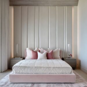
A channel-tufted velvet headboard keeps its rhythm visible because the channels produce built-in shading: each groove remains slightly darker than the raised ribs, even when the room is bright. The bed wall stays legible from the doorway and doesn’t dissolve into the light coming from outside.

Value selection follows the same daylight logic. Bedrooms that stay very bright and open often use mid-range velvets—greige, light gray, taupe—so the headboard stays substantial without turning into a dark block.
In harsher desert light or in rooms with very high-contrast outdoor views, charcoal or deep graphite velvet is used as a stronger interior anchor; it holds its depth and creates a steady backdrop behind the pillows. When the intent is a single saturated note that can survive daylight without looking washed, deep blues and teals in velvet become the solution: the color stays dense because the pile carries highlight and shadow at the same time, creating multiple values inside one hue.

In very open bedrooms with large tile floors and minimal furniture, the bed can start to look visually thin against the view wall. Concentrated velvet pillows in bronze, camel, or a warm brown solve that by adding a dense patch of tone right where the eye lands first—at pillow height—without needing pattern or many extra objects.

Velvet as the softener
Glass, stone, metal, and lacquer can make a bedroom feel refined, but they all share a similar visual behavior: they emphasize edges. Frames, slab outlines, trim lines, and reflections pull attention toward boundaries and corners.
That can be useful for making a room feel precise; it can also make the sleep zone feel slightly alert. Velvet can play the role of a soft perimeter placed at the body-contact points, not scattered as random decoration.
The fabric tends to concentrate in three places that structure the experience of the room.

The headboard contact zone
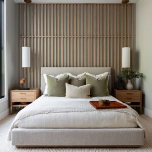
The headboard sits at the exact point where architecture meets the body: it is the surface behind the pillows, the backrest when sitting up, the primary textile field at eye level when entering the room. When the rest of the room relies on crisp elements (stone-topped nightstands, glossy drawers, metal edging, black-framed glazing), velvet makes the bed area feel like a comfort core.

Tufting reinforces this comfort core. Deep tufting creates peaks and valleys that hold micro-shadows, so even pale velvet headboards gain relief and depth.
That relief does a similar job to carved paneling or wall moldings, but with a softer feel and less visual hardness. In interior designs with mirrored accents or crystal lighting, that absorption and relief helps the bed wall stay calm while allowing sparkle to exist nearby without taking over.

The foot-of-bed landing zone
The bench at the foot of the bed looks like extra seating, but it functions like a layout marker: it extends the bed’s footprint forward, defines where the sleep zone ends, and creates a practical landing strip for dressing.

Velvet benches work especially well because the foot-of-bed area is often seen from a distance, from the entry. A tufted velvet bench doesn’t rely on pattern to look finished; the tufting itself creates small shadow pockets that read as detail and depth.
For a modern luxury look, it can be a bench with slim warm metal legs. That combination is important: velvet supplies volume and softness; the thin metal base keeps the bench from looking bulky and links it to the room’s metal accents (lighting stems, trim lines, console bases).

Another effect to think about happens in interior designs with glossy floors or polished tile: velvet acts as a glare absorber near the lower plane. When the floor throws light back up into the room, a plush bench helps break that reflection and visually warms the bed zone.

The lounge/read zone
In bedrooms that include a media wall or a sitting corner, velvet is a good option as well. In this case, it is usually a chair, chaise, sofa, or a pair of ottomans.
That choice solves two issues at once. First, it gives the lounge corner a comfort signal in a space that might otherwise feel like a display of stone, trim, and technology.
Second, velvet seating holds color and depth under changing light; it can sit near the window without turning shiny or washed. It can be one accent color, like deep teal or dusty blue: one velvet form can provide a color anchor and a tactile counterweight without the room needing multiple colorful accessories.

Scale logic: channels and tufting
Large bedrooms need the bed wall to read from far away. If the headboard is a flat, smooth rectangle in a quiet color, it can disappear into the room’s pale envelope.
Channel tufting solves this by introducing a large-scale rhythm that remains visible at distance. The channels can be wide enough to feel architectural, not fussy.
They create a pattern of gentle shadow grooves that stays legible in daylight and still has form at night under warm lighting.

Deep tufting solves the same scale problem in a different way. Instead of long grooves, it creates a quilted relief.
Each dimple holds shadow; each raised area catches a soft sheen. That relief gives the bed wall “presence” without requiring a bold color shift.
Tufting and channels can appear not only on headboards but also on ottomans and benches. When the foot-of-bed piece has deep tufting, it becomes a readable foreground element from the entry viewpoint.
It visually completes the bed footprint and adds a second large soft surface, so the headboard is not carrying all the softness alone.

Rhythm matching
If the room already contains strong vertical signals: window mullions, tall drapery falls, wood panel seams, beam spacing, sculptural sconces, crystal rod chandeliers, the channel tufting can follow those same vertical cues.

This is subtle but powerful. When the headboard’s channels run in the same direction as the glazing’s vertical divisions, the interior design feels coherent even if the materials are mixed (glass next to fabric, stone next to velvet).
In interior designs with vertical wood panel seams behind the bed, a channel-tufted upholstered bed can echo that rhythm while softening the overall feel. When the ceiling fixture is made of repeated vertical elements (like a cylinder of rods), vertical channels on the headboard create an easy visual relationship between the bed zone and the lighting—one is sparkle and shine, the other is soft absorption, yet both share a similar cadence.
Even when the wall finish behind the bed is not linear, such as a cloudy plaster texture, for example, the channels can provide the structured rhythm layer, while the wall provides tonal movement. The interior design gains depth through two different kinds of texture: one organized, one organic.

Color-density: saturated colors without pattern
The architecture and large furniture can be in neutrals and velvet can be a single-saturated note: a teal chair, a blue chaise, blue bedding, blue ottomans, or a cluster of bronze pillows. Velvet works for this role because saturated color in velvet rarely reads as flat.
The nap creates tonal variation: top planes appear slightly lighter; folds deepen; tufting pockets turn darker. One hue behaves like a small range of values.
That makes a single velvet color anchor feel richer than the same color in a flat cotton or a smooth synthetic. It also keeps the room from needing pattern-heavy decor.
In suites where the walls already have texture (stone slabs, metallic plaster, panel grids, warm outline lighting), velvet allows color to enter without stacking more visual information on top.

A sophisticated version of this strategy is color distribution at three scales. Instead of placing blue in only one object, the suite repeats it as a tall upholstered headboard (large scale), rounded ottomans (medium scale), and a painterly artwork field (background scale).
The repetition makes the saturated velvet feel intentional and integrated rather than a one-off statement. Warm neutrals can follow the same principle.
Bronze, camel, and caramel velvet accents often appear close to the pillows and runner zone. Those tones can look softly luminous in velvet—warm without being shiny—so they link naturally with brass hardware and warm chandelier finishes.

TV-wall integration
Bedroom TV walls can look accidental on a plain surface. Instead, the TV wall can be built as a panel composition: marble-look or stone-look fields, thin warm metal outlines, perimeter glow, patterned panels, or metallic-texture wall finishes.
The idea is to give the wall a structure first, then let the TV behave like an insert within that structure. Velvet’s role is not to compete with the wall; it keeps the room anchored as a sleep space.
Stone, metal, gloss, and technology can push a bedroom toward a sleek, display-like feeling. Velvet in the foreground—on a chair, ottomans, sofa edge, or pillows—adds the tactile counterweight that softens the overall mood.

Pairing ideas:
- A refined stone-and-brass media wall with a glossy console becomes more livable once a deep velvet chair introduces color depth and absorption near the floor plane.
- A large stone-look panel wall outlined with warm light feels less cold when deep blue velvet bedding supplies softness and a saturated anchor in the bed zone.
- Metallic-texture TV walls with framed screens feel controlled and glamorous, yet they risk becoming too reflective; blue velvet pillows or a velvet seating piece provide the calm absorption that prevents the wall finish from dominating.
The logic is simple: the TV becomes designed-in through background structure; velvet keeps the foreground human.

Shine management: velvet balances crystal, glass, lacquer, and metal
Velvet helps to build richness through controlled shine: crystal chandeliers, glass globes, mirrored bedside pieces, metallic wall finishes, glossy consoles, warm metal trims. Shine adds atmosphere, especially in the evening, but it can also create visual noise if every surface reflects.

Velvet moderates that effect because it absorbs light rather than throwing it back. For example, if there are mirrored nightstands and crystal lighting, a tufted velvet headboard keeps the bed wall from becoming another reflective plane.
If there are metallic-textured TV walls and brass-framed consoles, velvet accents in deep blue or warm bronze prevent the scene from turning into one continuous shimmer field. Even if there are simple glass globe chandeliers, velvet headboards and benches provide a stable matte-to-soft-sheen foundation that lets the lighting sparkle without making the room feel harsh.
The key is that velvet doesn’t remove shine; it gives shine a calmer context. Sparkle remains a highlight, not the baseline.
Why the mix looks richer without feeling busy
The richness can come from how surfaces behave rather than how many accessories are added.
- Glass supplies view and brightness, and it outlines the room with crisp frames and strong geometry.
- Stone and stone-look surfaces supply clarity and precision at bedside and media-wall zones.
- Metal supplies thin lines of warmth and the jewelry layer through trims and lighting.
- Velvet supplies absorption, depth, and comfort cues at the bed wall, the foot of the bed, and the seating zone.
Curtains and rugs reinforce velvet’s role. Drapery adds a large soft vertical plane near glass, helping the window wall feel less stark at night.
Rugs add a matte island underfoot, especially important in rooms with polished tile near pool terraces. Velvet then becomes the denser “touch texture” that anchors the bed and seating forms within that softer envelope.
In combination, the interior design can stay architectural—large panes of glass, slab-like surfaces, clean trims—while the sleep zone remains visually warm, grounded, and comfortable. Velvet provides that grounding through three repeatable mechanisms: it holds tone under daylight, it creates readable scale through channels and tufting, and it absorbs glare so reflective materials stay controlled rather than overwhelming.
Related Posts

Harmony Home Design brings 10+ years of residential interior design experience to the ideas shared here. We publish design concepts, layout thinking, and practical styling notes.