
A warm transitional space usually lands best when it starts with calm structure, then adds warmth through undertone, touch, and a few repeated finishes. The goal isn’t a “warm color theme.
” It’s a room that feels steady in daylight and still flattering at night, with enough texture and depth that neutrals don’t look blank.

Start with calm structure, then layer richness on top
Most warm transitional rooms feel restful because the big pieces behave like architecture: long, low, and visually quiet. A clean-lined sofa or a generous sectional becomes the steady horizon that keeps the room from feeling busy even when you add pillows, throws, and decor.

If the anchor piece is already highly detailed—rolled arms, heavy tufting, skirted edges, bold nailhead—your styling has to work harder, and it’s easy for the room to tip into too much.

In that case, the fix isn’t to strip the room bare; it’s to let the sofa be the character and keep the layers calmer: fewer pillow fabrics, fewer distinct patterns, and more emphasis on tone-on-tone texture.

Open-plan layouts benefit from the same discipline. A living zone reads as a real room when it has a clear footprint: a rug large enough to hold the seating and a centered table that feels scaled to the sofa.

When a rug is too small, the arrangement can look temporary no matter how nice the pieces are. The simplest correction is to scale the rug up so the seating sits comfortably within it, then choose a table with enough presence to hold the center instead of disappearing.

Use gentle “value steps” instead of harsh contrast
Warm transitional spaces often look expensive because the palette is controlled. Cream, oatmeal, sand, and greige can feel dimensional when they move in small steps rather than jumping into strong black-and-white contrast.

Pillows are one of the easiest places to build that depth. When the sofa is light, pillows that are just slightly deeper create a soft gradient that makes the seating look plush without needing bold color.

Pattern can absolutely live here, but it tends to work best when it stays quiet and repeats.

If every pillow is a different motif in a different scale, the sofa stops reading as calm and starts reading as a collection of samples. A more reliable approach is to keep shapes mostly consistent, vary the surfaces (smooth weave, micro-texture, nubby cream), and let one small pattern family show up in more than one pillow so it feels planned.

Add curves to soften a rectangle-heavy room
Warm transitional rooms often have rectangular architecture: door grids, openings, paneled walls, cabinetry lines, and media walls. One strong curve—often a round coffee table—can soften all of that without changing the style.

A round center also helps the room function better. Sharp corners can feel awkward in tighter seating areas and visually a little strict next to soft upholstery.
If you love a rectangular table, you don’t have to abandon it; you just need to introduce the curve elsewhere so the room doesn’t become all right angles.

Rounded chair arms, a circular tray, a curved lamp shade, even an arched mirror can do the job.

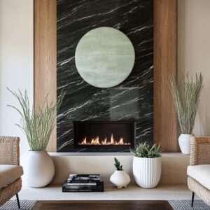
Make the TV wall feel designed, not accidental
The media wall is where many warm transitional rooms lose their calm. The issue is rarely the TV itself; it’s that the wall around it has no structure, so the screen becomes a hard black shape floating on a pale plane.

The fix is to treat that wall like an elevation: subtle panel rhythm, a recessed niche, gentle vertical texture, or balanced built-ins that give the composition a frame. Once the wall carries the design, the styling can relax.

This is where restraint matters. When the mantel line is crowded with tall accessories, the wall turns into competing focal points—TV, decor, fireplace, art—each trying to win.

A calmer approach is to keep the mantel low and minimal and let one or two quiet pieces add warmth through surface, not height: matte ceramic, a small warm-metal note, a soft-lit sconce.

In pale rooms, contrast can also be handled more gracefully by pairing the TV with another dark element in the same zone—often the fireplace opening or a darker console below. A lone black rectangle can look harsh; a small “set” of dark shapes usually reads intentional.

Warmth comes from finish pairing: matte textiles with a little soft glow
In this style, large surfaces typically stay matte: upholstery, paint, rugs, curtains.

Warmth then arrives through touch and a few small reflective notes—often brushed brass, warm bronze, or a champagne-toned metal.

These metals look most convincing when they repeat. One shiny brass moment with no echo can feel loud and isolated.
A softer sheen (brushed or satin) repeated in lighting plus one smaller detail—hardware, a table base ring, a mirror frame—tends to read like a thread running through the room rather than a statement trying to dominate it.

Wood plays a similar role. Warm wood tones prevent pale rooms from drifting cold, especially when the main palette leans cream and greige.

If the room is feeling chilly, it’s often not because you need “more color,” but because the wood tone is too ashy or the whites are too crisp.

Nudging the wood warmer and keeping whites creamy rather than stark can shift the whole mood without changing the overall look.

Accent color works when it’s repeated, not sprinkled
Warm transitional rooms can absolutely use color, but it usually works best when it’s treated like a controlled ingredient.

A warm accent family—peach, terracotta, coral, amber, toasted tan—often looks refined when it appears in a larger anchor (usually artwork), then shows up again at a medium scale (a patterned chair, a secondary textile), and finally returns in smaller notes (pillows, a throw, a vase).

When an accent shows up only once—one random pillow, one small object—it can read accidental, even if the color is pretty. The adjustment is simple: give it a “home” at a larger scale first, then let the smaller pieces echo it.

Cool accents can belong here, too, as long as they’re muted. Dusty blue or blue-gray can act like temperature control in a warm-neutral room, especially when warm metals and warm woods are present to keep the balance.

Where it tends to go wrong is when the blue is too bright or too saturated; then the room starts leaning into a different style direction. Pulling the blue toward foggy, gray-shifted tones usually keeps it comfortably transitional.

Window treatments are part of the room’s fabric layer
Warm transitional rooms feel finished when windows are treated like a major surface, not an afterthought. Full-height drapery adds softness and height.
A roman shade behind panels can give tailored light control while the side curtains keep the perimeter gentle.

Problems usually show up when curtains are hung low or too narrow, which makes windows feel smaller and the room less intentional. Hanging the rod higher, extending it wider than the opening, and using panels with enough fullness to fall in clean folds tends to fix that quickly.

In pale rooms, a darker rod can be a smart detail; it draws one crisp line near the ceiling and keeps the palette from washing out.

Shelves and built-ins: fewer pieces, better spacing
Warm transitional shelving looks calm when it relies on value discipline and breathing room. A tight range—creams, tans, matte ceramics, woven textures—lets you vary shapes without visual noise.

Closed storage below helps, too. It grounds the wall and keeps daily life from spilling into the display.

Even neutral shelves can look messy when everything is small and evenly scattered. Grouping items into a few larger moments, using fewer objects with stronger silhouettes, and leaving real negative space tends to read more intentional and easier to maintain.

A quick warm-up check
- Do you have one grounded base element (console, cabinet run, or a table base) so the room doesn’t feel floaty?
- Are your neutrals stepping gently in value rather than jumping into harsh contrast?
- Is there at least one curve to soften rectangular architecture?
- Do warm finishes repeat at least twice so they look intentional?
- If you’re using an accent color, does it show up in more than one place?

Small problems and realistic fixes
A neutral room that feels flat often needs texture, not new colors: one nubby layer and one slightly deeper value step can add depth fast.

A TV wall that feels harsh usually needs structure around it and less tall decor fighting for attention. Accent colors that feel random typically need repetition—bigger anchor first, then smaller echoes.

And if open shelving keeps turning messy, it’s usually a signal to rely more on closed storage and keep the shelves for only a few pieces you can maintain.
Related Posts

Harmony Home Design brings 10+ years of residential interior design experience to the ideas shared here. We publish design concepts, layout thinking, and practical styling notes.