
The most convincing version of warm minimalist interior design usually hangs on a few structural gestures that carry the mood on their own: a stone surface treated like a mural, seating kept low enough that light can move freely, and a handful of dark lines used like punctuation so the design doesn’t dissolve into beige fog. In the strongest examples, “warm” comes from how materials meet—oak grain against honed stone, ribbed upholstery against a clean plaster wall—while “minimal” comes from where detail is concentrated, not from stripping a space until it feels vacant.

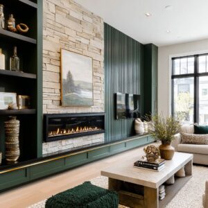
A tall stone fireplace slab is a clear case. When the wall reads as a single landscape of drifting veining, it behaves less like a feature wall and more like architecture.
The thin, low firebox cut into that slab does something subtle: it puts the visual weight near the floor, so the height of the stone feels calm rather than imposing. The hearth, when treated as a continuous bench in a pale mineral finish, becomes a baseline that lets everything else sit quietly.

In kitchens where a waterfall island is wrapped in the same veined slab as the backsplash, the drama isn’t coming from extra decoration. It’s coming from one material being allowed to run uninterrupted, with cabinetry held back into a smooth plane—sometimes glossy greige, sometimes warm wood—so the stone can speak without competing voices.

The design works better when “statement” is structural
There’s a difference between a statement object and a statement surface. A large square marble coffee table, very low and visually solid, can replace a whole scatter of side tables and trays because it provides one grounded center.
The interior design around it can stay restrained: two sofas facing each other, a lounge chair tucked near the fireplace line, and a pale rug that doesn’t outline itself with a high-contrast border. That kind of table becomes an anchor, not a display stand.

When a dramatic slab is paired with lots of small decorative pieces competing for attention—patterned pillows, a loud rug, several artworks fighting for the same wall—the veining can start to look restless rather than intentional. The adjustment isn’t to remove everything; it’s to relocate detail.
In rooms where the slab is the hero, the supporting layers usually become quieter and larger: fewer pillows but better texture, fewer tabletop objects but stronger silhouettes, one artwork sized correctly rather than a cluster that argues with the stone.

The same pattern can work in open-plan spaces where a veined stone wall behind the counter acts like an oversized mural. That wall already behaves like “big art,” so the framed artwork in the living zone works best when it’s modest, tonal, and placed as a supporting note—often on a blank plane that would otherwise feel under-finished.
When the art tries to outshout the stone, the room can start to feel like two focal points pulling in different directions.

Low furniture is less a style choice than a light strategy
The furniture can sit deliberately low: deep sectionals, blocky sofas with clean arms, lounge chairs kept below the sightline of the hearth. This isn’t only a comfort move.
It keeps the glass line and outdoor planting legible from inside, so the greenery reads like a living artwork and the black window framing becomes a crisp edge rather than a heavy border. In a bright open-plan setting, that low horizon also lets the ceiling stay quiet—recessed downlights, linear slots, a thin track—so the room doesn’t develop a “ceiling jewelry” problem.

Sometimes, though, a neutral room can lean so hard into low pieces that everything starts to sit on one flat plane. The adjustment tends to come from one or two vertical interruptions that are still calm: an airy indoor tree near the glazing, a tall matte vase on the hearth shelf, or a single branch arrangement on an island.
These work because they introduce height through a thin silhouette, not through bulky décor. The plant isn’t an afterthought; it functions as a soft column, the way an olive-like tree near a stone panel casts fine shadow texture on warm white walls.

Warmth with raw materials
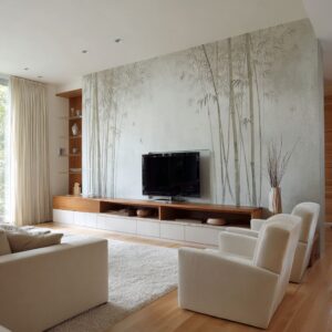
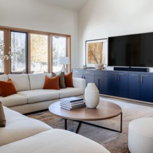
When an interior is dominated by pale stone and ivory upholstery, warmth can’t rely on paint color alone. It is often used as a material bridge: light oak floors with subtle grain, a walnut island base framed by pale stone edges, a wood stump side table that breaks the engineered perfection of slab surfaces.
These elements show up in the middle distance of the room—near the coffee table, at the island, beside the seating—because that’s where the eye spends time.

In some neutral interior designs, the instinct is to sprinkle lots of small wooden accessories around to “add warmth,” and it can turn busy fast—especially when the overall language is clean planes. The adjustment seen in the strongest examples is scale: one warm wood plane (a cabinet wall, a console line, a slatted panel, a walnut island base) tends to do more work than many small accents.
That’s why the slatted TV wall paired with a cloudy stone panel feels cohesive: the timber rhythm supplies warmth at architectural scale, and the stone provides movement without adding color.

Black details behave best when they are repeated
Dark elements can be used sparingly but consistently: the black frame of the sliding doors, the thin metal legs of upholstered stools, a slim linear pendant, the dark rectangle of the firebox. Those marks don’t try to decorate; they outline.
They also solve a common problem in pale interiors: without a few dark anchors, the space can read like one continuous wash, especially in strong daylight.

If black gets added in too many places at once—shelves, frames, hardware, rugs, décor objects—the room can shift from calm contrast into something sharper and more graphic than intended. The adjustment is usually restraint plus repetition: a handful of dark notes placed in a few clear roles (opening frames, one appliance stack, one table base, one fixture line) feels disciplined.
A reflective dark coffee table top is an interesting variation—it doubles contrast by mirroring edges and light without requiring more black objects in the room.

Texture becomes the pattern, so it needs variety and hierarchy
The most persuasive minimal interiors aren’t blank; they are textural. Bouclé-like stools can soften a stone island.
Ribbed or finely woven upholstery adds depth to a sectional without adding print. A rug with low-contrast tonal movement hides footprints while keeping the seating zone continuous.
In bedrooms, the “hotel” feeling comes from a controlled stack of textiles: crisp white bedding, a mid-tone throw creating one horizontal band, then pillows stepping from white to warm beige to taupe so depth comes from value shifts rather than busy pattern.

When every fabric lands in the same texture family—everything linen-like, everything evenly matte, everything uniformly soft—the result can feel dull even if the palette is right. The adjustment is not loud pattern; it’s different tactile roles: one tight weave on the sofa for crispness, one nubbier texture on a chair for softness, one smooth stone plane for clarity, one micro-textured wall finish (plaster, limewash-like clouding, or a large woven-look artwork) for depth.
Those roles are visible in the “museum lounge” living room where a massive textured artwork replaces the fireplace as the focal element. With a wall piece that reads like relief or woven surface, the rest of the room can stay quiet without feeling empty.

Concentrated detail beats distributed clutter
There’s a recurring styling move in minimalist interior design concepts: instead of spreading accessories everywhere, detail is concentrated on one surface. Often it’s the coffee table—a few bowls in charcoal and warm stone tones, stacked books as flat rectangles, one sculptural object placed slightly off-center so it feels lived-in rather than staged.
Sometimes it’s the hearth shelf, where objects are chosen for geometry: a tall vertical vase, a rounded weight, a smaller vessel, then deliberate empty space so the slab veining remains readable.

In minimal designs, trying to prove “not sterile” by distributing many small objects across the space—little candles, tiny vases, scattered stacks—usually reads as visual noise. The adjustment is scale and grouping.
A single large bowl plus one branch arrangement can carry an entire island top; a tray can gather smaller items so the surface reads calm even in daily use. The table becomes a controlled still life rather than a storage zone.

One quick check that keeps edited from turning empty:
- Is there one dominant surface doing the talking (slab, plaster wall, slatted panel, oversized artwork)?
- Is there one low anchor in the center (stone table, modular blocks, substantial ottoman)?
- Are the dark notes limited to a few repeatable roles (frames, firebox, legs, fixtures)?
- Is there a warm material plane large enough to register (oak floor, walnut base, wood wall)?
- Is the organic element sculptural, not decorative (one tree, one branch arrangement, one orchid moment)?

Symmetry can feel calm, as long as something interrupts it
Minimalist living rooms can use balanced seating—two sofas facing each other, centered coffee table, fireplace on axis. That kind of symmetry can read serene, especially when the fireplace wall is monolithic.
But the best versions rarely stay perfectly rigid. The interruption might be diagonal veining running through the slab, or one chair with a thin dark frame set slightly forward, or a plant placed to one side so shadow and silhouette break the formality.

If everything is centered, every pillow identical, every object mirrored, the room can slip into showroom energy. The adjustment doesn’t require disorder.
It usually takes one asymmetry that still feels intentional: an off-center tabletop object, a taller vessel on one side of the hearth, or a single sculptural lamp with a dark shade placed where it counterweights the firebox opening. That small irregularity gives the composition breath.

Circulation spaces can carry warm minimalist style
The trick is treating the corridor like a designed room: repetition of door openings creates rhythm, large-format pale tile reads as a continuous field, and one monolithic console block becomes the anchor. Above it, a large tonal artwork provides depth without shouting.
Botanical styling—orchids in mineral pots, airy branches in a tall vessel—adds softness with very few elements.

When a hallway gets filled with small frames, narrow runners, baskets, and hooks in an attempt to “add personality,” it can fight the calm. The adjustment is to keep the corridor’s objects oversized and few: one heavy console, one substantial artwork, one plant moment, and then let the architecture—trim lines, repeated openings, the light gradient toward the far end—do the rest.

Open plan stays calm when the kitchen reads like architecture
In open-plan layouts, the minimalist style kitchen should not announce itself with lots of visible parts. Tall cabinetry is flush and continuous, appliances are integrated, and the stone is allowed to be the focal material.
A glossy greige cabinet plane is a subtle move here: the gentle sheen bounces light so the wall feels lighter, while the stone’s veining provides movement. In another version, warm wood cabinetry becomes the warmth engine, with stone acting as the graphic counterpoint.

In open plans where the kitchen turns into a collage—multiple metals, patterned tile, contrasting cabinet colors, many countertop items—while the living area stays quiet, the space can split into two personalities. The adjustment is often to simplify the kitchen’s lines so it behaves like a background plane, then place warmth in one clear spot: upholstered stools in a creamy texture, a walnut base under the island, a single dark pendant, one tall vessel of greenery that repeats the outdoor planting silhouette.

Bedrooms show the same principles in a softer register
Interior design isn’t minimal because it has few items; it’s minimal because the layers are controlled. A tall upholstered headboard with subtle wings contains the bed composition.
Bedding uses tone-on-tone shifts rather than prints, and one mid-tone throw provides the main contrast band. A bench at the foot of the bed extends the bed’s footprint and adds a second soft mass.
One framed artwork, pale and atmospheric, stands in for a whole gallery wall.
When bedding turns into too many competing layers—lots of throws, several textures fighting, pillow stacks that start to look like décor—the calm can slip away. The adjustment is to give each layer a job: crisp white for freshness, one greige band for depth, one tactile accent pillow for softness, and then clear negative space so the bed still reads as a single composed object.
Even a single pottery vessel on the bench can add the handmade note that prevents the room from feeling too perfect.
Conclusion
The shared thread is not a rigid formula. It’s a preference for big, quiet planes paired with a few deliberate interruptions: veining that behaves like artwork, low furniture that makes daylight feel like a material, warmth delivered by wood placed at architectural scale, and organic elements treated as sculpture rather than decor.
When something goes off—when the room feels cold, flat, or overly staged—the fix tends to be less about adding and more about repositioning: move detail into one concentrated zone, trade many small accents for one larger warm plane, or replace hard symmetry with one measured asymmetry that still respects the calm.
Related Posts
Harmony Home Design brings 10+ years of residential interior design experience to the ideas shared here. We publish design concepts, layout thinking, and practical styling notes.