
A modern dining room can look expensive with very few pieces when the room is built on design structure first: one clear axis, a small set of finishes that repeat, and a short list of large-scale elements that do the visual work normally assigned to accessories. The feeling of luxury can come from how the big parts relate to each other—the table footprint matching the rug, the light matching the table, the focal wall matching the dining zone—so the interior design still looks complete even when the tabletop is almost empty and the sideboard holds only two or three objects.

The minimal-effort luxury formulas
The backbone of luxury interior design is a sequence of decisions that makes the dining zone look installed:
- One axis or one center point organizes the room.
- One hero object carries the identity of the space: a sculptural pedestal base, a chandelier with presence, or a high-finish credenza.
- One wall is resolved in a single move: oversized art over a long, low storage piece.
- One metal finish repeats two to three times and then stops: brass in the table base + light + a frame edge or chair leg note.
- Reflective materials are balanced by one large soft absorber: a plush rug, velvet-like upholstery, full-height drapery, or textured wallcovering.
- Chairs stay consistent so the dining set feels like a suite rather than a collection.
- Texture does the heavy lifting where color stays restrained: woven wallcovering, shiplap, ribbed fronts, fluted bases, bouclé chairs.
- Styling is treated as punctuation, not content: one centerpiece line or one low bowl, and a tight grouping on the credenza.
Each of these points sounds simple in isolation. What makes them powerful is the way they stack together, so one decision supports the next and the interior design gains a finished look without needing many extra elements.

The centerline: table → rug → light → art or credenza
Luxury interior design gains from having a clear visual lane that runs through the dining zone and continues into the focal wall. This is easiest to make in long-table rooms where a rectangle repeats: the rug outlines the dining footprint, the table sits centered on it, and the chandelier is long enough to relate to the table below.
Then the same alignment can continue onto the main wall: a long credenza sits under a large canvas so the wall looks solved in one gesture.

What such alignment does visually
It reduces the sense of randomness that often appears in dining spaces. The eye can understand the room quickly: the dining zone has a perimeter (the rug), a main mass (the table), a ceiling marker (the chandelier), and a wall anchor (art + credenza).
The space feels planned because the major pieces acknowledge the same centerline rather than drifting slightly off.

The same idea can be used in round-table rooms, but instead of one long lane, everything locks to a central point. The round table usually is in the middle of the rug; the chandelier is centered above; the art and sideboard are centered behind.
The visual effect is a stable, symmetrical composition that looks settled even when there is almost nothing on the table.

Pedestal bases reduce visual noise at floor level
A strong idea is the replacement of four legs with one central base. The base design varies.
It can be in warm brass cones, bronze cylinders, sculptural folded-metal forms, thick monolithic wood pedestals, and white flared pedestal silhouettes.
What changes when the base becomes central
At floor level, four legs create a busy corner condition: each chair sits near a table leg, and the whole set can look like many thin vertical lines competing for attention. A pedestal removes those corner interruptions.
Chairs read as a clearer ring or row around a single mass, and the underside of the table becomes a clean negative space. That negative space is one of the subtle signals of modern luxury: the furniture looks designed as an object, not assembled from parts.

Round pedestal vs long pedestal
- In round-table designs, the pedestal makes the table feel like one sculptural form.
- In long-table designs, pedestal bases do an additional job: they clear the long sides so chairs line up neatly. The underside stays visually open, and the long table reads as a single horizontal plane floating over a grounded center mass, which tends to look custom.
Where a sculptural base carries the room
In neutral rooms with minimal surface styling, the base becomes the identity marker. That is why the tables can keep the top simple—white, stone-like, glossy black, or glass—while investing visual complexity into the base.
The table acts like the room’s sculpture, so accessories can remain minimal without the space feeling empty.

Shine control: pair reflective planes with one soft absorber
Luxury can be created through reflection rather than ornament: glass tabletops, glossy floors, mirrored credenzas, high-gloss black tables, and polished marble or marble-look tile. Reflection multiplies light and doubles forms.
A chandelier becomes more dramatic when it appears in the table surface; windows feel larger when they reappear on the floor; gold tones look warmer when they bounce between surfaces.

Why reflection needs balancing
Shine can tip into a harsh, showroom-like look when every plane reflects equally. It can be avoided by introducing a single large absorber—usually a plush rug—plus softer textures in chairs and curtains.
The absorber breaks glare, softens light, and gives the dining set a comfortable visual base. The key is scale: the absorber works because it is large enough to hold the full chair footprint.

That is why the rug can be oversized. When the rug is large enough that chairs remain on it even when pulled out, the dining area feels like a single zone rather than furniture sitting on a hard reflective field.

Texture and color
Modern interior designs often keep color restrained—warm whites, greige, taupe, champagne brass, charcoal notes—yet still feel layered because texture changes how light lands on surfaces. Instead of relying on multiple colors, modern designs can use woven wallcovering, horizontal paneling, ribbed fronts, fluted metal, boucle upholstery, slatted credenzas, and faceted cabinet faces.
Texture as daylight architecture
Texture creates small shadow shifts across the day. A grasscloth-like wallcovering catches daylight differently than paint, so the wall looks richer even in one color.
Horizontal shiplap lines create rhythm that replaces the need for multiple framed pieces. Ribbed and slatted fronts on credenzas add depth with almost no decor on top.

Two to three texture types create clarity
Simple paring ideas:
- Woven wallcovering + plush upholstery + glass/metal accents.
- Shiplap paneling + light wood grain + bouclé or woven chairs.
- Ribbed panel wall + glossy table surface + warm metal highlights.
Ribbing and fluting as premium signals
Fluting and ribbing can be used in table bases, credenza fronts, and wall panels. The visual effect is micro-shadowing: thin ridges create alternating light/dark bands that read as depth even from a distance.
.

Scale beats quantity: one oversized artwork
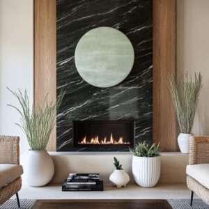
Wall design can be completed with one large artwork and one long, low storage piece. This pairing does several jobs at once: it gives the wall a focal point, it anchors the dining zone, it provides a long horizontal line that stabilizes the space, and it offers hidden storage so surfaces can remain visually open.

Why one large canvas works in modern dining rooms
Many small frames can create visual chatter near the dining zone, especially when lighting and reflective surfaces are already present. A single large piece gives the eye one destination and allows surrounding elements—like paneling, curtains, and the chandelier—to stay simple.
Sizing logic as visual anchoring
The artwork relates clearly to the credenza width. The canvas does not look isolated; it looks supported by the furniture beneath it.
The art can echo black and gold tones found in the room, or a light wood credenza as a calm base under black-and-gold art, allowing contrast to appear without multiplying colors.

Keeping the credenza top visually calm
When the wall is already solved by scale, the surface styling should be minimal: two or three objects in a tight group—one taller item for height, one lower piece for mass, occasionally a tray to contain a bar setup. This keeps the wall from turning into a display shelf while still preventing the surface from looking empty.

Repetition as set energy: one chair model, one upholstery tone
A consistent chair lineup is one of the clearest luxury signals, especially around long tables. The effect is immediate: the dining set looks planned as a unit, and the row of chairs becomes a composed rhythm rather than an assortment.
Why consistency matters more when the room has shine
In interior designs with glossy floors, glass tables, mirrored credenzas, or strong lighting fixtures, varied chair silhouettes can create too many competing outlines. A single chair model keeps the lower half of the room orderly so reflection can remain the feature rather than becoming visual noise.
How interest appears without mixing chairs
Character can work through:
- Texture on upholstery: bouclé-like weave, nubby fabric, velvet-like nap
- Contrast at the legs: slim dark legs under light upholstery, or warm metal legs under matte fabric
- Small metal notes: gold tips on chair legs or sled bases that echo brass in the chandelier and table base
The chairs remain consistent, but they still contribute depth through material behavior—how they catch or absorb light.

The edge color strategy: black framing
Warm neutrals and champagne brass avoid looking washed out when black appears as a clean outline. Most often, that outline comes from black-framed doors and windows.
It can be a dark sideboard, a dark art frame, or dark objects placed sparingly.
What black outlines do in a warm neutral room
Black creates crisp boundaries. It makes pale walls, pale rugs, and warm upholstery look sharper.
It also gives the room a modern graphic structure that can replace stronger color contrasts.

Small-dose repetition keeps it coherent
Black placement options:
- Window grids or door frames create the primary outline.
- The artwork often includes black marks or charcoal bands to echo the frames .
- One object—like a dark vase—reinforces the outline without becoming a second focal point.
Even moody interior designs can use this logic, but inverted: the walls may be charcoal, and the outline becomes the lighter rug or the clear glass elements that bring brightness into the darker envelope.

Lighting layers do what accessories usually do
Hotel-level luxury can be achieved with minimal surface styling because lighting provides depth, mood, and hierarchy. The most frequent layering pattern is: cove or perimeter glow + statement chandelier + supporting recessed lights, sometimes with sconces to energize the wall.

Layer roles and visual effect
- Cove/perimeter glow softens the ceiling edge and creates a halo effect. It makes white ceilings feel richer at night and gives the room an ambient base that does not rely on table lamps or many objects.
- Statement chandelier provides identity. Whether linear prisms, clustered glass globes, or ring forms, the chandelier becomes the ceiling centerpiece and often the main metal repeat in the room.
- Recessed lights keep corners bright so the room does not depend on a single dramatic fixture. This prevents shadowy edges that can make neutral rooms feel unfinished.
- Sconces add wall depth and reinforce symmetry around oversized art. Symmetrical sconces can flank the art and make the wall feel intentionally composed. A sconce can become a vertical glow that supports the long horizontal table composition.
Matching fixture shape to table shape
The long-table rooms use long linear fixtures or multi-drop compositions that relate to the table axis. Round-table rooms often use ring chandeliers or branching fixtures whose spread relates to the circle below.
The visual result is coherence: ceiling and furniture look like parts of the same composition rather than separate selections.

Luxury moods: how the same logic works for different moods
The eight logics can remain consistent, but the mood changes depending on light level, finish selection, and contrast strategy. The designs fall naturally into four tracks, and each track emphasizes different parts of the same framework.

Soft neutral, relaxed luxury: round tables + one art wall
These interior designs usually are built around warm neutral layering and tactile materials. Horizontal wall paneling (shiplap) can add rhythm.
Bouclé or nubby upholstery can be used on chairs. Brass can appear as a highlight in the chandelier and pedestal base, but it remains limited so the room feels soft rather than flashy.
The focal wall is typically one landscape or tonal abstract over a long sideboard. That wall treatment allows the rest of the room to remain uncluttered: a single low bowl on the table, a small lamp and branch moment on the sideboard, and full-height drapery to give the window wall a finished volume.

Bright hotel glow: cove lighting + long linear fixtures
Here, the luxury signal comes from lighting architecture and alignment. Cove lighting turns the ceiling perimeter into a soft, continuous glow.
Long linear fixtures with repeating glass prisms or drops add sparkle, but the repetition keeps it refined instead of ornate. Such interior design can also use glossy surfaces—glass tops, glossy white tables, polished floors—but grounded by large rugs.
The focal wall can remain the same formula: oversized art over a long credenza, often with slatted, ribbed, or mirrored fronts to add depth without extra decor.

Reflective glam: glass, mirror, marble, and glossy black with restraint
This track uses reflectivity as the main ornament. The design can combine a glass table, mirrored sideboard, and a globe cluster chandelier.
Or it can stack glass tabletop, mirrored credenza, and glossy marble floor. Glossy black furniture can be paired with pale marble flooring.
A dark reflective tabletop or brass ribbed base can center the room while a linear glass fixture and black-framed glazing add structure.

The key visual balance is soft absorption: plush rugs, velvet-like chairs, heavy drapery, or textured wallcoverings that keep reflections warm and human rather than harsh. The greige wallcovering and plush chairs can soften the impact of a reflective tabletop and oversized glass globes.
A ribbed moody wall can become the textured counterpoint to a glossy table and glass cluster chandelier, so the scene stays rich even with minimal objects.

Closing
The luxurious yet effortless modern dining room interior designs work as a composed set of big relationships rather than a collection of objects. The table is often a sculptural pedestal that removes leg clutter and turns the dining set into one clear mass.
The rug acts as the boundary that makes the arrangement feel installed. The ceiling is used as an architectural surface through cove glow, chandelier scale, and alignment.
The wall is solved through scale—one oversized canvas over a long storage piece—so the room gains a complete backdrop without needing shelves or clusters of frames.
Where shine is present—glass tops, glossy floors, mirrored credenzas—the rooms can stay refined because softness is consolidated into one major absorber, usually an oversized rug plus plush upholstery and full-height curtains. Where color stays restrained, texture takes over the job of creating depth: panel lines, woven wallcovering, ribbed fronts, and fluted metal bases create shadow shifts that keep the palette from going flat.
And where neutrals dominate, black outlines and small charcoal notes give the room definition without expanding the color set.
That combination—alignment, sculptural bases, controlled reflection, texture-driven depth, large-scale wall solutions, consistent seating, black outline definition, and layered lighting—explains why dining room interior designs can look expensive while keeping decor count low.
Related Posts
Harmony Home Design brings 10+ years of residential interior design experience to the ideas shared here. We publish design concepts, layout thinking, and practical styling notes.