
The interior designs that make people pause rarely rely on a loud color to do the work. More often, they lean on a small range of creams, ivories, sand, oatmeal, light taupe, and soft greige—then they become memorable because the materials and shapes are handled with intent.

You can see it in a living room design where slipcovered seating sits under a black-framed arched window: the palette is light-on-light, but a few thin black lines keep it crisp, and one oversized raw-wood coffee table gives the whole arrangement gravity. Or in an open-plan lounge design that drifts into a dining zone: one oversized warm-toned abstract artwork acts like an architectural panel, while matte ceramics and a floor vessel create quiet sculpture at different heights.
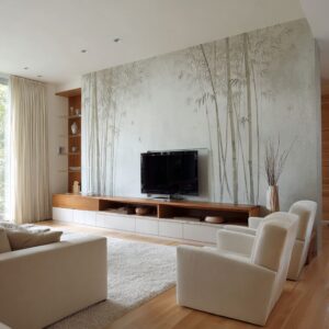
Or in a bright modern interior design where a cloud-like white sectional is held in place by a heavy square wood table and a walnut back wall that prevents the interior design from dissolving into brightness. Even a corridor can carry the same idea—texture becomes the “print,” and warm lighting turns relief surfaces into shadow patterns.

That’s the core of warm neutral interior design: less about chasing a single “perfect beige,” more about building a controlled family of tones and letting light, texture, and one or two strong anchors carry the story.

Warm neutrals interior design and how it differs from cool neutrals
Warm neutrals interior design is a palette built from ivory, cream, sand, oatmeal, warm taupe, mushroom, and soft putty tones, then strengthened with natural materials that already carry warmth—raw oak, weathered wood, walnut, woven fiber, matte ceramics, and gentle brass. The goal is not “beige everywhere.
” The goal is a room that feels sunlit and calm, where depth comes from undertone, texture, and shadow instead of bold color.

The fastest way to separate warm neutrals from cool neutrals is undertone. Warm neutrals lean beige, peach, or golden-taupe, and they tend to pair easily with honey woods and warm metals.
Cool neutrals lean blue-gray, green-gray, or icy white, and they can feel sharper next to warm woods—sometimes even a little clinical if the space is mostly hard surfaces.

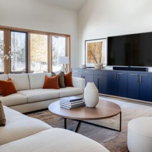
You can see the warm-neutral “signature” in interior designs that use a light-on-light base (slipcovered seating, creamy walls, soft drapery), then add definition using one honest wood anchor (a thick plank coffee table or a walnut back wall) and a few thin dark lines (black window mullions, a slim curtain rod, a dark metal table base). That combination keeps the palette warm and soft, while still giving the eye clear structure.

Start with one honest anchor, then let everything else soften around it
In this style, the coffee table isn’t a small accent—it’s the stabilizer. A thick plank-style table, a chunky rustic block, or a square slab with visible grain creates a grounded center so pale seating and tall glazing don’t feel like they’re floating.
The styling follows the same logic: low bowls, stacked books, a long tray, and one airy branchy arrangement that breaks the strict geometry of window grids or shelving.

If your room is compact or your seating already has strong visual weight (a deep sectional that wraps into a U shape), an oversized solid wood table can start to feel crowded. In that case, keep the “honest wood” idea but adjust the mass: choose a table with a thick top on a slimmer base, or a wood top with a dark metal frame that lifts the visual weight.
You still get warmth and grain, but you give the floor plane more breathing room.

Thin dark lines work best when they behave like a drawing, not a block
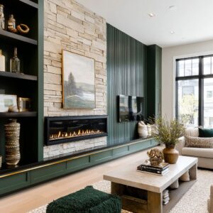
A popular detail shows up in many warm neutrals designs like this: black is present, but it’s used narrowly—window mullions, a curtain rod, a slim fireplace opening, a metal table base, a few stems of hardware. That’s why one darker pillow can read intentional rather than random: it echoes the window grid, so it feels like punctuation.
In open plans, a black-framed glass door or partition can quietly outline the space so the neutrals don’t blur.

If you already have a heavy dark element—say, dark beams overhead, or very deep walnut millwork—adding more black lines can make the room feel sharper than you want. The fix isn’t to remove contrast; it’s to change the type of contrast.
Swap pure black for softened dark notes that still read as structure: aged bronze, deep espresso wood, or a charcoal ceramic. Then let your curtains do what the strongest versions do: hang them full-height and slightly warmer than the walls, so they cushion the hard outlines and keep the room human at night.

Undertones show up in the “quiet” places first—curtains, rugs, plaster, and stone
Warm neutrals succeed when the background isn’t a flat, single paint color. That’s why plaster-like walls and limewash-style finishes feel so compatible with this look: the surface itself has gentle movement, so even an off-white reads layered.
The same thing happens with stone and textured tile used in niches or as a TV-wall panel—large calm planes give you stillness, and smaller-grain texture gives you detail.

In a hallway designed like a calm passage, the “pattern” can literally be the shadow thrown by a wave-like relief panel. In living rooms with a hand-worked wall finish, the wall quietly holds the space together before you add anything.

Warm neutrals can skew yellow or dull in some lighting, especially if your bulbs are very warm and your textiles lean creamy at the same time. If the room starts to look a little buttery or heavy, you don’t need to abandon the palette.
Shift one layer cooler within the neutral family: a linen curtain with a faint stone cast, a rug that leans oatmeal instead of cream, or matte ceramics that read chalky rather than beige. This is also where reflective surfaces earn their keep: a tall mirror with a warm wood frame can bounce daylight and keep the palette from feeling sticky, without introducing a new color.

Texture is your pattern—so choose it the way you’d choose prints
Notice how interior designs in this style often avoid busy motifs even when they use “vintage-inspired” rugs: the pattern is faded and low contrast, just enough to keep the floor from reading blank. Everywhere else, interest comes from weave and relief: bouclé dining chairs, a plush rug with looped circles, a woven lantern pendant, ribbed or fluted cabinetry fronts, matte ceramics with speckling, dried botanicals that add a soft irregular edge.

The best part is that the textures aren’t fighting each other; they’re mostly low-sheen, so the light stays gentle.

If you pile on nubby pillows, chunky throws, woven pendants, textured plaster, fluted furniture, and layered rugs all at once, the room can start to feel busy even though it’s “neutral. ” When that happens, simplify the silhouettes rather than stripping away comfort.
Keep the textures, but make the shapes calmer: fewer small accessories, more pieces that read as quiet blocks—one large floor vessel instead of three little vases, one substantial bowl instead of many tiny objects. This is exactly why open-plan rooms in this family can feel settled: fewer items, but each has enough presence to hold its place.

Scale is what makes a neutral room feel confident
A common mistake with warm neutrals is treating them as a “safe” background and then decorating timidly. The stronger versions do the opposite: one oversized abstract painting gives the dining zone identity without strong color; two tall arched mirrors act like architecture; a long sideboard anchors a dining wall; a big runner stretches a hallway; a large low table keeps the seating from drifting; a deeper-toned kitchen wall becomes a backdrop that makes pale upholstery look intentional.

Oversized doesn’t mean “big everywhere. ” If your ceiling is low, a giant horizontal artwork can press the room down.
In that case, use the same scale idea but change the orientation: tall mirrors, a narrow vertical artwork, or a pair of sconces that pull the eye up. A corridor shows this well—vertical sconces repeated in rhythm can make the space feel planned, while a single large relief panel gives the eye something to read without taking floor space.

Open plan: make the zones feel related without making them identical
Open plans in this style work when the material family repeats from zone to zone: pale upholstery, warm wood, matte ceramics, soft woven textiles, and then either thin black lines or warm brass as the sharpening note. Lighting often does the unifying job: a linear globe pendant over the dining table echoes a round mirror and repeats the “soft circle” language, so the living area and dining area feel like they belong to one home.

The calmest open plans also place a secondary focal point deeper in the space—like a branch arrangement beyond the sofa—so the room doesn’t read as “front only. ”.

If your kitchen has strong existing finishes you can’t change (very cool stone, or cabinetry that leans red), forcing the living room to match can make the whole plan feel constrained. Instead, connect the zones with bridges: choose curtains that sit between the kitchen tone and the sofa tone; repeat the kitchen’s metal finish in one living-room detail (a table base, a frame, a sconce); and rely on rugs to define the lounge as an “island.
” Layering two rugs in similar neutrals can help, especially when you want definition but you don’t want a bold print.

Paint, finish, and lighting: how to keep warm neutrals from turning yellow or flat
Warm neutrals look best when paint color, surface sheen, and lighting are chosen as one system. If any one piece is off, the room can swing buttery/yellow or feel washed-out and blank.

Paint: warmth that stays creamy, not buttery
- Aim for wall colors that read ivory, sand, warm greige, or soft taupe—tones that stay calm next to wood. If the wall starts to look like “vanilla pudding” beside oak or brass, the undertone is too yellow.
- Test large swatches in the places that matter most: near black-framed windows, beside raw wood tables, and next to cream upholstery. A color that looks perfect on a sample card can shift once it’s surrounded by slipcovers, drapery, and warm flooring.
- If your room already has strong warm elements (walnut wall, heavy wood table, brass pendants), use a wall tone that is warm but slightly muted (more putty/mushroom than honey) so everything stays refined.
Finish: keep sheen low so neutrals stay soft
- Warm neutrals turn “flat” when every surface is the same texture, but they also turn harsh when paint sheen throws glare. The sweet spot is matte or eggshell on walls, with a slightly stronger sheen only where you need durability (often trim).
- Spaces with plaster-like movement (hand-troweled texture, limewash-style clouding, relief panels) naturally create shadow and depth. If your walls are smooth, you can still get the same effect by keeping the finish low-sheen and letting light graze it gently, the way globe sconces do on a textured wall.
Lighting: warm neutrals need flattering warmth plus good color accuracy
- Warm neutrals can go yellow when bulbs are overly warm and low quality. Use warm light, but prioritize high color accuracy (CRI 90+) so creams look creamy, not dingy.
- Keep your main bulbs in a consistent warm range (commonly 2700K–3000K), then use dimmers so the room can shift from bright daytime function to evening softness without changing color.
- Layer lighting the same way:
- Even ceiling wash (recessed lights) so the whole room reads clean, especially in open plans.
- Wall lighting (globe sconces, vertical sconces) to create halos and bring out texture—perfect for plaster walls, relief panels, and corridors.
- A sculptural pendant (linear globe bar, woven lantern) to give rhythm over dining/islands without relying on contrast paint.
Quick fixes if the room looks wrong
- Looks yellow: switch to higher-CRI bulbs first, then soften the wall color toward putty/mushroom rather than creamy gold; keep curtains in warm beige instead of bright white next to black frames.

One short checklist
- Look at your main neutral in daylight and in evening light, next to your curtain fabric and rug.
- Make sure you have one grounding element (a substantial wood piece, a deeper-toned wall, or a long low console).
- Add contrast with a line (thin black, dark bronze, or deep wood), not a big dark block.
- Choose texture in at least two heights: floor (rug/runner) and eye level (pillows, sconces, art relief).
- Keep tabletop styling low and grouped (tray + books + one bowl + one airy element).

Where this style becomes personal
People sometimes describe warm neutrals interior design as “safe,” but interior designs built in this family show a different reality: the personality comes from the choices you don’t make. You don’t add loud color; you add a branchy silhouette.
You don’t fill shelves; you give each object space and let warm light do the shaping. You don’t scatter small decor; you pick one oversized artwork, one big mirror moment, one anchor table, one long sideboard, one corridor relief.

If your home needs more energy (kids, pets, constant traffic), an all-ivory scheme can feel impractical. You can keep the feel and add resilience by shifting the mid-tones deeper: oatmeal slipcovers instead of white, a rug with more visible border and pattern (still low contrast), and ceramics that are slightly darker—clay, sand, stone—so everyday life doesn’t show up as “damage,” it shows up as patina.

And if you’re after the calm minimal dining room with bouclé chairs and a linear globe pendant, but your space has sharp corners and no arches, borrow the softness in other ways: rounded chair backs, a mirror with softened corners, and lighting that reads as a gentle line rather than a heavy chandelier. Small decisions, repeated, do most of the work.

Used carefully, warm neutrals can feel bright without being cold, minimal without feeling empty, and soft without turning sweet. The examples that define this approach already contain the clues: one honest material, one crisp outline, a lot of micro-variation, and enough scale to let the room breathe.
Related Posts
Harmony Home Design brings 10+ years of residential interior design experience to the ideas shared here. We publish design concepts, layout thinking, and practical styling notes.