
A front door doesn’t act like a single object that needs decorating. It behaves like a small visual system: a set of outlines, depths, textures, and controlled contrasts that tells the eye where to pause, where to move upward, and where to rest.
The result is a look that reads calm in daylight, warm at night, and intentional even when nothing is staged. The aim here is to explore the main visual mechanics—how entries create a modern farmhouse-style presence, privacy, softness, and structure without leaning on obvious decor.

The “nested outline” effect: why arches feel softer without becoming sweet
Arches in modern farmhouse style work well when they’re treated as layers of outline rather than a single romantic gesture. The nested-arch setups create two separate moments:
- A big halo that announces height and generosity.
- A smaller, closer arch that feels human-scale and touchable.

This layering matters because it creates distance between “statement” and “welcome. ” The outer arch reads architectural and spacious; the inner arch reads personal and approachable.
When those two outlines sit close together, the eye perceives refinement—like a framed artwork with a mat around it. That’s why the entry appearance can feel grand while still staying restrained.

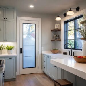
A key detail: the outer black grid doesn’t merely decorate the glass. It functions like ink lines around negative space, making the opening legible from far away.
The grid’s thinness keeps it from turning into a visual fence, but its darkness creates a crisp border that the warm whites can lean against. The arch becomes readable even in bright sun because black lines hold their shape when highlights wash everything else out.

This is one of the clearest patterns inside modern farmhouse front door ideas: shape does the heavy lifting first, and color stays quiet so the entry remains calm in every season.

Directional texture swaps: how “almost the same color” still feels defined
One of the most underestimated moves is keeping the door close in color to the siding—then separating them with direction and texture instead of paint contrast. A warm white door next to warm white wall can still stand apart when:
- the wall runs horizontal (lap siding), and
- the door runs vertical (plank face).

The eye reads direction changes instantly. Even when the colors are cousins, the surface “grain” changes the way light breaks across it.
Horizontal boards spread light in long bands; vertical boards pull light upward. That directional shift becomes a quiet kind of drama—enough definition for the door to feel present, without needing a high-contrast paint moment.

An especially subtle refinement appears when a plank door includes a single grounded panel low on the leaf. That lower rectangle acts like a visual anchor: it prevents the vertical planks from feeling too literal or overly rustic, and it introduces a calm “base note” that stops the door from looking tall and restless.
The door ends up reading composed: vertical energy above, stability below. This is the kind of detail that look mature: not more decoration, but better distribution of calm and movement.

Black as punctuation, not a theme: the ink line strategy
Black elements can behave like punctuation marks—small, deliberate strokes that clarify a sentence. The black grid, the long handle, the window frames, and sometimes a thin perimeter line at the threshold all do the same job:
- they edit the white,
- they organize the opening,
- they direct the gaze.

A long dark handle is especially powerful because it becomes the most legible vertical line on the door. It quietly reinforces height and gives the eye a clear “touch point” without adding ornament.
The handle doesn’t need flourish when it’s treated as a graphic stroke.

What makes this feel modern farmhouse rather than stark modern is the way black is kept thin and repeated, not enlarged and celebrated. The moment black becomes bulky—thick frames, heavy straps, oversized iron shapes—the entry starts leaning costume-like.
The thin black marks keep the mood crisp and architectural.

Depth as a luxury cue: recessed portal approach
The recessed wood-lined entry design is one of the most telling examples of modern farmhouse becoming quietly high-end. The effect isn’t about the door face alone—it’s about how the door sits inside a pocket of shadow and warmth.
That recess creates:
- a natural shadow frame that outlines the opening without extra trim drama,
- a feeling of protection that makes the entry psychologically calmer,
- a sense of arrival that a flat facade can’t create.

This move changes the role of the wall. Instead of acting as a backdrop, the wall becomes part of the entry composition—like a stage set built from just two tones (warm wood and soft white).
The recess functions as visual shelter, even before any light turns on.

What often goes unnoticed: the wood on the ceiling of the recess matters as much as the wood on the sides. When the top plane turns warm, the entry feels less like a cut-out and more like a wrapped space—something you step into.
That’s a big reason modern farmhouse door concepts read “finished” without needing decorative layers.

Glass that behaves like texture
The best glass moments avoid the all-or-nothing trap of clear transparency versus heavy frosting. Instead, the glass behaves like a surface with texture—something that catches light, breaks reflections, and hints at interior life without giving the whole scene away.

Three distinct glass behaviors:
- Grid glass surround: organized visibility.
The grid breaks the view into smaller calm rectangles, so the eye never falls into a single large exposed plane. - Slim clear sidelights in deep shadow: quiet light slices.
Because they sit back in a recess, they read darker and calmer, acting more like vertical light seams than windows meant for viewing. - Ribbed (reeded) sidelight: textured privacy.
Ridges turn daylight into a soft vertical shimmer. That shimmer adds richness beside wood grain without introducing pattern chaos. Wood has organic variation; ribbed glass has controlled repetition. Together they feel sophisticated.

A design point: textured glass often becomes the “movement” in an otherwise still entry. During the day, it changes with sun angle; at night, it becomes a lantern-like surface.
The entry looks alive without needing décor.

The floor and threshold as mood-setters: why grounded entries feel calmer
The visible base of the entry has outsized influence on whether the door reads airy, stable, modern, or casual. The floor and step edges can do a quiet job:
- Darker floor planes make light walls and wood feel anchored.
- Large, calm slabs read architectural and composed.
- Crisp step lines give the eye a clear “threshold moment.”

When the base is visually steady, the entry can afford to be minimal elsewhere. When the base is visually busy, the door needs extra help to feel intentional.
This is why the portal entry with darker stone underfoot can look finished with almost nothing added: the floor already supplies a strong, calm foundation.

“Silence” as a design decision: why some entries look styled even when empty
One of the strongest ideas is restraint that looks intentional rather than incomplete. The absence of extra objects becomes part of the look.
This silence works because the entry already contains enough visual information:
- a clear silhouette (arched outline or recessed portal),
- a strong rhythm (vertical boards, thin black strokes),
- a controlled palette (warm white + wood + black),
- a single tactile moment (glass texture or wood grain).
When those elements are balanced, the entry doesn’t need layers of seasonal items to feel cared-for. It reads like an edited composition.

This “edited quiet” is also why modern farmhouse can feel current rather than nostalgic: the focus shifts from themed accessories to proportion, outline, and surface behavior.

The entry as a sequence: pacing and approach
A final idea is that these doors aren’t designed only to look good head-on. They’re designed to look good while approaching.
Several details support that:
- Long vertical handles and slim sidelights stay legible from an angle.
- Recesses create changing shadow as someone moves.
- Black window frames echo the door accents, so the eye reads continuity along the façade.
- Simple path geometry and quiet ground texture keep attention on the entry itself.

This is where modern farmhouse main door ideas become more than a door styling exercise: the entry becomes a short visual story—approach, pause, threshold, and then a gentle hint of light.
Summary
Modern front door concepts feel farmhouse because they combine farmhouse-friendly elements (plank doors, warm whites, welcoming shapes) with modern discipline (thin black strokes, edited object count, controlled texture). Their “extra” quality comes from subtler decisions:
- outlines layered like frames,
- contrast created through direction and shadow instead of loud color,
- glass treated as texture and light behavior,
- depth used as a quiet luxury cue,
- black repeated in slim marks to organize the composition,
- a grounded base that stabilizes the whole scene,
- and intentional silence that reads confident rather than empty.
Related Posts
Harmony Home Design brings 10+ years of residential interior design experience to the ideas shared here. We publish design concepts, layout thinking, and practical styling notes.