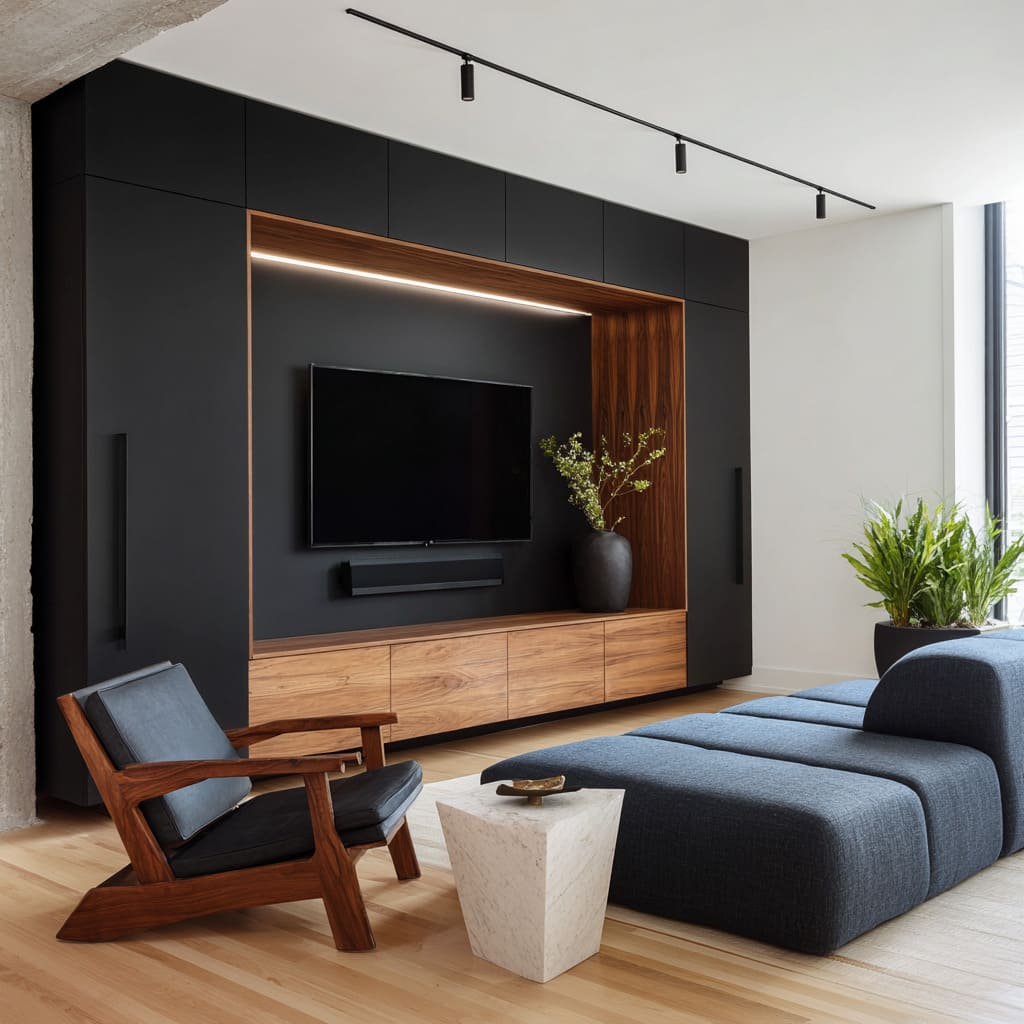
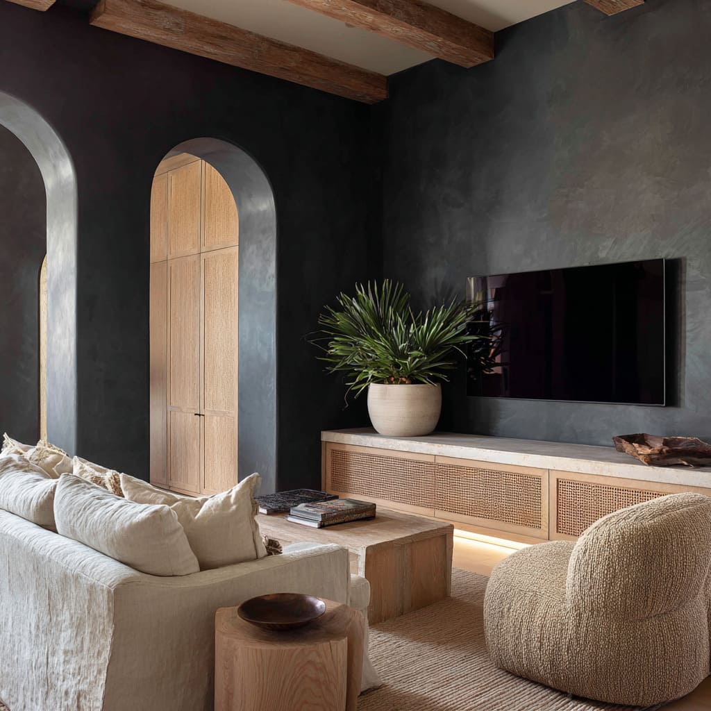
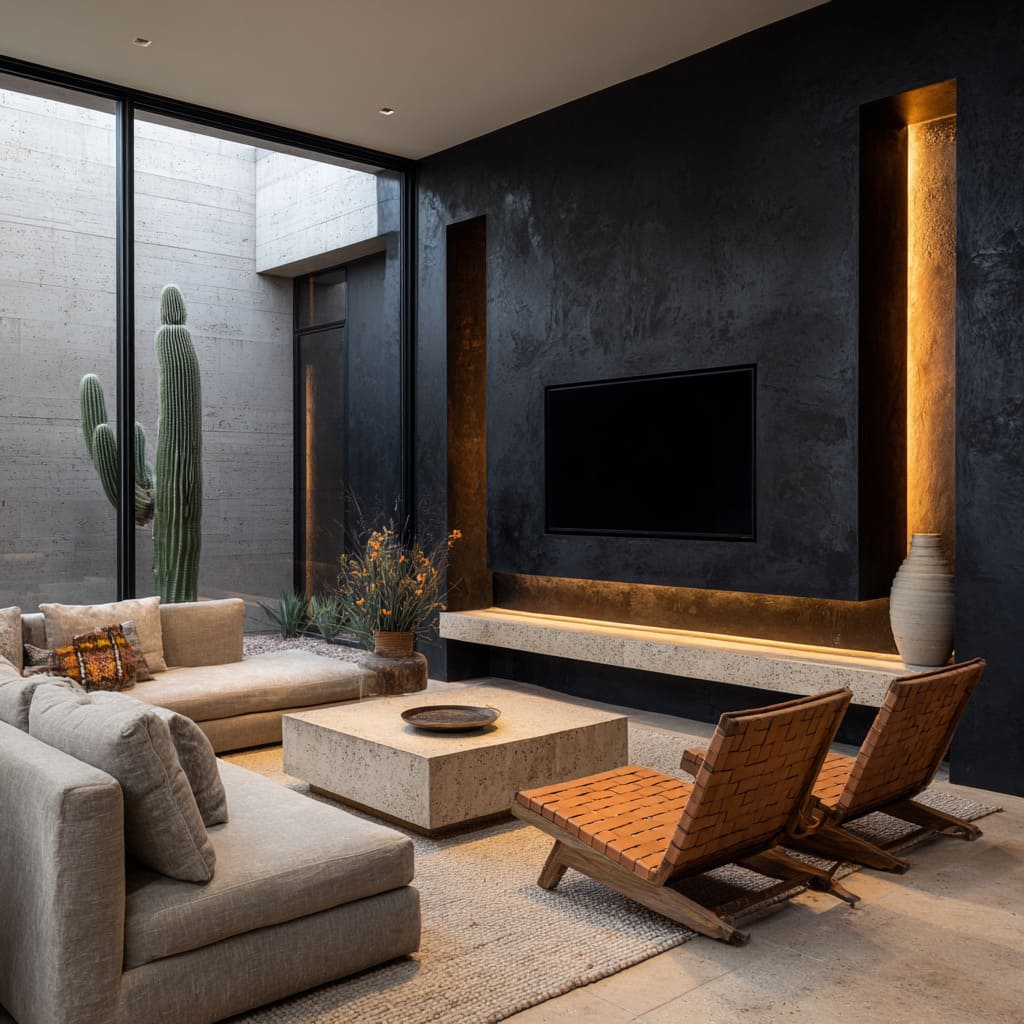
A black accent wall behind the TV can shift the entire tone of a living space—if handled with restraint and detail. It doesn’t have to dominate or darken a room.
Instead, it can create a visual anchor, offering shape, texture, and rhythm without calling attention to itself. The most refined versions do this through contrast, through the way light meets matte surfaces, or how surrounding finishes and furnishings interact with the depth of the wall.
Today’s most thoughtful black tv wall ideas go beyond flat paint or bold contrast. They consider material variation, surface structure, and the relationship between objects and architecture.
Some panels appear carved from shadow, while others are textured to catch light in precise ways. Recessed volumes, floating consoles, narrow vertical grooves, and grain-forward materials create a visual landscape that’s more architectural than decorative.
Rather than competing with décor, the black backdrop becomes a frame—calm, controlled, and dimensional. Paired with soft edges, woven textures, and diffused lighting, the overall composition invites quiet cohesion.
It’s not the color alone that defines these spaces—it’s what surrounds it, how it’s lit, and how the wall is built to speak without needing to be loud.
Light Written as a Brush-Stroke
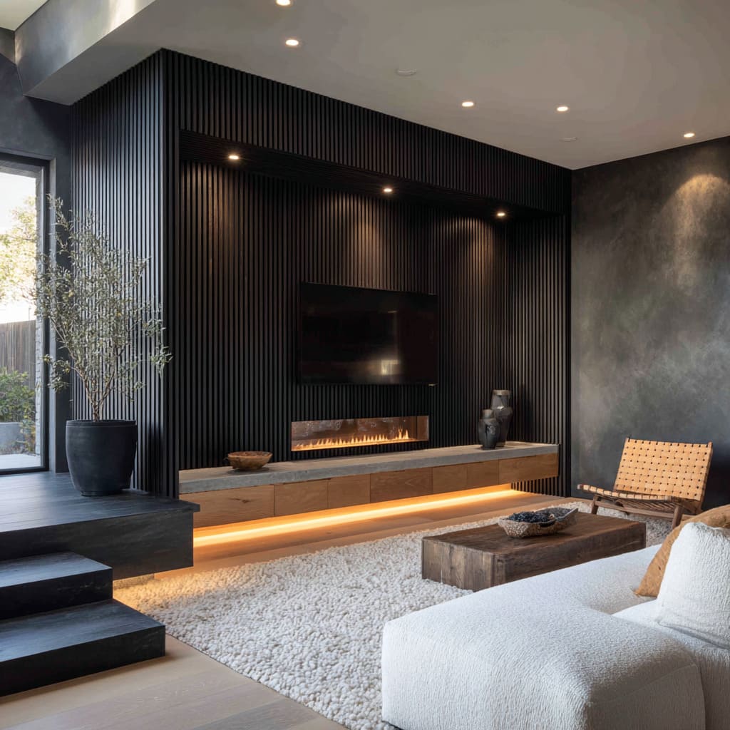
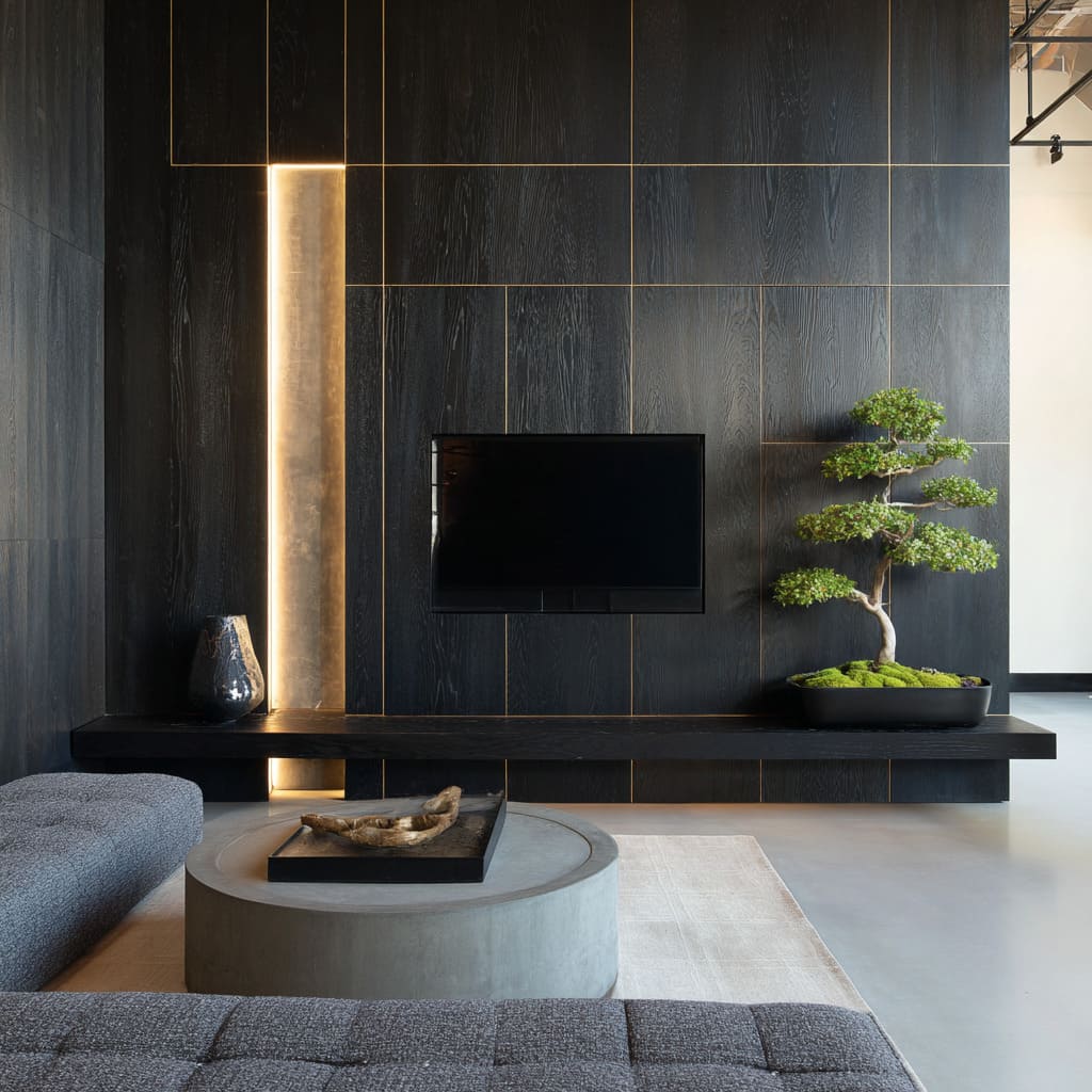
Thin strips of warm LED lighting aren’t placed for brightness—they’re composed like lines on a canvas. Instead of casting broad beams, these lights act more like a soft underline to the shapes around them.
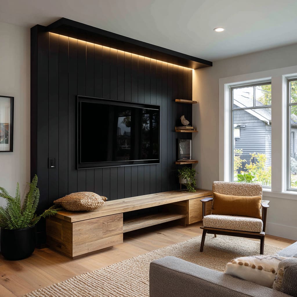
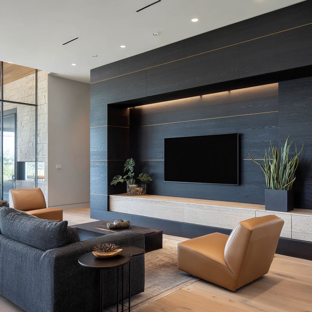
A black accent wall design behind TV doesn’t always need mass to make an impression; sometimes, it’s this quiet edge of amber light that carries the visual load. You’ll find this approach in several modern layouts where illumination doesn’t wash over the room—it creeps along joints, glides just under the lip of a floating shelf, or gently outlines the silhouette of recessed elements.
The warmth of the LED always contrasts with the cooler black finish around it. That slight shift in temperature gives the glow a tactile presence.
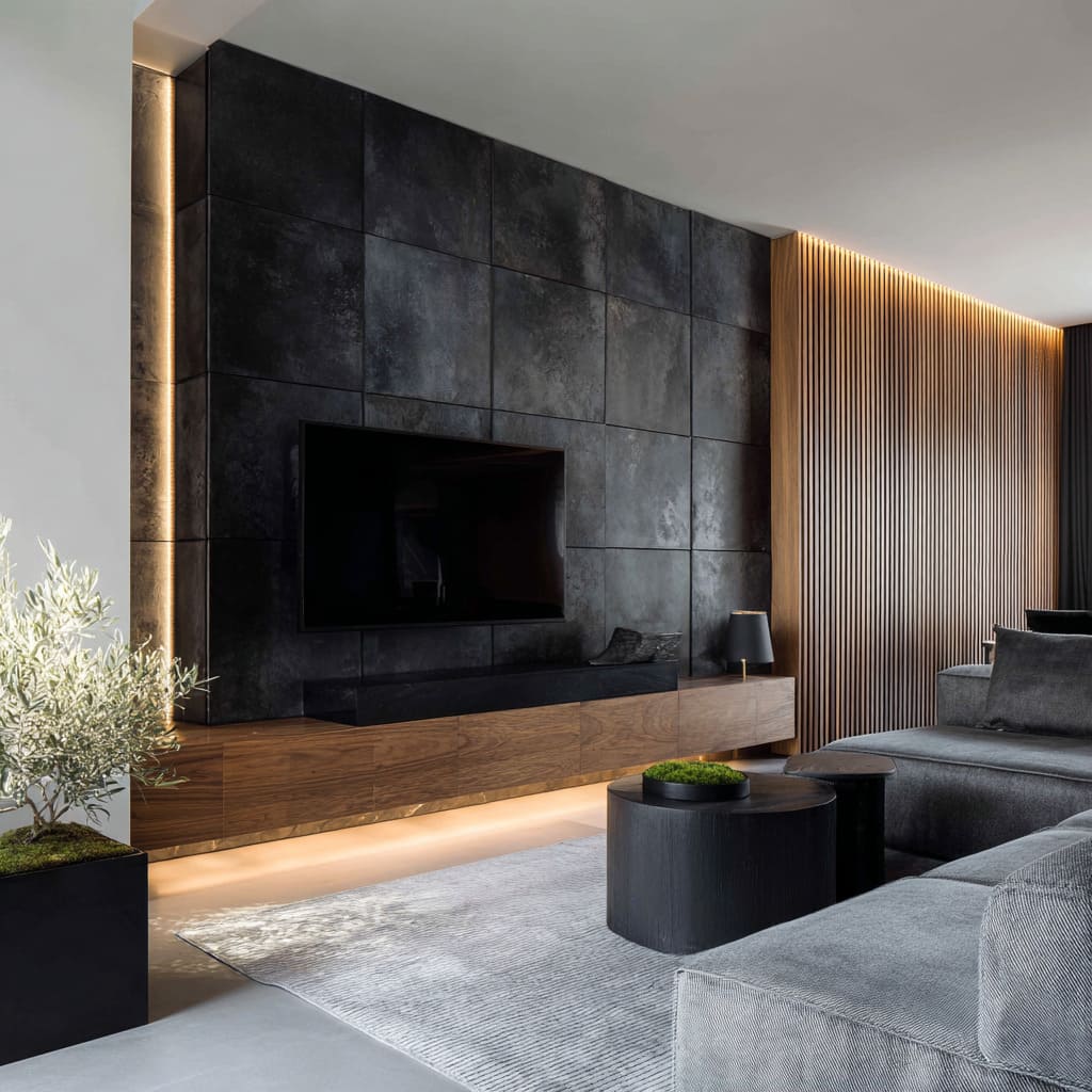
One narrow beam can make an entire cabinet appear to float, or pull the black away from the ceiling just enough to suggest the wall is its own distinct volume. The effect is less about function and more about tension—the light sits between surfaces like a signature.
In this way, what begins as a technical element ends up acting more like a compositional tool. The lighting isn’t there to help you see; it’s there to help you look—and to notice the precise joinery, the spacing, the intent of every line the builder left behind.
The result? An accent that hovers, recedes, and almost breathes depending on where you stand.
Black That Is Never One Color
The black on these walls is rarely solid—it moves. Not in the literal sense, but in how it responds to air, light, texture, and your position in the room.
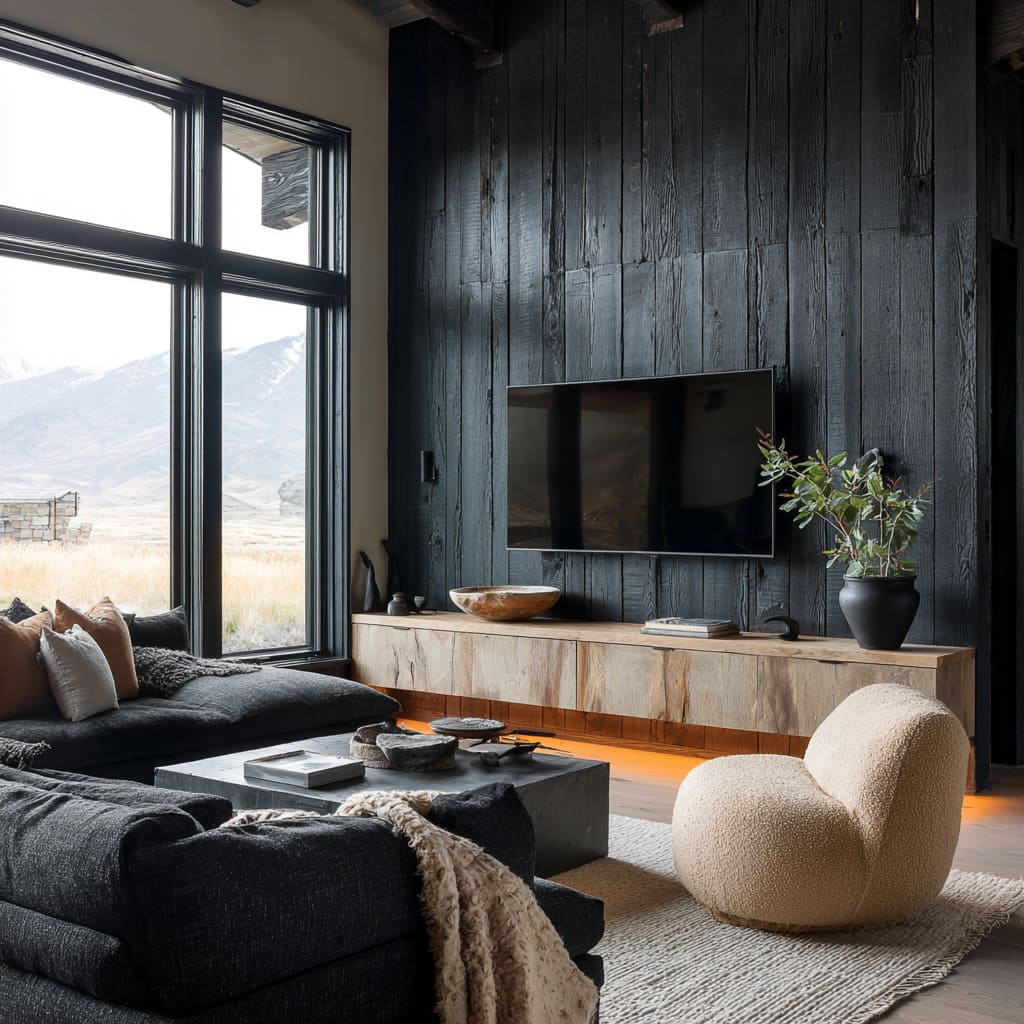
What seems like a flat backdrop from one angle may reveal streaks, shifts, and undercurrents of brown, gray, or even deep plum when caught by daylight or a warm lamp. This nuance is especially visible in textured surfaces—burnt wood, brushed stone, hand-troweled plaster—where shadows gather in the grooves and subtly alter the perceived hue.
One of the more compelling black tv wall ideas is to treat the color as a foundation, not a finish. It becomes a responsive field where depth isn’t applied with paint but emerges through what’s beneath it: grain, mineral, fiber, even the memory of fire.
In rooms that use stone or plaster, the shift from soot-like flatness to graphite shimmer gives movement to surfaces that might otherwise feel static. It also allows contrast without adding extra color—something vital in smaller or more tightly composed spaces.
This approach keeps the eye engaged without breaking the room’s tonal quiet. It’s not about decorating a wall but giving it life through tone variation that emerges only when you pause long enough to notice it.
Texture as Graphic Rhythm
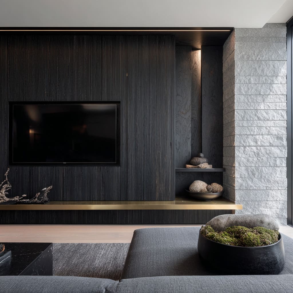
Ribbing, slats, and fluting are more than decoration—they manage visual speed. Imagine a barcode stretched vertically along a wall.
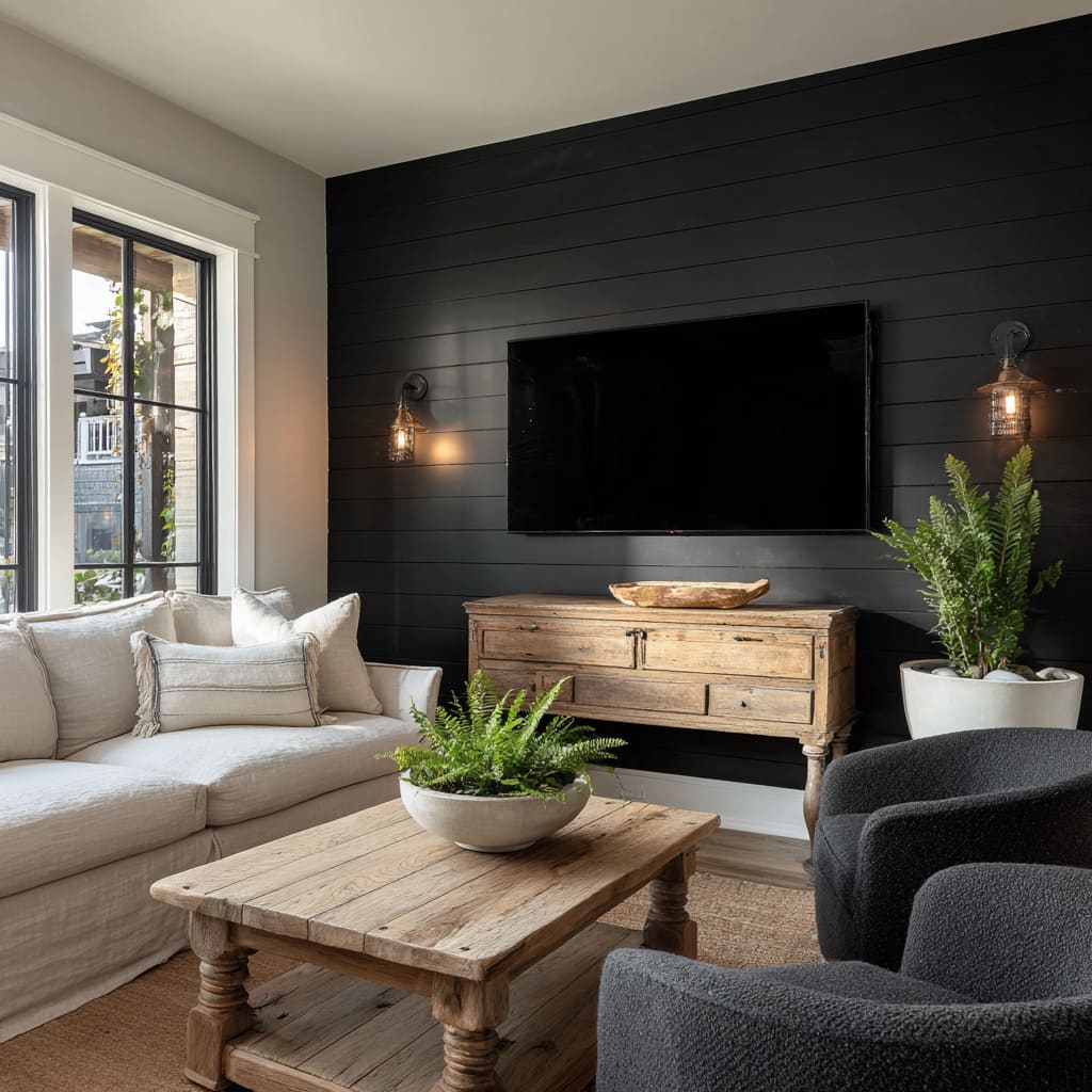
That’s what tight black grooves do to the eye—they pull it upward in small, repeated steps, slowing your glance and making a space feel taller. On the other hand, wider horizontal lines do the opposite: they ground the room and suggest width, calm, and familiarity.
Texture, in this case, becomes timing. A vertical rhythm adds precision and structure, even in rooms that feel soft overall.
It introduces a beat that can be fast and fine, like narrow fluting with pinpoint light, or slower and more open, like horizontal shiplap running behind a TV in a living space built for comfort. Either direction alters how long your eyes linger, how far they travel before pausing, and where the wall seems to begin or end.
These textures don’t compete with color—they are the color. In black, this effect is amplified because the shadows cast by the ribs become part of the palette.
The wall behaves more like a sculpture—shifting through the day as light moves, but never demanding attention. That balance between form and surface is what lets the wall act as a subtle anchor without overpowering the rest of the room.
Framing the Screen through Negative Space
The television is no longer the star—it’s the pause. In many updated layouts, the screen is treated as a recess rather than an addition.
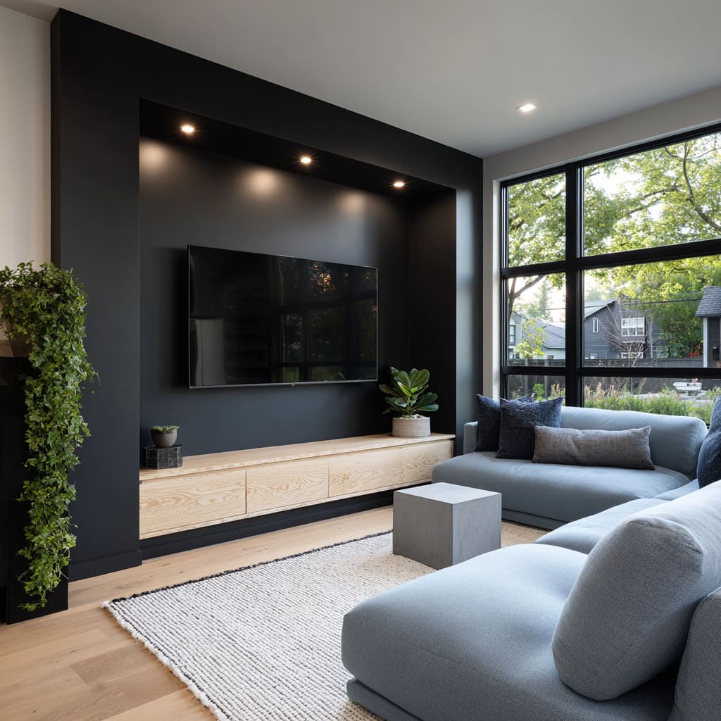
The idea is to carve out a shape from the wall, not place something onto it. A black accent wall for TV, when inset a few centimeters and surrounded by flush surfaces, transforms the TV from an appliance into a void.
It’s not hidden—but it doesn’t compete. This move allows the surrounding details to step forward.
A thin walnut frame might draw the eye to the grain instead of the glass. A simple ledge below might appear to float, making the space beneath the screen feel weightless.
Even the faintest shadow line created by a recessed mount becomes a detail—an element in composition rather than a technical choice. This style of layout is often paired with quiet materials.
Smooth matte finishes, soft lighting tucked into coves or cabinet lips, and neutral walls help the television sit within a calm, balanced setting. It becomes part of the structure, not the focus.
The result is a room where attention shifts to materials, rhythm, and light, not to the technology in the middle of the wall.
Material Pairings that Soften the Weight
Tactile contrast is what keeps black from feeling hard-edged. When a room builds tension between matte darkness and warm organic finishes, that’s when black reads as refined rather than overpowering.
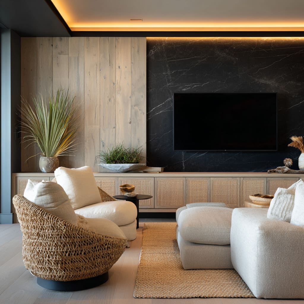
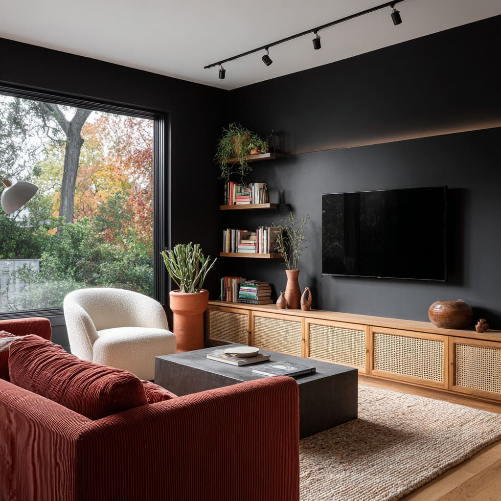
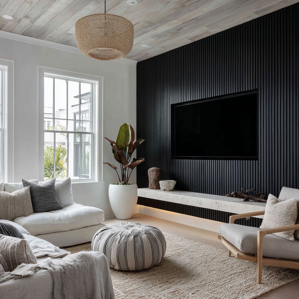
A pale travertine shelf under a flat black wall feels heavier than it is because it draws the hand to its texture. Rattan doors, with their repeating pattern of light weave, lend breathability to an otherwise closed surface.
The balance comes from where these elements land. Soft boucle chairs rest near the floor, where their shape and texture speak directly to comfort.
Cane doors stretch across wide consoles, letting pattern stretch horizontally and give the wall rhythm. Even a jute rug underfoot plays its part—it doesn’t shout for attention but adds a layer that meets the eye only when seated low in the room.
It’s this kind of quiet interplay that keeps the wall from feeling too dominant. A black feature wall behind TV can feel architectural and still soft when paired with elements that echo nature: rough stone, curved furniture, woven fibers, brushed metal, and pale woods.
The visual experience becomes one of balance between density and breath, between stillness and touch.
Regional Atmosphere Inside the Wall
Material finishes can pull in the landscape outside without copying it. Across different regions, the look of a black accent wall takes on qualities of its surroundings.
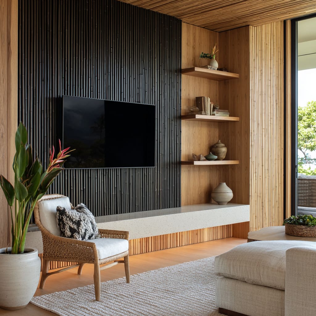
In warmer coastal homes, for instance, narrow black slats with soft luster might echo the shape of flattened bamboo, adding vertical rhythm that mirrors what grows outside the window. That touch of gloss catches natural light the way tropical plants do in bright shade.
In dry desert homes, a black surface might come through textured plaster or limewash. The finish stays matte but layered, catching light unevenly.
With lighting pulled through recessed bronze-toned niches, the wall feels sun-weathered, even indoors. These aren’t showy effects—they’re grounded responses to the materials and light that define a particular region.
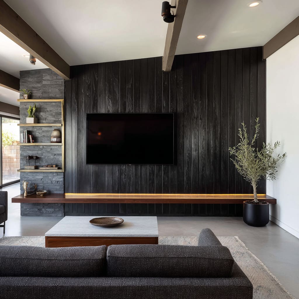
Mountain homes often use grain-forward black wood, deeply brushed or burnt, evoking fire, cold air, and rough textures. That surface tells a different story—one that feels worn in, even when the room is new.
So the feel of the accent wall changes not by switching colors, but by tuning how those colors are built: through tools, through light, and through the memory of the landscape just beyond the walls.
Controlled Reflections Rather than Gloss
Shine, when used sparingly, becomes a tool—not a distraction. In many of these black accent wall compositions, reflective surfaces aren’t applied uniformly.
Instead, they’re broken into small elements—used where a faint flicker or metallic glint will bring attention to form without disrupting the overall calm. For example, a torched wood finish with a light sheen may pick up narrow vertical streaks only under certain angles of ambient light.
The same surface, in shadow, appears nearly matte. This unpredictability adds depth without overstimulation.
Likewise, brass inlays in structured paneling—particularly in layouts with horizontal or vertical bands—glint faintly at the joints but recede as ambient light dims. The detail becomes almost like a fine stitch across the wall: barely seen, but grounding the surface with control.
Even a small brushed edge on a floating shelf carries weight here. That muted line might catch a single low lamp, turning a practical surface into a faint highlight.
There’s no glare, no polished shine—just a flicker where the eye might linger. This approach keeps the black surfaces quiet, but never flat.
Every reflection feels purposeful, shaped, and limited to narrow strips or points where they mark edges, define transitions, or create tiny pauses in the visual rhythm of the wall.
Furniture that Echoes Wall Geometry
Form and placement in furniture don’t compete—they continue the structure. In thoughtfully assembled layouts, the geometry behind the screen becomes a script that the rest of the room quietly follows.
Instead of setting walls and furniture in visual opposition, designers often let one mirror, soften, or bend around the other. Round tables and curved chairs are often used to break the strict verticals of fluted or ribbed panels.
A circular table centered in front of tall grooves adds tension and punctuation—a dialogue of forms rather than a clash. In other cases, a long, low concrete shelf mimics the wall’s wide panels, reinforcing a sense of groundedness through repetition.
These echoes create alignment without direct matching.
Materials help maintain that connection. Boucle, linen, and stone textures pick up the visual rhythm of the wall but shift the tone from architectural to tactile.
Seating often stays low and broad, letting the verticality of the black feature wall behind TV remain dominant while the softer shapes in front offer contrast. It’s a kind of visual layering, where lines in space aren’t interrupted—they’re extended, looped, and answered.
The outcome is a layout that feels fluent—where every shape, whether built into the wall or placed in the room, plays a part in a larger composition. The wall speaks first, but the furniture follows up with its own soft response.
Plant Life as a Color Echo, Not a Pop
In these rooms, plants aren’t used for bursts of color—they’re used for shape and rhythm. Every leaf, branch, or stem is chosen not to stand out, but to follow or counter the lines already set in motion by the wall behind it.
This is especially true with vertical paneling, fluting, or slatting, where the form of the wall has a strong direction, and the greenery steps in like a visual partner. Take olive trees, for instance.
Their thin, upright branches follow the pace of narrow vertical battens, adding movement without noise. In another setting, banana leaves with wide fans might contrast fine fluting—not through hue, but through scale and softness.
Their arc cuts across rigid lines and relaxes the grid. And in the most structured layouts, a bonsai tree placed near brass-inlaid black panels can echo the linear geometry in miniature.
The trunk’s bend and the moss base repeat textures already in the wall, without ever shifting the color palette. What ties these uses together is restraint.
The green is usually soft, the pot neutral, and the placement tight to the architecture. The effect is that the plant becomes part of the black wall’s shape language—not an accessory, but a quiet participant in the composition.
Whether grounded in a matte ceramic base or tucked into a corner niche, the greenery doesn’t disrupt the structure. It continues it.
Warmth Drawn with a Single Hue
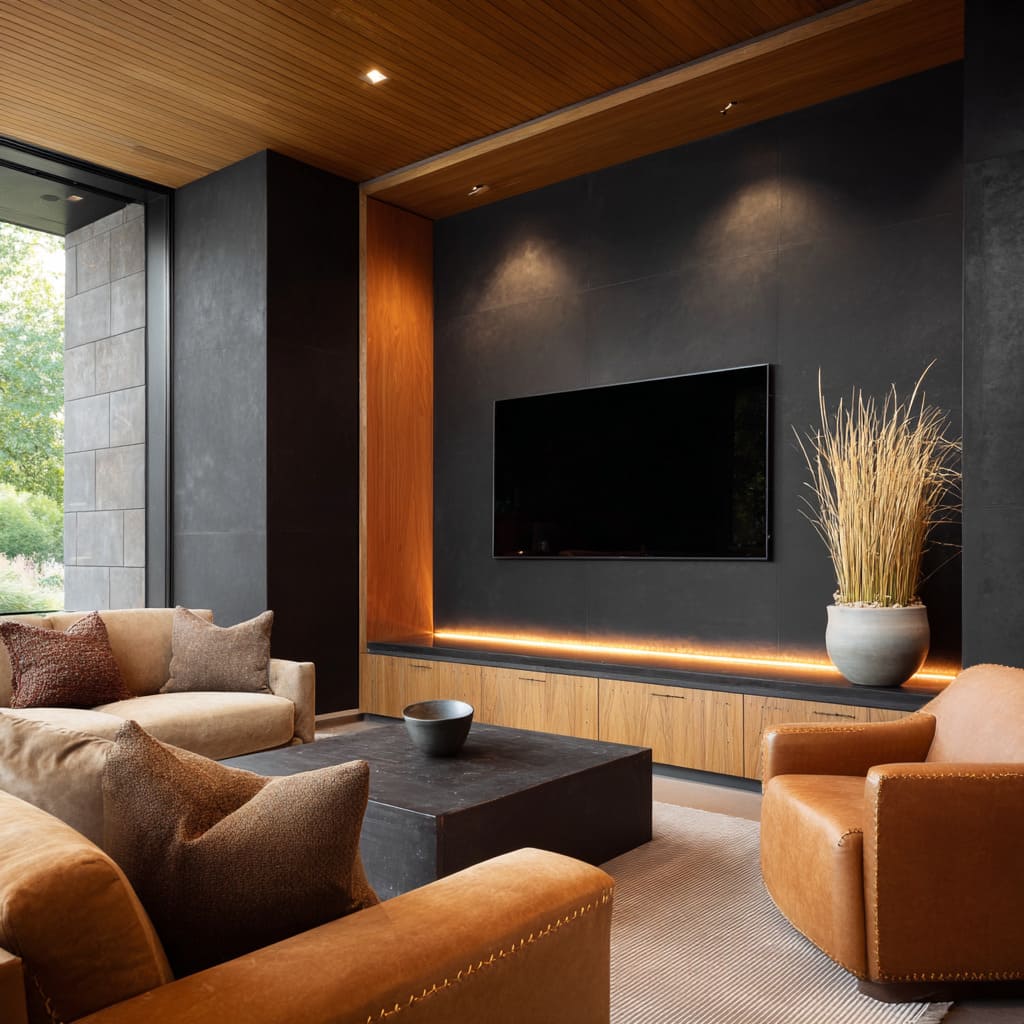
Amber light becomes the silent thread that pulls the space together. In interiors built on tonal contrast—black walls, pale woods, cool stone—one soft, golden hue repeated in the right places is often all that’s needed to give the room cohesion.
It doesn’t overwhelm. It connects.
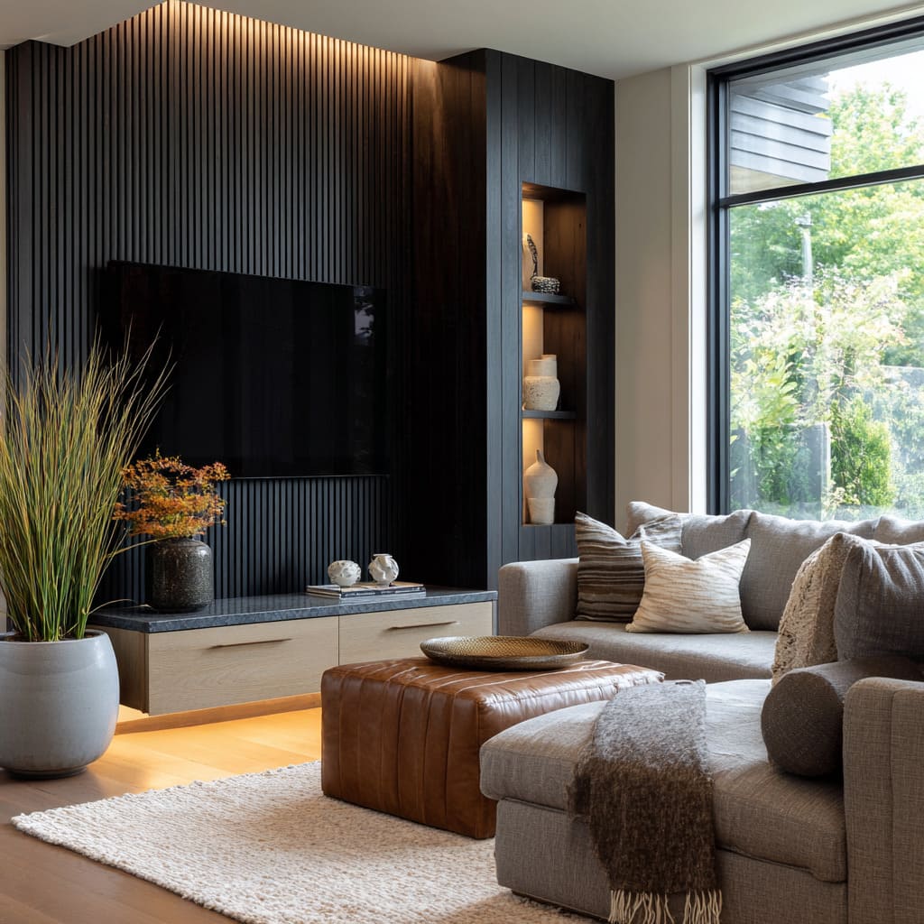
You’ll see it glowing under a floating shelf, just bright enough to trace the base of a cabinet without creating a spotlight. Or it might edge a niche in a side wall, catching on a bronze accent or textured plaster.
In some cases, it lines the top of a black panel in a recessed channel, lifting the wall upward with a quiet gradient. The tone is always amber—not white, not blue—and always low-intensity.
This consistency matters. It turns the light into a visual stitch, tying together surfaces that otherwise come from different materials, finishes, and color families.
A travertine ledge feels closer to a matte black panel when they both carry a whisper of the same warmth. A wood veneer feels more grounded when the light under it glows in sync with what’s beneath the screen.
The impact is more atmospheric than decorative. You don’t see the lighting first—you notice how the room feels like a single structure, even when the elements contrast.
That golden glow is what makes the edges feel softened, the shadows more layered, and the entire composition balanced without needing extra detail.
Conclusion
The impact of a black TV accent wall lies not in bold statements, but in layered restraint. Across layouts and styles, these walls prove most effective when they’re treated as part of a larger visual rhythm—tied together with warm light, balanced with soft materials, and echoed in the geometry of nearby furniture.
Design choices like amber underglow, low-sheen finishes, vertical ribbing, and light wood shelving aren’t random—they’re part of a larger language that reads through shape, line, and subtle repetition. Whether a room leans modern, rustic, coastal, or minimal, the black feature wall succeeds when it acts as the visual pause that lets other elements fall into place.
This approach to composition—where black absorbs, shapes, and supports rather than overtakes—continues to evolve through quiet detailing, material contrast, and atmosphere. In the end, the success of the wall doesn’t come from how much it shows, but from how much it holds together.
Related Posts
Harmony Home Design brings 10+ years of residential interior design experience to the ideas shared here. We publish design concepts, layout thinking, and practical styling notes.
