
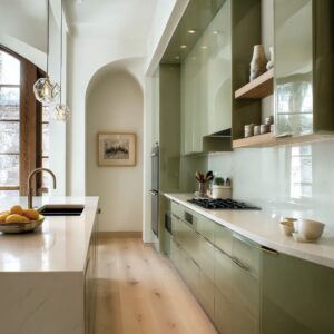
In current kitchen design, the backsplash has moved far beyond being a protective layer—it has become a central visual anchor. Especially in modern rustic spaces, the backsplash holds a distinct presence.
It does this not through heavy patterns or bold contrast, but through surface intent. Subtle textures, mineral tones, and lighting-conscious finishes now guide the direction.
Instead of leaning into overused motifs or decorative layering, today’s modern rustic backsplash focuses on the interplay between material and form. Natural surfaces—plaster, stone, terracotta, concrete—are shaped with control but allowed to breathe.
Imperfection is welcome, but not without boundaries. That balance between relaxed texture and structured composition defines the tone.

Muted palettes and precise layouts replace overt rustic signals. Walls reflect light in scattered pinpoints, absorb it into dry clay, or skim it across brushed metal.
A single brass or bronze element often serves as the only highlight, while the rest of the space lets form and finish speak quietly. These backsplash ideas don’t shout for attention—they’re built to shift with the light, ground the kitchen visually, and hold an atmosphere of calm structure.
Whether it’s a soft ripple in plaster or a ribbed tile echoing canyon shapes, what matters is how the surface feels and reacts—not how many styles it tries to reference. This article explores how these ideas come together—how backsplashes now borrow cues from landforms, use lighting as part of their structure, and rely on small details to hold the space.
The aim isn’t drama. It’s depth, crafted quietly.

Texture Treated as Topography
In modern rustic kitchen backsplash ideas, texture often leads the design language—and sometimes it speaks loudest when shaped like land. These backsplashes don’t sit quietly in the background.
Instead, they rise, shift, and drift like carved ground planes brought indoors. Take contour-carved concrete: its surface behaves more like a landscape relief than a wall finish.
Without changing color, its incised lines take on dimension simply through how light skims across them. A soft wash of angled lighting is all it takes to make each etched path feel like a tiny ridge, giving the entire wall a sense of quiet depth that doesn’t depend on bold graphics or dramatic tones.

Board-formed concrete takes a subtler approach, using narrow horizontal marks that recall sedimentary layers in rock. These faint, consistent impressions evoke time and process, like something weathered and settled.
They create calm rhythm across the surface, but also introduce movement—suggesting the passing of time without showing a timestamp. Then there’s troweled lime plaster, which brings a different energy.
It has no strict linear rhythm, but rather wide, curving gestures that catch light unevenly. The surface reads like something brushed by wind rather than smoothed by hand.
Its softness isn’t weak—it’s slow, weighty, and atmospheric. That irregular movement is what brings it alive.

The takeaway: in some rustic backsplash ideas, terrain becomes language. Valleys, furrows, lines—all fixed in solid surfaces but shaped to react with light.
Unlike high-gloss finishes or busy tile mosaics, these backsplashes shift mood through topography, not color. Lighting isn’t bright or direct; it travels softly, grazing every micro-shadow and letting the surface itself do the speaking.

Verticality as an Optical Stretch
In smaller kitchens or compact wall layouts, height becomes a valuable illusion. That’s where certain textures and patterns serve a subtle visual trick—drawing the eye upward without needing to raise the ceiling.
- Ribbed terracotta tiles do this with quiet precision. Stacked vertically like flute pipes, they introduce a gentle rhythm that doesn’t call attention to itself but still suggests height. The ridges bounce light in thin stripes, creating movement from counter to shelf to hood.
- Split-face limestone in wide horizontal rows adds a twist. While the lines run side to side, they still manage to guide the gaze upward—thanks to fine grain textures and vertical shelving details layered in. The wall seems to expand sideways first, then stretch tall through surface depth rather than layout.
- Brushed zinc panels follow no strict grain, but their softly irregular surface reflects light in uneven streaks. Some pull upward, others angle off-center. The result is a field of light and shadow that keeps the eye moving—never letting it rest low.
In short: the orientation of tile or grain may look like a small decision, but it can reshape how a kitchen feels. Vertical textures suggest stretch.
Even when materials run horizontally, certain surface effects still direct the eye up. These aren’t bold moves—they’re measured, quiet architectural gestures that shape perception without adding bulk.
This approach shows how much thought lies behind the look of refined rustic kitchen backsplash ideas. Verticality, light, and texture work together to change how space is experienced—not by building more, but by working smarter with what’s already there.

Controlled Irregularity
There’s a fine line between handcrafted charm and visual chaos. The most thoughtful kitchen rustic backsplash ideas manage to walk that line by deciding exactly where to let the texture breathe.
In this approach, imperfection isn’t random—it’s placed with intent.
- Handmade zellige and terracotta mosaics are perfect examples. Their shimmer and warp give the wall a slightly uneven rhythm, catching light in fractured glints. But these tiles don’t float loosely through the design—they’re framed by sharp, uninterrupted hood lines or boxed shelving that hold the visual energy in place. The wildness is inside the tile, not in the structure.
- Smoked brick, often used in darker, moodier palettes, carries the look of age and wear. But tight spacing, uniform grout depth, and a strict grid arrangement keep the layout from slipping into disorder. The aged finish is contained inside a clean silhouette, letting the eye appreciate texture without being overwhelmed.
- Split-face slate feels raw and craggy, but it doesn’t disrupt the scene. A long stone island and a pair of low-hanging lights draw the visual weight down, grounding the movement of the wall. This pairing lets the stone surface express roughness, while the overall setting stays calm.
The point: These rustic modern farmhouse backsplash designs know how to balance looseness and control. Irregularity gets its moment—but always within strict outlines.
Minimal shelving, muted tones, and tight spacing all act like boundary lines, so the surface can show variation without shouting for attention. It’s not chaos—it’s choreography.

Tone-on-Tone Narratives
In many modern kitchens, color isn’t used to create drama. It’s used to hold still.
Instead of contrast, these spaces rely on minor shifts in tone—pale against paler, warm against warm—to let the surface textures take over.
- Soft almond plaster with light oak makes one of the most restrained pairings. There’s no loud hue to guide the eye—just grain direction, gentle transitions, and a quiet sense of warmth. The wall doesn’t fight the cabinetry—it moves with it.
- Slate tile in a patchwork of moss, rust, and stone blue might seem bold, but in context it becomes a grounded focal point. The rest of the room—cabinetry, shelving, and counters—stays muted, so the slate feels natural rather than dominant. A single copper accent in a vent hood, for example, is all it takes to echo those undertones without starting a contrast war.
- Concrete surfaces with smoky gray and warm brown veneers tell a more subtle story. Instead of jumping between colors, they sit next to each other in the same tonal range—both grays, but with different temperatures. That temperature shift creates just enough difference to keep the eye moving. The surfaces feel related, but not flat.
In short: The rustic mood here isn’t about color statements—it’s about tonal harmony. These kitchens use narrow palettes with wide textures.
What makes the room interesting isn’t the hue, but the way light reacts to every plane. From soft reflections in a plaster wall to the cool grain in a wood panel, each surface carries its own quiet identity.
That’s where many of today’s kitchen rustic backsplash ideas find their strength—not in contrast, but in subtle balance.

Light as Design Material
Backsplashes in modern rustic kitchens are no longer passive surfaces—they interact directly with light. These materials are chosen for how they behave under different lighting, not only for their color or texture.
Reflection, shadow, and softness all become part of the composition. A cloud-finished zinc panel is a standout in this approach.
It doesn’t shine like polished metal, but it reacts to overhead or angled task lighting in subtle ways. The soft oxidation and brushed surface catch light just enough to release a muted blue sheen.
This shimmer isn’t constant—it shifts slightly with every hour of the day. The backsplash changes mood without changing material.

Thin-glazed bricks, especially in soft, neutral tones, hold another type of interaction. Their uneven surfaces form dozens of tiny wells and raised points.
When light enters from the side or overhead, these spots act like pinholes of brightness, dotting the wall with a quiet twinkle. The surface seems still until sunlight hits—and then the wall feels in motion.
In contrast, low-sheen plaster finishes absorb more than they reflect. Instead of bounce, the light spreads softly, eliminating glare entirely.
This kind of surface becomes a natural diffuser—letting other materials nearby, like timber shelving or textured ceramics, stand out. It creates balance: the wall steps back, the contents of the space take the visual lead.

What’s key here is that no extra lighting is needed to make the space feel layered. The wall itself does the work.
In these modern country kitchen backsplash ideas, it’s not about shine or sparkle—it’s about control. The material edits the light already present.
It might reflect, blur, or deepen the tone, but it always plays a quiet, intelligent role in the scene.

Shelf-to-Backsplash Merging
In many modern rustic backsplash settings, shelving isn’t treated as an add-on. It’s fully integrated into the visual plan—often so well that it looks fused to the wall.
The shelving doesn’t break the rhythm; it enhances or carefully interrupts it. Wooden shelves that seem to pierce through the backsplash slab create an effect that’s almost sculptural.
They don’t rest on top of the material—they pass through or emerge from it. This makes the vertical and horizontal surfaces feel connected.
It’s not just a wall and a shelf—it’s a continuous surface with depth.

In some kitchens, a dark walnut shelf running across brushed zinc does more than provide storage. It frames the metal backdrop.
The contrast between the warm wood tone and the cooler zinc shifts the visual balance and brings out the texture in both materials. This interplay sharpens the way light hits the backsplash, almost like a matte frame draws out the tones in a print.

Ultra-thin metal shelving over limestone plays a different game—disappearing into the wall, leaving the stone surface intact. This keeps the focus on the wall’s grain and texture.
The shelving becomes less about function and more about rhythm. It’s a structural pause, not a visual interruption.

The underlying idea is precision—not in a flashy way, but in how shelf tone, size, and placement are measured against the wall they sit on. These decisions affect whether the backsplash becomes a true backdrop, or something closer to a featured surface.
In many of today’s modern rustic backsplash looks, shelving plays an equal role in that dialogue. It can either vanish or amplify—depending on how it’s cut into the space.

Single Accent Metal
In many modern rustic kitchen backsplash designs, metallic elements aren’t spread evenly across the space—they’re concentrated in just one or two specific points. This focused use of hardware creates a subtle highlight without overwhelming the room.
A muted bronze pot-filler placed against vertical terracotta tile stands out not because it’s loud, but because everything else is restrained. The wall provides softness, while the bronze element offers just enough contrast to become a visual pause.
Its presence is deliberate—neither decorative nor buried.

Similarly, an arched brass faucet rising from a clay-toned counter or plaster wall becomes the only moment of reflection in a composition that otherwise avoids shine. The faucet acts as a counterpoint, not a theme.
This method works because it respects the materials around it. A single metal fixture becomes a punctuation mark—small but necessary.
Too many reflective pieces would compete with the texture of stone or clay, and the surface rhythm would start to blur. But one controlled glint holds focus and keeps the backdrop intact.

The effect is balance. One faucet, one sconce, or one handle—placed with care—creates visual depth without breaking the harmony.
In a palette where texture and matte finishes dominate, a modest shine becomes a tool, not a distraction. This is a common move in modern rustic style backsplash settings: keep the metal minimal, let the surface lead, and use just one note of gloss to hold the room’s attention.

Organic Objects as Texture Echoes
Even the smallest details in a modern rustic kitchen backsplash layout contribute to the space’s visual structure. Objects placed on counters or open shelves are not simply fillers—they’re chosen to echo the surfaces they sit near.
- Unglazed ceramic cups have a dry, almost powdery feel. That finish mirrors the chalky tones of hand-applied plaster walls. They reflect the same soft light, keeping everything in the same tactile register.
- Woven baskets, especially when used in open corners or high shelves, repeat the shadow lines found in deeply textured stone like split-face tile. Their layered strands cast fine shadows that feel connected to the irregular cuts in limestone or slate.
- Leather-seated stools, worn and slightly faded, pick up the warm tones and softened finishes of materials like smoked brick. The patina on both surfaces—tile and seat—tells a similar story of age and use.
These pieces aren’t decorative in the usual sense—they act as texture reinforcements. Every one of them reflects back the qualities of the wall: roughness, grain, temperature.
They subtly guide perception, letting the viewer register that stone feels firm, clay feels warm, and metal feels smooth. This quiet interplay of materials and accessories is what gives depth to modern rustic kitchen backsplash scenes.
The styling doesn’t compete—it connects. Every object becomes a visual echo of the surfaces around it, repeating their tone or finish in small, grounded ways.

Archetypes by Region, Re-Imagined
Modern rustic backsplash materials often read like compressed geography—less about tradition, more about atmosphere. These surfaces draw on natural settings, but not through obvious motifs.
Instead, they echo the character of the surrounding land.
- In northern coastal regions, finishes like clouded concrete channel the tone of fog and weatherworn stone. The surface is quiet, with muted striations or soft pitting, like sea-swept cement or wind-burnished rock. It doesn’t shout cold—it whispers mist.
- In desert climates, the use of fluted terracotta in warm peach or sand tones brings a grounded verticality that mirrors natural formations. The soft ribbed lines feel like miniature versions of sandstone ridges, sun-etched and wind-shaped, held in a kitchen’s scale.
- For mountain and forest zones, slate becomes the visual language. Its fractured edges, layered colors, and depth recall the cut of cliff walls or rock faces. The pattern may look random at first, but it’s controlled enough to reflect the logic of geology—stone settling in compressed layers over time.
The result: a backsplash that acts as a visual note from outside, framed and scaled for the home. These aren’t themed walls—they’re abstracted impressions.
The material doesn’t explain itself. It doesn’t need to.
It belongs because it carries a sense of place, translated without imitation.

Closing Insights
The most current expressions of modern rustic kitchen backsplash design pull away from overused formulas. No barn wood overload.
No brick treated as shorthand for “character. ” Instead, these spaces rely on control—and let the surfaces appear relaxed by craft, not by chance.
- Texture leads, ornament follows. What’s memorable isn’t a decorative accent but a carved line, a brushed grain, or a natural pit in a stone.
- Muted tones replace bold contrast. The room doesn’t need a split color scheme when the materials speak through shade variation and light response.
- Lighting reacts to the wall, not the other way around. A soft shadow across a plaster field or a glint off brushed zinc matters more than any ornate fixture.
- One strong metallic accent is enough. A faucet or pot-filler becomes the counterbalance in a room full of matte and mineral finishes.
The detail that defines this style isn’t always obvious. It’s in the slight shift of a tile’s glaze, the soft distortion of a handmade edge, the way light settles into the grain of wood or the break of stone.
These moments might go unnoticed at first glance, but they shape the atmosphere entirely. That’s the quiet strength of a modern rustic style backsplash: it holds the room without demanding the spotlight—grounded, layered, and tuned to texture rather than trend.
Related Posts
Harmony Home Design brings 10+ years of residential interior design experience to the ideas shared here. We publish design concepts, layout thinking, and practical styling notes.