
There’s a quiet shift in how bathrooms are being shaped—less about finish and more about feel. Instead of layering with patterns or decorating for effect, the focus moves inward: toward tone, texture, proportion, and small moments of softness that grow from restraint.
A cottagecore bathroom today doesn’t rely on florals or whimsy to find its identity. It leans into structure made gentle—light passing over limewashed walls, curves repeated with purpose, and materials that speak through weight rather than shine.
What defines this approach is its subtle control. A space might carry nods to past eras—a clawfoot silhouette, a Victorian sink base—but those gestures are kept in check by minimal lines and natural surfaces.
Nostalgia is referenced, then pared back. Decoration steps aside so texture can lead.
Shadow replaces contrast. Every choice feels grounded in touch and rhythm, rather than visual noise.
This article explores the elements that shape this softened modern direction—from tone-on-tone layers to sculptural light, from carefully placed negative space to furniture logic applied to fixtures. The result is a form of comfort that’s calm, deliberate, and deeply connected to how materials live in light.

Tone-on-Tone Camouflage
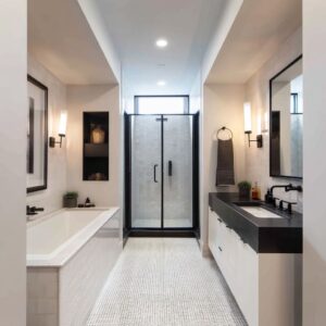
In many modern cottagecore bathrooms, color behaves more like atmosphere than accent. The palette tends to stay close-knit, where cabinetry, wall paneling, tub surrounds, and even trim are painted in matching or near-matching hues.
This approach causes edges to soften and corners to feel less boxed in. It’s not that color disappears—it blends.
Volumes retreat into the walls, allowing surfaces to read as one continuous field rather than a room full of separate objects. In some spaces, soft sage or pale greige takes over every surface, from the millwork to the bathtub casing, allowing light and shadow to define the room instead of contrasting tones.

The result is visual quietness. Shadow replaces outline.
A vanity that shares its tone with the walls doesn’t vanish—it hums gently in the background. This visual cohesion doesn’t flatten the space; instead, it clears the way for subtler moments to stand out—such as a curve, a brass sconce, or a stone basin.
Metallics follow a similar rule. Brass appears, but never shines.
The finishes often land somewhere between aged and brushed, offering just enough warmth to register against plaster, stone, or matte-painted wood, but never stealing the focus. It doesn’t behave like a bold accent.
Instead, it settles in quietly—part of the color story, not an overlay. You’ll find this approach frequently in cottagecore bathroom ideas where the goal is cohesion, not contrast.
Fixtures and finishes keep close company with the room’s tonal fabric, helping the design feel considered without calling attention to itself.

Texture Hierarchy Instead of Pattern Hierarchy
Instead of turning to pattern to bring life into the space, such bathrooms often lean into texture as the driving visual rhythm. This doesn’t mean rough or rustic—it means surface detail that shifts with the light, rewarding a closer look rather than shouting for attention.
Walls finished in limewash or hand-troweled plaster show faint brush movements, depth changes, and subtle shifts in color without any graphic motif. These finishes act like a kind of living surface, catching highlights and shadows that change as the day progresses.
Even in bathrooms with bolder gestures—like floral murals or botanical prints—these wall textures remain the quiet framework that holds the space together.

The floors usually carry more tangible textures. At ground level, variation matters.
You might see checkerboard marble tiles where the veining looks blurred, almost ghosted into the surface. Or pebble mosaics, not perfectly smooth but intentionally irregular, anchoring the bathroom in an earthy, tactile way.
Some layouts even use brick with mixed tones of clay red, faded black, and taupe, which never feel precious but always read as grounded. These micro-textures play a quiet game: rough where hands and feet touch, soft where eyes rest.
This layered approach helps the rooms feel built over time—even if everything is new. It’s one of the subtle visual strategies that distinguishes more refined cottagecore bathrooms from themed imitations.
Nothing shouts. Instead, the richness comes from how surfaces respond to light, how textures line up from floor to wall, and how the absence of strong pattern makes the small material changes matter more.

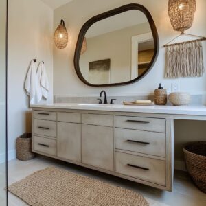
Curves as Spatial Lenses, Not Decoration
In today’s most nuanced cottagecore bathroom spaces, curves are doing more than softening lines—they’re quietly shifting how space is perceived. An arch isn’t treated like a flourish; it becomes a tool to reshape the room’s visual geometry.
A tall arch that meets a flat ceiling, even in a small powder room, can subtly stretch the space upward, directing the eye vertically and making the ceiling feel higher than it is. These gentle shapes aren’t there for ornament—they pull the proportions of the room into a more graceful rhythm.
Repeating curved forms brings quiet continuity. A window with a rounded top finds its echo in a freestanding stone basin.
A sculpted bathtub repeats the same arc as a shower niche. This repetition isn’t overt—it’s structural harmony working in the background.
Because the materials are usually matte and natural, the curves don’t shout. They breathe into the space.
The result is a calm cohesion that most people sense more than notice. Even a curtain rod bowed into a semi-oval, or a vaulted shower opening, adds to this effect.
These details make a space feel shaped, not just built.

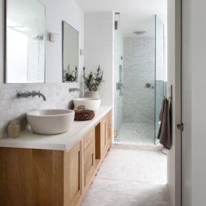
Furniture Logic Applied to Fixed Elements
What often distinguishes a more refined cottage core bathroom is the way fixed features are treated with the sensibility of furniture, not just function. Cabinetry isn’t boxed in or stretched wall to wall—it stands on its own terms.
Vanities often hover slightly above the floor or rest on kick bases that are subtly recessed. This gives them the profile of vintage chests or freestanding tables.
In many cases, countertops extend just beyond the cabinet line, mimicking the slight lip of old workbenches or farmhouse prep tables. These small gestures change how we read the volume of the room—they introduce lightness and definition.

Built-in elements take on the presence of moveable furniture. A deep niche carved into the wall, topped with stone and finished with a linen cushion, doesn’t feel like a hard surface—it invites touch.
These ledges double as seating or quiet display zones, reinforcing the idea that even solid architectural details can be softened. What’s important here is proportion.
The thickness of a slab, the curve of its edge, the depth of the wall behind it—all of these are tuned to feel intentional, not filler. They draw on historic domestic spaces, where utility and comfort shared the same language.
Together, these strategies bring a lived-in grace to bathrooms that might otherwise feel overly minimal or too structured. The room holds its shape, but without stiffness.
This is where cottagecore leans closer to the world of furniture than to construction—where even stone and plaster feel shaped by the human hand.

Light as Ornament
Light in a cottagecore bathroom decor setting doesn’t behave like a spotlight or an afterthought—it works more like a quiet design element, shaping the surfaces as the day moves. In many of such spaces, daylight feels curated rather than wide open.
A small skylight, or a high-set window draped in Roman shades, guides sunlight into the room like a slow-moving beam. As that light travels across plaster walls, it pulls out surface details—brush marks, slight shifts in texture, and soft curves—offering movement where there’s no actual motion.
These highlights and shadows play in silence, gently changing the mood throughout the day. The result feels more like an evolving mural than a fixed wall.

Evening brings its own rhythm. Candle-style sconces, single-bulb lanterns, or shaded pendants placed low on the wall don’t just illuminate—they shape the shadows.
These light sources create cone-shaped pools that settle onto textured plaster or soft tile. The wall becomes a gradient: light at the center, fading to a deep, absorbing matte in the corners.
This kind of soft-focus lighting gives depth without decoration, letting materials carry the story without needing added layers. There’s no need for loud art or graphic detail—the light does the storytelling.
In a room designed around natural materials, this type of illumination reads as both atmosphere and composition.

Material Memory & Honesty
Texture in bathrooms often speaks through intentional irregularity. That means grout lines are sometimes uneven, bricks carry smudges from their firing, and stone surfaces reveal their origin instead of hiding it.
A sandblasted stone counter doesn’t gleam; it holds a cloudy matte feel, as if weathered over time. Herringbone tiles built with rough, uneven brick invite the eye to scan slowly.
Each mark, seam, and mineral line feels purposeful, but never forced. These details aren’t about imperfection for style—they reflect a quiet respect for how materials behave naturally.
Matching doesn’t mean uniform. Instead, repetition across materials builds continuity.
A limestone bench, a sink from the same stone family, and a shower wall tiled in slightly varied cuts don’t compete—they connect. The surfaces might shift in finish or proportion, but they feel like they were shaped from the same place.
This approach doesn’t rely on accent colors or bold forms. It uses mineral similarity as its foundation, creating a room where every element feels related—not copied, but kin.
There’s a clarity in this approach that invites the space to breathe. It isn’t about layering for effect—it’s about showing what’s already there.

Edited Nostalgia
In the best examples of cottage-influenced bathrooms, nostalgia isn’t delivered in bulk—it’s edited down to a single, meaningful reference. A clawfoot tub, an iron towel ring, or a Victorian-style baseboard might appear, but these details don’t stand alone as a theme.
What sets rooms apart is how selectively those period touches are used. Rather than surrounding them with matching flourishes, the design pulls back.
A detailed tub might be set against plain walls. An antique-style faucet might sit above a minimalist basin.
The balance lies in restraint. Heritage here is a whisper, not a chorus.
One historic gesture stands at the center while everything around it remains crisp, clean, and spare. It’s this selective memory that allows the space to feel familiar without being nostalgic.
You don’t step back in time—you simply sense its influence in the outline of a form or the curve of a fixture. Prints, when used, follow this same controlled method.
Botanical motifs may appear, but their scale is handled with care. A wall mural in soft florals might be large and atmospheric, while a nearby cottagecore shower curtain echoes the same theme in a smaller, more structured repeat.
These shifts in size prevent the look from slipping into themed territory. Nothing is matchy.
The contrast in proportion keeps the design from flattening out—it holds depth, even in its softest expressions.

Purposeful Negative Space
One of the quiet strengths of Cottagecore bathrooms lies in how much they’re willing to leave out. Storage areas aren’t maxed out.
Open shelves often hold just a few items—perhaps a stack of towels, a small ceramic bowl, or a single folded linen. The rest is space.
Inset niches might host one bottle and a plant, nothing more. This selective placement turns what could be clutter into composed stillness.
Every item feels arranged, but never forced.

Walls are treated with equal restraint. Instead of filling every vertical plane, large stretches of plaster remain untouched.
This is especially important in rooms where texture is subtle—light gets a chance to move across the surface without interruption. It’s a deliberate choice that gives the eye places to rest.
The stillness of those blank zones makes the focal elements feel more grounded. A sculptural basin, a mirror with a distinctive shape, or a softly draped curtain all gain more presence when surrounded by quiet.
This use of negative space doesn’t read as emptiness—it reads as calm control. The room isn’t undecorated.
It’s held back so that materials, light, and form do more of the visual work. That’s what gives bathrooms their softness without sweetness—their calm without dullness.
Nothing is fighting for attention. Everything has a reason to be there.

Subtly Stretched Verticals
In many cottage-influenced bathrooms that lean modern, there’s a quiet trick used to alter the sense of scale without altering the structure: stretching the verticals just enough to shift perception. These are not large interventions—but their impact is clear.
Curtain rods are often mounted well above the top of the window frame, creating the illusion that the ceilings are taller than they are. The fabric falls longer, softer, and in fuller folds, emphasizing the drop rather than the span.
Wall sconces with elongated stems extend upward instead of branching outward. Even the panel molding runs high, drawing the eye toward the ceiling line and reinforcing vertical rhythm without adding bulk.

Mirrors follow the same thinking. A narrow mirror placed over a wide vanity basin plays with proportion in a deliberate way.
It avoids symmetry in favor of direction—pulling sightlines upward and minimizing the heaviness of thick marble counters or solid tubs. The mismatch isn’t jarring—it’s quiet and clever.
It serves to balance weight in rooms where stone, wood, and plaster already bring plenty of grounding force. These subtle architectural gestures never call attention to themselves.
They’re less about changing the space, more about shifting how the eye moves through it. The room feels taller, lighter, and more spacious—without giving anything away.

Key Ideas for a Modern-Tilted Cottagecore Expression
At the core of such bathrooms is a commitment to quiet clarity—not minimalism, but thoughtfulness. Certain choices repeat across many of them, forming a recognizable language that blends age with restraint.
- Using tone as the glue. When walls, cabinetry, and tile belong to the same tonal family, nothing feels out of place. Contrast is minimal, but texture becomes amplified.
- Leting one curve lead the space. A single arch, a rounded niche, or a softened tub shape can guide the whole room. Repeating that shape—subtly and at different scales—keeps the composition connected.
- Balancing every vintage note with something pared back. A clawfoot tub? Set it against a flat limewashed wall. A Victorian baseboard? Pair it with an unadorned brass fixture. It’s the pairing that prevents cliché.
- Treating light as if it were fabric. Allow it to fall softly across surfaces shaped by hand—plaster walls, linen curtains, matte stone counters. Let it shift as time passes.
- Leaving room for nothing. Not every shelf needs filling. Not every wall needs dressing. The gaps are part of the rhythm. They give form a place to speak.
Such spaces don’t rely on decoration to feel complete. Their atmosphere comes from grain, tone, proportion, and shadow.
The beauty isn’t in loud pattern or layered finishes—it lives in what’s restrained, shaped by memory, and held together by materials that remember where they came from. The result feels grounded and present—where softness has structure, and time feels folded gently into the edges.
Related Posts
Harmony Home Design brings 10+ years of residential interior design experience to the ideas shared here. We publish design concepts, layout thinking, and practical styling notes.