A hallway is often treated like leftover space: paint the walls, add one ceiling light, move on. But the hall can have its own character with its own rhythm—light repeating overhead, one strong wall surface that carries the length, and a few carefully chosen objects that make the space feel intentional without eating the walking width.
What keeps modern hallways working day to day is a simple idea: let the architecture do most of the visual work, then use furniture that stays slim, floor-clear, and easy to maintain. The is a design formula: vertical texture as the main background, one curved element that interrupts all the straight lines, and a console that acts like a long horizon line to stabilize the wall.
This article pulls those moves into clear design logic.
One background that can carry a long wall
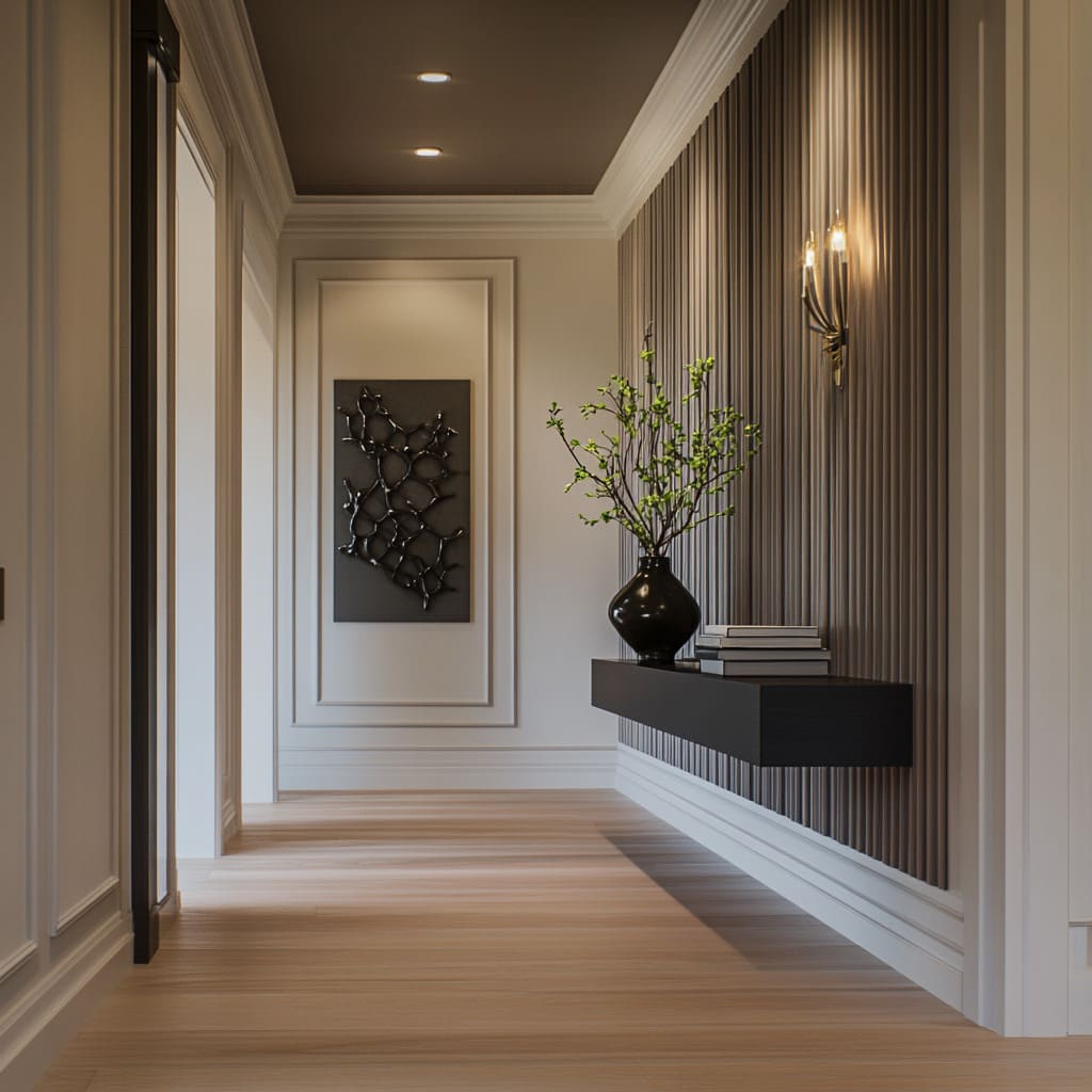
Modern hallway styling feels effortless when the wall itself has depth. Vertical ribbing, fluting, slats, or wide panel grooves add shadow detail so you don’t need bold paint or lots of framed pieces.
Tight ribs: fine texture that acts like a soft fabric on the wall
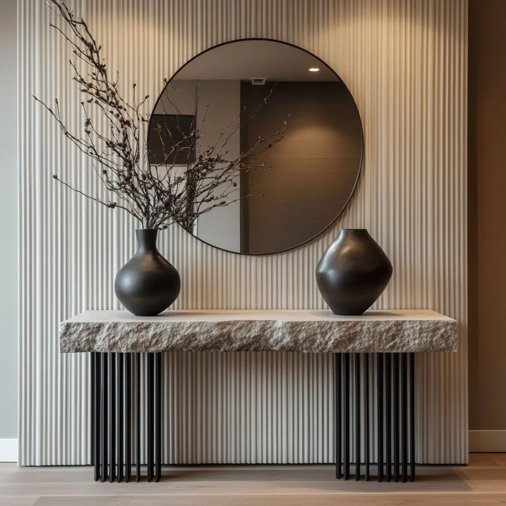
A full-height ribbed wall in, for example, warm off-white (between cream and light sand) changes the entire hallway even if it has added only a mirror and one console. The ribs create micro-shadows, so a plain palette still feels layered.
Because the grooves are small and consistent, the wall looks refined rather than busy, and it naturally makes the space feel taller.
Where it works:
- Narrow corridors where you want richness without pattern noise
- Entry moments where you want the wall to look finished even with minimal decor
- Areas where it is expected to have reflections (mirrors, glossy doors) and want something that can hold up visually
Wider panel grooves: calmer rhythm, more architectural
Wide vertical paneling gives structure with fewer lines. It reads quieter than tight ribbing and pairs especially well with thin-leg consoles and simple round mirrors.
It’s a good choice when your hallway already has a lot of seams (closet doors, trim breaks, door casings) and you want the wall texture to feel orderly rather than striped. A useful cue: if a hallway has mirrored closet doors or a mirror wall, wide panel grooves often feel steadier because reflections already multiply lines.
Slats in pale wood: warm texture without adding a new color story
Light wood slats (or wood-look slats) bring warmth while staying neutral. Adding a warm grazing light near the ceiling makes each slat ridge cast a thin shadow line.
That makes the wall feel deeper than paint, even when the palette stays pale. What to watch: slats plus strong window grids can create a lot of line-on-line.
This is where curved mirrors and rounded furniture matter most (more on that next).
One curved shape to break the vertical rhythm
Vertical texture is powerful, but if it’s all straight lines (ribs + door frames + long console + rectangular art), the wall can start to feel overly strict. The solution is simple: adding one strong curve—round mirror, oval mirror, or a circular wall disc—so the eye gets a reset point.
Round mirrors: the cleanest break
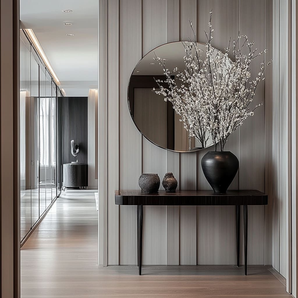
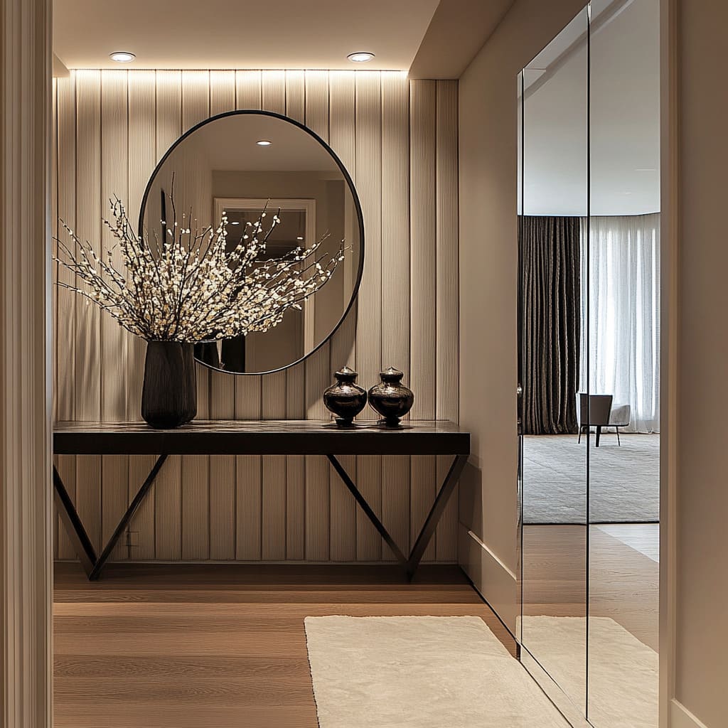
A circular mirror with a thin dark frame works like a punctuation mark on a ribbed wall. It softens the stripe effect and adds depth by pulling in the adjacent hall or room.
Even better, the circle makes the wall feel deliberate because it clearly contrasts with the vertical lines rather than competing with them.
Placement logic that keeps it looking intentional:
- Center the mirror over the console if the wall is the main feature moment.
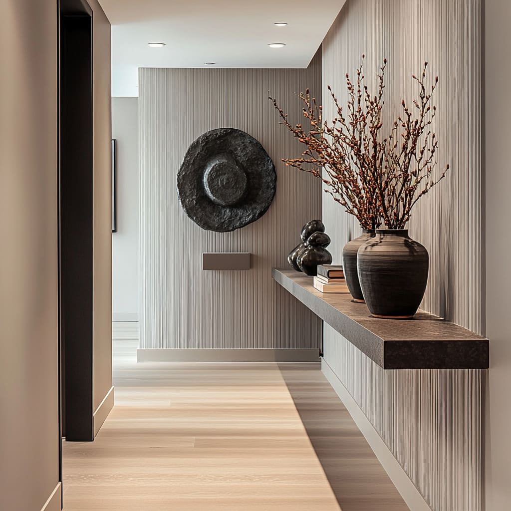
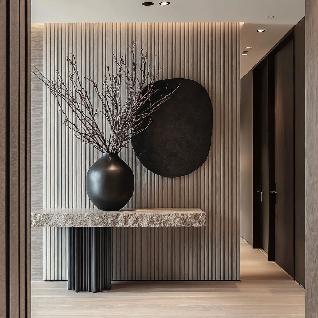
- If the wall already has a strong off-center object (like a sculptural disc), shift the mirror or disc off-center and let the negative space carry part of the composition.
Oval mirrors: tall, architectural, and great for narrow zones
A vertically hung oval mirror can feel like a full-height element without the cost or commitment of a full mirror wall. It connects console height to the upper wall, reflects window light deeper into the corridor, and softens the boxy geometry of alcoves.
How the oval works:
- It pairs naturally with vertical slats because it keeps the wall from becoming only straight lines
- It works well over floating drawer boxes in window-seat nooks, since the nook already has strong rectangles (bench, window frame, casing)
Textured circular wall discs: a stronger sculptural counterpoint
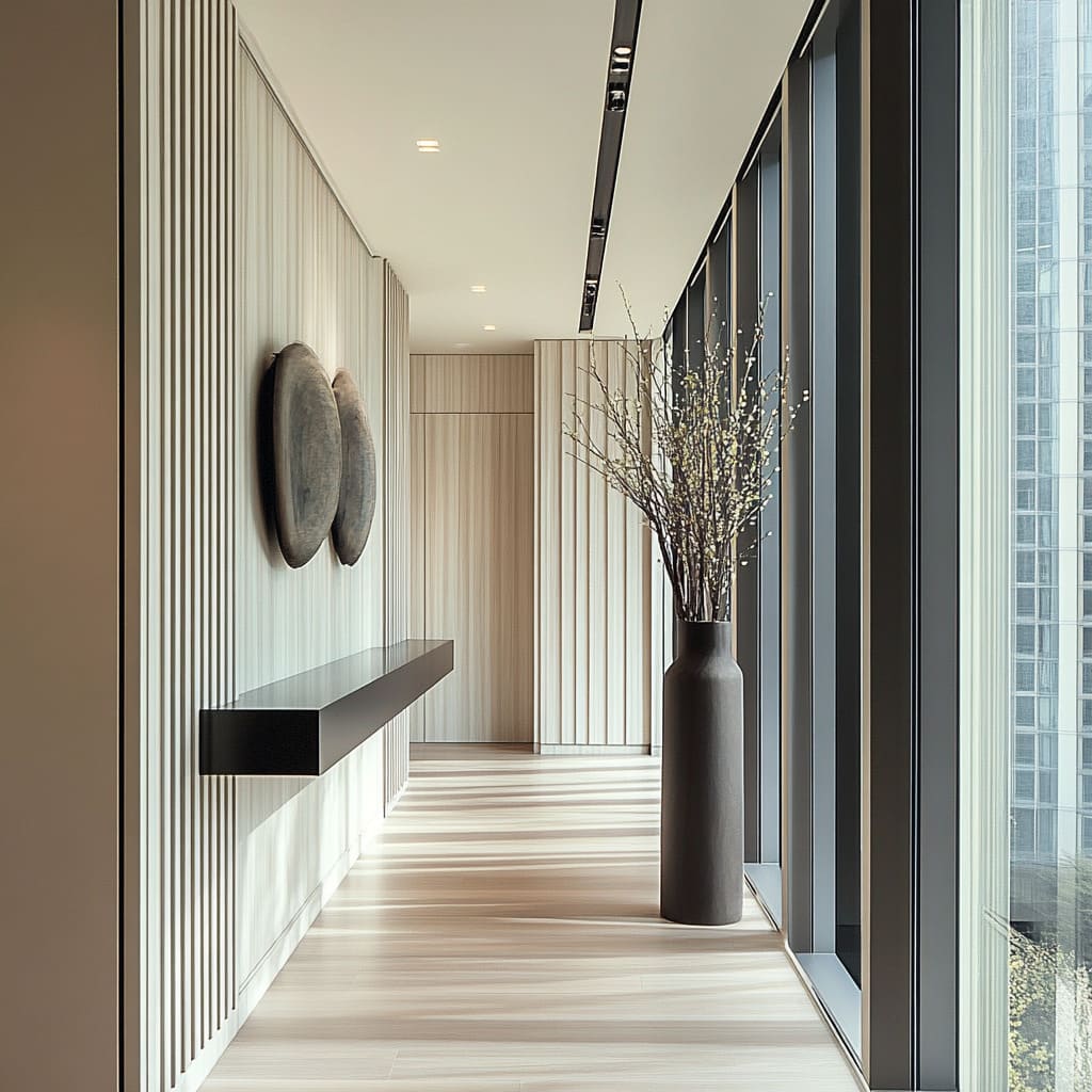
A dark circular wall piece with a rugged, crater-like surface can do what framed art does, but with more tactile presence. It creates uneven highlights and shadows, which adds a second kind of texture to the wall—especially effective against fine ribbing.
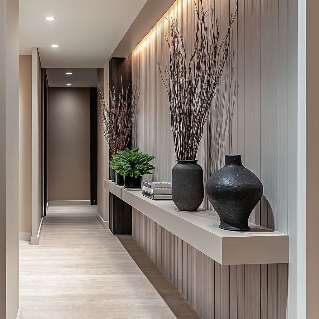
This move works best when you keep everything else restrained: one long ledge, a few sculptural vessels, and branches that cast shadows.
The console is a stabilizing horizon line
The console can work as a long horizontal band that cuts the vertical wall pattern and gives the eye a steady line to follow.
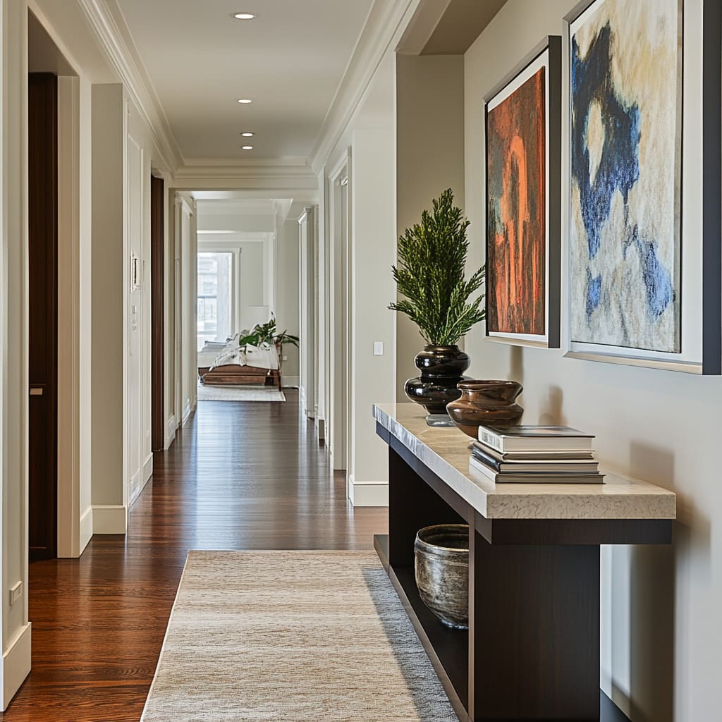
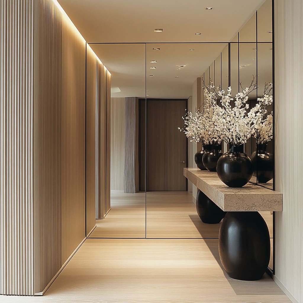
Stone slab tops: one strong weight, one strong line
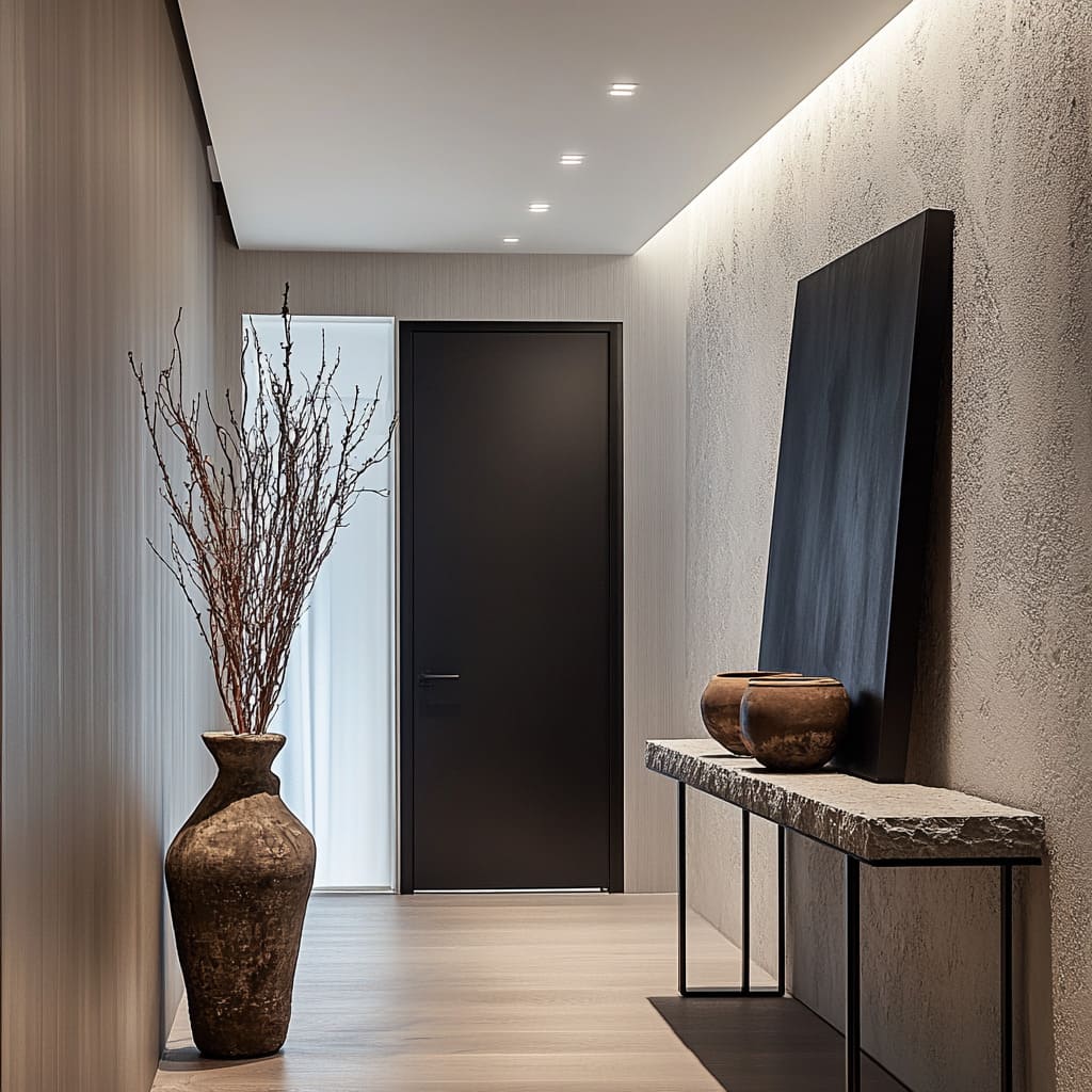
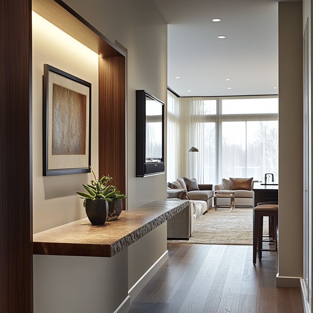
A thick pale stone slab (limestone or travertine-look) becomes the main weight in the composition. What makes it modern in these examples is the edge treatment: a rugged split-face or chipped front edge that catches light unevenly and creates tiny shadow breaks.
That rough edge adds character right at hand level, so the hall can stay quiet in color.
How to keep a heavy top from making the hall feel blocked:
- Using supports that are visually airy (thin black frames, clustered rods, or recessed supports set back from the slab edge).
- Keeping the underside open so the floor stays visible.
Two variations of this logic:
- Stone slab + thin clustered rod legs: the rods echo the vertical wall texture at a different scale while keeping the center open.
- Stone slab + rounded pedestal bases: the base becomes the soft element at shin height, which is practical in narrow corridors.
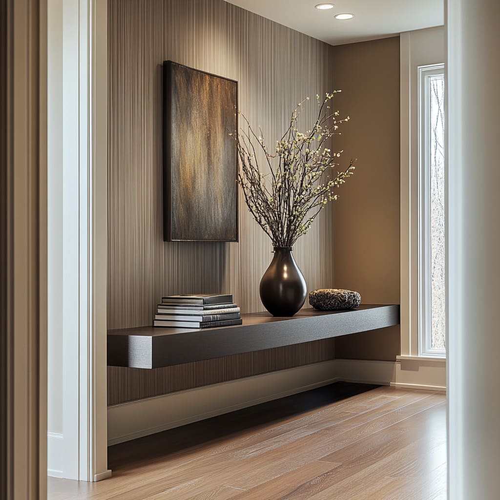
Floating ledges: the hallway workhorse
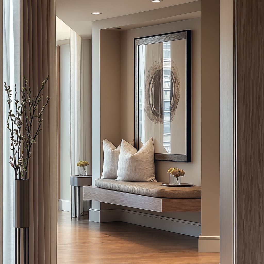
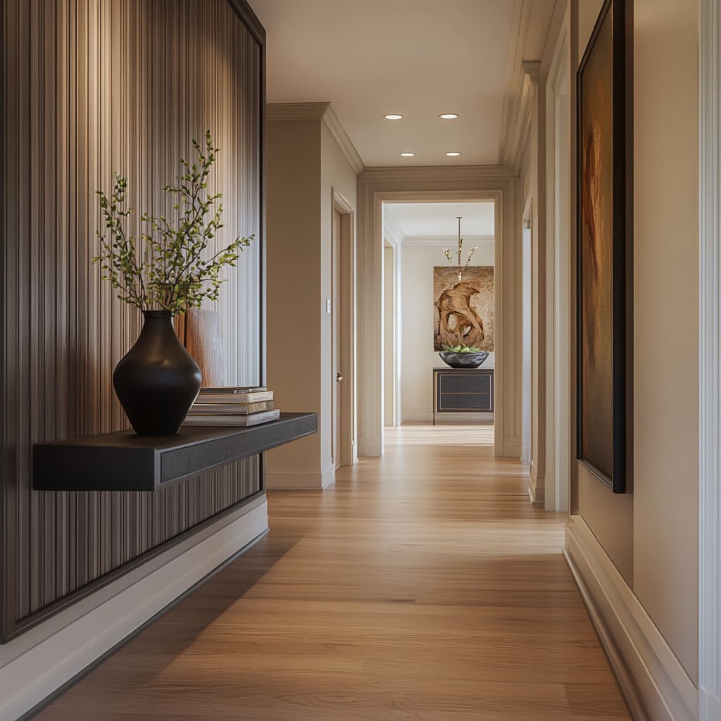
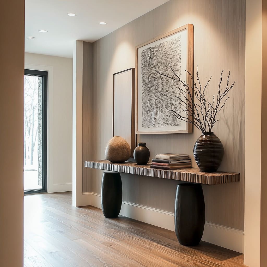
A long floating ledge behaves like architectural millwork rather than furniture. It’s shallow, keeps floor width open, and gives you a continuous landing zone for daily items.
Pairings:
- A light wood top with a darker base band beneath (so the top feels like it hovers), or
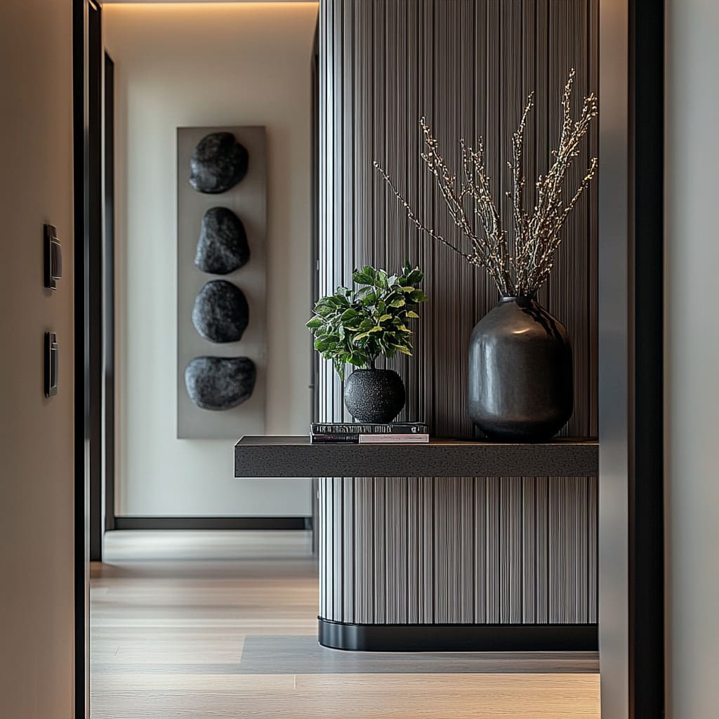
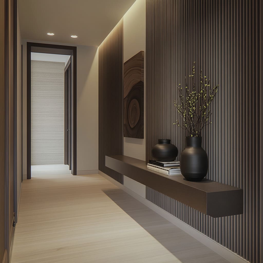
- A thin dark shelf mounted on a ribbed insert wall (so the shelf line stands out clearly).
A floating ledge also solves a common hallway problem: you want a styled surface, but you don’t want legs, dust traps, or anything that makes the corridor feel tighter.
Sculptural bases that stay slim but feel substantial
When the hallway is long and quiet, the console base becomes a chance to add personality without adding clutter. Console base ideas:
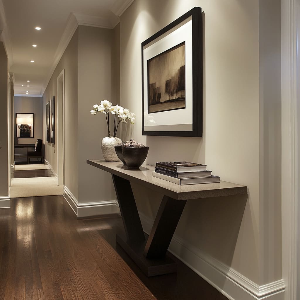
- Angled V supports: bold graphic geometry, strong presence, and open triangular negative spaces under the top.
- Diagonal brace/X bases: gives structure and a designed look while keeping the floor visible.
- Rounded pedestal supports: calmer at shin level, fewer snag points, and an easy match for oval mirrors and rounded decor.
Floor strategies
The hallway design can keep the walking lane visually open. This is less about minimalism and more about how the eye reads width.
When you see uninterrupted flooring under a console or bench, the corridor feels easier to move through.
Floating drawer boxes: storage without heaviness
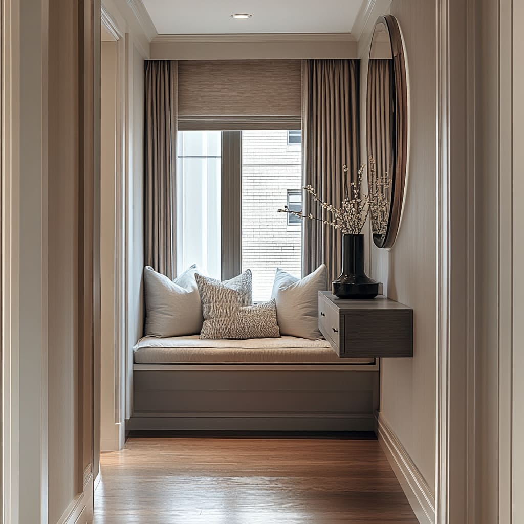
In window-seat alcoves, a floating drawer console at bench height acts like a nightstand, but it keeps the floor open. It gives a practical drop zone for keys and phone, and it avoids the bulky footprint of a full table in a tight nook.
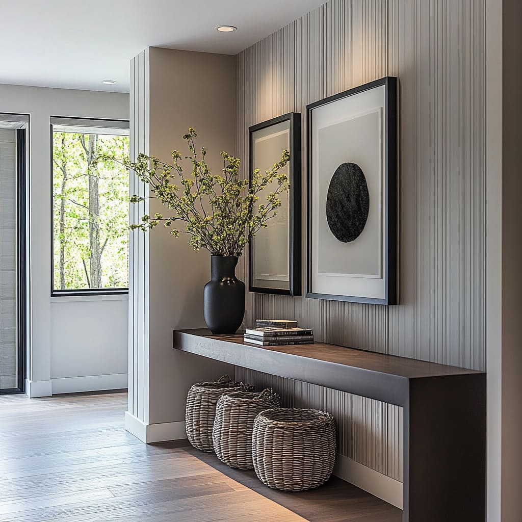
Baskets under a floating console: soft storage that still looks styled
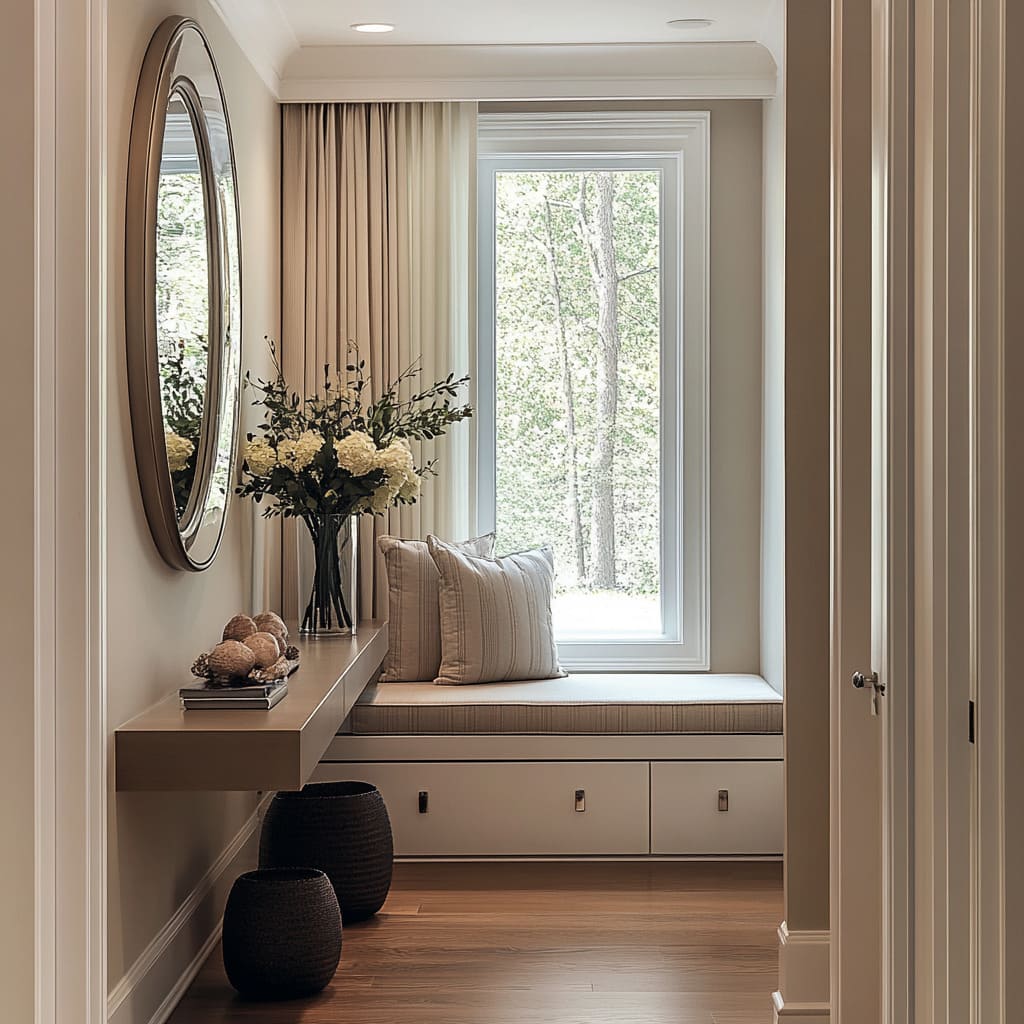
A long floating wood console with woven baskets tucked underneath is a smart blend of pretty and practical. The baskets act like flexible drawers (leashes, scarves, hats), while their warm weave adds texture against fluted walls and straight console lines.
The reason this works visually: the console stays crisp and architectural, and the storage sits lower and softer, so it doesn’t feel like clutter at eye level.
The hallway workstation trick: floating desk + movable pouf
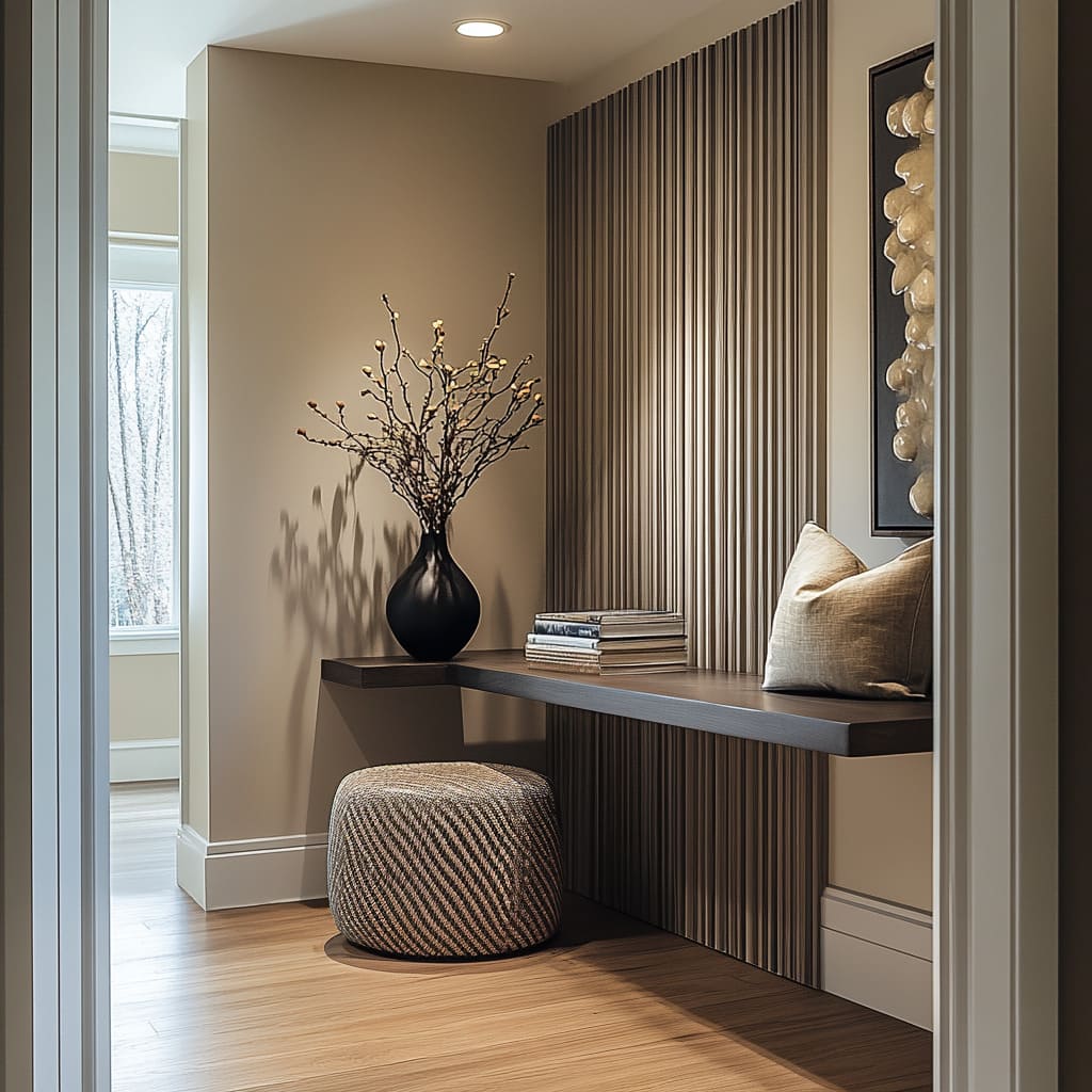
A dark fluted wall plus a cantilevered floating console can create a compact work/drop zone without adding a real desk. A woven pouf underneath brings flexibility: pull it in to sit, slide it out for extra seating elsewhere.
The pouf’s round, chunky texture is also a smart counterpoint to sharp grooves and crisp baseboards.
One grounded floor piece instead of more tabletop items
Another decorating idea is to avoid filling the console top by placing a large vessel on the floor—an amphora pot or tall urn with branches. This gives you height and presence without crowding the surface, and it creates a layered composition: wall texture, console line, then one tall form rising from the floor.
Lighting reveals texture
Modern hallways often use light that makes wall surfaces legible. Instead of big fixtures, the lighting plan is built from repeated, restrained moves.
A grazing linear wash near the ceiling
A concealed strip light washing down a ribbed wall is one of the most effective tools in the whole set of ideas. It exaggerates tiny highs and lows in plaster, microcement, slats, or fluting, turning the wall into a feature without hanging anything.
This is especially impactful on:
- Troweled plaster or microcement walls with grain and small pitting
- Dark ribbed feature walls, where the wash keeps the surface dimensional instead of flat
Evenly spaced downlights that create a steady cadence
A dotted line of recessed downlights gives a consistent rhythm down the hallway axis. It also keeps artwork readable and prevents bright spot + dark gap hallways, which often feel uncomfortable at night.
Occasional side light to soften niche ends
A slim wall sconce near a window-seat niche can help the alcove feel like a small room rather than a corridor end. It adds gentle side light that flatters textures and textiles, and it keeps the nook comfortable after dark without relying on a single ceiling spotlight.
Reflection works as architecture
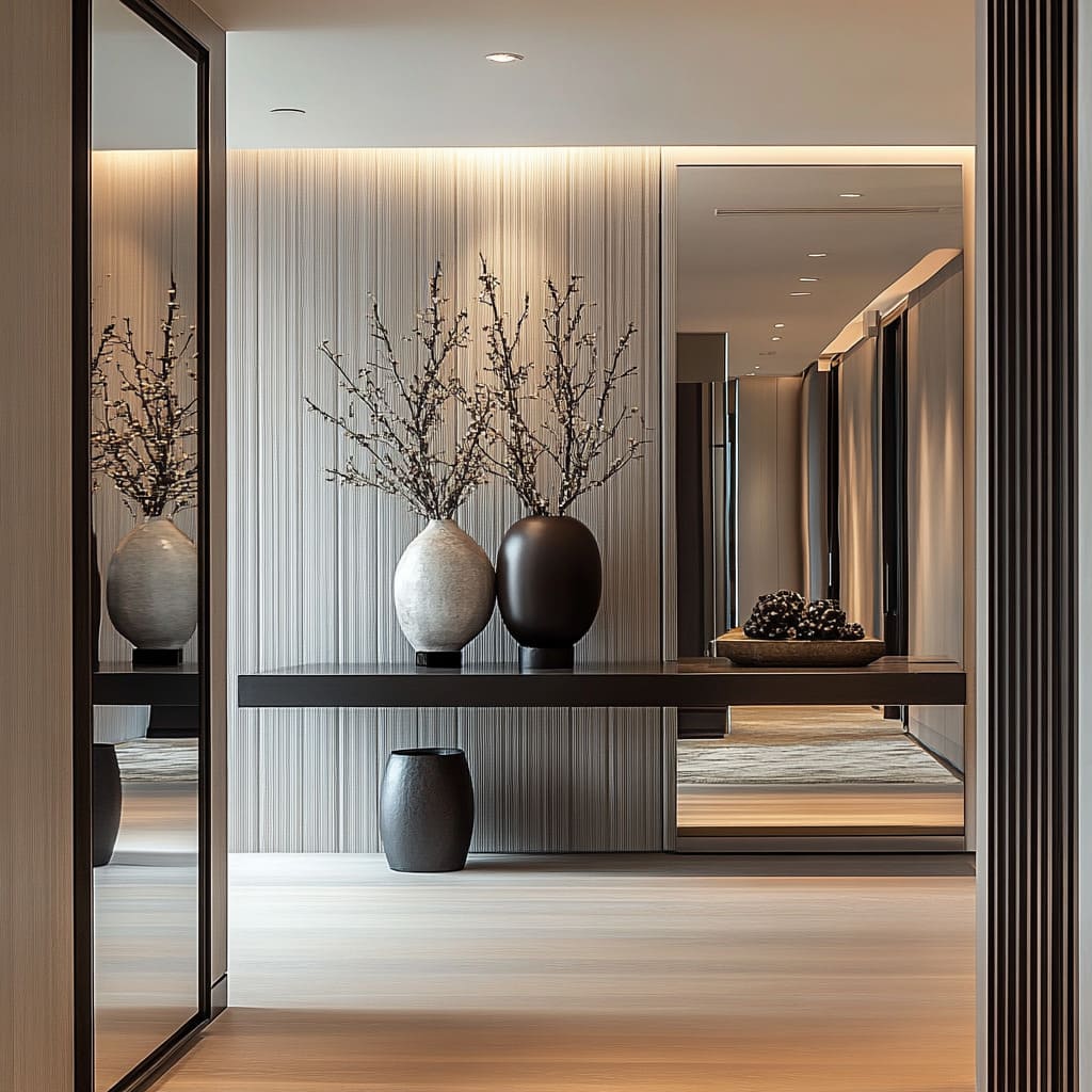
A full-height mirror wall or mirrored closet doors can make a corridor feel twice as wide. But reflections multiply everything—especially tabletop clutter.
The mirror can act as a clean wall plane with crisp seams, then keep the console styling minimal and sculptural.
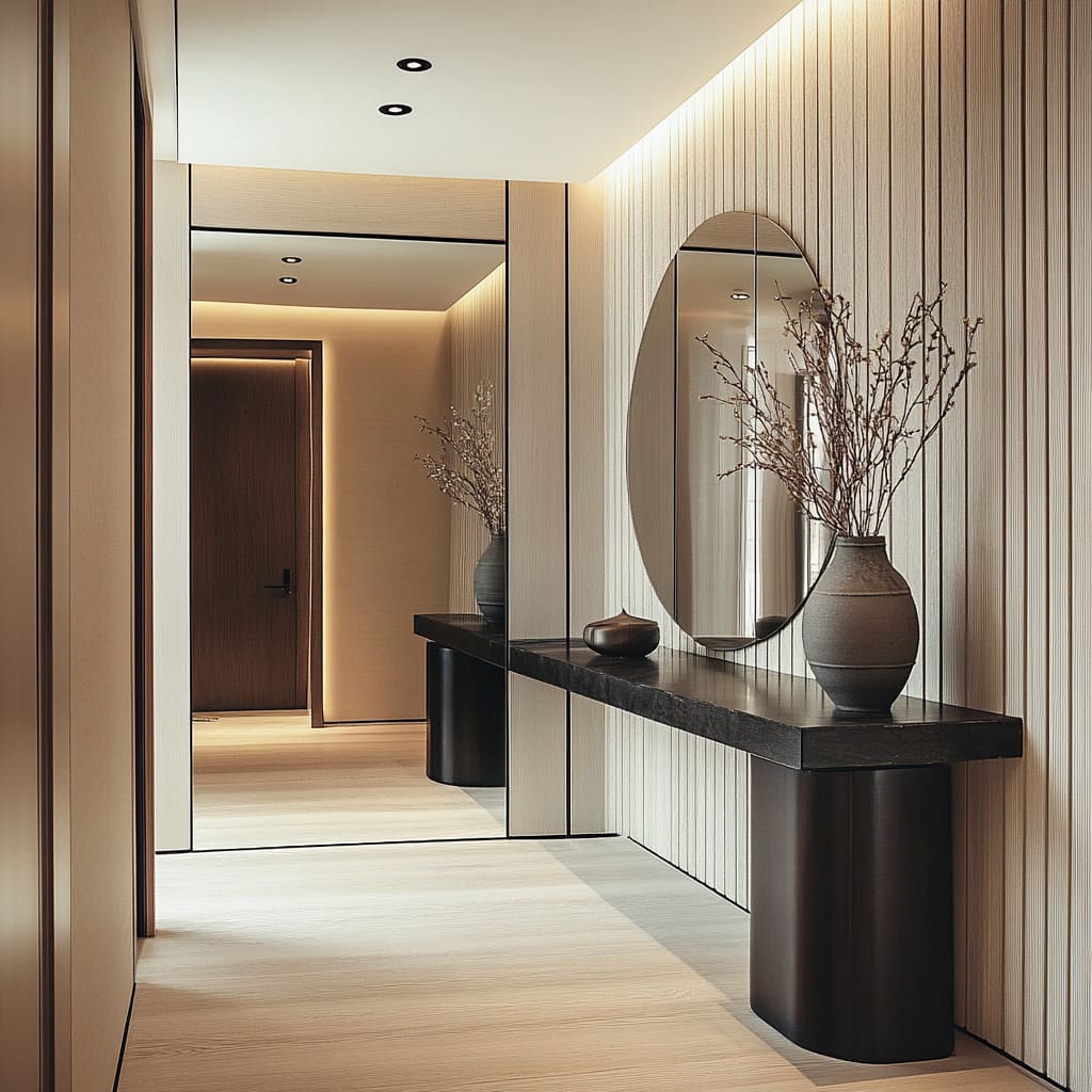
Mirror wall + stone console: how it stays orderly
A long corridor with a mirror wall works because:
- Mirror seams line up visually with the length of the corridor and the ceiling light rhythm.
- The console is heavy and grounded (thick stone top, dark rounded bases), so it doesn’t feel flimsy against a large reflective plane.
- Styling is limited to one strong cluster, often black vessels with airy blossoms or branches.
Mirrors as second corridors
Even a single round mirror can create the feeling of a second hallway by reflecting a darker adjacent corridor or another opening. That reflected depth makes a pale textured wall feel brighter and keeps the vignette from feeling flat.
But a glossy object creates bright highlights in the reflection and can pull attention too aggressively.
Styling: one tall airy form, low grounded shapes, one connector layer
The tall airy form
Branches or blossoms in a vase do the height work. They bring movement without adding color, and they create layered silhouettes in front of mirrors or textured walls.
The branches can deliberately overlap the mirror edge, so the arrangement becomes a layered composition rather than a simple stack (vase under mirror).
Why branches work:
- They echo vertical wall grooves, but with irregular spacing
- They cast shadows that add a second pattern layer on the wall
- They give height without adding bulky objects
The low grounded shapes
Bowls, jars, book stacks, and trays form the base. They keep the console feeling usable and prevent the scene from becoming only tall items.
Notice how often the books are used as risers: a stack under a bowl or tray creates a neat, intentional layer and keeps objects from looking randomly placed.
The connector layer at eye level
A mirror, a large artwork, or a sculptural wall piece ties the console height to the upper wall. This connector is what makes the console feel anchored to the architecture rather than floating in front of a blank wall.
A helpful scale note:
In long corridors, fewer larger artworks look more composed than many small frames. Large pieces hold the wall confidently and keep the hallway from looking scattered.
Texture contrast replaces color contrast
A modern hallway can feel rich without a loud palette. Here are texture pairings:
- Rough stone edge against smooth wall planes
- Matte ceramic next to one slightly glossy accent vase
- Woven baskets under crisp fluted walls
- Microcement grain under a grazing light, paired with clean trim
- Pale wood floors against dark accents (frames, vases, bases) repeated at controlled intervals
A tight palette also helps the hallway feel continuous: pale floors and warm neutrals keep brightness high, while dark accents repeat in a few key spots (mirror frames, console supports, vases, art frames) so the contrast feels planned.
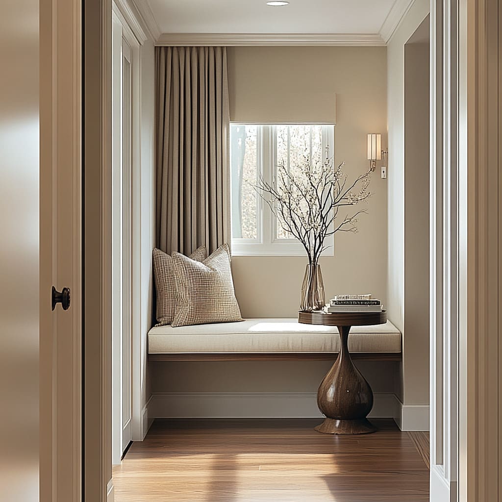
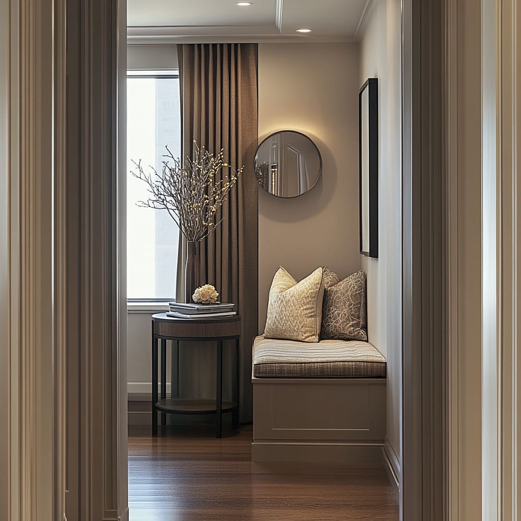
Window-seat nooks: turn the end of the hall into a destination
A window at the end of a corridor can feel like a blank stop, or it can become the most pleasant spot in the hall. The niche can be like a micro-room with clear zones: seating, surface, and reflection.
Built-in benches: millwork presence, daily comfort
The bench works best when it looks built-in rather than movable:
- Flat, clean face panels
- A tailored cushion that fits the width
- Pillow layering that adds texture without clutter
Two common pillow strategies:
- Two larger pillows plus one smaller patterned lumbar in the center
- Two large pillows with subtle texture that bridges wall and floor tones
Layered window treatments: structure plus softness
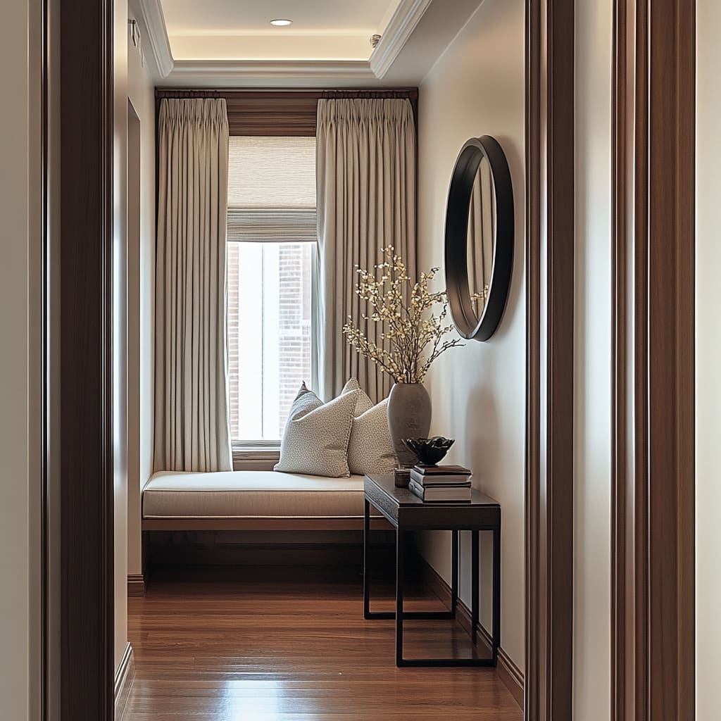
A roman shade inside the window frame plus long drapes to the floor gives depth and makes the window feel dressed. The drapes also add vertical fabric lines that balance the bench’s long horizontal line.
Side tables that protect circulation
Round tables and pedestal tables are used often because they avoid sharp corners in tight spots. A sculptural pedestal base can feel special without taking more space, and a rod-leg round table can look airy next to a thick bench plank.
Add a mirror to bounce light deeper into the corridor
A round mirror over the bench works well because it softens the casing and curtain lines and adds practical function (quick check before leaving). An oval mirror over a floating drawer box gives a taller, more architectural feel.
Lighting that makes the nook usable at night
A slim wall sconce near the niche avoids the spotlight end wall feeling. Combined with a ceiling downlight, it creates a comfortable pool of light that makes the bench feel like a real place to sit, not a hallway afterthought.
Hallway plan like a sequence: near moment, then a distant focal point
There is a simple planning trick: give the eye something to land on near the foreground (a ribbed insert wall with a thin floating shelf, or a console with art above), then show a second styled moment farther down the corridor. This stops the hallway from feeling endless.
It becomes a series of stops:
- A console line and one tall vase cluster
- A second artwork panel or cabinet farther down
- A window-seat destination at the end, framed by textiles and light
Even small punctuation elements help—like a dark inset panel interrupting long vertical grooves, or a contrasting art panel with wood-ring patterns breaking up a dark ribbed run.
Five easy hallway design ideas
A: Ribbed wall + round mirror + rugged stone console
- Warm off-white ribbed wall as the backdrop
- Round mirror with a thin dark frame centered above
- Thick pale stone slab console with a split, rugged front edge
- Airy support base (clustered rods or recessed legs)
- Styling: two matte vessels + branches in one + generous empty center space
Why it works: the circle breaks the ribs, the stone edge adds tactile contrast, and the open underside keeps the corridor feeling open.
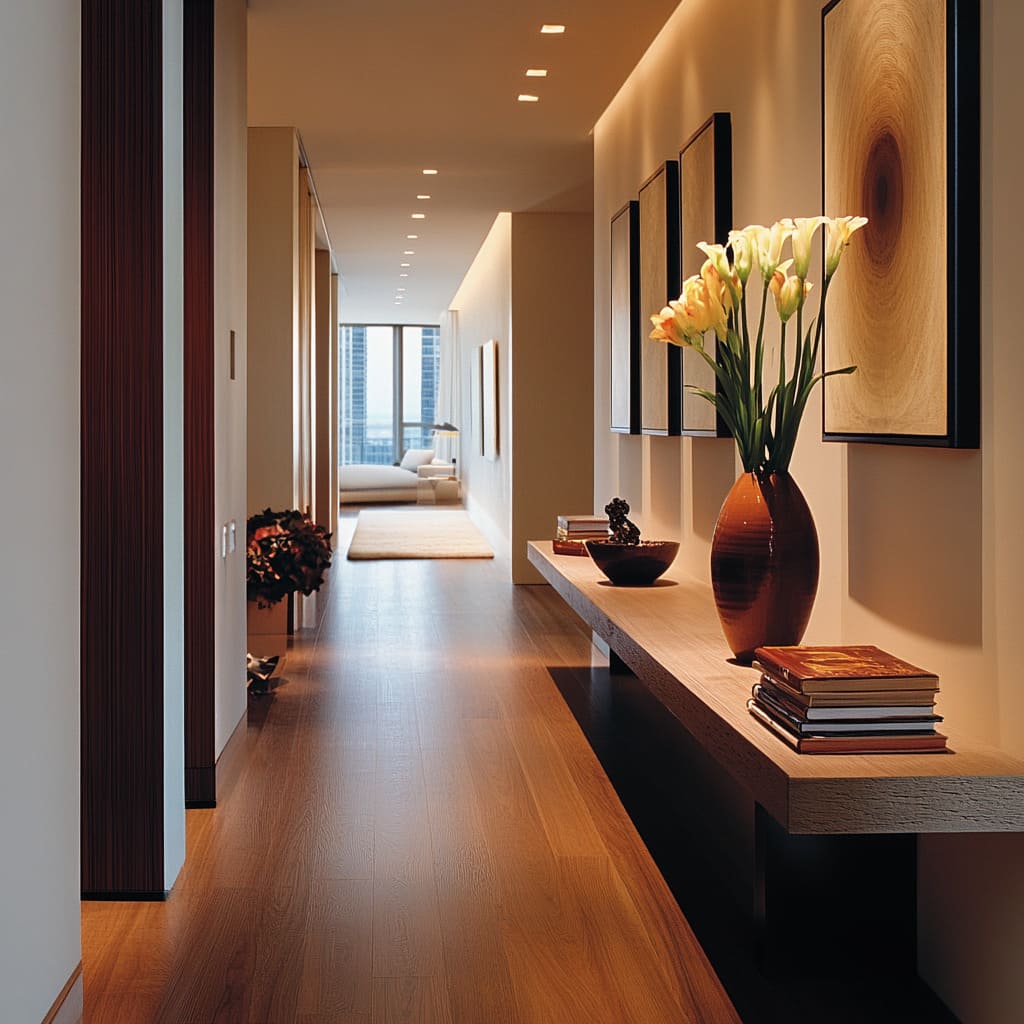
B: Long corridor + floating ledge + art rhythm
- Medium honey wood floor to warm up white walls
- Dark door frames as repeated punctuation along the length
- Long floating wood ledge with a darker band beneath to create a hovering look
- Series of framed pieces hung as a rhythm rather than one statement
- Styling progression: books → bowl → tall vase with soft blooms
Why it works: the ledge acts as a continuous horizon line, and the height progression makes styling look intentional even with few items.
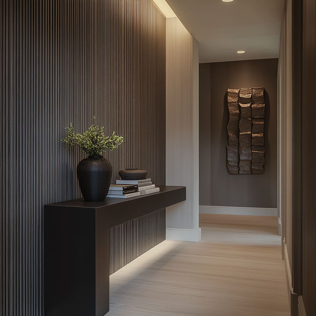
C: Dark ribbed feature wall + monolithic floating console slab
- Deep charcoal ribbed wall with downlights placed for gentle gradients
- Thick floating console with one vertical return panel to land the mass
- Pale wide-plank floor and bright baseboards to keep the corridor bright
- Styling: one rounded vase, one book stack, one shallow bowl
Why it works: one strong surface, one strong mass, and a minimal set of shapes keeps the look architectural.
D: Mirror wall corridor + stone slab + rounded black bases
- Mirror wall in tall panels with slim seams
- Opposite wall in warm wood slats or light vertical texture
- Thick pale stone top with a rugged edge
- Oversized rounded bases (soft at shin level)
- Styling: one cluster of black vessels + airy blossoms
Why it works: reflections double depth and light, and the restrained styling avoids visual mess multiplying.
E: Window-seat nook + floating drawers + oversized oval mirror
- Built-in bench with drawer storage or paneled millwork face
- Tailored cushion and layered pillows (two large + one textured lumbar)
- Curtains + roman shade for depth
- Floating drawer box at bench height (dark wood works well)
- Oversized oval mirror with a warm metal frame
- One glossy black vase with delicate branches for a small highlight
Why it works: seating, surface, and reflection each have a clear job, and the floor stays open so the nook never feels cramped.
Common mistakes that make a hallway feel tighter than it is
- Too many small objects on the console: the hallway starts to feel visually crowded, especially near mirrors.
- A deep table with bulky legs: even if the corridor is technically wide enough, it will feel narrower because the floor line gets blocked.
- Vertical texture plus only rectangles: ribs + frames + rectangular art can feel overly strict; add one curve.
- Spotlights without a wash: downlights alone can leave textured walls looking flat; a grazing wash makes the surface do the work.
- No destination at the end: a long corridor feels endless if the far end has no visual anchor (window nook, artwork, cabinet, or a strong wall moment).
A quick sizing guide that keeps it practical
- Console depth: keep it shallow so shoulders and bags pass comfortably. Floating ledges work especially well here.
- Console height: align it with typical hip/waist height so it functions as a true landing zone. In nooks, matching bench height creates clean parallel lines.
- Mirror size: go large enough that it feels architectural. Small mirrors often look like accessories rather than part of the composition.
- Branch height: let branches rise into the upper third of the wall so the vignette uses the room height, not only the waist zone.
Closing thought
The main design idea explored here is the formula: one wall surface with depth, add one curved element to soften the linework, anchor the scene with a slim horizon console, and keep the floor open. Then style with a simple hierarchy—one tall airy silhouette, a few low grounded shapes, and one connector element at eye level.
That combination gives a hallway that feels intentional in daylight, works in the evening with the right lighting plan, and stays easy to live with because circulation and storage were considered from the start.
Related Posts
Harmony Home Design brings 10+ years of residential interior design experience to the ideas shared here. We publish design concepts, layout thinking, and practical styling notes.
