
The most persuasive media walls don’t fight the screen or try to disguise it. They shift the wall’s identity so the screen becomes one element inside a composed scene of planes, shadow, rhythm, and a few objects chosen for silhouette.
In that sense, TV Niche ideas often succeed because the wall is given its own authority first. This thinking quietly powers TV niche wall ideas not as separate styles, but as different ways to control attention, calm contrast, and make the TV off state look complete.
What follows is a map of the design moves in such niche designs.

Let the wall outrank the screen: the dominant plane approach
A black screen can feel like a visual stop sign if the wall behind it has no personality of its own. One of the strongest approaches is to make the wall’s main surface feel valuable before the TV even enters the story.

This can happen through surfaces that carry depth rather than loud pattern—stone-like planes with cloudy light patches, plaster finishes with gentle tonal shifts, or panel fields that read as atmosphere instead of color. The important part is not luxury labeling; it’s the way the surface behaves visually:
- A surface with soft internal variation gives the eye something to read that isn’t the TV.
- The TV then reads like a temporary overlay, not the purpose of the wall.
- The mood survives when the screen goes dark because the wall still has a primary presence.
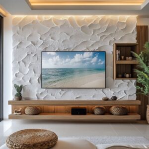
A common example is a pale, veined feature plane that feels softly luminous, where the TV is centered on that plane but the overall built-in is composed as multiple masses—so the TV is not the whole composition.

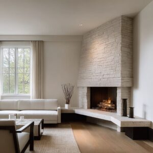
Thickness changes status: portal thinking instead of frame thinking
There’s a big difference between a thin border around a TV and a recess that reads like a carved opening. When the surround looks thick and weighty, the screen stops feeling pasted on; it starts feeling housed.

This approach works because thickness creates three quiet effects at once:
- Shelter: a top return and side returns create a sense of protection around the screen, which makes the black rectangle feel calmer.
- Authority: a deep opening reads like architecture, not furniture add-ons.
- Breathing space: extra margin around the screen acts like a mat board, giving the eye a buffer so the TV edge doesn’t feel harsh.

The TV can sit slightly lower within a tall opening. That isn’t a random proportion choice; it creates a calmer display box feeling, where the space above becomes intentional air rather than wasted emptiness.

The horizon line: why long, low bases make a screen feel settled
A long base run (cabinetry, a bench-like ledge, or a continuous counter line) does quiet psychological work. It gives the eye a place to land that isn’t the screen.

This approach is less about storage and more about visual gravity:
- A strong low line reduces the floating billboard sensation.
- The wall stops feeling top-heavy because the base reads like ground.
- When a dark countertop or a charcoal cabinet band repeats the screen’s darkness, the TV no longer carries the entire black note alone.
An example is a deep charcoal top surface beneath a lighter wall plane. The TV then feels connected to a longer dark stripe, which makes the black read like part of a palette rather than a device intrusion.

Reframe the wall as comfort: bench-language and rest-wall identity
One of the effective strategies in family room desings is to give the media wall a second identity that feels equally real: a built-in bench zone.

A bench under the screen changes the wall’s message:
- The TV no longer reads as command center; it becomes one layer above a lounging zone.
- Cushions and pillows translate the wall into everyday comfort language.
- The area beneath the TV stops behaving like a clutter-attracting tabletop and starts behaving like seating—naturally edited.
This is also why soft, neutral gradients matter here: floor warmth, wood tones, textiles, and pale wall surfaces create continuity so the screen becomes a single punctuation mark instead of a hard interruption.

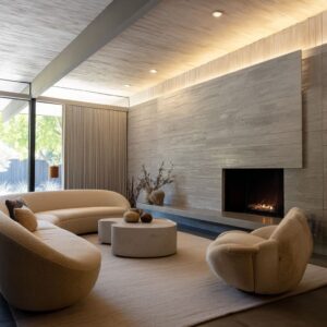
Prepared darkness: the dark field behind the TV approach
Another move is to give the TV a darker home field—charcoal, ink-toned, or deep textured black—so the screen doesn’t look like the only heavy graphic on a light wall.

The most refined versions share two traits:
- The dark field is larger than the screen, creating a calm margin that reads deliberate.
- The darkness is repeated elsewhere (a cabinet band, shadow pockets, a darker tower, a few sculptural objects), so the TV doesn’t feel like the only dark event in the room.

This is why some rec-room and open-plan concepts feel grown-up: the wall accepts darkness as a designed ingredient, then controls it with scale and repetition.

Blur without hiding: ribbed glass as a visual editing layer
Ribbed or blurred glass appears again and again because it solves a very specific visual problem: the desire for display and storage near the TV without turning the wall into a collage of small items.

This approach works like a filter:
- Detail becomes silhouette.
- Light can pass through, so the wall stays breathable.
- Warm interior glow turns the tower into an evening lantern, giving the wall atmosphere even when the TV is off.
What’s subtle is the role it plays in hierarchy: a glowing vertical tower can become a secondary destination for the eye, reducing the pressure on the TV to be the only focal point.

Vertical rhythm as padding: slats, reeding, and lined panels that soften edges
Vertical line rhythm (slats, fluting, lined backing panels, reed-like cabinet fronts) functions like visual cushioning around a hard rectangle.

The non-obvious strength is that it solves two problems at once:
- Harshness: fine rhythm breaks up the perception of a flat, glossy black plane nearby.
- Scale: vertical movement quietly stretches the wall upward, helping recesses feel taller and more composed.
A particularly strong version is rhythm plus pause: a lively slat field paired with a smooth niche pocket, so the TV sits in the quiet zone while the texture lives beside it or behind it in a controlled way.

Curves as relief: arches and rounded silhouette language
Curves change the emotional reading of a screen without denying that it’s a rectangle. An arch or curved recess makes the brain register architectural alcove before it registers device.

This approach also shows up in styling choices:
- Rounded ceramics and bowls counter the wall’s right angles.
- Airy branches add irregular linework that softens the screen’s crisp edges.
- Curves work best when they’re allowed to stay calm—too many small objects in an arched zone can turn softness into fuss.
In multi-arch compositions, the strongest result tends to come from a clear center role for the TV niche, while side niches take on quieter identities (library mood on one side, still-life mood on the other).

Give the TV a peer: large-scale rectangle balance through art or panel moments
A TV can feel socially dominant when it’s the only big rectangle on a wall. A surprisingly effective approach is to add a second large-scale rectangle that is softer in contrast—muted art, a hazy panel, or an atmospheric surface.

The wall then reads as curated rather than media-led:
- Two large rectangles feel like a composition.
- The TV becomes one participant rather than the whole statement.
- The room gains an off-state identity because the wall still has something substantial to read.
This is why some schemes can place a large, quiet artwork adjacent to a very clean TV wall: the goal isn’t decoration; it’s balance of scale and authority.

Styling as choreography: how objects behave near a screen
In strong design concepts, objects are not added, they are placed like punctuation marks that manage visual volume. Several quiet rules repeat across the examples:
- Silhouette over detail: organic outlines (bowls, vessels, branches) soften the TV without introducing small-item noise.
- Negative space as a material: edited shelves feel expensive because the gaps are treated as part of the design.
- Tall elements at the edges: vertical pieces often live away from the screen’s perimeter so the TV outline stays clean.
- Low, wide anchors under the screen: shallow trays and bowls create finish without climbing into the screen’s visual territory.
- Theme rhyme: when the wall is stone-like or plaster-soft, the objects often echo that mood (matte ceramics, geological forms, muted tones), so the wall feels like one language.

A small but powerful example is the two anchors only idea on a long ledge: one organic mound-like object and one vertical sculptural form, placed to create balance without crowding the screen zone.

Open-plan control: the niche as a calm pause between zones
In open-plan layouts, the media wall often needs to do a second job: it has to prevent the living area from feeling visually dissolved into kitchen and circulation space. The niche becomes a pause—an intentional compression of the wall—so the living zone gains a clear identity.

This approach tends to rely on large, readable blocks rather than fine detail:
- a recess field,
- one vertical counterweight (tower, slat panel, glass column),
- and a continuous low base that extends the composition sideways.
When these blocks are legible from multiple angles, the wall keeps its composure even with everyday foreground life—sofas, tables, trays—because the wall isn’t depending on tiny styling to work.

The reflection truce: glossy or mirror-like planes used as a calming strategy
A counterintuitive approach shows up in glossy panel schemes: instead of trying to make the TV the only reflective object, the wall becomes reflective too—softly, broadly—so the screen no longer feels like the lone shiny interruption.

The calmer versions avoid clutter by shifting styling to the perimeter:
- Objects sit toward the ends of the cabinet run.
- The center beneath the TV remains visually clean.
- The wall reads gallery-like, but still warm if the objects are matte, rounded, and low-contrast.

This approach works best when seams and composition lines are controlled, so reflections feel like atmosphere rather than visual noise.

The result: a wall that looks finished when the TV is off
The finished feeling tends to come from the main underlying structure:
- a primary surface with its own value (depth, softness, rhythm),
- a stable low horizon line,
- a second atmosphere source (soft glow, lantern tower, or a quiet peer element),
- and object placement that supports silhouette and breathing room.
That’s the deeper thread: the wall keeps its identity without asking the screen to animate it. The TV participates in a composed interior scene—present, but not in charge.
Related Posts
Harmony Home Design brings 10+ years of residential interior design experience to the ideas shared here. We publish design concepts, layout thinking, and practical styling notes.