
A small room can hold a TV and a linear fireplace on one wall, yet the setup often feels uneasy for a simple reason: both elements behave like dark rectangles, and in tight footage they can start to look like two separate cutouts rather than one composed feature. The modern interior design approach allows avoiding that collision by treating the wall as a single unit.
One large calm surface carries the composition, thin dark openings add definition, and one long horizontal element replaces the typical media console so the lower zone stays clean. The result is a wall that stays cohesive and still feels detailed at seating distance, without relying on lots of decor.

The TV wall has to do more work in a compact plan
In a small living zone, the TV wall can’t depend on shelves full of styling to look finished. It usually ends up doing several jobs at once:
- Holding two dark rectangles without turning the wall heavy
- Hiding everyday storage without advertising it
- Linking visually to the kitchen edge, bar counter, or coffee station so the open plan feels like one story
This is why the wall shifts from TV plus fireplace into an architectural composition with a clear hierarchy: one main plane, one thin cut, and one long line near seat height or close to the floor.

Big planes and thin cuts keep the wall calm
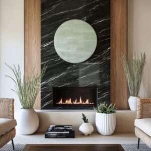
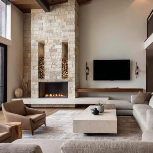
Modern feature wall designs often start with one oversized surface: a pale stone panel grid, a marble-look slab field, a plaster plane, a full-height slat wall, or a deep dark-wood niche. That main plane is intentionally quiet.
Definition comes from thin dark geometry: the TV, the firebox opening, a slim shelf line, or a narrow toe-kick light.

This formula works well in small spaces because scale does the organizing. A large plane is legible from a distance, then the smaller cuts and shadow lines provide the closer detail.
The wall feels designed without looking busy.

Common options:
- pale stone or stone-textured panels
- marble or marble-look slabs with soft veining
- full-height slats or fluting as texture instead of decor
- a recessed dark-wood box that wraps the TV zone
- a plain plaster wall where the fireplace block carries the material moment
Once that big plane is chosen, the rest stays disciplined: the TV becomes the upper black rectangle, and the linear fireplace becomes the lower black void, kept long and low so the flame reads as a controlled underline rather than a competing feature.

Vertical rhythm and a long horizontal datum
A strong pairing is vertical texture plus a strong horizontal line.

Vertical rhythm can be slats, fluting, wood pilasters, or narrow fins. It stretches the wall visually, gives the TV zone a finished perimeter, and adds micro-shadow that feels dimensional even under even downlighting.
Side slat panels framing a calmer center field are a clean way to add structure without turning the wall into cabinetry. Full-height slats behind everything give the wall texture while letting the room stay minimal.
Wood pillars flanking a stone center warm up the stone and reinforce height.

Then a strong horizontal datum calms the stack. It may be a floating bench, a thick ledge, a long base cabinet run, or a bar counter line.
In compact layouts this is the piece that makes the composition feel intentional, because it behaves like built-in furniture: it ties zones together, creates a baseline under the TV, and gives the eye a resting place between screen and flame.

Several horizontal datum idea:
- floating stone benches or hearth slabs with a shadow gap
- thick wood ledges that run wide and bridge left-to-right
- long, flat-front base cabinets that hide real-life storage
- a continuous shelf under the fire line that extends beyond the opening so it becomes a true console surface
When the wall looks calm but not empty, this horizontal element is usually the reason.

Depth replaces clutter
A small room can’t rely on many objects without looking crowded. Depth gives the same sense of intention with far fewer items.

The layering logic repeats in different ways, but the structure is consistent: back plane → recess → surround → projecting bench. A recessed TV pocket is one of the clearest moves.
A deep dark-wood niche wraps the TV zone and creates a shadowy perimeter that holds the screen. Another idea is to use a recess and shadow gap around the screen field so the TV feels seated in the wall rather than floating on paint.
A divider niche can do the same job while also zoning the room.

Shadow gaps under benches and consoles matter just as much. A thick stone bench can look suspended when support is set back, creating a clean negative space under the slab.
A floating stone base under a fireplace stack can use the same trick: heavy material, lighter presence. A toe-kick light under a hearth slab adds a subtle lift and makes the lower mass feel refined.

Depth also can be in side bays and step-down zones. A shelving bay that transitions into a bar counter prevents the feature wall from ending abruptly.
For example, a coffee niche with a dark interior and light base cabinets gives function without turning the wall into a storage display. Or built-in shelves with warm under-shelf lighting can add another layer of depth while keeping objects restrained.

The media console disappears
A typical media console brings seams, handles, legs, and open shelves full of devices. in modern designs, it can be replaced with elements that do several jobs at once: storage, perch, and a clean baseline under the TV.

A floating stone bench line is one of the clearest replacements. It projects forward with crisp edges and a shadow line underneath, reading as architectural rather than furniture.
A thick wood ledge can do the same job with warmth, bridging the wall and giving a landing surface without turning into a display shelf. Long base drawers in flat, handle-less fronts can hide the clutter that builds up in small rooms while keeping the lower zone quiet.
A thick hearth plinth that runs wall-to-wall can behave like a built-in bench and balances a deep dark TV niche above.

In each case, the goal is the same: keep the wall clean, yet make it work.

Material repetition ties the living wall to the kitchen edge
If it is an open plan, with the TV wall visible alongside a kitchen island, bar stools, or a coffee station, it needs a connection between the zones. The connection can comes from repeating one or two material cues so the eye reads the whole space as cohesive.

Simple link ideas:
- one stone family repeats (fireplace base to island top; hearth bench to bar counter)
- one wood tone repeats (slat panels echo cabinetry; dark niche echoes bar millwork)
- thin black lines repeat (firebox trim, TV, stool legs, light fixtures)
- warm light bands repeat (under-shelf lighting near coffee station, under-cabinet strips, toe-kick glow near hearth)
When the wall and kitchen share only two or three of these cues, the open plan feels intentional without looking overly matched.

Glare control through texture and depth
A TV can look harsh on flat paint, especially in daylight. It can soften that effect without adding visual clutter.
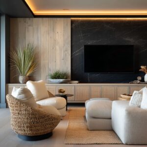
Texture behind the TV is a common solution: woven wallcovering, slats, fluting, or stone texture gives the eye something to engage with around the screen, so the black rectangle feels less abrupt. When the wall stays plain plaster or paint, the lower half often carries the material presence instead: a marble-clad fireplace block or thick stone plinth becomes the anchor, allowing the TV to sit quietly above.
Depth also reduces the black-on-flat effect by setting the screen back into shadow.

Spacing is part of the logic too. A deliberate stone can band or buffer zone between TV and fire opening keeps the two dark rectangles from merging into one heavy block.

Soft geometry for the rectangle stack
TV and fireplace walls naturally stack rectangles: screen, fire opening, panel seams, base cabinets.

Round coffee tables and rounded ottomans soften the design because they break the rigidity and make the seating feel social. Curved lounge chairs can soften the foreground silhouettes.
Tall branches add height and fine linework without introducing busy decor, and they can be placed near glazing where daylight helps the arrangement feel airy. This balance—structured wall, softer furniture—keeps the room comfortable while the architecture stays crisp.

Easy wall design patterns
There are a few modern design patterns with different looks:
- A framed center panel: a calm middle field holds the TV and linear fire, while vertical slat sides behave like modern pilasters. The room stays warm by echoing the slat tone in the kitchen cabinetry and repeating pale stone on the island.
- A stone or marble center stack framed by wood. The stone carries the TV and fire as one vertical anchor, and tall wood panels keep the composition warm. A floating stone base with a shadow gap gives the lower zone a clean bench-like presence. A bar or coffee wall to the side repeats the stone family and uses warm shelf lighting for depth .
- Full-height slats or fluting as the main backdrop. The texture replaces decor, the fireplace stays long and low, and storage is handled by a low cabinet run. Black accents repeat through stools and lighting so the open plan stays consistent .
- A deep recessed niche. Dark wood wraps the TV zone as a three-sided box, the fireplace becomes a thin flame band under the screen, and a continuous shelf line extends beyond the fire opening so the wall has a true console surface without a separate cabinet. Nearby coffee niches repeat the same depth-and-light logic.
- A plain wall with a lower material anchor. The TV sits quietly on plaster or paint, while a thick marble or stone fireplace block provides the statement. The furniture and rug carry the softness, and the kitchen repeats black accents and warm light lines so the palette stays cohesive.
- And for plans that need zoning, there is a divider hinge idea: a thickened divider volume holds a recessed TV niche, the fire becomes a shared centerpiece (sometimes visible from two sides), and wood slats add warmth while still letting light through. A bench-like base ties the whole mass together at floor level.

Closing
In a small room, a TV and a linear fireplace can share one wall without turning into two competing black boxes, as long as the wall is treated like a single composition. One calm main surface sets the background, thin dark openings stay long and low, and one continuous horizontal bench, ledge, or cabinet run gives the base a clean purpose while hiding real storage.
Add depth with recesses and shadow gaps instead of extra objects, then repeat one or two materials and a few black lines into the nearby kitchen or bar zone so the open plan feels connected. With that structure in place, the wall stays simple from a distance and still feels considered up close—clean, practical, and visually settled.
Related Posts
Harmony Home Design brings 10+ years of residential interior design experience to the ideas shared here. We publish design concepts, layout thinking, and practical styling notes.