
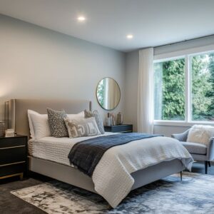
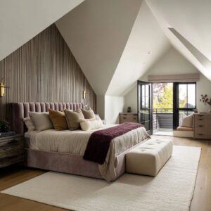
Removing the headboard has opened a wide field of creative thinking in modern bedroom design. Instead of relying on a single object to anchor the bed visually, designers now explore the full height and width of the wall as a space to build rhythm, texture, and atmosphere.
From sculpted niches and plaster finishes to integrated lighting and tonal surfaces, the entire wall becomes part of the composition. These no headboard approaches replace object-based styling with material-led ideas—inviting the wall to take on both visual and emotional weight without clutter or noise.
Whether shaped through light, tone, or repetition, these surfaces guide the eye and settle the room.

Wall-Behind-Bed Concepts Without a Headboard
In many modern bedrooms today, the wall behind the bed has moved beyond its former role as a place to hang a painting or rest a headboard. Instead, it’s becoming the central feature—visually calm, but compositionally rich.
Instead of relying on padded frames or upholstered panels, these spaces build the atmosphere using large surfaces that shape light and create depth through material. These aren’t showy walls.
They’re quiet but deliberate, behaving less like decoration and more like structural backdrops that hold the room together.

From softly washed plaster and grain-matched wood to fabric-wrapped alcoves or sculptural ledges, the approaches are subtle in execution yet precise in outcome. Many of these no headboard wall ideas depend on rhythm, texture, and proportion—not accessory.
They often link directly to the geography of the space, with homes in coastal or desert regions showing mineral finishes, while forest or mountain homes lean toward raw timber or darker tonal layering. No single format dominates.

Some walls form alcoves, others remain flush and flat. But in all cases, the treatment behind the bed has become something complete—meant to feel part of the room’s bones, not layered on top.
These strategies for decorating a wall behind the bed without a headboard don’t follow a formula. What they have in common is restraint, consistency, and a deep attention to how materials respond to natural light, how scale guides the eye, and how the absence of a headboard leaves room for other, more atmospheric choices.

Walls That Become Spatial Envelopes
| Sub-approach | Key Visual Moves | Insights |
|---|---|---|
| Full arches & alcoves | A broad curvature frames the bedding; plaster or stone textures run without breaks | Depth illusion: the eye senses a soft canopy even when the radius is shallow| Edge governance: because light cannot catch sharp corners, shadows melt, giving linens extra emphasis |
| Horizontal recesses | A slim slot is cut straight across the field at pillow height | Lens effect: the recess behaves like a camera aperture, guiding vision toward the centre of the mattress; any object placed inside looks curated by default |
| Cocooned rectangular panels | An inset plane sits flush with surrounding plaster, often with concealed uplight | Colour halo: indirect light lifts mid-tones near the base of the recess, letting the upper zone drift into a softer tint—subtle vertical gradient without paint |
Takeaway: When the wall wraps or cradles the bed, it whispers to the sleeper that the room is “holding” them; this emotional signal is stronger than any freestanding headboard can offer.

Integrated Ledges & Shelves as Visual Anchors
One of the most effective techniques in these bedrooms is the use of horizontal ledges or shelves installed directly into the wall surface—positioned with care at the height where a headboard would normally stop. This move creates an immediate visual boundary that doesn’t need to rely on large furniture.
The eye lands at that line and stays there. The entire wall feels intentional.

The ledges are never overfilled. Objects placed along them—a small ceramic vessel, a few leaning books, maybe a minimal sculpture—are arranged loosely, but always with balance in mind.
What seems casual is actually controlled. A touch of asymmetry, a soft contrast in color, and spacing that lets negative space speak all contribute to a sense of ease.
These surfaces don’t collect clutter; they act as quiet focal points.

Light, too, plays a key role. In some examples, the ledge casts a soft shadow just beneath itself, creating a dark horizontal accent that visually frames the bedding.
In others, integrated lighting hidden just behind or above the ledge adds a low-glow effect, turning the shelf into more than a surface—into a light feature. That subtle graze of warm tone across textured plaster or grasscloth pulls the wall forward without overwhelming it.
Together, the ledge, its objects, and the light create a visual “pause” in the wall’s vertical field. It’s a gentle way to anchor the bed without needing thickness or height.
This technique blends functional shelf space with quiet composition, proving that even a single horizontal line can hold an entire room in balance.

Material-Forward Monoliths
| Material Surface | Hidden Sophistication in the Look |
|---|---|
| Venetian or mineral plaster | What seems like a single colour is actually many micro-tones revealed only when grazed by light. This variability keeps large, bare surfaces from feeling stark. |
Raw, reclaimed or carefully matched woodVertical planking elongates the room; grain alignment across panels signals custom craftsmanship even to an untrained eye. Live edges introduce an informal counter-note to orderly bedding.
Natural grasscloth or textile wrapFibres catch light at irregular angles, so wall colour drifts through warm and cool notes during the day—an effect that makes the entire sleeping area feel subtly alive. Stone or micro-cementMineral surfaces offer built-in depth through fossils, pores, or gentle sheen shifts.
Under low light they read as warm fabric; at high noon they mimic outdoor masonry, linking bedroom to landscape. Takeaway: Instead of adding decoration onto the wall, such rooms make the wall itself the decoration, relying on light-responsive finishes to change mood hour by hour.

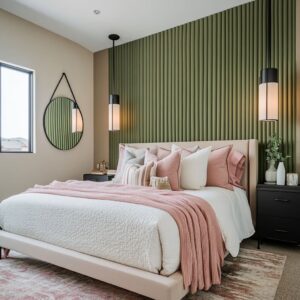
Rhythm Without Ornament
There’s a quiet structure built into the walls of these bedrooms—one that most viewers notice only after spending time in the space. Instead of relying on artwork or heavy furnishings, the rooms introduce order through subtle repetition.
Vertical planks, evenly spaced panels, or hand-applied stripe textures stretch across the wall behind the bed, giving the surface a sense of motion that doesn’t need decoration to feel complete.

These repeated elements guide the eye. In some rooms, narrow wooden slats stand in soft contrast to the plaster above them, while in others, paneling creates a grid that mimics the width of the mattress or the proportions of the window.
This repetition builds a sense of rhythm that makes the entire wall feel anchored, even if it holds no object at all. The effect is strong precisely because it is quiet.
Nothing shouts for attention.

The viewer simply reads balance—sometimes without realizing what is creating it. This is one of the reasons ideas for a behind bed wall without a headboard often rely on line work.
A striped limewash or a series of narrow grooves can visually support the bed the same way a traditional frame might—but without adding weight or interrupting the calm of the room.

Light as Mark-Maker
| Lighting Tactic | Visual Result |
|---|---|
| Continuous concealed LED | The glow sketches a horizon that steadies vertical textures (plaster strokes, planks). |
| Niche pendants or spotlights | Lamps become accents inside the architecture, echoing the idea of jewellery set in stone. |
Track or cove washBroad, shadow-less light turns texture into a soft mural. Less-obvious point: By avoiding direct fixtures above the pillow line, designers let shadows fall away from the sleeper’s face, so the bed feels calm even when the wall is busy.

Colour Discipline
A key detail across these examples is how restrained the color use tends to be. Bold color is rare.
Instead, tone and shade do most of the visual work. Most rooms keep their palette within a narrow spectrum—three or four values of one hue applied across wall, bedding, flooring, and soft furnishings.
This kind of layering brings in variation without breaking the calm. A beige wall might meet taupe bedding and a soft tan rug, with each element distinct, but related.

That connection between materials helps tie the sleeping area together visually. Because the wall and textiles share temperature—whether warm earth tones or cool mineral grays—the bed feels embedded into the room, not placed in front of it.
This is especially true in many modern no headboard wall ideas, where the surface behind the bed carries more of the visual load than usual. The color must not fight the textiles—it must carry them.

Still, there’s usually one moment of contrast. A rust-colored pillow.
A burnished brass strip. A black ceramic lamp on an otherwise pale ledge.
These accents aren’t loud, but they shift the gaze just enough to keep the space from feeling flat. It’s not about saturation—it’s about timing.
The single accent becomes more powerful because everything else is holding steady. And that’s how these walls—without a headboard—feel fully built, even in their restraint.

Subtle Design Devices Most People Miss
Much of what gives these bedrooms their depth and quiet structure lies in decisions that often escape quick attention. These details don’t stand apart—they fold into the composition so smoothly that they’re easy to overlook unless you’re watching for them.
One example is how often a lighting slot or plaster recess stretches a few inches beyond the mattress edge. That small extension frames the bed like a border, giving it spatial definition without needing a frame.
In rooms with wall niches or integrated shelving, the corners are almost always softened. Rounded interiors remove hard shadow lines, making the surface appear less like construction and more like fabric.
The viewer might not name the detail, but they feel the softness.

Plaster treatments carry similar nuance. The brushwork might seem loose or unplanned at first glance, but it’s arranged with care.
Swirls or drags in the material feel natural but are balanced across the surface so no part looks heavier than another. This is a kind of restraint that gives walls character without relying on decoration.
Where wood is used, it often speaks the same language as nearby plaster. A slab of oak might be chosen for its grain direction—one that mimics the same arcs and curves as a trowel left behind in lime-based finish.
This pairing makes the surface feel cohesive, even though it combines different materials.

Height placement also plays a role. In taller rooms, any strong visual break—be it a shelf, artwork, or lighting band—tends to sit low.
This prevents the eye from drifting too high, keeping the bed area grounded. Even in vaulted or beam-heavy rooms, visual focus hovers around shoulder height, not the ceiling.
And finally, tone does the styling. Objects placed on ledges or inside niches are rarely high-contrast.
A vase, for example, will differ only slightly in shade from the plaster behind it. That way, form takes precedence over color.
In a no headboard wall setup, these techniques do more to shape the space than any piece of furniture could.

Why These Walls Feel Complete Without a Headboard
There’s a reason these bedrooms don’t feel like they’re missing anything, even though the usual focal piece behind the bed is gone. The walls aren’t acting as blank backdrops—they’re active, structured, and fully integrated into the rest of the space.
When the surface is uninterrupted and expansive, it brings every element in the room into one visual field. The bed, the nightstands, even the lighting fixtures begin to read as part of the same scene, rather than individual objects.
Texture, too, replaces ornament. A finely applied plaster surface or a softly grained wood panel gives the viewer plenty to read—without ever needing artwork.
These surfaces shift with light, change tone through the day, and offer variation through detail rather than added items.

Much of the spatial depth is drawn through light. Recessed LED strips or gentle uplights highlight small changes in surface texture, creating depth through contrast and shadow.
This sense of dimension is difficult to match with padded furniture. Instead, the surface itself takes the lead.

Scale also matters. Whether the treatment stretches wall to wall or arches around the bed, it’s always measured to relate directly to the sleeping area.
These visual connections—edge to edge, curve to ceiling—make the eye trust the proportions. The space feels balanced because nothing feels inserted or floating.
In the end, a room built without a headboard isn’t lacking—it’s making different choices. These designs show how scale, texture, tone, and light can do the work that used to be assigned to a single piece of furniture.
And often, the result feels more complete, not less.

Conclusion
What makes these spaces feel complete is not the absence of a headboard, but the way the wall behind the bed steps into a stronger role. Instead of acting as a backdrop, it becomes part of the room’s foundation—connecting furniture, light, and bedding into a single view.
Each idea used here—be it a floating shelf, a tonal plaster wash, or a grain-matched wood panel—is measured and quiet, yet full of intention. These are spaces built without a headboard, but not without presence.
By focusing on proportion, surface texture, and visual balance, the wall becomes more than a place to rest behind the bed—it becomes the structure that holds the room together.
Related Posts
Harmony Home Design brings 10+ years of residential interior design experience to the ideas shared here. We publish design concepts, layout thinking, and practical styling notes.