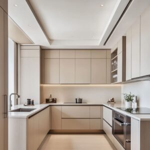
White farmhouse kitchens have become one of the most recognizable styles across American homes—but their charm runs deeper than clean paint and shaker cabinets. Beneath the soft color palette is a careful mix of texture, finish, layout, and history.
These kitchens may look simple at first glance, but each element—from the shape of a range hood to the type of brass used for a faucet—contributes to a layered and lived-in look that feels both current and timeless.
This article takes a closer look at what actually makes these kitchens work. It’s not about chasing trends—it’s about how small, specific design choices quietly shape the space.
From subtle color shifts in white paint to the way shelves or pendant lights line up with ceiling beams, we’re breaking down the less obvious details that give these kitchens their lasting appeal. Whether you’re building new, remodeling, or just gathering ideas, there’s plenty to learn from the design decisions hidden in plain sight.
Variations in White
One of the most overlooked details in white modern farmhouse kitchens is the fact that white isn’t one single shade—it’s a whole spectrum. What makes these spaces feel layered and refined isn’t just the layout or styling but the mix of soft, off-white tones that shift subtly across the room.
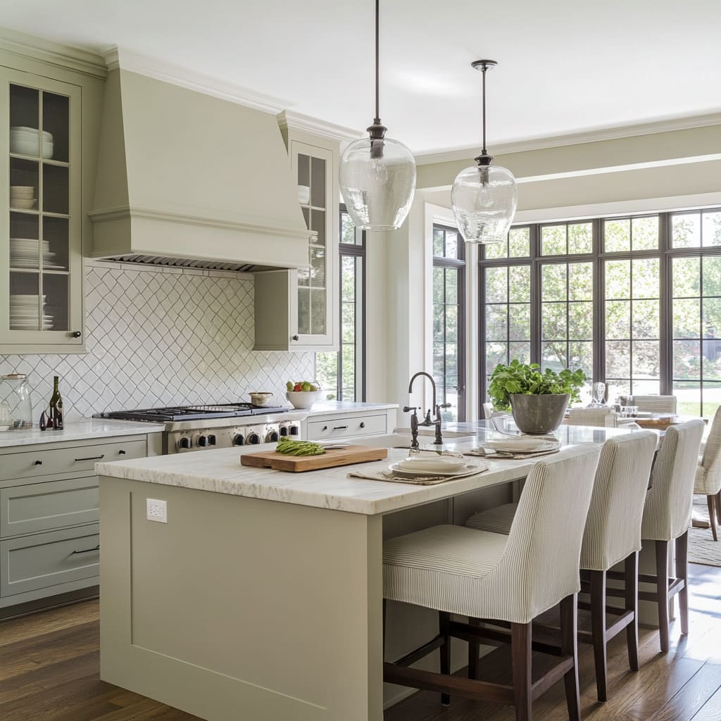
Cabinetry might lean into a creamy ivory, while nearby walls or backsplash tiles reflect a cooler greige or a pale gray-white. This quiet contrast between warmer and cooler tones keeps the room from feeling washed out or one-dimensional.
Designers often use this variation to create depth that’s felt more than immediately seen. For example, a modern farmhouse kitchen with white cabinets might feature a wall of crisp subway tile with just enough of a cool undertone to emphasize the cabinetry’s softness.
And these whites aren’t static—they respond to light. Early morning sunshine can pull forward a buttery warmth, while late afternoon shadow brings out hints of green or gray, depending on the paint’s base tone.
This shift isn’t accidental. It’s done to make the space feel richer, more natural, and alive throughout the day.
Texture and Finish Play a Key Role
While the color palette might seem quiet at first glance, texture does the heavy lifting in many white modern farmhouse kitchens. Flat color takes a backseat to surfaces that reflect, absorb, or scatter light in subtle ways.
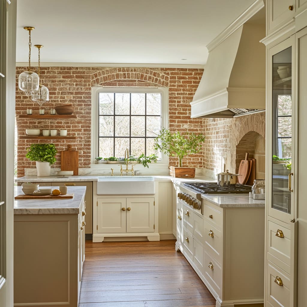
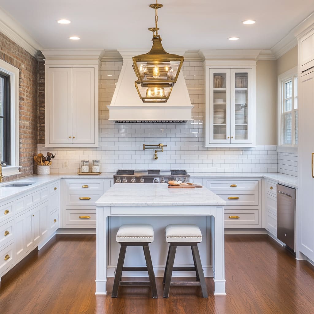
A painted brick wall, for example, doesn’t just bring character—it adds visual depth through slight imperfections. Hand-applied plaster finishes or limewashed backsplashes lend a soft, irregular feel that gives even the most refined kitchens a grounded and tactile atmosphere.
Tile selection plays into this as well. Designers lean into ceramic or stone tiles with ripples and movement, especially in spaces where light moves across the surface throughout the day.
A glossy tile might bounce light and create a shimmery pattern, while a matte version can absorb that same light and cast soft shadows. Even the grout matters—tight seams with matching grout lines create a seamless look, while wider, contrasting lines draw attention to the pattern and shape of the tile.
Subway tile, though common, is used in surprisingly different ways across these kitchens. Depending on the finish, the same tile can either catch the eye or quietly blend in.
It’s this intentional variety in surface feel—not just the materials themselves—that keeps white kitchens from falling flat or feeling sterile.
Brass: Beyond the Trend
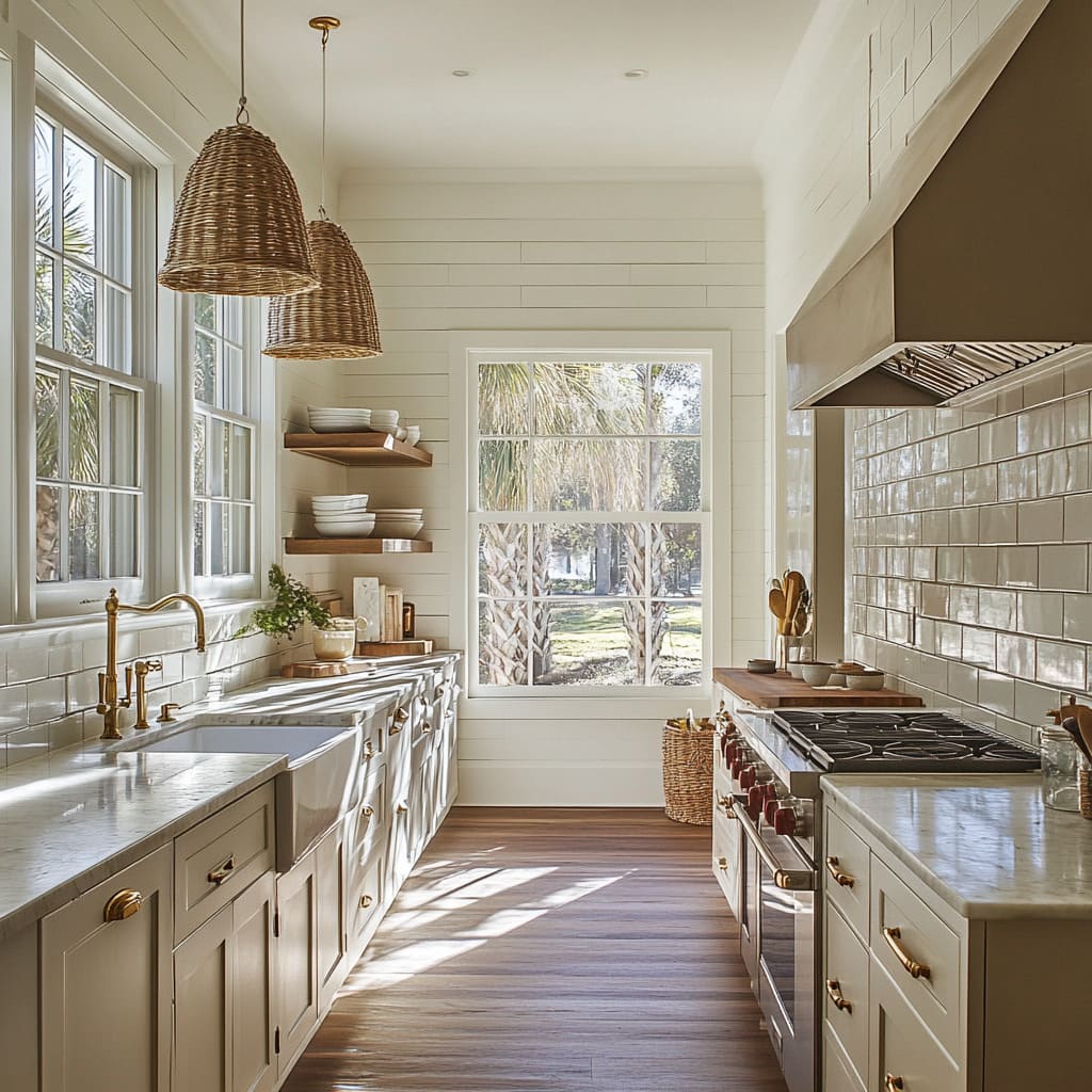
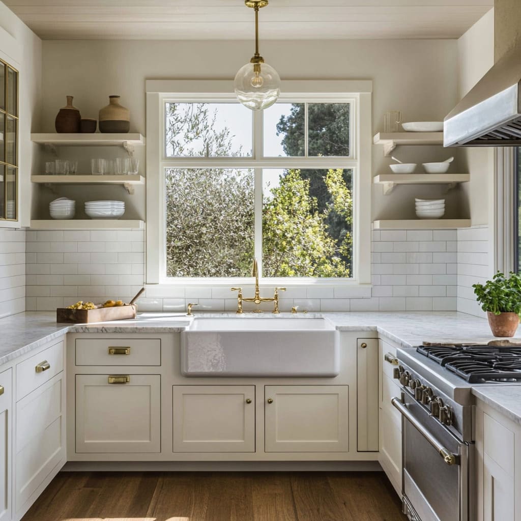
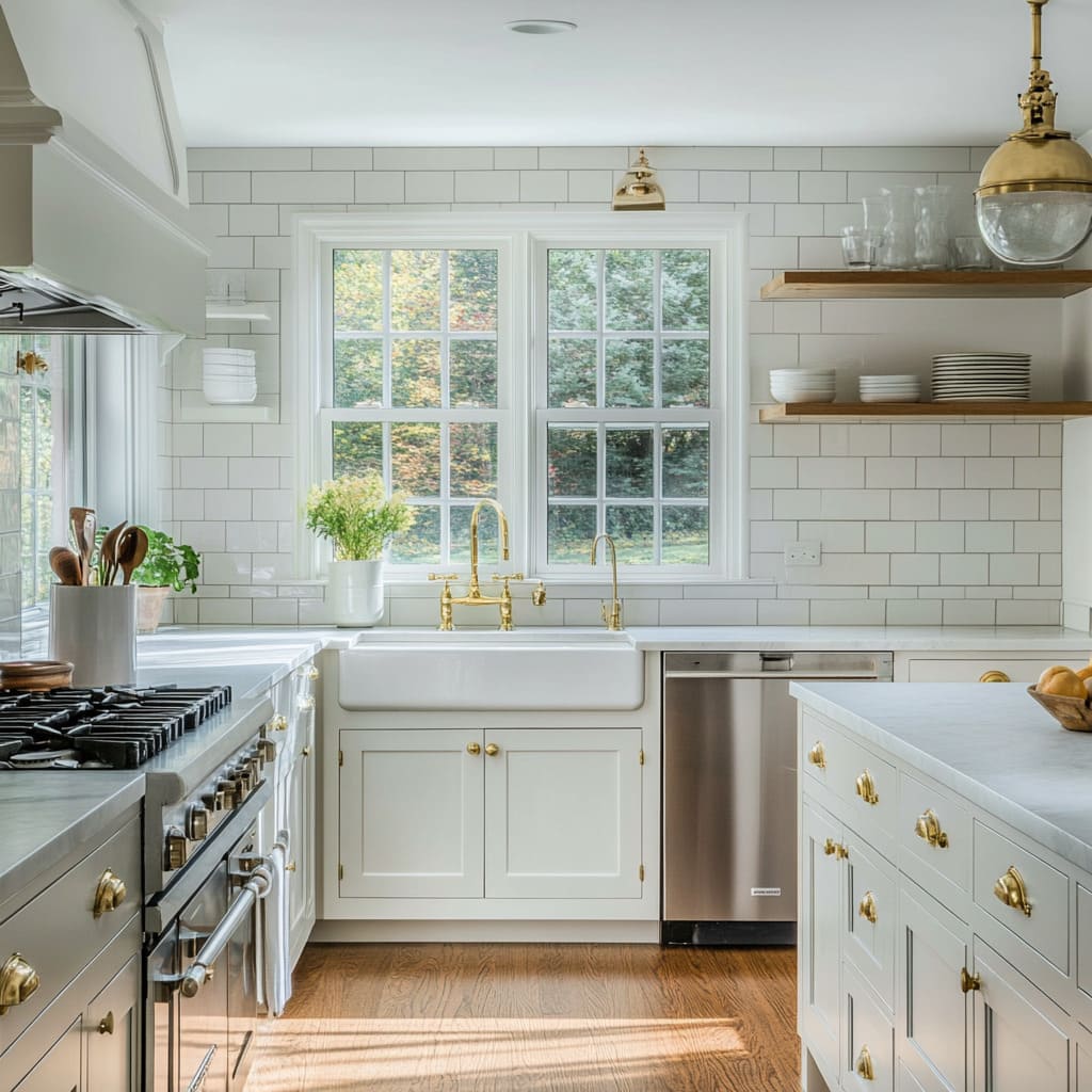
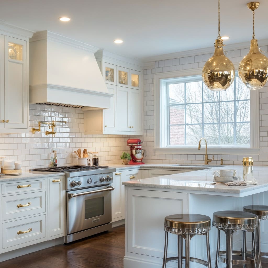
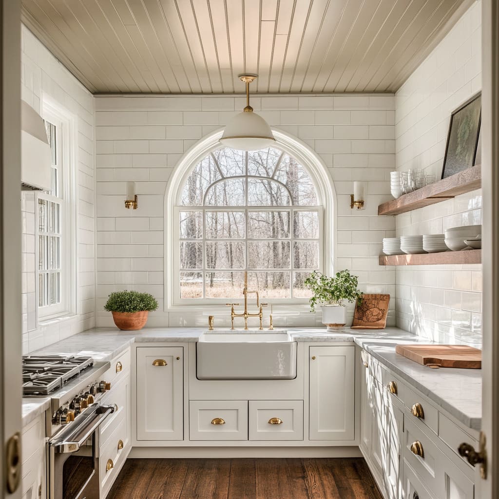
Brass shows up in nearly every corner of modern farmhouse kitchens—on cabinet pulls, bridge faucets, sconces, and even pendant light chains. But this isn’t a matter of chasing a trend.
It’s about layering in depth, warmth, and a subtle reference to history. In many cases, the brass hardware used—especially when paired with porcelain faucet handles—pulls influence from early 20th-century American kitchens.
There’s a quiet nostalgia in those details, but it’s paired with sleek surroundings to keep it grounded in current design.
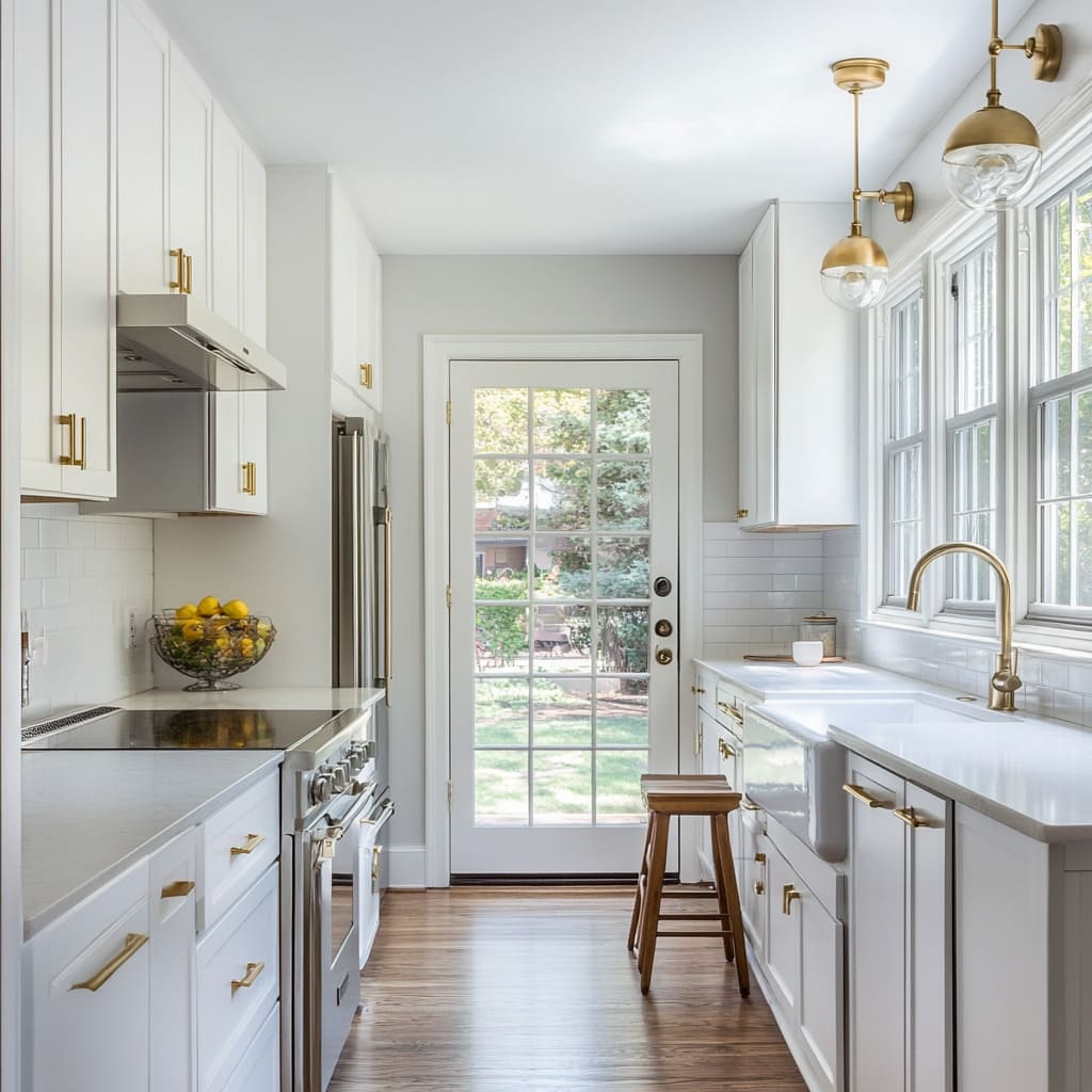
What’s especially noticeable in a modern farmhouse white kitchen is how brass becomes the balancing act. Surrounded by cool-toned stone, white tile, or pale paint, it brings in a glow that prevents the space from feeling flat.
And designers often use it consistently—faucets, handles, light fixtures—all in similar finishes, which ties everything together without being overwhelming.
Another detail worth pointing out is patina. Some kitchens use unlacquered brass that ages naturally, gaining character over time.
Others prefer a slightly aged finish from the start. Either way, these finishes shift with the light and evolve, making the space feel less like a showroom and more like a home that’s lived in.
The impact of brass isn’t limited to the hardware itself—it also shapes the room’s color temperature. Paired with wood elements, it enhances the warmth.
Paired with black accents or stone, it brings contrast. That flexibility is part of why it keeps showing up in both traditional and more transitional white country kitchen ideas.
Open Shelving for Breathing Room
Upper cabinets take a backseat in many of these kitchens, replaced by floating shelves that give the room a lighter, more open layout. But there’s more happening here than just a place to put dishes.
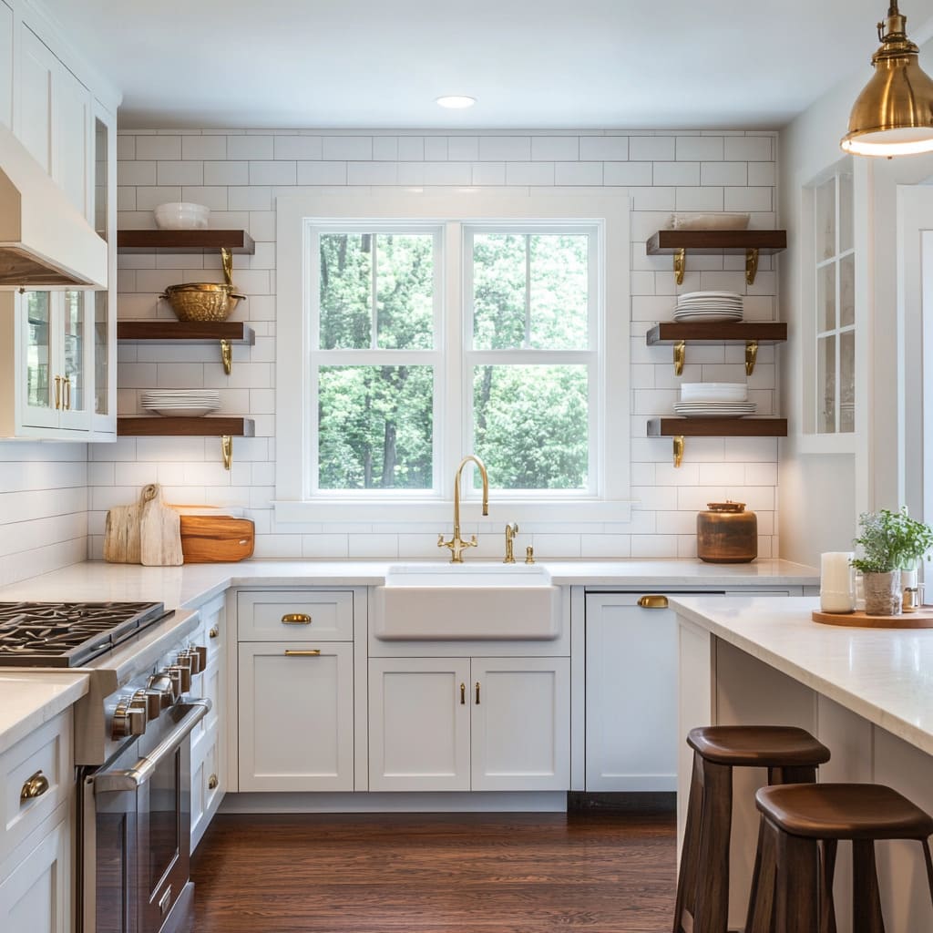
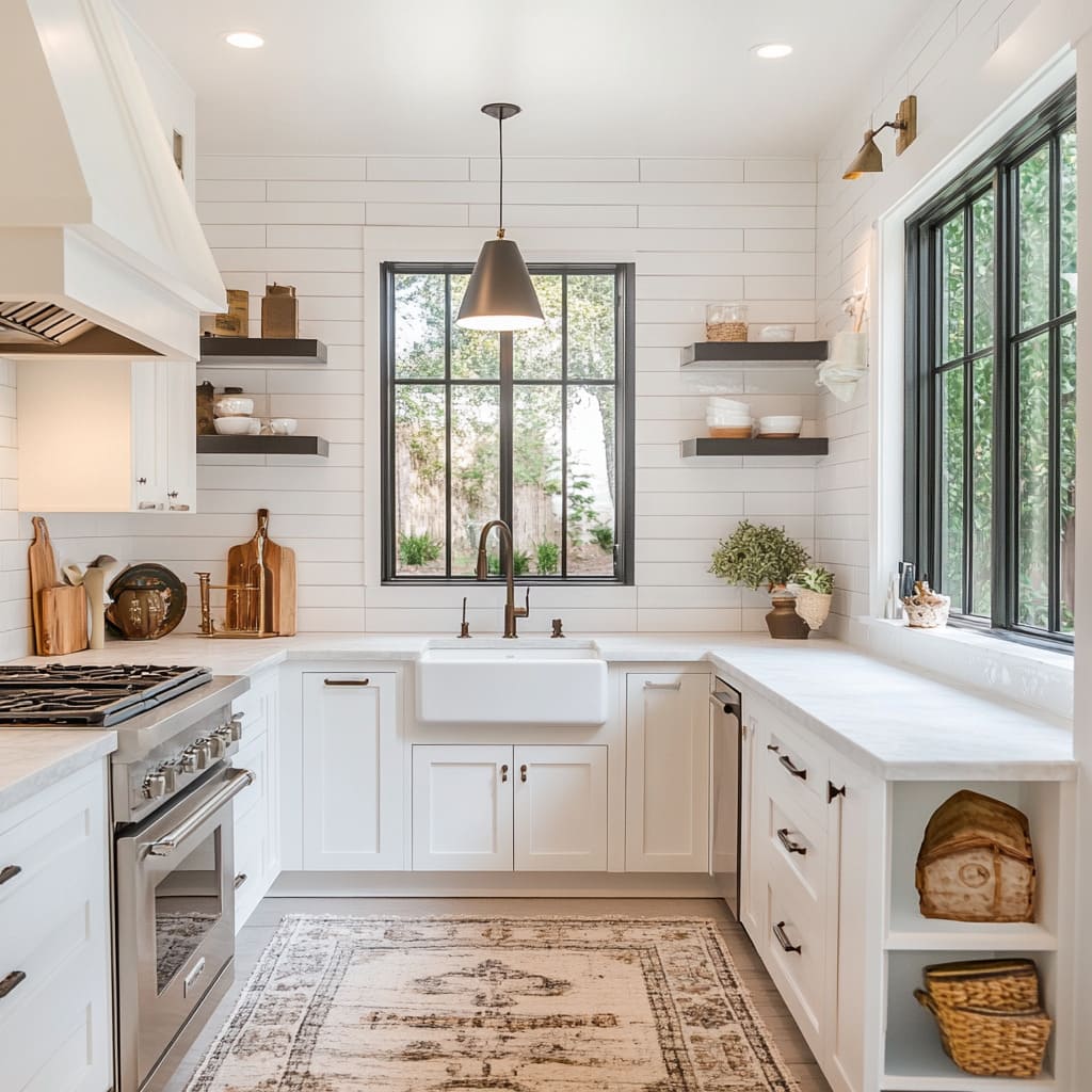
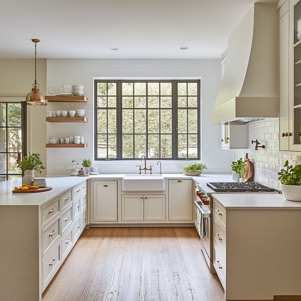
Shelving, especially when carefully placed on either side of a window or stove hood, helps establish symmetry. And in kitchens where the sink or range is already the focus, shelving frames it instead of competing with it.
These open shelves also act as a visual bridge between other materials. For example, white oak planks bring warmth that links white cabinets to wooden flooring.
Some designers go with lightly washed wood for a softer look, while others paint the shelves the same color as the walls so they almost disappear—letting the items on them do the work.
Styling is kept minimal. Just a few stacks of plates, a couple of glasses, maybe a plant or small vase.
That restraint is key. The shelves are part function, part negative space.
Overloading them would make the wall feel heavy, which goes against the easy, welcoming feel these kitchens aim for. The shelves themselves aren’t one-style-fits-all.
You’ll see differences in thickness, edge detail, and even how the brackets are handled. Some have visible aged metal brackets for contrast, others hide them completely for a cleaner line.
These choices, though small, add up to a kitchen that doesn’t feel off-the-shelf—it feels thought through, even if it’s simple.
Range Hoods as Architectural Statements
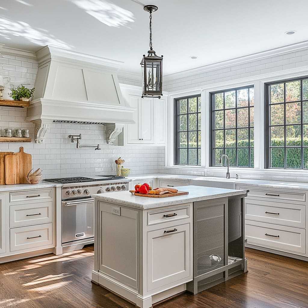
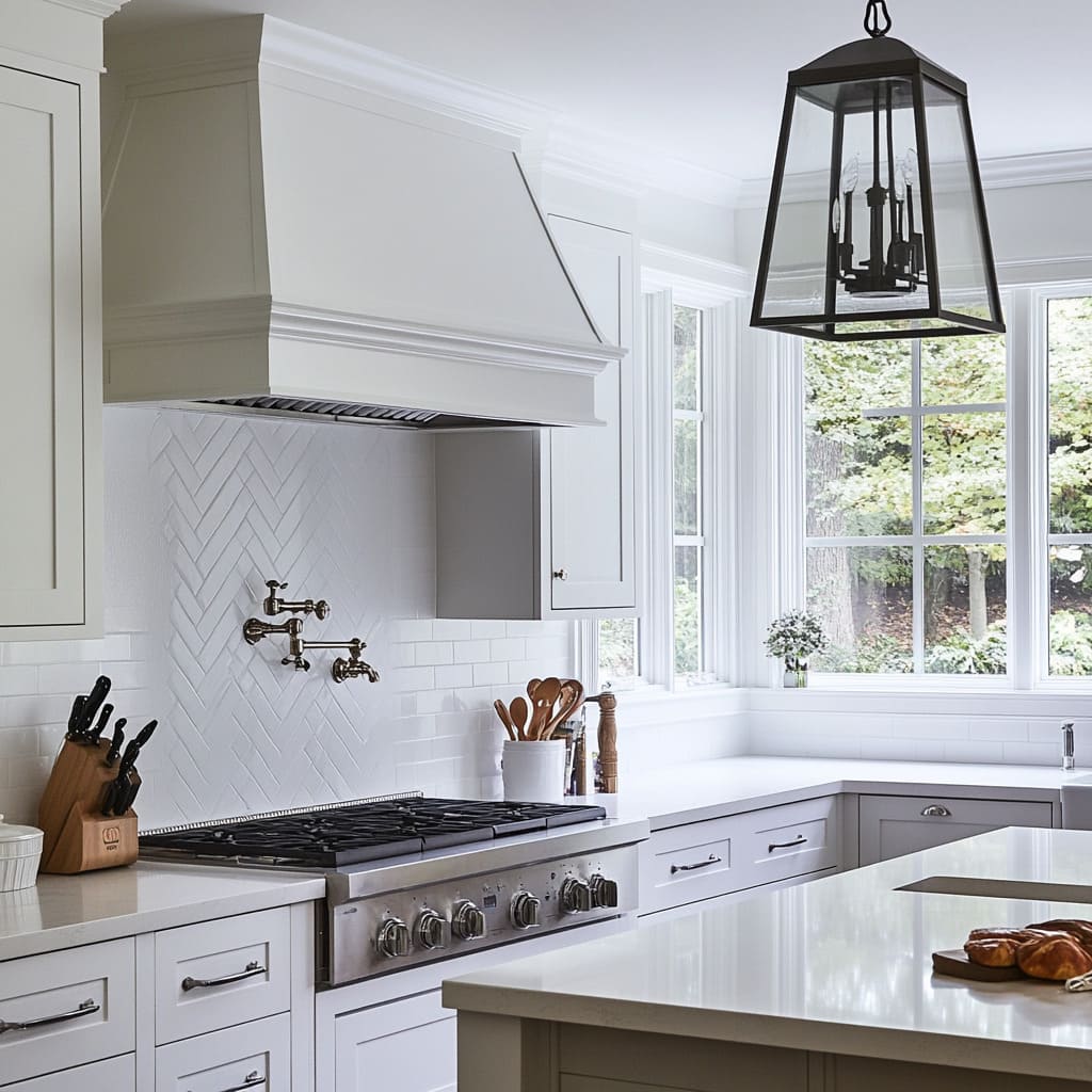
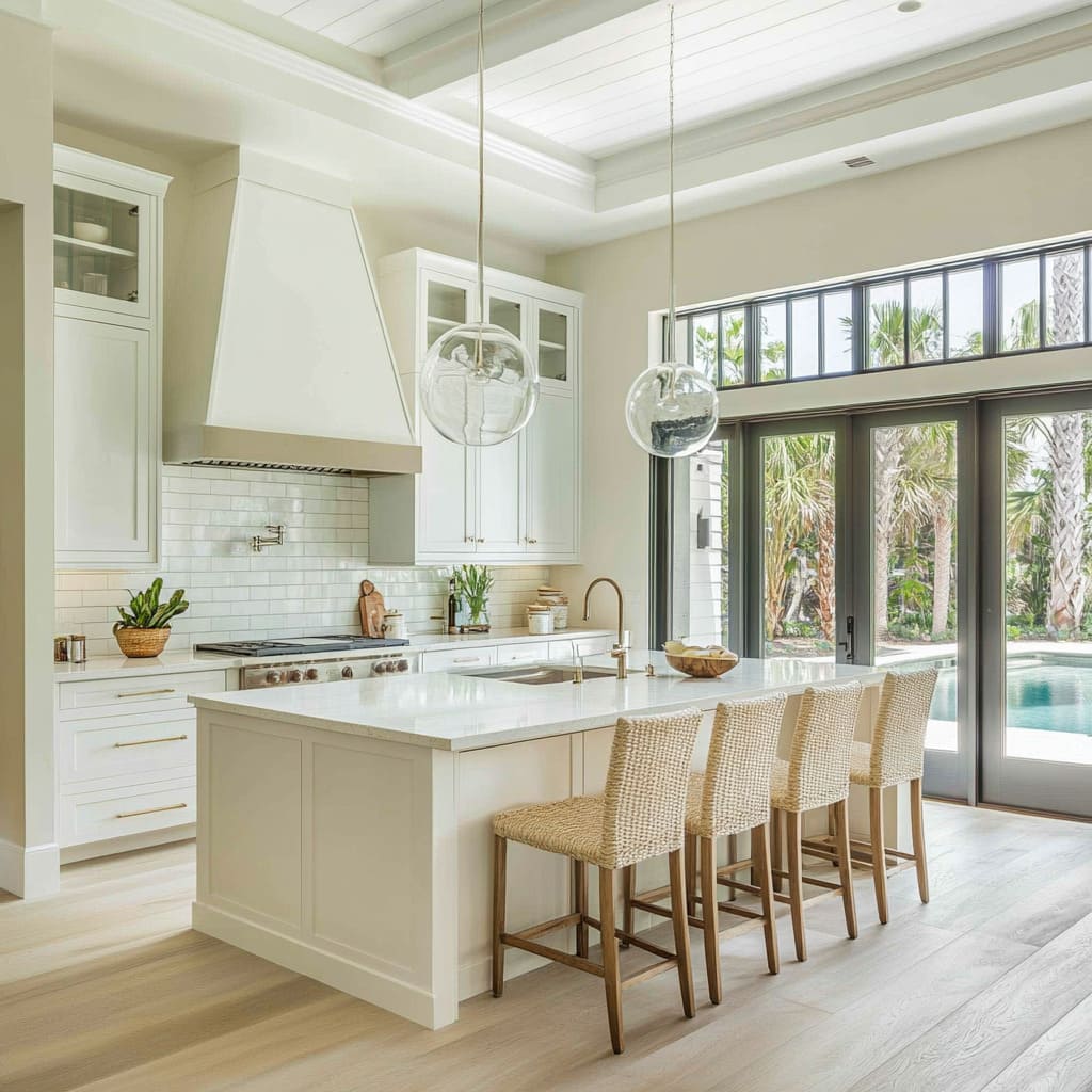
In many white kitchens, the range hood does far more than pull cooking smoke out of the air—it pulls visual weight. It’s often the tallest or most sculptural object on the wall, and designers have started to treat it as a quiet focal piece rather than something to hide.
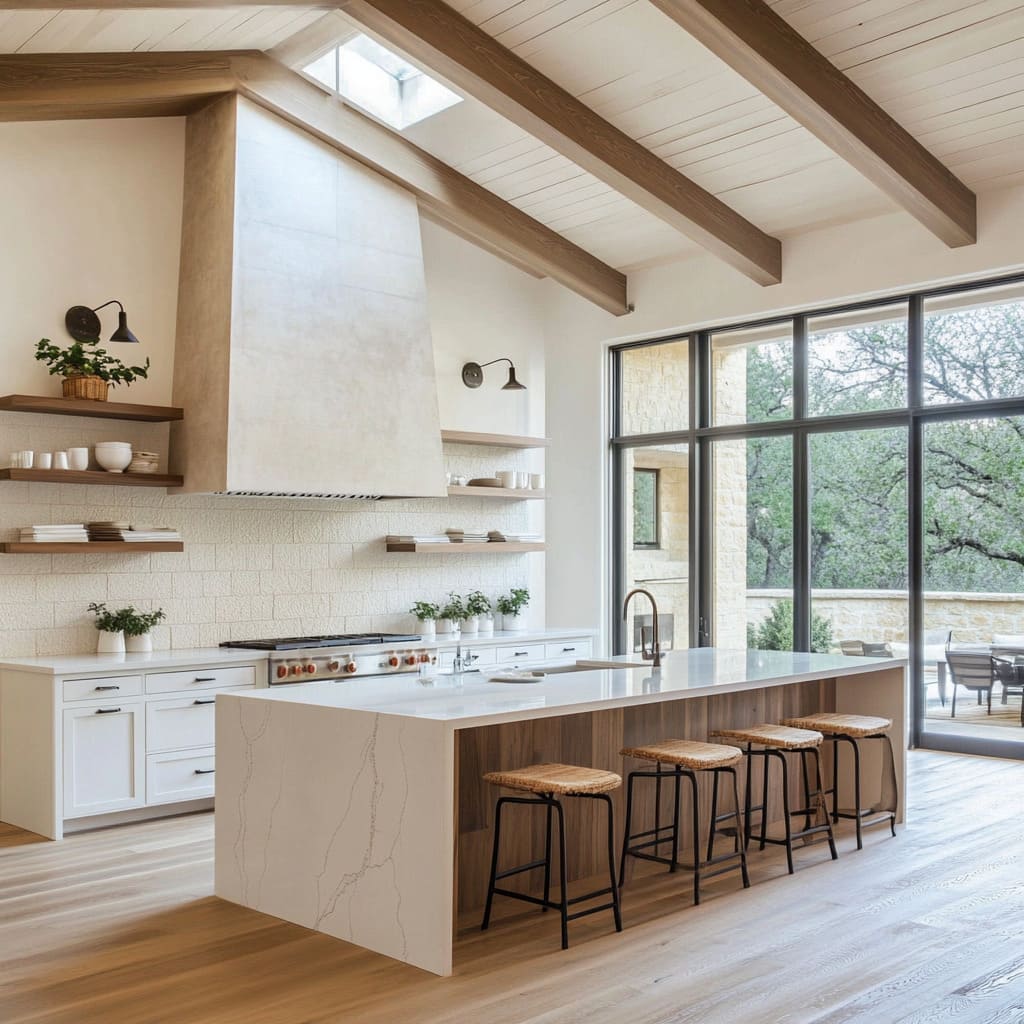
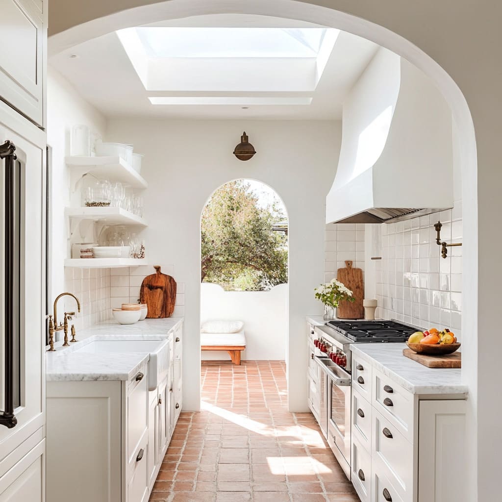
The variety in shapes and finishes is part of what makes white modern farmhouse kitchen ideas stand out. Some homes lean into plaster or wood-wrapped shrouds that echo the structure’s overall lines—arched forms work beautifully in Spanish-style settings, while squared, vertical hoods feel right in modern ranch-style layouts.
These shapes give the kitchen a sense of identity. In other cases, the hood disappears into its surroundings.
When painted the same tone as the cabinetry and set flush with upper cabinet lines, it blends in so smoothly that it becomes part of the background.
Then there are those that make a bold statement through form. A hood with deep layered molding, or one that’s been stretched tall and tapered, breaks up the horizontal flow of drawers, counters, and open shelves.
Even if it’s white, subtle changes in finish—like a soft plaster texture or matte paint—set it apart from nearby cabinets and give it definition. These decisions show how a practical feature becomes a sculptural moment that carries the entire wall.
More Than Just Subway Tile
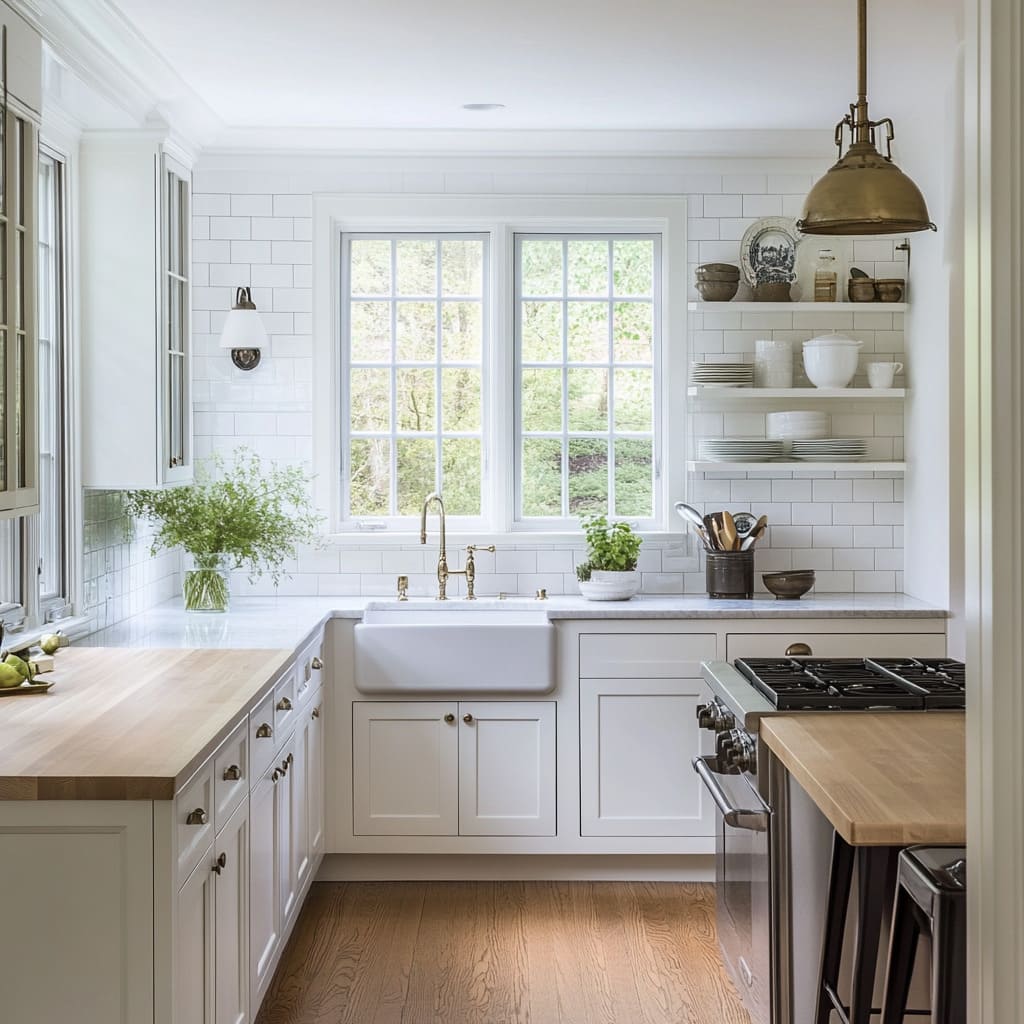
Subway tile has been a kitchen staple for generations, but it’s the way it’s used that keeps it fresh. In kitchens with white farmhouse kitchen cabinets, tile plays a huge role in shaping the wall’s texture and rhythm.
And although the format may look familiar, there are quiet differences that make one backsplash feel completely different from another.
Let’s break it down:.
- Grout Choices: Using bright white grout creates a continuous, uninterrupted surface. Switch to a slightly darker tone—greige or soft gray—and suddenly the pattern pops out, outlining each tile like a subtle grid.
- Size and Edge Detail: Some tiles stick to the classic 3×6 size, while others go larger or use handmade pieces with slightly uneven edges. That tiny bit of imperfection creates movement on the wall without loud contrast.
- Install Patterns: The standard running bond remains popular, but designers often switch it up with a herringbone layout or a diagonal pattern above the range. That one framed section instantly draws the eye and adds structure to the room.
Used thoughtfully, tile becomes more than a background element. A single change in grout line thickness or layout direction is enough to give a kitchen wall just the right amount of personality.
Historical Fixtures and Contemporary Function
One of the most interesting things about kitchens with a farmhouse influence is how they blend old-style charm with everyday practicality. Many of these spaces include bridge faucets with cross handles or side sprayers that could have come straight out of a vintage catalog.
But the inside tells a different story—these fixtures work with the same smooth precision and water-saving performance you’d expect in a brand-new home.
That balance of form and function shows up again with cabinet hardware. Cup pulls and bin pulls feel rooted in early American kitchens, but they’re paired with soft-close drawers and hidden glides that make them effortless to use.
Some kitchens even conceal dishwashers or fridges behind panels that match the cabinetry—so you get all the tech without interrupting the traditional look.
A few other details are often tucked into the design without shouting for attention:.
- Bridge Faucets with timeless silhouettes but current-day reliability
- Cup Pulls and Latches that feel nostalgic but are part of a fully modern cabinet system
- Built-in Water Filters and garbage disposals hidden beneath classic apron sinks
Even with vintage appeal, these kitchens are built for real use. Homeowners want the look of the past, but they’re not giving up modern conveniences to get it.
Architectural Cues That Frame the Kitchen
A white kitchen isn’t just defined by its finishes—it’s shaped by the structure around it. From the layout of the beams to the shape of the archways, architecture plays a huge part in how the space feels.
Some of the best white kitchens out there use these cues to build quiet drama and flow.
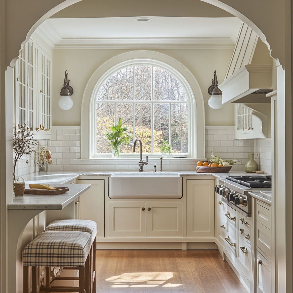
- Arched Passages soften lines and create a calm transition between spaces. Whether it’s a plaster arch leading to the dining room or a curved window casing, the shape adds grace without taking up floor space.
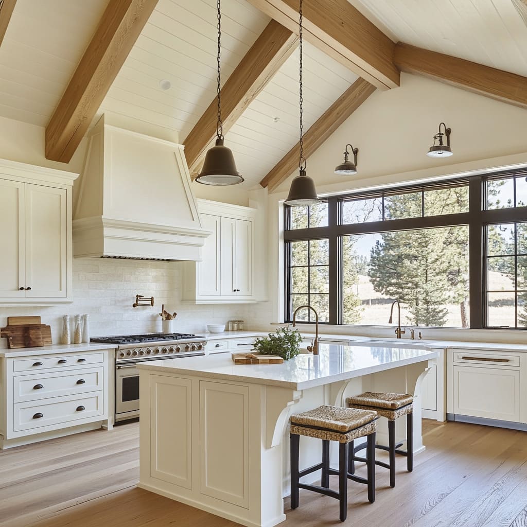
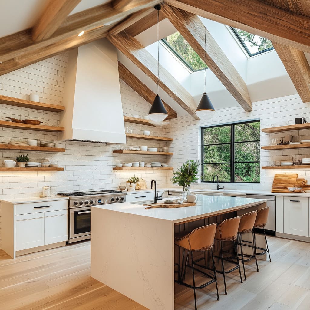
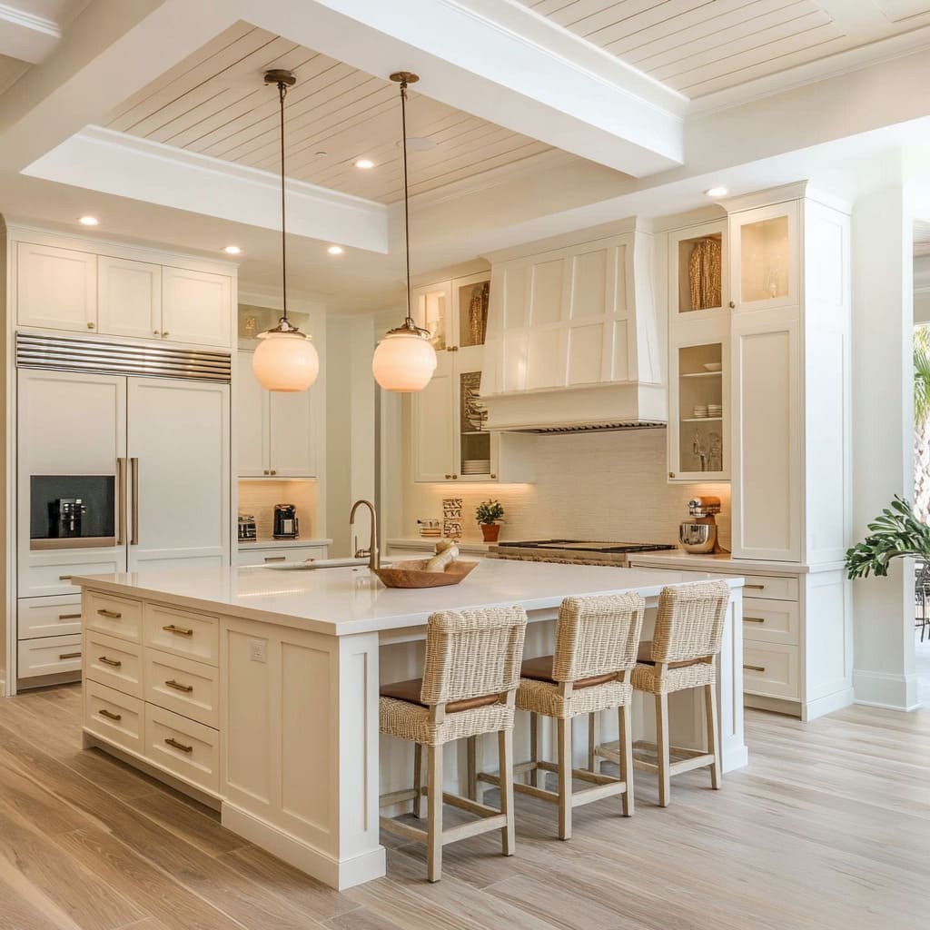
- Exposed Beams, especially when matched in tone to shelving or flooring, guide the eye across the kitchen. In a long galley-style layout, they stretch the space visually and anchor the lighting above.
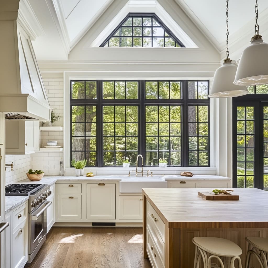
- Steel-Framed Windows break up large expanses of white. Their black or bronze mullions often repeat in cabinet hardware or lighting fixtures, pulling the look together with subtle contrast.
Some kitchens go further and align floating shelves or pendants exactly with the lines of these beams or window frames. That kind of alignment isn’t always obvious at first glance, but it gives the space a rhythm that feels settled and composed.
Even in kitchens with white farmhouse cabinets, these architectural moves keep the room from feeling flat or generic. They give the space structure—sometimes quite literally—and help tell the story of the house itself.
Furniture-Style Islands
Not all islands are cut from the same block—literally. In many modern white kitchens, the island takes on the look and proportions of a freestanding piece of furniture, and it changes the whole rhythm of the room.
Instead of being a heavy built-in that matches the perimeter cabinets, it feels like something that was chosen for the space, not just built into it.
Here’s what gives these islands their charm:.
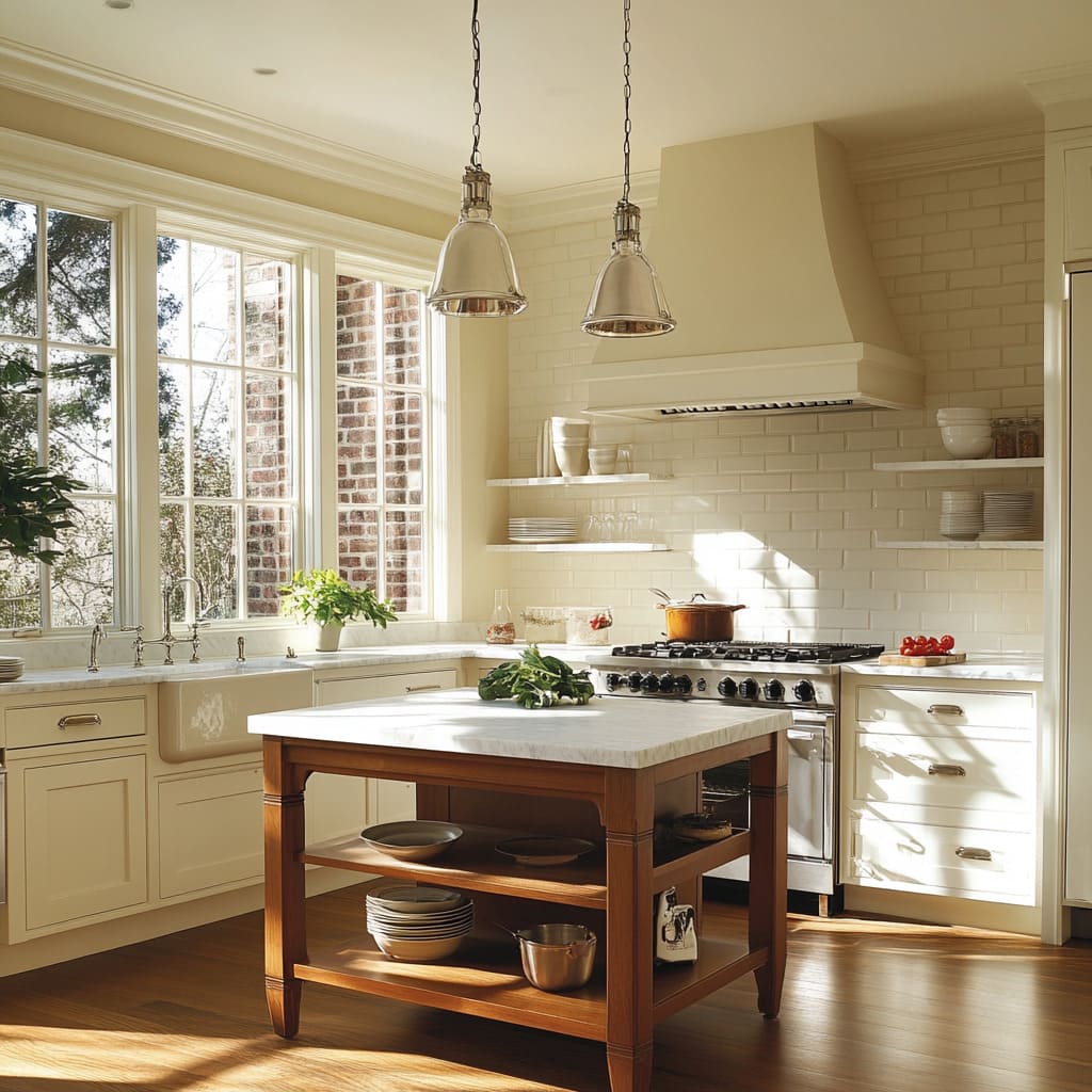
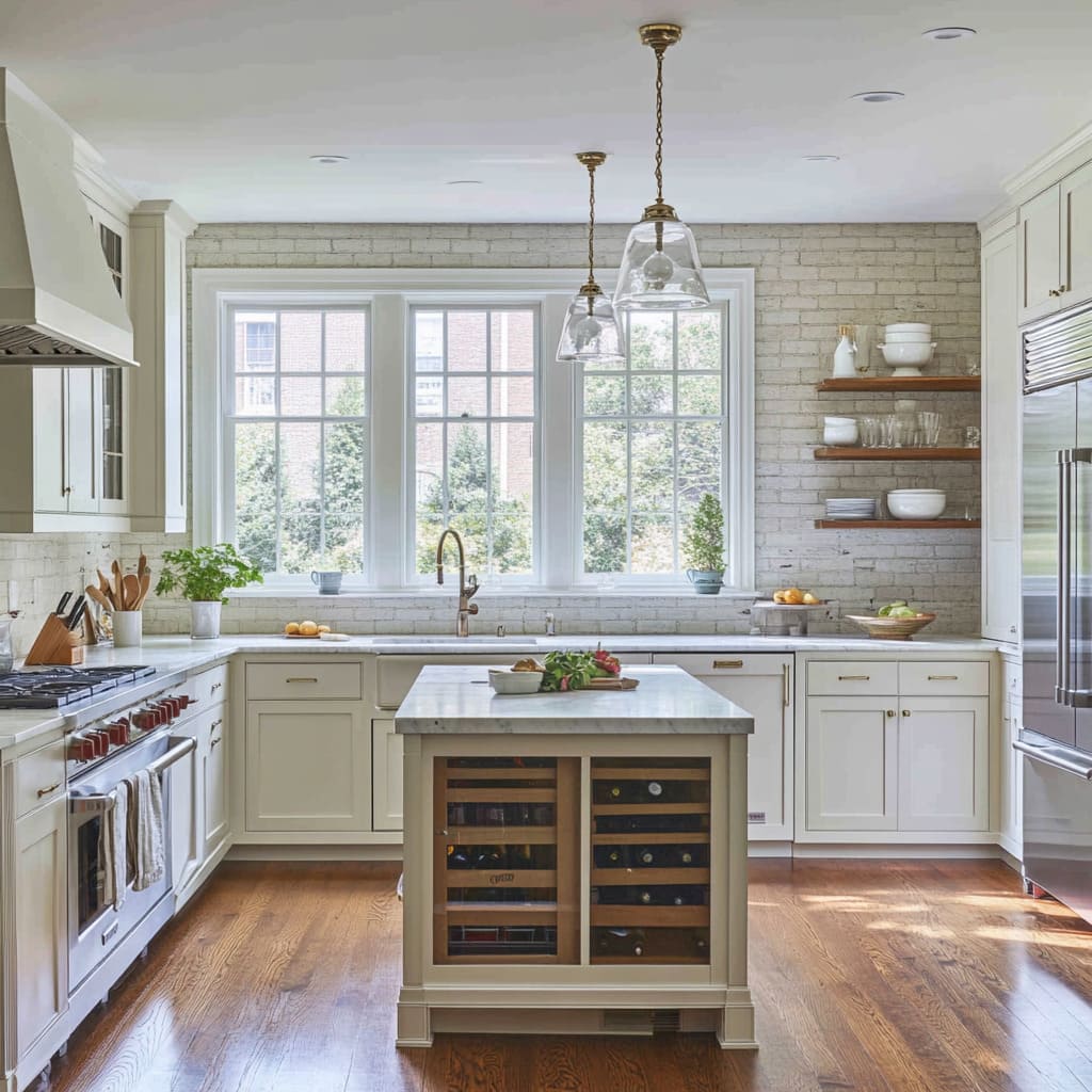
- Legs and Feet: Exposed legs, often turned or slightly tapered, give the island a lighter footprint. Some include a lower shelf for stacking baskets or storing large serving trays.
- Contrasting Finish: Designers frequently opt for a deeper wood tone or a custom paint color to set the island apart from the rest of the cabinetry. That difference helps break up long lines of white and brings in a sense of age or collected style.
- Mixed Storage Options: While wall cabinetry is typically closed and uniform, these islands might have open cubbies, slatted shelves, or a seating nook tucked into one end.
The goal is to avoid having the island feel like a giant rectangle stuck in the middle of the room. This style borrows cues from old worktables and vintage hutches, which naturally brings in personality.
In farmhouse-style homes, especially those with generous space or high ceilings, this approach adds structure without weighing the kitchen down.
The Micro-Color Pop
Even the most neutral kitchens benefit from one or two subtle breaks in tone. In many white spaces, designers bring in small accents that don’t take over the room—but still shift the mood.
These micro-pops create visual pauses and help a mostly tone-on-tone palette feel relaxed and natural.
Here’s where those small bursts show up:.
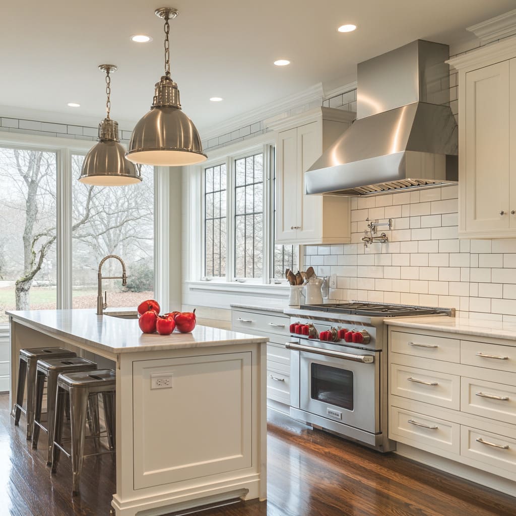
- Red Range Knobs or Stand Mixers: A pop of red, especially in an appliance or detail with a defined shape, draws the eye without competing with the design.
- Fresh Herbs and Plants: Tucking a basil plant on a shelf or placing a fern near the sink brings in organic shapes and a hint of green that softens all the clean lines.
- Wood Accents: Cutting boards with live edges, a carved bowl, or a wooden spoon jar on the counter introduces warmth and movement.
What looks like effortless placement is often carefully considered. A cutting board leaning against a backsplash near the window might be there to catch afternoon light.
A bowl of lemons might sit where the yellow lifts the space in shadowed corners. These details matter because they create breaks in the repetition.
In kitchens with lots of soft whites and pale stone, these touches prevent everything from blending together. They give the space a lived-in rhythm—quiet but intentional.
Final Thoughts
White modern farmhouse kitchens are more thoughtful than they first appear. What seems like a clean and simple space often holds dozens of layered decisions—small shifts in paint warmth, subtle grout contrasts, or a quiet mix of finishes that work together instead of standing out.
These kitchens don’t rely on bold statements. They succeed because of how well every surface, line, and material plays off the next.
Designers use detail to build atmosphere. The placement of a brass knob, the texture in a tile backsplash, or the tone of a floating shelf can shape the room’s entire rhythm.
It’s less about showing off and more about keeping things balanced—warm but not heavy, polished but still easy to live in.
That balance is what makes these kitchens feel lasting. They’re not chasing trends, they’re refining choices—making small, smart calls that hold up over time.
Whether the inspiration comes from a farmhouse in the Midwest or a coastal home in the South, what ties them all together is the quiet confidence built into every corner.
Related Posts

Harmony Home Design brings 10+ years of residential interior design experience to the ideas shared here. We publish design concepts, layout thinking, and practical styling notes.
