The Role of Textured Wallpaper in Bedroom Design:
In today’s design world, bedrooms have evolved from merely functional spaces into personal retreats that showcase style, comfort, and individuality. One of the simplest and most impactful ways to breathe new life into a bedroom is through the use of textured wallpaper and upholstery.
These elements allow you to elevate the ambiance, providing warmth, depth, and visual interest. In this guide, we’ll explore how to thoughtfully incorporate textures into your bedroom design, offering practical tips and insights that will help you create a space that feels both sophisticated and comfortable.
How can adding texture in a bedroom impact its overall look and feel based on what’s shown in the bedroom images?
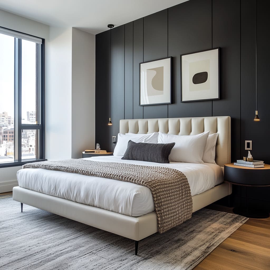
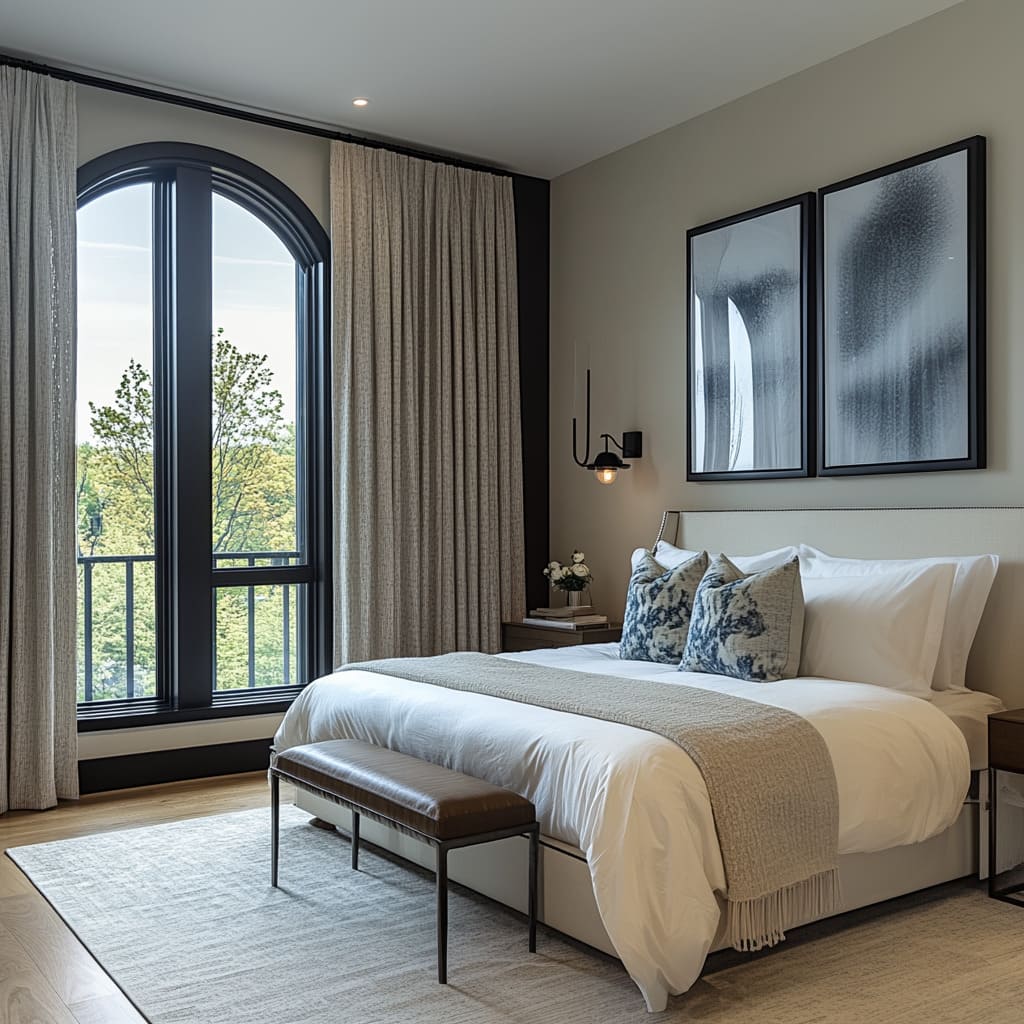
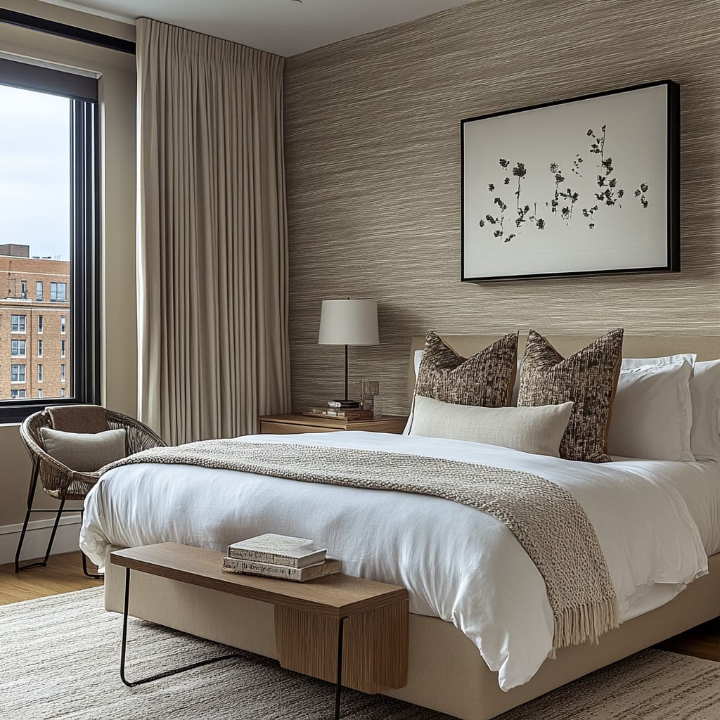
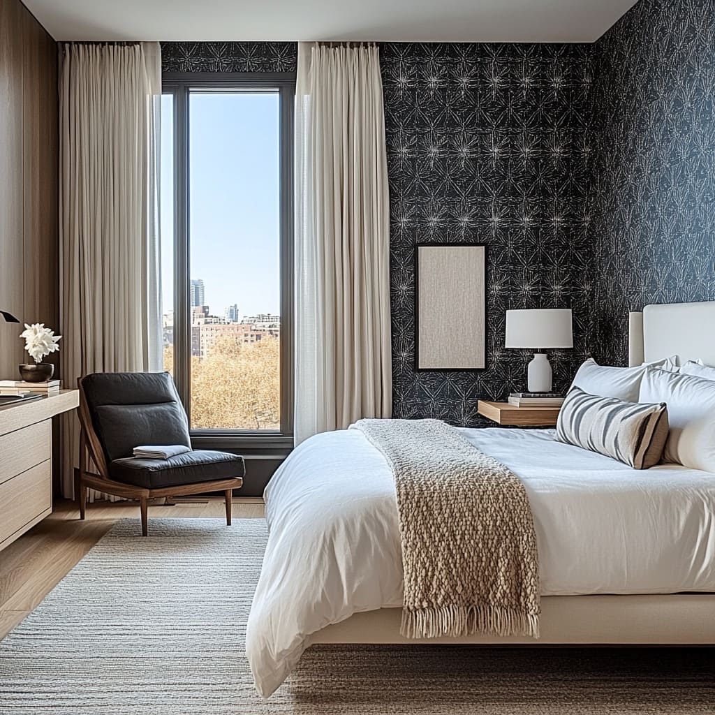
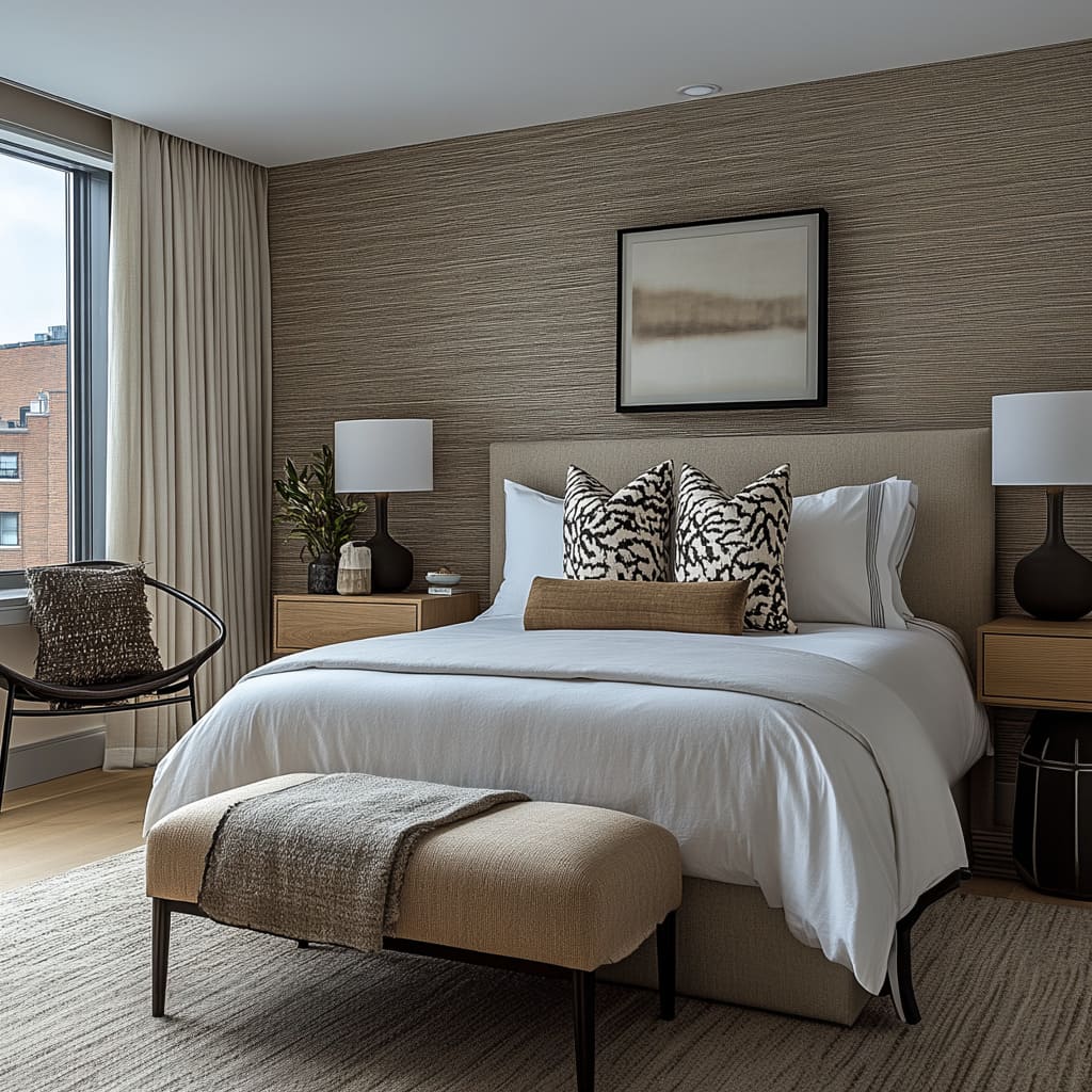
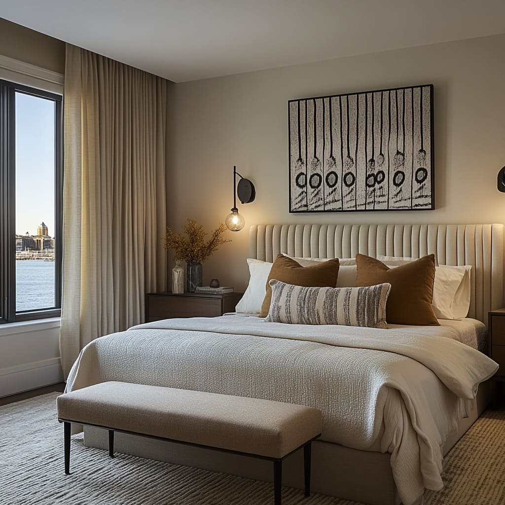
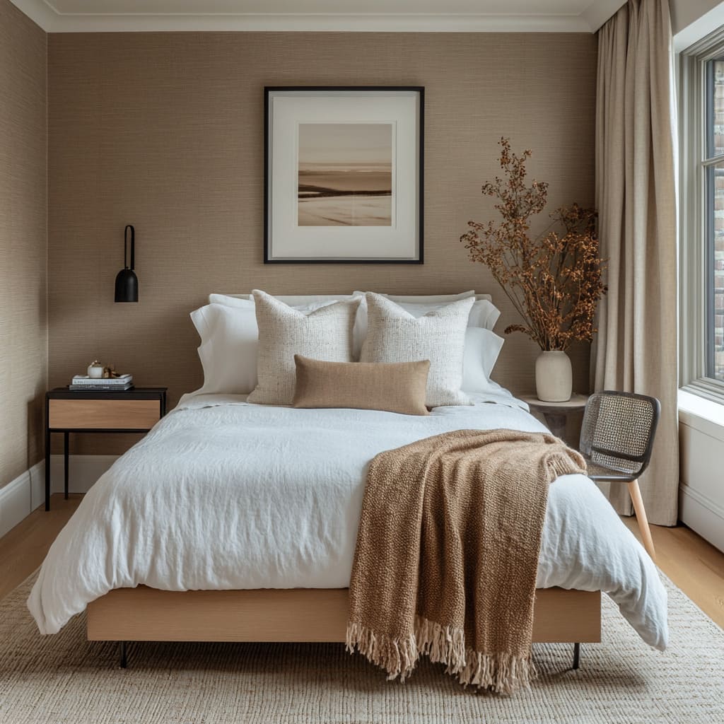
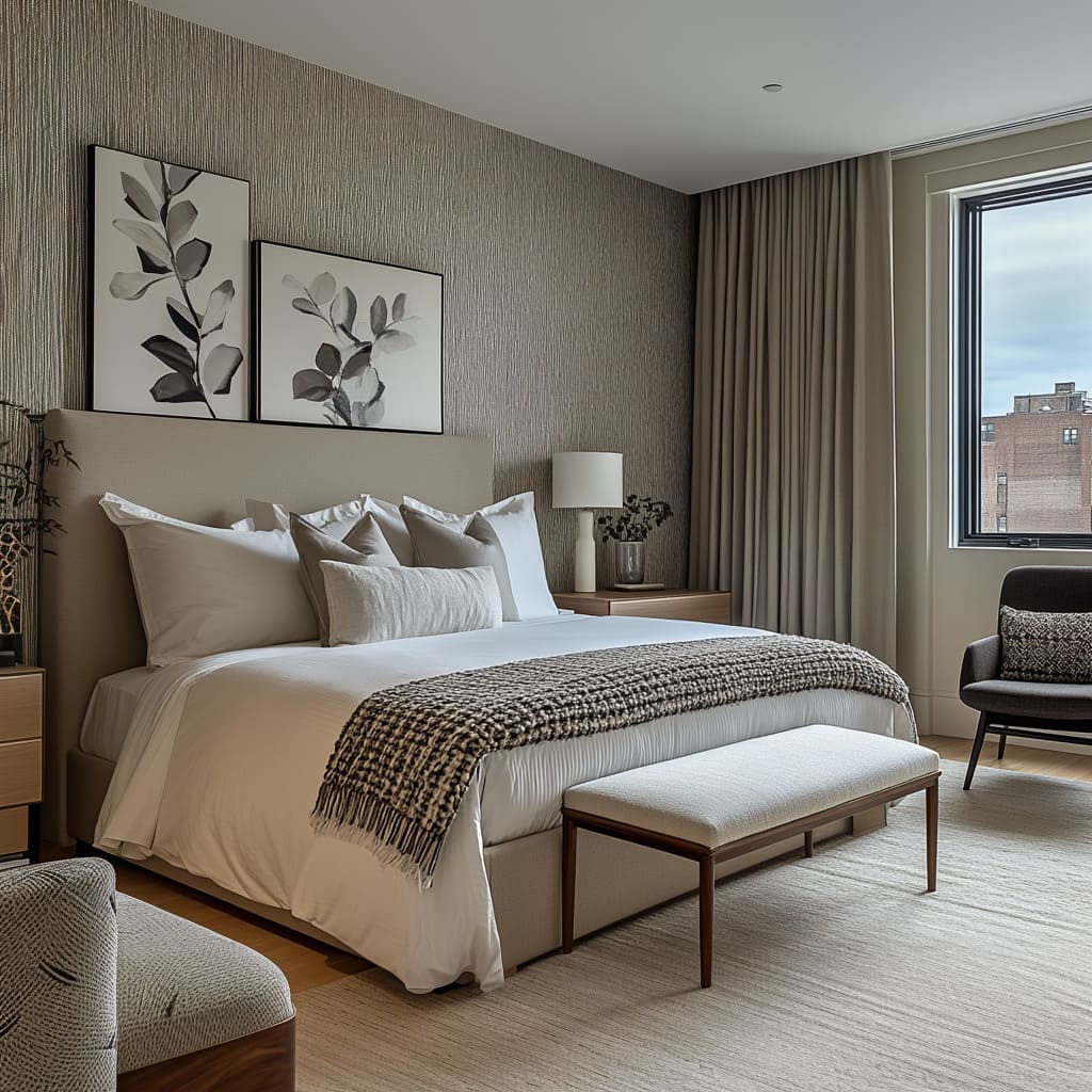
Textures, whether through wallpaper, upholstery, or bedding, create visual depth and tactile variety, making the space more engaging. For example, the use of textured wallpaper behind the bed immediately draws the eye and sets a focal point, giving the room a dynamic feel without the need for additional bold colors.
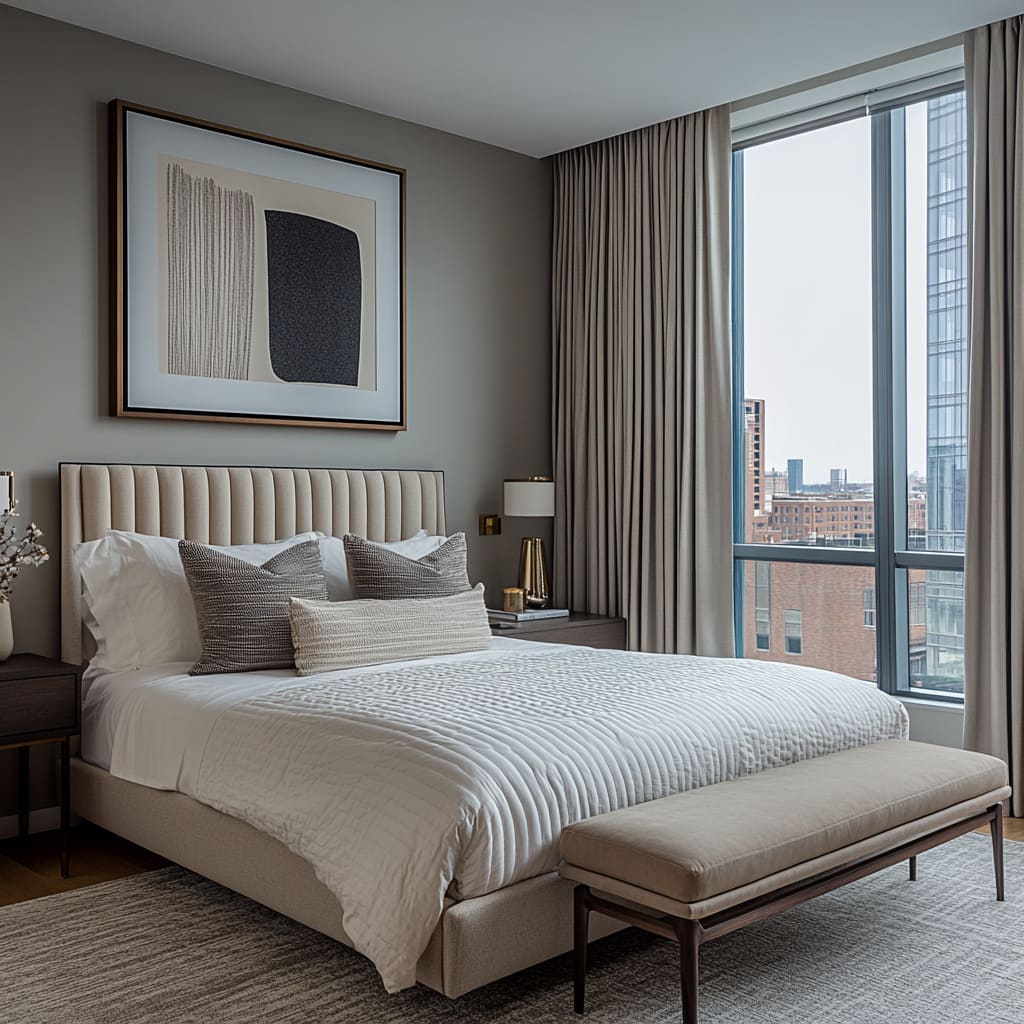
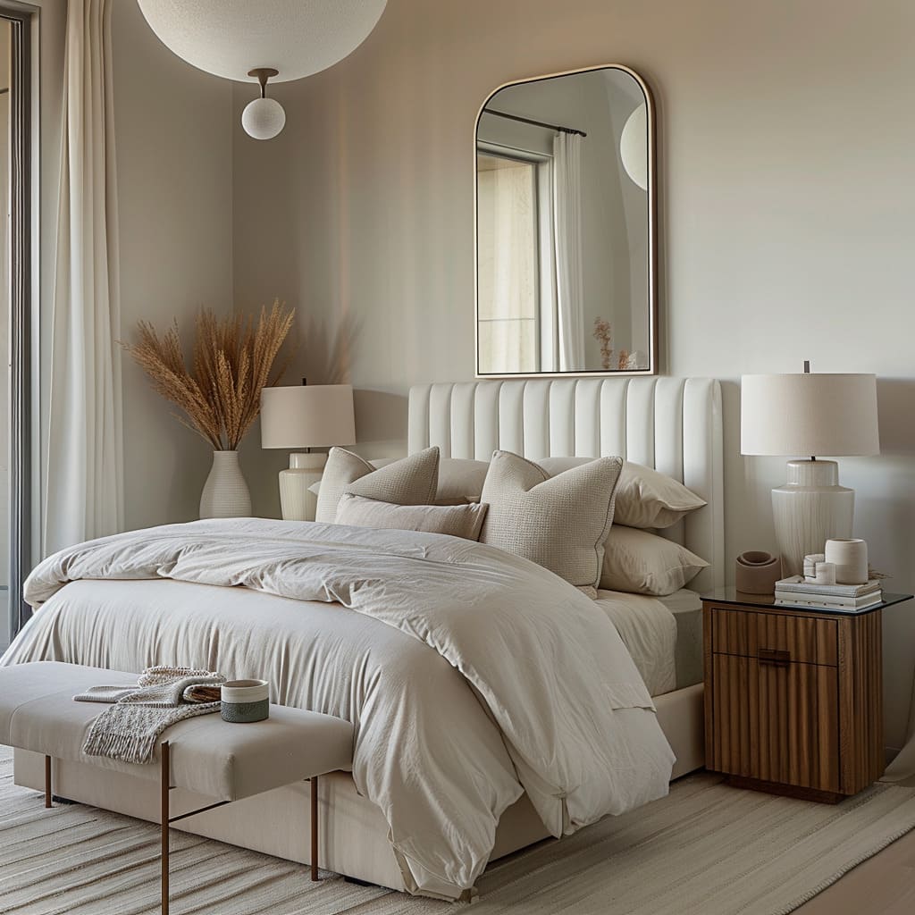
Upholstered elements, like the headboard and bench, add softness and comfort, inviting you to relax while balancing the sleek furniture and minimalist decor
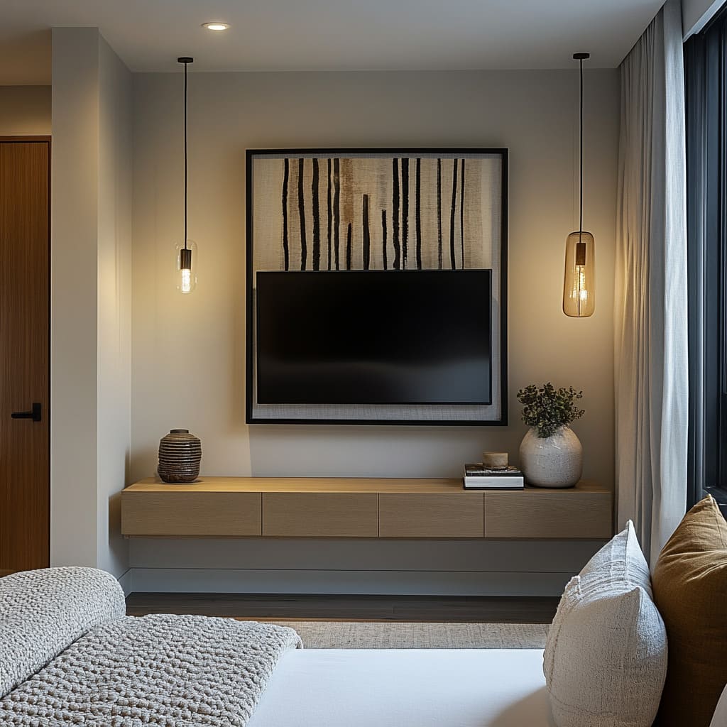
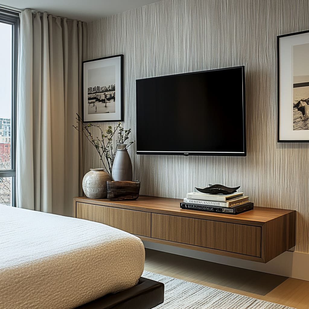
In the images, the combination of smooth surfaces, like the wooden floating console, with more textured pieces, like knitted throws or woven pillows, helps break up the uniformity, adding dimension to the room. The texture makes the space feel warmer, more inviting, and visually rich.
Without these textured elements, the room might feel flat or sterile, but with them, it becomes a balanced mix of comfort and style.
How do the large windows in the bedroom images enhance the design when paired with textured elements?
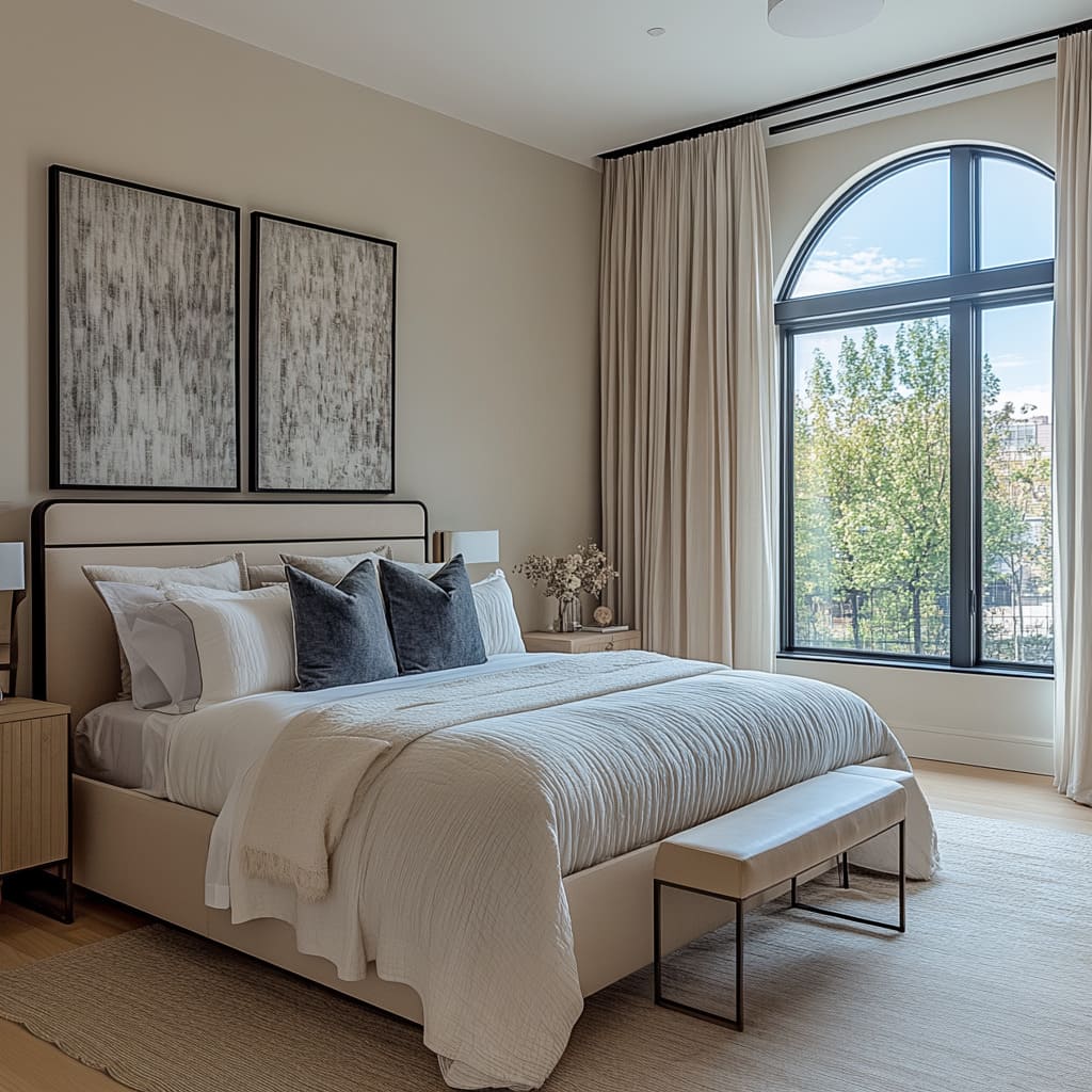
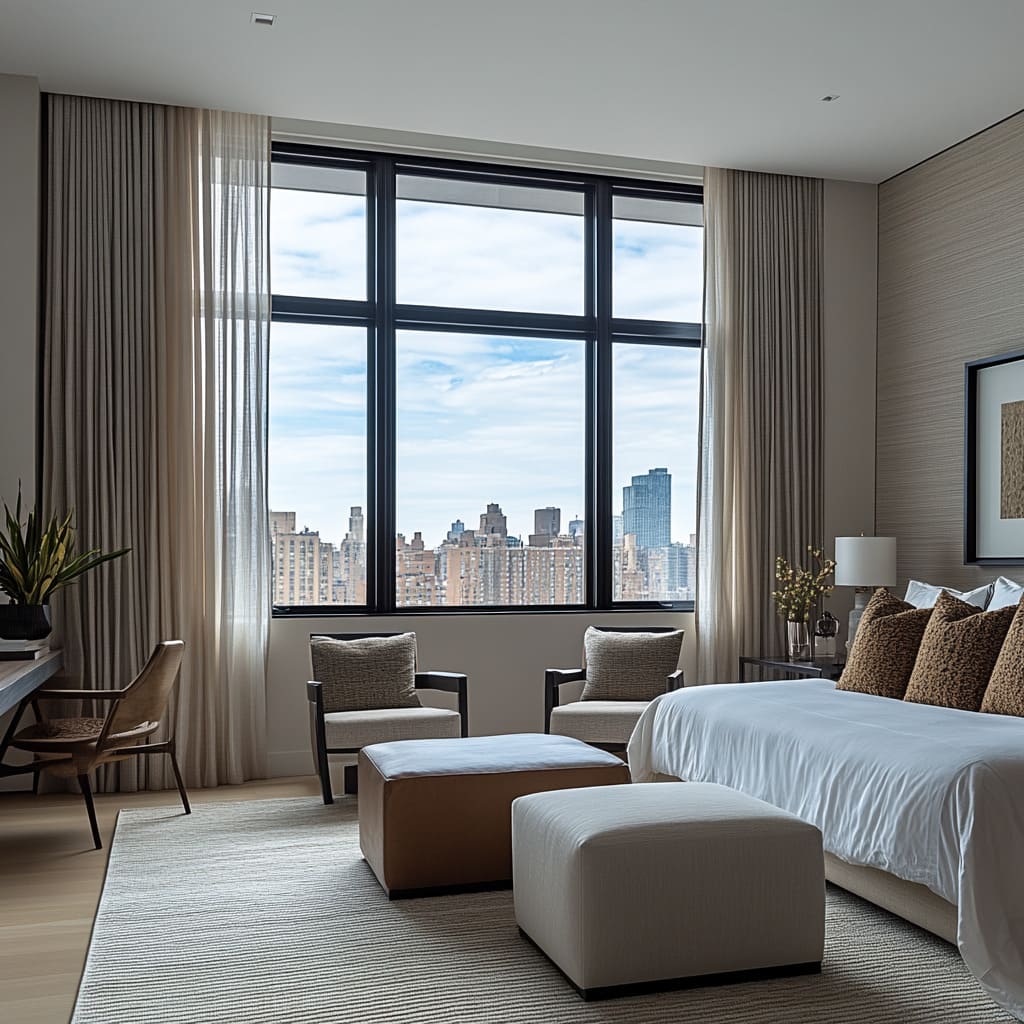
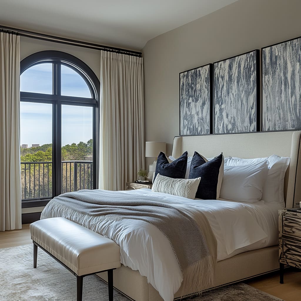
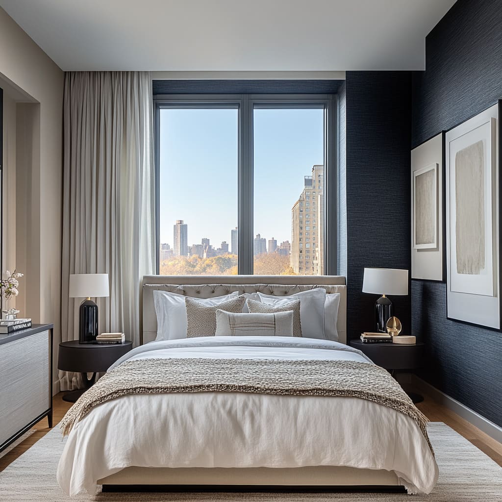
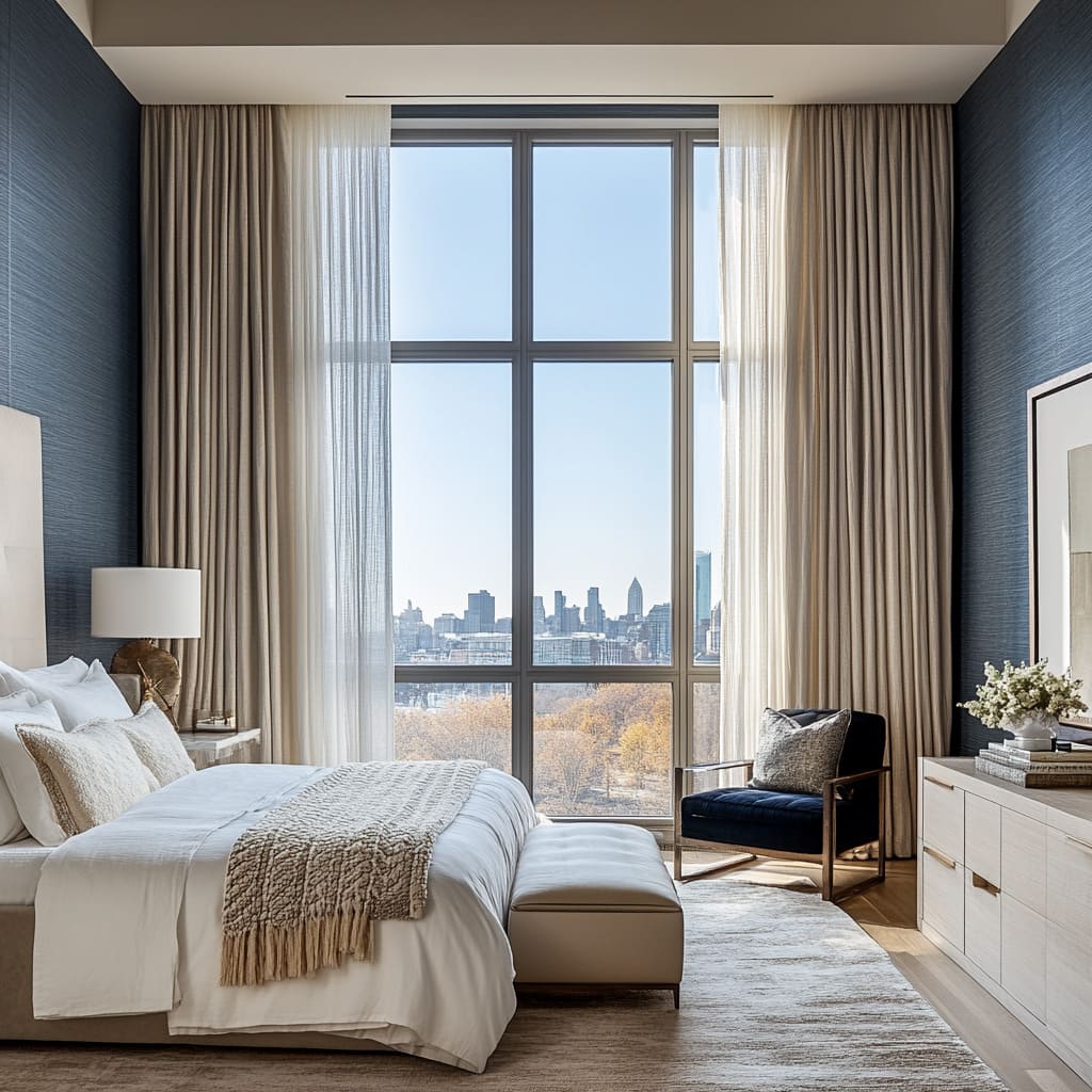
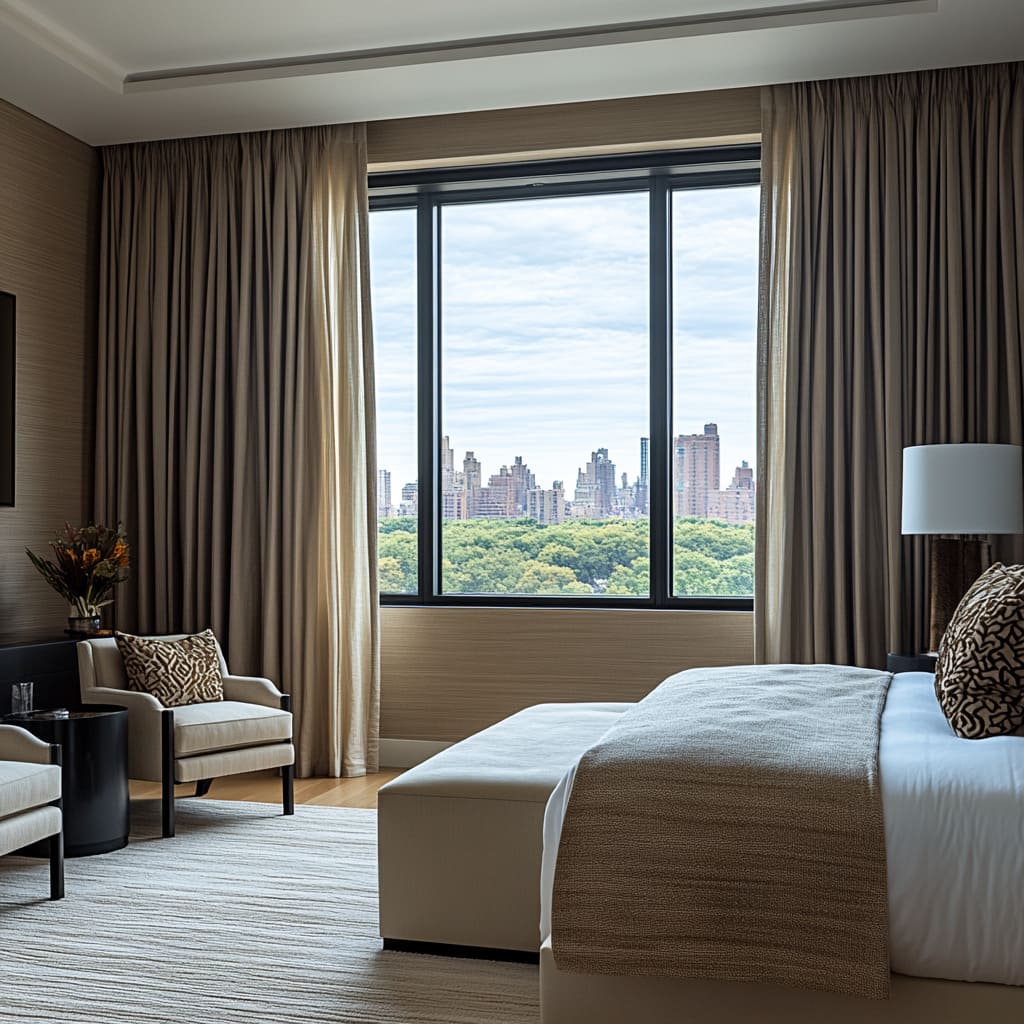
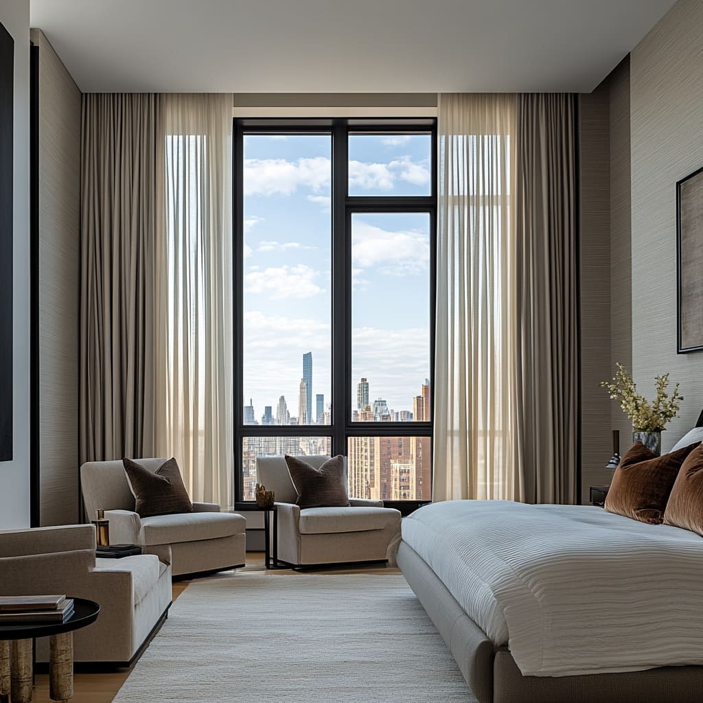
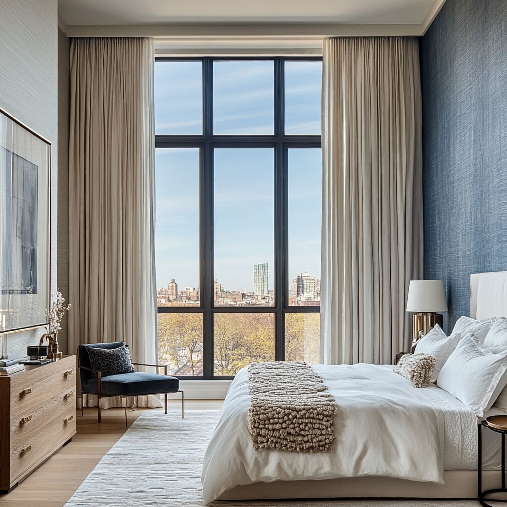
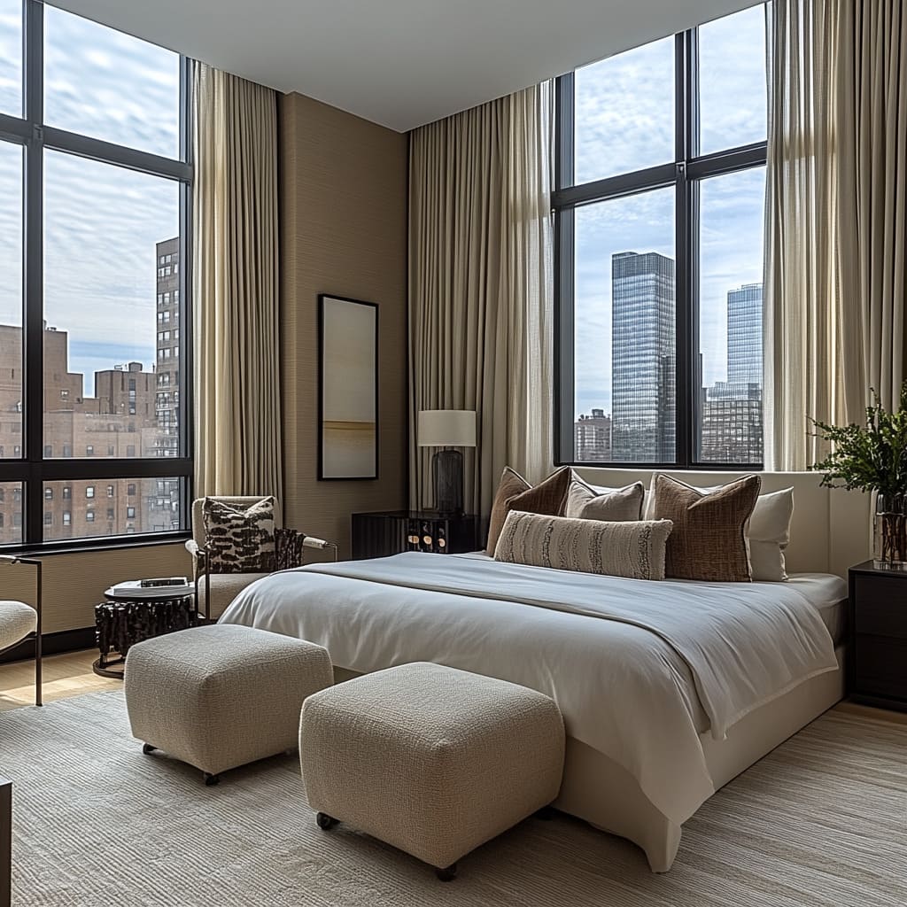
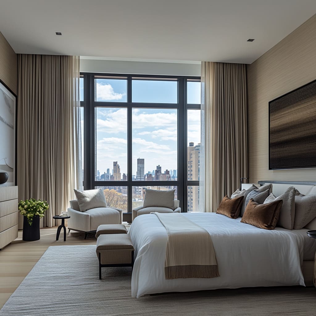
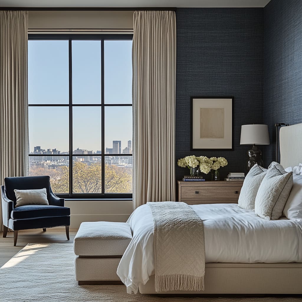
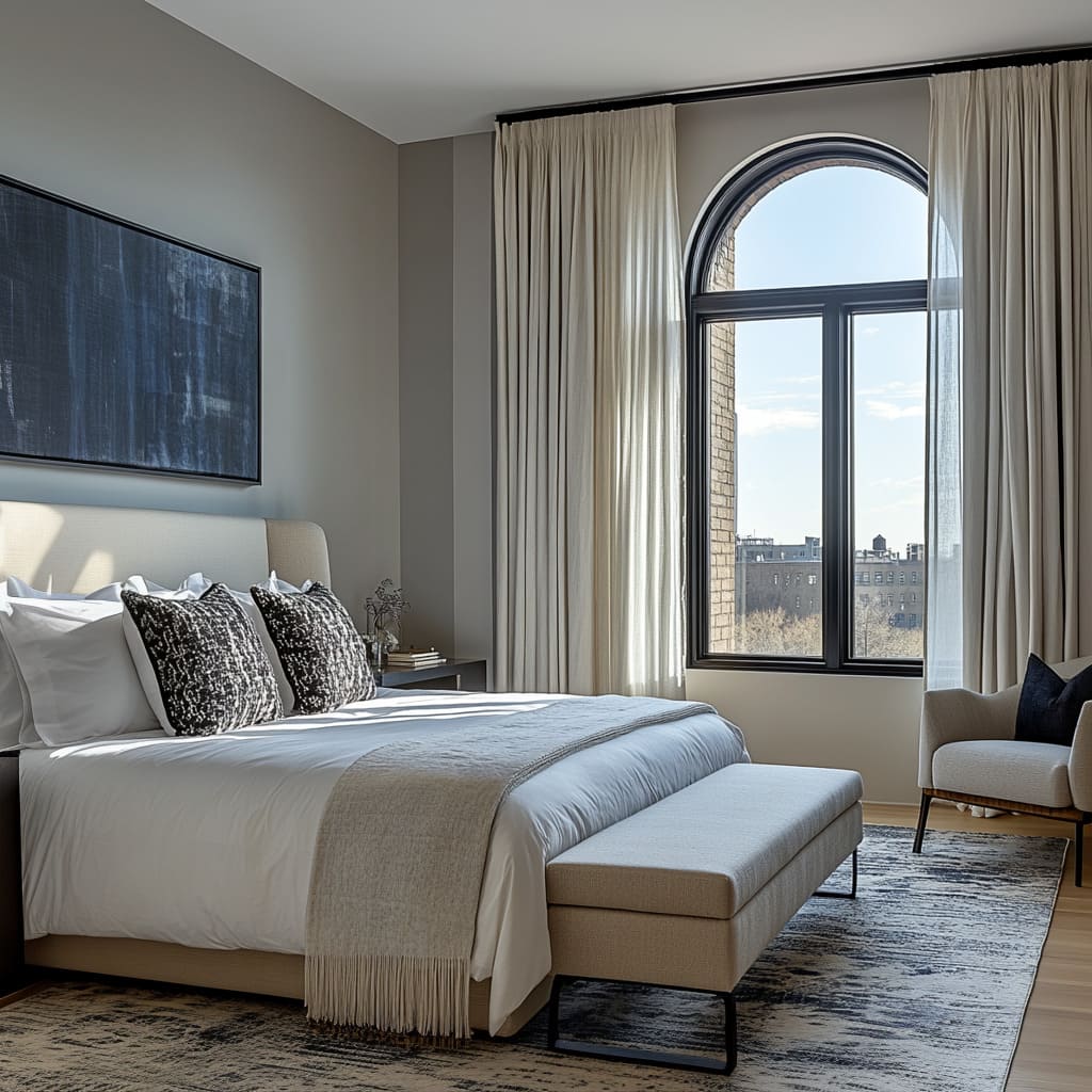
The large windows in the bedroom play a significant role in enhancing the overall design, particularly when paired with textured elements. These windows introduce an abundance of natural light, which interacts beautifully with the textures throughout the room, creating a sense of movement and depth that changes throughout the day.
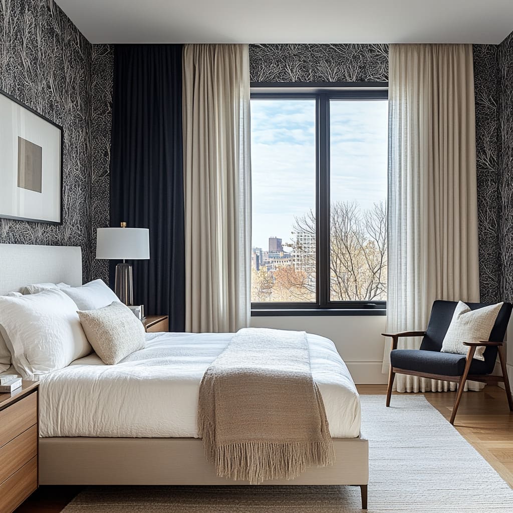
The light, both direct and ambient, highlights the subtle details of textured wallpaper, emphasizing the raised or patterned surfaces that might otherwise go unnoticed in dim or artificial lighting. For example, in rooms where botanical or abstract-patterned wallpaper is used, as seen in some of the images, the sunlight accentuates the intricate lines and curves in the design.
This interplay of light and shadow creates a three-dimensional effect, making the walls feel dynamic and adding a lively element to what could otherwise be a flat or static surface. The textural quality of the wallpaper becomes more apparent under natural light, adding a rich layer of visual interest to the room.
When it comes to upholstery, such as the soft headboard or upholstered bench at the foot of the bed, the natural light from the large windows adds a softness that enhances their cozy appeal. The sunlight reflects off the smooth, plush fabric, making the bed and seating areas seem more inviting and comfortable. The play of light on these fabrics also brings out their texture in ways that artificial lighting might not, showing off the woven patterns in the pillows, the softness of the headboard, or the subtle sheen in the upholstery
Moreover, the large windows prevent the room from feeling too heavy despite the rich textures. Without the natural light, a room with multiple textures—textured wallpaper, plush bedding, upholstered furniture—could potentially feel enclosed or overly complex.
The open view through the windows, along with the bright natural light they introduce, balances out these heavier elements, ensuring the room feels spacious and breathable. The lightness provided by the windows contrasts with the textured surfaces, ensuring the textures don’t overwhelm the space but rather complement it.
The windows also provide a clear view of the outside, which can act as a calming, expansive visual element. The balance between the interior textures and the smooth, uninterrupted view outside offers a harmonious contrast, helping the room feel more connected to the surrounding environment.
The natural textures inside, like wood and fabric, paired with the external view of the city or landscape, create a cohesive design that blends the indoors and outdoors seamlessly. In summary, the large windows enhance the textured design elements by allowing natural light to emphasize the richness of the materials, showcasing their depth and dimension, while also balancing the room’s overall feel.
The windows open up the space, keeping it light and airy, ensuring the textures feel intentional and inviting rather than overwhelming.
In what way do the upholstered elements in the photos complement the other design features like wooden furniture and artwork?
The upholstered elements work seamlessly with the other design features, such as wooden furniture and artwork, creating a harmonious and balanced aesthetic throughout the room. The combination of different textures, especially between the soft fabrics and natural wood, offers a rich, layered experience that feels both cohesive and inviting
Upholstery, like the headboard, bench, and pillows, introduces softness into the room, which contrasts beautifully with the clean, sleek lines of the wooden furniture. For example, the floating wooden console, with its smooth surface and natural wood grain, provides a solid and grounded element in the space. Paired with the plush, upholstered headboard or bench, the contrast creates a balance between hard and soft, warm and cool, establishing a more dynamic environment.
The upholstery adds warmth and coziness, making the room feel comfortable, while the wood contributes a sense of structure and durability. The colors and materials of the upholstery also complement the tones in the wooden furniture.
For instance, neutral tones in the upholstered pieces, like light beige or soft cream, match the warmth of the wooden console or side tables, ensuring that neither material feels out of place. The consistent color palette across the different textures helps the room feel unified, as the fabrics and wood share the same tones and work together instead of clashing.
Additionally, the upholstered elements complement the artwork by adding texture where the art brings visual complexity. If the artwork, for example, features bold black-and-white designs, the smooth, neutral-toned upholstery provides a contrast that helps highlight the art without distracting from it. The fabric, being soft and tactile, allows the artwork to take center stage visually while the upholstered items add depth and comfort to the room.
In this way, the upholstered pieces not only provide physical comfort but also help balance and soften the room’s more rigid elements, like the angular shapes of the wooden furniture and the framed artwork. Together, these components create an environment that feels well thought out and complete, where each element enhances the others rather than competing for attention.
Creating a Focal Point with an Accent Wall
One of the most effective ways to use textured wallpaper is by creating an accent wall. Typically, this wall is behind the bed, serving as a backdrop that anchors the room. By placing wallpaper on just one wall, you add interest without overwhelming the space.
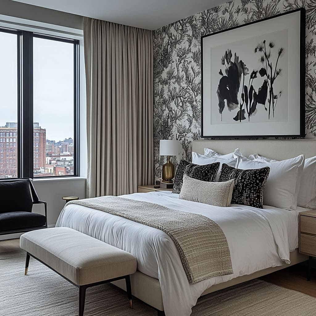
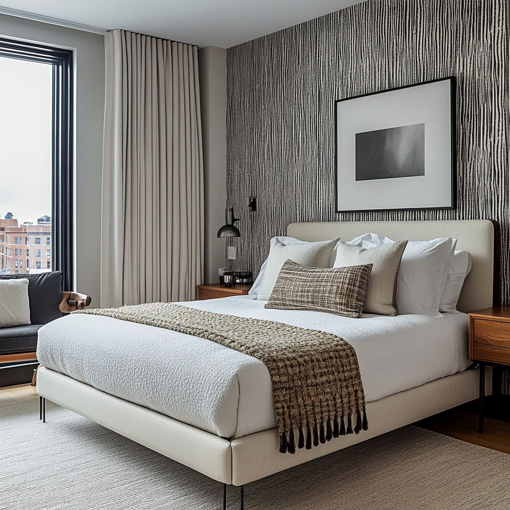
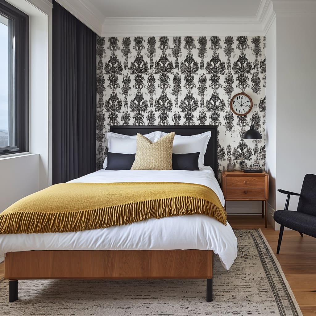
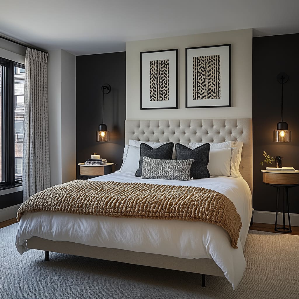
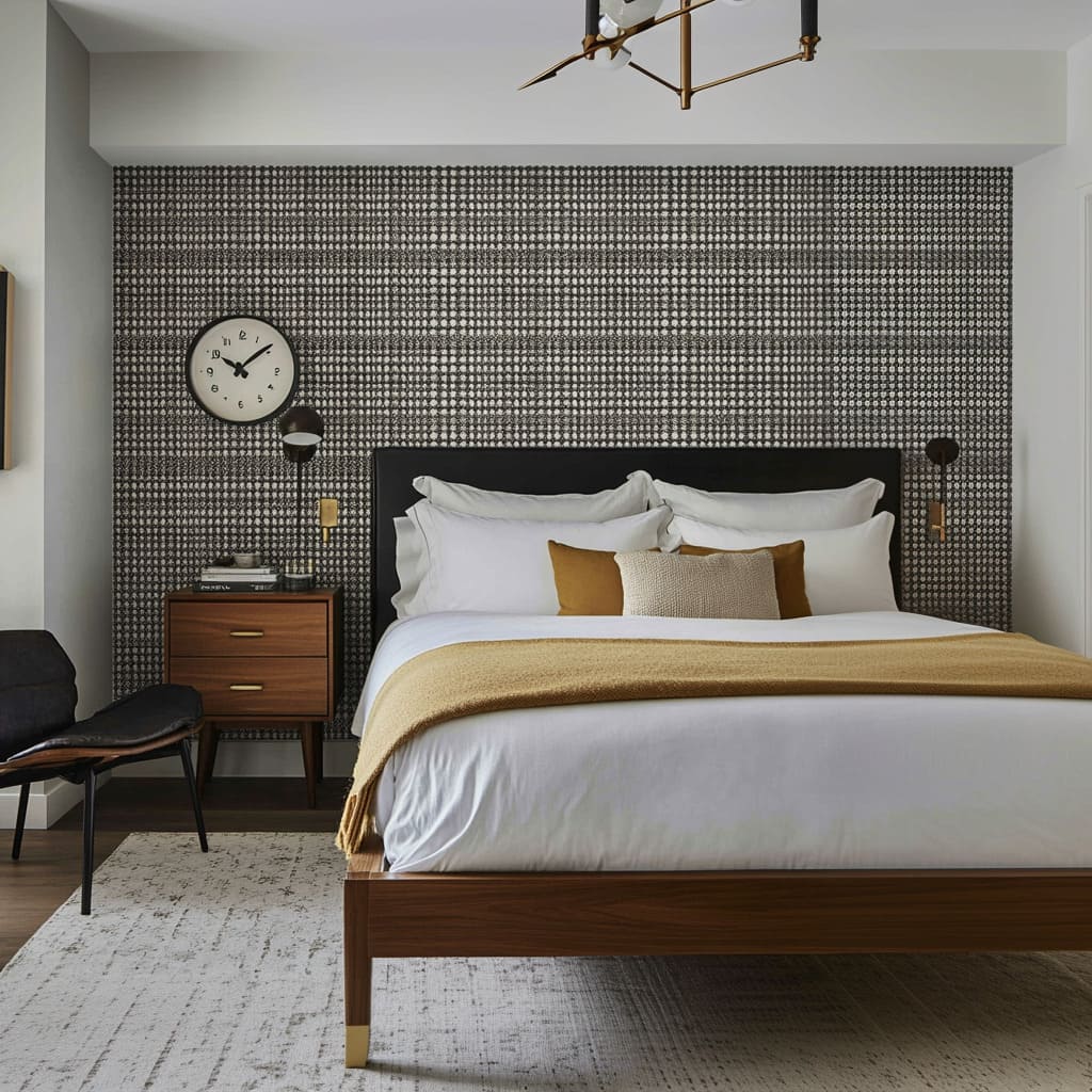
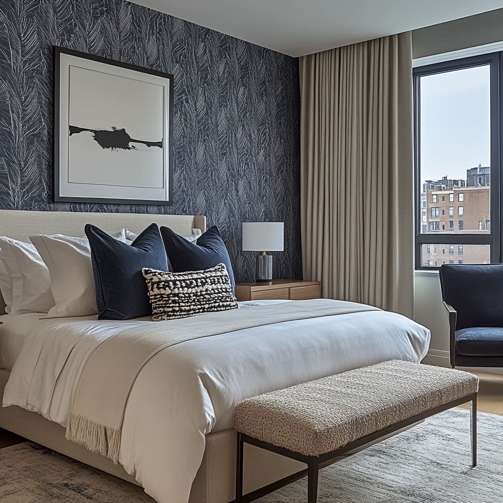
For example, a black-and-white botanical wallpaper can offer both contrast and sophistication. The intricate, nature-inspired design creates a visual statement that draws the eye without feeling too bold. This technique works well in bedrooms where other walls remain neutral, allowing the textured wallpaper to stand out while keeping the overall design balanced.
How does the black-and-white botanical wallpaper enhance the room’s design while still keeping it balanced?
The black-and-white botanical wallpaper enhances the room’s design by introducing a bold, nature-inspired pattern that adds depth and visual interest, while its monochromatic palette ensures the space remains balanced and cohesive. The contrast of black and white creates a dynamic backdrop that draws attention, yet the simplicity of the color scheme prevents it from overwhelming the room. This combination of intricate pattern and neutral colors makes the wallpaper stand out without clashing with other design elements
One of the key ways this wallpaper enhances the room is through its ability to anchor the space. Positioned as an accent wall behind the bed, the botanical design immediately draws the eye, serving as a focal point that frames the bed and complements the upholstered headboard.
The organic shapes in the wallpaper soften the room’s clean lines, such as the sleek floating console or the angular artwork, bringing a sense of balance between the room’s modern elements and its more natural, flowing design. Despite its bold pattern, the black-and-white color scheme allows the wallpaper to seamlessly blend with the room’s other textures and tones.
Because it stays within the neutral palette, it complements the beige tones in the bedding and the natural wood grain of the furniture, ensuring that the room feels cohesive rather than visually busy. The monochromatic nature of the wallpaper ensures that it enhances, rather than competes with, the room’s other elements like the artwork, furniture, and upholstery.
Furthermore, the pattern of the botanical wallpaper adds texture to the room without relying on heavy materials, which keeps the overall look light and open. The black lines of the pattern are delicate and detailed, creating a textured effect that works well with the room’s softer elements, such as the upholstered headboard and pillows.
This gives the space depth and dimension, while still maintaining the minimalist, airy feel created by the large windows and neutral palette. In summary, the black-and-white botanical wallpaper enhances the room by providing a bold yet balanced backdrop that complements the modern furniture and soft textiles.
Its pattern adds texture and visual interest, while the neutral color palette ensures harmony with the rest of the room’s design. By striking this balance, the wallpaper helps create a sophisticated, layered space without overwhelming the serene, minimalist feel of the room
What impact does an accent wall have when paired with simple, upholstered furniture, as shown in the images?
An accent wall, when paired with simple upholstered furniture, creates a striking yet harmonious contrast that enhances both elements in the design. In the images, the accent wall—particularly the one with the black-and-white botanical wallpaper—serves as a bold, eye-catching feature that immediately draws attention, while the upholstered furniture provides a soft, calming balance. This pairing allows the room to have a focal point without overwhelming the overall aesthetic, creating a space that feels thoughtfully designed and cohesive.
The impact of the accent wall lies in its ability to introduce texture and pattern without needing additional complex design elements. When placed behind a piece of upholstered furniture, like the bed’s headboard or a bench, the wall visually anchors these simpler pieces, giving them more prominence in the room.
The softness of the upholstery contrasts with the visual complexity of the wallpaper, making the furniture feel even more inviting while preventing the wall from overpowering the space. Because the upholstered furniture in the images is neutral and streamlined, it allows the accent wall to take center stage.
The neutral tones of the headboard and bench blend subtly into the room, leaving the accent wall to add the primary visual interest. However, rather than competing for attention, the upholstered pieces complement the accent wall by softening its bold design.
This ensures that the overall design remains balanced, with the accent wall providing energy and focus while the furniture offers comfort and simplicity. In addition, the accent wall enhances the room’s depth by creating layers of texture.
The bold, intricate wallpaper serves as a dynamic backdrop, while the upholstered furniture adds tactile warmth and coziness. This layering effect creates a visually rich environment, where the eye is drawn to both the details of the wallpaper and the inviting nature of the furniture.
The simple, neutral furniture acts as a counterbalance to the accent wall’s complexity, ensuring that the room feels visually interesting but not chaotic. In summary, the pairing of an accent wall with simple upholstered furniture elevates both elements, creating a room that feels stylish yet balanced.
The accent wall adds personality and depth, while the furniture keeps the design grounded and comfortable, resulting in a well-thought-out space that feels cohesive and inviting.
How do the patterns in the wallpaper interact with the rest of the bedroom’s minimalistic elements?
The patterns in the wallpaper interact with the bedroom’s minimalistic elements by introducing a sense of movement and visual complexity without disrupting the clean, simple aesthetic of the space. In the images, the wallpaper’s detailed botanical pattern creates a striking contrast to the otherwise straightforward design of the room, which is defined by neutral tones, uncluttered surfaces, and modern, streamlined furniture.
This interplay between the detailed wallpaper and minimalistic elements brings balance to the room, ensuring it feels neither too sparse nor overly decorative. The organic shapes in the wallpaper’s botanical pattern soften the linear, geometric forms of the minimalist furniture. For example, the floating wooden console and sleek bed frame feature clean, angular lines, which are complemented by the fluid, curving lines in the wallpaper.
This contrast between organic and structured elements adds depth to the design, preventing the space from feeling too rigid or stark. The wallpaper’s natural forms introduce a sense of softness, which helps to warm up the minimalistic layout without overwhelming the simplicity of the space.
Moreover, the monochromatic nature of the wallpaper aligns with the room’s restrained color palette, ensuring that the pattern doesn’t feel out of place in a minimalist setting. The black-and-white tones of the wallpaper blend harmoniously with the neutral beige, gray, and wood accents found in the upholstered furniture, bedding, and wooden console.
This consistency in color helps maintain the room’s minimalist integrity, allowing the wallpaper to add visual interest without clashing with the surrounding design. The scale of the pattern also plays a crucial role in how the wallpaper interacts with the minimalistic elements. The detailed, intricate design offers just enough texture to catch the eye, but because it’s limited to one accent wall, it doesn’t overwhelm the space.
The minimalist approach in the rest of the room—such as the smooth surfaces, simple bedding, and uncluttered furnishings—ensures that the wallpaper acts as a focal point rather than competing with other elements for attention. In essence, the interaction between the wallpaper and the minimalistic elements creates a balanced composition where both simplicity and complexity coexist. The minimalist furniture provides a calm, neutral base, while the wallpaper adds just the right amount of pattern and texture to keep the room visually engaging.
This thoughtful contrast elevates the overall design, giving the bedroom a unique personality while maintaining the serene and uncluttered atmosphere typical of minimalistic interiors.
Choosing the Right Pattern and Color for Your Space
When selecting textured wallpaper, it’s important to choose patterns and colors that enhance your bedroom’s existing features.
For smaller bedrooms, opt for softer, more neutral patterns that won’t make the room feel crowded. Large-scale patterns can overpower tight spaces, while smaller, repetitive designs like a linen-textured wallpaper can create a subtle yet refined look. As for color, consider a palette that complements your furniture and bedding. Soft grays, beiges, and creams tend to work well in bedrooms, as they evoke a sense of calm.
If your bedroom has darker furniture or metal accents, a monochromatic pattern like the one described in the example above can tie the room together seamlessly.
Why are neutral tones and smaller patterns particularly effective in smaller bedrooms, as shown in the images?
Neutral tones and smaller patterns are particularly effective in smaller bedrooms because they create a sense of openness and airiness, preventing the space from feeling crowded or overwhelming. In the images, the use of soft, light tones—like beiges, creams, and soft grays—helps reflect natural light, making the room appear larger than it actually is.
These neutral colors recede visually, allowing the eye to move freely across the room without being stopped by bold or intense hues. This openness enhances the sense of space, making the room feel less confined. When it comes to patterns, smaller, more delicate designs work well in compact spaces because they add visual interest without dominating the room. In a smaller bedroom, large or overly bold patterns can make the walls feel closer, creating a more enclosed, busy feeling.
By contrast, smaller patterns, like the subtle botanical designs seen in the wallpaper, provide texture and personality without overwhelming the space. These smaller patterns act as an accent rather than a focal point, blending seamlessly with the other elements of the room while still adding depth
Neutral tones also allow the room’s other elements—such as upholstered furniture, bedding, and wooden finishes—to shine without competing for attention. In a smaller bedroom, it’s important to keep a sense of cohesion, and neutral tones create a calm, unified backdrop that makes it easier to layer textures and patterns.
This allows you to add decorative elements, like textured throws or accent pillows, without making the space feel too busy. In the images, the upholstery, wooden furniture, and patterned wallpaper all harmonize thanks to the neutral tones, ensuring the room feels light, spacious, and balanced.
By choosing neutral tones and small-scale patterns, the room maintains a feeling of simplicity and elegance, ensuring that no one element overpowers the space. This makes it easier to introduce different textures, materials, and furnishings while keeping the room visually open and welcoming. In smaller bedrooms, where space is at a premium, this strategy maximizes the sense of comfort and style without making the room feel cluttered.
How do the selected wallpaper patterns work in harmony with the lighting choices in the bedrooms seen in the photos?
The selected wallpaper patterns work in harmony with the lighting choices by using both natural and artificial light to emphasize the texture and depth of the design without overwhelming the room. In the photos, the wallpaper features intricate botanical patterns that are softened by the surrounding lighting, creating a balanced and visually pleasing interaction between light and pattern. The lighting choices, including both natural light from large windows and carefully placed artificial lighting, help to highlight the details of the wallpaper while maintaining a calm, balanced atmosphere in the bedroom.
Natural light streaming through the large windows enhances the delicate patterns of the wallpaper, drawing attention to the intricate design without making it feel too bold. Sunlight accentuates the light and dark contrasts in the black-and-white wallpaper, creating subtle shadows and depth that bring the pattern to life. The light reflects off the neutral tones in the room, making the space feel airy and open, which helps prevent the patterned wallpaper from feeling too intense.
The combination of natural light and soft patterns ensures that the room remains visually interesting yet uncluttered. At night or during darker hours, the artificial lighting—such as the wall sconces or pendant lights—creates a warm, inviting glow that interacts with the wallpaper’s texture. The lighting fixtures are strategically placed to ensure the wallpaper remains a focal point, casting just enough light to highlight the intricate details without overwhelming the space. The soft, ambient light from the sconces enhances the natural shapes in the wallpaper’s botanical pattern, creating gentle shadows that emphasize the design’s depth and complexity
Additionally, the minimalistic nature of the lighting fixtures themselves—such as sleek, modern pendant lights—ensures that they do not compete with the wallpaper’s pattern. Instead, they complement it by providing a subtle, indirect light that enhances the room’s overall aesthetic.
The lighting choices help to create a layered, dynamic look, where the patterns in the wallpaper become more pronounced or understated depending on the time of day and the source of light. In summary, the interplay between the wallpaper patterns and the lighting choices allows the design to shift and adapt with the changing light, creating a room that feels dynamic and layered.
The lighting serves to enhance the wallpaper’s intricate details while maintaining balance, ensuring that the patterns remain a sophisticated and integrated part of the room’s overall aesthetic
What specific colors and textures in the images would work well in bedrooms with darker furniture?
The specific colors and textures in the images that would work well in bedrooms with darker furniture include neutral tones like soft beiges, light grays, and creams, paired with subtle textures in upholstery and wallpaper. These lighter shades provide a contrast to darker furniture, helping to balance the overall look of the room while preventing it from feeling too heavy. The contrast between dark furniture and lighter walls or upholstery creates a layered effect that adds depth and sophistication. For example, the upholstered headboard in light beige seen in the images works beautifully against dark wood or metal bed frames. This contrast allows the upholstered piece to stand out while also softening the impact of the darker furniture.
Similarly, a floating wooden console in a medium or light wood tone, as shown in the photos, would complement dark bedside tables or dressers by introducing a natural element that offsets the room’s heavier features. When it comes to wallpaper, a black-and-white botanical pattern like the one in the images provides a stylish contrast to dark furniture. The monochromatic pattern offers a contemporary and elegant touch that blends seamlessly with dark wood or metal pieces.
The light-colored background of the wallpaper keeps the room feeling open and airy, while the darker pattern ties in with the furniture, creating a cohesive look
Textures also play a key role in balancing darker furniture. Upholstered elements, such as a plush beige bench or pillows with soft, woven fabrics, add a tactile dimension that contrasts with the harder surfaces of dark furniture. These textures, along with light, neutral bedding, help to break up the visual weight of the furniture, ensuring that the room doesn’t feel too imposing or stark.
In conclusion, the lighter, neutral tones and soft textures seen in the images work perfectly in rooms with darker furniture, creating a balanced and harmonious environment. The contrast between dark and light allows for a sophisticated, layered look where each element complements the other, resulting in a bedroom that feels inviting and thoughtfully designed.
Textured Wallpaper as a Backdrop for Art and Furniture
Textured wallpaper can also serve as the perfect backdrop for other decorative elements, like artwork or key furniture pieces. In the bedroom, the accent wall behind the bed offers a wonderful canvas for framed art. Black-and-white photography or abstract prints stand out beautifully against a textured backdrop.
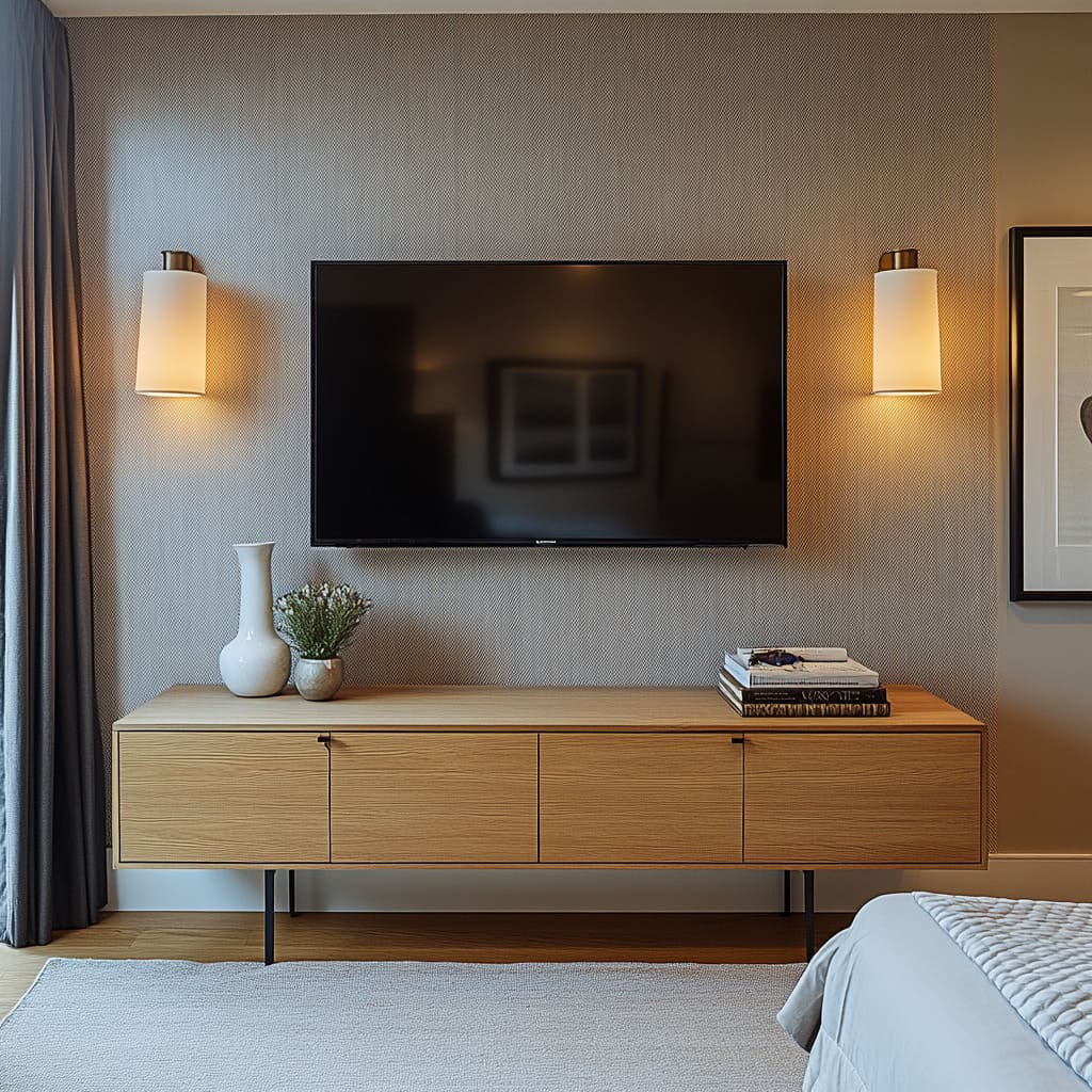
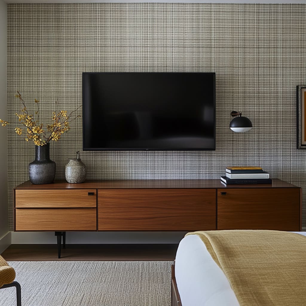
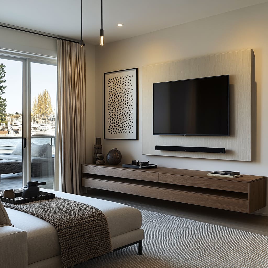
In addition, the wallpaper can highlight your furniture choices. A floating wooden console, for instance, becomes more striking when set against a textured wall, as the contrast between the sleek wood grain and the wallpaper’s tactile surface adds visual depth to the room.
How does the floating wooden console in the images interact with the wallpaper to create a cohesive design?
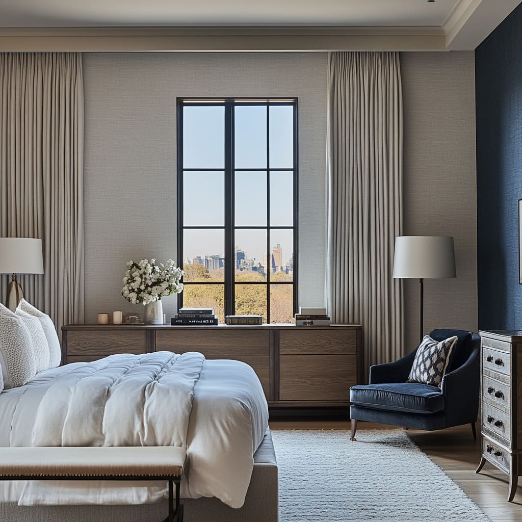
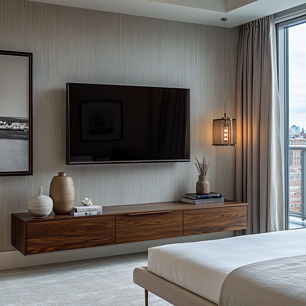
The floating wooden console in the images interacts with the wallpaper by creating a balanced contrast between natural textures and detailed patterns, contributing to a cohesive design that feels grounded yet visually dynamic. The sleek, minimalist design of the console, with its smooth wood grain and clean lines, offers a calm and natural element that complements the more intricate, organic patterns of the wallpaper. This balance of simplicity and complexity helps the two elements enhance each other without overwhelming the space.
The natural wood of the console adds warmth and texture to the room, providing a tactile contrast to the black-and-white botanical wallpaper. While the wallpaper introduces visual movement and depth with its detailed design, the console’s straightforward, unadorned appearance keeps the room feeling grounded.
The warm tones of the wood offer a soft, earthy balance to the cooler, monochromatic palette of the wallpaper, ensuring the space feels both harmonious and inviting. Additionally, the floating nature of the console contributes to the sense of openness and lightness in the room, aligning with the airy, spacious effect created by the wallpaper.
By being mounted off the floor, the console emphasizes the height and flow of the room, drawing the eye upwards towards the wallpaper’s intricate design. This interaction helps to elongate the space visually, making the room feel larger and more connected
The smooth surface of the console also provides a clean backdrop for decorative items, like the small vases and books seen in the images. These simple objects allow the console to maintain its minimalist appeal while tying into the patterns and tones of the wallpaper.
The lack of excessive decoration ensures the room doesn’t feel cluttered, letting the bold wallpaper pattern stand out as the focal point. In summary, the floating wooden console and the wallpaper work together to create a cohesive design by balancing simplicity with intricacy.
The natural, smooth texture of the wood complements the organic shapes and patterns of the wallpaper, while the contrast in tones—warm wood against cool black and white—keeps the design feeling dynamic yet unified. This careful balance between the console and wallpaper helps create a room that feels well-curated, visually interesting, and comfortable.
In what way does the placement of art above the bed, as shown in the photos, enhance the textured wallpaper?
The placement of art above the bed enhances the textured wallpaper by adding an additional layer of visual interest while drawing attention to the wall’s pattern in a subtle, complementary way. In the photos, the artwork is positioned at the center of the accent wall, directly above the upholstered headboard. This placement serves to frame both the bed and the wall, creating a cohesive focal point that brings the room together.
The art doesn’t compete with the wallpaper; instead, it highlights the texture and pattern in a way that enhances the overall design. The clean, minimal lines of the art provide a visual break from the intricate patterns of the wallpaper, allowing the eye to rest while still appreciating the wall’s detail. By placing the artwork above the bed, the room gains balance and structure, ensuring that the wallpaper doesn’t feel too dominant.
This method of layering art over textured wallpaper helps blend the two elements, adding complexity without overwhelming the space. The simplicity of the art, whether abstract or geometric, interacts with the organic nature of the botanical wallpaper, creating a contrast that adds depth.
The neutral tones of the artwork also harmonize with the monochromatic palette of the wallpaper, ensuring consistency in the room’s color scheme. Since the artwork often echoes the neutral or monochromatic tones of the wallpaper, it creates a seamless transition between the two design elements. The framed art provides a structured element that contrasts with the fluid, natural shapes in the wallpaper, creating a sense of balance and order.
This prevents the room from feeling too visually busy, while still maintaining a sophisticated, layered look
In summary, the placement of art above the bed adds a layer of structure and focus to the textured wallpaper, enhancing its intricate design while ensuring the room feels balanced and unified. The combination of framed art and wallpaper creates a thoughtful, cohesive design that ties the entire room together, allowing both elements to stand out without clashing.
How do the contrasts between wood tones and wallpaper textures add dimension to the bedroom design in the images?
The contrasts between the wood tones and wallpaper textures in the images add dimension to the bedroom design by creating a rich interplay of natural materials and intricate patterns, resulting in a balanced yet visually dynamic space. The smooth, natural wood grain of the floating console or bed frame introduces warmth and a tactile, organic feel that contrasts beautifully with the more detailed and structured pattern of the wallpaper.
This combination of earthy wood tones and textured wallpaper helps to break up the room visually, offering layers of depth that make the space feel multi-dimensional and carefully curated. The organic quality of the wood provides a grounding effect, which balances out the more intricate, delicate patterns in the wallpaper. In the photos, the botanical designs in the wallpaper offer a visual complexity that draws the eye, while the wooden furniture introduces a solid, calming presence.
This contrast helps to keep the design from feeling overly busy or overwhelming. Instead, the natural wood tones help anchor the space, allowing the wallpaper’s details to stand out without competing for attention.
The light or medium wood tones used in the furniture also interact with the monochromatic black-and-white palette of the wallpaper, adding warmth and texture without clashing with the cooler tones. The result is a harmonious blend of natural and man-made materials that creates a sense of depth and balance in the room. The smooth, untextured surfaces of the wood further enhance the dimensionality of the space by playing off the raised or patterned surfaces of the wallpaper, which adds tactile contrast and makes the room feel more layered and engaging
Furthermore, the interaction between the organic wood and the stylized, patterned wallpaper helps establish a connection between natural and artistic elements. The wood represents a raw, earthy material, while the wallpaper introduces an artistic, stylized depiction of nature. This interplay adds complexity to the room’s design, making it feel more thoughtful and intentional, as the contrasts between these two elements guide the eye and encourage visual exploration.
In summary, the contrasts between the wood tones and wallpaper textures in the images introduce layers of visual and tactile depth that add dimension to the bedroom design. The warmth and solidity of the wood balance the intricate, patterned textures of the wallpaper, creating a cohesive, multi-dimensional space that feels both grounded and visually stimulating
Incorporating Upholstery to Elevate Comfort and Style:
Upholstered Headboards: Combining Comfort and Elegance
An upholstered headboard not only adds comfort but also enhances the visual appeal of your bedroom. It softens the overall look and offers a more inviting touch, especially when paired with textured wallpaper.
Neutral tones like beige or cream are timeless choices for headboards, as they blend effortlessly with various styles and patterns. Additionally, an upholstered headboard creates a focal point without needing extra decoration, making it a great choice for minimalist bedrooms.
Its plush surface also provides a comfortable spot for sitting up in bed, whether you’re reading or watching television.
How does the upholstered headboard in the images balance with the wallpaper behind it to create a unified look?
The upholstered headboard in the images provides a soft, neutral counterpoint to the bold, patterned wallpaper, creating a sense of balance that unifies the overall design.
The simplicity of the headboard’s clean lines and smooth texture contrasts with the intricate, visually engaging wallpaper behind it, allowing each element to stand out without competing for attention. The neutral tone of the headboard acts as a calming buffer, toning down the potential intensity of the wallpaper’s black-and-white botanical design.
This interplay between a sleek, plush headboard and the detailed wallpaper brings harmony to the space, ensuring the focal wall feels complete rather than overwhelming. The upholstery’s understated nature complements the wallpaper’s complexity, resulting in a cohesive, well-composed design.
Why is neutral upholstery like the beige headboard in the photos effective in minimalist bedroom designs?
Neutral upholstery, like the beige headboard in the photos, is effective in minimalist bedroom designs because it provides a versatile, calming foundation that doesn’t distract from the room’s simplicity. In minimalist spaces, where the focus is often on creating a clean, clutter-free environment, neutral tones like beige help maintain a sense of openness and airiness. The headboard’s soft color blends effortlessly with the room’s neutral palette, allowing other design elements—like the textured wallpaper, wooden furniture, or carefully chosen decor—to stand out without competing for attention.
Neutral tones also evoke a sense of relaxation and warmth, qualities that are essential for a peaceful bedroom. The beige headboard subtly complements the textures and patterns in the space, enhancing the overall design while preserving the minimalist aesthetic.
How do the textures of the headboard and throw pillows work together to add warmth to the space, as seen in the images?
The textures of the upholstered headboard and throw pillows in the images work together to add warmth and coziness to the bedroom by creating a layered, inviting look. The headboard’s soft, plush fabric introduces a tactile comfort that instantly makes the space feel more welcoming. When combined with the various textures of the throw pillows—such as woven or knitted fabrics—the overall effect is a room that feels layered and dynamic. The pillows not only bring additional comfort but also provide subtle patterns and textures that enhance the visual interest of the bed, making it the focal point of the room.
These layered textures help soften the sharper, more defined elements in the space, such as the wallpaper’s bold patterns and the clean lines of the furniture, creating a balanced environment that feels both stylish and comfortable
Upholstered Benches and Their Functional Role
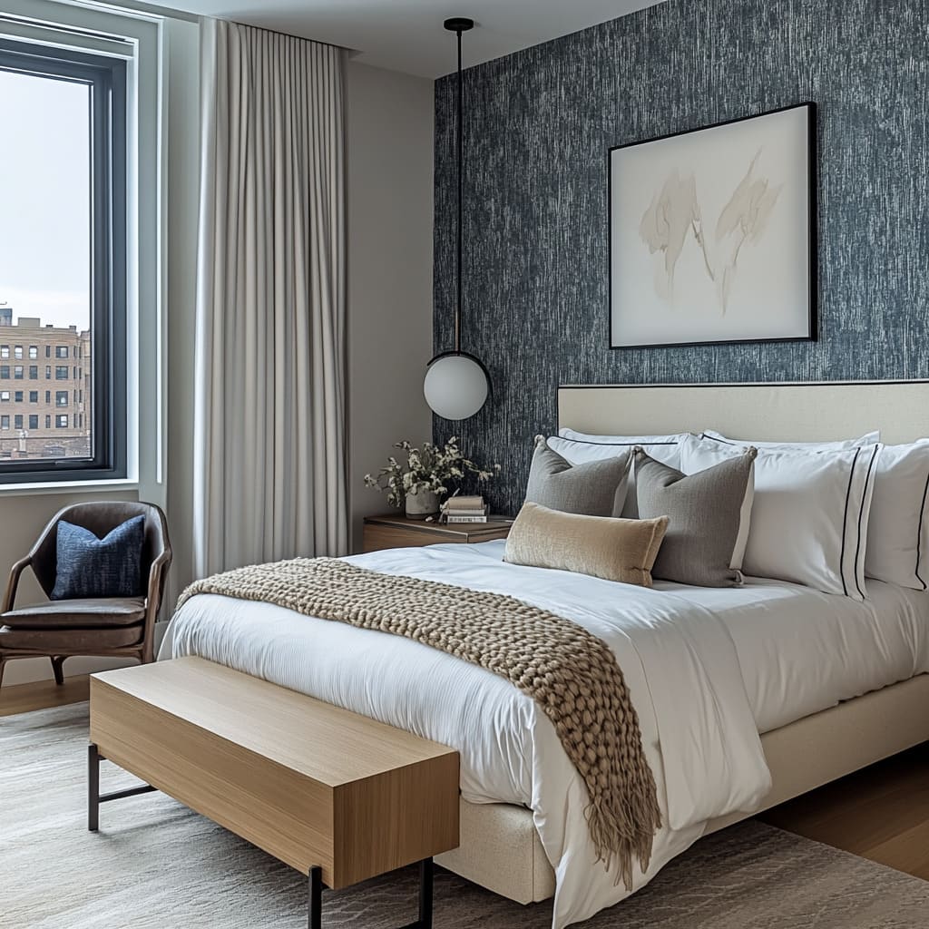
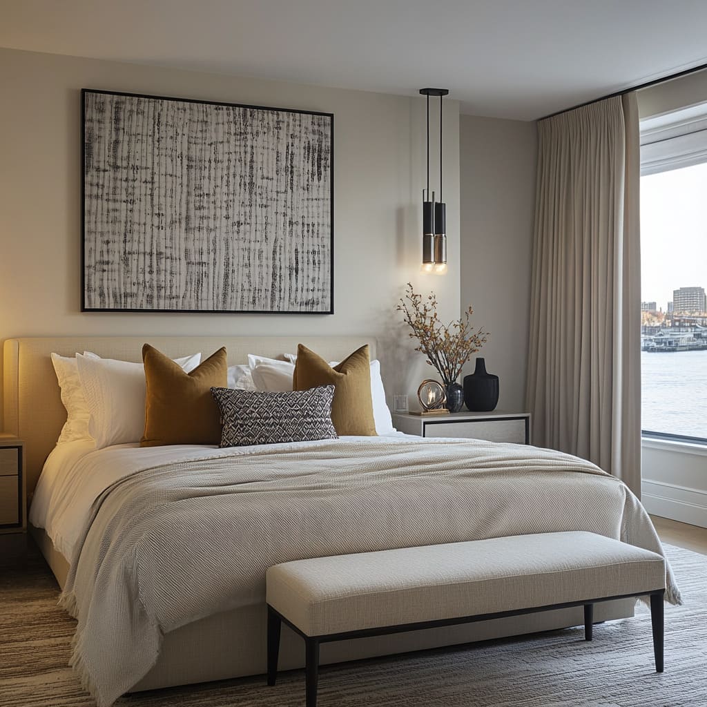
Incorporating an upholstered bench at the foot of the bed is a simple way to add both style and functionality. Not only does it provide additional seating or a place to lay out clothing, but it also ties the room together by extending the use of fabrics. When selecting a bench, choose a material and color that complement the headboard or bedding.
A light beige fabric works well, providing continuity in the design while keeping the space open and airy. The bench’s simple lines and soft upholstery balance the more textured elements in the room, like the wallpaper and bedding, without competing for attention.
How does the upholstered bench in the photos add both practicality and visual appeal to the bedroom?
The upholstered bench adds practicality by serving as a functional piece of furniture while simultaneously elevating the room’s aesthetic with its design. Positioned at the foot of the bed, it provides an extra seating area, allowing for a convenient place to sit while dressing or putting on shoes. It also doubles as a spot to lay out clothing or bedding without needing to disturb the bed itself.
This dual-purpose functionality adds to the room’s usability, enhancing the daily routines that happen within the space without crowding the room. From a visual perspective, the upholstered bench contributes a sense of luxury and softness, which enhances the overall warmth and coziness of the bedroom. Its plush, padded design adds to the room’s texture, complementing the upholstered headboard and throw pillows to create a cohesive softness throughout the space.
The bench’s clean lines and sleek form echo the minimalist nature of the room’s furniture, ensuring that while it serves a practical purpose, it also contributes to the room’s overall visual appeal. The presence of this simple yet elegant bench helps to ground the room by introducing a tactile, welcoming element that harmonizes with the surrounding decor.
Why is the selection of light beige upholstery for the bench, as seen in the images, effective in maintaining the room’s balance?
The selection of light beige upholstery for the bench is effective in maintaining the room’s balance because it seamlessly integrates with the neutral color palette of the bedroom, ensuring that the space remains calm and cohesive. The light beige tone of the upholstery ties in with the other soft, neutral shades used throughout the room—such as the upholstered headboard, throw pillows, and bedding—creating a consistent and soothing color scheme. This soft, muted shade doesn’t draw too much attention, allowing the bench to blend effortlessly into the design, while still adding subtle warmth and texture to the space
Additionally, the light beige tone provides a contrast to the darker wood tones present in the floating console and potentially in other furniture elements, preventing the room from feeling too stark or overly dominated by one material. The bench’s light fabric introduces a sense of lightness that balances the visual weight of these darker, more solid pieces. By keeping the upholstery neutral, the overall design feels airy and spacious, reinforcing the minimalist, uncluttered atmosphere of the room.
The beige color enhances the bench’s ability to contribute to the room without overwhelming it, ensuring that the space feels balanced, comfortable, and inviting.
How does the bench’s design complement the bed and floating console to create harmony in the room?
The bench’s design complements the bed and floating console by mirroring their clean lines, minimalist aesthetic, and soft textures, ensuring a cohesive and harmonious look throughout the room. The bench’s simple, streamlined form reflects the modern, understated design of both the bed and the console.
Its low profile and unobtrusive shape align with the floating nature of the console, which adds to the room’s open, airy feel. Both the bench and the floating console exhibit a sense of lightness, with the console mounted off the floor and the bench offering a similar visual lightness through its slender legs and simple form.
The upholstered bench, with its soft, fabric surface, also enhances the room’s emphasis on tactile comfort, echoing the textures found in the upholstered headboard and the bedding. This creates a continuity of softness that ties the seating and sleeping areas together, ensuring the room feels cohesive rather than fragmented. The bench adds an additional layer of texture without introducing new design elements that might disrupt the harmony of the space.
Additionally, the bench provides a visual and physical connection between the bed and the console, bridging the two focal points of the room. Its placement at the foot of the bed anchors the bed within the space, while also drawing the eye toward the console. The bench’s minimalist design doesn’t detract from either the bed or the console; instead, it enhances the overall flow of the room by ensuring that the various pieces of furniture feel interconnected.
In this way, the bench contributes to a sense of balance, where the bed, console, and bench all work together to create a unified, harmonious environment.
Adding Textured Throws and Pillows for a Layered Look
To truly transform your bedroom into a cozy retreat, consider layering textures through your bedding accessories.
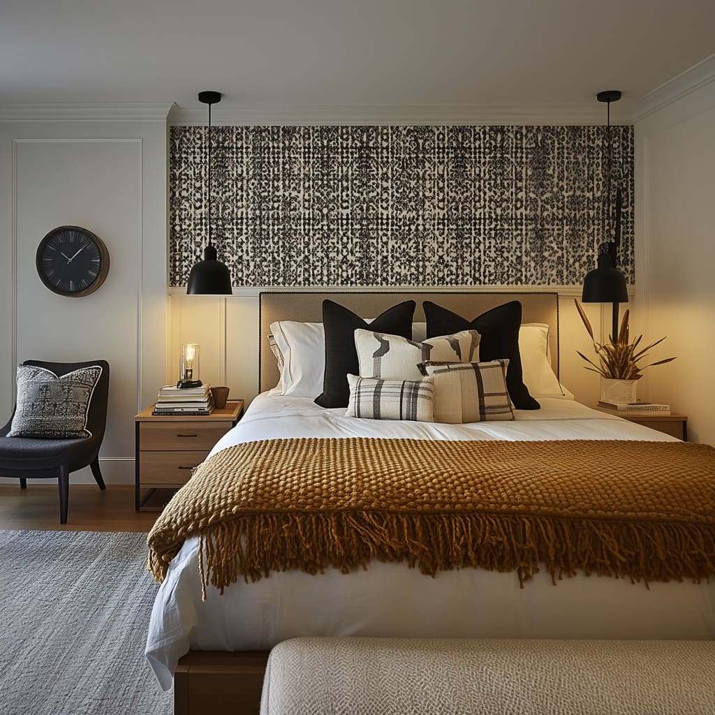
A chunky knit throw draped at the foot of the bed, paired with pillows in various fabrics, can add warmth and interest. In contrast to the smooth surface of the duvet or sheets, these items introduce a more tactile experience.
Neutral-colored pillows with subtle patterns, as described in the example above, can also bring texture without overwhelming the design. The key is to keep the color palette cohesive, allowing the textures to stand out rather than the patterns.
How does the choice of chunky throws and pillows in the images enhance the comfort of the room?
The choice of chunky throws and pillows in the images significantly enhances the comfort of the room by adding both visual and tactile warmth.
The thick, knitted textures of the throws, when draped over the bed, immediately evoke a sense of coziness, making the space feel more inviting and lived-in. These pieces introduce an element of softness that contrasts with the clean lines of the furniture and smooth surfaces in the room, such as the upholstered headboard and the floating wooden console.
The chunky texture of the throws creates a tactile quality that appeals to the senses, making the bed feel like a comfortable retreat rather than a purely decorative feature
The pillows, particularly when layered in different sizes and textures, offer a similar boost in comfort. The variation in texture between smooth fabric pillows and chunkier, knitted ones adds depth to the bed, making it look and feel more luxurious and plush. The different textures provide a variety of tactile sensations, making the space feel more dynamic.
From a practical standpoint, the additional layers of throws and pillows also offer extra warmth, perfect for creating a cozy, relaxing environment. The use of chunky textures ensures that the room doesn’t feel sterile or overly minimalist; instead, it exudes a sense of comfort that encourages relaxation.
What effect does layering textures in bedding have on the room’s overall aesthetic, as seen in the photos?
Layering textures in bedding adds visual interest and complexity to the room’s aesthetic, creating a sense of depth and richness that elevates the overall design. In the photos, the combination of smooth bedding, chunky throws, and various pillow textures creates a multidimensional look that prevents the room from feeling flat or overly simple. This layering effect not only enhances the tactile experience but also makes the bed the focal point of the room, drawing the eye toward the different textures and materials that make up the bedding
By mixing textures, the room gains a sense of balance between the smooth and the more rugged elements. For example, the contrast between the soft, crisp sheets and the thick, knitted throws adds a dynamic tension that keeps the room visually stimulating without introducing bold colors or patterns.
The layering of textures in the bedding mirrors the natural layering of materials elsewhere in the room, such as the combination of wood and upholstery in the furniture, ensuring a cohesive look throughout the space. Additionally, the layered textures in the bedding create a sense of comfort and warmth, contributing to the overall feeling of relaxation and calm in the room. The bed appears more inviting, as the variety of textures suggests that the space is designed not just for visual appeal, but for comfort and functionality as well.
Layering textures also allows for subtle contrasts in the room’s minimalist design, providing depth without overwhelming the space with complex patterns or bright colors.
Why is maintaining a neutral palette important when using multiple textures in bedding, as illustrated in the images?
Maintaining a neutral palette when using multiple textures in bedding is crucial for keeping the space visually balanced and cohesive, especially in a minimalist design. In the images, the room relies heavily on layering textures to create interest and comfort, and the neutral color scheme—using tones like beige, cream, and soft grays—ensures that the different textures work together harmoniously rather than competing for attention.
If bold or contrasting colors were introduced, the multiple textures could create a chaotic or busy look, detracting from the room’s overall calm and serene atmosphere.
The neutral palette acts as a unifying backdrop, allowing the variety of textures in the bedding—such as chunky knits, smooth fabrics, and soft upholstery—to be appreciated for their tactile qualities rather than for their color. This consistency in color ensures that the room feels cohesive, despite the complexity introduced by the different materials. The soft, muted tones allow the textures to stand out without overwhelming the space, creating a balanced, layered look that still feels uncluttered and refined.
Furthermore, a neutral color palette complements the other elements in the room, such as the wooden furniture, the textured wallpaper, and the upholstered headboard, without drawing attention away from these key features. By keeping the bedding neutral, the design allows the textures to enhance the room’s overall aesthetic without introducing unnecessary visual distractions. The result is a bedroom that feels comfortable, warm, and inviting, with a sophisticated simplicity that aligns with the minimalist style
In summary, a neutral palette is essential when using multiple textures because it keeps the room feeling cohesive and serene, ensuring that the different materials work together rather than against each other. This approach allows for a rich, layered design that emphasizes comfort and warmth while maintaining the clarity and simplicity characteristic of minimalist interiors
Balancing Texture with Simplicity:
Maintaining a Clean, Minimalist Look While Adding Texture
Adding texture to a bedroom doesn’t mean you have to sacrifice simplicity. In fact, textured elements often work best when they are balanced with minimal furniture and décor. For example, pairing a textured wallpaper with a simple floating wooden console keeps the room looking streamlined and modern.
The clean lines of the furniture contrast with the more detailed wallpaper, creating a balanced aesthetic that feels fresh and uncluttered. The key is to let the textures shine by keeping other design elements understated.
In what way does the simplicity of the room’s furniture complement the textured wallpaper, as seen in the photos?
The simplicity of the room’s furniture acts as a perfect complement to the textured wallpaper by providing a calming counterbalance to the more intricate patterns on the walls. The clean, straight lines of the furniture, including the bed frame, floating console, and upholstered bench, offer a sense of structure and minimalism that contrasts with the organic, detailed design of the wallpaper. This balance between the furniture’s simplicity and the wallpaper’s complexity creates a harmonious aesthetic where neither element overwhelms the other, allowing both to contribute to the overall design in a balanced way
The minimalist nature of the furniture—featuring smooth surfaces, neutral tones, and uncluttered forms—ensures that the focus remains on the texture and patterns of the wallpaper. For example, the upholstered bed frame and headboard, with their soft beige tones and simple design, act as a backdrop for the bold botanical wallpaper, helping to soften the impact of the intricate design. The simplicity of the furniture prevents the room from feeling too busy or overwhelming, which might occur if both the furniture and wallpaper were competing for attention with complex patterns or bold colors.
Additionally, the natural materials used in the furniture, such as the wood of the console and the upholstered fabric of the bed, introduce subtle textures that interact gently with the more detailed wallpaper. These textures are understated, yet they complement the room’s overall design by adding a layer of warmth and comfort. This thoughtful interplay between the furniture’s minimalism and the wallpaper’s texture creates a balanced design where each element enhances the other.
The furniture’s simplicity also contributes to the room’s spacious feel. By keeping the furniture clean-lined and functional, the room avoids visual clutter, which is essential for maintaining an open, airy atmosphere.
The absence of excessive ornamentation or detail in the furniture ensures that the wallpaper becomes the main decorative feature, while the furniture provides the necessary functionality without distracting from the textured walls. This creates a room that feels both relaxing and aesthetically pleasing
How does the balance between the minimalist furniture and textured wallpaper create an airy, open feeling in the room?
The balance between the minimalist furniture and textured wallpaper creates an airy, open feeling by combining simplicity with visual depth, allowing the room to feel spacious and well-proportioned. The minimalist furniture, with its clean lines and neutral tones, establishes a sense of openness and lightness. The floating console, for example, contributes to this airy effect by being mounted off the floor, creating the illusion of more space and preventing the room from feeling cluttered.
This minimal approach to furniture allows the eye to move freely throughout the space, without being interrupted by heavy or bulky furnishings. On the other hand, the textured wallpaper adds depth and visual interest without taking up physical space, enhancing the room’s design without making it feel crowded. The wallpaper introduces layers of detail and texture, but because it’s applied to the walls, it doesn’t infringe on the room’s floor space.
This use of texture on the vertical surfaces, as opposed to within the furniture itself, allows the room to maintain a sense of airiness while still feeling richly designed. The contrast between the wallpaper’s intricate pattern and the furniture’s simplicity helps to visually expand the room, as the minimalist furniture grounds the space while the textured wallpaper adds dimensionality. Furthermore, the interplay between the light, neutral tones of the furniture and the bold black-and-white palette of the wallpaper enhances the room’s sense of openness. The neutral tones keep the space feeling bright and reflective, allowing natural light to flow freely, while the wallpaper provides a focal point that adds visual depth.
The combination of these elements makes the room feel larger and more expansive than it might otherwise. The light, airy feel is reinforced by the lack of excessive decoration or heavy furniture, ensuring that the room remains open and breathable.
In addition, the balance between the furniture’s smooth, uncluttered surfaces and the detailed wallpaper pattern helps to avoid visual overload. By limiting the complexity to the walls and keeping the furniture minimalist, the room feels spacious, rather than busy or cramped.
This creates an atmosphere where the intricate wallpaper design can be appreciated without overwhelming the senses, while the furniture provides the necessary structure and functionality without drawing attention away from the walls
In summary, the balance between the minimalist furniture and textured wallpaper fosters an airy, open ambiance by ensuring that the room’s visual interest comes from texture rather than clutter. The minimalist approach to furniture frees up space, while the wallpaper adds richness and depth, creating a well-proportioned and visually engaging design that feels light and spacious
Neutral Palettes as a Canvas for Textures
Neutral color schemes provide the perfect canvas for layering textures without overwhelming the space. Soft grays, warm beiges, and muted whites create a soothing backdrop that allows textured wallpaper and upholstery to become the stars of the room. Neutral tones also ensure that the space remains versatile, making it easy to update or change accessories over time.
The combination of neutral tones and texture also works well in both large and small bedrooms, as it creates a cohesive look that feels neither too bold nor too flat.
Why is a neutral palette particularly effective when paired with large furniture pieces like the headboard and bench, as shown in the photos?
A neutral palette is particularly effective when paired with large furniture pieces like the headboard and bench because it helps maintain a sense of visual balance and prevents the room from feeling weighed down. Large furniture items inherently take up significant space, both physically and visually.
If these pieces were done in bold colors or complex patterns, they could easily dominate the room, making it feel cluttered or overwhelming. By using neutral tones, the headboard and bench blend seamlessly into the overall design, contributing to a calm and cohesive look.
In the images, the large upholstered headboard in soft beige complements the textured wallpaper without competing with it, while still adding a tactile element to the room. The neutral color of the headboard allows the eye to appreciate the subtle textures in the fabric without being distracted by bold hues.
The bench at the foot of the bed, also done in a neutral tone, serves as an extension of the bed, adding functionality without interrupting the visual flow of the space. This ensures that the room retains its sense of openness and doesn’t feel visually cluttered, even with the presence of these large furniture items. Additionally, neutral tones in large furniture pieces create a sense of harmony with the other elements in the room. For example, the floating console and the upholstered bed both maintain clean, minimalist lines, and their neutral palette ties them together.
The light, neutral colors reflect natural light, further enhancing the room’s airy, spacious feel. This prevents the large furniture from feeling too heavy or dominant, which is especially important in minimalist designs where simplicity and balance are key.
Neutral colors also make it easier to layer other design elements, such as textured throws or decorative pillows. With a neutral headboard and bench, it’s possible to introduce additional textures or subtle patterns in the bedding and accessories without overwhelming the room. The neutral furniture provides a blank canvas that enhances, rather than competes with, these other elements, ensuring that the room remains harmonious and thoughtfully composed
How do the different textures in the wallpaper and upholstery work together within the neutral color scheme to maintain balance in the design?
The different textures in the wallpaper and upholstery work together within the neutral color scheme to create a balanced, harmonious design by offering a dynamic mix of tactile elements while maintaining visual cohesion. The key to this balance is the use of a soft, neutral color palette that allows the room’s textures to be appreciated without introducing visual chaos. By sticking to muted tones like beige, gray, and cream, the room is able to feature multiple textures—such as the botanical wallpaper, upholstered headboard, and woven bedding—without feeling overly busy.
The wallpaper’s intricate pattern adds a layer of visual texture to the walls without disrupting the overall flow of the room, thanks to its neutral black-and-white color scheme. This monochromatic palette allows the wallpaper’s texture to stand out as a design element without overwhelming the room. Meanwhile, the upholstery on the headboard and bench introduces a soft, tactile quality that contrasts with the smoother surfaces of the wooden furniture.
The neutral upholstery allows these large furniture pieces to blend effortlessly with the wallpaper, ensuring that the texture and patterns on the walls remain the focal point. In addition, the upholstery’s plush, soft textures provide a sense of comfort that complements the more structured texture of the wallpaper. While the wallpaper offers visual complexity through its botanical patterns, the upholstered elements add a layer of warmth and physical softness that makes the room feel inviting.
These textures interact to create a balanced contrast: the wallpaper adds depth and detail to the vertical surfaces, while the upholstery softens the horizontal planes of the room, such as the bed and seating areas. This combination of soft and structured textures ensures that the room feels layered and dynamic without sacrificing its sense of calm and simplicity.
The neutral color scheme is essential to this balance because it keeps the room’s textures from competing with one another. The wallpaper’s pattern and the upholstery’s texture each contribute to the room’s overall aesthetic, but because they share a neutral palette, they don’t overpower one another. Instead, they work together to create a cohesive design where both elements can shine.
The neutral tones unify the various textures, ensuring that they enhance, rather than detract from, the room’s minimalist and comfortable vibe. In summary, the interaction between the different textures in the wallpaper and upholstery, when combined with the neutral color palette, creates a sense of harmony and balance in the room. The neutral tones allow these textures to coexist without overwhelming the space, resulting in a room that feels thoughtfully layered, visually interesting, and perfectly balanced between comfort and style.
Lighting Choices to Highlight Textures:
Using Lighting to Enhance Textured Elements
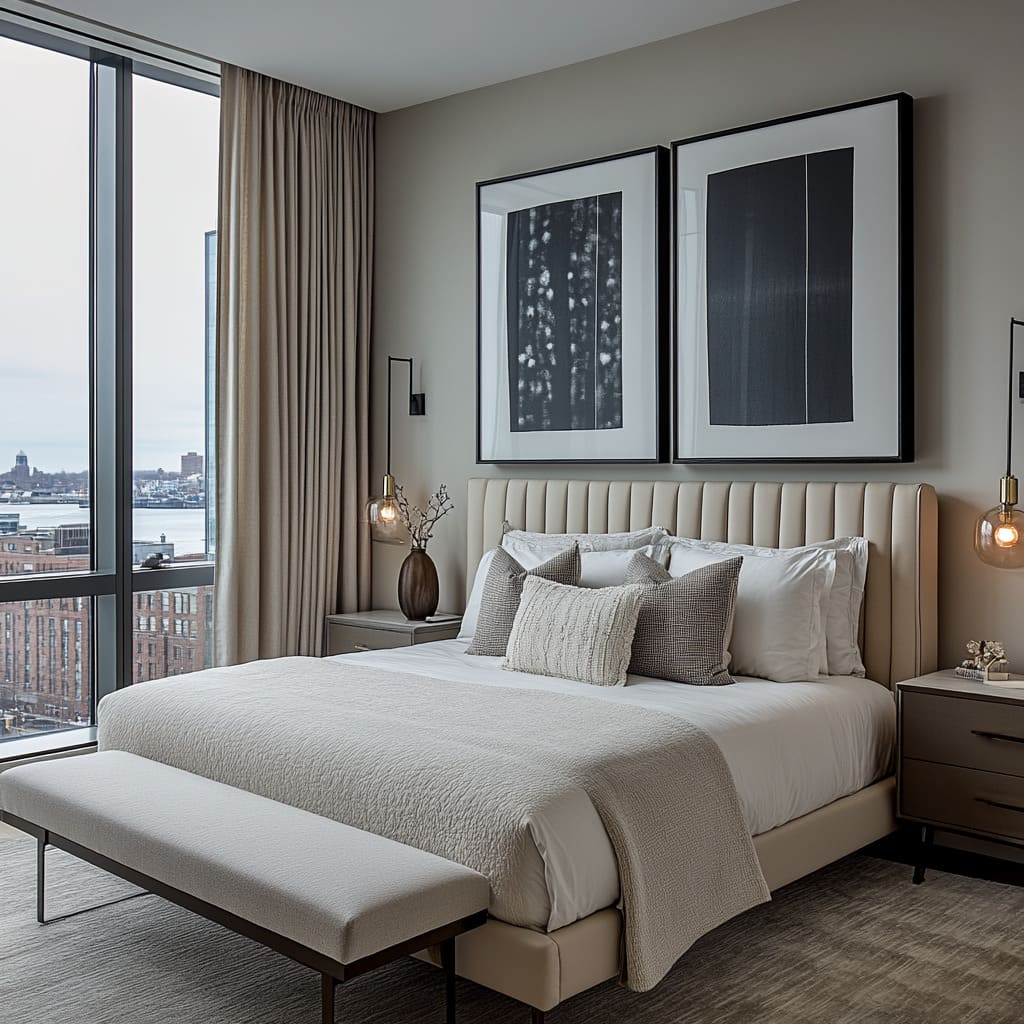
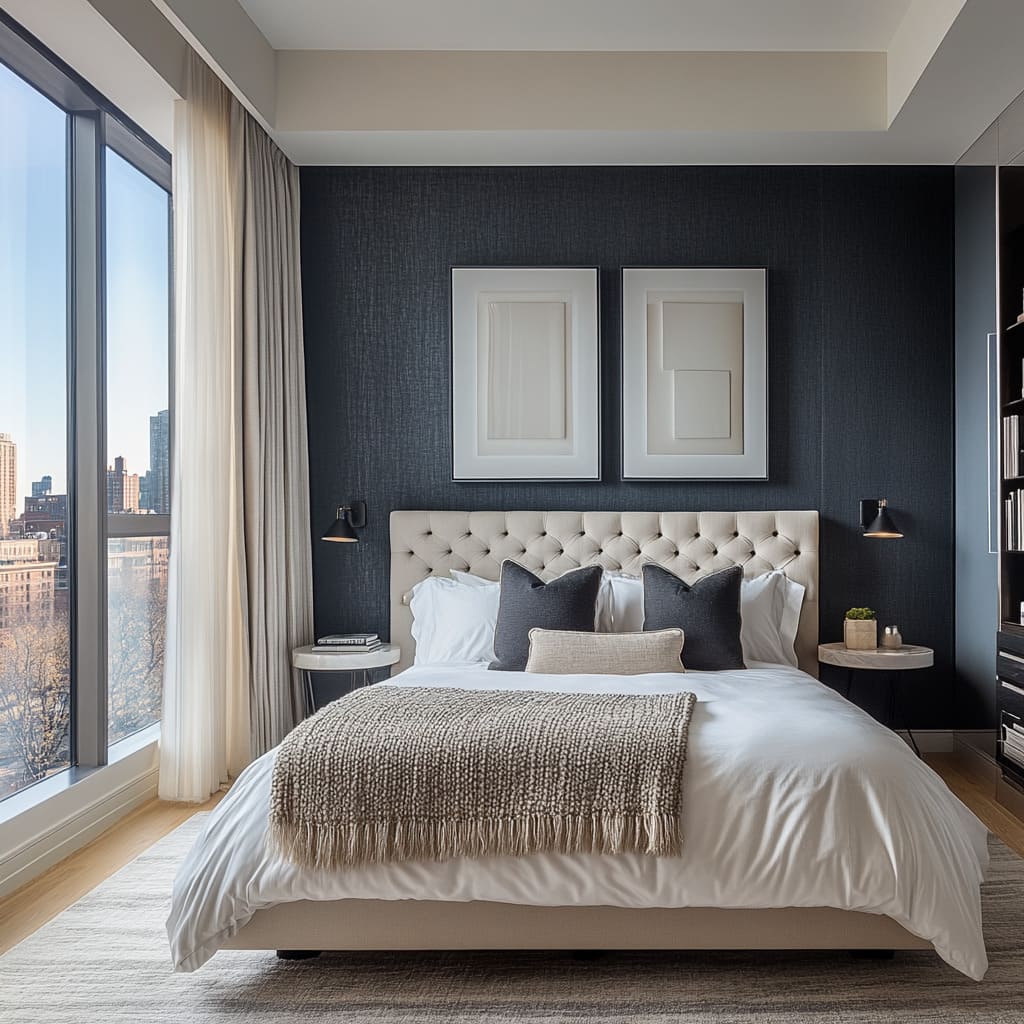
Lighting plays a crucial part in showcasing the textures in your bedroom. Soft, ambient lighting can emphasize the depth of textured wallpaper, casting subtle shadows that bring out the details in the design. A wall-mounted sconce or pendant light, like the industrial-style fixture mentioned earlier, can create interesting lighting effects on both wallpaper and upholstered surfaces.
When placed thoughtfully, lighting can enhance the texture without overpowering the room, making the entire space feel more cohesive.
How does the pendant light in the images interact with the textured wallpaper to create depth in the room?
The pendant light in the images interacts with the textured wallpaper by casting soft, ambient light that highlights the subtle details of the wallpaper’s patterns, creating a sense of depth and dimension in the room. The wallpaper, with its intricate botanical designs, already introduces texture and visual complexity to the walls.
When paired with the focused lighting of the pendant, the light and shadows play off the raised elements of the wallpaper, emphasizing the dimensionality of the design. The contrast between light and shadow creates visual depth, making the wallpaper appear more three-dimensional and dynamic, rather than flat or purely decorative.
The pendant light is strategically placed to direct a warm glow onto the wall, enhancing the texture without overpowering it. Because the wallpaper features a black-and-white botanical pattern, the interplay of light and shadow accentuates the darker and lighter areas of the pattern, drawing attention to the design’s intricacies. The soft light creates subtle shadows in the more detailed parts of the wallpaper, adding layers of depth that help the texture stand out.
In this way, the pendant light helps to bring out the wallpaper’s texture, making it a more integral part of the room’s overall design rather than just a backdrop. Moreover, the pendant light itself has a minimalist design that complements the room’s aesthetic, allowing the light it emits to take center stage rather than the fixture.
This design choice ensures that the focus remains on the texture of the wallpaper and how the light enhances it. The pendant’s warm light creates a gentle ambiance that brings a sense of coziness to the space while also serving a functional purpose by illuminating the intricate texture of the wallpaper, making it feel more immersive and tactile
What effect does the wall-mounted lighting fixture have on the perception of texture in the bedroom, as seen in the photos?
The wall-mounted lighting fixture in the photos enhances the perception of texture in the bedroom by creating focused illumination that highlights and enhances the depth of the various textures present, particularly in the wallpaper and upholstery. The direct light emitted by the fixture casts soft shadows on the wallpaper, bringing out the raised or patterned areas and making the texture appear more pronounced. The fixture’s placement close to the wall allows it to accentuate the natural undulations and intricacies of the wallpaper, particularly in areas where the design is more detailed or complex.
This interplay of light and shadow caused by the wall-mounted fixture helps to bring the wallpaper’s texture to life, allowing the viewer to appreciate the finer details that might go unnoticed in flatter, more diffuse lighting. The fixture creates contrast by illuminating certain portions of the wallpaper more intensely while leaving other areas in softer light, which results in a greater perception of depth and richness.
The lighting adds a tactile quality to the wallpaper, as the varying intensity of light across the surface makes the wallpaper’s design feel more dynamic and textured. The lighting fixture also influences how the textures of the upholstered furniture are perceived. When light from the fixture falls onto the headboard or other upholstered elements, it reveals the softness and warmth of the fabric, emphasizing the plush texture of the furniture.
The light highlights the smoothness of the upholstery in contrast to the detailed texture of the wallpaper, creating a balance between the different textures in the room. The lighting’s warm tone enhances the cozy, inviting feel of the upholstered furniture, adding to the room’s overall sense of comfort while still drawing attention to the texture.
By directing light in specific areas, the wall-mounted fixture creates focal points within the room, encouraging the viewer to notice and appreciate the layered textures present in the design. Whether it’s the textured wallpaper or the upholstered headboard, the lighting fixture ensures that each element is accentuated in a way that elevates the overall perception of texture in the bedroom, making the room feel more layered and visually rich.
How does the positioning of light sources in the photos emphasize the details of both the wallpaper and the upholstered furniture?
The strategic positioning of the light sources in the photos emphasizes the details of both the wallpaper and the upholstered furniture by highlighting their textures and creating a dynamic play of light and shadow that enhances the room’s overall design. In the images, light sources such as pendant lights, wall-mounted fixtures, and natural light from large windows are carefully placed to draw attention to key elements of the room, including the textured wallpaper and upholstered furniture.
The pendant light is positioned to illuminate the accent wall, where the botanical wallpaper takes center stage. The light shines directly onto the wall, enhancing the texture of the wallpaper by creating contrast between the lighter and darker areas of the pattern. This focused lighting allows the intricate details of the wallpaper to become more pronounced, making the texture more tactile and visually interesting.
The positioning of the pendant ensures that the light falls softly across the surface of the wallpaper, creating subtle shadows that give the pattern depth and dimension. The wall-mounted lighting fixture, placed near the upholstered headboard, directs light onto both the headboard and the adjacent wallpaper. This dual focus enhances the texture of the upholstery by casting a soft glow over the fabric, revealing its plush, cushioned quality.
The light accentuates the smooth, tactile nature of the upholstery while also highlighting the contrast between the soft fabric and the more detailed, textured wallpaper behind it. The light brings out the depth of both materials, emphasizing the interplay between soft and hard textures.
Natural light from the windows also plays a critical role in emphasizing the room’s textures. As sunlight streams through, it casts natural, diffused light over the entire room, softly illuminating both the wallpaper and the upholstered furniture. Natural light tends to highlight texture in a more organic way, making the wallpaper’s intricate designs and the fabric’s soft textures feel more integrated into the room.
The combination of natural and artificial light creates layers of illumination, ensuring that every texture in the room is brought to life in a way that feels balanced and cohesive. The overall effect of the light sources, in terms of their positioning and intensity, is that they enhance the texture of the wallpaper and upholstery without overwhelming the space. The thoughtful placement of the lights ensures that each surface is highlighted in a way that draws attention to its unique texture, creating a room that feels layered and visually rich, yet open and harmonious.
Soft vs.
Direct Lighting The type of lighting you choose can also impact how textures are perceived. Softer, indirect lighting enhances the warmth and coziness of textured elements, while direct lighting may highlight the finer details of fabrics or wallpaper patterns.
In the evening, softer light from bedside lamps or sconces will make your upholstered headboard and bedding feel even more inviting. During the day, natural light from large windows will naturally enhance the textures in the room, creating a dynamic yet calm environment.
How does the natural light coming through the large windows in the photos bring out the textures in the room?
Natural light coming through the large windows in the photos plays a pivotal role in revealing and enhancing the different textures within the room by casting a broad, diffused light that gently illuminates every surface and material. The soft sunlight interacts with the textured wallpaper, upholstered furniture, and other design elements in ways that artificial lighting might not achieve as naturally.
The daylight brings out the intricate details of the wallpaper’s patterns, allowing the raised or patterned sections to cast delicate shadows, creating a subtle play of light and shadow that makes the texture more pronounced and lifelike. In particular, the botanical patterns on the wallpaper seem to come alive under natural light, with the variations in brightness emphasizing the depth and complexity of the design
On the upholstered furniture, the natural light highlights the soft, plush texture of the headboard and bench, casting a gentle glow over the fabric that makes it appear even more inviting. The light reflects off the smoother surfaces of the upholstery, enhancing the fabric’s sheen and making it look luxuriously soft.
The even distribution of light ensures that the texture is fully visible without harsh contrasts, creating a calming effect that invites tactile engagement with the furniture. The textures of the pillows and throws, which might otherwise blend into the bedding, are also brought into focus by the natural light, giving the room a layered, multidimensional feel.
The large windows allow the natural light to flood the room from multiple angles, which helps soften and diffuse any harsh lines or dark corners. This not only brings out the textures in the design but also creates a sense of openness and airiness, preventing the room from feeling too closed off or heavy despite the presence of various textures. The consistent flow of natural light throughout the day ensures that the textures in the room shift and change, creating a dynamic environment where the wallpaper, upholstery, and other elements reveal different qualities depending on the time of day.
This natural variation contributes to the room feeling more lively and textured without overwhelming the minimalist design.
Why is softer lighting more effective for enhancing the warmth of the upholstery in the images?
Softer lighting is more effective for enhancing the warmth of the upholstery in the images because it casts a gentle, ambient glow that accentuates the plushness and softness of the fabric without introducing harsh shadows or sharp contrasts. Softer, diffused light wraps around the surfaces of the upholstered furniture, such as the headboard, bench, and throw pillows, creating a seamless transition between light and shadow that highlights the fabric’s texture without creating stark lines.
This type of lighting enhances the tactile qualities of the upholstery, making it appear more inviting and cozy. The warm tones of the light work in harmony with the neutral tones of the upholstery, such as the beige headboard and light-colored bench, amplifying the comfort these pieces provide. Soft lighting enhances the natural warmth of these fabrics, making the room feel more intimate and relaxing.
In contrast, harsher lighting might create overly bright spots and deep shadows, which could make the upholstery feel colder or less appealing. By using softer lighting, the room retains its calming, soothing atmosphere, and the upholstery appears even more comfortable, as the light accentuates the fabric’s delicate folds and textures
Additionally, softer lighting softens the overall look of the room by reducing the visual intensity of the furnishings. The upholstered pieces are large and prominent within the room, and if lit too harshly, they could dominate the space.
Softer light ensures that the upholstery blends harmoniously with the other elements, including the textured wallpaper and wooden furnishings, without losing its presence. The light allows the viewer to appreciate the depth of the upholstery, such as the fine weave or plush surface, without any distractions caused by glaring or overly sharp lighting.
Finally, soft lighting adds to the layered, tactile nature of the room’s design by creating a warm, diffused glow that envelops the furniture. This lighting choice highlights the upholstery’s texture in a way that invites interaction and comfort, making the room feel both visually and physically warm. The subtle shadows and highlights created by soft lighting enhance the overall aesthetic, allowing the textures to stand out naturally without disrupting the calm, minimalist vibe of the space.
How do both natural and artificial light sources contribute to the layered look of textures, as shown in the bedroom photos?
Both natural and artificial light sources work together to create a rich, layered look of textures in the bedroom, enhancing the room’s overall sense of depth and dimension. Natural light, coming through the large windows, provides a broad, even illumination that highlights the subtleties of the textures across different surfaces, from the wallpaper to the upholstered furniture. As daylight changes throughout the day, the interaction between light and texture shifts, adding dynamic variation to how the room is perceived.
In the morning, the softer, diffused natural light gently enhances the textures of the fabric and wallpaper, bringing out their tactile qualities without harsh contrasts. Natural light is especially effective in showcasing the textures on vertical surfaces, such as the intricate wallpaper behind the bed. The daylight reveals the detailed patterns in the wallpaper by casting soft shadows on the raised areas, which enhances the texture and depth of the design.
As light floods the room, it brightens the neutral tones of the upholstery, making the fabric appear softer and more luxurious, further emphasizing the room’s cozy, layered look. In contrast, artificial light sources like pendant lights and wall-mounted fixtures create more focused, controlled lighting that complements the natural light and accentuates specific textures at different times of day or in the evening. The pendant lights, for instance, cast direct light on key areas such as the bed and nearby furnishings, adding emphasis to the upholstery’s softness while highlighting the texture of the throws and pillows.
This focused light helps define the edges of the furniture and accentuates the layers of fabric, creating a warm and inviting ambiance as it brings the textures into sharper focus. The wall-mounted fixtures add a secondary layer of lighting that highlights textures in more subtle, localized areas, such as the headboard and nearby walls. These fixtures provide targeted light that brings out the fine details of both the wallpaper’s pattern and the upholstery’s softness. This additional layer of lighting works to create focal points within the room, making the textures stand out without overwhelming the space.
The controlled nature of the artificial light allows for more precise illumination, ensuring that the room’s layered textures are fully appreciated, even in low-light settings
The interaction between natural and artificial light sources creates a nuanced, multidimensional effect that adds to the room’s overall richness. During the day, natural light ensures the room feels open, airy, and naturally textured. In the evening, the artificial lighting steps in to enhance these same textures, providing warmth and intimacy by casting light on the fabric and patterns in a way that complements the neutral palette.
Together, these light sources work in tandem to create a balanced, textured environment that feels layered, cozy, and thoughtfully designed. This layered lighting approach ensures that every texture in the room—whether soft fabric or intricate wallpaper—is brought to life in a way that feels cohesive and harmonious.
Accentuating with Furniture and Décor:
Wood Tones and Texture: A Natural Contrast
Wooden furniture provides a natural complement to textured wallpaper and upholstery. For example, a floating wooden console in a rich grain finish can offer a striking contrast to a textured wallpaper backdrop.
The wood’s organic feel and warm tones soften the room, preventing it from feeling too stark or cold. This natural contrast also creates a sense of balance between the modern elements and more traditional materials, ensuring that the room feels cohesive and thoughtfully designed.
How does the contrast between the wooden console and the textured wallpaper in the images add to the room’s overall balance?
The contrast between the wooden console and the textured wallpaper adds to the room’s overall balance by creating a visual equilibrium between simplicity and complexity, warmth and pattern. The smooth, organic grain of the wooden console introduces a natural, earthy element that contrasts with the intricate and visually stimulating botanical patterns of the wallpaper behind it. This contrast provides a calming counterbalance to the wallpaper’s bold design, grounding the room and preventing the pattern from feeling overwhelming.
The natural wood tones of the console introduce warmth, which softens the sharp black-and-white contrast of the wallpaper. This balance of natural warmth and bold texture ensures that the room feels inviting while still maintaining visual interest. The console’s minimalistic design doesn’t compete with the wallpaper for attention, which allows the texture and pattern on the wall to be a focal point.
At the same time, the console’s natural material and clean lines act as a stabilizing element, providing visual rest amid the busier backdrop. This interaction between the two ensures that neither element dominates the space, resulting in a well-composed and harmonious design.
The console’s simplicity also allows it to function as a base for decorative objects without overcrowding the room. Its sleek, understated presence helps highlight the depth and texture of the wallpaper without creating visual chaos. The contrast between the smooth wood and the intricate pattern adds depth and dimension to the room, making it feel more dynamic without overwhelming the senses.
In this way, the interaction between the console and wallpaper fosters a sense of balance, where complexity and simplicity coexist seamlessly.
Why is the use of natural wood in the bedroom design important for maintaining a comfortable and welcoming environment?
Natural wood plays a crucial role in maintaining a comfortable and welcoming environment in the bedroom because it introduces warmth, texture, and an organic feel that softens the overall design. Wood has an inherent quality of bringing nature indoors, which creates a sense of connection to the natural world, a quality that is particularly important in spaces meant for relaxation like bedrooms.
The grain and texture of natural wood add depth and richness, making the room feel more inviting and less sterile. The use of wood in furniture such as the floating console and perhaps other accent pieces contributes to a cozy and welcoming atmosphere.
Wood tones have a unique ability to ground a space, adding stability and warmth to what could otherwise feel like a cold or impersonal design. This is especially true in a room that incorporates modern or minimalist elements, where the presence of wood offsets any harshness from clean lines or stark contrasts. The wooden console, with its smooth surface and warm tones, introduces a tactile quality that invites interaction, further enhancing the comfort of the space
Additionally, wood is versatile and complements a wide variety of design elements, from upholstered furniture to textured wallpaper. Its natural warmth works well with the neutral color palette often found in bedroom designs, creating a seamless integration with the bedding, throws, and pillows.
The organic texture of the wood also interacts beautifully with the room’s other materials, such as fabric and metal, adding depth and character without overpowering the design. This combination of versatility, warmth, and natural beauty makes wood a key material for creating a comfortable and welcoming bedroom.
How do the wood tones interact with other elements like the bedding and lighting to create a unified look, as seen in the photos?
The wood tones in the bedroom interact with elements like the bedding and lighting to create a unified look by tying together the room’s natural and artificial materials through a consistent palette and complementary textures. The warm, earthy hues of the wood console resonate with the soft neutral tones found in the bedding, such as light beiges, creams, and grays.
This creates a harmonious color scheme that ensures the room feels cohesive and balanced. The wood tones act as a unifying element, bridging the gap between the textured wallpaper, smooth bedding, and upholstered furniture, ensuring that no single element feels out of place. Lighting further enhances the interaction between wood tones and other elements in the room. The soft, ambient light emitted by pendant lights or wall-mounted fixtures bathes the wooden console in a warm glow, accentuating its natural grain and enhancing its tactile quality.
The lighting creates subtle highlights and shadows on the wood’s surface, which adds depth to the room. This interaction between light and wood emphasizes the organic texture of the material, reinforcing its role as a grounding element in the design. In addition, the wood’s warmth contrasts yet complements the cooler, softer materials of the bedding, such as cotton sheets, upholstered headboards, or knitted throws.
The wood acts as a neutral backdrop that allows the textures in the bedding and pillows to stand out, while the warm lighting enhances the comfort and coziness of both materials. Together, the wood, lighting, and bedding contribute to a unified aesthetic that balances hard and soft textures, light and dark tones, resulting in a room that feels cohesive, layered, and inviting.
Thoughtful Use of Accessories
When it comes to accessories, less is often more. In a bedroom filled with texture, it’s best to keep the décor simple and purposeful.
A few well-chosen items, such as a set of ceramic vases or a small sculpture, can enhance the room’s aesthetic without adding clutter. These accessories should complement the textures already present in the room, whether they are displayed on a console or bedside table. By keeping the décor minimal, you allow the wallpaper and upholstery to remain the focal points.
How does the use of simple accessories in the images complement the textured elements without overwhelming the space?
The use of simple accessories in the images complements the textured elements by adding subtle decorative touches that enhance the room’s overall design without detracting from the dominant textures, such as the wallpaper or upholstered furniture. Accessories such as vases, small sculptures, or books placed on the floating console or bedside tables are kept minimal and understated, allowing the focus to remain on the more prominent features of the room.
This minimalistic approach ensures that the space remains open and uncluttered, which is key in maintaining a calm, restful environment in a bedroom
By keeping the accessories simple and in line with the room’s neutral color palette, they blend into the design seamlessly rather than standing out. These objects provide just enough visual interest to break up the surfaces of the console or shelves without competing with the room’s more textured elements, like the wallpaper. For example, a set of ceramic vases in neutral tones complements the organic nature of the wood console and upholstered furniture while enhancing the depth of the space.
In this way, the simple accessories act as supporting elements, providing subtle highlights that enhance the room’s textures rather than overwhelming them. These items add a layer of refinement to the design, creating visual balance between texture and decoration.
The accessories are functional, yet their simplicity ensures that the room’s focal points—such as the textured wallpaper and plush bedding—remain at the forefront of the design.
What is the role of decorative objects like vases in enhancing the overall design, as shown in the photos?
Decorative objects like vases play an essential role in enhancing the overall design by introducing subtle points of interest and adding a personal, curated touch to the space. In the photos, vases serve as understated yet thoughtful accents that enrich the room without overwhelming its simplicity.
Placed strategically on surfaces like the floating console or bedside table, vases provide a break in the visual field, adding dimension to areas that might otherwise appear too smooth or flat
The vases are often in neutral tones or soft textures, which complement the room’s natural palette and materials without disrupting the harmony of the design. They introduce a sculptural quality, drawing attention through their shape and form rather than through bold colors or patterns. This restrained approach to decoration ensures that the vases enhance the room’s overall aesthetic rather than overpowering it.
In addition, the vases subtly echo the organic forms present in the textured wallpaper, further reinforcing the room’s connection to nature. Their placement and design serve to tie the various elements of the room together, from the natural wood of the console to the soft textures of the bedding. The role of these decorative objects is to provide a sense of refinement and completion to the design, adding small yet impactful touches that elevate the room’s overall look while maintaining its serene and balanced atmosphere.
How do the minimal accessories in the room work in harmony with the textured wallpaper and upholstered elements to maintain a balanced design?
The minimal accessories in the room work in harmony with the textured wallpaper and upholstered elements by adding delicate accents that enhance the room’s layered look without overwhelming the primary textures. The choice of accessories is kept simple and neutral, in line with the overall aesthetic of the room, ensuring that they complement rather than compete with the textured wallpaper or upholstered furniture. For example, small vases or decorative objects placed on the wooden console provide just enough visual interest to break up the space without distracting from the main design features, like the plush headboard or intricate wallpaper patterns. The minimal accessories are carefully curated to reflect the room’s neutral tones, ensuring that they blend seamlessly into the environment.
These objects are strategically placed to enhance the textures already present, such as the upholstered bench or the botanical wallpaper, creating a cohesive look where each element feels purposeful and integrated. By keeping the accessories subtle and refined, the design maintains a sense of balance and tranquility, which is essential in a bedroom setting. Additionally, the accessories contribute to the overall texture of the room without introducing new, competing patterns or colors. Their simplicity ensures that the focus remains on the room’s larger design elements, such as the tactile quality of the fabric or the intricate details of the wallpaper.
The accessories serve as subtle highlights that enhance the room’s overall depth and dimension, adding visual interest without disrupting the flow or balance of the design
In summary, the minimal accessories work in harmony with the textured wallpaper and upholstered furniture by adding understated touches that complete the design while maintaining a sense of balance and simplicity. These small decorative elements enhance the room’s textures and contribute to its layered, cohesive look, ensuring that the space remains both visually engaging
