
Creating a bedroom with deep, rich colors isn’t just about painting walls in bold shades and adding a few velvet pillows. There’s a whole world of design choices that make jewel-tone bedroom ideas stand out, from how light interacts with fabric textures to the subtle ways metallic accents shift the mood of a space.
This article takes a deep look at these details, going beyond the usual color pairings and fabric selections. Whether it’s the way a sapphire-toned wall absorbs light differently than emerald or how layering textures can soften the depth of darker hues, every choice in these spaces has an impact.
Get ready to explore the art behind these luxurious interiors and see what makes them feel so refined and thoughtfully put together.

Interplay Between Light Absorption and Refraction
Velvet and High-Gloss Elements
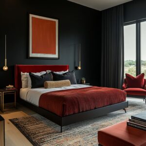
The balance between soft, light-absorbing materials and reflective finishes plays a huge role in how a jewel-tone bedroom design feels. Velvet, a favorite for beds, benches, and accent chairs, deepens the intensity of colors like emerald, ruby, and sapphire by absorbing light rather than bouncing it back into the room.
This effect creates a rich, cocooned atmosphere, making even bold hues feel inviting rather than overwhelming. But jewel tones need contrast to stay visually dynamic.
That’s where high-gloss surfaces step in. Polished brass pendants, gold-trimmed mirrors, and reflective ceiling fixtures catch and scatter light, preventing deep colors from feeling heavy.
A glossy pendant above a deep sapphire bed, for example, can add just the right amount of shimmer, ensuring the room feels balanced rather than dim.

Tinted Glass and Smoky Pendants
Lighting choices can completely shift how these deep colors behave throughout the day. Instead of harsh overhead lighting, many of these rooms rely on tinted glass pendants and smoky fixtures that soften brightness.
These pieces act as subtle filters, casting a diffused glow that changes the way jewel-toned walls and textiles appear. For example, an emerald feature wall may seem richer under warm-toned smoky glass, while a sapphire headboard might take on cooler undertones when paired with a frosted pendant.
This intentional contrast between soft, matte fabrics and sleek, light-catching materials adds depth, making the entire space feel more thoughtfully layered. The right lighting doesn’t just illuminate—it shapes the entire mood of the room.

Micro-Coordination of Metallics
Brass Veining, Gold Trims, and Subtle Hardware
The beauty of metallics in a muted jewel-tone bedroom isn’t just about statement fixtures—it’s the smaller details that bring the space together. A gold-framed mirror or brass pendant might catch the eye first, but it’s the subtle accents, like brass veining in stone nightstands or the thin gold trim on a console, that create a polished and cohesive design.
When these smaller elements repeat the finishes of larger pieces, they act like a thread weaving the room’s details into a seamless composition. A lamp’s gold base might subtly echo the hardware on a dresser, while a delicate brass inlay in a bedside table reinforces the room’s overall warmth.
These understated touches prevent metallics from feeling overpowering, allowing them to enhance rather than dominate the space.

Matching Warmth Levels
The way metallics interact with wood tones is another layer of thoughtful design. Gold and brass naturally complement warm wood finishes like walnut and oak, as the golden undertones blend effortlessly with the organic grain.
This pairing keeps the space feeling rich and inviting without an artificial shine. On the other hand, bedrooms with deeper, cooler tones—charcoal walls, navy bedding, or black furniture—often benefit from a different approach.
A slightly muted brass or matte black metal finish prevents the contrast from feeling too stark, ensuring that metallics enhance the atmosphere rather than disrupting it. By fine-tuning these metallic details to match the overall warmth or coolness of the space, designers achieve a sense of depth and balance.
The result isn’t just a bedroom with bold color—it’s a space where every element feels intentional, refined, and connected.

Enhancing Contrast Through Textural Pairings
Layering Neutrals with Deep Colors
A jewel-colored bedroom idea doesn’t rely on rich shades alone—the secret to making those bold hues feel intentional and sophisticated lies in the contrast. Crisp white bedding, soft beige throws, or off-white accent pillows aren’t just decorative additions; they amplify the surrounding deep tones, making emerald, plum, or sapphire appear even more intense.
This technique plays with the eye’s perception, ensuring that the room feels balanced rather than overwhelmed by color.

Beyond contrast in color, texture plays a critical role. A quilted coverlet, a linen throw, or a subtle woven pattern in neutral tones introduces depth without distracting from the main palette.
This layering keeps the room visually engaging, preventing heavy jewel tones from feeling overly flat or uniform.

Blending Organic Textures with Plush Fabrics
Pairing rich fabrics like velvet with natural textures is another way to create contrast without adding more color. Walnut paneling, reclaimed wood nightstands, or even a woven rattan accent chair introduce an earthy element that grounds the room’s luxurious feel.
Wood, in particular, has a way of breaking up the sheen of jewel tones, offering a tactile balance that keeps the space from leaning too theatrical.

This mix of organic and plush materials ensures that jewel-toned spaces feel warm and inviting rather than overly formal. A tufted headboard in deep ruby red, for example, paired with a raw oak nightstand, strikes the right balance between polished and relaxed.
It’s this careful combination of textures that transforms deep colors from dramatic to livable, creating a bedroom that feels layered, refined, and thoughtfully put together.

Depth Creation Through Layered Walls
Shiplap, Board-and-Batten, and Paneling
The walls of a jewel-tone master bedroom do more than hold up the décor—they play a huge role in shaping the atmosphere. Deep colors like navy, emerald, and forest green can sometimes feel flat if applied to a plain surface, which is why wood paneling, shiplap, or board-and-batten detailing is often used.
These textures create subtle shadow lines that catch the light differently throughout the day, adding movement and preventing darker hues from feeling one-dimensional.

Vertical battens can also make the ceiling feel higher, giving the space a more expansive look, while horizontal paneling introduces a structured, cohesive feel. Even in the deepest tones, these layered wall treatments ensure that the color has visual texture, making the bedroom feel rich rather than heavy.

Two-Tone or Extended Paneling
For bedrooms that need a little contrast, breaking up a deep color with a second tone—usually white, soft gray, or taupe—keeps the space feeling open. Some designs feature paneling on the lower half of the wall with a bold color above, creating a balance between depth and airiness.
Others extend paneling behind the headboard up to the ceiling, subtly framing the bed while leaving the rest of the room light and uncluttered. This approach is especially useful in jewel-toned spaces, where deep shades thrive but need structure to avoid overwhelming smaller rooms.
By layering color and texture strategically, walls become a design feature rather than just a background, making the entire bedroom feel more intentional and visually engaging.

Curated Shelving as a Design Extension
Sculpture, Vases, and Book Stacking
Shelving isn’t just a storage solution in jewel-tone bedroom decor—it’s a way to reinforce the color palette and add personality without overwhelming the space. Floating shelves above headboards, along fireplace mantels, or integrated into built-in units are styled to feel intentional rather than purely functional.

Objects placed on these shelves are carefully chosen to echo the surrounding hues. In an emerald green bedroom, gold vases or brass sculptures introduce a warm contrast, while a sapphire-toned space might feature deep teal glass or rich blue ceramics.
Burgundy glassware or framed artwork with hints of plum fits seamlessly into a room with a deep ruby palette. Arranging these pieces in layers—placing larger items first, then adding smaller accents—ensures that the display looks collected rather than cluttered.

Invisible Repetition of Color Hues
A subtle but effective trick in these spaces is the selection of books that match or complement the dominant color scheme. Instead of stacking books randomly, designers often choose editions with spines in coordinating jewel tones or even wrap them in custom covers to maintain visual harmony.
This might not be immediately noticeable, but it enhances the overall flow of the design, making the room feel cohesive down to the smallest detail. By treating shelving as an extension of the room’s palette rather than an afterthought, the decor feels effortlessly polished.
Whether through sculptural accents, well-placed books, or reflective surfaces that play with light, shelving adds depth, color continuity, and a personal touch to jewel-toned interiors.

Subtle Color Shifts and Gradients
Pillows and Rugs
Color transitions in jewel-toned bedrooms don’t always have to be stark. A thoughtful way to soften bold hues is through gradual shifts in tone, using layered textiles that create a seamless flow.
Instead of pairing a single bold color with a sharp contrast, some rooms use a gradient effect—navy pillows blending into sky blue, or burgundy cushions fading into dusty rose. This keeps the color scheme dynamic without feeling abrupt, making the space feel more fluid and intentional.

Rugs follow a similar approach, acting as a bridge between different elements in the room. A well-chosen rug might incorporate both the wall color and secondary accents, tying everything together.
For example, an emerald bedroom can feel even more cohesive with a patterned rug that includes hints of gold or beige, preventing the space from feeling too heavy with one dominant tone.

Curtains and Windows
Window treatments offer another opportunity to introduce subtle transitions. Floor-length drapery in a shade slightly lighter or deeper than the walls ensures a smooth visual shift, keeping the color story intact without overwhelming the space.
This method works particularly well in rooms with tall windows, where the continuous tone elongates the walls, making the ceilings appear higher.

By choosing fabrics that echo the surrounding hues in a softer or more intense shade, curtains create a natural extension of the color palette. The result is a space that feels thoughtfully layered, where bold jewel tones remain striking but never overpowering.

Balancing Multiple Jewel Tones in One Space
Pairing Greens and Reds or Blues and Purples
Mixing multiple jewel tones in one bedroom creates a bold and luxurious look, but getting the balance right is key. Combinations like deep emerald and burgundy or sapphire and amethyst can be visually rich, but without careful contrast, they can feel overwhelming.
The trick is introducing enough neutral elements to prevent the colors from competing. White bedding, light wood flooring, or a soft cream area rug help offset the intensity, giving the eyes a place to rest while still allowing the rich tones to stand out.

Metallic accents also play a role in balancing the palette. A brass lamp, a gold-framed mirror, or even subtle silver detailing on decor pieces help break up the depth of the colors without adding another dominant shade.
The key is proportion—too much of one deep hue can make the space feel heavy, but when paired with the right neutrals, each color can shine without overpowering the room.

Inserting a Third or Fourth Accent
To add even more depth without clashing, a carefully placed third or fourth accent can create a more layered and intentional design. If a room is built around two bold jewel tones, a small hint of a contrasting or complementary shade—like mustard, caramel, or navy—can bridge the gap between them.
This might appear in an accent chair, a few decorative pillows, or a patterned throw blanket that subtly ties the colors together.

By introducing a grounding neutral and an extra accent color, jewel-toned bedrooms feel thoughtfully composed rather than chaotic. The result is a space that feels bold yet harmonious, where every shade enhances the overall design rather than fighting for attention.

Notable Floor Treatments and Rugs
Softening the Impact of Strong Colors
In a room filled with deep jewel tones, the floor plays a crucial role in keeping the design balanced. A well-chosen rug can either reinforce the richness of the space or soften it by introducing lighter tones.
Large patterned rugs featuring touches of emerald, sapphire, or burgundy can subtly echo the surrounding decor without making the room feel overwhelming. This approach ensures that the floor becomes an extension of the color scheme rather than a stark contrast, helping the entire space feel immersive yet comfortable.

For rooms where the walls and furniture are already bold, a rug with a blend of neutral tones—like beige, soft gray, or cream—can provide a visual break, preventing the space from feeling overly saturated. A slightly faded or distressed pattern can also tone down the intensity of jewel tones while still maintaining a cohesive look.

Mixing Traditional Patterns with Contemporary Lines
One of the most effective ways to bring depth into a bedroom with jewel tones is through a mix of classic and modern elements, and rugs are a great way to achieve this balance. Persian or kilim-style rugs, with intricate patterns and rich hues, can add a sense of history and craftsmanship to a room that otherwise features sleek, contemporary furnishings.
A tufted velvet bed paired with a traditional rug creates a layered and sophisticated look, blending different design influences seamlessly.

The key is to ensure some degree of color harmony. A Persian rug with hints of plum or deep teal will naturally connect with a room featuring those tones, keeping the design fluid.
If the goal is a more modern aesthetic, a rug with geometric patterns or abstract brushstrokes in similar shades can complement clean lines without feeling out of place.

By carefully selecting a rug that either enhances or balances the room’s jewel tones, the floor becomes more than just a foundation—it becomes an integral part of the overall design, tying together the different elements in a way that feels both stylish and intentional.

Conclusion
At first glance, a jewel-toned bedroom might seem like a simple combination of deep colors, plush fabrics, and metallic details. But a closer look reveals the thoughtful layering that makes these spaces feel balanced rather than overwhelming.
The way neutrals are woven in to temper bold hues, how reflective surfaces play off velvet’s softness, and the careful repetition of materials in both large and small details—all of these decisions shape the overall mood of the space.

Wood accents, textured rugs, and subtle greenery help prevent heavy colors from feeling too intense, while well-placed gradients and lighting shifts keep the palette from becoming too rigid. Even the smallest choices, like the finish on hardware or the way shelving is styled, contribute to the sense of harmony.
By paying attention to these finer details—paneling depth, fabric finishes, and how different materials interact—jewel-toned bedrooms become more than just visually striking. They feel intentional, layered, and inviting, proving that strong colors don’t have to come at the cost of warmth or comfort.
It’s this level of consideration that turns a bold color scheme into a space that feels both luxurious and livable.
Related Posts
Harmony Home Design brings 10+ years of residential interior design experience to the ideas shared here. We publish design concepts, layout thinking, and practical styling notes.