
Black and white has been used in bathrooms for decades—but what’s happening now is something entirely different from the checkerboard floors and high-gloss contrast of the past. In high-end homes across the country, designers are shaping black and white bathrooms with more care, more control, and more depth than ever before.
The results are quieter, smarter, and far more structured. Instead of using color to build personality, these rooms rely on texture, shadow, alignment, and restraint.
The strongest impressions don’t come from bold finishes—they come from the way a matte black faucet floats off a ribbed wall, how terrazzo wraps around a bench and vanishes into the floor, or how daylight is shaped into a vertical line above a shower niche.

These bathrooms don’t chase visual noise. They reduce it.
Floating vanities, wall-mounted taps, flush cabinetry, hidden light sources—all of it works together to make the layout feel weightless and balanced. Nothing feels added last.
Every decision—tile direction, fixture alignment, even the placement of a single stem in a ceramic vase—is made with the full space in mind. This guide looks closely at how those details come together.
Not just the big moves, but the small ones too—the kinds of things you notice on your second or third look. If you’re searching for grounded and realistic black & white bathroom ideas that feel refined without being sterile, this is the reference to keep open.

Texture Replaces Color as the Accent
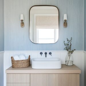
A common thread in most black and white bathroom ideas that feel current is how little color is used—and how much texture does the heavy lifting. Instead of painting walls or bringing in bold accents, designers rely on materials that do something interesting with light at close range.
Take glossy bevel tiles, for example. These aren’t loud on their own, but once the light hits their angled edges, they throw micro-highlights that shift as you move.
That sparkle is subtle, but it brings life to a monochrome wall.

Ribbed glass plays a different role. It’s used in doors, partitions, or sometimes as cabinet fronts to soften outlines and blur forms behind.
What you see isn’t the object—it’s a silhouette that feels private without closing off the space. This kind of visual filtering brings softness without needing color.
Then there are the tiny mosaics—especially hex tiles used in dry zones or across full shower walls. Their fine texture adds grip and breaks the visual field into something dynamic, especially under directional lighting.
The floor feels active, even when the palette stays quiet. Some bathrooms lean on shiplap or beadboard, especially in areas inspired by coastal design.
Painted white, these materials add rhythm through linework and shadow rather than hue, bringing familiarity without feeling rustic. Across all examples, the use of texture is carefully considered.
Smooth concrete, matte stone, fluted tile, or raw wood each interact with light differently. This creates a layered surface experience without having to shift the color wheel at all.
Texture becomes the accent, and it’s handled with precision instead of noise.

Light Treated as Structure, Not Decoration
In the best black and white bathroom design projects seen today, light isn’t added after the fact—it’s integrated as a primary part of the layout from the start. The clearest examples come from rooms where skylights are placed with surgical accuracy.
Rather than simply bringing in sun from above, these vertical openings line up directly over the shower or wet zone, turning that daylight column into a kind of invisible architecture. But what happens when there’s no skylight?
That’s where thin perimeter lighting and cove LEDs come in. Designers hide the fixtures deep inside ceiling recesses or behind mirror planes, so the light appears to wash from the wall itself.
You don’t see the bulb—you only see what it’s doing to the surface. This removes glare and lets shadows create dimension.

Even more refined are the floating mirrors with backlights. These serve two roles at once: offering clean task lighting around the face while also lifting the mirror visually away from the wall.
It’s a detail you’ll find in high-end homes across the country, especially where layered lighting is essential to balance the hard contrast of dark tiles. Below, the under-vanity glow acts almost like an architectural trick.
Even a solid concrete counter can appear lighter and slimmer when lit from underneath. It’s not theatrical—it’s quietly deliberate.
The overall effect isn’t about making things brighter. It’s about subtracting visual weight and adding depth without filling the space with objects.
In many of these homes, contrast isn’t only delivered through color. Shadow becomes the contrast.
And that’s where light earns its place as one of the core materials.

Weightlessness Through Cantilever and Gap
There’s a specific visual cue that signals refinement in black and white bathrooms, and it’s often not the tile or fixtures—it’s the space just beneath the cabinetry. In many high-end designs, vanities and benches appear to float, with nothing anchoring them to the floor.
But what makes this effect believable is the uninterrupted shadow line underneath. That slim band of darkness isn’t just empty space—it’s read by the eye the same way a carpenter’s reveal would be: intentional, controlled, and clean.

This shadow effect is often extended through lighting. By running toe-kick LED strips beneath vanities, designers give that negative space a glow that makes the structure feel almost weightless after dark.
The effect is subtle but changes how the room feels—especially when paired with dark flooring or matte tiles that visually recede. The same thinking applies to glass.
Frameless glass dividers or fixed panels, often separating shower zones, completely erase the traditional sense of a threshold. There’s no metal frame to cut the view, no bottom rail to signal a transition.
Instead, the only shift comes from the flooring material, where a change in tile texture or direction quietly defines the wet zone. In some rooms, even concrete sinks are made to float.
Designers keep the countertop thick for presence, but extend it with an open air gap beneath that plays a trick on perception. The sink appears heavy, but it doesn’t press down on the space.
It hovers. Put simply: the illusion of weightlessness is built from careful spacing, continuous shadows, and restraint in hardware.
Once your eyes adjust, these tiny structural decisions end up shaping the entire room’s mood.

Monolith Surfaces for Calm Acoustics
The most sophisticated black and white master bathroom ideas often rely on a surprisingly quiet approach—use one material, and let it do everything. Micro-topped concrete, smooth plaster, poured terrazzo, or tightly grouted stone planks are used across floors, walls, and sometimes even ceilings.
The point isn’t to make the room look extreme. It’s to remove all the visual chatter that comes from edge breaks, transitions, and excessive trim.
Without baseboards or changes in finish at every corner, the space feels whole. This uninterrupted surface strategy also has a very real acoustic effect.
With fewer exposed angles and material joints, sound has nowhere to bounce aggressively. It gets absorbed.
What you hear is softer. More hushed.
Many of these bathrooms use the same material from floor straight up the walls—sometimes right into the shower zone—with only glass or a thin light strip marking where one function ends and another begins. Where grout exists, it’s color-matched so closely that you’d miss it unless you ran your hand across the tile.

What’s striking is how this approach doesn’t feel sterile. The depth comes from texture and light, not from adding more elements.
A terrazzo wall reads differently than a concrete one, but both can run floor to ceiling without any trim line or visual stop. And that uninterrupted surface makes the space feel larger, calmer, and more cohesive—even in a small layout.
This is where less really is more—but only if every material is chosen with care. That simplicity is never accidental.

Grid Discipline vs. Intentional Off‑Grid
One of the most underappreciated tools in a black and white tile bathroom is the layout grid. Not the tiles themselves—but how those tiles are aligned in relation to everything else.
In high-end designs, nothing is random. You’ll find subway or mosaic tiles snapped perfectly to the edge of a mirror, lined up with a sconce backplate, or running exactly beneath a clerestory window.
That kind of alignment isn’t visual fluff—it’s structural rhythm. It holds the room together.
But then there are moments where the rhythm breaks on purpose. A vertical stripe of black tile disrupts an all-white wall to carve out a shower recess.
A tile pattern rotates 90 degrees—horizontal in the main room, vertical only inside the shower zone. Or an irregular offset layout appears, but only behind the vanity to differentiate it from the rest.
These aren’t mistakes or style for style’s sake. They’re designed as visual cues: this is where the room’s function changes.
The smartest use of grid logic isn’t to follow one rule forever. It’s to stick to the rhythm until something new needs to be said—then return immediately to baseline.
It’s like using silence in music: the break makes the pattern stronger. This method lets you build contrast not through color, but through structure.
In some of the most well-composed bathrooms, the biggest design move is how quietly the grid guides the eye.

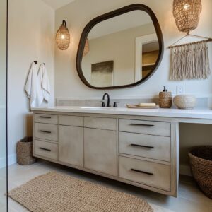
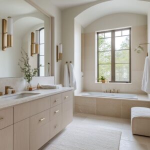
Warm Counterpoints: Wood, Stone, and Greenery
Even in the most dramatic black and white bathroom suite, there’s often one small moment of softness—and it’s usually not coming from the tiles or light. What balances out the contrast is warmth introduced through natural touches: pale wood, earthy stone, and a branch or leaf arranged with care.
Most of the wood finishes seen in upscale bathrooms avoid going too dark. Lighter oak tones or bleached ash help bring brightness back into the composition.
When used on floating vanities or open shelves, this light wood doesn’t feel rustic. It feels intentional, even refined.
Then there’s greenery. But not in abundance.
You’ll usually find just a single stem in a narrow-neck vase, or a small succulent in a matte planter. These tiny natural gestures are powerful precisely because they’re not loud.
They don’t fight the palette—they pause it.

In some spaces, warm stone takes over the role of contrast. Beige, taupe, or soft travertine starts to nudge the “white” of the room into something more like bone or sand.
It doesn’t look colorful, but the tone shift is enough to keep the black from feeling too stark. All of these choices are small in size but huge in effect.
One plank of wood. One curved branch.
That’s often all it takes to stop a black and white room from feeling too hard. The contrast stays—but the space becomes livable.

Vertical Illusion in Slender Rooms
In narrow layouts, making the room feel taller is often more effective than trying to widen it visually. This is where vertical elements come into play—and in the smartest black and white small bathroom ideas, you’ll notice a recurring set of techniques that work almost invisibly.
Tall mirrors, for example, don’t just give better reflection range—they draw the eye upward, especially when aligned with vertical windows or narrow wall panels. In several bathrooms, this technique doubles the perceived height even when the ceiling is average.
Tile orientation is another tool. A pattern may run horizontally in the main dry area, but then flip to vertical inside the shower stall.
This simple rotation breaks up the corridor effect without needing a single shift in color or material. It’s subtle, but the geometry resets your sense of space.

Some rooms take advantage of vaulted or angled ceilings, but instead of highlighting the slope with contrast, they keep everything the same tone. This lets the form do the work.
By skipping ceiling-mounted fixtures or bold crown lines, designers preserve the clean silhouette, letting light lines or concealed LEDs give shape without clutter. Even the decision to eliminate ceiling fans or pendant lights helps.
These fixtures often interrupt the upper third of a small space. In today’s most efficient layouts, that zone stays quiet—and the room feels taller because of it.

Hardware Minimalism and Finish Logic
A clean room only feels complete when the hardware is handled with discipline. That’s especially true in a black and white shower room, where any extra shine or visual clutter breaks the mood.
What you’ll see in the most refined examples is this: matte black rules. Not because it’s trendy, but because it absorbs attention instead of asking for it.
But it’s not about being extreme. Chrome or dark bronze may still appear—but only if they echo something else in the space.
A polished silver drawer pull might be used, for example, but only if the sconce trim above it is the same tone. These repetitions are tight and controlled.
Nothing is random.

Faucets mounted on the wall clear up counter space and cut down the visual bulk of deck-mounted fixtures. This small change also makes cleaning easier—especially around vessel sinks or integrated slabs.
Cabinetry often avoids pulls entirely. Instead, designers opt for push-to-open or recessed edge details, keeping the focus on clean face panels.
This works particularly well when cabinetry sits beneath a stone or solid surface slab. It’s a surface-driven approach, not a hardware-driven one.
And then there are the smaller items: towel ladders, soap pumps, toilet paper holders. In a well-built room, all of these match the faucet finish—perfectly.
If the tap is matte black, everything else is too. This consistency acts like a typeface system: one family, one weight, no strays.
Introducing a rogue metal here would feel like switching fonts mid-sentence. Designers avoid it for the same reason—it weakens the message.
In these rooms, restraint isn’t plain. It’s sharp.
And the result feels smooth because every detail speaks the same visual language.

Framing Nature
In the most refined black white bathroom designs, nature isn’t something added in—it’s something quietly framed. Across many standout bathrooms, designers use windows not for exposure, but for alignment.
A narrow vertical pane beside the shower, a square cutout above the vanity, or a glass door at the far wall isn’t only for light—it’s positioned so that the outside view acts like a built-in artwork. Because these bathrooms stick to grayscale tones—mostly black, white, warm stone, or soft gray—even a glimpse of olive-toned leaves through frosted glass creates a focal point.
A scrubby tree or a soft skyline carries more visual weight than any towel or wall art. The trick lies in where that view is placed.

In several examples, the glazing sits directly opposite the sightline—either from the entry or reflected in the vanity mirror. That means you see the scene twice: once straight ahead, and once again in reverse.
This layering doesn’t clutter the space. It gives the illusion of depth, especially when the rest of the room stays stripped back.
The benefit here isn’t only aesthetic. This alignment of natural views provides a sense of orientation—something often lacking in fully enclosed interiors.
It connects the daily use of the room to the time of day, the season, the weather. And that quiet interaction becomes part of the design itself.

Matching Black and White Bathroom Design Ideas
What ties all these spaces together isn’t one style—it’s how certain choices get repeated with a clear purpose. In any successful black and white bathroom layout, there’s usually a collection of smaller moves that add up to a cohesive result.
Here’s a breakdown of some of the most consistent ones seen across high-end homes:
- Start with a “light spine.” Whether it’s a skinny skylight above the shower or a recessed LED strip along the ceiling, these lighting paths guide the eye through the room vertically. The rest of the fixtures are kept secondary so the space feels structured by light itself.
- Then, float what needs visual lift—and ground what doesn’t. A concrete sink might float off the wall, but a darker shelf beneath it will stabilize the composition and help divide function cleanly. If the walls and floor are done in the same finish—plaster, terrazzo, or micro-cement—change the sheen subtly.
- A matte surface above, paired with a satin or low-sheen surface underfoot, brings grip without changing color. Accent texture is also best used sparingly. A room might feel flat with only smooth tiles—so a fluted niche, a ribbed glass panel, or a sand-textured feature wall is added for touch rather than for tone.
- In most of these rooms, greenery plays a part—but never as decoration. One leaf, one branch, one low planter beside a faucet. That’s enough to bring in warmth and light absorption, without pulling attention away from tilework or light structure.
- For bathrooms with vaulted ceilings, the mirror might stop short of the peak on purpose. That gap keeps the ceiling form readable and avoids visually flattening the room.
- As for tile layout—many rooms follow strict grids until a feature interrupts. Then, and only then, the pattern shifts. A rotated niche, a vertical stripe, or a broken grid signals a program change without resorting to trim or color blocks.
- Shadow reveals also play a role. A slim 20mm space between mirror and wall, or cabinet and floor, makes everything feel light without floating every object.
- And finally, keep alignments clean. The faucet spout height often dictates where towel bars, window sills, and sconces fall. These alignments may not be obvious at first, but they hold the visual field together like a baseline in design.
All of these tactics are simple on their own. But in combination, they shape a room that feels exact, functional, and quiet—without ever needing to be complicated.
Related Posts
Harmony Home Design brings 10+ years of residential interior design experience to the ideas shared here. We publish design concepts, layout thinking, and practical styling notes.