
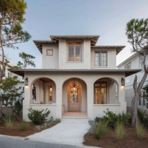
The way a front porch is styled can say as much as any entry door or façade. It’s the first space that meets the eye and often the last to be overlooked.
Today’s porch decorating approaches focus less on decoration for decoration’s sake, and more on how materials, shapes, and light build a subtle language. Across styles—whether minimal, coastal, rustic, or traditional—there’s been a shift toward using texture, shadow, and proportion as core design tools.
Cushions are no longer the loudest voice on a bench. Lighting is selected for the softness of its glow.
Even planters, seating forms, and flooring layouts are chosen not only for function, but for the visual rhythm they bring to the entry. This article explores front porch ideas that work through restraint, repetition, and intentional detail.
Rather than focusing on large statement pieces, it studies how light, shape, and placement shape the feel of a porch—even before a guest steps inside.

Texture-First Storytelling
In current front porch decorating ideas, visual interest doesn’t always rely on objects or patterns. What often defines the space is what it’s made of—not what’s placed on it.
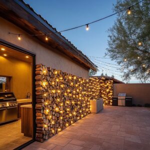
Surface materials are used with such care and control that they take the role of ornament. Wood grains, rattan weaves, poured concrete, and lightly veined limestone tiles are arranged in ways that speak through repetition, shadow, and material quality.
Cedar slats, especially when aligned vertically or wrapped over ceilings and sidewalls, introduce rhythm without needing added decoration.

Rather than layering color or loud accessories, many porches use texture to create tone shifts: polished stone beside rough clay, smooth concrete broken up by coiled wicker, or aged timber next to crisp stucco. These textures interact with light throughout the day, pulling depth from even the most neutral surfaces.
It’s a method that allows the porch to feel composed even when nearly empty. Grain, fiber, and mineral finish become the silent but constant storytellers.
This approach turns the architecture itself into decor, especially in designs that avoid bright ornament. It also opens up a broad range of front porch furniture ideas that work with—rather than fight—the surrounding finishes.
On many porches, a simple bench, one oversized planter, or a compact rug is enough, because the ground, wall, or ceiling already speaks visually.

Shadow as Moving Décor
There’s a quiet design language found in how sunlight lands. In many of the most carefully designed porches, it’s shadow that becomes the main visual feature.
It shows up not just in decorative cast-iron railings or perforated lanterns, but in deeper architectural features: vertical slats, wood-paneled overhangs, spaced battens, cutout screens, or even floating stairs with thin LED strips glowing underneath. What makes this so compelling is how it introduces change.
As the sun moves, so do the shapes across the floor and walls. Light filters through foliage or slatted walls, forming slow-moving patterns that animate the porch without needing color or bold prints.
It turns the entry into a stage for natural variation, rather than a fixed display.

This idea shows up frequently in homes influenced by modern lines, coastal simplicity, or traditional Southern porches—places where porches are treated as thresholds, not rooms. In these cases, lighting and form take precedence over filling space.
Fixtures are often chosen not to shine, but to shape how surfaces are seen—whether that’s a line of wall sconces washing cedar with amber light, or a rattan pendant forming soft grid shadows under an open roof. Among front porch ideas that rely on subtlety, using shadow as a visual element is one of the most overlooked but visually rich techniques.
It doesn’t require additional objects, just the right spacing, orientation, and surface.

Low Color Range, Single Flash
Many of the most composed porch decor ideas rely on a quiet foundation—neutral materials, softened whites, and muted woods—then place just one bold accent to stir the calm. The surrounding tones are intentionally kept close: soft taupes beside ash gray, charcoal next to driftwood brown, or warm beige alongside off-white.
This allows a single object—an amber pillow, a geometric yellow rug, or a coral cushion—to gain presence without shouting.

This method works because it doesn’t aim for contrast in volume. It builds visual weight slowly through material, then lets one piece break rhythm gently.
The accent doesn’t fight for attention—it’s simply unmissable because everything else stands back. What’s interesting is that these accent moments often come from soft items: a textile, a throw pillow, a low-profile rug.
They’re easy to swap, but their visual job is to stop the eye—right where the scene needs it. This approach is especially useful in small front porch decorating ideas, where too many colors can quickly turn cluttered.
A reduced palette with a single highlight helps define the space while keeping the atmosphere calm and coordinated.

Furniture that Echoes Architecture
One of the most overlooked cues in strong porch design ideas is how often the furniture echoes the structure. Visual shapes are chosen to reflect the lines already found in arches, columns, niches, and overhangs.
A curved rattan chair doesn’t feel casual when its back matches the arch behind it. A round-backed bench feels intentional when it aligns with a vaulted entry.
Even the slight slope of a sling chair can speak to the pitch of a nearby roofline. This kind of alignment isn’t always exact—it’s more about creating rhythm than replication.
A pebble-shaped chair placed on a flat concrete porch will soften the geometry without fighting it. Likewise, a swing hung between squared columns, using long rounded forms in the cushion, brings balance between structure and ease.
What makes this idea powerful is that it doesn’t require extra styling. The forms themselves, when in harmony, create visual unity.
Furniture becomes part of the architecture’s language—less like a set of added objects and more like an extension of the shell.

Planting as Geometry, not Garden
In the most composed porches, greenery is often used more like sculpture than like a flower bed. It’s not about lushness or bloom—it’s about shape, proportion, and outline.
Whether it’s a slender cactus standing tall next to a slim screen, or a bonsai shrub that spreads low and wide to emphasize horizontal lines, planting is selected to repeat the geometry of the space it occupies.

The strongest effect happens when plants are framed by minimal containers—matte black cylinders, square stone boxes, or off-white concrete cubes. These forms ground the foliage and define how it’s seen.
Two tall urns beside a door, for instance, create a kind of frame. Their height matches the door’s vertical line, and their contents often echo the softness or structure of what surrounds them.
Even in porches with limited footprint, this method holds strong. In smaller settings, a single architectural planter can do more than a row of mixed pots.
Greenery here isn’t used as filler—it’s used to shape the composition. And that’s what makes these designs stand out: plants chosen to echo form, not just add life.

Floors that Announce the Theme
Porch floors are far more than a base—they often act as the clearest cue to the space’s character. Before someone sees a pillow or planter, their eye lands on what’s beneath their feet.
That’s why in so many modern front porch ideas, the ground itself carries the visual identity. It might be patterned cement tile laid out with the precision of a rug border, or diagonally placed slate tiles that stretch like furniture-scaled panels.
These ground treatments don’t just frame the porch—they name it.

You’ll find that many porches use tone and pattern in subtle but calculated ways. A soft yellow flatweave rug over rich wooden boards, for example, defines a zone before a single chair is added.
Terracotta and gray checkerboards set the mood for porches with Mediterranean or vintage charm, while pale travertine tiles signal clean coastal energy. In every case, the floor is the first layer of atmosphere.
Especially in homes where the porch connects directly to the entry or blends with interior space, the flooring links both sides of the threshold. It acts as a silent invitation—without needing signage or ornament.
It’s one of those outdoor porch ideas that works across styles simply because of how foundational it is.

Negative Space Works Hard
Space left open often carries just as much purpose as the space that’s filled. In thoughtfully arranged porches, absence is used to highlight structure, materials, or views.
These aren’t porches cluttered with furniture—they’re framed compositions. A single chair beside a concrete wall, or a floating bench with room to either side, does more than provide a place to sit—it sharpens the focus.

This approach is particularly common in small front porch ideas, where the instinct might be to overfill. Instead, restraint becomes the visual strength.
Chairs are often pulled slightly off-center, rugs leave margins around their edges, and planters are spaced in groups of one or two rather than filled edge to edge. By giving empty zones a clear role, porches feel purposeful, not incomplete.
The effect is quiet but striking—air and space serve as framing tools for the few elements that are present. It’s a method borrowed from gallery design, applied to thresholds.

Visual Weight Balancing Tricks
Porches succeed visually when materials are chosen with awareness of weight—not literal weight, but how each piece reads to the eye. This balance often comes through contrast.
A thick ceramic drum beside a knitted pouf, for example, lets each object define the other by difference. One feels dense, the other soft.
One anchors, the other lifts. You’ll see this balancing act in many designs: wide teak armrests set against airy chairs, heavy concrete stools placed near woven seats, or boxy side tables offset by curving planters.
These moments of contrast prevent visual fatigue. Without them, a porch can feel flat or overly coordinated.
In smaller porches especially, the interaction between dense and airy becomes the key to making the footprint feel alive. It also helps guide the eye: bold shapes draw attention, while lighter ones leave room to pause.
The trick isn’t to match every piece—it’s to allow them to respond to each other through form and feel.

Symmetry Used Sparingly—and Subverted
Porch compositions that feel natural rarely follow strict symmetry. Instead, they hint at balance—then break it slightly to keep the space from feeling frozen.
Full symmetry shows up only where formality is the goal, usually in porches with grand doors and lanterns aligned like punctuation. But even in those layouts, something often shifts: a planter tucked further back, a single lantern hung lower, or a drape gathered to one side.

That kind of controlled irregularity creates a tension that holds interest. You’ll notice groupings like a 2-1-1 planter layout, or seating that’s technically centered, but layered with throws or pillows that lean visually left.
On porches with swings, the drapery is sometimes drawn tighter on one column than the other—not for utility, but to loosen the scene. The result is that even with strong framing—columns, railings, steps—many of the most expressive front porch design ideas leave just enough irregularity to feel relaxed.
It’s the small shifts that keep the layout from slipping into showroom stiffness.

Ceilings Treated as Fifth Wall
The ceiling, so often ignored in transitional outdoor spaces, is used here as a tool to complete the visual envelope. Rather than being an afterthought, the overhead plane gets equal attention.
In some porches, wood slats continue uninterrupted from the ceiling down a side wall, making the transition feel wrapped and immersive. In others, pendant lights drop low—nearly within arm’s reach—so the light fixture becomes part of the seated experience.

Painted ceilings play a similar role. A blue-green tone continued from a door upward unifies the vertical space, while natural wood planks overhead bring tone warmth to otherwise cool palettes.
Even recessed lighting, when thoughtfully spaced, draws linear paths across the top of the porch and pulls sightlines upward. On compact layouts especially, using the ceiling visually helps frame the footprint.
It creates the sense of enclosure without closing the space. In several of these porch ideas, the ceiling isn’t just background—it’s one of the most expressive surfaces.

Doors as Color Anchor and Tactile Moment
In many porche designs, the door quietly dictates everything else around it. It sets tone, texture, and visual grounding.
A walnut door that matches wall slats makes the entry feel carved from one continuous material. A sage-green door that mirrors planter leaves ties the softscape and architecture together.
Blue-painted panels echoed in the porch ceiling give the entire zone an extended feel. The most successful front doors don’t stand alone—they speak to the surrounding finishes.
That’s why they’re often paired with matched lighting, stepped planters, or textured walls that pick up on the tone or grain. Their finish also plays a role: some are raw wood, some matte color, and others finely grained composite—but they’re always chosen for how they look next to the other elements.
Even in minimal setups, the door provides a tactile marker. It’s the one thing everyone interacts with up close.
That makes its scale, finish, and even hardware part of the porch’s visual rhythm. It functions less like a separate entry and more like the center of the whole exterior composition.

Lighting That Draws Without Shouting
Lighting on front porches isn’t used as jewelry—it’s used as shadow, outline, or atmosphere. In many of the most visually controlled porches, the lighting decisions are quiet on purpose.
The effect comes not from how the fixture looks, but from how it behaves. A pencil-thin sconce casting a long vertical glow along grainy wood.
A recessed LED strip under a floating concrete step, tracing the edge of each tread like a faint underline. A simple pendant in woven rattan that softens light into scattered flecks overhead.

The visual goal is often rhythm, not sparkle. Warm bulbs in low-hanging pendants bring weight to the overhead zone.
Tiny downlights wash walls instead of spotlighting objects. Even lanterns, when used, are typically framed in muted metal finishes and clear glass—more about form than flourish.
Because porches shift from daylight to nightlight zones, this lighting approach lets the space evolve without hard contrast. It doesn’t demand attention, but it completes the composition.
Just as a bench anchors the base of the design, a soft-lit edge defines its after-dark outline.

Screens & Drapes for Porosity
Walls aren’t always needed to create privacy. Many porches use layers instead—layers that filter, not block.
Two of the most effective tools for this are vertical wood slats and lightweight outdoor curtains. Both act like thresholds in motion.
Slatted wood screens—whether floor-to-ceiling battens or half-height partitions—allow air to pass freely while creating light patterns that shift across the day. They provide shape without cutting the porch off from its surroundings.
The spacing is everything: tight enough to filter light, loose enough to keep the space breathable.

Then there’s outdoor drapery. Often white or linen-toned, these curtains don’t act like fabric—they act like movement.
Hung from ceiling beams or tucked between columns, they sway gently with breeze and create a soft edge to the structure. Some are gathered, some left to hang in vertical folds, but all serve the same function: to wrap the porch in quiet.
These choices highlight why porch ideas often succeed not through structure, but through texture and airflow.

Accents that Hint at Use, Not Stage a Scene
Subtle decor matters more than full arrangements. The most refined porches avoid trying to look ‘set’ or styled.
Instead, they leave small clues that the space gets lived in. A folded throw left over the bench corner.
A weathered clay jug placed by the door. A basket tucked with books or magazines.
These accents don’t try to complete a scene—they start one.

In smaller porches especially, the difference is felt. Too many objects, and the space closes in.
But one or two personal touches offer scale, movement, and a trace of use. A drink tray placed casually on a side stool, a planter that’s slightly imperfect, or a rug with soft uneven fading can say more than a row of coordinated decor pieces.
This kind of restraint works because it lets texture and material do the heavy lifting. Instead of decoration becoming display, it becomes memory—the kind that suggests activity, rest, and pause.
And in spaces built to welcome, that suggestion is often enough.

Conclusion
The most lasting front porches aren’t always the ones filled with furniture or color—they’re the ones where each surface and object holds its place with purpose. From the direction of ceiling planks to the spacing between vertical slats, the decisions that matter often appear quiet but carry lasting effect.
What unites many of these porch decorating ideas is how little they rely on excess. Texture does the talking.
Soft color palettes leave room for one clear accent. Plant shapes echo railings and screens.
Negative space becomes part of the layout, not a leftover. Even the lighting plays a role in outlining the structure itself, rather than just brightening it.
As outdoor areas continue to act as functional extensions of home life, these design moves—subtle, structural, and composed—will likely stay central. Not because they follow trends, but because they make space feel considered from the ground up.
Related Posts
Harmony Home Design brings 10+ years of residential interior design experience to the ideas shared here. We publish design concepts, layout thinking, and practical styling notes.