
Saying a house is “blue” oversimplifies a much broader range of facades. A powdery sky tone reacts differently than a deep indigo under daylight, while denim, steely navy, or chalky blue all shift in warmth, intensity, and depth depending on the time of day and surrounding materials.
These subtle shifts carry real impact. They influence how a door appears—whether it seems to float lightly, anchor the space, step forward with weight, or quietly blend into the plane.

The visual strength of door colors for blue house facades doesn’t rely on bold contrast alone. It depends on how the saturation and warmth of the blue siding respond to nearby surfaces—like whether the door should bring in a new hue, deepen the tones already there, or add texture for depth.
Understanding this allows a more refined control of the entry’s presence.

Contrast Through Temperature, Not Brightness
Modern design ideas often rely on temperature difference between colors rather than making the door pop through brightness. This method plays with how colors feel rather than how light or dark they appear.
In one smart example, a peach-blush door is set against dusty blue brick. The pairing skips the usual bright-vs-dark contrast.
Instead, the blush introduces a warm note that hums quietly beside the cooler wall. The brick texture stays dominant, while the satin finish of the door avoids reflecting extra light.
This combination builds interest through warmth meeting coolness, not through visual volume.

Another example uses a burnt terracotta door next to muted blue planks. The clay tone leans warm and grounded, while the siding stays cool but softened by its gray tint.
They feel connected, not competing. Both colors are toned down, which makes their difference feel subtle and real—like soil next to sky.
The terracotta doesn’t demand attention; it holds its place because the blue backdrop respects its tone.

Takeaway: Warm-cool contrast allows for richer, quieter combinations that feel settled and intentional. These blue house door color ideas use temperature shifts rather than visual loudness, which creates impact without noise.

Framing as a Visual Control Mechanism
The door color alone rarely carries the entire composition—it’s the frame that sets the tone. In front entries for blue houses, the trim doesn’t just outline the door; it’s part of the visual weight.
Whether dark, pale, or matching the door itself, the framing acts as the edge that either amplifies or contains what the color does.
- A pale blush door, for example, on a dark blue facade would easily get swallowed up without a bold outline. The black frame here doesn’t only support—it defines. It turns the door into a crisp focal point, clearly marked within a larger dark field. That same black is repeated in surrounding elements like planters or window trim, letting the eye read it as one stable unit.
- On another entry, black trim slices cleanly through soft blue siding, giving the door shape through contrast without changing its tone. In both cases, the frame becomes a boundary that sculpts. It introduces visual discipline, helping compositions feel composed even when the color palette is quiet.
Framing isn’t an afterthought—it’s a color move. Choosing the right contrast or blend between frame and siding is as impactful as picking the front door color for a blue house itself.
Whether aiming for sharp outlines or blended seams, the trim helps define the way the door is read in context.

Planters Are Color Bridges, Not Just Decor
Plants on the porch often seem like a finishing touch, but in modern compositions, they behave more like connective tissue between all the surface tones. Both the plants and the containers they sit in play an active role in composition.
Some entries use material echo—black planters with a similar matte finish as the door trim. This draws a line across the base of the entry, visually grounding it.
The planters aren’t doing their job alone, though. Foliage is picked with color logic in mind—warm-tipped grasses, pale silvery herbs, or deep green leaves with golden edges show up in the same color range as the door, the handle, or even the ceiling wood above.

In one striking example, a bronze door handle finds its match in the amber bloom tips of nearby plants. The visual link isn’t loud, but it’s enough to keep the color story moving.
These aren’t coincidences. They’re soft alignments that extend the color palette beyond the structure.
This is what gives so many blue house front door color ideas a cohesive look without needing exact matches. Plants mirror tones, diffuse contrast, and soften structure—doing quiet but important work in making the entry feel complete without visual strain.

Light as a Mood Shaper, Not a Spotlight
Lighting around an entry isn’t only about visibility—it plays a larger part in how tone, depth, and rhythm come together across the whole facade. Light has been used with a quieter purpose, not to shine directly on the door, but to adjust how the colors feel throughout different times of day.
In some entries, a door nearly vanishes into its siding as dusk sets in, its tone darkening with the cladding around it. This soft fade doesn’t read as a loss of definition—it allows shadows and plants to rise in contrast.
The entry becomes calm, dimensional, and immersive without anything needing to glow.

Elsewhere, cool dark siding is paired with warm wall sconces—a move that changes the tone balance, making the warm-toned door stand out through temperature, not saturation. It adds quiet tension without resorting to stark color changes.
In another case, stairs are lit from below, casting a warm reflection upward that visually connects the cooler siding with a wood ceiling above. That light completes the vertical line, finishing the composition from the ground up.
The light doesn’t demand attention—it finishes the atmosphere. It adjusts what would otherwise be flat surfaces into spaces that shift with the hour, season, and weather.

Low-Saturation Palettes = Spatial Expansion
Muted color schemes—where both the door and siding carry low chroma tones—offer a completely different experience. Instead of focusing the eye on a single standout element, they let the space stretch and blend.
These combinations often allow the entry to feel wider, softer, and more integrated into the full structure. In one example, an olive-taupe door meets a dusty blue-green siding—both tones quiet, slightly shaded, and full of subtle gray.
This keeps the palette grounded, without any one color overpowering the others. In another, a clay-beige door is paired with a cool, pale blue-lavender wall—neither is bright, but they hold contrast through undertones.
That small difference in warmth creates depth without separation.

This kind of approach allows other materials to take up more visual space. A brushed metal handle, the grain of a wood soffit, or the natural veining in the stone beneath the steps—these textures begin to carry more visual weight, becoming part of the structure’s color story.
Low-chroma palettes in blue houses are not dull—they’re expansive. They trade obvious contrast for layers of rhythm, softness, and shape, which give front doors room to feel integrated rather than isolated.

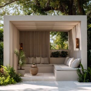
The Ceiling Is a Secondary Color Anchor
The ceiling above the entry—whether it’s a canopy, soffit, or small overhang—is more than structural cover. It acts as an upper boundary to the color story and can either reinforce or offset what’s happening below.
While eyes often settle on the door or siding first, the ceiling quietly ties the vertical space together and influences the entire composition. In some entries, a door and ceiling share the same amber tone, creating a full-height echo from the porch floor to the top edge.
That repetition builds a warm envelope, almost like the entry is gently glowing from within. In others, a golden-tan door finds its match in the soft hue of the wood eaves above—not an exact match, but close enough to register as part of the same tone family.

A different approach uses contrast instead. Cool blue-silver siding is broken by a warm wood ceiling, giving the entry a horizontal pause line and softening the overall temperature.
What seals the balance is when planters below repeat the warmth from above, anchoring the ceiling tone back into the lower third of the scene. The ceiling doesn’t just float overhead—it sends color downward, bouncing warmth or diffusing coolness depending on its tone.
It also plays a key role in shaping the rhythm of shadows, especially in deep or recessed entries. This is where light and color meet surface—not to grab attention, but to shape how the entire facade breathes.

Textural Contrast Replaces Color Contrast
Not every striking entry relies on a bold door color. Many of the strongest compositions do the opposite—they keep the tones close and instead introduce textural opposition that holds attention.
A standout example uses an ochre door with visible vertical wood grain set against horizontal siding. The lines don’t match, and that’s the point.
It creates a directional energy—a quiet visual tension—without shifting the palette. The eye notices the clash in rhythm, not color.

In another case, a soft sage-green door rests against rugged brickwork. The door is smooth and even-toned, while the wall is irregular, layered, and rough.
The contrast is in how each surface absorbs and reflects light, not in the hue. That difference becomes the main visual divider.
Then there’s the pairing of a celadon green door with matte texture, framed by slate pavers and wispy foliage. Each surface brings something different—hardness, softness, line, and break.
And all of it works within a narrow band of tone. Texture does what color often can’t—it shapes the entry with detail and rhythm, while keeping the palette calm.
This is especially effective in minimalist or low-chroma setups, where small shifts in surface or grain direction can hold more impact than even a bright contrast.

Near-Monochrome Isn’t Neutral—It’s Calculated
A nearly matching door and siding palette might seem quiet at first glance, but it’s this restraint that lets the subtleties stand out. Near-monochrome combinations reduce visual tension, giving the composition room to breathe without feeling blank.
The close color values eliminate the usual push-pull between two surfaces and instead create a surface where other details rise to the surface.

The eye is pulled to the trim, the planter shapes, or the finish of the material. Because there’s no loud contrast between door and wall, texture shifts and shadows become more noticeable.
A groove in the wood, a fine edge of metal, or even the changing light across the surface adds depth that would otherwise go unnoticed in a high-contrast setup. Shadows take on a new role here.
In low-contrast palettes, they become the ornament. They move with the day, giving shape to edges and outlines that color would usually define.
What seems plain during noon becomes layered in late afternoon. It’s a subtle technique, but one that rewards careful design.

Door Handles: Material vs. Hue
Handles do more than open the door—they often carry the strongest material punctuation on the entry. In minimal palettes, the handle becomes the visual pause or underline.
Whether it’s a long bronze pull, a soft matte wood grip, or a dark steel bar, the handle is often the one moment where a different material steps forward. This works because handles often echo something already present—a wood handle tying back to the ceiling slats, or a bronze pull matching nearby lighting tone.
Even when the hue is close to the door, the finish—shiny, brushed, matte—offers a break in surface and a shift in how the light plays across it. In many cases, the handle is the only visible metal, which gives it extra weight in the color story.
It becomes the tone bridge—the link between hard structure (door and siding) and the softer touches below like planters or steps. Even its placement adds rhythm, especially when it’s elongated vertically to counter wide horizontal siding.
A good handle doesn’t shout, but it holds everything in place visually—and in calm, color-tight designs, it’s often the part that defines the balance.

Emotional Tone Through Subtle Asymmetry
Perfect symmetry might look orderly, but it often feels static. In many modern blue house entries, asymmetry is where the feeling comes in.
These shifts don’t call attention to themselves—but they guide the eye, suggest motion, and bring depth without fuss. A glass panel on just one side of the door.
A planter placed slightly off-center. A pull handle mounted to the left instead of centered.
These aren’t layout flaws—they’re quiet decisions that introduce rhythm. They work especially well when siding runs in rigid horizontals.
That off-balance detail breaks the repetition gently, giving the whole entry a more natural flow.

In some examples, the spatial weight is uneven but balanced by tone or texture—a lighter planter on one side, denser foliage on the other. This isn’t randomness.
It gives the entry an approach path. It says the space is meant to be walked through, not just looked at.
This is where emotional tone is set. The composition doesn’t follow a grid—it follows a human gesture.
It feels placed, not plotted. And that difference makes the entrance softer, more grounded, and more engaging to the eye.
Final Summary
The strongest blue house and front door combinations rarely rely on dramatic contrast or loud color moves. What sets them apart is how carefully they control visual rhythm.
Each decision—frame tone, ceiling hue, handle finish, plant texture—builds toward an atmosphere that feels settled without being static.
Such entry designs succeed because they choose softness over spectacle. They guide the eye through temperature shifts, fine textures, and muted tones.
Whether it’s a cool blue cladding paired with a warm clay door, or a matte celadon framed in pale wood, each element speaks quietly—but with clarity. The effect isn’t decorative.
It’s compositional. And that’s what makes such front entries memorable—not because they demand attention, but because they hold it without needing to raise their voice.
Related Posts
Harmony Home Design brings 10+ years of residential interior design experience to the ideas shared here. We publish design concepts, layout thinking, and practical styling notes.