
A grey sofa rarely functions as a simple neutral. In strong interior designs, it behaves like a tuning tool that controls light–dark balance, warm–cool drift, surface noise, outline sharpness, and the room’s sense of calm.
The most convincing looks are built less by adding color and more by arranging value bands, texture scales, and reflective moments so the room reads intentional from far away and richly layered up close.

Grey as a value stabilizer, not background filler
Stylish designs often treat grey seating as the middle-value anchor in a three-level structure:
- Light field: walls, curtains, ceiling, large rug surfaces
- Mid field: the sofa (and often one or two nearby textiles)
- Dark punctuation: fireplace openings, window frames, a table silhouette, thin frames in art

When this mid field is calibrated well, bright whites stay bright without looking thin, and dark elements stay crisp without feeling harsh. The sofa becomes the tonal hinge that lets opposites sit comfortably in the same room.

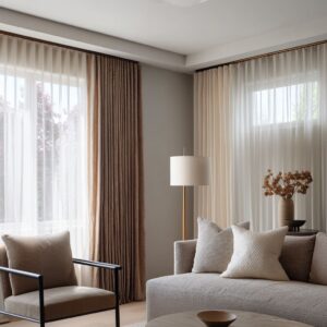
Temperature drift: grey borrows its mood from neighbors
Grey is emotionally changeable. It can read coastal-soft, urban, or gallery-clean based on what touches it visually.
- Warm companions (wood, warm whites, brass, rust, woven textures) make grey feel textile-rich and relaxed.
- Cool companions (bright whites, sharp black lines, silvery finishes) make grey feel cleaner and more graphic.

In many successful designs, warmth appears in small, high-impact doses rather than turning the whole palette beige. That keeps the grey identity intact while avoiding a cold cast.

Texture-frequency mapping: micro-weave can calm chaos
Some of the strongest grey sofas succeed because of how the fabric breaks up visual noise:
- Micro-textured weaves (salt-and-pepper, tight nubby surfaces, fine line textures) can average out busy backdrops like brick, heavy stone, or dark cladding. The sofa reads calm because its detail is tiny and consistent, so the eye stops fighting the background.
- This creates a subtle effect: the room can keep bold architecture without feeling visually loud in the seating zone.
Grey, in this role, becomes a quiet filter that turns dramatic surfaces into a comfortable setting.

Macro pattern: grey can become the room’s signature without loud color
A different strategy uses grey as a graphic material rather than a quiet mediator. Large-scale woven blocks, stripes, or broken-grid motifs let the sofa behave like a statement piece while staying in a neutral range.
The impact comes from contrast and rhythm, not from bright hue. This works best when other pieces hold back: warm architectural materials stay present (wood, stone), and dark accents appear as a few clean silhouettes rather than scattered objects.

Scale control: pattern looks designed when it has pauses
Designs that feel polished often manage pattern through scale steps:
- A main upholstery pattern sets the tempo.
- Pillows repeat the idea at a different scale (tighter or softer).
- Solid pillows act as pauses so the eye rests.

The result is a seating group that reads layered instead of busy, even when the sofa fabric is active. Grey supports this because its contrast can be tuned without introducing competing color families.

Edge budgeting: black outlines sharpen; grey keeps them livable
Many modern interior ideas lean on black window frames, black fireplace openings, dark art frames, or a dark table. Those outlines can easily make a room feel strict.
Grey often prevents that by carrying the large soft mass. Black remains punctuation, while grey remains structure.
The room keeps clarity, but the seating still reads comfortable rather than severe.

Reflectance choreography: matte grey becomes richer next to one reflective plane
A recurring visual tactic is pairing matte or light-absorbing grey upholstery with one reflective surface:
- A glossy black table can supply polish and a controlled sense of shine.
- A glass table can remove visual weight so the sofa and rug become the main solid field.

Either way, the shine is usually limited and placed low, so it reads intentional rather than distracting. Grey benefits because it gains depth from contrast in reflectance, not from added color.

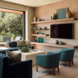
Shape counterweights: one curve can soften a room full of rectangles
Strong living room ideas often contain a strict framework: linear fireplaces, gridded windows, slatted wood walls, rectangular TVs, and blocky seating. The common softener is a set of curves:
- a round or drum-like table
- rounded vases and vessels
- soft-edged stools, mushroom-like lamps, or curved chair silhouettes

Grey helps here because it doesn’t compete with shape. It lets curves feel like a quiet emotional counterweight, turning strong architecture into something relaxed.

Banding and horizon effects: stripes and linear fireplaces organize the whole scene
Designs can build calm through horizontal banding: a long linear fireplace reads like a horizon line, the sofa becomes the central middle band, and a dark low table acts as the base band. Striped grey upholstery strengthens this organizing principle because it echoes the room’s main geometry while staying soft through weave blur.
This is one reason certain monochrome rooms feel composed rather than empty: the eye reads the space in layers, not in scattered accents.

Grey as shadow that makes whites look expensive
In bright designs dominated by warm whites and creams, grey frequently appears as the depth layer: a sofa, chair, or textile repeat that gives contour to the light palette. Whites look richer when they have a controlled shadow tone nearby.
Grey supplies that shadow without the sharpness of pure black.

This is the quiet logic behind many light grey couch living room ideas: the room stays luminous, but it gains shape and hierarchy through mid-tone placement.

The deep-grey anchor: weight that still feels calm
Deep charcoal seating can be the strongest visual mass in a bright room if it is handled as a soft shadow instead of a hard block. The most convincing versions rely on:
- warm whites that break up the mass
- micro-variation in the textile so darkness reads tactile
- a light rug that bounces light upward
- limited black accents so the room doesn’t become overly rigid

This is the common backbone of many dark grey couch living room ideas: depth arrives through value and texture, while the space stays breathable through light fields and controlled shine.

A consistent styling syntax that keeps grey from feeling generic
Many successful grey living room designs share a similar internal grammar:
- Low, horizontal styling on tables (books, trays, shallow bowls) preserves sightlines and keeps the room calm.
- Corralled groupings (often via a tray) make small objects feel intentional instead of scattered.
- Light accents on darker bases (cream pillows on grey, pale ceramics on dark tables) create repeatable rhythm at multiple height zones.
- Micro warmth (a warm metal note, a woven texture, a muted clay tone) prevents an icy cast without changing the room’s main identity.
Together, these strategies explain why the grey sofa living room design can read warm, clean, textured, graphic, coastal, or urban—without relying on loud color, and without losing the calm that makes grey so widely searched.
Related Posts

Harmony Home Design brings 10+ years of residential interior design experience to the ideas shared here. We publish design concepts, layout thinking, and practical styling notes.