
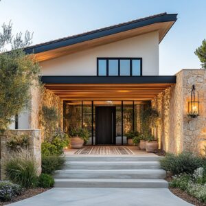
The garage door is often the largest single plane on a front elevation, so color behaves like a steering wheel for the whole first impression. In strong examples of garage door color ideas, paint is used less like decoration and more like composition: it decides what reads first, what reads second, and what feels calm instead of busy.
The door’s color can make a house feel wider or tighter, warmer or cooler, vintage or current, even when the architecture stays the same.

What most people miss is that the door color is rarely working alone. The strongest color scheme concepts treat the garage door as part of a small system: value level (light-to-dark), temperature (warm-to-cool), edge control (how the opening is framed), texture rhythm (panel seams and grooves), and partner notes (small dark accents, warm wood, or soft planting that makes the color look intentional).

Garage Door Palette Map
Here are fast ideas before the deeper logic:
- Creamy off-whites and bone-beiges: make the door behave like wall architecture; shadows become the pattern.
- Taupe, greige, and warm concrete grays: stabilize contrast and keep large doors from feeling either glaring or hole-like.
- Charcoal and graphite: reduce the door to a single calm plane; other façade cues carry the welcome.
- Soft blacks: simplify the garage face and sharpen the surrounding geometry when paired with warm cues nearby.
- Muted navy and slate blues: read classic and grounded; color appears without turning the façade themed.
- Sage and olive greens: act like planted tones in paint form; the garage feels landscape-linked.
- Deep red and oxide red-browns: pair naturally with brick warmth while calming busy textures through a uniform plane.
A useful way to read these directions is by visual job, not by shade name: some colors reduce the garage’s weight, some soften harsh contrast, some tie mixed materials together, and some create a calm focal plane while letting the entry stay emotionally primary.

Fixed elements first: roof, trim, wall material, driveway
Color gets easier when it is treated as a response to what cannot change. The roof and window trim set the strongest temperature authority (warm vs cool), and the wall material sets the texture noise level (smooth stucco vs busy brick/stone).
The driveway then becomes the ground reflector that pushes the door lighter or heavier from the curb.

A clean reading method is to sort the facade into three roles: top (roof), edges (windows/trim/gutters), and field (wall material). The garage door sits between them, so it works best when it either matches one role (quiet continuity) or mediates two roles (controlled contrast), rather than inventing a new direction that none of the fixed elements support.

Common fixed-element pairings and what they tend to reward
- Cool roof + black window frames + light wall field: deep charcoals, soft blacks, and smoke-leaning mid grays tend to read architectural, because the door joins the existing dark edge language instead of starting a new accent.
- Warm roof + creamy wall field + warm stone notes: taupe-grays and browned grays tend to look expensive, because they absorb warmth without turning beige, and they keep the stone natural instead of making it look overly orange or pink.
- Red brick field + darker trim language (black/bronze): calm red-browns and muted near-oxbloods often feel coherent because they relate to the brick’s warmth while smoothing the texture into a single plane.
- Busy stone/brick field + light trim + pale wall elements: quieter mid-tones and near-neutrals often outperform strong colors because the wall already supplies visual activity, so the door’s job becomes steadiness.
Driveway reflection: the hidden brightness push
A very light concrete drive bounces light upward and makes mid-tones read lighter than expected; dark asphalt absorbs light and makes the same mid-tone read heavier. This is one reason mid-tone doors can look too pale on a bright driveway and too serious on a dark one, even before the wall color is considered.

Value comes first: color succeeds because the door’s weight is correct
A garage door’s first job is value, not hue. Whether the door reads as a quiet plane or a loud billboard is mainly decided by how far its brightness sits from the wall and the driveway.
Quiet-light doors
A warm off-white, bone, or creamy beige can make a large door read like part of the wall plane rather than a separate object. The hidden trick is that definition comes from shadow, not contrast: sun-and-shade blocks, thin reveal lines, and subtle seams supply depth, so the door stays calm even in strong daylight.

Mid-tone anchor doors
Greige, smoke-taupe, warm concrete-gray, or mushroom-taupe often act as the stabilizing middle note between bright siding/stucco and darker roofs or window frames. In many successful garage door paint schemes, the mid-tone door keeps the elevation from becoming either glare-heavy (too light) or hole-like (too dark), while still reading intentional.
Deep-value doors
Charcoal, graphite, ink-black, and near-black hues can compress a wide opening into a single calm plane. Deep doors feel most composed when the overall contrast map is managed: bright ground planes, controlled warm lighting, and small repeated dark notes elsewhere prevent the door from becoming visually heavy.

Undertones decide expensive vs. awkward
Two paints that look similar on a swatch can behave very differently when placed next to stone, brick, and sunlit stucco. The strongest garage door paint color ideas are usually undertone solutions.
Mixed warm materials
When a facade includes warm stone plus warm-leaning stucco, balanced neutrals (taupe-leaning grays, browned grays) tend to behave like mediators. They keep the stone reading natural and keep the stucco from shifting pink or yellow in bright light.

Brick and other lively textures
A door color can be related but calmer rather than contrasting. A softened oxide red, merlot, or oxblood-brown often works because it shares the brick’s warmth, yet looks more uniform and smooth—so it becomes the steady panel surrounded by a busy texture field.
Near-neutral tints
Lavender-gray, fog-blue, silvery-blue, seafoam-gray, and sage-gray often work best when they read as gray first and tint second. This keeps the result grown-up: the hue appears mainly in good daylight or close range, instead of presenting as a pastel block from the curb.

Timeless vs current is usually a contrast decision
Many timeless garage door colors are simply colors that keep their role stable as exterior styles shift. They do that by staying inside one of three stable roles:
- quiet continuity (close to the wall value),
- calm anchor (mid-tone mediator),
- or clean outline (deep edge language repeated elsewhere).
Current looks often come from one of two moves: a more deliberate undertone stance (greige that leans clearly warm or clearly cool), or a more intentional depth stance (soft blacks and deeper charcoals used to simplify large planes). In other words, what reads current is often not novelty; it’s clarity—undertones and depth that look chosen, not accidental.

What makes a color age well on a large door plane
Colors that hold up best tend to read as materials rather than paint personality. That usually means: gray-first tints, browns that feel wood-adjacent, greens that feel planted, and deep neutrals that behave like shadow.
This also explains why extremely clean brights often feel dated quickly on garage doors: the plane is too large for a small accent behavior.

Edge control: the frame decides if color feels set in or stuck on
A door rarely looks finished by paint alone. The opening edge functions like a frame for the color plane.
Light buffer trim around saturated paint
A warm light trim line between a strong door hue and a textured wall (brick/stone) prevents color bleed. The door reads as an inset panel, not a sticker.
Dark outline around warm soft colors
Muted apricot, clay-tinted peach, or dusty warm tones often look most controlled when a darker outline edits the rectangle. The outline supplies crisp geometry so the warm color can stay soft without feeling flimsy.

No heavy outline, but distributed structure lines
Some palettes avoid bold framing and instead rely on other structural darks—roof edge, window frames, downspouts, a slim wall light—to keep the opening legible. This is a frequent pattern in modern garage door paint ideas where the architecture carries the definition.

Surface rhythm edits saturation: seams and grooves filter the color
Two doors in the same paint color can read dramatically different if one throws sharp highlights and the other holds a soft, steady surface. A calmer finish tends to keep tinted neutrals from turning sugary and keeps deep colors from looking like a hard black cutout.
It also changes how panel seams show up: strong highlights can exaggerate every joint; softer reflection lets the rhythm stay quiet and architectural. This is why clean-looking garage colors are often less about picking a safer shade and more about controlling how the surface catches light.
When reflection is disciplined, the door reads like a composed plane; when reflection is jumpy, even a neutral can feel busy.

Vertical grooves
Fine vertical lines create micro-shadows that soften saturation on warm hues (mustard-ochre, deep reds, wine tones) and make the plane feel tailored instead of loud.
Wide horizontal bands
Long horizontal seams suit low rooflines and modern forms because they repeat the home’s horizontal calm. On pale or mid-tone colors, the seams provide just enough depth so the door reads architectural, not blank.
Carriage-style grids and restrained hardware
A neutral door can feel crafted when the rhythm is disciplined: a clear panel hierarchy, modest hardware scale, and a measured amount of detail. The key is restraint—detail that organizes the plane, not decoration that creates noise.

The window band is often an anchor, not a style feature
Upper glazing is most successful when it stabilizes the color plane.
Dark glass as a cap
A thin dark band near the top gives a lighter or warmer door a place to lean, helping the main color stay grounded. Reflections add movement without adding objects.

Softened glazing treatments
When glass reads too harsh, a softened layer behind it (diffused interiors, gentle backing, light-filtering treatments) can make the garage face feel more like a small studio volume and less like a utility opening.
Asymmetry used politely
Narrow inserts placed to one side can break mass while keeping the overall plane quiet—especially effective on modern doors that avoid busy patterns.

Repetition makes the garage color feel like a house identity, not a garage statement
One of the most reliable intentionality cues is controlled repetition.
Repeat on the entry door or a second door plane
When the same hue appears in the entry zone, the color reads like a palette decision rather than a single accent patch. The entry can still hold emotional priority through depth, shadow, and warmer materials.
Repeat as trim, not objects
In softer palettes, repeating a tinted neutral on fascia lines, casings, or opening trims can turn the door color into a secondary trim language.
Repeat in very small notes
A mailbox, planter, or a thin surrounding line can echo the color quietly, reducing the sense of isolation.

Temperature balance: warmth keeps cool colors friendly; warmth also needs crispness
Cool door colors feel welcoming when a facade carries warm counter-notes.
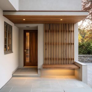
Warm wood as the human-scale stabilizer
A warm wood entry, wood-toned framing, or a warm-toned surround can keep foggy blues, seafoam tints, and sage-grays from reading chilly.
Warm light on deep paint
Lantern glow and soft downlighting can turn deep colors into calm, inviting planes by adding gentle gradients and human-scale reference points.
Small warm accents
Tiny warm notes (a pot, seasonal flowers, a warm metal detail) can correct a palette that otherwise risks feeling cold, without changing the main paint story.

Wood tone as a color strategy
Wood tones behave differently than pigment colors because they carry built-in variation. That variation breaks up the garage plane softly, so the door can feel warm without becoming loud.
In many façades, wood-tone doors work as the human-scale stabilizer even when the rest of the exterior stays cool and minimal, because the grain pattern supplies visual life while the overall value stays controlled.

A useful way to classify wood tones is by the role they play: light honey tones keep the garage open and casual; mid walnut tones feel grounded and tailored; deep espresso tones can function like a soft black, but warmer and less severe. The most composed results typically appear when the wood tone is echoed once elsewhere (a small entry element, a ceiling detail, or a trim note) so it reads as a home palette choice, not a lone statement.

Dark palettes as control, not drama
Black garage door ideas often succeed because black simplifies: seams recede, the door becomes one calm plane, and the entry zone gets to hold texture and warmth. Convincing black garage door paint ideas typically rely on three supporting moves: a few other dark partners (roof edge, frames, slim fixtures), warmth nearby (wood or interior glow), and lighting that creates soft gradients instead of harsh spotlighting.

Common mismatch patterns that make a garage color feel off
Certain situations repeatedly create regret, not because the color family is wrong, but because the door plane magnifies small conflicts.
- Warm wall field + cool gray door (or the reverse) with no mediator: the door can look slightly separate from the house even when the shade is attractive on its own, because the temperatures argue at full scale.
- Very bright white on a large door plane in a textured or dusty context: the door can read like a high-contrast signboard because the value jump becomes the main event.
- Near-black on a façade with no other dark partners: the door can become a visual hole, because there is nothing else to explain the depth.
- Strong saturated color next to busy stone/brick: the surface activity of the wall plus the intensity of the door can stack into noise; the door stops feeling like architecture and starts feeling like a themed accent.
- A pretty swatch that turns harsh at street distance: some tints behave better up close than far away; when the hue reads before the value from the curb, the door can feel more decorative than composed.
This is why the safest way to judge garage color is often by street-distance behavior: does the door read as a calm plane first, with color appearing as a second layer, or does the color hit first and make the facade feel organized around the garage?

The main synthesis
The recurring logic is simple: garage-door color works best when it is treated like a plane inside a controlled system—value placement, undertone harmony, crisp edges, surface rhythm, and a small network of supporting accents. The result feels finished not because the color is unusual, but because the whole elevation reads organized and calm.

A closing synthesis
Taken together, garage door color is a whole-facade move disguised as a paint choice. The main points:
- control value so the garage has the right visual weight,
- tune undertones to stone, brick, stucco, and daylight,
- frame the opening so color reads set-in rather than stuck-on,
- use panel rhythm to soften, sharpen, or quiet the color,
- let a dark glazing band and small dark accents act as anchors,
- repeat color once so it becomes a home identity note,
- balance cool tones with warm wood and warm light,
- keep surroundings calm so the door color feels edited.
That is why good garage door paint color ideas often look simple but feel unusually finished: the color is part of a controlled system, not a one-off shade choice.
Related Posts
Harmony Home Design brings 10+ years of residential interior design experience to the ideas shared here. We publish design concepts, layout thinking, and practical styling notes.