
Exposed brick can land in two very different places. In one interior design it feels like a raw shell that never got finished.
In another, it feels like the richest surface in the whole home, the kind of background that makes stone, velvet, and metal look even better.

The difference usually has nothing to do with the brick itself. It comes from what you place right next to it, how big those neighboring elements are, and how the lighting is aimed.
Brick already brings built-in pattern: every joint, mortar line, and color shift creates visual activity. If you stack more small-scale activity on top of that (tiny frames, fussy decor, busy rugs), the wall starts to feel loud.
If you answer brick with larger, smoother, higher-finish counterweights (marble, broad upholstery planes, controlled metal, big art, calm flooring), the brick instantly feels intentional and expensive.

Think of brick as a textured backdrop that wants clear hierarchy. Give it one or two major moments to sit beside, keep the smaller styling low and spaced, and the wall stops feeling industrial and starts feeling like a luxury material.

Three brick approaches that keep the room luxury-level
1) Full brick envelope: brick as the main skin, luxury as the counterweight
In a full-envelope brick living interior design, the wall is the loudest surface by default. The smartest high-end rooms accept that and simplify everything else.

What makes it work:
- One continuous brick field often feels more upscale than a patchy, interrupted application. When brick runs from the window edge to the shelving bay without random breaks, it reads like a deliberate backdrop.
- Large smooth inserts keep the eye from getting tired. A bright stone fireplace surround, a big pale rug, and a substantial stone table create resting zones for the eye.
- Low furniture height helps brick feel architectural instead of heavy. When sofas sit low, the wall reads taller and cleaner, and the window view can occupy the upper half of the room.
Where full-envelope brick can go wrong:
- Too many small décor items on shelves and tables.
- Patterned rugs that compete with the brick joints.
- Lots of small art pieces that turn the wall into visual static.
The luxury fix:
There can be fewer items, but each one is bigger, and let the brick be the texture story while the furniture becomes the comfort story.

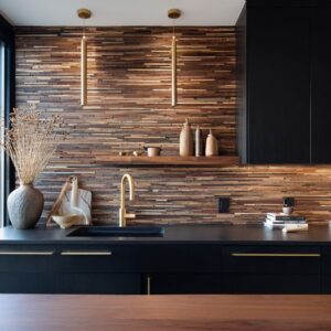
2) Framed accent brick: brick as a curated panel inside a designed wall system
The interior design can be built on the idea of not letting brick dominate every wall. Instead, brick becomes a framed texture panel: a strip behind a fireplace and TV, a band around glazing, or a backing inside shelving towers.
What makes it work:
- Brick feels upgraded when it sits inside a precise composition. Dark cabinetry, paneled millwork, and symmetrical shelving bays turn brick into a chosen material, not leftover construction.
- Warm shelf lighting is a huge advantage. When light grazes brick behind shelves, the mortar lines turn into soft shadow relief. Brick starts to resemble a textured wall finish instead of a rough surface.
- Controlled edges matter. Brick works when it has a clean boundary: stone surround, millwork trim, or a shelving frame that clearly contains it.
A simple model:
Brick becomes the texture layer. Millwork becomes the structure layer.
Stone becomes the luxury anchor. Warm metal becomes the finishing detail.

3) Painted or lightwashed brick: texture without strong color
A painted or lightwashed brick wall changes the whole mood. It keeps the shadow texture from the joints, but you lose the heavy red-brown color weight. That often pushes the room toward modern luxury immediately, especially with dark velvet seating and strong window grids.

What makes it work:
- Light brick raises the brightness ceiling of the room. It lets you bring in navy velvet, charcoal shelving, or black-framed windows without the room feeling too dark.
- Stone looks sharper next to light brick. A marble surround pops more clearly because the wall is calmer in color.
- Artwork can carry the warmth. When brick is light, you can bring warm beige, bronze-brown, or gold tones through art and pillows rather than relying on the brick itself for warmth.
The key detail:
Painted brick still has a lot of texture. Treat it like texture, not like a blank drywall wall.
That means pairings are still big forms: oversized art, broad drapery panels, and furniture with clean mass.

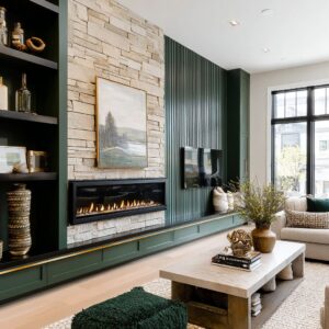
Fireplace wall: marble surround types + art scale rules
A fireplace is the easiest place to make brick feel expensive, because it lets you place a high-finish material directly against the roughest surface. The design can use the fireplace as an insert or a spine that organizes the entire wall.

1) Traditional mantel surround: classic profile inside a loft shell
A traditional mantel in white stone or painted finish can look surprisingly high-end against brick because it brings crafted edges and stepped depth.
Why it works with brick:
- Brick is busy and matte. A mantel has crisp lines and shadow edges.
- The mantel creates a clear boundary that makes the brick look intentional rather than random.
- A traditional profile can still feel current when paired with a modern firebox opening or a slim flame line.
Details that make it look expensive:
- A dark, recessed firebox that reads as a deep shadow pocket. Even when the fire is off, the dark rectangle gives the wall a strong anchor.
- Clean margins around the surround so the brick does not feel crowded.
- One large artwork above the mantel, sized to compete with tall windows.
2) Linear insert: long flame line as a modern counter-stroke
Linear fireplaces are powerful in brick interior designs because brick and windows often create strong vertical structure. A long flame line adds a horizontal element that balances all those uprights.

Why it works with brick:
- It stretches the wall visually, making brick feel more like a designed feature plane.
- The long opening prevents the fireplace from feeling like a small hole in a big textured surface.
- It pairs naturally with low, wide seating layouts.
The stone surround matters here:
A pale surround—marble with soft gray veining—acts like a brightness reset. Brick can be warm and visually dense; stone gives the eye a clean pause.

3) Full-height chimney feature: the vertical spine for double-height brick
In very tall layouts, brick can feel endless. A full-height stone chimney feature solves that by giving the eye one continuous clean surface from fireplace to ceiling line.
Why it works:
- Stone becomes a vertical spine that organizes the wall.
- Brick becomes the framing texture on both sides.
- The room instantly feels scaled and composed instead of cavernous.
How to keep it from feeling cold:
- A flame line low in the stone mass adds warmth and motion.
- Art layered on top of the stone adds depth and stops the feature from feeling like one flat slab.
Art scale rules above brick fireplaces
Art is where many brick rooms slip into that unfinished loft vibe, mainly because the scale is wrong.

Rule 1: One big piece usually beats many small pieces.
Brick already acts like a pattern. A gallery of small frames can turn into a jittery patchwork.
A single oversized canvas creates a calm focal pause.
Rule 2: Match art scale to window height, not mantel width.
In loft living rooms, windows are often the tallest elements. Artwork needs enough height and presence to hold its own in the same wall view.
Rule 3: Keep the palette related to the room’s main materials.
Warm neutrals connect to brick. Charcoal and black connect to window mullions.
Soft gold connects to brass and chandelier metal. The goal is not perfect matching; it is a controlled relationship so nothing feels dropped in at the last minute.
Rule 4: Frames are a quiet luxury signal when used sparingly.
A thin warm-metal frame can echo brass bases and chandelier details. The key is restraint: one or two warm-metal touches in the wall zone go a long way.

Seating palettes that keep brick rich
Brick can make upholstery look either extremely luxe or strangely casual, depending on color, texture, and how the cushions are detailed. Seating can be treated like a large color mass that stabilizes the brick wall.

Navy velvet: depth that makes brick feel intentional
Navy is one of a good partners for brick because it adds weight and contrast without the harshness of pure black.
Why velvet works so well here:
- Brick scatters light in tiny breaks and shadows.
- Velvet holds a soft sheen and shifts tone in daylight.
- Put together, you get depth without needing a complicated color scheme.
What keeps navy from feeling heavy:
- A large pale rug that creates a bright base.
- Pillows graded through cream, taupe, and muted metallic notes.
- Warm accents (camel, gold, brass) that keep the navy from feeling cold.
Rust and caramel velvet: warmth that blends with brick without disappearing
Rust, cognac, caramel, and saddle tones create a rich warm story with brick. The risk is that the sofa can blend into the wall and look muddy.
The better rooms solve that with value contrast and stone.

How to keep warm velvet from blending into brick:
- Use a pale stone table or marble surround as a cooling counterpoint.
- Keep the rug pale and calm.
- Repeat the warm sofa tone in artwork above the fireplace, but in a more matte or painterly way. That repetition makes the sofa color feel planned, not random.
Warm neutrals: cream, taupe, greige, and soft gray
Warm neutrals are the safest way to let brick be the star while still feeling expensive.

What makes neutrals look high-end with brick:
- Big upholstered pieces with substantial cushions and clean silhouettes.
- Texture changes instead of color contrast: bouclé-like weaves, linen-like fabrics, soft velvets, and subtle ribbing.
- One or two warm-metal touches to keep the palette from feeling flat.
Why tufting and channeling are so effective with brick
Tufting and channeling appear constantly in luxury brick living rooms, and it’s not an accident.
- Brick has micro-shadows in the joints.
- Tufting creates controlled shadow rhythm on upholstery.
- Channeling adds neat, repeatable texture that pairs well with window grids and shelving bays.
The important part is scale. Deep tufting on a large sofa or oversized ottoman reads as intentional texture.
Tiny tufting details sprinkled everywhere can feel busy. One big tufted sofa plus one tufted ottoman often looks stronger than many small tufted accents.

Geometry fixes: when round tables, ottomans, and curved sofas save the room
Brick walls plus grid windows plus rectangular fireplaces plus shelving bays can make a room feel overly rigid. The interior designs bring in curves as a structural tool, not as decoration.
Round coffee tables: the simplest way to soften a grid-heavy room
Round tables do several jobs at once:.
- Break up brick courses and window mullions visually.
- Improve circulation around a large sectional.
- Create a social center where everyone has equal access.
A thick stone drum table or a round marble top with a strong base feels especially right in brick rooms because the material repeats the fireplace stone while the shape softens the architecture.

Oval tables: a bridge between strict millwork and soft seating
In media-wall rooms with strict rectangles, an oval table keeps the middle from feeling boxy. It still feels structured, but it removes sharp corners in a tight seating zone.
Curved sofas and rounded modular corners
Curved seating changes the plan immediately. Instead of a corridor-like layout pointing at a TV, the center becomes a destination.
Curves also prevent a dark sofa from feeling severe, because the silhouette looks softer even when the color is deep.

Ottomans as flexible seating and soft barriers
Oversized ottomans show up in many high-end brick rooms for practical and visual reasons:.
- A big ottoman works like a soft island in the center.
- It keeps sightlines open in front of fireplaces and windows.
- Tufting adds texture without adding another pattern layer.
When the ottomans are round, they repeat the curve theme and soften the hard lines from stone and millwork.

Built-in luxury: media walls, shelf spacing, and lighting
Brick can feel upscale without any built-ins, but built-ins make it far easier to control the room’s visual order. The highest-end rooms treat built-ins as architecture first, storage second.
Media wall composition that feels finished
A TV can look like a black hole on a brick wall. The fix is framing and proportion.
Practices that keep it polished:
- Panel molding that creates a clear TV zone so the screen feels contained.
- A marble surround beneath that repeats the stone story in the room.
- Symmetry in shelving towers when the room has symmetrical windows.
- Lower cabinets to hide practical clutter, keeping the open shelves visually clean.

Shelf spacing and negative space
In brick rooms, shelves look expensive when they are not filled. Books and objects need breathing room so the brick texture can still be seen and the shelves read as part of the wall system.
A useful styling logic:.
- Mix vertical and horizontal book stacks, but keep them in small groupings.
- Use a few larger objects instead of many small ones.
- Leave empty zones so the shelf lighting has space to glow.
Integrated warm lighting: the night-time luxury signal
Warm shelf lighting changes brick at night. Brick that can feel flat or heavy in low light suddenly gains depth because the mortar lines catch soft shadow.
That glow also makes dark shelving feel lighter and more layered.

If a room already has big windows, shelf lighting becomes the evening equivalent of daylight: it keeps the room dimensional after sunset without needing busy decor.

Glam layer: crystal chandeliers, brass lines, and piano lacquer as controlled shine
Glam brick loft style depends on contrast. Brick and concrete absorb light; crystals and polished stone return it.
Glam style interior designs often do not use shine like a random set of sparkly items.

Crystal chandeliers: filling the tall volume
In loft interior designs with tall windows, the upper zone can feel empty. A large chandelier fixes that by giving the ceiling area a focal element that holds its own against the window height.

Why crystal works especially well with brick:
- Brick is matte and textured.
- Crystal creates small bright highlights that move with daylight.
- The combination makes the room feel richer because you see two very different surface behaviors in one glance.
The chandelier looks elegant when its scale is bold enough to be seen from the entry and from the seating area. Too small and it disappears; too delicate and it feels decorative rather than structural.

Brass and warm metal: thin lines that finish heavy materials
Brass is often used as a thin base line under a marble table, a band under an ottoman, or a small set of sconces on stone. Those details matter because they:.
- Separate heavy stone from the floor visually.
- Add warmth that keeps marble from feeling cold.
- Create a repeated highlight that connects table base, frame edges, and lighting.
Warm metal can be repeated two to four times, not ten. Enough for consistency, not so much that it turns flashy.

Grand piano lacquer: a luxury object that also balances the architecture
A glossy black piano beside large windows works as both culture and composition.
- It repeats black mullions and any dark ceiling elements.
- Its curved silhouette breaks up rectangles from brick, stone, and glazing.
- The reflective finish adds a mid-level shine that sits between chandelier sparkle above and marble polish below.
Placed near the window wall, the piano becomes a sculptural anchor that also keeps the view active. It feels intentional when it is angled and given space rather than pushed flat against a wall.

Window wall + drapery: how full-height panels finish industrial glazing
Large black-framed windows are one of the strongest features in brick loft living rooms. They can also make the space feel stark if the edges are not softened.

Full-height drapery panels: turning window grids into a finished wall
Long drapery panels do several important jobs:.
- Add a soft vertical surface that balances brick texture.
- Reduce the hardness of tight mullion spacing.
- Make the window wall feel complete rather than purely functional.
Warm neutrals (beige, taupe, gray-beige) are common because they relate to brick and stone without pulling attention away from the view.

Layered treatments: sheers + heavier panels for a high-end finish
Sheers soften daylight and make the brick texture look gentler. Heavier side panels give weight and provide that hotel-like finish at the perimeter.
Rod and hardware choices
Warm-toned rods and subtle metal finishes help connect the window zone to brass table bases and chandelier metal. Hardware should not steal attention; it should quietly support the room’s metal story.

Keeping sightlines open
Seating can stay low so the view occupies the upper half. That is a key luxury move: it treats the exterior as part of the interior composition without adding any extra objects.

Greenery placement: making brick and glass feel connected
Plants are not filler in brick living rooms. They are one of the tools for preventing masonry and black framing from feeling severe.

Place greenery at the brick–window transition
A tall plant where brick meets glazing softens that hard corner and visually stitches the interior wall texture to the exterior view.
Use branches and airy stems near the fireplace wall
Branches on a mantel can overlap the window view behind, which creates a layered scene: interior styling in front, exterior geometry behind. That overlap makes the room feel composed rather than segmented.

Repeat green notes in small ways
A single large plant can feel isolated if nothing else supports it. A compact arrangement on a coffee table, a small plant near a shelving bay, or a subtle green in textiles helps the room feel cohesive.

Why greenery is especially effective with brick
- Leaves create crisp silhouettes against the joint pattern.
- Green cools warm brick tones slightly, keeping the palette balanced.
- Daylight through leaves throws soft shadows that add another layer of depth on stone and fabric surfaces.
Pulling it all together
Even though interior design can vary—some lean modern, some classic, some media-wall focused, some piano-and-chandelier glam—the same underlying logic is useful:.
- Let brick be the texture, not the clutter backdrop. Keep décor low-count and larger-scale.
- Add a bright stone anchor. A marble surround, a stone table, or a full-height chimney feature creates a clear luxury reset.
- Use upholstery as a calm color mass. Navy velvet, rust velvet, caramel velvet, or warm neutrals work when the silhouette stays substantial and the fabric has depth.
- Soften grids with curves. Round tables, rounded ottomans, and curved seating prevent the room from feeling rigid.
- Finish the wall system. Paneled TV zones, symmetrical shelving, and warm integrated lighting turn brick into a curated material.
- Control shine. Crystal, brass, piano lacquer, and marble polish are strongest when repeated with restraint.
- Treat windows like part of the décor. Full-height drapery gives a finished perimeter and keeps the room from feeling stark.
- Use plants as structural softness. Place them where brick meets glass or stone, so transitions feel natural.
When those pieces line up, exposed brick stops feeling like a leftover loft feature and starts functioning like a luxury backdrop—rich, dimensional, and confident enough to sit beside marble, velvet, and jewelry-level lighting without needing extra decoration.
Related Posts
Harmony Home Design brings 10+ years of residential interior design experience to the ideas shared here. We publish design concepts, layout thinking, and practical styling notes.