
In many blue sofa living room ideas, the sofa’s job is not to add blue so much as to control what the eye reads first, how long it lingers, and how the room’s light feels on the skin of the space. Blue can behave like architecture, like shadow, like atmosphere, or like a clear zoning signal—four very different visual outcomes that often get lumped into one category.
This article breaks down the optics behind those outcomes: value (lightness), visual weight, texture noise, shape language, repeat geometry, and how blue changes the room’s sense of volume—without leaning on technical or construction talk.

Four roles a blue sofa can play in a room
A. Blue as architecture
This effect happens when the sofa’s blue sits close to the lightness of walls, curtains, or built-ins. The sofa reads as a calm plane that feels integrated with the room’s shell, so the overall impression is quiet and composed.
In this role, blue behaves like a soft structural layer rather than a statement object, which is a core logic seen in blue sofa living room design concepts built around airy whites and daylight.
Visual result: the room’s vertical elements (windows, paneling, tall curtains) take the drama, while the sofa becomes the stabilizing base that makes the design feel settled.

B. Blue as shadow
Deep navy and midnight blues can do the work of black while staying gentler. The sofa becomes a low shadow line that steadies bright glazing, pale floors, and tall volumes.
This is the underlying logic behind navy blue couch living room ideas that feel serious, calm, and modern without leaning on harsh contrast.
Visual result: the darkest weight stays near the floor line, making the room feel taller and clearer, especially in high-light designs.

C. Blue as atmosphere
Here, blue functions like an emotional tint rather than a dominant object. It often appears in a measured triangle—foreground seating, pillows, and a large art moment—so blue reads as a palette decision tied to light and view rather than matching decor.
Visual result: the design feels fresh and expansive, with blue acting like a soft bridge between indoor calm and outdoor brightness.

D. Blue as signal
In open-plan rooms, a saturated blue sectional can define the living zone instantly. The sofa becomes the clearest marker of this is where the room’s social gravity sits, even when dining and kitchen areas remain visually continuous.
Visual result: the plan reads organized and intentional, with one strong color mass acting as the anchor that keeps the eye from drifting.

Value mapping: how sofa lightness changes the room’s perceived volume
A deceptively powerful lens is the sofa’s lightness relative to walls and large textiles.
Blue close to wall value: calm integration
When the blue is pale, powdery, or misty, it merges with the room’s light field. Dark accents can then appear as thin graphic punctuation without making the room feel sharp.
The effect is often gallery calm: controlled, bright, and emotionally soft.

Blue far from wall value: silhouette-first clarity
When the blue is deep enough to separate strongly from walls, the sofa becomes the first shape the eye reads. The room tends to feel edited and modern because the composition is built around one dominant form.
Key optic: high contrast reads cleanest when the design also contains generous visual breathing space—pale rugs, light-toned planes, and airy table choices—so the deep sofa becomes a strong form, not a heavy block.

Texture noise vs calm mass: why blue works so well near busy backdrops
Some designs contain unavoidable visual static: brick joints, exposed beams, dense shelving, or walls filled with books and objects. In those environments, a sofa that reads as a single calm mass becomes the resting point that makes the surrounding complexity feel curated rather than restless.
- Brick + dark built-ins: a deep blue sofa can steady warm, varied texture by acting as a solid color field next to it.
- Bookshelf walls: a muted blue-gray sofa often reads unusually calm against multicolor spines because the grid of books becomes controlled background movement, and the sofa becomes the quiet foreground plane.
Visual result: the room can hold richness without looking busy because one element is deliberately simple and continuous.

The depth ladder: how blue becomes dimensional instead of flat
Many of the most convincing blue designs build depth in steps rather than relying on one solid hit.
Floor-plane blue legitimizes sofa blue
When blue appears in a rug pattern (even softly), the sofa stops feeling like an inserted object. The room reads color-planned because blue exists in more than one visual plane.

Pillows as color engineering
Pillows often function as a controlled gradient: off-whites and pale neutrals lighten the sofa’s perceived weight; one deeper accent adds depth and prevents pastel blues from reading overly sweet; textured weaves restore detail that darker blues can absorb.

Solid blue + broken blue
A sophisticated blue design frequently mixes solid blue (upholstery, a single deep cushion) with broken blue (prints, watery art, patterned textiles). The mix creates movement without making the palette feel noisy, and it’s one of the clearest differences between collected-looking rooms and showroom-looking rooms.
This layered logic appears frequently in blue couch living room ideas where the room reads curated even with restrained furniture.

Shape language: why curves and circles soften bold blues
Shape has a direct effect on how a strong blue is emotionally received.
- A deep or saturated blue in straight, sharp-edged forms tends to read more formal and graphic.
- The same blue on rounded silhouettes reads friendlier and more enveloping, because the eye travels smoothly along the form instead of stopping at corners.

Round coffee tables, pedestal forms, and curved sectionals also create a repeat rhythm that makes the sofa feel part of the room’s geometry, which helps strong color feel intentional rather than dominant.

Surface behavior as an optical tool: velvet, tufting, weave, glass, reflection
Velvet and nap: color that shifts
Velvet-like blues change with light direction. That shifting creates built-in depth and makes even a single-color sofa feel rich because the surface produces natural variation.
Tufting: micro-shadow pattern
Tufting breaks the blue into small highlights and dimples, turning the upholstery into a subtle light pattern. This is one reason deep blues can look visually layered without additional prints or accessories.
Woven denim: controlled speckle
Denim and chambray-style weaves produce tiny light/dark flecks that read tailored and grown-up, helping mid-tone blues hold a large surface area comfortably.

Glass and reflection: lightness without adding more color
Glass tables reduce the sense of stacked mass in the center of the room, allowing a strong sofa to remain the lead visual event without making the layout feel heavy. Mirrors and glossy lamp bases amplify cool clarity through reflection, increasing the clean feeling of blue without multiplying blue textiles.

Warm counterweights: how blue stays mature and inviting
A consistent pattern in high-end-looking blue designs is the use of warmth in small but strategic ways:
- Dark wood or espresso accents can give pale blues seriousness.
- Warm rugs (including reds and rust tones) can make cool blues feel refined and welcoming, especially in skylit spaces where cool daylight risks feeling clinical.
- Firelight and amber-toned glow can make deep blues look plush and layered rather than flat.

This is where many color schemes to go with blue sofa succeed: the warmth is not competing with blue; it’s stabilizing it.

Black as punctuation: the graphic outline that sharpens blue
Black often appears as thin, concentrated moments—window frames, a fireplace opening, a small sculptural piece, a dark table base. When black is treated like punctuation rather than a second headline, it gives the room crisp edges and makes blue feel deliberately placed, not randomly chosen.
Visual result: blue reads clearer, and the room’s composition feels more defined without becoming harsh.

View: interior blue as a mat that intensifies daylight
Designs with strong water or sky views often use blue in a non-literal way. Instead of matching the outdoor color exactly, interior blue becomes the controlled counterpoint that helps the eye transition between bright exterior light and softer indoor surfaces.
Visual result: the view often looks even brighter and more saturated because the interior provides a calm, deeper reference point—an effect that can be surprisingly strong in a modern blue sofa living room built around large glazing and pale reflective finishes.

Repeat geometry: why blue feels planned when it appears in the right places
The most convincing blue rooms tend to repeat blue by position rather than by exact matching.
- A common structure is a three-point placement: a low blue mass (seating), a mid-level echo (pillows or ceramics), and an eye-level authority (art).
- Another structure is a vertical ladder: blue appears low, mid, and high so the eye doesn’t search for where the palette went.
Equally important is restraint: repeating blue a limited number of times can read more intentional than scattering it everywhere, because the architecture and light already provide variation.

A catalog of distinct blue-sofa visual effects
- Gallery Calm Blue — pale blue near warm whites, with thin dark punctuation and a quiet art echo.
- Shadow-Line Blue — deep navy acting like a stabilizing base under tall light and glazing.
- Silhouette Blue — a dark sectional against a pale shell, where shape becomes the first read.
- Bright Aqua, Still Grown-Up — light aqua balanced by dark wood seriousness and controlled repeats.
- Warm-Wood Envelope Break — dusty denim as cool relief inside heavy warm wood fields.
- View-Extension Blue — blue placed as an accent triangle so the outdoor scene remains the lead.
- Porcelain Pattern Blue — blue used as a pattern language (solid + print) over warm neutrals.
- Textile Story Blue — blue built through sofa, pillows, and rug while glass keeps the room light.
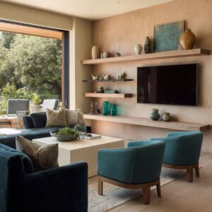
- Soft Drama Blue — saturated velvet blue calming rough texture like brick, framed by pale light.
- Reading-Room Blue — muted blue-gray as the resting plane in front of dense shelving.
- Soft-Architecture Teal — curved saturated blue-green reading as a friendly spatial form.
- Daylight Anchor Blue — strong blue sized to hold its presence in intense sun and big glass.

The hidden logic that ties the strongest blue designs together
The most coherent designs tend to clarify three things visually:
- What role blue is playing (architecture, shadow, atmosphere, or signal).
- Where relief is coming from (breathing space, warm counterweights, round forms, reflective lightness, or texture layering).
- How blue is repeated (by height and material shifts rather than strict matching).
When those three are aligned, blue stops behaving like a sofa color and starts behaving like a deliberate visual structure that shapes mood, clarity, and the room’s overall read.
Related Posts
Harmony Home Design brings 10+ years of residential interior design experience to the ideas shared here. We publish design concepts, layout thinking, and practical styling notes.