
In many kitchen ideas with concrete countertops, the material behaves like a set of visual rules: it decides where the design feels steady, where it feels light, and how warm accents get noticed. The most consistent pattern is that concrete doesn’t rely on ornament to look finished; it relies on placement, thickness, line control, and light behavior.
This is why the same gray family can read gallery-quiet, lounge-like, graphic, cozy, or studio-clean without changing the basic layout.

Concrete takes on a few repeating roles that shift the whole mood
Concrete can be treated like different characters. Most concrete countertop ideas that look composed tend to commit to one primary role, then support it with warmer materials in very controlled positions.

Concrete as a continuous horizon
When the counter reads as one long, uninterrupted band, the kitchen tends to feel organized, even in compact footprints. The eye follows a stable line, so the room reads as edited and calm.
This is a key move in many concrete countertop kitchen ideas that look tidy without heavy styling.

Concrete as a monolith
When the counter becomes a thick object (especially on islands), it reads like a central mass rather than a surface layer. That single volume sets “center of gravity” and slows the eye, so the room can stay quiet elsewhere and still feel complete.
Many concrete kitchen countertop ideas lean on this: one dominant concrete body, then minimal supporting planes around it.

Concrete as a frame for color and texture
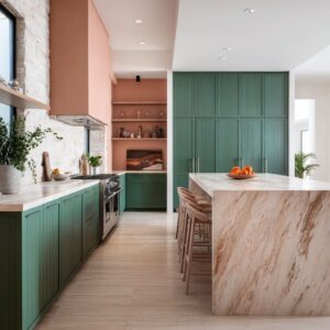
Concrete can behave like a stable border that makes stronger colors and grids feel controlled. Bold yellows, mustard blocks, blush panels, or dark tile fields often look more grown-up when the concrete reads as a steady edge or a thick outline that anchors the palette.

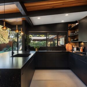
Concrete as a mediator between dark planes and warm wood
In rooms built on high contrast (dark cabinetry, oak ceilings, black grid doors), concrete often sits in the “middle temperature” zone. It sharpens the composition without making it harsh, especially when the finish stays matte and the tone is mid or pale.

Concrete as a runway in long plans
In galleys and corridor-like layouts, concrete surfaces can read like a runway that makes length feel intentional. The most polished versions pair the long counter line with an end-point move (a niche, a darker full stop, or a single anchor element) so the eye feels closure rather than endless repetition.

Concrete as a “content surface”
Concrete often carries built-in visual information—subtle tone drift, light mottling, small marks. When it is allowed to act like the room’s quiet texture, the kitchen can reduce extra decor and still feel layered.
This is where decorative concrete countertops ideas often succeed: the surface itself supplies the interest, so the styling can stay sparse and deliberate.

Thickness is a mood tool long before color is considered
One of the strongest shifts in concrete countertop design comes from thickness and vertical returns. A thin slab reads as a layer applied to cabinetry; a thick edge reads as a built-in element with authority.
- Waterfall sides and end-caps create a visual stop-point that makes compositions feel finished, especially in small kitchens where the eye can otherwise slide out of the scene.
- Corner returns (where the material drops vertically at turning points) can make the plan feel carved from a single family of forms, which adds an architectural calm even when the palette is simple.
This is also where cement countertop ideas often overlap with concrete: the look tends to feel more crafted when the material is presented as a volume rather than a thin skin.

Warmth works best when it is concentrated at human height
A repeated strategy is that warmth is not scattered; it is placed in zones where the body and eye naturally pause.
- Hand level warmth: wood shelves, warm under-shelf glow, oak overhangs, leather seating.
- Body-contact warmth: an inset wood band on an island face, ribbed wood under an overhang, a warm-toned bar front.
- Perimeter warmth: ceiling wood, window trim, or a controlled repeat of one oak tone in a few locations.
This placement is why the concrete can stay gray and still read welcoming: the warmth is staged exactly where the room is experienced.

Sheen choreography makes matte concrete feel richer
Concrete often looks refined when it remains matte, then a small number of surfaces bring controlled reflection elsewhere. The contrast makes the concrete read calmer and more intentional.

Common supporting surfaces include:
- a glossy dark panel that deepens corners by reflecting shapes and light,
- a satin or glossy tile field that adds shimmer without clutter,
- a textured backsplash that behaves like “jewelry” because the counter stays quiet.
This is the moment where backsplash ideas for concrete countertops become part of a larger visual system: the backsplash isn’t competing with concrete; it is providing a second layer of light behavior (sparkle, depth, sheen) that the matte surface can stabilize.

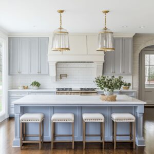
Bands and horizon lines create the calm, “edited” look
Many successful designs are built from long horizontal bands: counter lines, shelf lines, or single color panels that read as clean rectangles. This band logic reduces visual noise because the room is organized into a few strong statements rather than many small details.
- A darker wall plane behind a lighter work plane builds a layered story without busy pattern.
- A slim shelf line cutting a tall surface acts like a horizon that relaxes height and makes heavy materials feel calmer.
- A single, concentrated color block reads architectural; scattered color accents tend to read messier.
.

Depth devices that keep minimal rooms from feeling flat
In tight layouts, small depth moves can do the work of decoration while keeping the palette restrained:
- a recessed niche that acts as a visual endpoint,
- a wood pocket inside a dark shell that becomes an emotional center,
- a tiny recess detail on a concrete face that signals intention,
- a cubby or negative space carved into a peninsula that adds warmth and shadow.
These moves help minimal kitchens feel layered without adding more objects.

Object spacing behaves like still-life composition, not storage
A repeated “quiet luxury” signal is spacing. Open shelves and ledges read curated when everyday items are grouped with breathing room and arranged in a clear rhythm (light-to-dense, tall-to-short, glossy-to-matte).
The room feels finished because objects look placed rather than parked.

Lighting edits proportions and warms gray without changing the palette
Lighting choices frequently do two jobs: they correct proportions and they change how concrete is perceived.
- Warm metallic interiors in pendants can cast an amber pool that softens gray surfaces visually.
- Repetition of pendants sets rhythm and scales long islands so the room feels proportionate.
- Under-shelf glow creates localized warmth at counter height, which can make nearby concrete read velvety rather than stark.
.

Concrete often shifts the kitchen from task zone to hangout table
A frequent layout effect is social: concrete becomes the table object where life happens, not only the work plane.
- A deep overhang reads like a built-in pause zone (coffee, laptop, slow prep).
- A long thick bar reads like the room’s main gathering surface.
- Softer seating materials (leather, upholstered stools) turn the concrete edge into a destination rather than a hard boundary.

This is why many cool concrete countertop ideas feel relaxed instead of industrial: the social posture of the room changes, and the styling follows that calmer tempo.
Color stays mature when concrete anchors it and dark lines outline it
In color-forward kitchen designs, concrete frequently acts as the stabilizer while black elements provide crisp outlines (faucet, hardware, stool frames, rails). That combination prevents pale palettes from washing out and prevents bright palettes from feeling temporary.
The consistent secret is controlled contrast, not maximum contrast
The most composed kitchen designs tend to limit how many loud moves happen at once. Dark planes stay continuous, warm accents repeat in a few predictable zones, and concrete stays matte and steady.
The result is a room that feels confident because nothing competes for attention—materials carry the story through proportion, line, and light.
Related Posts
Harmony Home Design brings 10+ years of residential interior design experience to the ideas shared here. We publish design concepts, layout thinking, and practical styling notes.