
A small bathroom can feel surprisingly generous without changing its footprint, but the shift rarely comes from style alone. It comes from layout clarity: a longer visual run from the doorway, fewer hard stops that chop the view into pieces, and less countertop noise.
If the plan gives your eye a clean lane, the room starts to feel organized before you even notice finishes.

You’ll recognize the problem patterns right away: a narrow corridor bath where your view lands on a busy vanity wall; a compact vanity-and-shower pairing that feels boxed-in because the shower reads like a separate compartment; and the tight toilet-to-vanity setup where storage and lighting decide whether everything looks tidy or squeezed.

Pick one main sightline, then protect it
Most small bathrooms feel smaller than they are because the plan presents multiple competing focal points. A mirror here, a patterned wall there, a bright window to the side, a shower frame that grabs attention—your eye keeps stopping, restarting, and scanning the space again.
The fix is simple in concept and strict in execution: choose one primary axis (entry → vanity is the most common) and keep that lane visually clean.

Choose an axis that makes sense for how people enter
In many layouts, the doorway already points you toward a back wall. Lean into that.
Let the vanity wall be the destination, not one stop among many. When your first view is a composed end wall—mirror plane, calm counter, one intentional feature surface—the room feels planned rather than incidental.

Keep the lane free of visual clutter
A protected sightline is less about empty space and more about removing interruptions that sit directly in the line of view.
- Avoid a tall object mid-lane (a freestanding hamper, a plant that grows into the walkway, a shelf that projects too far).
- Avoid high-contrast fragments at random heights (small art pieces scattered, mixed hardware finishes fighting for attention).
- Avoid a busy end wall made from many small parts (tiny mirror plus separate sconces plus open shelves plus multiple countertop items).
Instead, make the end wall legible from the door: one mirror plane, one light strategy, one tidy surface.

Use one end-wall destination move
A narrow bath reads longer when the far wall feels intentional. Two reliable options:
- A calm reflective stop: a tall mirror plane or a wide mirror band that visually extends the room’s depth.
- A tactile feature band at the end: a single strip of three-dimensional tile behind the sink (wave, rib, or subtle relief) that gives the lane a clear finish without turning the whole room into pattern.
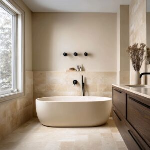
If the bath has a strong window at the end, treat that window as the anchor. A tub under a window, centered and kept low in styling, can organize the entire room in one move.
The window becomes the endpoint, the tub becomes the base shape, and everything else supports that order. In narrow bathroom design, the biggest win is often not a new fixture, but one protected line of sight that stays clean from entry to endpoint.

Make the floor read like one continuous surface
If walls are the room’s backdrop, the floor is the room’s map. In a small bath, a choppy floor pattern or excessive joint lines can make the footprint feel busy and visually shorter.
A continuous floor, on the other hand, acts like a single calm sheet that your eye glides over—length feels longer, width feels steadier, and the room stops reading as a set of tiny rectangles.

Reduce joint clutter with larger tiles
Large-format tiles (or at least fewer grout lines) simplify the ground plane. This matters most in corridor layouts where the floor is a long strip you see from the doorway.
The fewer breaks your eye has to count, the more the room reads as one place.

If small tile is needed, contain it like an inset
Small mosaic often belongs in the shower floor for grip and for drainage geometry. The mistake is letting that small pattern spread everywhere so the whole room starts to flicker.
Treat mosaic like a functional inset:
- Keep it inside the shower pan.
- Use a clean, intentional threshold at the shower line.
- Let the main bath floor stay calm.
This creates a clear wet/dry logic without building a heavy curb or adding extra materials.

Let direction reinforce the plan
Tile direction is a layout tool, not only a finish choice.
- Long runs in a corridor support length because your eye follows the alignment down the lane.
- A diagonal layout can add energy without adding objects, especially in a bath where walls and vanity are very restrained. Diagonal floors work best when everything else stays simple—otherwise you get motion in too many places.
Example logic:
- A pale tile lane laid in long runs can visually extend a corridor bath.
- Large shower wall panels plus a small mosaic shower floor create calm where your eyes go and texture where feet need grip.

Keep partitions transparent, but give glass a clear edge
A small bathroom often feels boxed-in because the shower reads like a separate room inside the room. Transparency solves that: when your eye can move through the wet zone without hitting an opaque barrier, the footprint reads bigger.
But there’s a catch: glass can become visually messy if it lacks a readable boundary, because reflections start stacking and edges disappear.

Minimal glass works when the room is already strong in geometry
A near-invisible panel works best when wall planes and tile lines are disciplined. The shower becomes part of the same visual field: same wall tone, same tile family, and no extra outlines competing.

Framed glass works when you need a crisp outline
In pale rooms, a thin dark frame around the glass can be a gift. It gives the shower boundary a single clean line, so the glass reads as intentional architecture rather than a leftover divider.
This is especially helpful when the bath has multiple reflective surfaces (mirror, glossy tile, polished stone) that can otherwise blur together.

Warm-metal hardware quietly ties wet and dry zones
If the vanity faucet and the shower hardware share the same warm finish, the shower stops feeling like a separate kit of parts. Even small repeats matter: hinge tone, handle tone, control plate tone.
The idea is not to decorate the glass, but to keep the room’s touchpoints speaking the same language. A glass shower enclosure increases perceived space most when it keeps the wet zone visually connected while still giving the glass a clean, readable edge.

Full-height mirrors and wall-width mirrors: the fastest way to add depth
Nothing changes perceived space faster than mirror scale. A small mirror can make a small bath feel chopped because it creates a contained reflective patch.
A larger mirror plane reads like an extension of the room—depth doubles, light multiplies, and the vanity wall feels calmer because it becomes one continuous band.

One big mirror plane beats multiple small mirrors
Two small mirrors often create two competing vertical panels, especially in tight layouts. A wall-width mirror behind a vanity reads as one field.
It’s easier on the eye, and it makes the whole grooming wall feel less busy.
Mirror cabinets solve clutter without stealing surface area
A mirror that also holds daily items is one of the cleanest layout upgrades for small baths because it removes the reason clutter exists in the first place. Instead of fighting countertop mess with trays and styling, you remove the storage problem.

A strong approach is a mirror cabinet with side niches: the mirror stays dominant, while a few controlled items live in lit recesses at the edges. The key is restraint—side niches should hold a small, repeatable set (one bottle cluster, one small tray), not a mix of everything.

Segmented mirror panels can add proportion without shrinking the feel
Segmentation works when it’s architectural, not fussy. For example: a central mirror cabinet flanked by narrow vertical mirror strips or slim lit niches.
You still get a large reflective field, but the wall gains structure and rhythm. In a full-height mirror bathroom layout, the mirror reads like a vertical extension of the corridor, making the end wall feel farther away than it is.

Floating vanities, leggy bases, and toe-kick light keep the lower half open
A bathroom reads tighter when the base mass blocks the floor line. When the vanity hits the floor with a heavy toe-kick, your eye reads the room as a series of blocks.
Lift the vanity, and suddenly the floor becomes a continuous plane again.

Floating vanity: uninterrupted floor line
A floating cabinet makes the bath feel wider because your eye can see under it. This matters most in corridor plans, where the vanity often sits at the end and becomes the visual stop.
A lifted base makes that stop feel lighter.

Toe-kick glow exaggerates openness
Under-cabinet light is a spacing trick. The glow creates a shadow gap, and that gap makes the cabinet feel like it’s hovering.
It also acts as soft night lighting, which is practical without adding more fixtures to the wall.

Slim legs can work when you want furniture character
A leggy vanity base can make a small bath feel less built-in and more like a room with furniture. The important part is proportion: legs should be slim enough to keep the base airy, and storage should still be strong enough to hide daily clutter.
This approach works best when the underside stays visually tidy—one basket row, one towel band, or nothing at all.

Grout and pattern: decide where detail lives, then keep the rest simple
Pattern can make a small bathroom feel rich, but it can also make it feel crowded if it appears in too many places at once. The goal is not avoiding pattern; it’s assigning pattern a job and giving it a boundary.
Width trick: horizontal dark tile with thin light grout
A long horizontal tile field behind the vanity can visually widen the wall. Thin grout lines act like subtle pinstripes, and the wall reads broader.
This is especially effective when white porcelain fixtures sit against that darker plane—everything looks crisp and intentional.

Height trick: vertical white tile
Vertical tile behind a tub or in a shower wall can make a ceiling feel taller because the surface carries your eye upward. In small baths, this can be more effective than adding decor, because it changes how the wall reads at full height.
Depth and shine: glossy dark herringbone near glass
Glossy dark tile can be a light-catcher, especially near glass partitions. The shine creates depth; the herringbone creates movement.
This works best when the rest of the room stays restrained: warm wood for the base, a white counter band to reset the eye, and one soft organic element to keep the geometry from feeling harsh.

Soft movement without visual mess: speckled floors
Speckled or terrazzo-like floors have an underrated advantage: they hide daily marks better than pure white and they add gentle movement without forcing more objects into the room. In bright baths, this keeps the room from feeling like a blank box while still staying light.

Quiet base + one feature wall
A grey or stone-soft base with a single chevron or patterned zone can feel modern and intentional. The mistake is repeating strong pattern on multiple planes.
One feature wall plus calm surrounding fields tends to feel larger than three competing patterns.
A simple hierarchy that prevents visual noise
1 feature surface, 1 calm field, 1 texture layer (woven, textile, or plant).

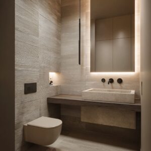
Tight toilet-to-vanity adjacencies: make them feel designed, not accidental
In many small baths, the toilet sits right beside the vanity. When that happens, the wall composition becomes the organizer.
If the wall treats the toilet as an afterthought, the whole plan feels squeezed. If the wall unifies fixtures into one composition, the layout feels intentional even when everything is close.

Use one depth panel to unify the zone
A darker tile panel behind the vanity and toilet can make white porcelain pop cleanly and can visually group the two fixtures. The key is crisp edges: the dark surface should stop cleanly, like a deliberate panel, not fade out in a messy transition.
Add a ledge that runs through the toilet zone
A thin ledge behind the toilet can merge the toilet area with the vanity wall. It becomes a functional landing zone and a compositional line that connects both fixtures.
When styled simply—one framed print leaning, one small glass vase, one woven basket—the ledge reads like design, not storage spill.

Use a wall niche above toilet height
A niche above the toilet can replace countertop clutter and also create a vertical focal band that makes the wall feel planned. Dark-backed niches work especially well because they hide shadows and make towels or baskets read like blocks rather than piles.
Three-part rectangle logic
One effective compact plan reads as three vertical bands: toilet wing, vanity center, shower wing. When each band has its own clear wall treatment and lighting logic, the room stops feeling like fixtures pushed together.

Storage that stays calm: closed first, open second, and lit recesses third
Storage is where small bathrooms win or lose. If storage is mostly open, the room becomes a display of daily life (bottles, backups, cleaning supplies).
If storage is mostly closed, the room reads as architecture. The most successful small baths usually follow a clear order: hide the messy categories first, then allow open storage for one or two predictable categories, then use lit recesses to make the open parts look intentional.
The best bathroom storage ideas for small plans reduce countertop objects by moving daily items into walls, mirrors, and the volume under the vanity.
")
Recessed niches that replace countertop clutter
This works best when the niche replaces a category, not when it becomes a dumping spot.
- Shower niches: keep bottles off corners and off the floor. The niche should be sized so bottles stand in a neat row, not stacked in front of each other.
- Display-style niche: treat it like a small gallery. One plant arrangement, one container, one towel band—tight grouping, not scattered pieces.
- Dark-backed linen niche with LED strips: towels read intentional when light washes down the stacks. The dark back hides depth shadows, and the LED makes even simple towel blocks look planned.
Shelf towers that act like a buffer between zones
A tall shelf tower can connect tub and vanity and also prevent those two zones from competing. This works especially well in classic white baths where the tower becomes a vertical hinge: towels, a few jars, one basket, and plenty of breathing room.
")
A second version is the open shelving tower used as a spa-like storage spine: towels stacked in repeatable blocks, a basket base, and one small plant or vessel to break the rectangles.
")
Under-vanity baskets that hide messy categories
A single row of woven baskets under a floating vanity works because repetition reads orderly. The trick is sizing and consistency:
- same basket family,
- same fill level,
- same category per basket (extra towels, hair tools, backups).
Plain rule: open storage looks clean when it holds one category per shelf band (towels only, baskets only, or a small bottle cluster only), not a mix of everything.
")
Soft layers that don’t shrink the room
Soft layers make bathrooms feel livable, but too many soft items can visually thicken a small footprint. The goal is adding softness in places that support the plan: along the lane, at the window, and at foot level.
")
Runner rugs define the lane
A runner in a corridor bath does more than add comfort: it visually pulls the eye deeper. Keep it aligned with the main walking line and choose a tone that relates to the room’s main materials (wood, stone, or warm neutral).
In corridor baths, a runner works best when it reads as one calm strip, not a high-contrast pattern that competes with tile joints.

Linen or sheer curtains filter glare and organize big glass
Full-height curtains can make a bathroom feel like a suite, but the win is also practical: glare softens, the window reads like a planned feature, and the fabric adds vertical fall that balances hard tile geometry. Sheers give softness without darkening the room.

Woven texture in small doses
Woven texture belongs where it won’t crowd sightlines: at foot level (rugs, baskets, poufs) or at window level (woven shades). Used this way, it adds warmth without turning the walls into visual noise.

Lighting that stretches space: vertical, under-shelf, and face-level
Lighting shapes perceived space as much as mirrors do. In small baths, lighting should do three things: make faces look good at the mirror, make the room feel deeper without adding more objects, and reduce the heaviness of base cabinetry.

Face-level light that avoids harsh mirror shadows
Pendants in front of the mirror can work beautifully when the shades diffuse light and the drop height is tuned to face level. Another reliable approach is side sconces with frosted cylinders: they light evenly and reduce shadowing under eyes and chin.
The mistake to avoid is relying only on overhead downlights, which often create shadowy faces and make the room feel flatter.

Hidden light that adds depth without adding clutter
Under-shelf LED in a corridor niche makes towels look like planned blocks rather than overflow. Under-mirror grazing light can reveal stone texture and give the vanity wall a layered feel without adding decorative objects.
Toe-kick glow as a lighter base trick
Toe-kick lighting makes floating cabinets read even more open at night. It also keeps the floor plane visible, which helps a small bath feel less boxed.

Material roles that make a small plan feel intentional
Small bathrooms look expensive when each material has a job and repeats in the right places. The goal is not a large palette; it’s a small kit used with clarity.

Dark surfaces as depth panels
Dark tile or dark walls can add depth when they stop cleanly and repeat in small doses elsewhere. The dark plane becomes a backdrop that makes white porcelain, pale counters, and mirrors look sharper.

Warm wood as the comfort layer
Wood on vanity fronts, shelving, or a wall band keeps the room from feeling clinical. It also helps stone and tile feel more livable.
Wood becomes even stronger when it repeats in more than one form (vanity + shelf + mirror frame, for example).

Metal as the connector
Pick one main metal family and let it appear on water, storage, and one secondary touchpoint (flush plate, towel ring, glass hardware). This prevents the room from feeling like multiple unrelated kits.

Layout recipes readers can copy
For a compact bathroom layout, recipes beat random upgrades because they make the visual priorities obvious.
The corridor bath recipe
End-wall mirror plane, floating vanity, runner in the lane, glass on one side, lit niche on the other. Keep the side walls calm and let the end wall be the composed destination.
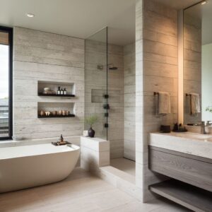
The compact vanity + straight-ahead shower recipe
Clear glass, large shower wall panels, mosaic only on the shower floor, storage built into wall thickness (mirror cabinet plus a shower niche). The shower should read as part of the room, not a box.

The tight toilet-to-vanity recipe
One composed wall: mirror scale that matches the vanity width, face-level lighting that flatters, and either a ledge or a niche so countertop items can disappear. A wall-mounted faucet helps keep the counter surface clear.
The tub-under-window recipe for small baths
Center the tub under the window, keep side styling low, add one woven element and one plant element, and let the window be the feature. Vertical tile behind the tub can add height; soft curtains can filter glare and add a calm vertical fall.

Finish check
Before calling it done: can you see a clean lane from entry to the main destination; does the floor read as one calm surface with any small-tile areas contained; is the mirror large enough to act like a wall plane; is storage mostly closed with open storage limited to one category per shelf band; does the glass edge read clearly; and does face-level lighting make the vanity wall feel finished without relying on countertop objects?
FAQ
How do I make a narrow bathroom feel wider without remodeling?
Reduce visual breaks. Keep the floor calm (fewer joints), use a larger mirror plane, and simplify the end wall so the room reads as one long view instead of many small stops.
A darker depth panel behind white fixtures can also make the wall feel broader if edges stay crisp.
Is a floating vanity better for a small bathroom?
Often, yes—especially in corridor plans—because it preserves the floor line and makes the base feel lighter. It works best when the underside stays tidy (either empty, or one repeatable row of baskets or towels).
What mirror size works best in a compact bathroom?
Bigger than you think. A wall-width mirror behind the vanity is usually the fastest way to add depth.
If you need storage, choose a mirror cabinet so daily items disappear without consuming counter space.
Should I use clear glass or a shower curtain in a small bath?
Clear glass typically makes the room feel larger because it keeps the wet zone visually connected. If privacy is needed, choose glass with a readable edge (thin frame or strong hardware line) so it still feels intentional.
A curtain can work, but it usually shortens the view unless it stays pulled back most of the time.
How do I keep open shelves from looking messy?
Limit open shelves to one or two categories (towels only, baskets only, or a small bottle cluster only). Keep spacing consistent, avoid mixing many small items, and consider a darker back or integrated lighting so the shelf reads like a designed recess rather than overflow storage.
Related Posts
Harmony Home Design brings 10+ years of residential interior design experience to the ideas shared here. We publish design concepts, layout thinking, and practical styling notes.